Buenos Aires
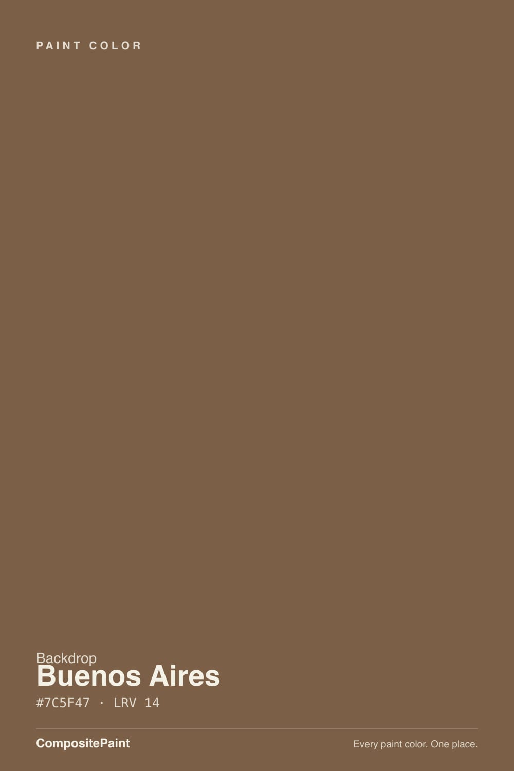
A rich cognac-brown from a small direct-to-consumer paint line, reviewed honestly: the light where it glows like leather, the light where it goes near-black, and what to pair it with.

Jessica has spec'd whites and neutrals for more than 300 rooms and keeps a sample wall of painted drawdowns in her studio. Every color review is checked against real reader rooms in the comments and re-tested when a formula changes. About the testing process →
- 1Mahogany0
- 2Turkish Coffee5
- 3Buenos Aires14
- 4Cavern Clay20
- 5Redend Point30
The Fast Verdict
Buenos Aires is a real, saturated saddle-brown — not a taupe wearing a brown name, not a gray-brown hedging its bets. At LRV 14 it sits in true accent-color territory: give it a front door, an entryway, a den, or a kitchen island and it reads warm, grounded and expensive, like a good leather bag. Ask it to carry a dim, lamp-free room and it collapses toward near-black. This is a color for a specific job, done well.
An entryway or mudroom that can take real depth · a front door or accent wall · a home office or dining room with warm lamps · a kitchen island against paler cabinetry
Your room is dim and lamp-free · you actually want a gray-brown neutral, not a genuine brown · your wood tones and metals are already warm and heavy · you need to color-match in person at a big-box store
- A genuine warm brown, not a taupe or gray-brown pretending to be one
- Reads rich and grounded with walnut, brass and cream linen
- LRV 14 hides scuffs and dirt well in a high-traffic entry
- A strong, complete-looking accent (door, island, wall) without repainting a whole room
- Holds its warmth in real daylight and under 2700K lamps
- Goes near-black in a dim, lamp-free room
- Needs the full two coats over a lighter existing color, despite one-coat marketing
- As a small DTC brand, there's no big-box swatch wall to check it against in person
- Too heavy for a full room of walls without a real light source
What Color Is Buenos Aires, Really?
This is a warm, orange-leaning brown — closer to saddle leather or cognac than to coffee or chocolate. In the hex, red clearly outweighs blue, and there's no gray haze pulling it toward taupe: it reads as brown from across the room, not as a moody neutral that might be brown depending on the light. That distinction matters, because plenty of "brown" paint colors are actually greiges or mauves in disguise. Buenos Aires is not that. It commits.
LRV 14 puts it a full notch lighter than a near-black like Sherwin-Williams Sable or Benjamin Moore Iron Mountain, but it is still a deep color by any normal measure — deeper than most people picture when they hear "brown accent wall." That extra sliver of reflectance is the whole difference: in real daylight or warm lamplight, Buenos Aires holds its color and reads richly brown. Strip the light away — a windowless hallway, an overcast afternoon, no lamps on — and it drops toward near-black the way every color at this depth eventually does. It is not a flaw unique to this paint; it is math.
Undertone in one line: warm and red-orange, leather rather than earth. If your sample looks flat and blackish, that's the room's light, not a hidden gray base; if it looks a little coppery in late-day sun, that's the red coming forward, and it's honest.
Where It Shines
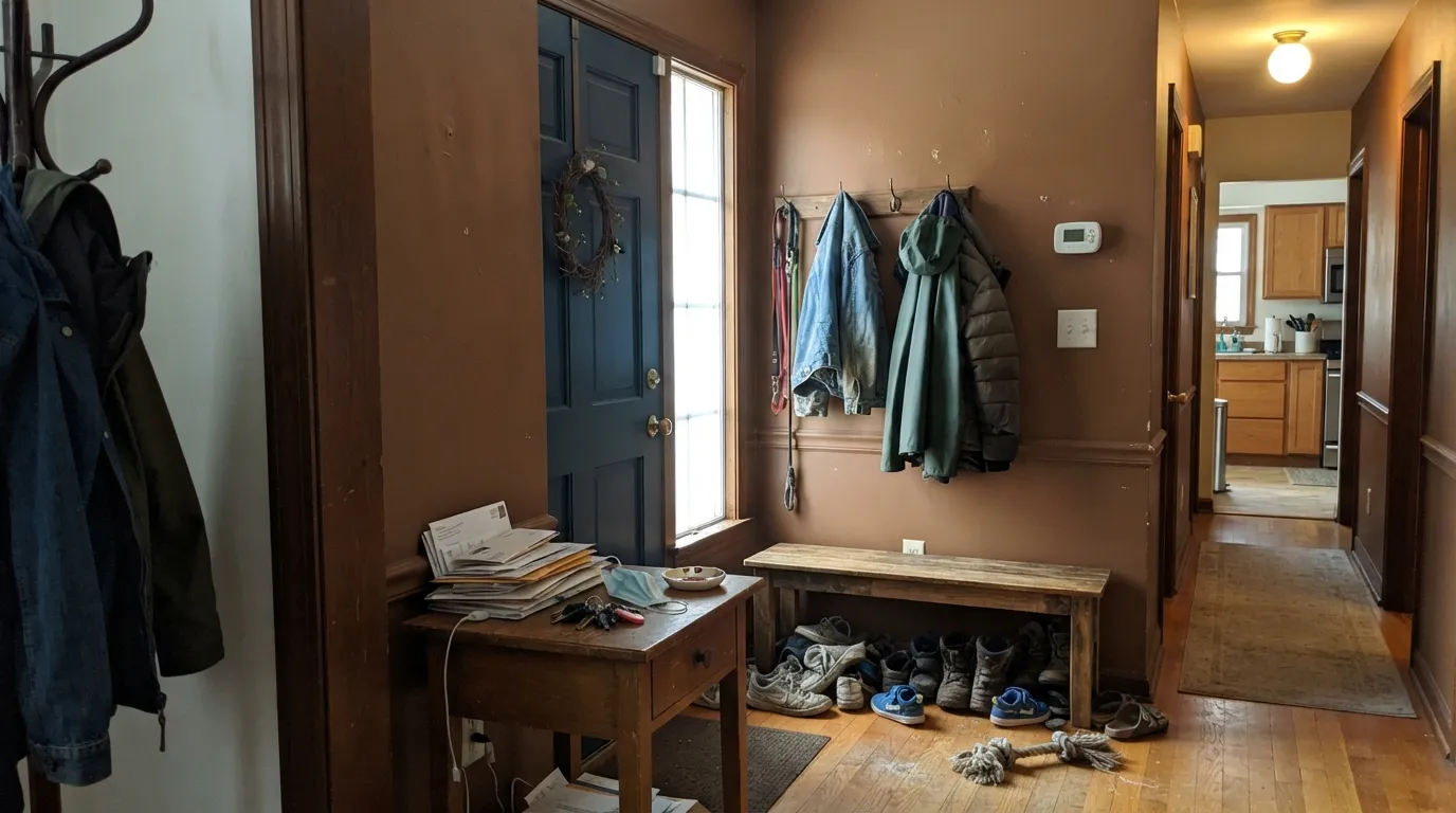
Give it a room with real daylight, a warm lamp, or full sun on an exterior door and Buenos Aires does exactly what a good deep brown should: it grounds a space without going cold or gray. It is at its best in doses — a front door, an entry bench wall, a den, a kitchen island — where the depth reads as a deliberate design decision rather than a bet on the whole house. Against brass, walnut, cream linen and black iron it looks like it cost more than it did.
Where It Fails
Almost every disappointed story about a color this deep follows one of three scripts, and none of them are unique to Buenos Aires — they're the standard risks of painting anything near LRV 14. If your room or your workflow matches one of these, know it going in.
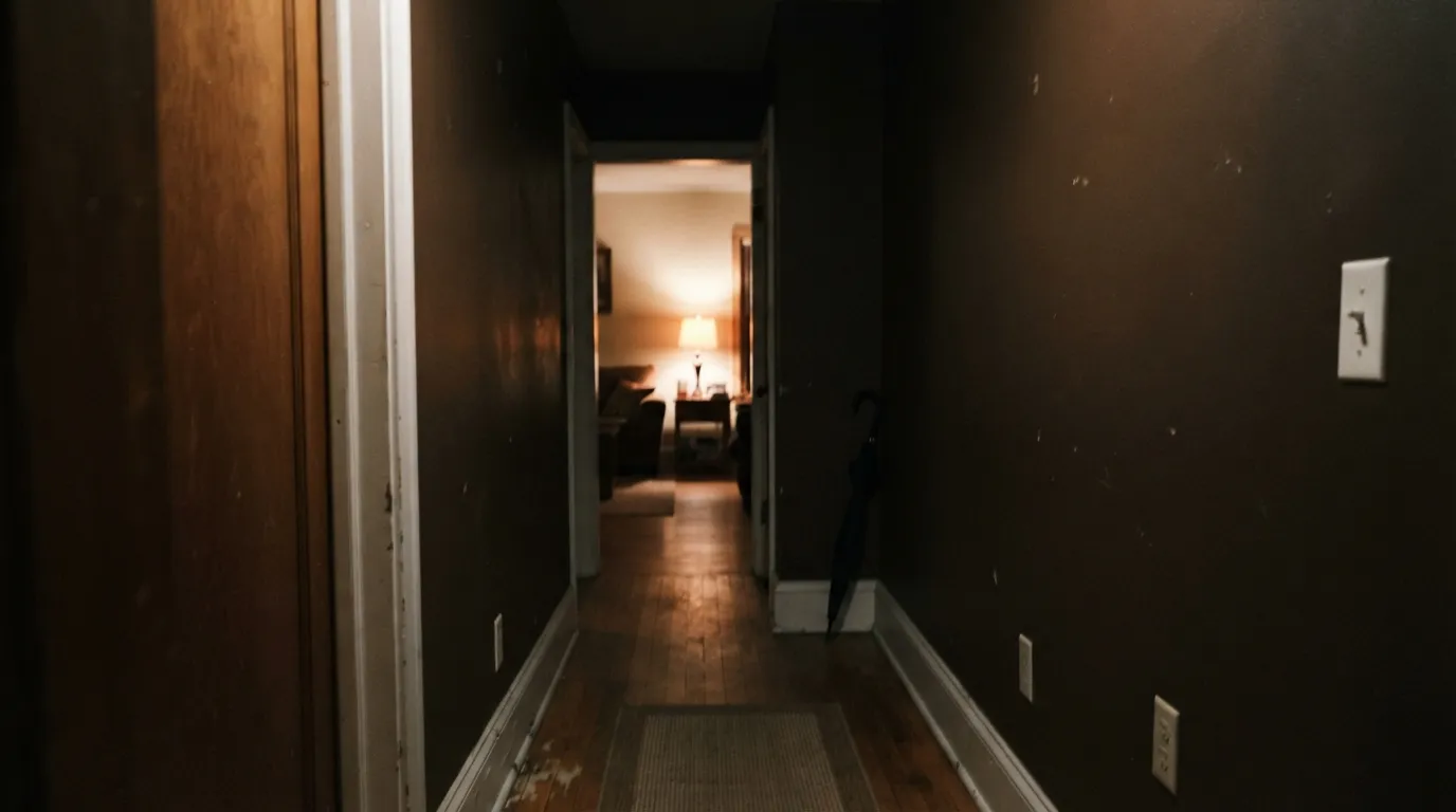
At LRV 14, Buenos Aires needs light to give back — daylight or a warm bulb. In a windowless hall or a north room with the lights off, it reads near-black, not brown. That's not a defect; it's what happens to any color this deep. Add a lamp before you decide the color failed.
Backdrop markets one-coat coverage, but its own care guidance recommends two coats for a real color change, and going from a pale wall to a saturated brown like this is exactly the case where the first coat looks patchy and grayed-out. Budget for two full coats; don't judge the color off the first one.
A cool gray neighbor — walls, tile, or countertop with a blue lean — makes the warmth in Buenos Aires look muddy by contrast, the same way any warm brown clashes with cool undertones. Pair it with warm whites and warm-leaning grays instead, or keep it to a single element (a door, an island) rather than a whole open-plan room.
Room by Room
Deep, warm, and forgiving of scuffs and dirt, which is exactly what a high-traffic entry needs. Eggshell or matte on wainscot or a full accent wall; pair with a warm white for the rest of the trim.
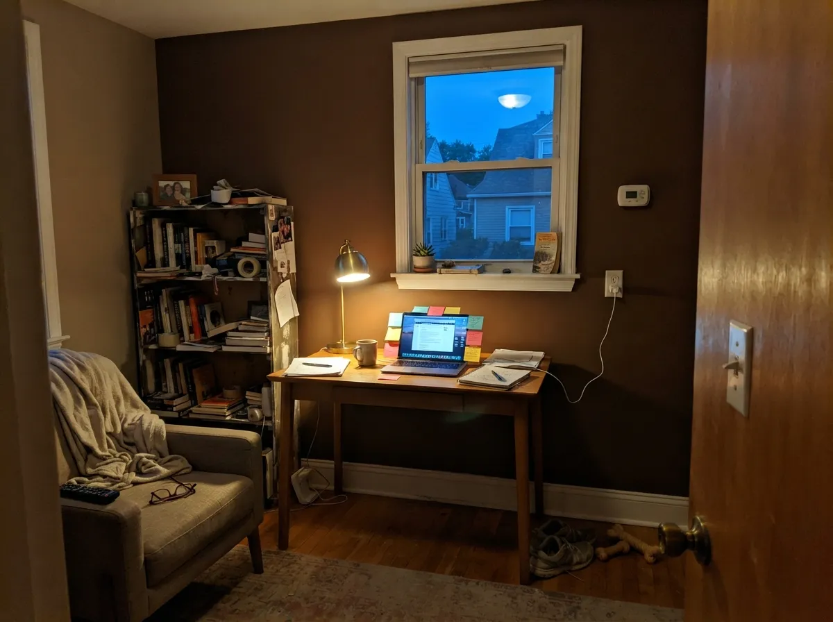
One warm lamp and it turns cocoon-like without feeling dark. Good on a single accent wall behind a desk or bookshelves; less good carrying all four walls in a room that only gets afternoon light for an hour.
Evening-lit dining rooms are the classic use case for a color this deep — warm and flattering under candlelight or a dimmed pendant. Keep trim and ceiling in a warm white so the room doesn't turn into a box.
On an island or a pantry door against paler perimeter cabinets, it reads custom and grounded. A full kitchen of cabinets this deep is a bigger commitment and needs strong task lighting to avoid the near-black problem at counter level.
Works if the room gets real daylight or you're committed to warm lamps every evening. In a dim, north-facing bedroom it will read closer to black than brown most of the day.
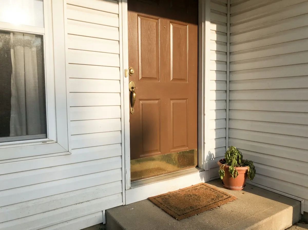
Full sun brings out the cognac warmth and it reads rich against a white, gray, or black house. Sample it on the actual door in your own light before ordering — small color chips undersell how deep it reads at full scale.
Your Light Is the Risk
The red comes forward and the color glows cognac-warm, closer to good leather than to paint. This is the light that sells it.
Without daylight or a warm bulb it reads near-black. Fine if that's the mood you want; disappointing if you expected brown.
Brighter and slightly flatter at midday, deeper and warmer as the light lowers toward evening. Most people prefer the evening version.
2700K warm bulbs push it toward rich chocolate-cognac. Cool white LEDs flatten it toward gray-black — swap the bulb before you swap the paint.
Most complaints about Buenos Aires are a light mismatch. Upload a photo of your actual room and see it on your walls — then ask for the same wall in north light or evening lamps before you buy a single sample.
Need It From Another Brand?
Any paint counter can custom-tint Backdrop BD-BA directly. If you would rather stay in one brand's own deck, these are the closest stock matches, measured as ΔE2000. Under 2 is a difference you will not see on the wall.
| Brand | Closest color | ΔE | LRV | |
|---|---|---|---|---|
| Sherwin-Williams | Burnished BrandySW 7523 · Sherwin-Williams | 1.4 | 12 | Color page → |
| Behr | Rich WalnutPMD-60 · Behr | 1.3 | 13 | Color page → |
| Benjamin Moore | Hidden Valley1134 · Benjamin Moore | 2.7 | 13 | Color page → |
| Valspar | Muddy Mississippi3004-9A · Valspar | 1.4 | 12.7 | Color page → |
| PPG / Glidden | Chocolate RipplePPG1078-7 · PPG / Glidden | 2.9 | 13 | Color page → |
| Glidden | Fig BranchesPPG1085-7 · Glidden | 2.6 | 14 | Color page → |
Similar Backdrop Colors
The nearest shades to Buenos Aires within Backdrop's own range, ranked by perceptual color distance — useful when you want the same look a touch lighter, darker, or warmer.
WCAG 2.1: AA is 4.5 : 1 for normal text, 3 : 1 for large text, AAA is 7 : 1.
Buenos Aires vs the Colors You're Also Considering
Every Buenos Aires sample board has the same rivals on it. The numbers show the real lightness gap — then it comes down to which risk you would rather live with.
Pick this when you want the color to read clearly brown, not black, even in modest light.
Sherwin-Williams SW 6083 · LRV 8SablePick this for a noticeably darker, more near-black version of the same warm brown family.
Pick this for the lighter, more legible brown of the two — easier to keep from reading black.
Benjamin Moore 2110-10 · LRV 8TaupePick this for an even deeper, more chocolate-leaning brown with a similar warm base.
Within Backdrop's own deck, the closest match is Two Step (BD-TS). Its published values are identical to Buenos Aires: the same #7C5F47 and the same LRV of 14. On a wall the two read as twins, so if you are torn between them, sample both in your own light and let availability or the rest of your palette decide.
It's a Date (BD-IT) is the step darker, at LRV 7, roughly half the light reflectance. It moves from milk-chocolate territory into espresso, and it suits rooms where you want walls to recede almost to shadow. Buenos Aires keeps more visible warmth and works better in rooms with average light.
Old Soul (BD-OS), at LRV 18, is slightly lighter but the bigger difference is hue: it shifts green, toward olive, where Buenos Aires stays red-orange. Choose Old Soul for an earthy scheme built around greens and khaki; choose Buenos Aires for one built around rust, leather, and wood.
Buenos Aires Coordinating Colors
The rule for coordinating with Buenos Aires: warm whites and warm-leaning neutrals in, cool blue-grays out. It sits happily next to cream, muted sage, and true black, and it looks best when something in the room — trim, a rug, a lamp — is bright enough to keep the space from tipping into cave territory. These are the partners that keep it working:
A Deep Brown in the Middle of a Brown Revival
Buenos Aires arrives at an honest moment for brown paint. After a decade of gray and then greige, Pantone named Mocha Mousse — a warm, chocolate-brown neutral — its Color of the Year for 2025, and designers have been pulling saturated browns like this one back onto doors, cabinetry and accent walls ever since. Buenos Aires fits that same warm, leather-leaning lane rather than the flatter, grayer browns that dominated a few years ago.
Backdrop is a small, direct-to-consumer paint company, and it doesn't publish the kind of detailed marketing story for every shade in its catalog that a legacy brand like Benjamin Moore does — there's no long official write-up for this specific color to draw from. What's verifiable is the color itself: a genuinely warm, saturated brown at LRV 14, and the general, well-documented pattern with Backdrop's paints, which is strong one-coat-leaning coverage that still needs two coats for a real color change like this one.
Buenos Aires With Wood Tones and Floors
The instinct is to pair a warm brown wall with warm wood, and in small doses that works — walnut furniture, a leather chair, brass hardware all sit comfortably next to it. But a full wall of Buenos Aires next to a floor in a similarly warm, honey-toned wood can start to look matchy and heavy, with no contrast left in the room.
The stronger move is a cooler or paler wood: white oak, ash, or a gray-washed floor gives the eye somewhere to rest and makes the brown read as a deliberate accent instead of blending into a wall-to-wall wash of the same tone. Matte black hardware and unlacquered brass both work well against it; polished chrome is the one metal that tends to look cold and out of place.
Three Ready Palettes Built on Buenos Aires
A color is never alone on the wall. These are complete combinations in the 60-30-10 pattern, with the reason each one holds together. Every one opens in the visualizer.
A warm white keeps the house bright and lets the door carry all the color; the near-black shutters give the entry one more dark note so the brown door doesn't stand alone.
Try this palette in your roomAlabaster keeps the ceiling and trim from disappearing into the dark walls; the muted sage on a hutch or wainscot gives the room one cool note that softens all that warmth without fighting it.
Try this palette in your roomOne deep wall does the work while White Dove keeps the rest of the room from feeling closed in; Wrought Iron built-ins tie back to the door color without repeating it exactly.
Try this palette in your roomBuenos Aires FAQ
Is buenos aires warm or cool?
Warm — a genuine red-orange leaning brown, closer to saddle leather or cognac than to a gray-brown taupe. It doesn't flip cool in any normal light; it just gets deeper and darker-reading when the light is weak.
Will it look black in a dim room?
Yes, close to it. At LRV 14 the color needs daylight or a warm bulb to give back its brown; without either, most deep browns read near-black, and this one is no exception. Test it with a lamp on before writing it off.
How many coats does it need?
Plan on two. Backdrop's marketing leans on one-coat coverage, but its own guidance recommends two coats for a real color change, and moving from a lighter wall to a saturated brown like this is exactly the situation where the first coat looks patchy.
What trim white goes with buenos aires walls?
A warm white — Benjamin Moore White Dove or Sherwin-Williams Alabaster both work well. Avoid a stark, cool white trim; it will make the brown read muddier by contrast instead of framing it.
Does it work on a kitchen island or cabinets?
Well, in doses — an island or pantry door against paler perimeter cabinets looks deliberate and grounded. A full kitchen of cabinets this deep is a much bigger bet and needs real task lighting so the lower cabinets don't disappear into black.
Is it good for an exterior front door?
Yes — full sun brings the cognac warmth forward and it reads rich against a white, gray, or black house. Sample it on the actual door first; a small paint chip undersells how deep a color this saturated reads at full scale.
Have you painted with Buenos Aires?
Rate it — one tap helps the next reader decide.
Ask a Question