Hartford
Backdrop's DTC-only sage-gray reviewed honestly with the data we could verify: where its LRV 22 depth earns its keep, the light that flattens it, and what to check before you buy a gallon sight unseen.

Jessica has spec'd whites and neutrals for more than 300 rooms and keeps a sample wall of painted drawdowns in her studio. Every color review is checked against real reader rooms in the comments and re-tested when a formula changes. About the testing process →
- 1Essex Green6
- 2Vintage Vogue12
- 3Hartford22
- 4Evergreen Fog30
- 5Clary Sage41
The Fast Verdict
Hartford is a muted, gray-leaning green at a working mid-depth (LRV 22) — the same depth and family Sherwin-Williams built two of its best-known cabinet sages around. Backdrop sells it online only, with no in-store swatch wall and almost no independent write-ups to check first, so this review leans hard on the color's own numbers and the brand's verified track record rather than borrowed marketing copy. On cabinets, a mudroom bench, or a well-lit small room, it behaves like a proven sage should. On four walls in a dim north room, it goes flat exactly the way its closest deck twins do.
Kitchen island or lower cabinets · a mudroom or laundry bench · a small, well-lit powder room · a home office wall behind open shelving
Your room is north-facing and dim with no warm lamps · you want a true gray with no green in it · you need to see the paint in person before buying (Backdrop ships direct only)
- Same proven depth and family as Sherwin-Williams Retreat and Dried Thyme, at Backdrop's own DTC price
- Deep enough (LRV 22) to hide grease and fingerprints on cabinets and a mudroom bench
- Muted gray-green undertone stays quiet next to white quartz, butcher block, and black hardware
- Backdrop's Standard finish goes on smooth with minimal streaking, per early buyer reviews
- GreenWise-certified low-VOC formula, low odor while painting
- Online-only — no in-store swatch wall, and almost no independent color-specific track record to check before buying
- Goes flat and khaki-gray in a dim, north-facing room with no warm light
- Reads clearly green at wall scale — not a substitute for a true gray
- Little published detail exists yet on this exact color; this review leans on hex/LRV data and Backdrop's general brand record, not owner photos
What Color Is Hartford, Really?
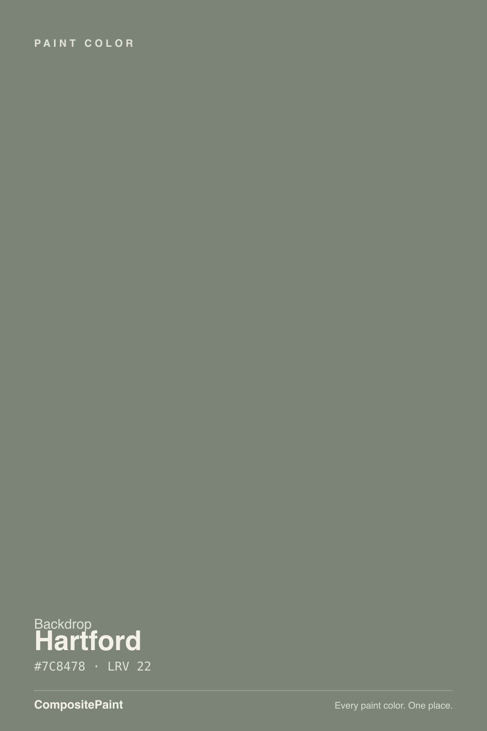
Backdrop is a direct-to-consumer paint brand — no big-box aisle, no in-person swatch wall, just a website, a sample program, and gallons shipped to your door. Its catalog leans into playful names (Mom Jeans, Cookies & Cream, Don't Eat the Yellow Snow) rather than Color-of-the-Year marketing pushes, and Hartford does not come with an official brand story we could verify — no designer feature, no viral room, no owner-review thread turned up in research. What we do have is precise: hex #7C8478, LRV 22, applied in Backdrop's Standard finish, a velvety semi-matte that early buyer reviews describe as smooth and low-streak to roll.
Read the numbers and Hartford sits almost exactly where Sherwin-Williams Retreat (#7A8076, LRV 21) and Dried Thyme (#7B8070, LRV 21) sit — hex values within a few points, same LRV band. That is the most useful comparison available for a color this thin on public record: both of those are proven cabinet sages, muted enough to avoid looking loudly green from across the room, dark enough to hide daily grease and fingerprints around cabinet handles, light enough that recessed shaker-door shadows still read as shadow rather than black holes.
Undertone in one line: gray-green with only the faintest warm lean — the red channel sits a few points above the blue in the hex, nothing more dramatic than that. It is never a true neutral gray and never a bright grassy green. If it looks flatter and more khaki on your wall than it did on the sample, that is the light draining the green out, not a different can of paint.
Where It Shines
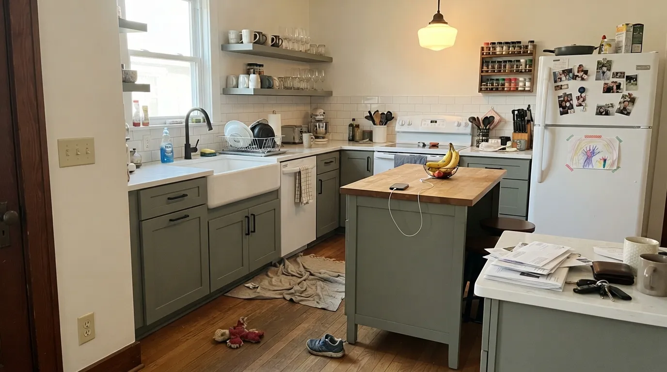
Kitchens with painted lower cabinets or an island are the strongest, most predictable use — the LRV 22 depth hides everyday grime a lighter sage can't, and the muted undertone stays quiet next to white quartz, butcher block, and matte black or brass hardware. Give it a mudroom bench or a small, genuinely well-lit powder room and it earns the same result: a quiet color decision that reads deliberate rather than trendy.
Where It Fails
Because it sits in the sage/moss family at LRV 22, Hartford's failure modes are the predictable ones for any color at this depth and undertone — plus one that is specific to buying a can from a brand that only sells online.
Cool daylight strips out what little warmth this color has and leaves a flat, muddy khaki-gray on the wall — the same trap that catches its closest deck twins, Sherwin-Williams Retreat and Dried Thyme. Add real 2700K lamp light, or move it off open wall space onto cabinets and trim instead.
This is a green-gray, not a gray-gray — at four walls of depth the green is unmistakable in any daylight. If the goal was a color nobody could name on sight, look at a true gray like SW Light French Gray or BM Stonington Gray instead.
Backdrop sells direct online only — there is no big-box swatch wall to stand in front of, and screen renderings of a muted color like this are unreliable in both directions. Order the actual peel-and-stick or sample pot before committing a whole kitchen; skipping that step is behind most regretful DTC-paint stories, not this specific color.
Room by Room
At LRV 22 it sits in the same working zone as Sherwin-Williams Retreat and Dried Thyme, both proven cabinet sages. Lower cabinets or an island in Hartford, white quartz or butcher block counters, matte black or brass hardware — this is where the color has the least room to disappoint. Backdrop's semi-gloss finish for durability.
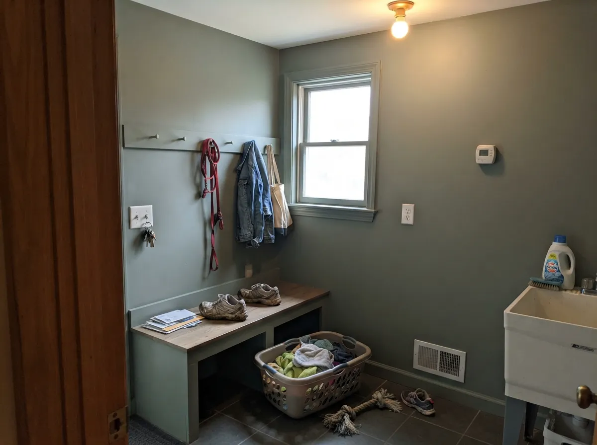
A muted, workaday green-gray is exactly what a boot bench or laundry wall wants: enough color to feel decorated, dark enough to hide the daily scuffs a bright white can't. Semi-gloss on the bench and hooks, eggshell on the walls.
Small rooms take depth well, and a powder room usually gets a real fixture instead of relying on a single window. Skip it only if the room's sole light source is one dim ceiling can with no warm bulb.
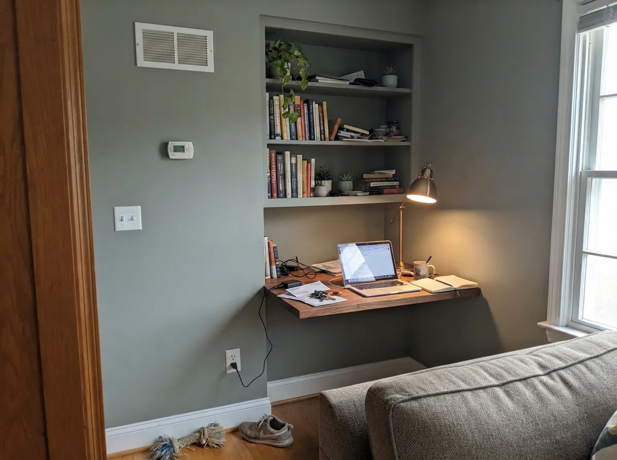
Behind open shelving or on a single built-in wall it reads calm and a little architectural, especially with a warm desk lamp doing most of the lighting. A full room of it with no window needs that lamp light to work.
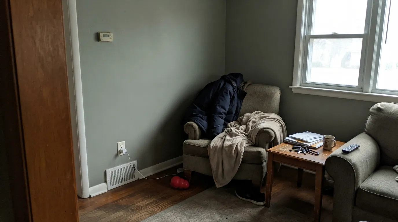
In a bright, south- or west-facing room it is a genuinely good quiet accent. In a dim, north-facing living room this is the color most likely to disappoint — it goes flat exactly where a livelier gray-green would still read as intentional.
Full outdoor daylight brings out more green than it shows indoors, which can work well against a white or light-gray house. This is one to test on an actual sample board outside first — exterior sun reads every muted color differently than the can promises.
Your Light Is the Risk
In a well-lit room with east or south exposure, the gray-green sits calm and true. This is the light every sample should be checked in.
Cool, low daylight drains the little warmth this color has and leaves a flat, muddy khaki-gray — the same trap that catches its Sherwin-Williams twins, Retreat and Dried Thyme.
Warmer and greener at the sun hours, quieter and grayer at midday and after dusk. Expect it to look like two different colors over one day — normal for this depth.
2700K lamps pull it toward olive; cool white LEDs push it colder and flatter. If the room is lit mostly at night, buy the warm bulbs before you buy the paint.
Most complaints about Hartford are a light mismatch. Upload a photo of your actual room and see it on your walls — then ask for the same wall in north light or evening lamps before you buy a single sample.
Need It From Another Brand?
Any paint counter can custom-tint Backdrop BD-HF directly. If you would rather stay in one brand's own deck, these are the closest stock matches, measured as ΔE2000. Under 2 is a difference you will not see on the wall.
| Brand | Closest color | ΔE | LRV | |
|---|---|---|---|---|
| Sherwin-Williams | Privilege GreenSW 6193 · Sherwin-Williams | 3.4 | 23 | Color page → |
| Behr | Village GreenN410-5 · Behr | 1.2 | 23 | Color page → |
| Benjamin Moore | Night Train1567 · Benjamin Moore | 3.4 | 23 | Color page → |
| Valspar | Fat CatT697 · Valspar | 0.7 | 23 | Color page → |
| PPG / Glidden | Smokey SagePPG11-24 · PPG / Glidden | 2.2 | 23 | Color page → |
| Glidden | Smokey SagePPG11-24 · Glidden | 1.7 | 23 | Color page → |
Similar Backdrop Colors
The nearest shades to Hartford within Backdrop's own range, ranked by perceptual color distance — useful when you want the same look a touch lighter, darker, or warmer.
WCAG 2.1: AA is 4.5 : 1 for normal text, 3 : 1 for large text, AAA is 7 : 1.
Hartford vs the Colors You're Also Considering
Every Hartford sample board has the same rivals on it. The numbers show the real lightness gap — then it comes down to which risk you would rather live with.
Pick this if you're already comparing Backdrop's DTC sample kit and want this specific Standard-finish can, not a store-mixed match.
Sherwin-Williams SW 6207 · LRV 21RetreatPick this if you want the exact same depth and family at a store you can walk into today — the two are close enough to be the same paint job.
Pick this if you'd rather order a peel-and-stick sample online than stand in a paint-store aisle.
Sherwin-Williams SW 6186 · LRV 21Dried ThymePick this for the same idea with wider brand recognition and easier in-store sample access.
Within Backdrop's deck, the closest calls are Old Soul and Polly Wants. Old Soul (BD-OS), LRV 18, is a shade darker and noticeably warmer, an olive with a clear yellow lean where Hartford stays neutral. Side by side, Old Soul looks like dried herbs and Hartford looks like weathered stone. Choose Old Soul when the room's woods and textiles run warm and you want the paint to join them; choose Hartford when you need a green that will not clash with cooler grays already in the space.
Polly Wants (BD-PW), LRV 27, is the cool-side counterpart: a gray-blue at similar depth. If you are torn between a moody green and a moody blue for the same office or bedroom, this is the pairing to sample together. Polly Wants feels crisper and more coastal; Hartford feels earthier and pairs better with plants and wood.
Anita (BD-AN), LRV 33, is the exit ramp if Hartford proves too dark: a lighter warm neutral with no green at all, useful when you like Hartford's calm but need more reflected light.
Hartford Coordinating Colors
The rule for coordinating with Hartford is the same rule that works for any muted sage-gray: warm whites keep it from reading flat, and near-black or charcoal accents give it one grounding note without competing for the green. These are the partners that make sense given what the color's numbers tell us:
About Backdrop, the Brand Behind Hartford
Backdrop is a direct-to-consumer paint brand — no big-box aisle, no in-person swatch wall, just a website, a sample program, and gallons shipped to your door. Its catalog leans into playful names (Mom Jeans, Cookies & Cream, Don't Eat the Yellow Snow) rather than Color-of-the-Year marketing pushes, and its Standard finish has held up well in the outside reviews we could verify: smooth application with minimal streaking, and a GreenWise-certified low-VOC formula with noticeably low odor while painting.
Hartford itself has almost no independent trail to follow — no owner threads, no design-blog feature, nothing pinned to a viral moment. That is not unusual for a brand this size with dozens of colors in the catalog; it is simply the honest state of the record as of this review. What is solid is the color's own data: hex #7C8478, LRV 22, sitting in the exact depth and family Sherwin-Williams built two of its best-known cabinet sages around. That comparison, not marketing copy, is the most reliable way to predict how Hartford will behave in a room.
Hartford With Wood Tones and Metal Finishes
Matte black and unlacquered brass are the two metals that read best against a muted sage-gray this deep — both hide the slight green lean instead of fighting it, which is why cabinet hardware in either finish is the safe default.
Wood is more particular. White oak, walnut, and butcher block all sit comfortably next to Hartford because their warmth balances the color's cool-leaning green. Orange-heavy honey oak is the one combination worth sampling first: the same green-versus-orange tension that trips up brighter, more saturated greens shows up here too, just less dramatically because Hartford is already so muted.
Three Ready Palettes Built on Hartford
A color is never alone on the wall. These are complete combinations in the 60-30-10 pattern, with the reason each one holds together. Every one opens in the visualizer.
Alabaster's warm white keeps the kitchen bright enough that Hartford's green stays a color decision, not a mood; Wrought Iron gives the island one grounding near-black note without going full charcoal.
Try this palette in your roomWhite Dove trim keeps a small mudroom from feeling like a cave under Hartford's depth, and Kendall Charcoal on the bench and hook rail hides scuffs the green-gray alone can't.
Try this palette in your roomPure White overhead keeps the room from feeling closed in under Hartford's depth, and Iron Ore on a single shelving backer adds real contrast without doubling down on green.
Try this palette in your roomHartford FAQ
Is Hartford by Backdrop warm or cool?
Essentially neutral gray-green with a slight warm lean — in the hex, the red channel sits only a few points above the blue. It reads as sage or moss more than as a clean gray or a bright green. Cool light flattens it toward gray; warm light nudges it toward olive.
Is it a good kitchen cabinet color?
Yes — it sits at the same depth and in the same family as Sherwin-Williams Retreat and Dried Thyme, both proven cabinet sages. It works well with white quartz or butcher block counters and either matte black or brass hardware.
Can I get a sample before buying a gallon?
Backdrop sells direct-to-consumer online only, with no in-store swatch wall to check. Order their peel-and-stick or sample pot before committing a whole kitchen — screen renderings of a muted color like this are unreliable in both directions.
Does it work in a north-facing room?
Risky without help. Like every muted mid-depth green-gray, cool north daylight drains the green and leaves it flat and khaki. Add warm 2700K lamps, or keep it off the open walls and use it on cabinets or trim instead.
What sheen should I use — walls vs. cabinets?
Backdrop offers both a Standard finish (a velvety, semi-matte-leaning paint good for walls) and a Semi-Gloss finish. Use eggshell-equivalent Standard on walls and the Semi-Gloss on cabinets and trim, where it needs to wipe clean.
How does Hartford compare to Sherwin-Williams Retreat or Dried Thyme?
The hex values and LRV sit within a few points of each other — close enough that if you already have a can of either, you effectively have this color's twin. Choose between them based on which is easier to get your hands on, not which looks different, because they largely don't.
Have you painted with Hartford?
Rate it — one tap helps the next reader decide.
Ask a Question