Polly Wants
A mid-depth slate with a teal lean, reviewed honestly: the kitchens where it looks custom, the rooms where it goes steel, and when to pick a real gray instead.

Jessica has spec'd whites and neutrals for more than 300 rooms and keeps a sample wall of painted drawdowns in her studio. Every color review is checked against real reader rooms in the comments and re-tested when a formula changes. About the testing process →
- 1Salamander6
- 2Hidden Gem14
- 3Polly Wants27
- 4Peacock Blue35
- 5Wythe Blue48
The Fast Verdict
Polly Wants is a dusty blue-gray that sits on the teal border — deeper than a wall gray, lighter than navy, and built for surfaces you stand in front of every morning. On kitchen cabinets in mixed daylight it reads custom and calm; on four dim walls it goes steely and a step darker than the chip. Buy it for cabinets, built-ins, and small rooms with real light. Do not buy it hoping for gray.
Kitchen cabinets and islands · laundry and mudroom built-ins · powder rooms you can drench · offices with real daylight
You actually want gray · the honey-oak kitchen is staying · you need an airy wall color · the room is north-facing, dim, and lamp-shy
- Cabinet-depth color that is more interesting than gray and less heavy than navy
- Holds a calm slate on kitchen doors in mixed daylight
- Muted enough to live with everyday clutter and white counters
- Works in small doses: powder rooms, laundry built-ins, one office wall
- Playful name, serious muted color — not a tropical novelty
- Not gray — buyers expecting gray see blue-teal by the second coat
- Fights honey oak, cherry, and yellow builder granite
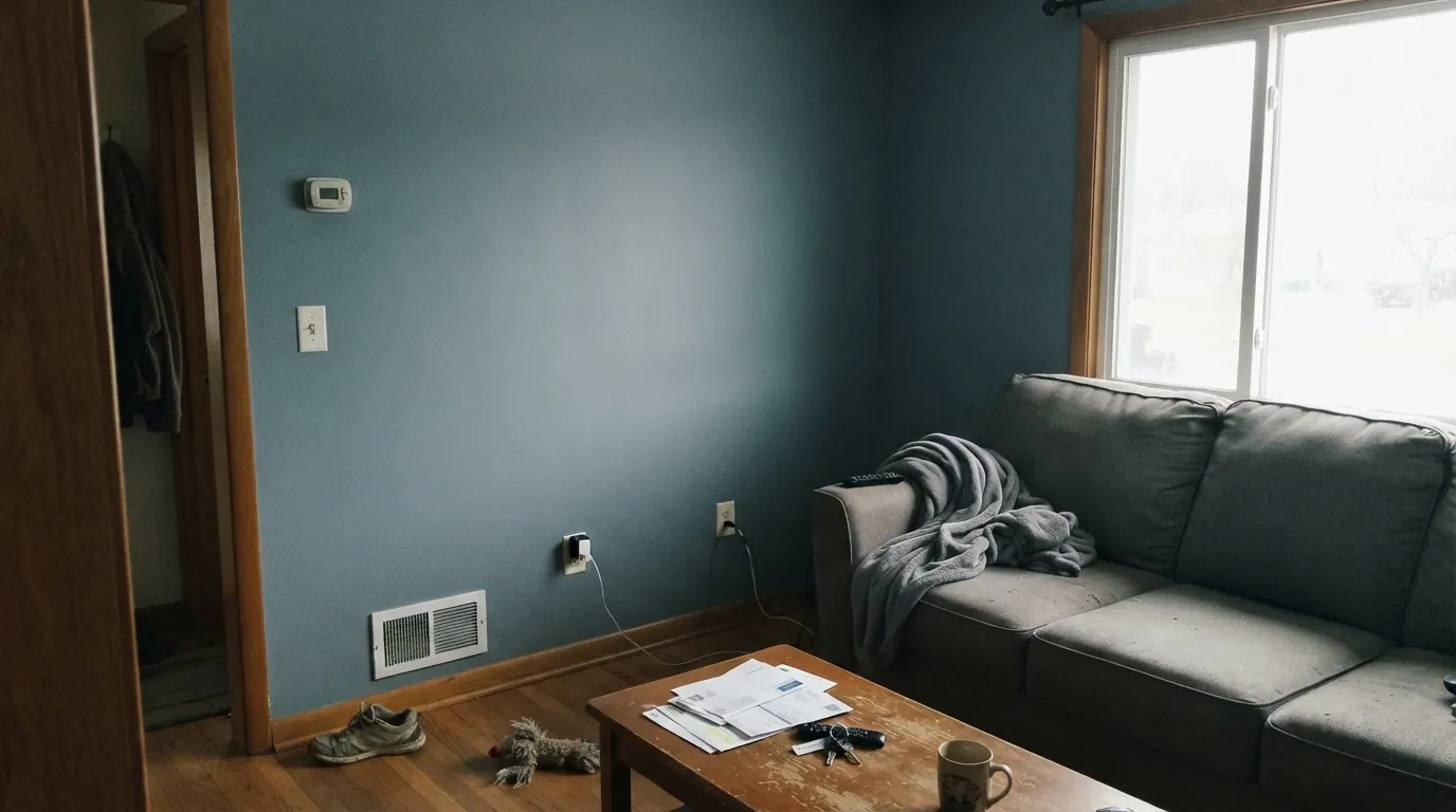
- LRV 27 on four dim walls goes steely and cave-like
- Warm 2700K bulbs pull a dusty green-gray that some readers will call muddy
What Color Is Polly Wants, Really?
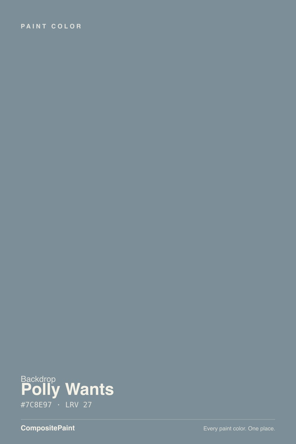
A muted slate that lives between blue-gray and teal — and the teal is the part the chip under-sells. Hex #7C8E97 is cool and slightly green in the blue, so it never lands as a dead gray and never goes full parrot. Backdrop filed it as a mid color with a joke name; the joke is the only loud thing about it. On a cabinet door it looks like the dusty wing of a bird, not a tropical punch.
At LRV 27 it is cabinet-depth, not wall-airy. That number sits in the same band as workhorse cabinet colors like Evergreen Fog (LRV 30) and Dovetail (LRV 26): dark enough to read as a color next to a white counter, light enough that you can still find a mug. Plan for it to read a step deeper and more blue than the chip once it is on a vertical surface — every mid blue-gray does this, and it is the first surprise in a sample-only decision.
Undertone in one line: blue first, a green-teal second, gray only as the mute. Cool daylight steels it; warm late sun dusts it slightly greener; 2700K bulbs gray it toward olive-slate. If your sample reads flat gray, the light is warm and dim. If it reads pool-blue, the light is cold. Both are the same paint being honest about the room.
Where It Shines
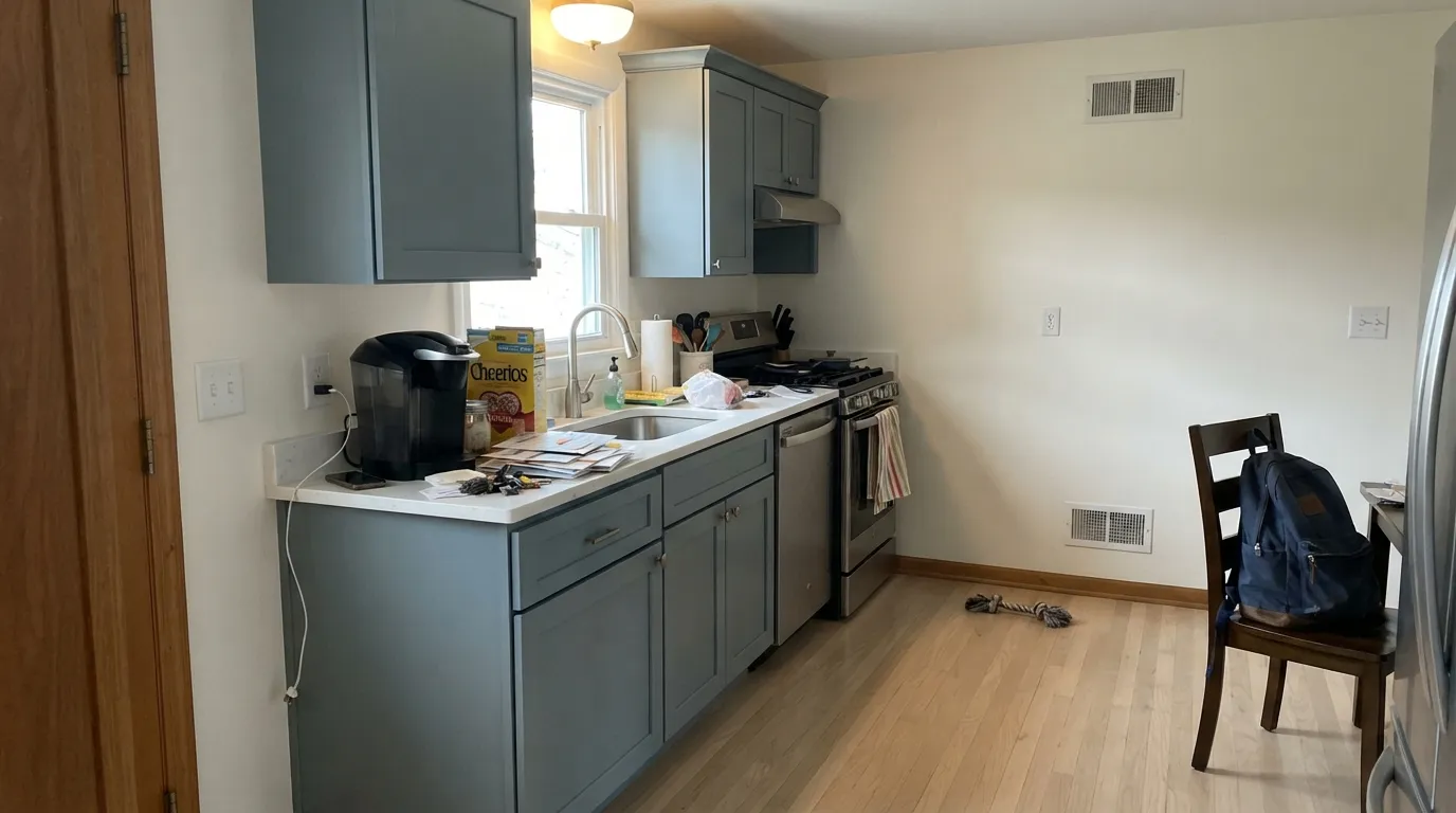
This color is built for kitchens. On shaker or slab cabinets under mixed window light it holds a calm slate that is more interesting than gray and less heavy than navy, which is the whole point of a mid blue-gray. White counters, unlacquered brass or matte-black pulls, and pale oak or walnut floors are its natural company. Its second home is the small, well-lit commitment: a powder room drench, a laundry built-in, an office desk wall, where LRV 27 looks intentional instead of cave-like.
Where It Fails
Almost every regret story about a mid blue-gray follows one of three scripts, and Polly Wants is not exempt. None of them are the paint's fault — but if your room matches one, this is not your color, and a bigger sample will only confirm it.
On the chip it can pass for a moody blue-gray. On cabinet boxes and especially on four walls, the teal-blue is unmistakable — depth multiplies undertone. If your goal is gray with a little personality, this is too much personality; look at Dovetail instead and let it stay warm gray at almost the same depth.
Yellow-orange sits across the wheel from this blue-teal, so honey oak floors, cherry cabinets you are keeping, and yellowy builder granite all push Polly Wants toward pool-blue while the wood goes more orange. Both sides lose. It wants white oak, walnut, ash, or a big rug between it and anything golden.
LRV 27 on all four walls of a north room or an interior kitchen with no window is a cave with a steel cast. The color is honest at this depth; the job is wrong. Keep it on cabinets or a single wall, or pick Sleepy Blue and stay in the same family without eating the light.
Room by Room
This is the room the depth was made for. Satin or cabinet enamel on perimeters under Alabaster or Pure White walls looks finished without going navy-trendy. An island in the same color is a full look; a Hale Navy island under Polly Wants perimeters is the two-tone version that still belongs to one house. Skip it if the oak is staying honey.
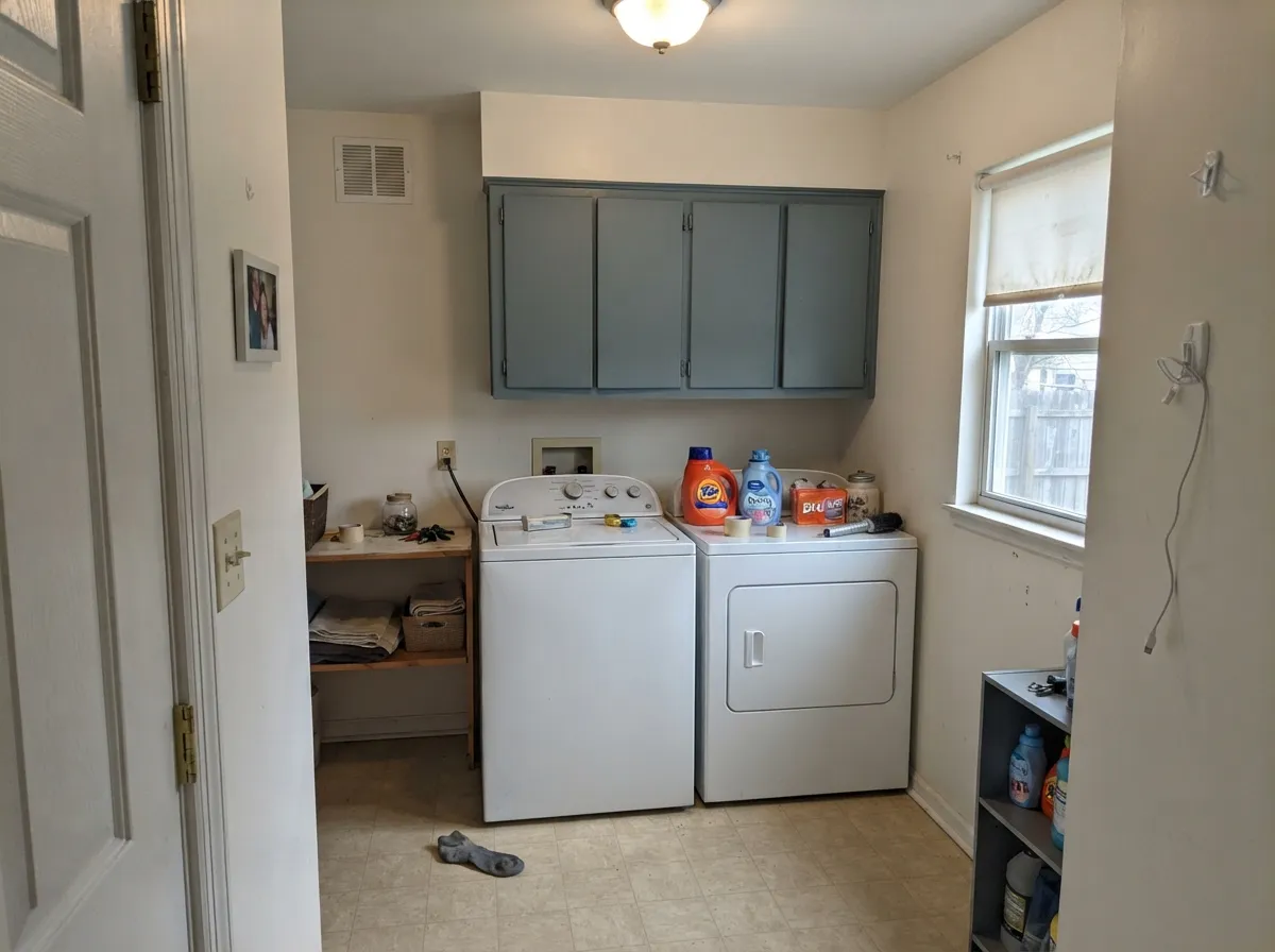
Built-ins, cubbies, and the wall behind the washer take this depth well because you are not living inside four walls of it. Eggshell on walls, satin on doors. A pile of detergent bottles will not kill a color this muted.
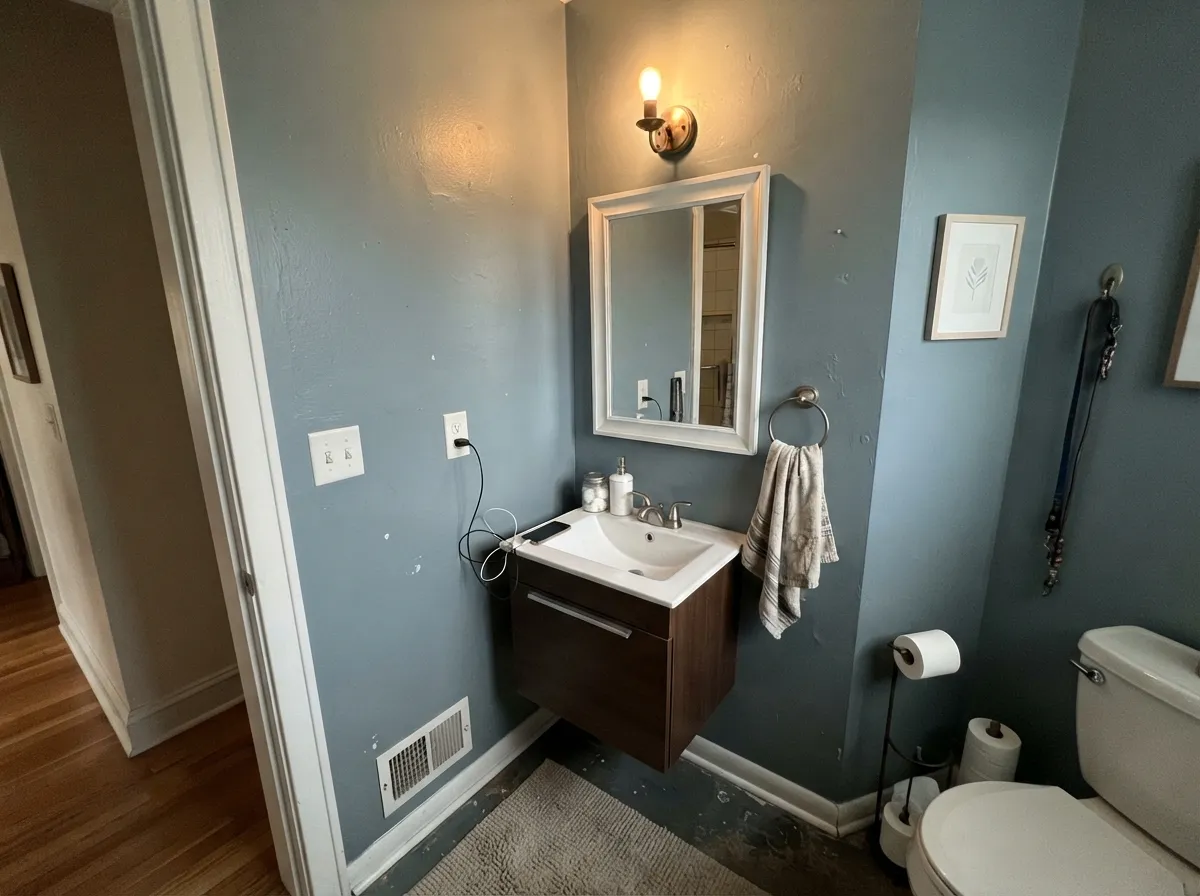
Small rooms forgive mid-depth color. Drench the walls in eggshell, keep White Dove on the trim, and the slate reads custom instead of gloomy — as long as there is a window or a warm sconce. Vanities in satin are the lower-commitment version of the same idea.
A desk wall or a run of shelves in Polly Wants looks deliberate next to Pure White trim. Four walls only if the office has real daylight; north interior dens will go steel and make the screen the brightest object in the room.
A fireplace surround, a built-in, or one chimney wall can carry this. A full living-room drench at LRV 27 needs south or west light and warm lamps or it reads like a cloudy marina. Sleepy Blue on the other walls is the lighter handoff in the same family.
Bedrooms want rest, and a cool mid-teal at this depth can feel like weather on the walls unless the room is bright and the bedding is cream, not gray. Outside, full sun washes the teal toward dusty metal and the color can look like faded siding from the street. A shaded side door on a white house is the only exterior maybe.
Your Light Is the Risk
A window over the sink plus bounce from a white counter is the honest read: clearly a dusty blue-gray with a teal edge, not navy and not fog. This is the light that makes the cabinets worth painting.
Cool, low daylight steels the blue and drops the value a step. On cabinets it just looks colder; on four walls it looks like a closed marina. If the kitchen has no window, this is the wrong depth.
Morning cool light is the bluest, most slate version. By late afternoon the green in it dusts forward and it reads slightly teal-gray for an hour. Sample on a cabinet door you will see at 8am and at 6pm.
Warm 2700K bulbs mute the blue and pull a dusty green-gray — fine if you like olive-slate, disappointing if you bought it for blue. 3000K holds the mid slate. Cool 4000K LEDs ice it toward steel. Under-cabinet strips should match the overheads or the doors will look like two colors.
Most complaints about Polly Wants are a light mismatch. Upload a photo of your actual room and see it on your walls — then ask for the same wall in north light or evening lamps before you buy a single sample.
Need It From Another Brand?
Any paint counter can custom-tint Backdrop BD-PW directly. If you would rather stay in one brand's own deck, these are the closest stock matches, measured as ΔE2000. Under 2 is a difference you will not see on the wall.
| Brand | Closest color | ΔE | LRV | |
|---|---|---|---|---|
| Behr | Cold SteelMQ5-20 · Behr | 1.5 | 25 | Color page → |
| Benjamin Moore | Wild Blue YonderCSP-620 · Benjamin Moore | 1.1 | 27 | Color page → |
| Valspar | Cottage Door8004-38E · Valspar | 1.4 | 26 | Color page → |
| PPG / Glidden | Chalky BluePPG1153-5 · PPG / Glidden | 1.2 | 26 | Color page → |
| Glidden | Chalky BluePPG1153-5 · Glidden | 0.7 | 26 | Color page → |
| Dutch Boy | Streamed Blue335-5DB · Dutch Boy | 3.2 | 25 | Color page → |
Similar Backdrop Colors
The nearest shades to Polly Wants within Backdrop's own range, ranked by perceptual color distance — useful when you want the same look a touch lighter, darker, or warmer.
WCAG 2.1: AA is 4.5 : 1 for normal text, 3 : 1 for large text, AAA is 7 : 1.
Polly Wants vs the Colors You're Also Considering
Every Polly Wants sample board has the same rivals on it. The numbers show the real lightness gap — then it comes down to which risk you would rather live with.
Pick this when the slate-teal is the point, not an accident on the way to gray.
Sherwin-Williams SW 7018 · LRV 26DovetailPick this if you want this depth without any blue — a dependable deep warm gray until the light goes flat.
Pick this when you need cabinet-weight color, not an airy wall blue.
Sherwin-Williams SW 6225 · LRV 58Sleepy BluePick this for walls that stay in the blue-gray family without eating the light — more gray than the name admits.
Within Backdrop, the closest neighbors sit on either side of it in temperature and depth. Hartford (BD-HF), LRV 22, is a touch darker and reads green-gray rather than blue-gray; side by side, Polly Wants looks like water and Hartford looks like foliage. Choose Hartford if your room leans toward greenery, clay and warm wood; choose Polly Wants where you want a cooler, calmer, more coastal read.
Nuevo (BD-NU), LRV 38, is a full step lighter and sits closer to a true soft gray-green. It stays quieter on large wall areas and suits smaller or dimmer rooms where Polly Wants would feel heavy. Old Soul (BD-OS), LRV 18, goes the other way: darker and distinctly olive, better for a den or a study than a kitchen.
The practical rule: Polly Wants is the only one of this group that reads blue. If blue is the point, none of the others substitute for it.
Polly Wants Coordinating Colors
The rule for coordinating with Polly Wants: quiet whites, one deeper navy, and lighter blue-grays in the same family — and keep yellow-warm woods at arm's length. It likes white oak and walnut, brass and matte black, and it looks cheaper next to orange wood and chrome. These are the partners that keep the kitchen from turning themed:
Why This Depth Belongs on Cabinets
Mid-depth blue-grays had a long run on walls in the 2010s and then got replaced by greige, then by beige, then by sage cabinets. What survived is the cabinet job: a color deep enough to look considered on a door, light enough that the kitchen still photographs, and muted enough that white quartz does not look sterile against it. Polly Wants sits in that band. It is not a viral Color of the Year — Backdrop does not run that calendar — and it is not a whole-house wall gray. It is a kitchen surface color with a joke name.
That is also why the wall regrets are predictable. People sample a 2-inch chip of a blue-gray, like the calm, and put LRV 27 on four living-room walls. The chip was always a cabinet chip. If you want the family on walls, step up to Sleepy Blue (LRV 58) or Rainwashed (LRV 59) and let Polly Wants stay on the doors.
Polly Wants With Wood Tones, Counters, and Metals
This decision gets made at the floor and the counter, not the paint store. White oak, walnut, and ash make the teal read smoky and deliberate. Gray-washed or painted floors are safe. Cream or white counters — quartz, marble, butcher block in maple — keep the value contrast the color needs at LRV 27.
The honest no is golden: honey oak, orange-stained trim, yellow builder granite, terracotta backsplash. Yellow-orange exaggerates the teal, the teal exaggerates the orange, and no extra coat fixes that geometry. If the golden floor is staying, put a large rug down or pick Dovetail and keep the depth without the fight.
Metals are straightforward: unlacquered brass, antique bronze, and matte black all work. Polished chrome and cool stainless in a north kitchen will ice the slate; mixed with warm wood they are fine. Hardware in the same metal as the faucet, not two competing cools.
Three Ready Palettes Built on Polly Wants
A color is never alone on the wall. These are complete combinations in the 60-30-10 pattern, with the reason each one holds together. Every one opens in the visualizer.
Alabaster is a superb cabinet-adjacent white, so the walls stay quiet while Polly Wants does the color work. Hale Navy on the island is the one darker note — safest navy in the BM deck, as long as that run of cabinets still gets light. Brass or matte-black pulls, not chrome.
Try this palette in your roomWhite Dove is the safest warm trim white in the BM deck, and it keeps a mid-teal from looking dusty next to a stark edge. Naval on the door is the navy that still reads navy — one almost-black punctuation mark so the drench does not float.
Try this palette in your roomSleepy Blue keeps the walls in the same family without the depth of Polly Wants, and it is more gray than the name admits, so the built-ins can be the color. Pure White is the default trim white — it only fails when you pair it wrong, and a cool slate is not the wrong pair.
Try this palette in your roomPolly Wants FAQ
Is Polly Wants gray or blue?
Blue-gray with a teal lean — quietly, but not gray. In warm, dim light it can pass for a dusty slate; in cool daylight the blue-green is obvious, especially on cabinets next to a white counter. If gray is what you actually want, Dovetail at LRV 26 is the same depth without the teal.
Does Polly Wants work on kitchen cabinets?
Yes — that is its best job. At LRV 27 it has enough weight to look like a color on a door and enough lightness that the kitchen does not go navy-dark. Use satin or a cabinet enamel. Pair with Alabaster or Pure White walls, not with honey oak.
What trim white goes with Polly Wants?
White Dove if you want a soft warm edge, Pure White or Alabaster if the kitchen is already cool. A very creamy white in a west-facing room can make the teal look a little tired; a stark blue-white can ice it. Semi-gloss on the trim, satin on the cabinets.
Is LRV 27 too dark for walls?
On four walls of a dim or north room, yes. In a small powder room with a sconce, or on one office wall with a window, it is the right depth. If you want this family on a whole living room, Sleepy Blue at LRV 58 is the wall version.
Does it work with oak floors?
Depends on the oak. White oak, ash, walnut, and gray-washed floors are excellent. Golden honey oak is the clash: the yellow-orange in the wood pulls the teal bluer and the floor more orange. A large rug helps; replacing the stain helps more; picking Dovetail instead also works.
Polly Wants or Retreat for cabinets?
Retreat if you want sage-green cabinets — it is a superb cabinet green, a bit deeper (LRV 21), with a real low-light problem if you put it on walls. Polly Wants if you want the blue-slate side of the same mid-depth idea. Sample both on a door in morning and evening light before you commit a whole kitchen.
Have you painted with Polly Wants?
Rate it — one tap helps the next reader decide.
Ask a Question