Mom Jeans
A denim-blue slate from a DTC brand with a small track record, reviewed honestly against its own numbers: where it turns true blue, the light that flattens it, and what to pick instead.

Jessica has spec'd whites and neutrals for more than 300 rooms and keeps a sample wall of painted drawdowns in her studio. Every color review is checked against real reader rooms in the comments and re-tested when a formula changes. About the testing process →
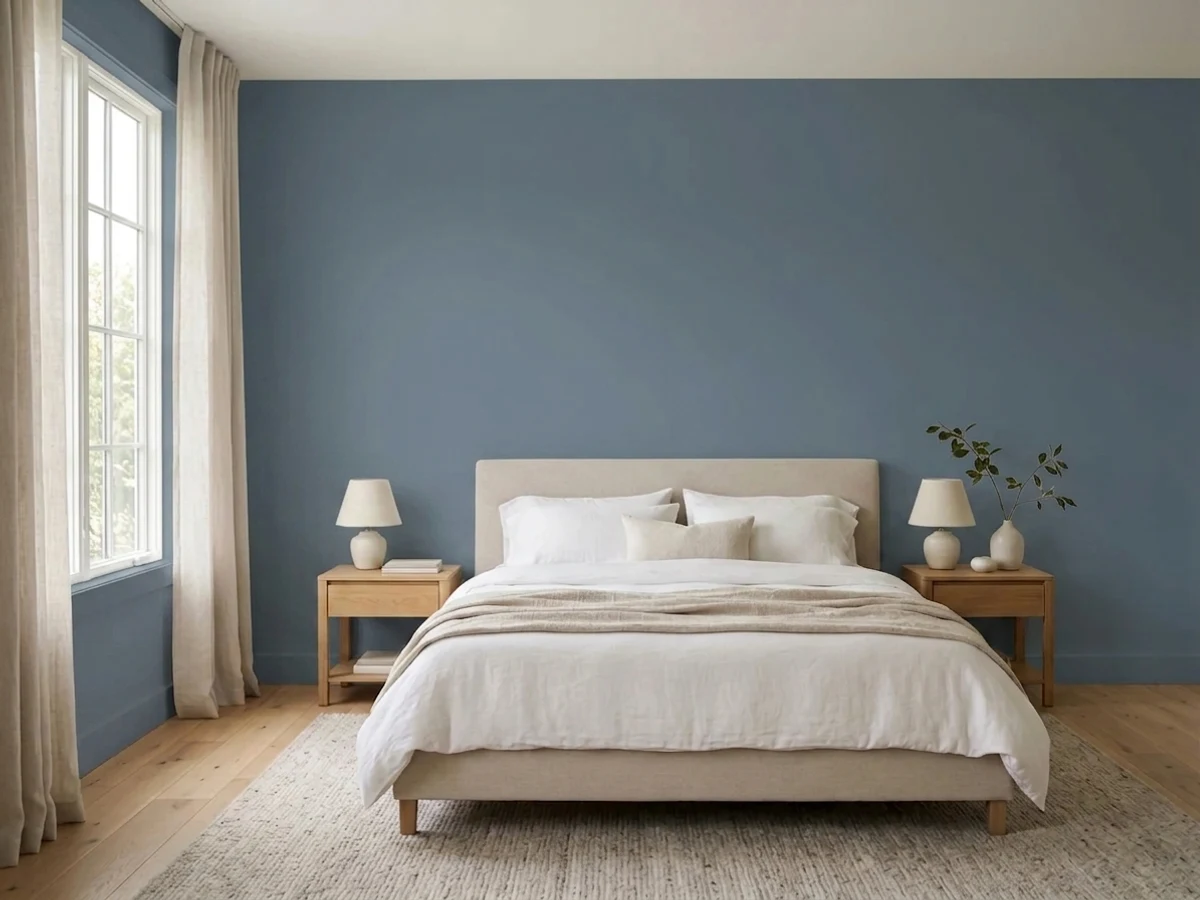

- 1Hale Navy8
- 2Waterloo13
- 3Mom Jeans18
- 4Williamsburg Wedgwood Blue28
- 5Resolute Blue40
The Fast Verdict
Mom Jeans is Backdrop's straight-faced joke that turns out to be accurate: a mid-depth, grayed-down denim blue with just enough green-slate in it to read like actual faded jeans, not a paint-store blue. At LRV 18 it sits in the middle-to-deep zone — dark enough to feel enveloping in a den or dining room, not dark enough to read as navy. Under a warm lamp it goes true blue; under a cold ceiling LED it goes flat slate-gray. Because Backdrop is a small direct-to-consumer line, this color does not have the decade of real-room photos a Sherwin-Williams or Benjamin Moore staple has — the review below is built on its own hard numbers (hex, LRV) and Backdrop's documented paint formula, not a pile of owner testimonials that don't exist yet.
Home offices and dens · dining rooms lit by a chandelier or lamps · powder-room vanities · accent walls with walnut or brass · anyone who wants a blue that reads calm, not nautical
Your room runs on cool LEDs with no lamps · you want a crisp, saturated true blue rather than a grayed one · your floors are honey oak or yellow-toned pine · you need a color with 10 years of other people's before-and-afters to lean on
- A genuinely blue-gray denim color — the name is not a stretch
- Deep enough (LRV 18) to feel enveloping without tipping into navy-black
- Turns rich, true blue under warm lamp light — built for evening rooms
- Self-priming, low-VOC Backdrop Standard formula, sold with a real peel-and-stick sample program
- Small-room and accent applications (vanities, built-ins, islands) look considered, not trendy
- Cool LEDs and north daylight flatten it toward dull, flat gray
- Fights honey oak and yellow-toned wood floors
- As a small DTC brand color it has far fewer real-room examples to preview than a legacy-brand staple
- A genuinely deep color for a whole open-plan room without any contrast trim
What Color Is Mom Jeans, Really?
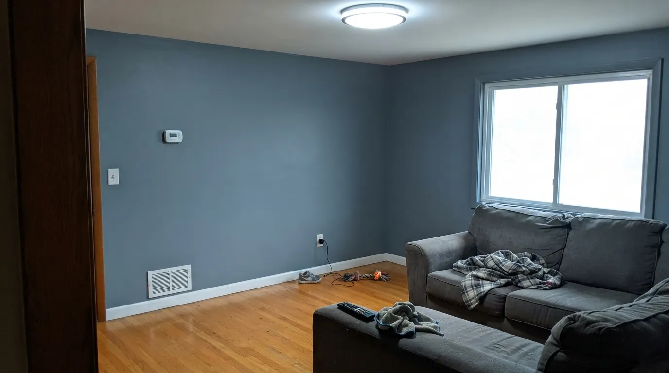
A cool, grayed-down slate blue with a name that is doing real work: Backdrop names its deck after pop-culture and nostalgia (Hocus Pocus, Lost in the 80s, Old Soul, Le Freak sit in the same catalog), and Mom Jeans earns its spot — the hex genuinely lands in stone-washed denim territory, not a bright "jeans ad" blue. It ships as part of Backdrop Standard, the brand's self-priming, low-VOC, GreenWise-certified interior line at a 6-percent semi-matte sheen, sold direct at backdrophome.com (with a peel-and-stick sample program so you can test the actual paint on your wall before buying a gallon, which matters more than usual for a color this light-sensitive).
At LRV 18 it is a genuine mid-to-deep color, not a pastel dusty blue. That depth is the point: it holds its blue identity in daylight instead of washing out, and it reads enveloping rather than washed-out in a den or dining room. It sits close in depth and undertone to Sherwin-Williams Smoky Blue (LRV 15) — both are cool, grayed slate blues that behave the same way in the same light, which is a useful sanity check when a Backdrop-specific data point is thin.
Undertone in one line: blue-gray with a touch of slate-green, never purple, never true navy-black. If your sample reads pure gray with no blue at all, that is cold light doing it — warm it up before you decide the color is wrong.
Where It Shines
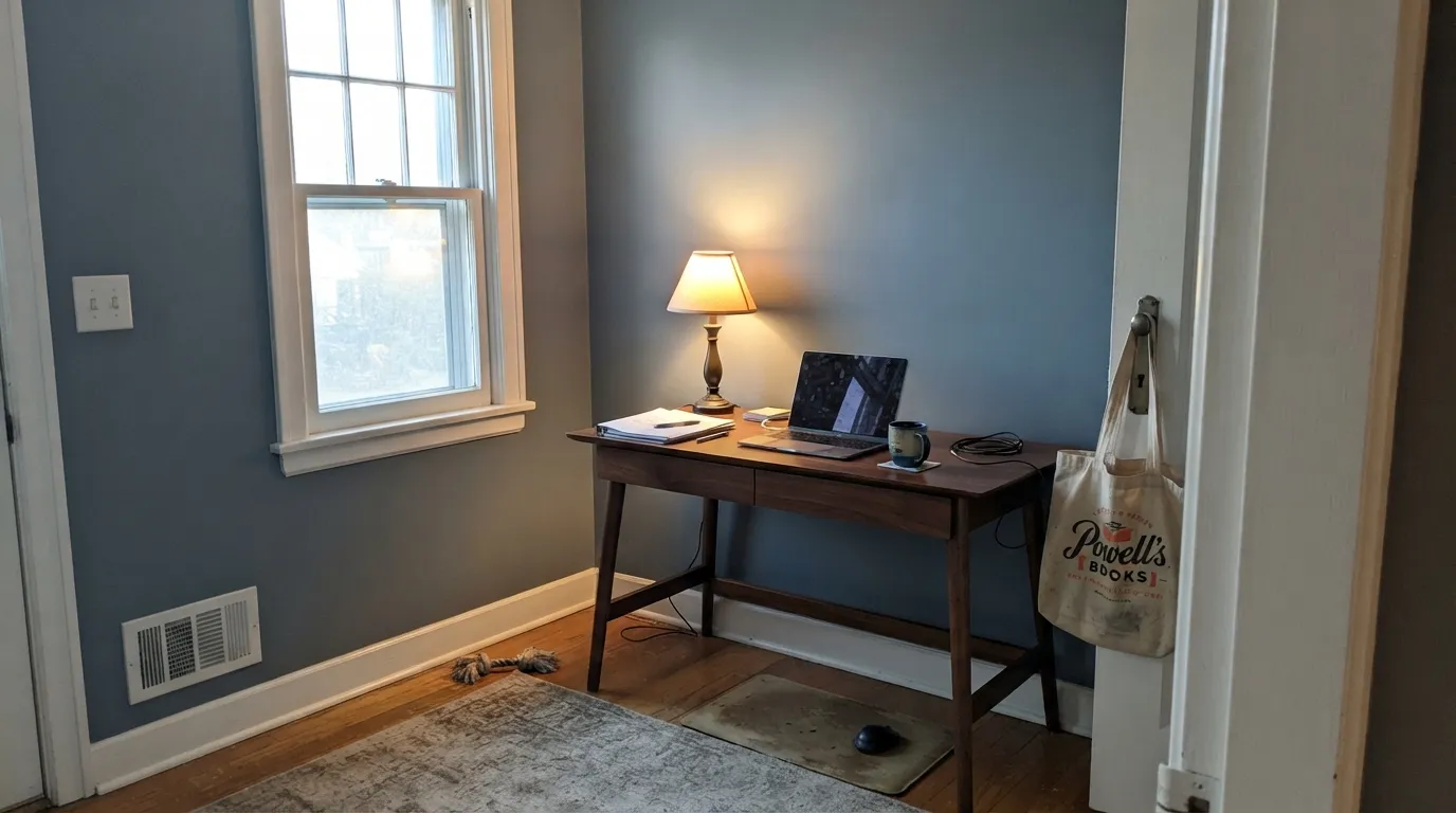
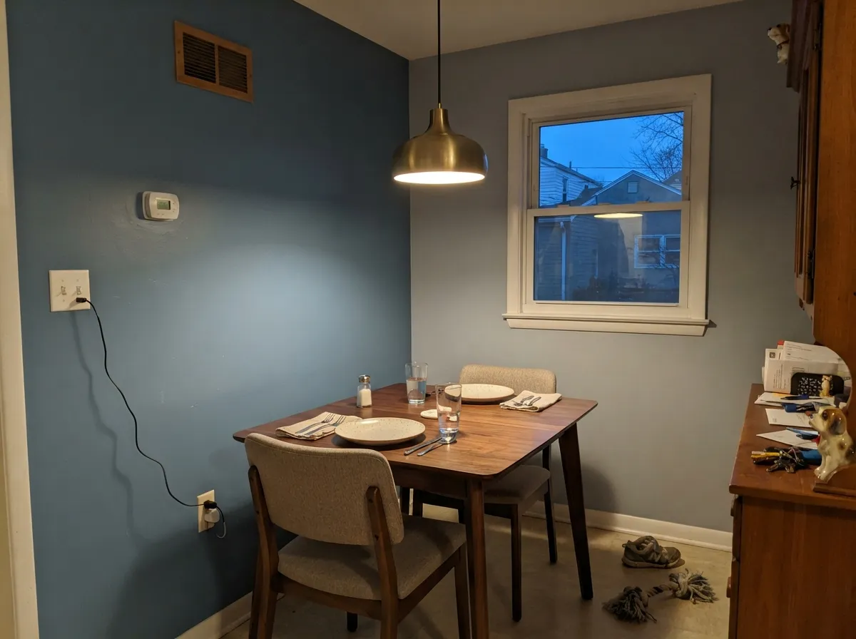
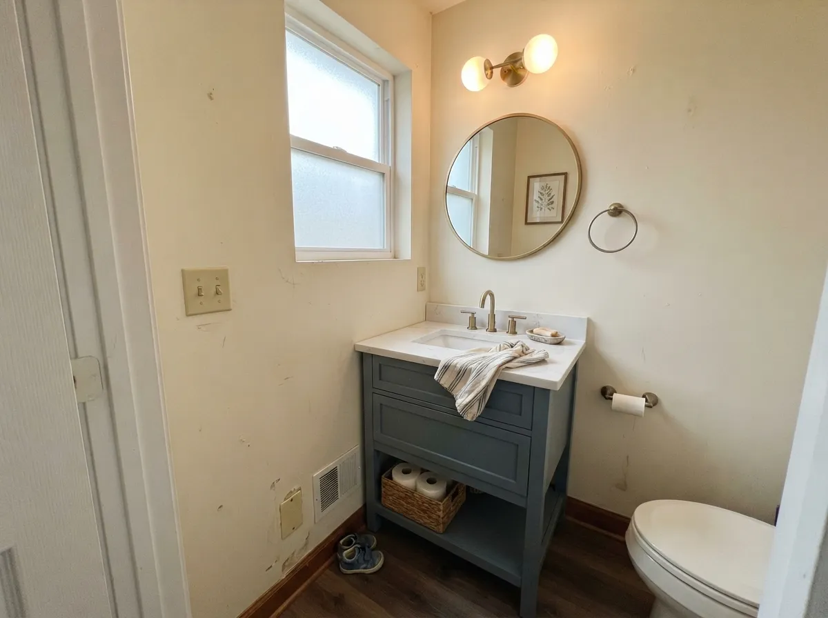
This is a color built for rooms people use after the sun goes down. Under a 2700K lamp or a brass chandelier the blue steps forward and the wall reads rich and denim-true, which is exactly what makes it work in a home office, a dining room, or a den that gets more evening traffic than daylight. Its second home is the small commitment: a powder-room vanity or a run of built-ins, where the color reads intentional and a little unexpected without repainting an entire open floor plan. Give it walnut, leather, or brass and it looks considered rather than trendy.
Where It Fails
The complaints that will show up for a color like this are predictable from the numbers alone, even without a stack of owner reviews to confirm them. All three come down to light and wood, not the paint being wrong.
Cold light strips the blue out of any grayed slate color and leaves a flat, slightly dull gray behind — the same thing that happens to Sherwin-Williams Smoky Blue and every other color in this family. If the room only gets cool overhead light, swap to 2700K bulbs before you decide the color disappointed you.
Orange-toned wood sits almost opposite this blue on the color wheel, and the two argue: the floor looks more orange, the wall looks more gray. Walnut, espresso, or pale white oak are the floors that actually get along with it.
At LRV 18 this is a genuinely deep color for four walls with nothing to break it up. In a big open room with builder-white trim and no warm materials nearby, it can read heavier and more closed-in than the sample chip suggested. It is a better bet as one committed room than a whole-house wall color.
Room by Room
Low daylight and warm desk-lamp hours flatter it constantly, and the depth makes video calls and reading nooks feel deliberately cozy rather than dim. Eggshell for durability at a desk chair's backrest height.
A room people mostly use at night is the ideal match for a color that turns velvety under lamp light. Pair with a brass fixture and a walnut table and it reads like a considered, expensive choice.
A Mom Jeans vanity under cream walls, or all four walls of a small powder room, is a weekend project with a big visual return — small rooms carry deep color well, and brass hardware brings out the blue's warmth.
Works as an accent wall or a full room if the bedding, rug, and lamps run warm. A north-facing bedroom with cool LEDs and no lamps will read the color flatter and grayer than intended — swap the bulbs first.
Denim-blue cabinets or an island in this color, under a white or warm-wood counter, is a proven look in the wider paint world; a full kitchen of it over honey-oak floors is the one combination to test carefully first.
In an open-plan living room it needs warm materials nearby to avoid feeling heavy; Backdrop's catalog is built for interior walls, and this color has no meaningful documented exterior track record, so treat it as an indoors-only pick.
Your Light Is the Risk
2700K bulbs or a brass fixture pull the blue forward and the wall reads rich, denim-true, and a little velvety — the light this color was picked for.
Cold light drains the blue and leaves a flat, slightly dull slate-gray. Test with warm bulbs before writing the color off.
Cooler and grayer at midday, noticeably bluer and warmer through the late-afternoon and evening hours.
2700K lamps: deep, calm denim blue. Cool white LEDs: flat and gray — same paint, opposite result.
Most complaints about Mom Jeans are a light mismatch. Upload a photo of your actual room and see it on your walls — then ask for the same wall in north light or evening lamps before you buy a single sample.
Need It From Another Brand?
Any paint counter can custom-tint Backdrop BD-MJ directly. If you would rather stay in one brand's own deck, these are the closest stock matches, measured as ΔE2000. Under 2 is a difference you will not see on the wall.
| Brand | Closest color | ΔE | LRV | |
|---|---|---|---|---|
| Sherwin-Williams | DistanceSW 6243 · Sherwin-Williams | 0.9 | 15 | Color page → |
| Behr | NypdN480-6 · Behr | 3.1 | 15 | Color page → |
| Benjamin Moore | Mozart Blue1665 · Benjamin Moore | 3.3 | 17 | Color page → |
| Valspar | Pacific Coast4004-4B · Valspar | 2.4 | 14.8 | Color page → |
| PPG / Glidden | Hatteras GrayPPG10-10 · PPG / Glidden | 2.0 | 16 | Color page → |
| Glidden | Hatteras GrayPPG10-10 · Glidden | 1.2 | 15 | Color page → |
Similar Backdrop Colors
The nearest shades to Mom Jeans within Backdrop's own range, ranked by perceptual color distance — useful when you want the same look a touch lighter, darker, or warmer.
WCAG 2.1: AA is 4.5 : 1 for normal text, 3 : 1 for large text, AAA is 7 : 1.
Mom Jeans vs the Colors You're Also Considering
Every Mom Jeans sample board has the same rivals on it. The numbers show the real lightness gap — then it comes down to which risk you would rather live with.
Pick this if you want the exact Backdrop-catalog version and don't mind ordering direct.
Sherwin-Williams SW 7604 · LRV 15Smoky BluePick this if you want the same slate-blue mood from a brand with a can at every hardware store, not a peel-and-stick sample by mail.
Pick this when you want blue without the near-black depth Hale Navy carries.
Benjamin Moore HC-154 · LRV 6Hale NavyPick this for a real committed navy — darker and more saturated, less gray.
Within Backdrop, the closest calls are Polly Wants and We Three Kings, and they bracket Mom Jeans on either side.
Polly Wants (BD-PW), LRV 27, is noticeably lighter and grayer. Side by side, Mom Jeans looks like denim while Polly Wants looks like an overcast sky. Choose Polly Wants for smaller or dimmer rooms where LRV 18 would feel heavy, and Mom Jeans when you want the wall to read clearly blue.
We Three Kings (BD-WK), LRV 8, is the deep end of the same idea, a true navy-leaning dark blue. It brings more drama and more risk: at LRV 8 it needs excellent light or a deliberate cocoon plan. Mom Jeans gives most of the mood with more forgiveness.
Hartford (BD-HF), LRV 22, sits nearby in depth but leans green-gray instead of blue. If your furnishings are earthy and warm, Hartford blends in; if they are cool or high-contrast, Mom Jeans is the better fit.
Mom Jeans Coordinating Colors
The rule for coordinating with Mom Jeans is the same as for any grayed slate blue: warm whites, near-blacks, and walnut-toned wood do the work; yellow-warm neutrals and honey wood argue with it. These are the partners that keep it looking deliberate rather than accidental:
The Name: A Denim Joke That Actually Checks Out
Backdrop's whole catalog leans into pop-culture and nostalgia names — Hocus Pocus, Lost in the 80s, Old Soul, Le Freak all sit in the same deck — and Mom Jeans is the brand's most literal joke. Most paint companies naming a color after a piece of clothing pick a bright, marketing-friendly version of that color; Backdrop instead landed on an actual grayed, mid-depth denim blue, the kind that matches a real pair of worn, stone-washed jeans rather than a fresh-off-the-rack pair. It is a small detail, but it means the name is doing honest work instead of just being catchy.
Because Backdrop is a relatively young DTC brand, Mom Jeans does not carry the years of Houzz threads, Reddit "is this too dark" posts, and magazine features that a Sherwin-Williams or Benjamin Moore icon accumulates. That is not a strike against the paint itself — the formula is a documented, self-priming, GreenWise-certified acrylic — it just means the fastest way to know how it will read in your specific room is Backdrop's own peel-and-stick sample, taped up in the actual light you plan to use it in.
Mom Jeans With Wood Tones and Metals
Walnut, espresso, and pale white oak are this color's best company — the cooler or darker the wood, the more the blue reads intentional rather than accidental. Leather in cognac or brown tones plays well too, echoing the worn-denim idea without fighting it.
The floor to test carefully first is honey oak or any yellow-orange-toned wood: it sits close to opposite this blue on the color wheel, so the pairing tends to make both look worse rather than better. Brass and unlacquered metals warm the color up nicely; polished chrome is the one finish that pushes it colder.
Three Ready Palettes Built on Mom Jeans
A color is never alone on the wall. These are complete combinations in the 60-30-10 pattern, with the reason each one holds together. Every one opens in the visualizer.
A warm white trim keeps the blue from feeling cold, and a near-black on built-ins gives the room the one dark note it needs to feel finished rather than monochrome. Add walnut and brass and the room does the rest.
Try this palette in your roomCream walls keep a small room from feeling closed in while the vanity carries the color; a charcoal-framed mirror and brass fixtures give it the one crisp, deliberate contrast note a powder room needs.
Try this palette in your roomEdgecomb Gray carries the light-filled rooms of the house while Mom Jeans takes the one room that gets used mostly at night — a warm greige and a cool denim blue can share a house as long as the same warm trim white ties them together.
Try this palette in your roomMom Jeans FAQ
Is Mom Jeans actually blue, or is it more gray?
Blue-gray, and the balance depends entirely on light. Under a warm lamp it reads as a genuine denim blue; under cool overhead LEDs or flat north daylight it grays down noticeably. Both are the same paint being honest about the light in the room.
Does it really look like faded denim?
Closer than most "denim blue" paint names manage. The hex sits in real stone-washed jeans territory — a grayed, mid-depth blue rather than a saturated jeans-ad blue — which is unusual for a paint named after a fabric color.
What white goes with Mom Jeans trim?
A warm white like Benjamin Moore White Dove or Swiss Coffee, in semi-gloss. A stark cool white trim will make the blue read colder and flatter than it needs to.
Will it work with honey oak floors?
Not well. Yellow-orange wood sits opposite this blue on the color wheel, so the two amplify each other in the wrong direction — the floor looks more orange, the wall looks more gray. Walnut, espresso, or pale white oak are the floors that actually pair with it.
How many coats does Backdrop paint need on a color this deep?
Plan on two full coats. Backdrop's own Standard formula is self-priming and covers well on lighter colors in one coat, but deeper, more saturated colors in the line — this one included — generally need the second coat for even hide, the same as any brand at this depth.
Is Backdrop a trustworthy brand for a color this specific?
Backdrop is a genuine direct-to-consumer paint line — self-priming, low-VOC, GreenWise-certified — sold at backdrophome.com with a peel-and-stick sample program. It simply doesn't have the decades of nationwide reviews a Sherwin-Williams or Benjamin Moore color has yet, so lean on the sample swatch on your actual wall more than you would for a legacy-brand color.
Have you painted with Mom Jeans?
Rate it — one tap helps the next reader decide.
Ask a Question