After Hours
Backdrop's soft charcoal black, reviewed honestly: the dining rooms where it turns expensive, the dim rooms where it becomes a cave, and what to pick instead.

Jessica has spec'd whites and neutrals for more than 300 rooms and keeps a sample wall of painted drawdowns in her studio. Every color review is checked against real reader rooms in the comments and re-tested when a formula changes. About the testing process →
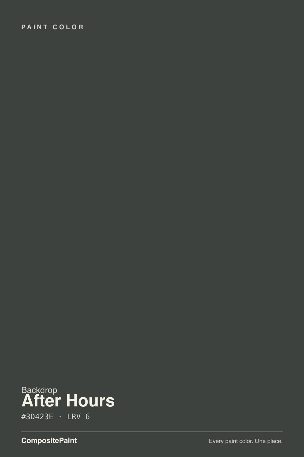
- 1Cordovan Brown0
- 2After Hours6
The Fast Verdict
After Hours is not a true black. It is a soft charcoal that sits one shade up from the abyss, deep enough at LRV 6 to drench a dining room and still show a little gray when the sun hits it. Under 2700K lamps it goes velvety and expensive; in a dim room with no lamps it is just a cave. Buy it for rooms you already run after dark — not for a whole house, and not if you wanted Tricorn-level black.
Lamplit dining rooms · bedrooms that should feel like evening · cabinets, built-ins, and front doors · powder-room drenches
The room is dim and you refuse lamps · you want a true black · you are painting whole-house walls · you hate dusting dark surfaces
- Charcoal that still reads as color, not a hole — black without the abyss
- Dining rooms and lamplit bedrooms look expensive in one decision
- Cabinets, built-ins, and front doors take it with less risk than four walls
- Same depth as Iron Ore (LRV 6) if you want the boutique version of that mood
- Backdrop's 6-percent sheen hides roller stipple on a color that would flash in eggshell
- LRV 6 in a dim room with no lamps is a cave, not a mood
- Not true black — daylight shows the green-gray charcoal
- Dust, scuffs, and switch-plate fingerprints are a lifestyle, not a one-time wipe
- Too dark and too specific for whole-house walls or a bright open plan
What Color Is After Hours, Really?
A soft charcoal black — and the softness is the whole point. Backdrop files it next to its darker true black and tells you this one is a shade lighter, which is the honest pitch: you get the mood of black without the dead, inky hole. The brand is a 70-odd-color direct-to-consumer deck, not a 3,000-chip wall, so After Hours is doing a specific job in a short list: the charcoal you reach for when Dark-adjacent is the brief and a pure black would swallow the room. It is not a Color of the Year. It does not need to be. Designers keep putting it in lamplit dining rooms because that is the room where LRV 6 looks intentional instead of punitive.
At LRV 6 it absorbs almost everything that hits it. That is the same depth as Sherwin-Williams Iron Ore, which is the useful comparison: both read as black from the doorway and as charcoal once you are in the room. The chip will always look lighter than the wall. Plan for four walls to go a full step darker than the peel-and-stick, then another step after dark. Gray-tinted primer is not optional over existing light paint — Amazon reviewers who skipped it spent an extra coat chasing the real color.
Undertone in one line: near-neutral charcoal, a hair of green-gray, never chocolate and never inky blue. Cool north light strips the softness and leaves a flat sooty black; 2700K lamps pull it back toward a greige-charcoal that Bobby Berk has called almost a neutral in a moody room. If your sample looks blue, that is the bulb or the neighbor, not the can.
Where It Shines
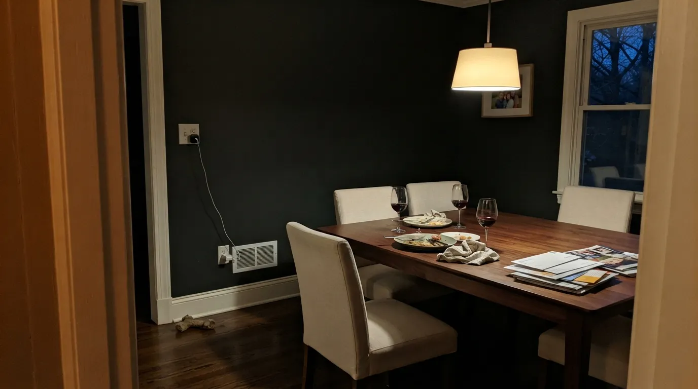
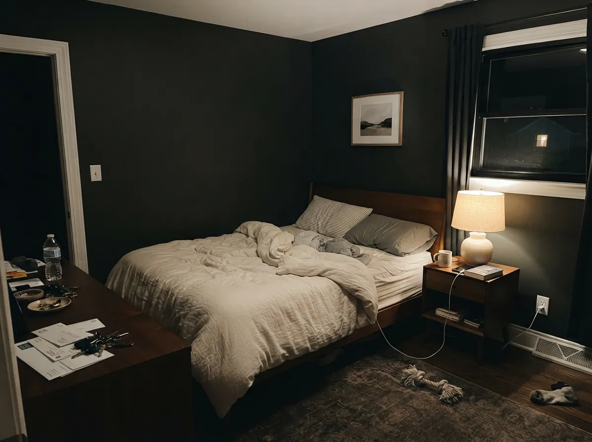
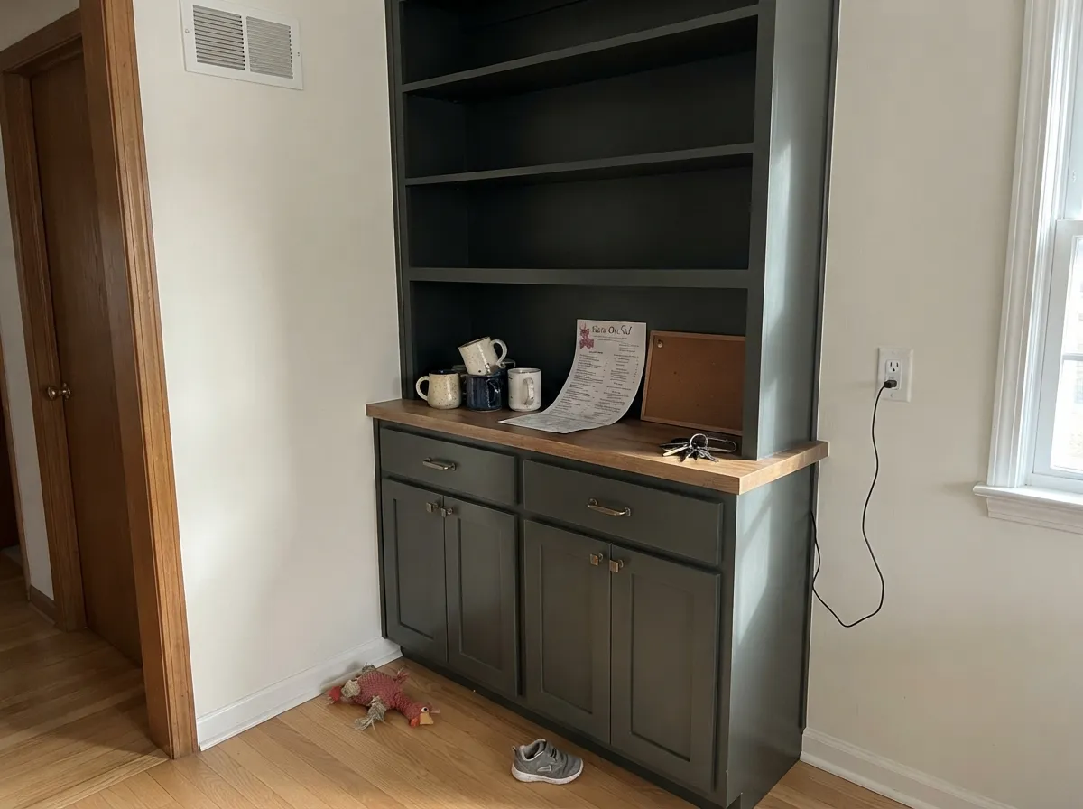
Give it lamps and a room you use at night and it earns the name. A dining room with a pendant, candles, walnut, and cream linen is the picture the color was mixed for — the walls recede, the table comes forward, and the charcoal reads expensive instead of gloomy. Bedrooms are the second home: under warm bulbs it goes velvety the way Bobby Berk described in his 2026 bedroom list. Its practical third act is the one-surface job — cabinets, built-ins, an interior door, a front door in semi-gloss — where the charcoal looks custom and you are not betting four walls on LRV 6.
Where It Fails
Almost every regret story about After Hours is the same story told three ways, and all three are visible before you open the can. None of them are the paint's fault — but if your room matches one, this is not your black, and a bigger sample will only confirm it.
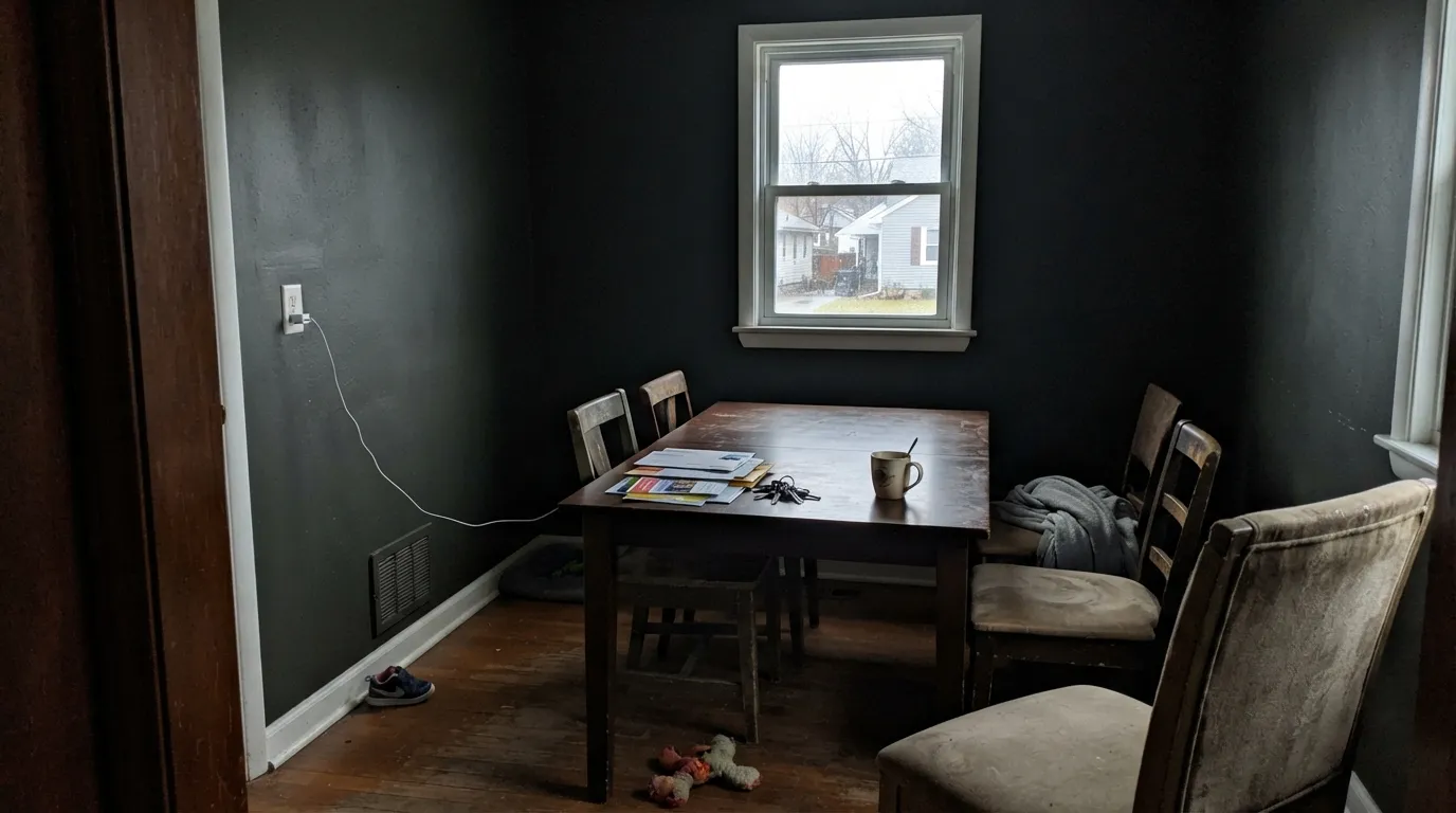
LRV 6 in north light, on an overcast day, with the overhead off, is not moody. It is a cave. Corners disappear, faces look tired, and readers call it depressing rather than dramatic. After Hours needs a light source it can fall off of — a pendant, a picture light, a table lamp. If you will not add lamps, pick a charcoal that still has some bounce, like Kendall Charcoal at LRV 15.
On the chip it passes for black. In south daylight the green-gray charcoal shows, and next to Tricorn Black (LRV 3) or Backdrop's own Hocus Pocus it is clearly the softer, dustier cousin. If the brief is inky, go darker and cooler. After Hours is the black you pick when you still want to see a little color on the wall at noon.
Every dark wall collects dust, shows knuckle marks around switches, and flashes wherever the roller went a little heavier. Amazon owners flag the dusting; that is physics, not a bad batch. Stay at Backdrop's 6-percent semi-matte or a true matte on walls — eggshell and above will glitter on a color this dark. Semi-gloss belongs on cabinets and doors, where you actually want the wipe-down.
Room by Room
This is the use the color was built for. You already run a dining room at night, so LRV 6 is a feature: the walls drop away, the table and the light fixture do the talking. Matte or 6-percent semi-matte on all four walls; Jane or White Dove on trim in satin. Walnut, brass, cream linen, and a dimmer on the pendant are the rest of the recipe.
Bobby Berk's line is right: by lamplight it becomes something luxurious. Matte finish, 2700K bulbs, cream or white bedding — not beige, which goes yellow against charcoal. A north-facing bedroom with one window and no lamps is the fail shot. Add the lamps or pick a lighter charcoal.
Semi-gloss After Hours on a dining hutch, a media built-in, or a front door is the low-risk version of the same mood. Owners like it on doors; Amazon reviewers used it on built-ins and called it very black, which is what they wanted. Gray-tinted primer, two finish coats, and a real cabinet enamel if it is going to take hands every day.
Small rooms take deep color well, and a powder you visit for four minutes does not have to bounce light. Paint walls and even the ceiling After Hours, keep the trim a warm white, add one warm sconce. It reads like a jewel box, not a basement.
A closed, lamplit living room with walnut and cream can carry it. An open-plan main floor cannot: After Hours will make the adjacent kitchen and hall look like they were painted in a different house, and daytime TV-watching in a charcoal cave is a specific taste. If you want dark in a living room people actually use at noon, look at Kendall Charcoal instead.
A front door in semi-gloss After Hours on a light house is a confirmed owner win: charcoal, not stark black, so it still reads as a color from the curb. Full-sun siding is a different job — at LRV 6 the body of a house soaks heat and shows every lap mark. Leave the siding to a real exterior black and keep this on the door.
Your Light Is the Risk
2700K pendants, picture lights, and table lamps are the light this color was mixed for. The charcoal goes velvety and the room reads designed, not dark. This is why dining rooms and bedrooms work.
Cool gray daylight plus LRV 6 equals a sooty cave. Corners die, faces look tired, and the softness that makes After Hours charcoal instead of black is gone. Test here first, with the overhead off.
Midday south light is the honest read: clearly a green-gray charcoal, not black. West sun and golden hour warm it and pull it toward a softer greige-black for an hour. Sample at noon and at 6pm.
2700K: the charcoal softens and the green-gray recedes. Cool 4000K LEDs: a dead, flat black with no depth. The bulbs are part of this paint job — swap them before you repaint.
Most complaints about After Hours are a light mismatch. Upload a photo of your actual room and see it on your walls — then ask for the same wall in north light or evening lamps before you buy a single sample.
Need It From Another Brand?
Any paint counter can custom-tint Backdrop BD-AH directly. If you would rather stay in one brand's own deck, these are the closest stock matches, measured as ΔE2000. Under 2 is a difference you will not see on the wall.
| Brand | Closest color | ΔE | LRV | |
|---|---|---|---|---|
| Sherwin-Williams | Iron OreSW 7069 · Sherwin-Williams | 3.5 | 6 | Color page → |
| Behr | Dark Cavern790F-7 · Behr | 1.4 | 6 | Color page → |
| Benjamin Moore | Notre DameCSP-570 · Benjamin Moore | 3.1 | 6 | Color page → |
| PPG / Glidden | Black MagicPPG1001-7 · PPG / Glidden | 4.3 | 5 | Color page → |
| Glidden | Black MagicPPG1001-7 · Glidden | 5.0 | 5 | Color page → |
| Dutch Boy | Cauldron437-7DB · Dutch Boy | 4.1 | 5 | Color page → |
Similar Backdrop Colors
The nearest shades to After Hours within Backdrop's own range, ranked by perceptual color distance — useful when you want the same look a touch lighter, darker, or warmer.
WCAG 2.1: AA is 4.5 : 1 for normal text, 3 : 1 for large text, AAA is 7 : 1.
After Hours vs the Colors You're Also Considering
Every After Hours sample board has the same rivals on it. The numbers show the real lightness gap — then it comes down to which risk you would rather live with.
Pick this if you want the slightly softer, boutique charcoal and you are already in Backdrop's short deck.
Sherwin-Williams SW 7069 · LRV 6Iron OrePick this if you want the same LRV 6 charcoal from a painter who already stocks Sherwin-Williams — it is the whole-house-capable version of this depth.
Pick this when you still want a little gray in the black so the wall does not read as a void.
Sherwin-Williams SW 6258 · LRV 3Tricorn BlackPick this if you actually want true black — the reference black in the Sherwin-Williams deck, with no charcoal left to see at noon.
Within Backdrop's own darks, the closest calls are North End, Last Call, and Hocus Pocus. North End (BD-NE, LRV 7) is the greener sibling: one point lighter, with a much more visible green cast. If you want walls that clearly read as dark green, choose North End; if you want them to read black with just a hint of depth, After Hours is the safer pick.
Last Call (BD-LC) shares the same LRV of 6 but leans blue-violet instead of green. In evening lamplight the two look similar, but daylight separates them: Last Call goes navy-adjacent, After Hours stays charcoal. Rooms with cool gray furnishings favor Last Call; rooms with wood and warm textiles favor After Hours.
Hocus Pocus (BD-HP, LRV 3) is the true black of the group, darker and colder. Pick it for maximum drama or graphic exteriors; pick After Hours when you want the same mood with slightly more forgiveness in low light.
After Hours Coordinating Colors
The rule for coordinating with After Hours is warm whites, cream, and one deeper black — and keep icy gallery whites at arm's length. It wants Jane or White Dove on the woodwork, a cream in the next room so the drench has somewhere to land, and at most one true-black note on a door or a cabinet. Brass, walnut, and cream linen are the furniture half of the same sentence.
Why Dining Rooms Are the Natural Habitat
Most dark paints get sold as bedrooms. After Hours keeps showing up in dining rooms for a boring, structural reason: a dining room is already a night room. You dim the pendant, you light the candles, you sit in one place. LRV 6 stops being a liability and becomes the thing that makes the table the brightest object in the room. Backdrop has never named a Color of the Year, and After Hours does not need the stamp — the use case is older than the brand.
The same logic is why it fails in a family room at 2pm. If the room's job is daylight, homework, and TV, charcoal walls make everyone look tired and every sock on the floor into a design problem. Save the four-wall drench for the room you occupy after 6pm, and use After Hours on a cabinet or a door everywhere else.
After Hours With Wood Tones, Floors, and Metals
Walnut and espresso are the easy yes — the red-brown depth makes the green-gray in the charcoal read as smoke instead of dirt. Pale unstained white oak goes Scandinavian-moody and is the safest light floor. Honey-orange builder oak is the one to sample in place: the floor goes louder, the wall goes a hair greener, and some rooms like that fight. Cool gray LVP and stone recede, which is fine; the paint is doing all the talking.
Metals: unlacquered brass, antique bronze, and matte black. Polished chrome is the cold one — it turns the charcoal sooty. Hardware on After Hours cabinets is not a small decision; brass is how the semi-gloss reads furniture instead of appliance.
Three Ready Palettes Built on After Hours
A color is never alone on the wall. These are complete combinations in the 60-30-10 pattern, with the reason each one holds together. Every one opens in the visualizer.
Jane is Backdrop's own White Dove analog, so the trim stays warm and the charcoal does not look sooty against a blue-white. Cookies & Cream in the next room is the cream handoff that keeps the dining drench from feeling like a black box off the hall.
Try this palette in your roomThis is the low-risk After Hours: the dark sits on the cabinets where you wanted drama, and the walls stay a warm white. White Dove and Jane are the same idea in two decks — pick whichever brand is already on site and keep the trim in the same temperature family.
Try this palette in your roomTonal blacks only work if one of them is clearly the wall and one is the accent. After Hours carries the room; Hocus Pocus — built for one surface — takes the door or the headboard wall. White Dove keeps the edges from going funeral-parlor.
Try this palette in your roomAfter Hours FAQ
Is After Hours black or charcoal?
Charcoal that passes for black after dark. At LRV 6 it is deep enough that most guests will call it black, but south daylight shows a green-gray softness that Tricorn Black and Hocus Pocus do not have. If you need inky, go darker. If you need the wall to still be a color at noon, this is the one.
What trim white goes with After Hours?
A warm, slightly creamy white — Backdrop Jane or Benjamin Moore White Dove. A stark gallery white (Tabula Rasa territory, LRV 92) makes the charcoal look sooty and unfinished at the edge. Satin or semi-gloss on the trim, matte on the walls.
Will it make my dining room too dark?
Not if you already eat dinner with a pendant and candles — that is the operating condition this LRV was mixed for. It will make a dining room with one north window and a builder dome light feel like a basement. Dimmer on the fixture, 2700K bulbs, and a sample on all four walls before you commit.
Can I use After Hours on kitchen cabinets?
Yes — Backdrop sells it as a cabinet-and-door color in semi-gloss, and that is a smarter bet than four kitchen walls. Gray-tinted primer, two coats of the alkyd enamel, and brass or unlacquered-brass hardware. A full kitchen of LRV 6 cabinets is a strong look; an island or a hutch is the reversible version.
Does it work with oak floors?
Walnut, espresso, and pale white oak are the easy yes. Honey-orange builder oak will make the charcoal look greener and the floor look louder — not a geometric clash the way violet is, but a temperature fight. A large rug helps. Cool gray LVP is fine; the floor recedes and the walls do the talking.
How many coats does it take?
Prime with a gray-tinted primer over any light existing color, then two finish coats. Skipping the primer is how you end up buying a third gallon to chase hide on a color this dark. Over an existing mid-tone, two coats of finish may be enough — still sample the real stack, because darks shift as they build.
Have you painted with After Hours?
Rate it — one tap helps the next reader decide.
Ask a Question