Last Call
The darkest of Backdrop's four blues, reviewed honestly: the light where it turns navy, the light where it turns black, and what to pick instead.

Jessica has spec'd whites and neutrals for more than 300 rooms and keeps a sample wall of painted drawdowns in her studio. Every color review is checked against real reader rooms in the comments and re-tested when a formula changes. About the testing process →
- 1Last Call6
- 2Waterloo13
- 3Charcoal Blue19
The Fast Verdict
Last Call is the deepest color in Backdrop's small blue lineup — a cool, desaturated blue-charcoal at LRV 6 that reads more like a shadow than a paint chip. It is not a saturated sailor navy; it is closer to denim gone almost black, the kind of color that needs a lamp or real daylight to admit it is blue at all. Give it a kitchen island, a powder room, or a front door and it looks expensive and deliberate. Paint four dim walls with it and it just looks black.
Kitchen islands and cabinets · powder rooms · front doors · a den or office that only gets used after dark · one accent wall under warm light
You want a true saturated navy, not a near-black · the room is small, north-facing and lamp-free · you're covering all four walls of the only room in the house with real daylight · you need a color your local big-box store restocks
- A genuine blue-black, not a muddy or violet-leaning near-black
- Looks deliberate and expensive on cabinets, vanities, and doors
- Backdrop's self-priming, low-VOC formula covers a dark color like this in fewer coats
- Pairs cleanly with warm whites, brass, and walnut without any extra thought
- Sold direct with an affordable sample pot, so testing it costs almost nothing
- Reads as plain black, not blue, in any room without real light
- Too muted and gray to satisfy anyone who pictured a true saturated navy
- Small DTC brand — no big-box stock and far fewer independent owner reviews than the mainstream navies it competes with
- Cool LED bulbs at night erase what little blue is left
What Color Is Last Call, Really?
Backdrop is a Los Angeles direct-to-consumer paint brand founded in 2018 by Natalie and Caleb Ebel, built around a small, curated deck sold direct at backdrophome.com with sample pots first and a self-priming, low-VOC, one-coat-hide formula. The brand names its colors with a wink — think Mom Jeans, Vampire Weekday, Hocus Pocus — and Last Call is the darkest of just four blues in that deck, sitting well below the pale Lost in the 80s and the mid-depth We Three Kings and Mom Jeans.
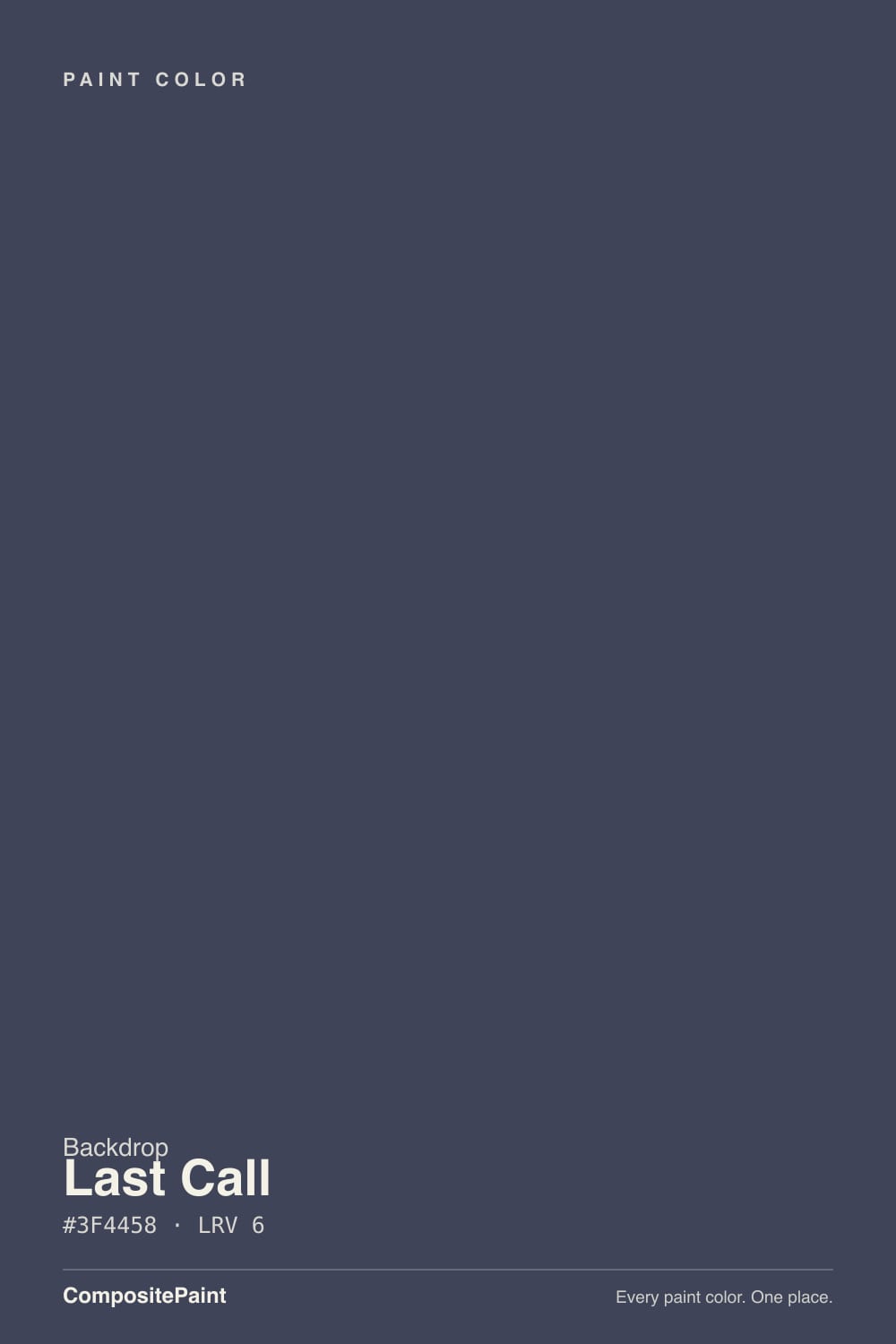
At hex #3F4458 the color is a cool, heavily grayed blue: more blue-gray charcoal than the saturated, high-chroma navy you'd get from something like Behr's Navy Blue. That low saturation is the whole personality. In flat or dim light it reads as a plain near-black; only when real daylight or a warm lamp hits the wall does the blue step forward and separate it from a true black. At LRV 6 it sits in the same near-black band as Benjamin Moore's Hale Navy and Sherwin-Williams's Charcoal Blue and In the Navy — good company, and proof this depth of blue-black behaves the same no matter whose can it comes in.
Undertone in one line: cool blue-gray, verging toward slate rather than pure indigo-navy — never green, never violet. If your sample reads flat black, the room needs more light reaching the wall; if it reads teal, that is reflected foliage or a green-cast LED bulb doing the work, not the paint.
Where It Shines
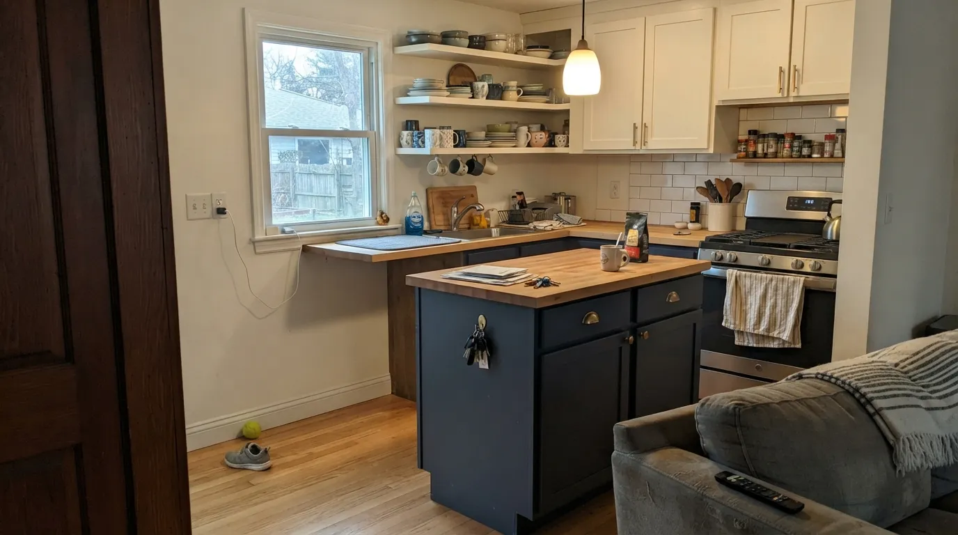
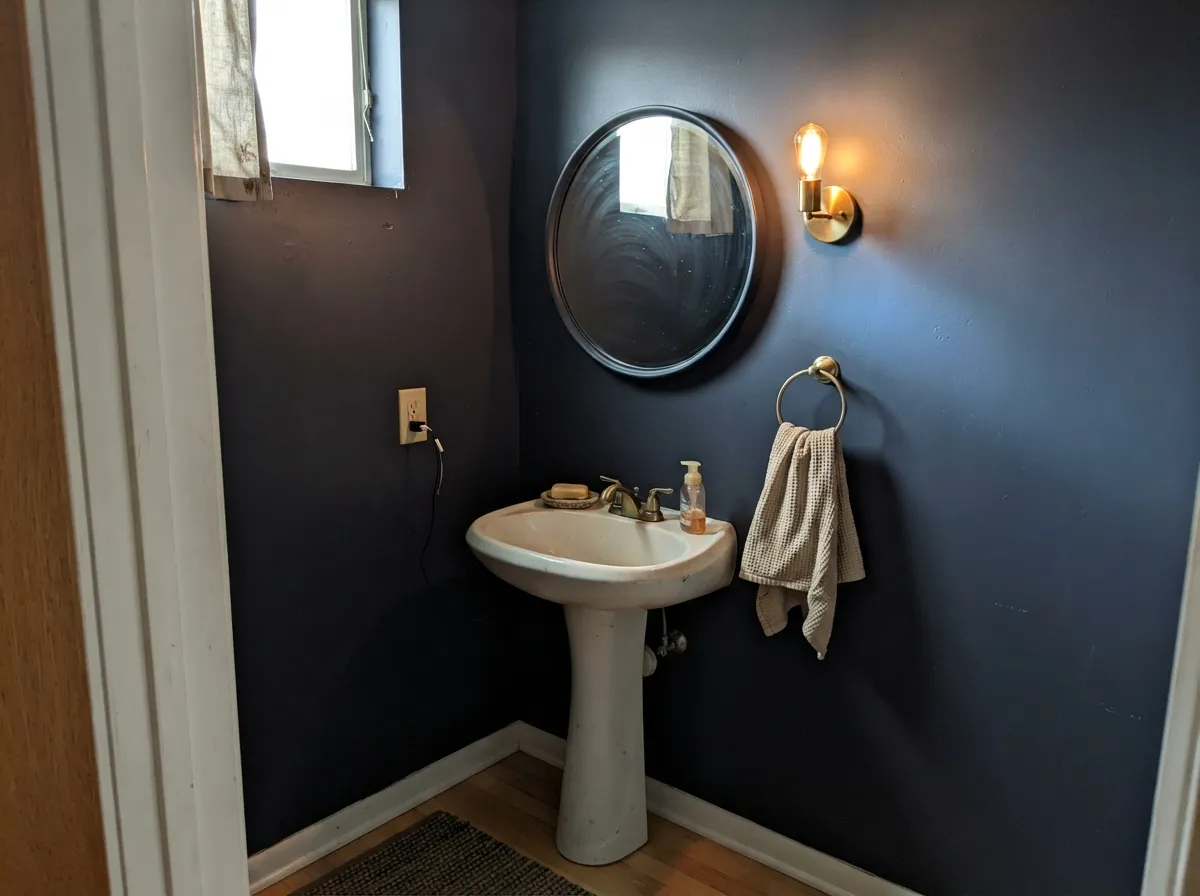
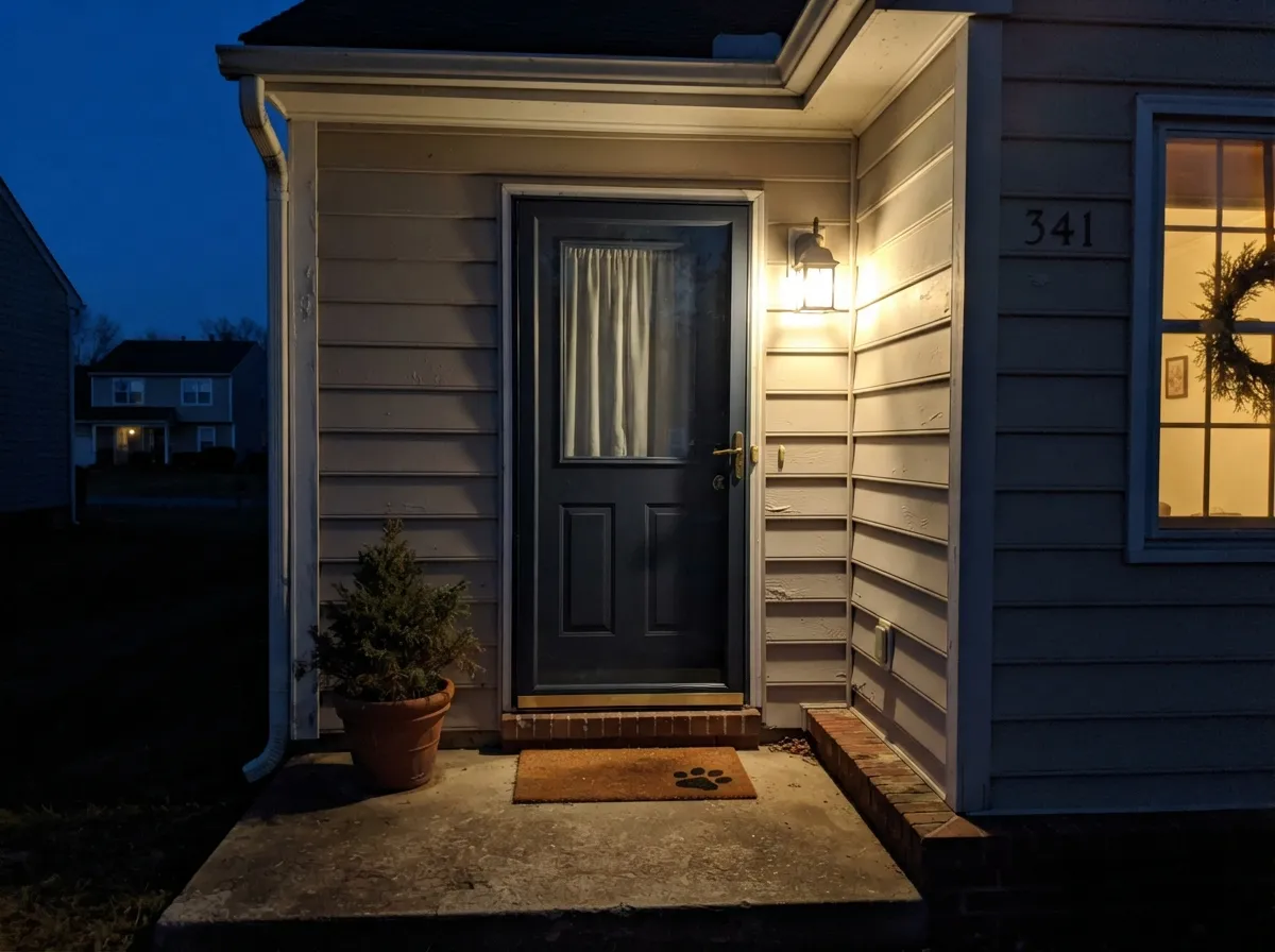
This is a color built for one confident surface, not a whole room, and it earns that job. On a kitchen island or a run of lower cabinets under decent daylight, the blue comes forward against white uppers and brass pulls, and it reads custom rather than store-bought. Small rooms with a light source close by — a powder room with a sconce, a front door with a porch light — are its other natural home: enough depth to feel dramatic, small enough that it never goes flat and lifeless the way a whole dim room would.
Where It Fails
The regret stories with a color this dark all trace back to one of three things, and none of them are the paint's fault — they're a mismatch between what the color needs and what the room gives it.
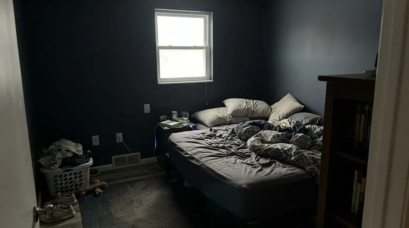
Without a light source close to the surface, Last Call reads as flat black — the blue simply has nothing to reflect off of. It is at its best on one lit surface, not drowning a whole dim room.
This is a muted, grayed-down blue-black, not a saturated sailor navy. If you're picturing something as vivid as Behr's Navy Blue, Last Call will look closer to charcoal than to blue — go to a brighter, more saturated navy instead.
Cool LEDs strip out the last bit of warmth and leave the color looking like a flat black hole in photos. Warm 2700K bulbs are part of getting the color you paid for, especially after dark.
Room by Room
Island or lower cabinets under a warm white upper cabinet and daylight from a window: this is where Last Call looks most deliberate. Satin cabinet enamel wipes clean and holds up to handles and elbows.
Small rooms take deep, near-black color well, and a sconce or vanity light is usually close enough to keep the blue alive. Drench all four walls or keep it to the vanity — both work.
Against a light or mid-tone house body and a working porch light, a near-black blue-charcoal door reads current without going full black. Semi-gloss for weather and wipe-down.
A room you occupy mostly in lamplight is exactly the light this color wants. Pair with warm wood shelving and a brass task lamp rather than cool overhead LEDs.
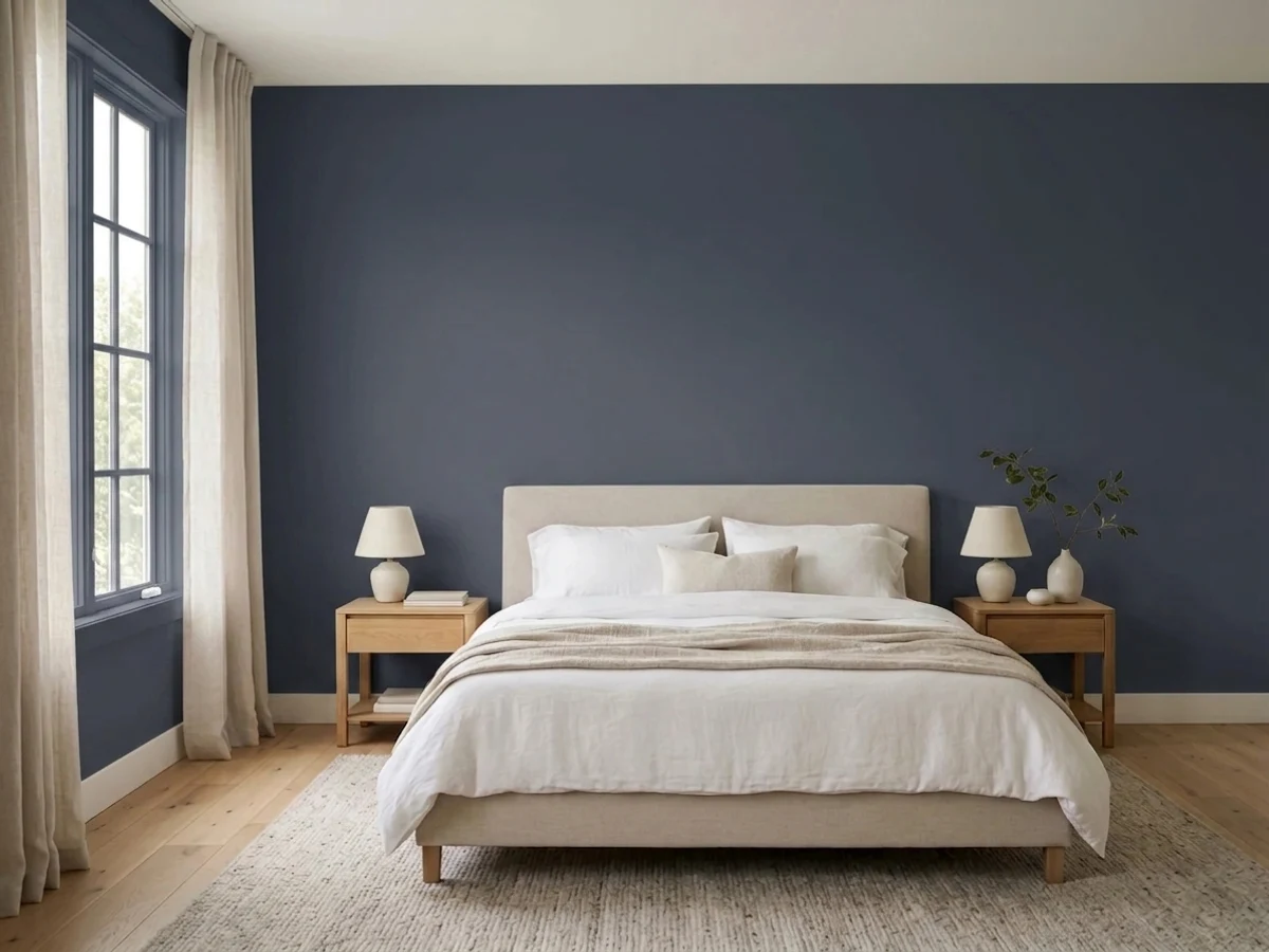
Behind a headboard, with a warm lamp on each nightstand, it goes moody and calm rather than cave-like. Four walls of it in a dim bedroom is the one place this color regularly disappoints people.
In an open, sunny room it can anchor a reading nook or a fireplace wall beautifully. In a smaller or north-facing living room, treat it as a one-wall or built-in color, not a whole-room commitment.
Your Light Is the Risk
One warm lamp is enough to pull the blue forward and give the color its name-sake mood — this is the light it was made for.
With no light source reaching the wall, it goes flat black and the blue disappears entirely. Test it exactly where the light actually is, not near a window across the room.
Direct daylight is the clearest proof this is blue and not black — the cool undertone shows plainly at midday, then settles back into shadow by evening.
2700K bulbs keep a trace of blue alive after dark. Cool white LEDs flatten it into a black rectangle — swap the bulb before you blame the paint.
Most complaints about Last Call are a light mismatch. Upload a photo of your actual room and see it on your walls — then ask for the same wall in north light or evening lamps before you buy a single sample.
Need It From Another Brand?
Any paint counter can custom-tint Backdrop BD-LC directly. If you would rather stay in one brand's own deck, these are the closest stock matches, measured as ΔE2000. Under 2 is a difference you will not see on the wall.
| Brand | Closest color | ΔE | LRV | |
|---|---|---|---|---|
| Sherwin-Williams | Charcoal BlueSW 2739 · Sherwin-Williams | 4.6 | 6 | Color page → |
| Behr | Manhattan BlueMQ5-09 · Behr | 0.5 | 6 | Color page → |
| Benjamin Moore | Blackberry PunchCC-962 · Benjamin Moore | 2.5 | 5 | Color page → |
| Valspar | Emperor8003-48G · Valspar | 2.6 | 6 | Color page → |
| PPG / Glidden | Victory BluePPG1165-7 · PPG / Glidden | 3.1 | 5 | Color page → |
| Glidden | Victory BluePPG1165-7 · Glidden | 2.8 | 5 | Color page → |
Similar Backdrop Colors
The nearest shades to Last Call within Backdrop's own range, ranked by perceptual color distance — useful when you want the same look a touch lighter, darker, or warmer.
WCAG 2.1: AA is 4.5 : 1 for normal text, 3 : 1 for large text, AAA is 7 : 1.
Last Call vs the Colors You're Also Considering
Every Last Call sample board has the same rivals on it. The numbers show the real lightness gap — then it comes down to which risk you would rather live with.
Pick this for the boutique, direct-sold version — same depth, sample pots by mail, none of Charcoal Blue's big-store ubiquity.
Sherwin-Williams SW 2739 · LRV 6Charcoal BluePick this for almost the identical cool blue-black in a brand every paint counter carries — easier touch-ups and reorders down the road.
Pick this when you want it darker, quieter, and more shadow than statement — Hale Navy still announces itself as navy.
Benjamin Moore HC-154 · LRV 6Hale NavyPick this if you want a navy that reads unmistakably blue in more rooms, with the decades of owner reviews to back it up.
Within Backdrop, the closest calls are We Three Kings (BD-WK), After Hours (BD-AH), and Mom Jeans (BD-MJ). We Three Kings, at LRV 8, is a step lighter and its blue leans toward teal rather than violet. On the wall it stays recognizably blue in more lighting conditions, while Last Call drops to near-black sooner. Pick We Three Kings if you want a navy that still shows its color in a dim room; pick Last Call for maximum depth and a slightly moodier, ink-like finish.
After Hours (BD-AH) shares the same LRV of 6 but is a green-black, not a blue-black. Side by side, After Hours reads organic and earthy while Last Call reads cooler and dressier. Choose by what is nearby: After Hours flatters plants and warm wood; Last Call suits brass, white marble, and crisp trim.
Mom Jeans (BD-MJ), at LRV 18, is what to reach for when Last Call tests too dark; it keeps the same denim character three shades up.
Last Call Coordinating Colors
The rule for coordinating with Last Call: warm whites and one warm accent color, and give it a light source. It sits happily next to Backdrop's own warm-leaning neutrals, and it takes a blush or terracotta accent well since the cool blue and the warm tone trade off instead of competing. These are the partners that keep it from reading as a flat black hole:
The Story Behind the Name
Backdrop names its colors with a wink — Mom Jeans, Vampire Weekday, We Three Kings — and Last Call fits the pattern: the hour a bar's lights come up just enough to read a menu, warm and low and a little blue at the edges. That is a fair description of how the paint actually behaves, which is more than most brand-name backstories can claim. It happens to be the darkest of only four blues in Backdrop's deck, sitting well below the airy Lost in the 80s and the mid-depth Mom Jeans and We Three Kings.
Backdrop itself is a small, direct-to-consumer operation — founded in Los Angeles in 2018 by Natalie and Caleb Ebel, selling a self-priming, low-VOC, one-coat-hide formula straight from its own site with an inexpensive sample pot before any gallon commitment. That scale is worth knowing going in: there isn't the twenty-year archive of Houzz threads and contractor opinions that a color like Hale Navy has built up. What there is instead is a well-made, well-pigmented near-black blue that performs the way the numbers say it should — dark, cool, and dependent on light to prove it's blue.
Last Call With Wood Tones and Floors
Dark, cool colors like this one are the most forgiving with wood of almost anything in a paint deck, because the contrast in value does the work — walnut, black stained oak, and white oak all read cleanly against it whether the wood leans warm or cool. Brass and unlacquered bronze hardware are the classic finish partner; they catch just enough warm light to keep a Last Call cabinet or vanity from feeling like a black box.
The one caution is scale, not tone: a small run of honey-oak floor under a Last Call island reads fine, but wrapping an entire small, dim room in this color over wall-to-wall golden wood can tip the room toward gloomy rather than moody. Keep it to one surface, add a warm light, and the wood tone becomes an asset instead of a fight.
Three Ready Palettes Built on Last Call
A color is never alone on the wall. These are complete combinations in the 60-30-10 pattern, with the reason each one holds together. Every one opens in the visualizer.
A warm off-white base keeps the room bright enough for the island to read blue instead of black; one blush-terracotta door gives the cool navy a warm partner instead of leaving it to argue with the white alone.
Try this palette in your roomSmall rooms carry deep color well, and a warm blush vanity against near-black walls reads jewel-box rather than cave. A sconce over the mirror is what keeps the blue alive after dark.
Try this palette in your roomA warm greige body and a warm white trim give the near-black door somewhere to stand out. Add a working porch light — without it, the door reads plain black at night instead of the blue-charcoal it is by day.
Try this palette in your roomLast Call FAQ
Is Last Call navy blue or black?
Both, depending on the light. It is a genuine cool blue at heart, but it is so grayed down and dark (LRV 6) that without a lamp or real daylight nearby it reads as plain black. Put it somewhere with a light source and the blue shows; put it in a dim corner and it won't.
What's the difference between Last Call and Benjamin Moore Hale Navy?
They sit at the same LRV 6, but Hale Navy carries more visible blue in more lighting conditions and has decades of owner reviews behind it. Last Call is darker-reading and more charcoal-leaning — pick Hale Navy if you want the safer, more obviously-navy option; pick Last Call if you want it quieter and more shadow-like.
Does Last Call work on kitchen cabinets?
Yes — it's arguably its best job. On an island or lower run of cabinets, under a lighter upper cabinet or wall color and real kitchen light, it reads confident and current. Use a satin, cabinet-grade enamel.
Is Backdrop paint actually good quality?
Backdrop is a small direct-to-consumer brand (founded 2018, LA-based) that sells a self-priming, low-VOC, one-coat-hide formula direct through its own site, with sample pots available before you commit to a gallon. It doesn't have the big-box distribution or decades of independent reviews that Benjamin Moore or Sherwin-Williams have, but the pigment and coverage on a dark color like this one hold up the way you'd expect from the bigger brands.
What trim white goes with Last Call?
A warm off-white — Backdrop's own Tabula Rasa or Jane, or Benjamin Moore White Dove if you're mixing brands. A stark, cool bright white will make the near-black wall look even more like a hole in the room; warm white gives it somewhere to land.
Will Last Call look too dark in my room?
If the room has no natural light and no lamp near the wall, yes — expect it to read essentially black. If there's a window, a sconce, or even one warm lamp within a few feet of the surface, it will read as the intended blue-charcoal rather than a flat black wall.
Have you painted with Last Call?
Rate it — one tap helps the next reader decide.
Ask a Question