August
A warm peach-beige from a small direct-to-consumer paint brand, reviewed honestly: the light where it turns dusty pink, the rooms it was clearly built for, and what to pick instead if you want a longer track record.

Jessica has spec'd whites and neutrals for more than 300 rooms and keeps a sample wall of painted drawdowns in her studio. Every color review is checked against real reader rooms in the comments and re-tested when a formula changes. About the testing process →

- 1Mindful Gray48
- 2Revere Pewter55
- 3August60
- 4Pale Oak69
- 5Shoji White74
The Fast Verdict
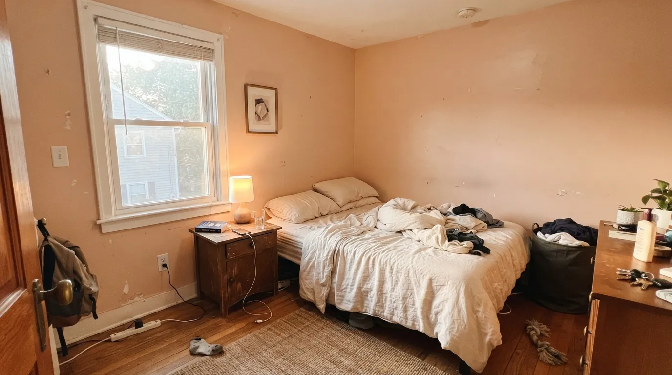
August is a soft, warm beige with real pink underneath — closer to a blush than a true neutral, and unmistakably peach once it is on four walls in daylight. Backdrop only sells one interior wall finish, a durable semi-matte, so there is no eggshell-vs-satin decision to make on this one — just whether the undertone is right for your light. In a warm-lit bedroom or nursery it reads gentle and a little expensive; in a cool north room it drifts toward a flat, dusty mauve nobody asked for.
Bedrooms and nurseries with real daylight · dining rooms under warm bulbs · anyone who wants blush without admitting it is blush · small rooms that should feel warm, not gray
You want a true gray-beige with zero pink · your room is north-facing and dim · your trim is a stark, brighter white · you need a color with a long, provable track record behind it
- Genuine warmth without going full peach-pastel
- Bedrooms and nurseries look soft and a little expensive under lamp light
- Backdrop's one-finish system means zero sheen guesswork on walls
- LRV 60 keeps small rooms bright, not gloomy
- Flatters brass, warm wood, and skin tones at table height
- Reads distinctly pink on the wall, more than most buyers expect from "beige"
- Cool north light drains it to a flat, dated mauve-gray
- A stark white trim makes it look dingy instead of intentional
- Small brand, with far less real-world track record than the majors
What Color Is August, Really?
August sits in Backdrop's small, curated interior lineup — the direct-to-consumer paint brand built around a single semi-matte "Standard Finish" for walls instead of the usual flat-eggshell-satin menu, plus a separate enamel for cabinets and doors. That one-finish approach is the brand's whole pitch: fewer decisions, one durable coat. August itself reads as a warm, dusty peach-beige — at hex E5C8B7 the numbers show exactly what the eye sees, a meaningful gap between the red channel and the blue channel that pulls it toward blush rather than toward a neutral greige.
At LRV 60 it sits mid-deck: bright enough to lift a small bedroom or nursery, deep enough to read as a real color rather than an off-white. That is the same LRV band as Sherwin-Williams' Abalone Shell and Benjamin Moore's Odessa Pink — both known for the same trick, looking like plain beige in flat light and turning distinctly pink the moment warm sun or a lamp hits the wall. August does the same dance. It is not a color you can call "safe neutral" with a straight face; it is a blush that learned to whisper.
Undertone in one line: pink-orange, closer to peach than to true blush-pink, and never gray. If a sample looks dusty or mauve on your wall, that is cool daylight or a cool LED bulb doing it — warm the light before blaming the paint.
Where It Shines
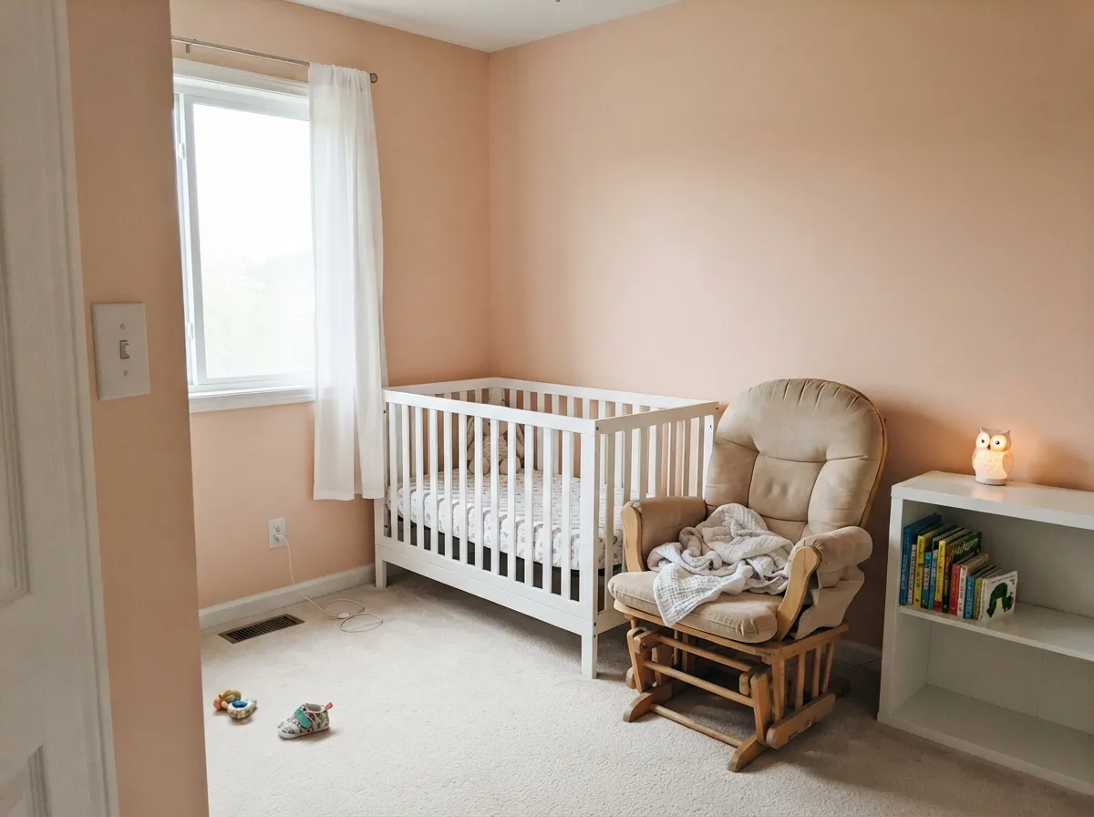
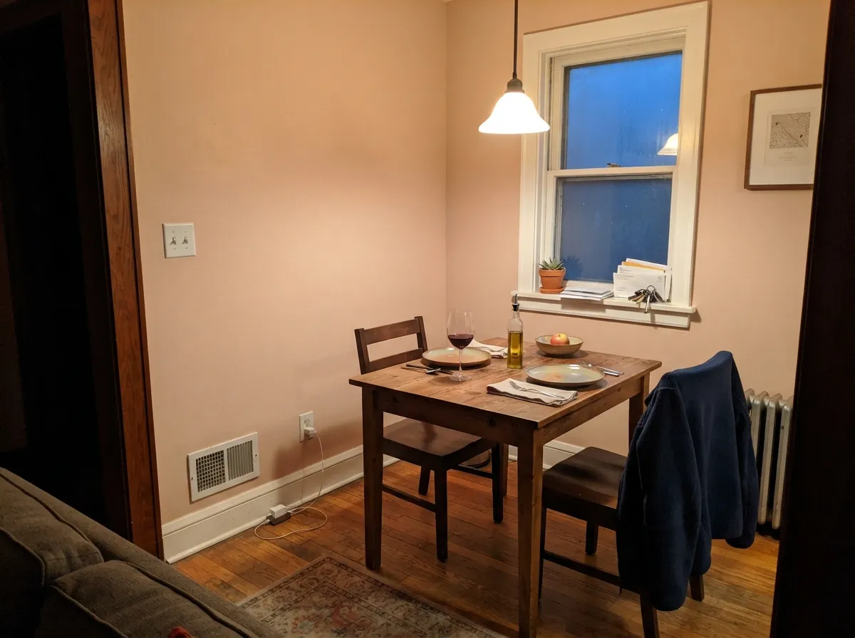
Give it warm daylight, a lamp, and cream or warm wood around it, and August goes from "is that beige or pink?" to a color people ask about. It is built for small, cozy rooms — a bedroom, a nursery, a dining nook — where you want warmth without committing to a fully saturated wall. Because it is Backdrop's only wall finish, there is also nothing to overthink about sheen: one durable semi-matte coat, and the undertone does the rest of the work.
Where It Fails
Every complaint pattern this color risks is really the same complaint in three costumes: pink shows up where the buyer expected only beige. None of it is a defect in the paint — it is undertone doing exactly what a warm color does at LRV 60 — but if your room matches one of these, sample a full sheet before you commit a whole wall.
On a small chip this can pass for a warm neutral. On four walls in daylight the pink is unmistakable — color intensifies with surface area. If "neutral with maybe a hint of warmth" is the goal, this has too much hint; look at a color built to stay gray, like Sherwin-Williams Accessible Beige, and let peach stay optional instead of a promise.
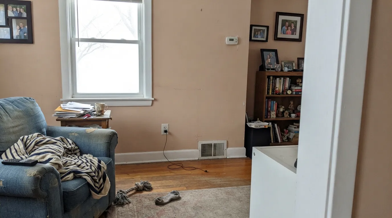
Cool daylight strips the peach out and leaves a flat, dusty mauve-gray that reads dated rather than deliberate. The color did not fail; the light did. Add warm lamps, or pick a color that does not depend on the sun to look warm.
A stark cool-white trim makes August's warmth look like grime instead of a chosen color — the classic pairing mistake. Trim it in something warm (Swiss Coffee, White Dove) so the wall and the trim agree on temperature.
Room by Room
With warm bulbs and real daylight the walls glow soft blush without ever tipping into nursery-pink. Semi-matte hides texture and stays washable enough for a headboard wall.
Soft enough for a girl's room or a genuinely gender-neutral one without reading as candy pink. Pairs easily with white furniture and warm wood toys and shelves.
Under a warm pendant it flatters skin tones at the table, the same reason old-school dining rooms leaned on blush and terracotta. Skip it if the room only gets cool overhead LEDs.
Cozy and warm in a closed, lamplit room. Riskier in a large open-plan space that runs cool or north-facing, where it can look washed-out and slightly dated instead of intentional.
Small rooms carry a blush wash well, and it plays nicely with brass fixtures and a marble or wood vanity top.
In most kitchens the peach reads as slightly dirty next to white appliances and cool countertops. Outdoors, full sun oversaturates the pink and it tends to look faded rather than intentional — neither is this color's job.
Your Light Is the Risk
Late-day sun plus a warm lamp brings the peach fully forward — soft, blush, flattering. This is the light the color was clearly chosen for.
Cool, flat daylight drains the warmth and leaves a dusty mauve-gray that reads dated rather than deliberate.
Cooler and more beige around 9am, warmer and more distinctly pink by golden hour — expect the wall to visibly change through the day.
2700K lamps push it rosy and warm; cool white LEDs flatten it toward gray. Bulb choice matters here as much as the wall color does.
Most complaints about August are a light mismatch. Upload a photo of your actual room and see it on your walls — then ask for the same wall in north light or evening lamps before you buy a single sample.
Need It From Another Brand?
Any paint counter can custom-tint Backdrop BD-AU directly. If you would rather stay in one brand's own deck, these are the closest stock matches, measured as ΔE2000. Under 2 is a difference you will not see on the wall.
| Brand | Closest color | ΔE | LRV | |
|---|---|---|---|---|
| Sherwin-Williams | BeigeSW 2859 · Sherwin-Williams | 2.9 | 60 | Color page → |
| Behr | Tapestry BeigeS210-2 · Behr | 1.8 | 60 | Color page → |
| Benjamin Moore | Pink Beach1172 · Benjamin Moore | 1.3 | 61 | Color page → |
| Valspar | Misty Loch8003-12C · Valspar | 1.3 | 61 | Color page → |
| PPG / Glidden | Birthday Suit1071-3 · PPG / Glidden | 0.8 | 60 | Color page → |
| Glidden | Sultan SandPPG1068-3 · Glidden | 2.5 | 62 | Color page → |
Similar Backdrop Colors
The nearest shades to August within Backdrop's own range, ranked by perceptual color distance — useful when you want the same look a touch lighter, darker, or warmer.
WCAG 2.1: AA is 4.5 : 1 for normal text, 3 : 1 for large text, AAA is 7 : 1.
August vs the Colors You're Also Considering
Every August sample board has the same rivals on it. The numbers show the real lightness gap — then it comes down to which risk you would rather live with.
Pick this if you would rather buy from a small, curated direct-to-consumer brand and do not mind less history to lean on.
Benjamin Moore HC-59 · LRV 59Odessa PinkPick this for the same blush-beige idea from a brand with decades of paint-store track record behind it.
Pick this for a slightly quieter, more peach-forward version of the same warm-neutral idea.
Sherwin-Williams SW 6057 · LRV 62Malted MilkPick this if you want the pink to be even more obvious — Malted Milk commits harder to blush.
Within Backdrop's deck, the closest call is Boy Meets Girl (BD-BG), LRV 53. It sits seven points darker than August and reads as a deeper, rosier version of the same idea. Side by side, August is the airier of the two. Pick Boy Meets Girl for a moodier bedroom or a room with abundant daylight to spare; pick August when the room is small or dim and you need the extra light bounce.
Eames (BD-EA) shares August's LRV of 60 exactly, but its hue is yellow rather than red-orange, so it lands as a golden ochre tone instead of a pink. If a room's textiles run yellow and rust, Eames blends in where August would add a pink note.
Cookies & Cream (BD-CC), LRV 73, is the escape hatch. It is 13 points lighter and far more neutral, for anyone who tested August and decided they wanted warmth without visible pink.
August Coordinating Colors
August pairs best with warm whites, muted sage, and a little near-black for grounding — steer away from cool bright whites and blue-gray neighbors, which make the pink look accidental instead of chosen. These are the partners that keep the room feeling deliberate:
Backdrop's One-Finish Model, and Why It Matters Here
Backdrop is a direct-to-consumer paint brand sold only online: a small, curated color library rather than a wall of thousands of chips, and one durable semi-matte finish for interior walls instead of the flat-eggshell-satin-semi-gloss ladder most brands sell. Cabinets, trim, and doors get a separate dedicated enamel. The pitch is fewer decisions and a low-odor, low-VOC formula that dries fast.
That model matters for a color like August because there is no eggshell-vs-satin trade-off to research and no decades of contractor chatter to lean on the way there is for a Sherwin-Williams or Benjamin Moore staple. What you are buying is the undertone itself, on one finish, from a brand that has been around only a few years — a real trade-off worth knowing before you order gallons rather than a sample pot first.
August With Wood Tones and Floors
Warm wood is this color's easiest partner. Honey oak, walnut, and butcher block all share August's warmth, so the wall and the floor read as one warm room instead of two colors negotiating. It is a rare warm-toned color that actually likes golden oak rather than fighting it — most warm neutrals start to clash once the floor gets that orange.
Cool floors are the harder pairing. Gray-washed wood, cool LVP, and ashy engineered flooring pull attention to August's pink by contrast, the same way a cool trim white does. It is not automatically a dealbreaker — a warm rug and brass hardware can bridge the gap — but sample a large piece of the paint above the actual floor before committing a whole room.
Three Ready Palettes Built on August
A color is never alone on the wall. These are complete combinations in the 60-30-10 pattern, with the reason each one holds together. Every one opens in the visualizer.
August walls read blush without competing with anything; White Dove trim keeps the temperature warm instead of stark. One accent wall or nook in Kendall Charcoal adds enough depth that the room does not float into pastel territory.
Try this palette in your roomPeach and sage is the pairing every "gender-neutral but not beige" nursery search leads back to. Evergreen Fog is muted enough not to fight August's pink, and White Dove keeps the crib and trim from looking dingy against either color.
Try this palette in your roomAccessible Beige carries the square footage without turning pink; August gets one wall to itself where the blush can do its job without overwhelming the whole room. Swiss Coffee ties the trim to both without introducing a cooler white that would expose either color's warmth.
Try this palette in your roomAugust FAQ
Is August warm or cool?
Warm, with real pink in it — this is not a beige that merely hints at warmth. At hex E5C8B7 the red channel runs meaningfully higher than the blue, which is what the eye reads as blush the moment daylight or a lamp hits the wall. In cool light it settles toward a dustier neutral, but it never turns cold.
Is it more pink or more beige?
Pink, once it is on four walls — a small swatch reads more neutral than the finished room does, because color intensifies with surface area. If you are hoping for "basically beige," sample a full sheet on the actual wall before buying gallons.
Does it work in a nursery?
Yes — it is one of its strongest rooms. LRV 60 keeps the room bright, and the blush is soft enough to work for a girl's room or a genuinely gender-neutral one without reading as candy pink. Pair it with white furniture and warm bulbs.
What white goes with August trim?
A warm white — White Dove or Swiss Coffee, not a cool, bright white. A stark cool trim makes August look dingy by comparison instead of intentional; the two need to agree on temperature.
What finish does it come in?
Backdrop sells it in one interior wall finish, a durable semi-matte they call Standard Finish — there is no flat, eggshell, or satin menu to navigate. For trim, doors, and cabinets, use their separate Cabinet & Door enamel.
Does August work with oak or warm wood floors?
Yes, better than it works with cool gray flooring. Honey oak and walnut share August's warmth, so the pairing feels cohesive rather than fighting for attention. Cool gray LVP or ashy floors make the pink in the wall read more obvious by contrast — sample first.
Have you painted with August?
Rate it — one tap helps the next reader decide.
Ask a Question