Eames
A light honey-gold with a real orange undertone, reviewed honestly: the mid-century rooms where it glows, the light that turns it mustard, and what to pick instead.

Jessica has spec'd whites and neutrals for more than 300 rooms and keeps a sample wall of painted drawdowns in her studio. Every color review is checked against real reader rooms in the comments and re-tested when a formula changes. About the testing process →
- 1Chilled Wine41
- 2Honey Tea52
- 3Eames60
- 4Banana Cream71
- 5Lemon Chiffon79
The Fast Verdict
Eames is honey, not cream and not mustard — a light gold with enough orange in it that you will never mistake it for a neutral. Named for the mid-century designers, it wants walnut, navy, and a room that already knows it is yellow. In south light it looks expensive and intentional; in a dim north room or under cool LEDs it goes dingy harvest-gold. Buy it as an accent, a dining room, or a cabinet color. Do not buy it hoping the walls will quietly warm up.
Dining rooms and mid-century living rooms with walnut · kitchen islands and lower cabinets · powder rooms · anyone who wants honey-gold on purpose
You actually wanted a warm beige · the room faces north and stays dim · your floors are already honey oak · cool gray furniture or cool white LEDs are staying
- Honest honey-gold — not cream pretending to be yellow
- LRV 60 holds color in daylight without going dark at night
- Flatters walnut, teak, brass, navy, and khaki-olive
- Excellent in doses: island, powder room, one living-room wall
- The mid-century name matches what is actually in the can
- Not a neutral — four walls are a yellow room, period
- Cool north light and cool LEDs turn it dingy mustard
- Fights honey oak and anything already gold
- Obscure DTC yellow with almost no owner photos to check
What Color Is Eames, Really?
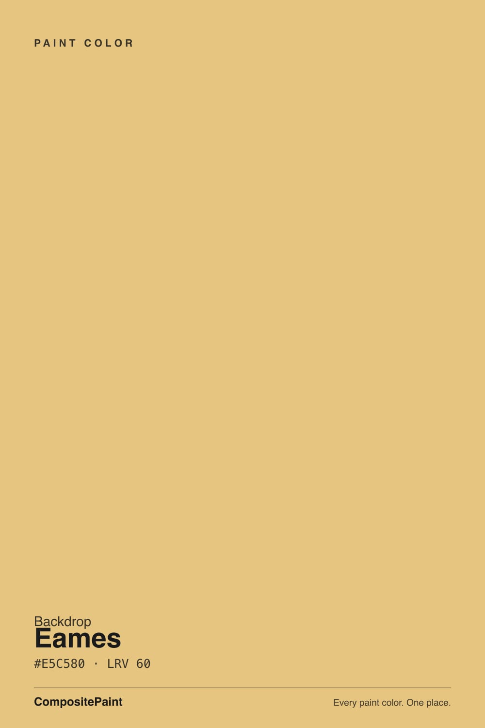
A light honey-gold, not a butter cream and not a 1970s mustard. The name is the brief: Charles and Ray Eames, Case Study houses, walnut lounge chairs, ochre against cream and navy. Backdrop filed it as a yellow, and the chip is honest about that — #E5C580 sits in gold-amber, with more red than green, so the undertone is orange-honey rather than lemon. If you were hoping for a yellow that pretends to be a neutral, this is the wrong card.
At LRV 60 it is light enough to bounce daylight around a room, and still chromatic enough that four walls will read as a yellow room from the doorway. That is the useful gap. Creams live up in the 80s and wash out to off-white; deep mustards drop into the 30s and 40s and go brown after dark. Eames holds a clear honey in daylight and then warms a step more orange under lamps. Plan for the wall to look richer, and more gold, than the peel-and-stick — yellow always does this once it wraps a room.
Undertone in one line: orange-gold first, honey second — never green-lemon, never beige. If your sample goes sickly or olive, the light is cool; if it goes peach or pumpkin, that is west sun or 2700K bulbs pushing the orange. Both versions are the same paint telling on the room.
Where It Shines
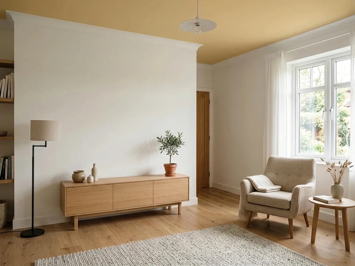
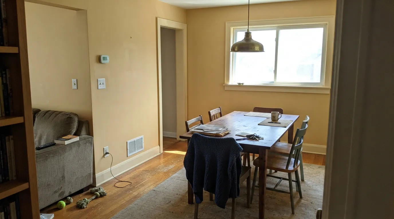
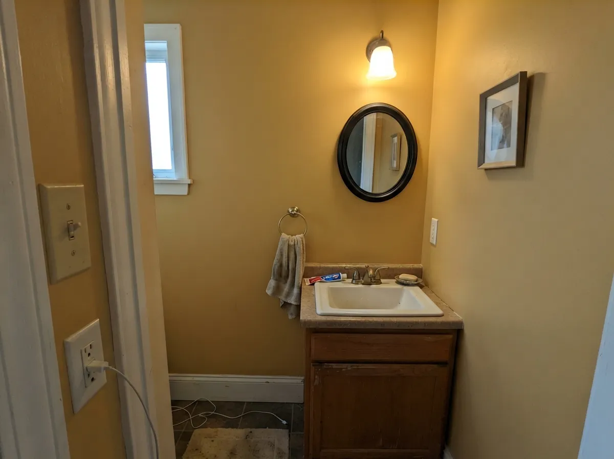
Give it real daylight, walnut, and a room that was already going to be yellow, and Eames is one of the better honey-golds you can still buy. Dining rooms are its natural habitat: the color flatters wood tables, brass, and evening lamps the way a mid-century ochre is supposed to. Its second home is the contained surface — a kitchen island, lower cabinets, a powder room, one living-room wall behind a credenza — where the gold reads custom instead of themed. Pair it with cream linen, teak or walnut, navy or khaki-olive, and black metal, and it looks like 1958 on purpose.
Where It Fails
Almost every regret story about a honey-yellow follows one of three scripts, and all three are visible before you open the can. None of them are the paint's fault — but if your room matches one, this is not your color, and a bigger sample will only confirm it.
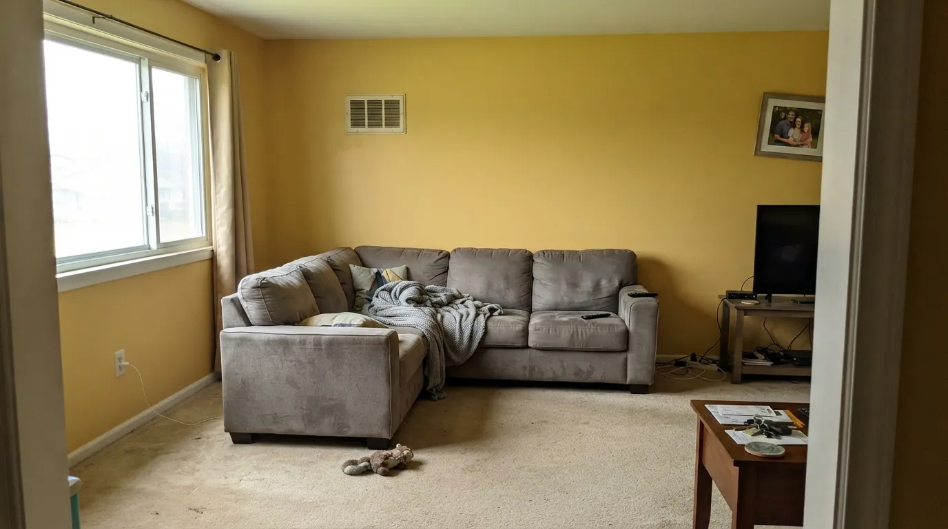
On a two-inch chip Eames can pass for honeyed plaster. On four walls the yellow is unmistakable, and it bounces gold onto the ceiling, the trim, and everyone's faces. If your goal was "a little warmth," you will get a yellow room. Hay or a true cream will do the quiet version; Eames will not.
Cool daylight and 4000K bulbs strip the honey and leave a dingy green-gold that readers of every similar yellow call mustard, nicotine, or sickly. The orange undertone has nothing warm to bounce off, so the wall goes cheap. Warm 2700K lamps are part of this paint job. If the room is dim and you will not add lamps, pick a color that does not depend on warmth.
Yellow on yellow is a soup, not a scheme. Golden oak floors, honey-stained trim, builder-beige carpet and Eames walls melt into one ochre field — no edge, no contrast, a lot of 1970s. Walnut, teak, espresso, and pale white oak give it something to play against. If the honey floor is staying, put a large rug down or pick a navy or olive instead.
Room by Room
This is the room the color was named for. South or west light, a walnut table, brass, cream linen — Eames looks like a decision, not a mood board. Semi-matte on the walls; Jane or White Dove on the trim so the gold stays gold instead of looking dirty next to a stark white.
One wall behind a credenza or bookcase is the designer move; four walls is a commitment. It works in a closed living room with walnut, a navy sofa, and real daylight. In an open plan it will tint the kitchen and hall gold, so sample at the doorway, not just on the feature wall.
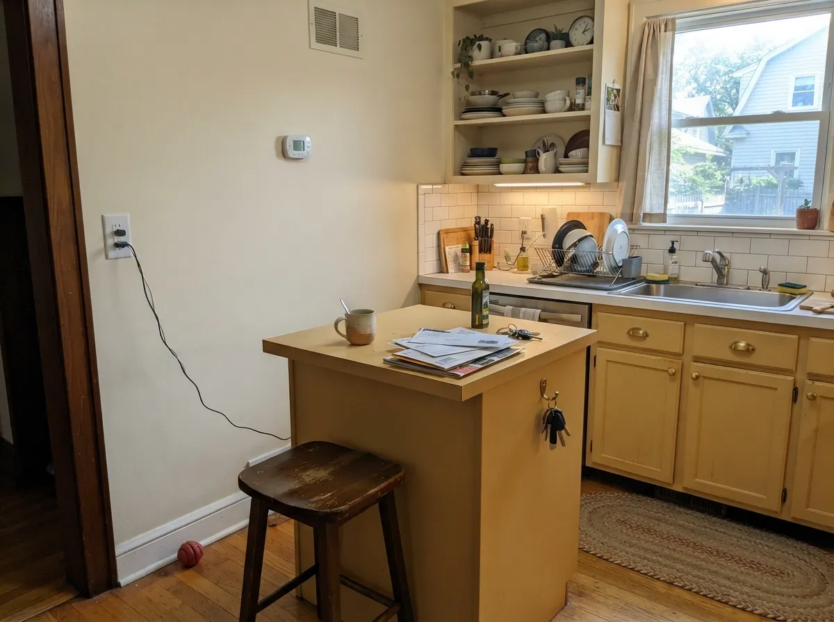
Lower cabinets or an island in Eames under cream walls is the mid-century kitchen people actually mean. Semi-gloss for wipe-down. A full kitchen of honey-gold boxes is a strong bet, and a losing one over honey-oak floors. Keep the uppers cream or a soft white.
Small rooms take chromatic color well. Drench the powder room, hang a black or brass mirror, keep the light warm, and it reads jewel-box instead of highlighter. Semi-gloss on the vanity if you paint that too.
Makers and people on camera all day will either love the warmth or hate the bounce. In a south-facing office it is cheerful without being lemon. In a north cave it will look like you painted the walls manila folder. Test at the hour you actually sit there.
A honey bedroom at 7am puts gold on your skin; some people want that, most do not. Full exterior sun punches it toward cheap gold from the curb. The exception is a sunny porch ceiling, where a light yellow is a classic — still sample, because LRV 60 reads louder outdoors than the chip suggests.
Your Light Is the Risk
Warm daylight is the light this gold was mixed for. The honey reads clean and expensive, not mustard, and the orange stays in check. Sample here first.
Cool gray daylight kills the honey and leaves a dingy green-gold. Fine if you half-wanted mustard; disappointing if you wanted warmth. Do not commit from a north-facing sample board.
Quieter and more straw-like in morning light; distinctly more orange through a west afternoon. The shift is real — live with a big sample at 5pm before you paint the dining room.
2700K bulbs push it richer and more honey, which most people want. Cool white LEDs (3500K and up) pull a cheap chartreuse-mustard. Swap the bulbs before you blame the paint.
Most complaints about Eames are a light mismatch. Upload a photo of your actual room and see it on your walls — then ask for the same wall in north light or evening lamps before you buy a single sample.
Need It From Another Brand?
Any paint counter can custom-tint Backdrop BD-EA directly. If you would rather stay in one brand's own deck, these are the closest stock matches, measured as ΔE2000. Under 2 is a difference you will not see on the wall.
| Brand | Closest color | ΔE | LRV | |
|---|---|---|---|---|
| Sherwin-Williams | White RaisinSW 7685 · Sherwin-Williams | 3.5 | 57 | Color page → |
| Behr | Golden ThreadMQ4-13 · Behr | 1.9 | 57 | Color page → |
| Benjamin Moore | Da Vinci's Canvas208 · Benjamin Moore | 2.1 | 56 | Color page → |
| Valspar | Home Brew8002-24C · Valspar | 2.4 | 61 | Color page → |
| PPG / Glidden | Gold BuffPPG1208-4 · PPG / Glidden | 2.3 | 59 | Color page → |
| Glidden | Autumn GlowPPG1106-3 · Glidden | 1.2 | 57 | Color page → |
Similar Backdrop Colors
The nearest shades to Eames within Backdrop's own range, ranked by perceptual color distance — useful when you want the same look a touch lighter, darker, or warmer.
WCAG 2.1: AA is 4.5 : 1 for normal text, 3 : 1 for large text, AAA is 7 : 1.
Eames vs the Colors You're Also Considering
Every Eames sample board has the same rivals on it. The numbers show the real lightness gap — then it comes down to which risk you would rather live with.
Pick this for the mid-century framing and Backdrop's finish, without the 2003 kitchen association.
Pratt & Lambert 16-7 · LRV 60Tuscan SunPick this if you want this same golden yellow at a traditional dealer — and can live with the Tuscan-kitchen baggage the name still carries.
Pick this when you want more honey and less lemonade, and you are fine being clearly gold.
Benjamin Moore HC-4 · LRV 71Hawthorne YellowPick this if you want the paler, more Colonial butter yellow — grown-up, still yellow, a step closer to cream.
Within Backdrop's own deck, the closest neighbors are lighter and far less saturated, which is exactly the practical difference to understand.
Cookies & Cream (BD-CC), LRV 73, is what you get if you drain most of the yellow out of Eames. It reads as a warm cream, a background color you stop noticing after a week. Choose it when you want the warmth of Eames across a whole home without the color ever announcing itself; choose Eames when you want the walls to be part of the design.
Don't Eat the Yellow Snow (BD-DS), LRV 84, is paler still, essentially a yellow-tinted off-white. It suits ceilings and low-light rooms where Eames would feel heavy.
Real Real (BD-RR), LRV 65, sits closest to Eames in lightness but leans greige rather than gold. In a side-by-side test, Real Real recedes and Eames advances. If your room already has strong color in furniture or art, Real Real defers to it; Eames competes with it.
Eames Coordinating Colors
The rule for coordinating with Eames: cream, navy, khaki-olive, and near-black — and keep other yellows and cool grays at arm's length. It wants walnut and brass more than it wants beige. These are the partners that keep a honey-gold room from looking themed:
Why It Is Called Eames
Backdrop names colors after cultural shorthand, and this one is aimed at a very specific mood: Charles and Ray Eames, molded plywood, the lounge chair, Case Study House No. 8. Mid-century interiors used ochre and honey against walnut, cream, and navy because those colors photographed well in California daylight and made wood look richer. Eames the paint is trying to bottle that, not to match a documented room at the Eames House.
That matters for how you should buy it. This is not a Color of the Year, not a viral TikTok yellow, and not a color with a decade of Houzz threads. It is a small-brand honey-gold with a good name. If the mid-century brief is actually your house — walnut, splayed legs, a dining room you use at night — the name is a fair warning. If you just liked a warm chip at the store, you may have wanted Hay or a cream.
Eames With Wood Tones and Floors
This decision gets made at the floor. Walnut and teak are the color's best friends — the red-brown depth makes the honey read designed instead of leftover. Espresso and painted-black floors are high-contrast and very mid-century. Pale white oak is safe and a little more current; the gold sits next to it instead of melting into it.
The honest no is already-golden wood: honey oak, orange-stained pine, yellow-beige carpet. Two yellows in the same value range cancel each other's edges. If that floor is staying, a large flatweave rug in cream or navy can split them, or you skip Eames and put Hale Navy or Old Soul on the walls so the floor can be the warm thing.
Metals are easy: unlacquered brass, aged bronze, and matte black all belong. Polished chrome and satin nickel go cold against the orange and make the yellow look louder. Keep the bulbs at 2700K so the honey stays honey after dark.
Three Ready Palettes Built on Eames
A color is never alone on the wall. These are complete combinations in the 60-30-10 pattern, with the reason each one holds together. Every one opens in the visualizer.
Honey, cream, and a near-black is the mid-century triad: Eames carries the color, Jane keeps the edges soft the way White Dove would, and After Hours (a charcoal that only tells on itself in daylight) stops the scheme from looking like a yellow box. Walnut furniture does the rest.
Try this palette in your roomCream walls let the gold stay on the boxes, which is where honey yellow belongs in a kitchen. Cookies & Cream is a known warm cream; Old Soul is the khaki-olive that rewards the same good light Eames wants. Brass pulls, walnut stools, no honey-oak floors.
Try this palette in your roomNavy is ochre's classic partner — Hale Navy still reads navy, and it grounds a gold room so the walls do not float. Jane on the trim keeps both colors from looking dusty against a stark white. This is the dining room that photographs like a catalog and still works at Tuesday dinner.
Try this palette in your roomEames FAQ
Is Eames yellow or gold?
Both, and that is the point. It is a light honey-gold with an orange undertone, not a lemon and not a cream. On four walls nobody will call it beige. If you need a yellow that can pass as a warm neutral, look at Hay instead.
What trim white goes with Eames?
A warm, soft white — Backdrop Jane is the in-house match (it is the closest thing to White Dove in this deck), or Benjamin Moore White Dove if your painter is already in that can. A crisp cool white like Chantilly Lace makes the gold look cheaper and more mustard against the hard edge. Semi-gloss on the trim, Backdrop's Standard semi-matte on the walls.
Can I paint a whole living room Eames?
You can. You should only do it if you want a yellow living room. At LRV 60 it will not go dark, but it will bounce gold onto everything in the space, including adjacent rooms in an open plan. One wall or a dining room is the lower-risk version of the same idea.
Does Eames work with oak floors?
Depends on the oak. Walnut, teak, espresso, and pale unstained white oak are the partners it was mixed for. Golden honey oak is the clash: two yellows, no contrast, a lot of harvest-gold soup. A large rug can split them; if the floor is staying honey, pick navy or olive for the walls.
Will it look mustard in a north-facing room?
It might. Cool north light strips the honey and leaves a dingy green-gold, which is the classic failure mode of orange-based yellows. Warm 2700K lamps help after dark but will not fix gray daylight. Sample on the actual wall and look at it at noon on an overcast day before you commit.
Is this a Color of the Year or a famous designer yellow?
No. Backdrop does not run a Color of the Year, and Eames is a small-deck DTC yellow with almost no published owner photos. The name nods at Charles and Ray Eames; it is not a documented match to the Eames House. Treat it as a honey-gold that has to earn the room on its own merits.
Have you painted with Eames?
Rate it — one tap helps the next reader decide.
Ask a Question