Cookies & Cream
Backdrop's warm cream neutral, reviewed honestly: how close it really is to Dover White and Bone White, the one wall sheen you don't get to choose, and where the light turns it flat.

Jessica has spec'd whites and neutrals for more than 300 rooms and keeps a sample wall of painted drawdowns in her studio. Every color review is checked against real reader rooms in the comments and re-tested when a formula changes. About the testing process →
- 1Agreeable Gray60
- 2Balboa Mist66
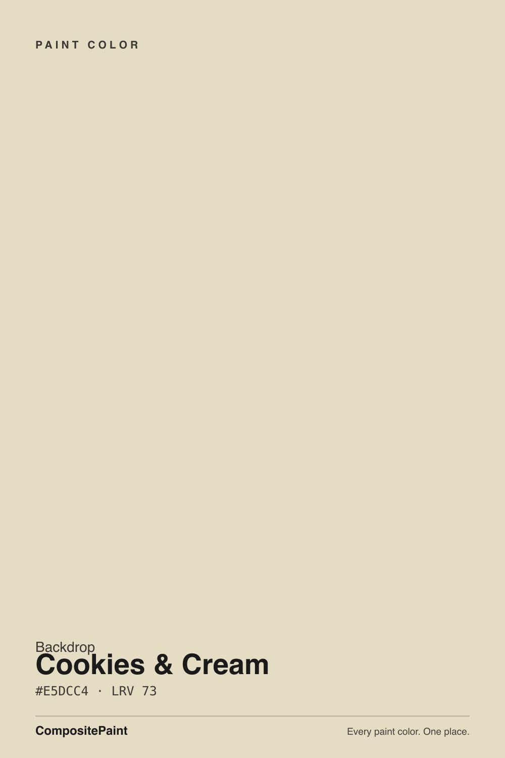
- 3Cookies & Cream73
- 4Shoelace78
- 5Dover White83
The Fast Verdict
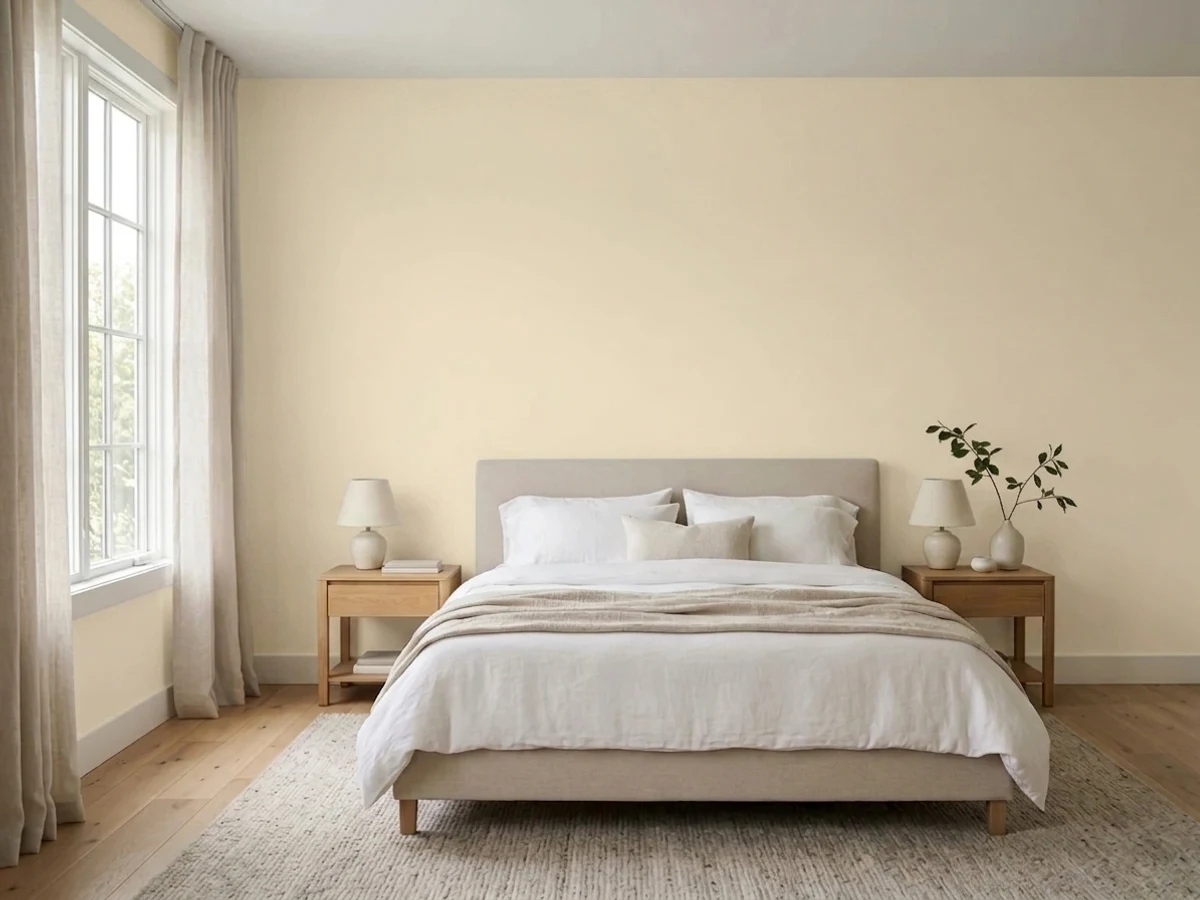
Cookies & Cream is Backdrop's answer to a category every paint brand already has: the safe, warm, buttery cream neutral. It's soft, it's genuinely warm without tipping yellow, and at LRV 73 it brightens a room without going stark. What it isn't is unique — put it next to Sherwin-Williams Dover White or Benjamin Moore Bone White and you will struggle to tell them apart. You're not buying a color nobody else has; you're buying Backdrop's small, curated deck and its DTC packaging around a color that already exists three other places.
Whole-house warm neutral for anyone who wants a tiny, pre-curated color card instead of 3,500 chips · living rooms and kitchens with warm wood and brass · a matched walls-and-trim look using Backdrop's Standard + Semi-Gloss lines · shoppers who already like Backdrop's other colors and want one deck for the whole house
You want a choice of wall sheen — Backdrop sells one · your kitchen or bath needs a scrubbable, grease-resistant finish · you're comparing on price — the near-identical shade costs less at Sherwin-Williams or Benjamin Moore · your room is a dim, north-facing space with no warm lamps
- Warm, buttery cream that reads finished without ever going yellow
- LRV 73 keeps a room bright while still giving the walls real color
- Backdrop's small 74-color deck is pre-curated, so pairing colors together is close to foolproof
- Matching Semi-Gloss trim and Cabinet & Door enamel are sold in the identical shade
- Flatters warm wood, brass, and cream textiles the way any good warm cream does
- No eggshell or satin option — Backdrop sells exactly one wall sheen for this color
- Costs more per gallon than a near-identical shade at Sherwin-Williams or Benjamin Moore
- Virtually indistinguishable from Dover White, Bone White, and Almond Wisp — you're paying for the deck and the brand, not a unique color
- "One-coat" marketing rarely holds on a real color change; budget for two coats
What Color Is Cookies & Cream, Really?
Cookies & Cream is the light half of the sundae-shop name: a soft, buttery cream with a warm yellow-tan undertone — no pink, no gray — that behaves like dozens of other warm creams already sitting in the Sherwin-Williams and Benjamin Moore decks, because functionally it is one. Backdrop is a direct-to-consumer paint startup built around a single edited deck of 74 named colors, no fan decks, no wall of 3,500 chips at the hardware store, and a warm neutral cream was always going to be one of the 74. Every major line needs its version of this color; Cookies & Cream is Backdrop's.
At LRV 73 it sits in almost exactly the same reflectance band as Sherwin-Williams Dover White (also LRV 73) and Benjamin Moore Bone White (also LRV 73) — not a coincidence of marketing, a coincidence of formula. Line up the hex codes and the gap nearly disappears: Dover White is #E8DEC9, Bone White is #E5DFCB, Cookies & Cream is #E5DCC4. On a wall, the difference between these three colors is smaller than the difference daylight makes to any single one of them. What you are actually paying for with Cookies & Cream is Backdrop's smaller curated deck, its packaging, and its no-choice-paralysis pitch — not a shade nobody else sells.
Undertone in one line: warm yellow-tan, the classic "cream" family — never pink, never green, never truly gray. If it reads flat or slightly gray on your wall, that's your light doing it, not the base color.
Where It Shines
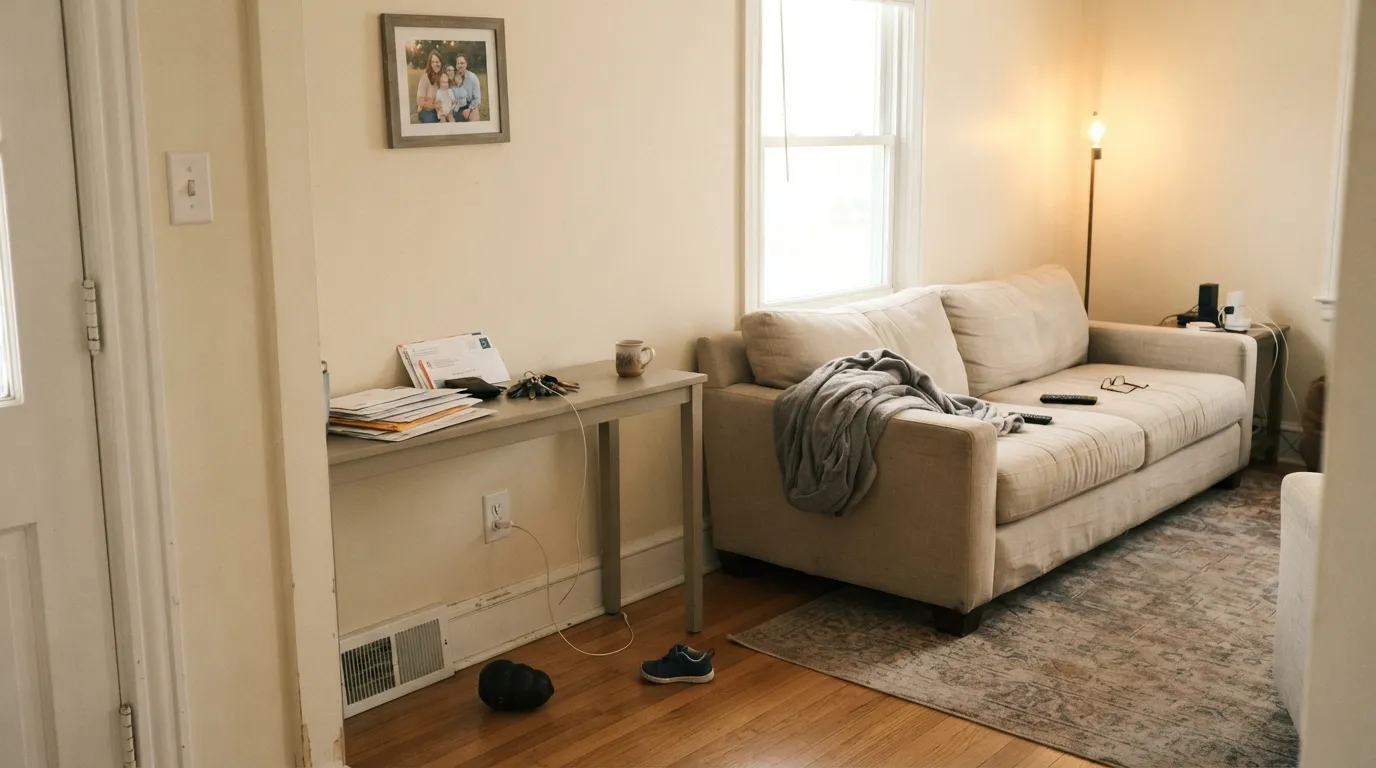
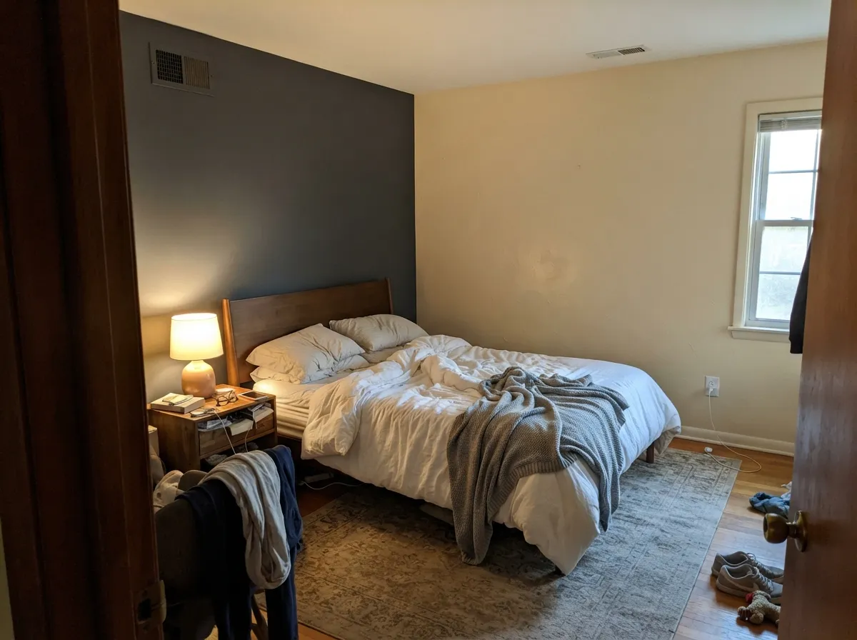
Give it real daylight and it does what every color in this family does well: warms up a room without tipping yellow, and gets along with almost any wood tone in the house. Its real selling point, though, isn't the color itself — it's the deck around it. Backdrop only sells 74 colors, all pre-tested to coordinate with one another, so a Cookies & Cream living room paired with another Backdrop shade is close to foolproof in a way scrolling thousands of Sherwin-Williams or Benjamin Moore chips is not. It's also one of the few DTC colors with a matched trim sheen and a matched cabinet enamel sold in the identical formula, which makes the classic "one-color room" easy to execute without color-matching a second brand.
Where It Fails
Almost every regret story with a warm cream in this exact reflectance band comes down to the same three things — Dover White, Bone White, and every other color like it gets the identical complaints — plus one that's specific to how Backdrop sells paint.
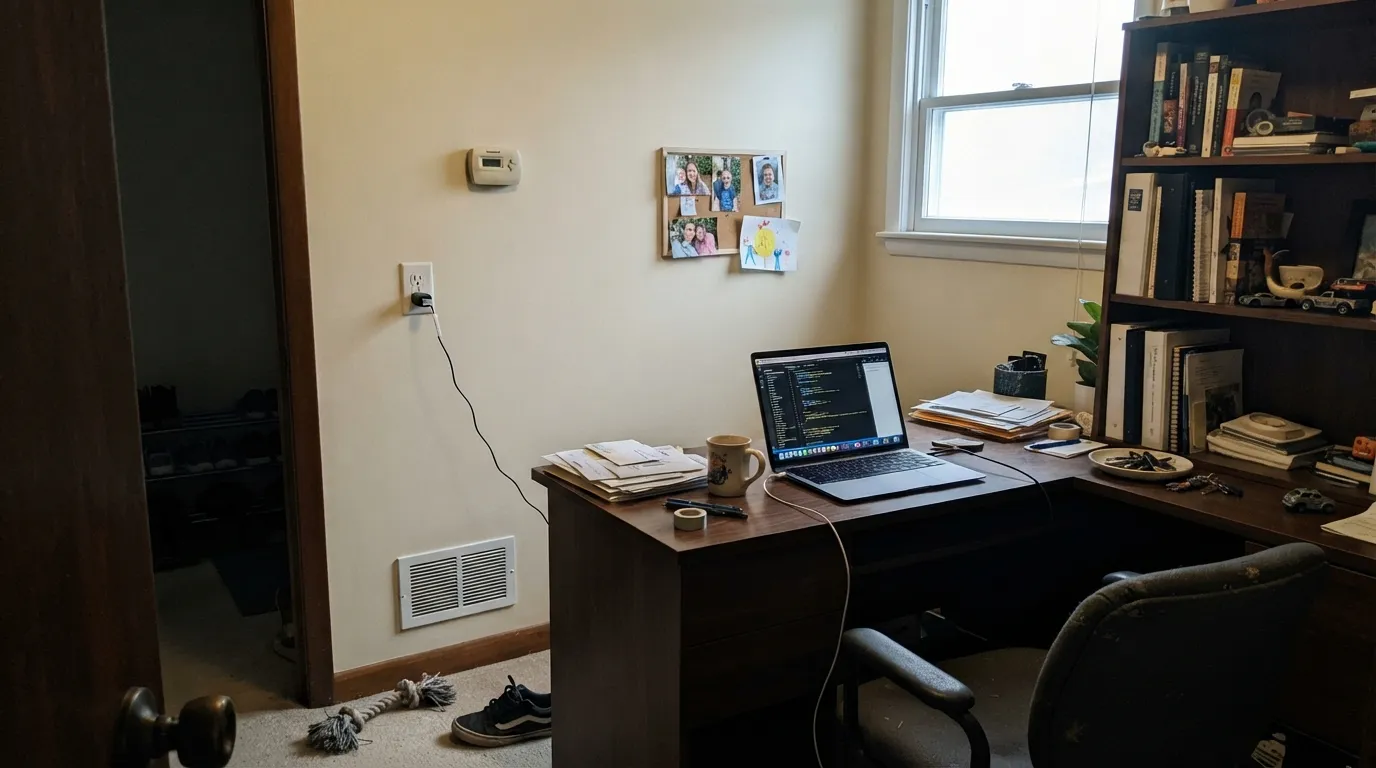
Cool north daylight strips the warmth out of every color in this family — it happens to Dover White, Bone White, Shoji White, all of them — and Cookies & Cream is no exception. Without a warm lamp running, it goes flat and slightly gray instead of buttery. Sample it in your actual room, in your actual light, before committing a whole house to it.
Set next to a brighter white — trim, a neighboring wall, a white countertop — Cookies & Cream will read dingy by comparison, the same complaint every soft cream gets. If white was the goal, this was never the right pick; look at an actual near-white instead of a cream wearing a white-adjacent name.
Backdrop markets one-coat hide, but real owner reports of Backdrop's line — and Backdrop's own application guidance — call for two coats on any genuine color change, and more over anything dark. Budget for two coats; the per-room math changes once you do.
Room by Room
Warms up wood furniture and neutral upholstery without turning the room yellow. It needs actual daylight or warm lamps to do this; a dim, artificially-lit room will read flatter than the sample.
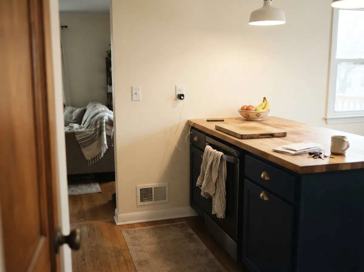
Reads calm and buttery against oak, walnut, and brass hardware. Since Backdrop's Standard finish isn't built for heavy grease scrubbing, use the Cabinet & Door enamel (same color) on cabinets rather than the wall paint.
Under 2700K lamps it turns genuinely cozy at night. In a north-facing bedroom with only overhead cool light, it will look duller than expected — swap the bulbs before you swap the paint.
Plays well with a walnut table and a brass fixture, the same combination that flatters nearly every warm cream in this family. Nothing about it is dining-room-specific; it's simply a dependable warm neutral.
Backdrop's Semi-Gloss trim line is sold in the identical Cookies & Cream formula, so a one-color room — walls in Standard, trim and doors in Semi-Gloss — is a genuinely easy match. That coordination is the deck's real advantage over mixing brands.
Backdrop does sell Standard and Semi-Gloss exterior lines pulled from the same 74-color deck, so Cookies & Cream is technically available outside. We could not find real exterior photos or owner reports of this color on a facade — order a large sample and test it against your actual siding and trim before committing.
Your Light Is the Risk
Glows warm and buttery all day without slipping into yellow. The most flattering light this family of colors gets.
Cool, gray daylight drains the warmth and leaves a flatter, slightly gray cream. Sample first if your room faces north.
Warmer and more buttery at the sun hours, quieter and more neutral once the direct light passes. A normal, gentle shift.
2700K lamps: cozier and more cream-forward. Cool white LEDs: flatter and slightly gray — change the bulbs before you second-guess the paint.
Most complaints about Cookies & Cream are a light mismatch. Upload a photo of your actual room and see it on your walls — then ask for the same wall in north light or evening lamps before you buy a single sample.
Need It From Another Brand?
Any paint counter can custom-tint Backdrop BD-CC directly. If you would rather stay in one brand's own deck, these are the closest stock matches, measured as ΔE2000. Under 2 is a difference you will not see on the wall.
| Brand | Closest color | ΔE | LRV | |
|---|---|---|---|---|
| Sherwin-Williams | Antique WhiteSW 6119 · Sherwin-Williams | 1.9 | 72 | Color page → |
| Behr | Desert PlainECC-21-1 · Behr | 1.4 | 73 | Color page → |
| Benjamin Moore | Ivory Porcelain239 · Benjamin Moore | 0.5 | 72 | Color page → |
| Valspar | Daybreak6008-3A · Valspar | 1.0 | 71.2 | Color page → |
| PPG / Glidden | IrresistiblePPG1094-1 · PPG / Glidden | 0.5 | 72 | Color page → |
| Glidden | Almond PastePPG1103-2 · Glidden | 1.0 | 71 | Color page → |
Similar Backdrop Colors
The nearest shades to Cookies & Cream within Backdrop's own range, ranked by perceptual color distance — useful when you want the same look a touch lighter, darker, or warmer.
WCAG 2.1: AA is 4.5 : 1 for normal text, 3 : 1 for large text, AAA is 7 : 1.
Cookies & Cream vs the Colors You're Also Considering
Every Cookies & Cream sample board has the same rivals on it. The numbers show the real lightness gap — then it comes down to which risk you would rather live with.
Pick this if you specifically want Backdrop's curated deck and matched trim/cabinet lines in the identical shade.
Sherwin-Williams SW 6385 · LRV 73Dover WhitePick this if you want essentially the same color at a lower price and with an eggshell or satin sheen option on walls.
Pick this for Backdrop's small-deck simplicity and the matching Semi-Gloss trim in the same formula.
Benjamin Moore OC-23 · LRV 73Bone WhitePick this for the same warm cream from a brand with a far bigger, more established color card and dealer network.
Within Backdrop's deck, the closest calls are Real Real (BD-RR) and Don't Eat the Yellow Snow (BD-DS).
Real Real sits at LRV 65, noticeably deeper, and it is grayer and quieter, closer to a greige. Side by side, Cookies & Cream looks sunnier and creamier while Real Real looks calmer and more muted. Pick Real Real for a very bright, sun-blasted room where Cookies & Cream might read too golden; pick Cookies & Cream for average or dim light, where Real Real can go murky.
Don't Eat the Yellow Snow, at LRV 84, is a big step lighter, essentially a warm off-white with a similar cream character. It suits people who want the same warmth but barely-there color, or a ceiling and wall pairing with Cookies & Cream on the walls. Jane (BD-JA), at LRV 86, is lighter still and less yellow, a near-white that works when you want warmth you sense rather than see.
Cookies & Cream Coordinating Colors
The easiest way to coordinate with Cookies & Cream is to stay inside Backdrop's own 74-color deck — every color in it was chosen to sit together, so the guesswork most palettes require is mostly done for you. Outside the deck, it behaves like any warm cream: it wants warm woods, brass, and darker warm neutrals, and it argues with anything icy or blue-gray.
Why a Startup Paint Brand Needed Its Own Cream White
Backdrop's whole pitch is the opposite of the traditional paint aisle: instead of thousands of chips organized into fan decks nobody can navigate alone, it sells 74 named colors, period, ordered online, with a matched trim sheen and a matched cabinet enamel for each. A warm, dependable cream neutral is the single most-requested category in every major paint line — it's what White Dove, Dover White, and Bone White exist to answer — so Backdrop's deck was never going to skip it. Cookies & Cream is that entry.
We could not find independent designer write-ups, Houzz threads, or Reddit reports specifically about this color by name — Backdrop is a small enough brand, and this a quiet enough neutral, that it hasn't built up the public track record a color like White Dove has over two decades. That's an honest gap, not a red flag: the hex and LRV place it squarely inside a well-documented, well-behaved family of warm creams, and everything in this review about its light behavior and pairings is grounded in that family's established, repeated pattern across brands — not in specific testimonials about this exact can.
Cookies & Cream With Wood Tones and Floors
Warm wood is this color's best company. Oak, walnut, and butcher block all sit comfortably against Cookies & Cream because the paint's own warmth meets the wood halfway — the same relationship every warm cream in this reflectance band has with warm floors.
Cool, gray-washed or gray LVP flooring is the one combination worth sampling first. Against a cold gray floor, the warmth in Cookies & Cream can read slightly yellow by comparison. It's rarely a dealbreaker — a warm rug and some brass hardware usually settle the argument — but test a large sample above your actual floor before committing a whole room.
Three Ready Palettes Built on Cookies & Cream
A color is never alone on the wall. These are complete combinations in the 60-30-10 pattern, with the reason each one holds together. Every one opens in the visualizer.
All three colors come from the same 74-color Backdrop deck, so the pairing is pre-vetted rather than guessed at: the warm cream walls stay light and easy, North End's near-black green gives the front door real weight, and Old Soul's khaki-olive warms the kitchen without introducing a fourth undertone to manage.
Try this palette in your roomThe navy island supplies the one dark, saturated note the scheme needs, and a genuinely bright trim white keeps the warm cream walls from reading dull or dingy — the same fix every soft cream needs when it's paired with a brighter white on purpose instead of by accident.
Try this palette in your roomCookies & Cream keeps most of the room soft and warm during the day; Kendall Charcoal on one wall adds the single dark note a calm bedroom can carry without tipping moody. White Dove trim ties both back together without the harsh edge a stark white would give.
Try this palette in your roomCookies & Cream FAQ
Is Cookies & Cream basically the same as Sherwin-Williams Dover White?
Close enough that most people can't tell them apart on a wall. Both sit at LRV 73 with nearly identical warm yellow-tan hex codes. The real difference isn't the color — it's that Backdrop sells it inside a small, curated 74-color deck with matched trim and cabinet formulas, while Dover White is one shade in Sherwin-Williams's much larger, cheaper-per-gallon system.
Is Cookies & Cream warm or cool?
Warm — a straightforward yellow-tan cream with no pink and no gray in it. It only reads flat or cool-ish in dim north light without a warm lamp running.
Does Backdrop sell trim and cabinet paint in this same color?
Yes. Backdrop's Semi-Gloss line covers trim and doors, and its separate Cabinet & Door enamel covers cabinetry — both sold in the identical Cookies & Cream formula, which is the easiest way to run a true one-color room.
Is Backdrop worth the price for a color like this?
Depends what you're buying. If you want the curated 74-color deck, the matched trim and cabinet lines, and the DTC ordering experience, it's a fair trade for a premium price. If you just want this exact warm cream on your walls for less money, Dover White or Bone White will get you there for less.
Will it look yellow in strong sun?
It will warm up and glow more in direct south or west light, the way every color in this family does, but the grayed-down base keeps it from tipping into true butter-yellow. It reads warm, not yellow, in normal daylight.
Does it work with honey oak floors?
Yes — warm wood is this color's best company, and honey oak is warm wood. It's cool, gray-washed floors that need a sample first; the warmth in the walls can look slightly yellow against a cold gray floor.
Have you painted with Cookies & Cream?
Rate it — one tap helps the next reader decide.
Ask a Question