Antique White
Sherwin-Williams' most committed cream, reviewed honestly: the traditional kitchens it was built for, the light that pushes it orange, and the exact moment 'antique' turns into 'dated.'

Jessica has spec'd whites and neutrals for more than 300 rooms and keeps a sample wall of painted drawdowns in her studio. Every color review is checked against real reader rooms in the comments and re-tested when a formula changes. About the testing process →
- 1Agreeable Gray60
- 2Balboa Mist66
- 3Antique White72
- 4Pearly White77
- 5Dover White83
The Fast Verdict
Antique White is not a white you drift into by accident — it is a decision. At LRV 72 it is a real, deep cream with a rich yellow-orange undertone, built for traditional and French-country kitchens with warm wood and brass. Give it the room it was made for and it looks intentional and old-house-handsome. Put it in a bright, modern space next to white appliances and it reads like leftover 1990s cabinet paint.
Traditional or French-country kitchen cabinets · oak, maple, or cherry wood tones · rooms with brass hardware and warm daylight · anyone deliberately chasing a warm, old-house cream
You searched for "a white kitchen" and mean it · your appliances, counters, or backsplash are bright white or stainless · your room gets strong west or south afternoon sun · you want the color to read modern, not traditional
- A genuinely warm, deep cream — reads as a real style choice, not a compromise white
- Flatters oak, maple, cherry cabinets, and brass hardware
- Classic French-country and traditional-kitchen pedigree
- LRV 72 hides scuffs and fingerprints on cabinets better than a bright white
- A deliberate, cozy backdrop for rooms furnished in real wood
- Not a white — expect real, visible yellow-orange, especially in strong sun
- Can read dated next to white appliances, tile, or a brighter trim white
- Too deep an LRV to double as a bright, crisp trim or ceiling white
- Fights cool gray stone, chrome fixtures, and stark modern surroundings
What Color Is Antique White, Really?
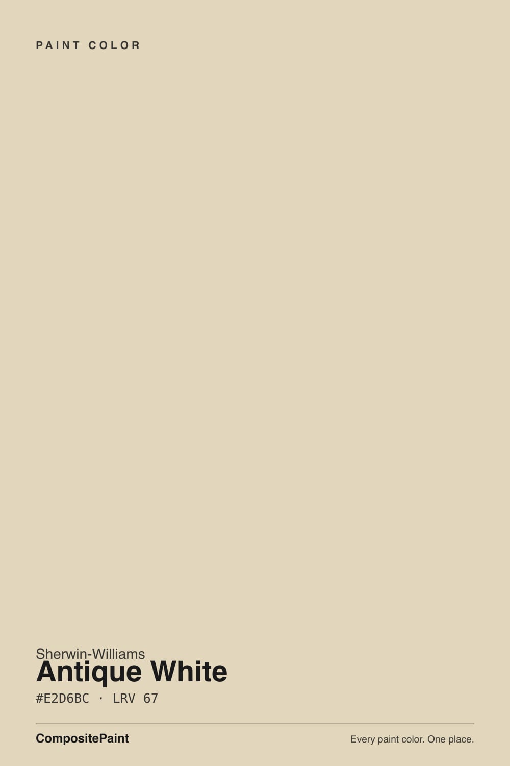
A deep, fully-committed cream with a distinct yellow-orange undertone — not a warm-leaning white, but a cream that stopped apologizing for being a cream. Sherwin-Williams keeps several off-whites at a similar depth (Navajo White, Dover White, Natural Linen), but reviewers consistently place Antique White at the yellowest, most saturated end of that group: warmer and more orange than Navajo White SW 6126, and more saturated than the beige-leaning Natural Linen SW 9109. The name is doing real work here — this is a color built for a specific, traditional aesthetic, not a neutral safe-white default.
At LRV 72 it sits meaningfully below the typical range for a trim or cabinet white in the SW deck — Dover White runs 73, Navajo White 72, Creamy 81. That gap is exactly why some color consultants flag it as an unusual cabinet pick even though it is genuinely popular for cabinets: most buyers browsing "white kitchen" boards expect something closer to LRV 80+, and Antique White simply is not that. It reads as a warm, medium-toned cabinet color, not a bright trim white, and that mismatch between expectation and reality is the root of most complaints.
Undertone in one line: warm yellow-orange, first and last — never gray, never pink. Strong direct sun pushes it further toward tan; the deep, rich end of that shift is the whole reason traditional-kitchen fans reach for it, and the whole reason "I wanted white and got yellow" is the most common regret.
Where It Shines
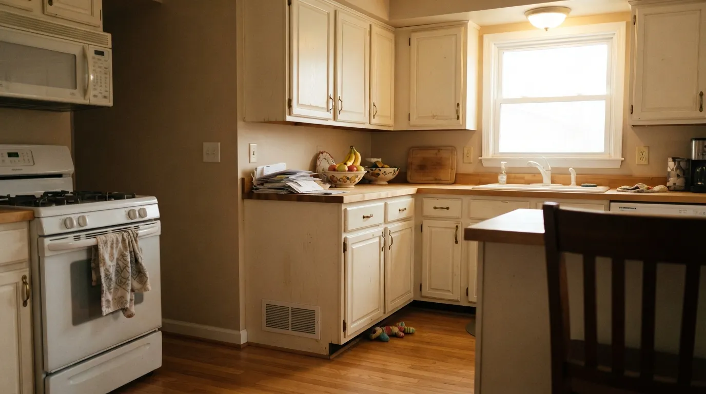
This color earns its keep in a room that already leans warm and old-house. Traditional and French-country kitchens are its home turf: oak or cherry cabinets in Antique White, brass pulls, a butcher-block or warm-stone counter, and it reads custom and collected, not builder-grade. Because it sits at a deeper LRV than most trim whites, it also hides fingerprints and grease around cabinet handles far better than a bright white would — a genuinely practical win in a working kitchen. Its second home is any dining or living room furnished in real wood, where the cream reads as a deliberate, cozy backdrop instead of an accident.
Where It Fails
Almost every regret story about Antique White comes from one of three predictable mismatches, and none of them are the paint's fault — the color is doing exactly what its undertone and LRV say it will do. If your room matches one of these, sample it big before committing.
Antique White's yellow-orange undertone and LRV 72 (well under the ~72-84 range most SW trim and cabinet whites live in) mean it reads as a genuine cream, not a white. Show a painter a bright-white Pinterest board and end up with this color and the mismatch is jarring on day one — this is the single most common complaint about it.
Direct sun deepens the undertone further, pushing it from cream toward tan-orange for the hours the light is strongest. Owners who sampled it on an overcast day are the ones most often surprised by how warm it gets in full afternoon sun.
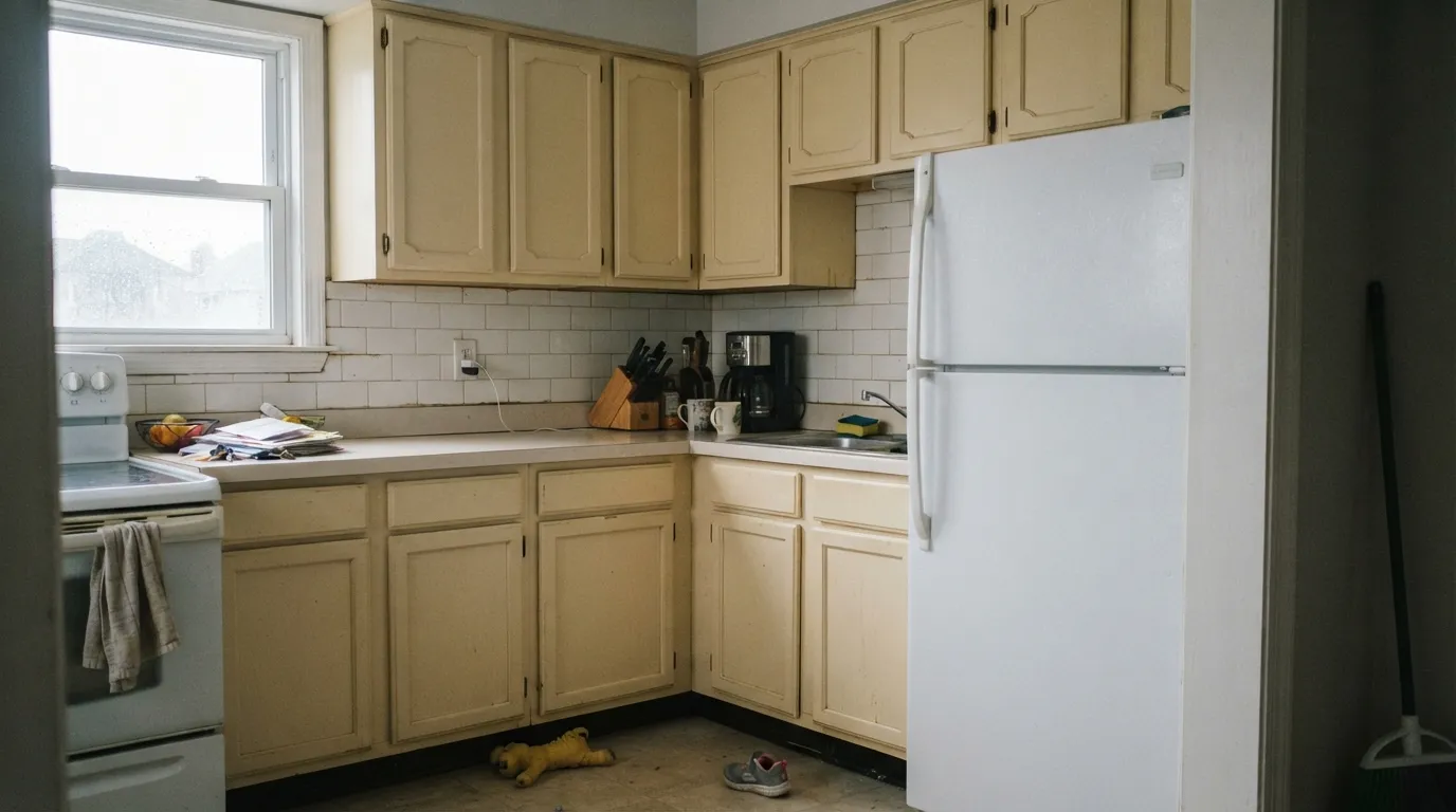
White appliances, white subway tile, or a brighter white trim color sit right beside it and win the contrast — Antique White looks dingy and dated by comparison rather than intentionally warm. This is the classic 1990s-cabinet-versus-new-white-fridge clash. The fix is consistency: keep the appliances, counters, and backsplash on the warm side too, or repaint the trim to match rather than contrast.
Room by Room
This is the room it was made for. On oak, maple, or cherry cabinets with brass hardware it looks like a real design choice, and the deeper LRV hides scuffs and grease better than a bright white. The trap: pair it with white appliances or stark countertops and it looks dated instead of deliberate. Satin or semi-gloss cabinet enamel, always.
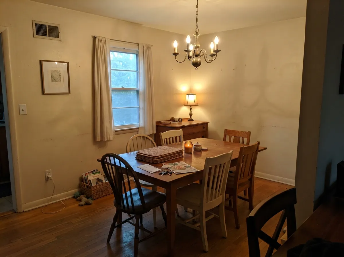
With real wood furniture, warm lamps, and a rug that isn't stark white, it is a calm, collected cream backdrop. In a bright, minimalist, or intentionally modern room it will read old-fashioned rather than classic — know which look you're going for before you commit.
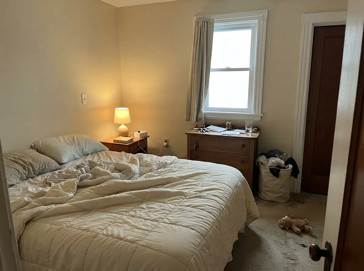
Under warm 2700K lamps it goes soft and cocooning, closer to a cottage feel than a bright, airy one. A dim, north-facing bedroom with no lamp warmth will look flat and dull rather than cozy — this color needs some warm light to do its job.
With a wood vanity, brass fixtures, and warm stone it works. Against bright white subway tile or chrome fixtures it argues with its surroundings and reads dingy — the same clash as the kitchen appliance problem, just tiled.
Because the color itself sits at LRV 72, using it as trim against a brighter wall color makes the trim look like it needs a fresh coat rather than intentionally warm. It works far better as the main color in a warm, monochrome room than as an accent trim against something crisper.
It can work on a full traditional or farmhouse exterior with dark trim and shutters, echoing the same warm-cream siding look many older houses already wear. Paired with bright white porch trim or a modern build, the same dated-versus-crisp clash shows up outdoors that shows up in the kitchen.
Your Light Is the Risk
Diffused daylight keeps the cream balanced and warm without tipping into orange — the most flattering, most honest read of the color.
Direct sun pushes the yellow-orange further, edging the color toward tan for the hours the light is strongest. Sample in that exact light before committing.
Cooler and creamier in the morning, noticeably deeper and warmer by late afternoon. The shift is real, not subtle — expect it.
2700K bulbs push it further toward gold and tan, doubling down on the warmth. Cool white LEDs hold it closer to a plain cream but can flatten the color's character.
Most complaints about Antique White are a light mismatch. Upload a photo of your actual room and see it on your walls — then ask for the same wall in north light or evening lamps before you buy a single sample.
Need It From Another Brand?
Any paint counter can custom-tint Sherwin-Williams SW 6119 directly. If you would rather stay in one brand's own deck, these are the closest stock matches, measured as ΔE2000. Under 2 is a difference you will not see on the wall.
| Brand | Closest color | ΔE | LRV | |
|---|---|---|---|---|
| Behr | Authentic TanN290-2 · Behr | 0.5 | 73 | Color page → |
| Benjamin Moore | Lambskin1051 · Benjamin Moore | 0.8 | 73 | Color page → |
| Valspar | Natural SoapT559 · Valspar | 0.4 | 72.1 | Color page → |
| PPG / Glidden | Heavy CreamPPG1098-2 · PPG / Glidden | 1.4 | 73 | Color page → |
| Glidden | Heavy CreamPPG1098-2 · Glidden | 0.7 | 73 | Color page → |
| Dutch Boy | Antique White011W · Dutch Boy | 0.0 | 72 | Color page → |
Similar Sherwin-Williams Colors
The nearest shades to Antique White within Sherwin-Williams's own range, ranked by perceptual color distance — useful when you want the same look a touch lighter, darker, or warmer.
WCAG 2.1: AA is 4.5 : 1 for normal text, 3 : 1 for large text, AAA is 7 : 1.
Antique White vs the Colors You're Also Considering
Every Antique White sample board has the same rivals on it. The numbers show the real lightness gap — then it comes down to which risk you would rather live with.
Pick this when you want the deeper, more fully-committed cream — Navajo White is the softer, more forgiving version.
Sherwin-Williams SW 6126 · LRV 72Navajo WhitePick this for the same warm-cream family with a slightly lighter, less orange-forward undertone.
Pick this when the room calls for the more saturated, more classically "antique" cream.
Sherwin-Williams SW 9109 · LRV 67Natural LinenPick this if you want the same depth of color but leaning beige rather than straight yellow-cream.
The nearest relatives differ mainly in how much yellow they carry. Steamed Chai SW 9509 at LRV 67 is the same brightness with a slightly softer cast. Irish Cream SW 7537 at LRV 66 is a point darker and reads a touch deeper. Echelon Ecru SW 7574 at LRV 70 and Roycroft Vellum SW 2833 at LRV 71 are lighter, so they read closer to a true off-white on a wall.
Across brands the matches are unusually tight. Dunn-Edwards Sand Dollar DE6171, Behr Scribe MQ2-31 at LRV 69, and Farrow & Ball Matchstick No. 2013 at LRV 67 are all exact color matches on the numbers. Benjamin Moore Mohair 1058 at LRV 67 and Valspar Fennel Splash 6007-3B at LRV 66.9 are visually identical in normal room light. Clare Turbinado PNT100-LT-21 at LRV 66 is very close, so sample it first.
Antique White Coordinating Colors
The rule for coordinating with Antique White is simple: stay warm and stay close in depth. It clashes with cool grays, chrome, and anything bright-white and crisp — and it rewards warm woods, brass, and other creams that don't try to out-white it. These are the partners that keep it looking deliberate instead of dated:
Why "Antique" Is a Style, Not Just a Color
The name is not marketing filler — it tells you exactly what lane this color is in. Antique White is the deepest, most yellow-committed cream among Sherwin-Williams' family of warm off-whites, and it built its popularity in traditional, French-country, and old-house kitchens, not modern ones. That history is also where the color's most common complaint comes from: a whole generation of 1990s and early-2000s kitchens used this exact tone of cream cabinet, and buyers who now associate that look with "dated" are reacting to the era, not a flaw in the paint.
The honest way to use it in 2026 is to lean into that traditional identity rather than fight it: warm wood floors, brass or oil-rubbed-bronze hardware, and a counter or backsplash that doesn't read stark-white. Used that way, it still looks like exactly what it is — a real, confident cream, not an accident.
Antique White With Wood Tones and Cabinets
Warm wood is this color's best partner, full stop. Oak, cherry, and maple cabinetry or trim share its undertone, so the whole room reads as one warm, cohesive palette instead of two competing tones. Butcher block and warm stone counters do the same job at the countertop level.
The pairing to plan around carefully is anything cool or stark: bright white appliances, chrome fixtures, cool gray quartz, or a brighter white trim color all sit at the opposite temperature and expose the cream as "yellow" rather than "warm." If those elements are already fixed in your kitchen, sample a large board of Antique White right next to them before committing to a full repaint.
Three Ready Palettes Built on Antique White
A color is never alone on the wall. These are complete combinations in the 60-30-10 pattern, with the reason each one holds together. Every one opens in the visualizer.
Two warm creams at different depths keep the cabinet-to-wall handoff seamless instead of contrasty, and the dark charcoal island gives the eye one grounded, deliberate note so the room reads designed, not dated.
Try this palette in your roomLinen walls and cream trim sit at the same depth so nothing looks mismatched, and the warm brown door supplies one confident dark note in the same warm family — nothing here fights Antique White's undertone.
Try this palette in your roomWhite Dove is warm enough to trim Antique White without the brighter-white clash that dulls it elsewhere in the house, and October Mist adds one quiet sage note for a cottage bedroom that feels layered rather than monochrome.
Try this palette in your roomAntique White FAQ
Is Antique White actually white?
No — despite the name, it is a genuine deep cream with a strong yellow-orange undertone. At LRV 72 it sits well below the typical range for a white paint. If you want an actual white, look at a color with LRV 80 or higher instead.
Is it good for kitchen cabinets?
It's one of the more popular traditional cabinet creams in the SW deck, and it genuinely flatters warm wood and brass. The catch: it works best when the appliances, counters, and backsplash are also warm-toned. Next to bright white appliances it can look dated rather than intentional.
What trim goes with Antique White walls or cabinets?
Stay warm and close in depth — Dover White or Navajo White (SW 6126) both work as a softer, lighter trim without the jarring contrast a brighter white creates. Avoid a stark white trim; it will make Antique White look dingy by comparison.
Does Antique White look dated?
It can, and that risk is real — the color is strongly associated with 1990s and early-2000s traditional kitchens. Whether that reads as "dated" or "classic" depends entirely on the rest of the room: paired with modern white appliances it looks old; paired with consistent warm wood, brass, and stone it reads as an intentional traditional style.
Will it look too yellow in my room?
In a dim or north-facing room, less so — the undertone is muted without strong light. In a room with real west or south afternoon sun, expect the yellow-orange to intensify noticeably by late afternoon. Sample it in your actual light before committing to cabinets.
Can I use it on an exterior?
It can work on a fully traditional or farmhouse exterior with dark trim and shutters, echoing older warm-cream siding. On a modern build or next to bright white porch trim, the same dated-versus-crisp clash that shows up indoors shows up outside too.
Have you painted with Antique White?
Rate it — one tap helps the next reader decide.
Ask a Question