Almond Wisp
A warm cream-beige with almost no chatter under its own name — no Color of the Year run, no viral room, barely a forum thread. Here's what it actually does on a wall, and which Behr sibling to grab if this one leaves you flat.

Jessica has spec'd whites and neutrals for more than 300 rooms and keeps a sample wall of painted drawdowns in her studio. Every color review is checked against real reader rooms in the comments and re-tested when a formula changes. About the testing process →
- 1Mindful Gray48
- 2Revere Pewter55
- 3Almond Wisp60
- 4Pale Oak69
- 5Shoji White74
The Fast Verdict
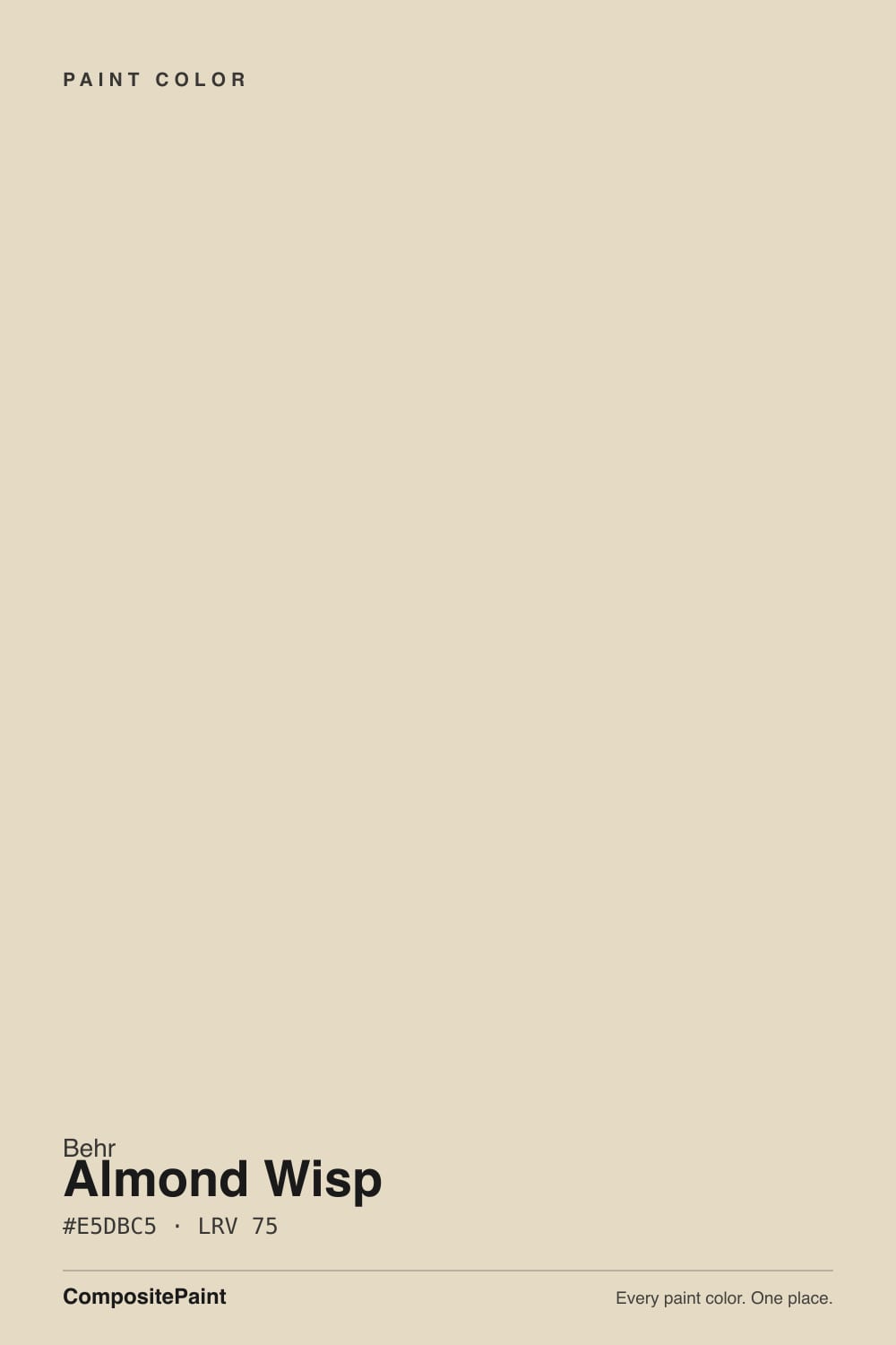
Almond Wisp is a plain, warm cream-beige that does its job without asking for credit. It has no famous backstory and barely any independent reviews to check before you buy — search around and most of what turns up is auto-generated color-matching pages, not real owner photos. What it actually is: a light, orange-leaning warm neutral sitting deep in Behr's own crowded cream cluster, competent on walls, cabinets, and a traditional exterior, and close enough to several of its own siblings that a phone screen won't reliably tell them apart.
Traditional-style exteriors — Colonial, Cape Cod, farmhouse trim · warm interiors that want cream without stark white · kitchens with oak, maple, or butcher block · anyone who wants an unshowy neutral and doesn't need it to have a story
You want a color with a track record to research before buying · your room is dim and north-facing with cool bulbs · you're standing in the Behr aisle comparing several near-identical creams and need a real reason to pick this one over Swiss Coffee or Blank Canvas · you want forum consensus to lean on
- Genuinely warm cream without tipping into peach or pink
- At LRV 60 it hides scuffs and dust better than a brighter white
- Sold in Behr's standard exterior-rated lines, so wall and exterior body can match exactly
- Pairs easily with oak, maple, butcher block and brass
- A safe, unshowy neutral if you don't need the color itself to be interesting
- One of several near-identical warm creams in Behr's own deck — easy to grab the wrong one
- Goes flatter and grayer under cool LEDs or in a dim north room
- Almost no independent reviews or real owner photos to check before you buy
- Not distinct enough for anyone who wants a color with a recognizable identity
What Color Is Almond Wisp, Really?
Almond Wisp is a light, warm cream-beige with an orange-leaning undertone — warmer than a plain white, lighter and less saturated than a true tan. It sits inside Behr's crowded warm-neutral cluster alongside colors like Swiss Coffee, Blank Canvas, Roman Plaster and Wheat Bread, several of them close enough in hex value that a quick glance won't reliably tell them apart. Unlike some of that group, Almond Wisp has almost no independent track record: no magazine feature, no Color of the Year run, barely a forum thread with its name in the title. That isn't a flaw in the paint — it's an honest, low-profile color that has never been marketed hard enough to build a reputation, good or bad.
At deck LRV 60 it sits between two of its own siblings: lighter and airier than Roman Plaster (LRV 65), which reads as a plainer, more grounded beige, and a step deeper than Swiss Coffee (LRV 80), the brighter, more attention-getting member of the same family. That middle position is basically Almond Wisp's whole identity — light enough to open a room, warm enough to avoid feeling cold or clinical, without the extra brightness that shows every scuff the way a brighter white would.
Undertone in one line: warm and orange-leaning, no pink and no green in the mix. Like every color in this family, it loses warmth under cool white LED light or in a dim north room and slides toward a flatter, grayer beige — a shift you'll see in almost any Behr cream this light, not a defect unique to this one. If your sample looks muddy, check your bulbs and your compass direction before you blame the paint.
Where It Shines
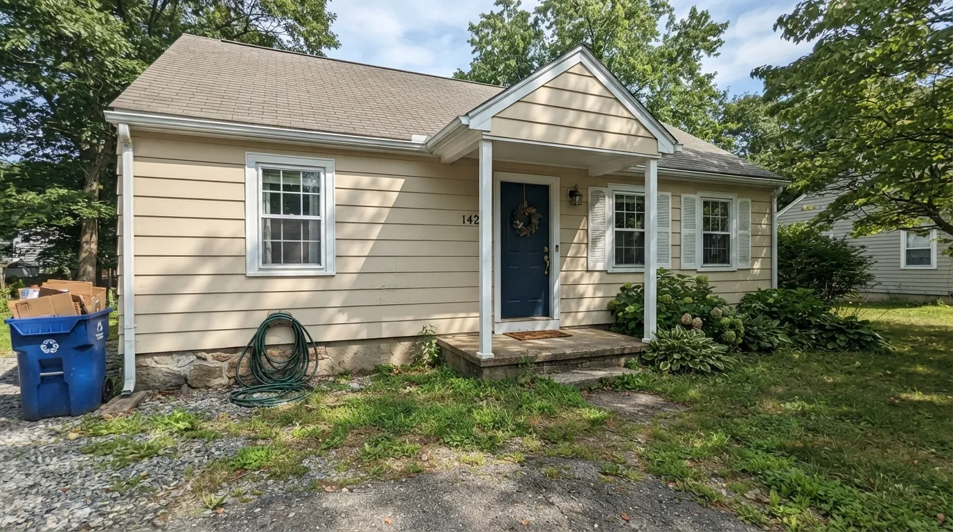
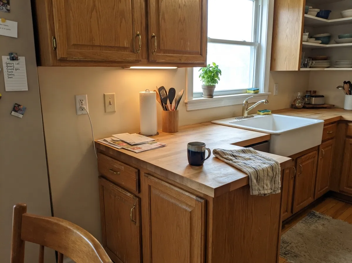
Give it real daylight and warm wood and it's a perfectly solid, if unheadlined, cream. It works the way a color is supposed to work when nobody is trying to sell you on it: on a traditional exterior — Colonial, Cape Cod, a farmhouse with painted trim — a warm cream body reads as classic and well kept, and Almond Wisp does that job as well as its splashier siblings. Behr sells it as both an interior and exterior color, in the same exterior-rated lines (Ultra flat, Premium Plus satin) as its more famous neighbors, so a wall and an exterior body can be an exact match if you want one. Indoors it does its best work against real wood — oak floors, maple cabinets, butcher block — where the warmth has something to agree with.
Where It Fails
Almond Wisp doesn't generate dramatic one-star stories — there just isn't enough chatter about it anywhere for drama to form. But three honest, predictable problems show up whenever people actually paint with it, and none of them are about the paint being defective.
Every color in this warm-cream family loses its warmth in flat, cool light, and Almond Wisp is no exception — it slides from cream toward a flatter, grayer beige. It isn't a bad color in that room; it's the wrong light for this whole family. Warm 2700K bulbs recover most of it.
Behr's own deck has several warm creams within a few points of Almond Wisp's hex value — Swiss Coffee, Blank Canvas, Cotton Knit, White Mocha, and Roman Plaster among them. Order a real sample of the exact SKU and paint a large board before you commit; a phone screen or a memory of "the beige one" won't reliably tell it apart from its siblings.
Its warmth reads correctly against warm whites and wood, but set it beside a stark blue-white trim or cool gray stone and the cream can look dull and slightly dirty by comparison — the same optical trick that trips up every warm neutral. Match the trim's temperature, not just its brightness.
Room by Room
A warm cream body with a bright white trim reads as a well-kept traditional house. Behr sells Almond Wisp in the same exterior-rated Ultra and Premium Plus lines as its better-known siblings, so there's nothing second-tier about the formula — only about how much anyone talks about it.
Against oak, maple or butcher block it warms up nicely without tipping yellow. It won't fight granite or quartz, and at LRV 60 it hides everyday kitchen grime better than a stark white would.
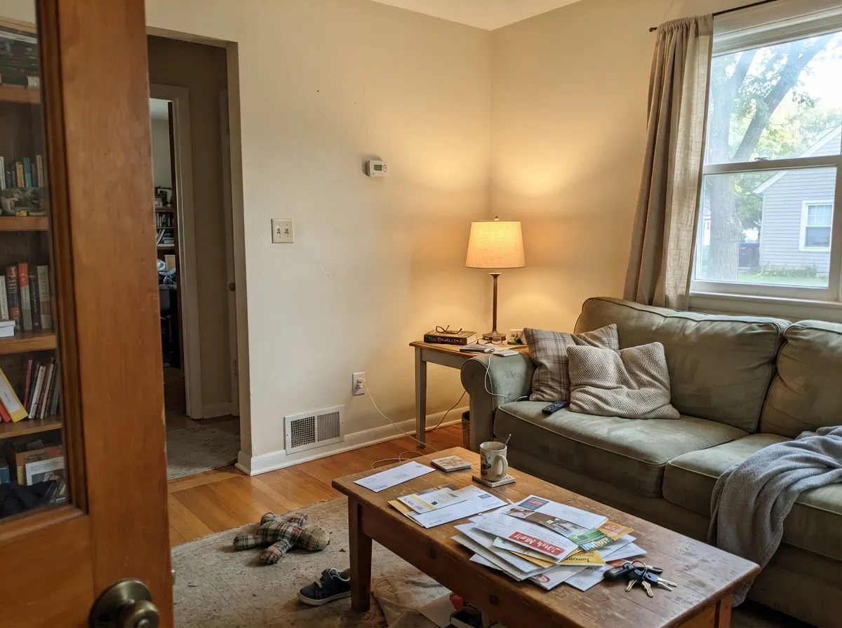
In real daylight it's a calm, competent cream backdrop for furniture and art. It won't be the reason anyone compliments the room, and that's fine — that's the job.
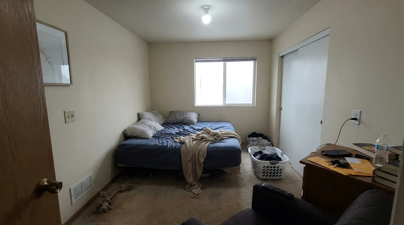
Under 2700K lamps it stays soft and cream. A north-facing bedroom with cool overhead LEDs is the one place it disappoints — swap the bulbs before you swap the paint.
It works as a soft trim tone over deeper warm walls, but a brighter, whiter Behr trim color is the more common pick over pale walls in this family. Almond Wisp on trim is a fine choice, just not the obvious one.
With warm-toned tile, wood vanities and brass it settles in comfortably. Against cool gray or blue-toned tile, the cream can look slightly yellowed by contrast — sample large before committing.
Your Light Is the Risk
Real daylight — south sun or bright east/west — keeps it a clean, warm cream without washing out. Ordinary, reliable behavior, nothing more dramatic than that.
Cool light strips the warmth out and leaves a flatter, grayer beige. Swap to 2700K bulbs before deciding you don't like the color.
Warmer and creamier at the sun hours, quieter and more neutral in between. A normal, gentle shift — nothing dramatic.
2700K lamps keep it cream and cozy. Cool white LEDs flatten it toward a grayer beige — the usual reason a cream reads different at night than it did on the store sample.
Most complaints about Almond Wisp are a light mismatch. Upload a photo of your actual room and see it on your walls — then ask for the same wall in north light or evening lamps before you buy a single sample.
Need It From Another Brand?
Any paint counter can custom-tint Behr PPU5-12 directly. If you would rather stay in one brand's own deck, these are the closest stock matches, measured as ΔE2000. Under 2 is a difference you will not see on the wall.
| Brand | Closest color | ΔE | LRV | |
|---|---|---|---|---|
| Sherwin-Williams | SymmetrySW 9601 · Sherwin-Williams | 1.0 | 61 | Color page → |
| Benjamin Moore | Litchfield GrayHC-78 · Benjamin Moore | 0.5 | 59 | Color page → |
| Valspar | Desert Fortress2008-10B · Valspar | 1.7 | 60.9 | Color page → |
| PPG / Glidden | In The BuffPPG1019-2 · PPG / Glidden | 1.3 | 61 | Color page → |
| Glidden | Buffed Tan30YY 60/104 · Glidden | 0.9 | 60 | Color page → |
| Dutch Boy | Sandstone Tint441-2DB · Dutch Boy | 0.8 | 59 | Color page → |
Similar Behr Colors
The nearest shades to Almond Wisp within Behr's own range, ranked by perceptual color distance — useful when you want the same look a touch lighter, darker, or warmer.
WCAG 2.1: AA is 4.5 : 1 for normal text, 3 : 1 for large text, AAA is 7 : 1.
Almond Wisp vs the Colors You're Also Considering
Every Almond Wisp sample board has the same rivals on it. The numbers show the real lightness gap — then it comes down to which risk you would rather live with.
Pick this for a shade more grounded and less glowy, without losing the warmth.
Behr 12 · LRV 80Swiss CoffeePick this for a brighter, slightly glowier member of the same family, at LRV 80.
Pick this if that peach tell sounds risky; Almond Wisp stays a straightforward cream.
Behr DC-003 · LRV 79Blank CanvasPick this for Behr's best warm white — but expect a peach flash in strong sun.
Two colors match it exactly on paper. Valspar Daybreak 6008-3A and Glidden Almond Paste PPG1103-2 both carry the same hex value with a measured difference of 0, so on a wall they are the same color. Their listed reflectance runs a little lower, around 71, but visually they are interchangeable.
Sherwin-Williams Antique White SW 6119 at LRV 72 comes in at 1.0, and Benjamin Moore Ivory Porcelain 239 at LRV 72 at 1.39, so both look visually identical in normal room light. Farrow and Ball Lime White No. 1 at LRV 72 sits at 1.36 and behaves the same way, though it is slightly less orange.
Further out, C2 Buzz C2-627 at LRV 72 measures 2.66, close but worth sampling first, since it reads a shade more yellow. Clare Greenish PNT100-LT-68 at LRV 72 is 3.68 away, close but visibly different side by side, with an obvious green cast Almond Wisp does not have.
Almond Wisp Coordinating Colors
Stay warm and you're safe: Almond Wisp pairs cleanly with warm whites, real wood and near-blacks, and it goes dull next to stark cool whites or blue-gray stone. These are the partners that make the most sense for the traditional, unshowy rooms it's built for:
Almond Wisp on Exteriors
There's no independent facade-testing data or magazine feature to point to here — this is an honest, low-profile color, not a famous one. What's actually verifiable: Behr sells Almond Wisp in its standard exterior-rated lines, including a flat exterior formula and a satin enamel exterior/interior formula, the same product tiers used for its better-known warm-cream siblings. There's nothing second-tier about the paint itself.
A warm cream body suits a traditional facade — Colonial, Cape Cod, farmhouse trim — because it reads as classic rather than trendy, and it gives a crisp white trim or a dark door something calm to stand against. Expect the usual exterior behavior for any cream this light: full sun brightens it, and the shaded side of the house will read a touch warmer and creamier than the sunny side. Walk the sample around the whole house before committing.
Almond Wisp With Wood Tones and Floors
Warm wood is where this color is most comfortable. Oak, maple, butcher block and honey-toned floors all sit easily against Almond Wisp because the paint's own undertone is already warm — there's no fight for the room to have.
The one flooring situation that needs a real sample first is cool gray-washed wood or gray LVP. Against a cool floor, Almond Wisp's warmth becomes more obvious and can start to look slightly yellow by contrast — not a dealbreaker, but worth testing a large board over the actual floor before committing to the whole room.
Three Ready Palettes Built on Almond Wisp
A color is never alone on the wall. These are complete combinations in the 60-30-10 pattern, with the reason each one holds together. Every one opens in the visualizer.
Warm cream body, bright white trim, near-black shutters and door — the classic Colonial contrast this kind of quiet warm cream is built for. The near-black keeps the pale cream from reading washed out at a distance.
Try this palette in your roomWhisper White cabinets stay bright without going cold, Almond Wisp walls keep the room cream and warm, and a Wheat Bread island adds one deeper, same-family note so the kitchen reads coordinated instead of matched.
Try this palette in your roomPolar Bear trim keeps the edges clean without going stark, and a Creamy Mushroom accent wall adds depth from the same warm-neutral family, so the room deepens instead of contrasting hard.
Try this palette in your roomAlmond Wisp FAQ
Is Almond Wisp a warm or cool color?
Warm — a straightforward cream-beige with an orange-leaning undertone, no gray or pink lean. In cool artificial light it can read flatter and less warm, but on the wall in daylight it never goes cold.
What is the difference between Almond Wisp and Swiss Coffee?
They're close family. Swiss Coffee (LRV 80) is a touch lighter and brighter; Almond Wisp (LRV 60) sits a shade deeper and quieter. Side by side the difference is real but small — order both samples if you're choosing between them.
Is it a good exterior color?
Yes, in the ordinary sense — it's sold in Behr's standard exterior-rated lines (Ultra flat, Premium Plus satin), and a warm cream like this suits a traditional facade well. There's no independent exterior-testing data on it specifically; it just isn't a color anyone writes up online, on a house or otherwise.
Will it look pink or peach?
No. Its undertone is straightforward orange-warm, not pink or peach — that particular tell belongs to its sibling Blank Canvas, not to Almond Wisp.
What trim white goes with Almond Wisp?
A warm white, not a stark blue-white. A cool trim white makes the cream look dull and dirty by comparison — stay in Behr's warm-white lane.
How does it look under LED lights at night?
Depends on the bulb, not the fixture. Warm 2700K bulbs keep it cream and cozy; cool white LEDs flatten it toward a grayer beige. If a room looks "off" at night, check the bulb temperature before repainting.
Have you painted with Almond Wisp?
Rate it — one tap helps the next reader decide.
Ask a Question