Tabula Rasa
Backdrop's blank-slate white, reviewed honestly: the near-twin whites it's chasing, the DTC trade-offs nobody markets, and the rooms where it actually earns its price.

Jessica has spec'd whites and neutrals for more than 300 rooms and keeps a sample wall of painted drawdowns in her studio. Every color review is checked against real reader rooms in the comments and re-tested when a formula changes. About the testing process →
- 1Classic Gray74
- 2Alabaster82
- 3Tabula Rasa92
- 4Ultra Pure White97
The Fast Verdict
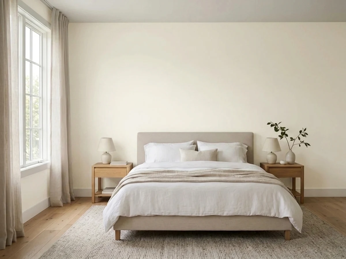
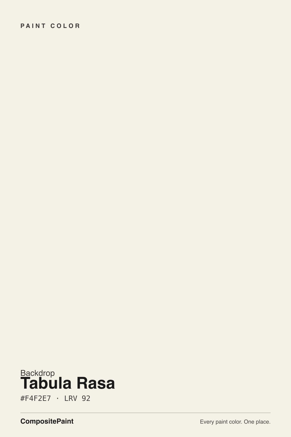
Tabula Rasa is Latin for "blank slate," and at LRV 92 that's an honest name — this is one of the palest whites Backdrop sells, built to disappear into trim, ceilings and cabinets rather than announce itself. Run the hex through the math and it lands almost exactly on top of Benjamin Moore Chantilly Lace and Behr Ultra Pure White: three companies, three names, the same near-white. What actually separates Tabula Rasa from those two is not the color — it's buying it direct from a startup instead of off a shelf, with the coverage and shipping trade-offs that come with that.
Trim, ceilings and cabinets in any brightness · a crisp blank-canvas white you're already ordering from Backdrop's curated palette · rooms with strong daylight that can carry a near-white on the walls too · buyers who want zero undertone drama and don't mind ordering online
Four bare walls in an average or dim room · you're chasing the cheapest per-gallon price · you want to grab a sample can at a local store today · you're covering a dark or saturated color and expect one coat to do it
- One of the brightest, cleanest whites in the near-white tier — LRV 92
- Near-identical formula to proven whites like Chantilly Lace and Ultra Pure White, at a fraction of the undertone guesswork
- Self-priming saves a separate primer step
- Low-VOC, GreenWise certified — genuinely low odor
- Excellent, predictable trim, ceiling and cabinet white for any wall color
- Same wall risk every LRV-92 white carries: flat and sterile without real daylight
- Real-world coverage needs two coats despite one-coat marketing language
- DTC-only ordering: no store sample, no easy in-person return, dented-can shipping complaints
- Premium price for a white that is essentially a twin of cheaper, more established options
What Color Is Tabula Rasa, Really?
Tabula Rasa's name is the whole pitch: a blank slate, a fresh start, nothing to argue with. At LRV 92 it backs that up — this sits at the very top of the brightness scale, the same tier as the whitest whites any brand sells. Run its hex (#F4F2E7) against the deck and the twin jumps out immediately: Benjamin Moore Chantilly Lace is #F4F1E6, Behr Ultra Pure White is #F4F2E8. The RGB values are within a point or two of each other across all three. That is not a coincidence of marketing — it is three companies converging on the same formula for "the whitest white that still reads as a color and not a glare."
The undertone math says faintly warm — the blue channel sits about 13 points below red, the same gap Chantilly Lace carries — but at this brightness the eye reads it as crisp and neutral, not creamy. That is consistent with how the near-identical BM and Behr whites behave in their own reviews: technically warm on paper, visually clean in the room. Expect the same story here. If a sample looks blue or gray on your wall, that's your light or your floor talking, not a cool undertone in the can.
What's genuinely different is not the color, it's the company selling it. Backdrop is a direct-to-consumer paint brand — no retail counter, no walking in with a chip to match against your cabinets, just an online order shipped to your door. That changes how you should shop this color even though the paint itself is chasing the same target as colors you can pick up at any Sherwin-Williams or Home Depot this afternoon.
Where It Shines
This is a trim, ceiling and cabinet white first. At LRV 92 it brightens a doorway or a run of upper cabinets without going stark, and its near-neutral undertone means it won't fight whatever wall color sits next to it — warm greige, cool gray, deep navy, all of it. It's also the natural pick if you're already building a Backdrop order: their curated ~70-color palette and free shipping make sense as a whole-house plan, and a blank-slate white is the connective tissue that ties the rest of that order together.
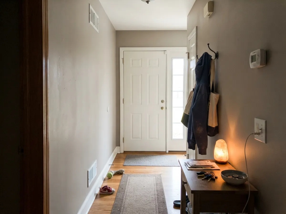
Where It Fails
The real complaints about Tabula Rasa split into two kinds: the ones every LRV-92 white shares, and the ones that are specifically about buying paint from a startup instead of a paint aisle. Both are predictable before the first coat goes on.
Near-max-LRV whites like this one need real daylight to stay soft; without it they go flat and clinical — the exact trap Behr Ultra Pure White and BM Simply White fall into on their own walls-only reviews. Fine for trim and ceilings in any room; risky as the only color on four walls unless the room gets strong sun most of the day.
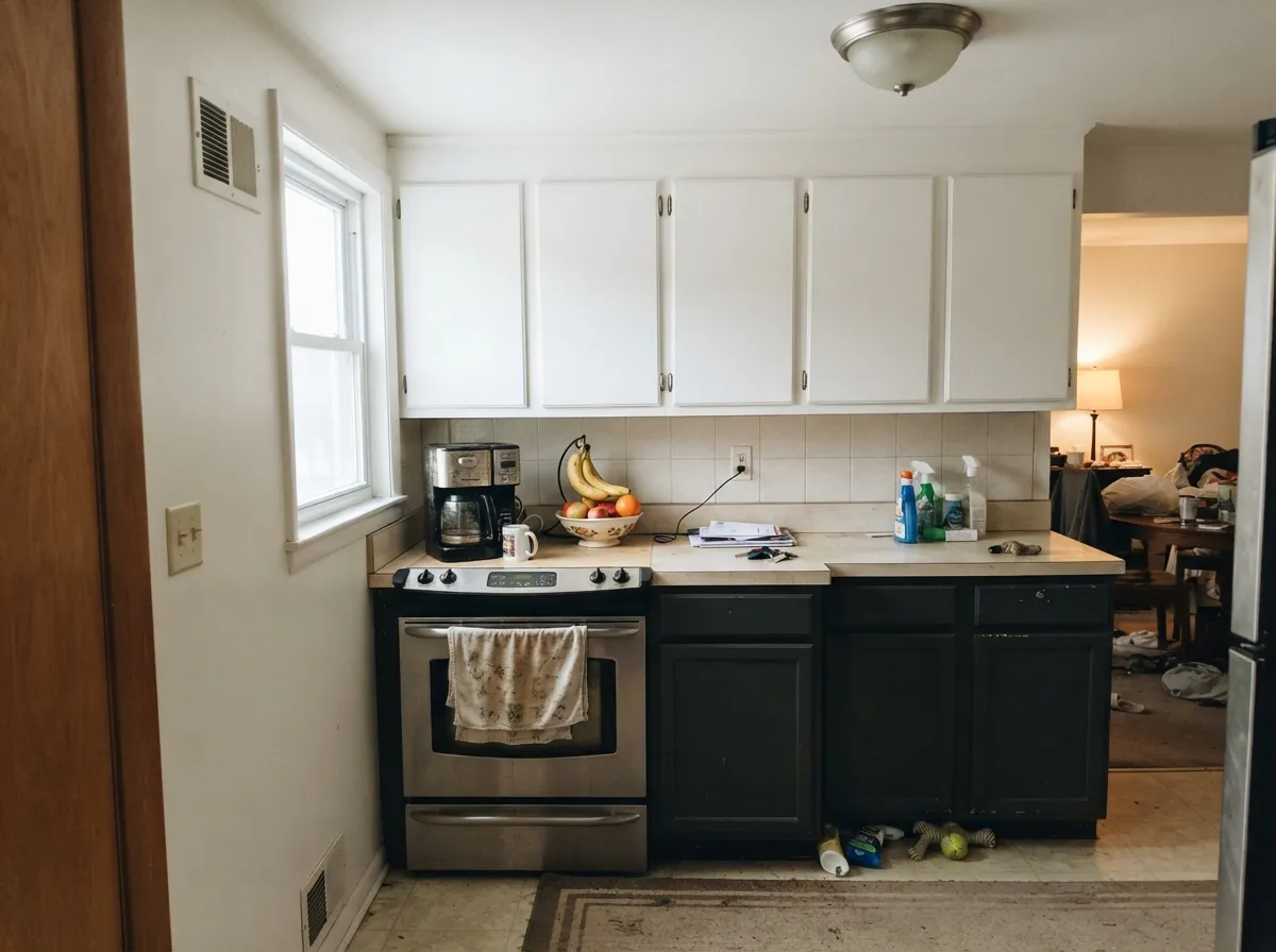
Backdrop calls its paint self-priming, but independent reviews of the brand consistently report the same thing: real color change over an existing color takes two coats, not one, and the hide is thinner than the marketing implies. Budget for two coats like you would with any paint — the self-priming claim saves you a separate primer step, not a second coat.
Backdrop sells direct only — no retail counter, no same-day pickup, no returning a bad-fit gallon to a local desk. The most common real complaint in shipping reviews is dented cans arriving from the carrier, which is a shipping problem more than a paint problem, but it's part of what you're actually signing up for at this price point versus a national brand.
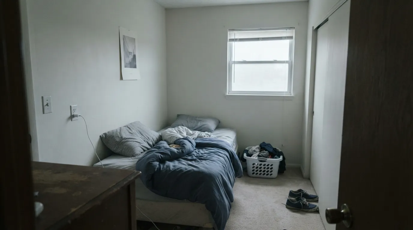
Room by Room
Semi-Gloss Tabula Rasa on trim under almost any wall color reads clean without going cold. This is the safest, most predictable use of the color — the one that plays to the LRV-92 strength instead of exposing its risk.
A crisp near-white on upper cabinets brightens a kitchen without the stark look a true cool white gives off. Semi-Gloss is the right call for wipeability around handles; expect two coats for full, even hide.
Standard finish overhead keeps the room feeling bright without demanding attention. This is the least risky room in the house for a color this pale — ceilings rarely get the harsh, flat light that trips up near-white walls.
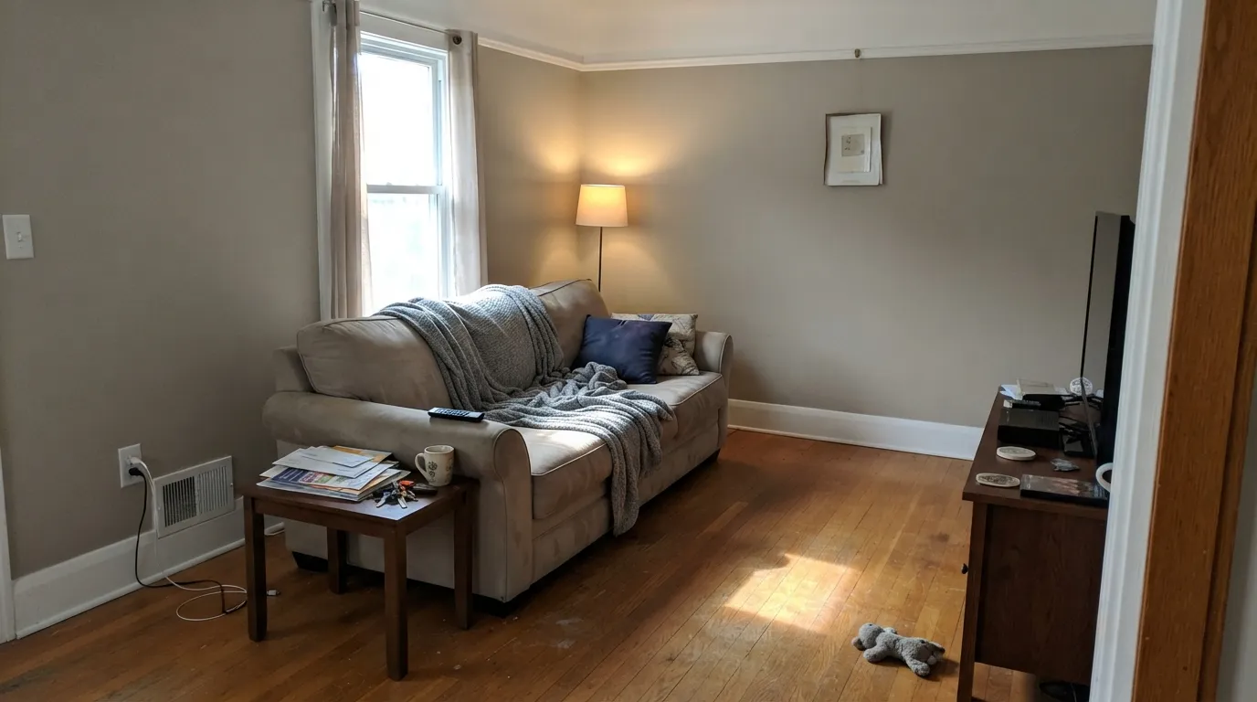
In a south-facing room with real sun most of the day, it can carry the walls and stay soft. In an average or north-facing living room, expect the flat, slightly sterile look that near-white walls are known for — go with a warmer, lower-LRV neutral instead.
On a vanity or as trim against tile it's a safe, bright choice. As the wall color in a windowless or north-facing bathroom, it can read cold under standard bathroom LED lighting — swap to warm bulbs before you decide it's the wrong white.
Backdrop markets Tabula Rasa as an interior color, and there isn't independent exterior-use data to draw on. If you're considering it outside, treat it like any bright interior white pushed outdoors: expect it to read brighter and cooler in full sun, and confirm with Backdrop directly whether the formulation is rated for exterior use before committing.
Your Light Is the Risk
Strong daylight keeps a near-white this bright looking crisp and soft at once — the condition every LRV-92 white needs to shine.
Without real sun, whites this pale can go flat and slightly clinical — the same failure mode as its BM and Behr near-twins. Test on the actual wall before committing to four of them.
A faint warm cast shows at golden hour on the sun-facing side; otherwise it reads as a quiet, neutral bright white through the day.
2700K warm bulbs keep it soft and inviting at night. Cool white LEDs push a white this bright toward a sterile, almost blue-white cast — swap the bulb before you blame the paint.
Most complaints about Tabula Rasa are a light mismatch. Upload a photo of your actual room and see it on your walls — then ask for the same wall in north light or evening lamps before you buy a single sample.
Need It From Another Brand?
Any paint counter can custom-tint Backdrop BD-TR directly. If you would rather stay in one brand's own deck, these are the closest stock matches, measured as ΔE2000. Under 2 is a difference you will not see on the wall.
| Brand | Closest color | ΔE | LRV | |
|---|---|---|---|---|
| Sherwin-Williams | CheviotSW 9503 · Sherwin-Williams | 1.2 | 89 | Color page → |
| Behr | Snowy EgretPWN-50 · Behr | 0.6 | 88 | Color page → |
| Benjamin Moore | Capitol WhiteCW-10 · Benjamin Moore | 0.9 | 87 | Color page → |
| Valspar | Cravat8007-5C · Valspar | 0.9 | 88 | Color page → |
| PPG / Glidden | Crumb CookiePPG18-01 · PPG / Glidden | 0.7 | 87 | Color page → |
| Glidden | Clear YellowPPG1215-1 · Glidden | 1.0 | 87 | Color page → |
Similar Backdrop Colors
The nearest shades to Tabula Rasa within Backdrop's own range, ranked by perceptual color distance — useful when you want the same look a touch lighter, darker, or warmer.
WCAG 2.1: AA is 4.5 : 1 for normal text, 3 : 1 for large text, AAA is 7 : 1.
Tabula Rasa vs the Colors You're Also Considering
Every Tabula Rasa sample board has the same rivals on it. The numbers show the real lightness gap — then it comes down to which risk you would rather live with.
Pick this if you're already building a Backdrop order and want one consistent supplier for the whole house.
Benjamin Moore OC-65 · LRV 92Chantilly LacePick this if you want the same near-white from a brand you can buy at any Benjamin Moore dealer, with a longer track record and no shipping risk.
Pick this if the low-VOC, self-priming formula and curated Backdrop palette matter more to you than saving on the gallon.
Behr 1850 · LRV 92Ultra Pure WhitePick this for the same brightness at Home Depot prices, with same-day pickup if you need paint today.
Within Backdrop's own deck, the closest neighbor is Jane (BD-JA, LRV 86). The two share the same warm-white character, but Jane is six LRV points deeper, so on a wall it looks like Tabula Rasa with the brightness turned down a notch. Choose Jane when Tabula Rasa feels too glaring in a sun-blasted room, or use the pair together as walls and trim.
Don't Eat the Yellow Snow (BD-DS, LRV 84) tips further into visible cream. Side by side, Tabula Rasa looks like white while Don't Eat the Yellow Snow looks like the start of a butter yellow. Pick it when you want the warmth to be an obvious feature, not a whisper.
Cookies & Cream (BD-CC, LRV 73) has left white territory entirely; it is a light warm neutral that reads as a color in its own right. If a room needs walls with presence rather than a light-spreading backdrop, that is the one; if the goal is bright and quiet, stay with Tabula Rasa.
Tabula Rasa Coordinating Colors
As a blank-slate white, Tabula Rasa is built to stay quiet next to almost anything — the coordinating rule here is less about undertone-matching and more about letting it do its one job: trim, ceilings and cabinets that don't compete with the wall color next to them. These are the kinds of partners that put it to best use:
Backdrop, the Company Behind the Color
Tabula Rasa's paint is only half the story — Backdrop is what changes the buying experience versus a national brand. It's a direct-to-consumer paint company: no retail counter, no local dealer, a curated palette of roughly 70 colors ordered online and shipped to your door, typically $59 to $75 a gallon. The paint is low-VOC and GreenWise certified, with genuinely low odor, and comes in just two finishes — a soft Standard around 6 percent sheen, and a full Semi-Gloss.
The honest trade-offs, drawn from independent brand reviews rather than Backdrop's own marketing: the self-priming claim saves a primer step but does not mean one coat, real-world coverage over an existing color typically needs two coats like any paint, and the most common complaint in the direct-shipping model is a dented can arriving from the carrier. None of that makes Tabula Rasa a bad white — it makes it a white you're buying from a small, newer company at a premium price, for a color that a national brand sells for less with a longer track record.
Tabula Rasa With Wood Tones and Floors
As a near-white this bright, Tabula Rasa's job is mostly to frame whatever wood is in the room rather than fight it. Warm oak, walnut and butcher block all sit comfortably against it — the faint warm lean in the undertone keeps it from feeling clinical next to honey-toned floors. Cool gray-washed or white-oiled floors work too, since the color reads more neutral than creamy in most light.
The one pairing that needs a real sample first is a very bright room with light floors and light counters all together — three near-white or near-neutral surfaces in strong daylight can wash a room out and erase the sense of depth a room needs. Bring in one warm or dark material — a walnut table, black hardware, a leather chair — before committing to Tabula Rasa on the walls of a room that's already pale top to bottom.
Three Ready Palettes Built on Tabula Rasa
A color is never alone on the wall. These are complete combinations in the 60-30-10 pattern, with the reason each one holds together. Every one opens in the visualizer.
Tabula Rasa's job here is exactly what its name promises: a neutral trim white that doesn't compete with Revere Pewter's warmth or argue with the navy door. It disappears so the other two colors can do the talking.
Try this palette in your roomA two-tone kitchen where Tabula Rasa's brightness does the real work: it lifts the upper cabinets and ceiling plane while Iron Ore grounds the island, with Agreeable Gray as the quiet warm-neutral backdrop tying it together.
Try this palette in your roomOnly works in a genuinely bright house — the one-color trick (same white, two sheens) needs strong daylight to stay soft instead of flat. Wrought Iron on the door supplies the one dark note the scheme needs; everything else stays out of the way, true to the name.
Try this palette in your roomTabula Rasa FAQ
Is Tabula Rasa a warm or cool white?
Faintly warm by the numbers — its blue channel sits a few points below red and green, the same small gap Benjamin Moore Chantilly Lace carries. In the room it reads crisp and neutral rather than creamy, which is how its near-twin whites behave too. If a sample looks blue or gray, that's your light or floor, not the paint's undertone.
How is Tabula Rasa different from Benjamin Moore Chantilly Lace or Behr Ultra Pure White?
By the hex numbers, barely at all — all three sit within a point or two of each other in RGB and share the same LRV 92. The real difference is where you buy it: Chantilly Lace and Ultra Pure White are available at any BM or Behr retailer with a matched track record; Tabula Rasa ships direct from Backdrop, an online-only startup, at a higher price.
Does Backdrop's self-priming claim mean I only need one coat?
No — self-priming means you can skip a separate primer coat, not skip a second color coat. Independent reviews of Backdrop consistently report needing two coats for full, even hide, especially over an existing color. Budget for two coats like you would with any paint.
Is it good for a whole room or just trim and cabinets?
Trim, ceilings and cabinets are the safe bet in any light. As a wall color for an entire room, it needs strong daylight most of the day to stay soft — in an average or north-facing room, near-white walls at this LRV tend to look flat and sterile.
Can I buy Backdrop paint in a store?
No. Backdrop sells direct-to-consumer only, shipped to your door. That means no walking into a store with a chip, no same-day pickup, and the most common real complaint in shipping reviews is a dented can arriving from the carrier — factor that into the buying decision, not just the color.
What sheen should I use for cabinets and trim?
Backdrop offers just two finishes: Standard (a soft, roughly 6-percent-sheen matte) and Semi-Gloss. Use Semi-Gloss for trim and cabinets, where wipeability matters, and Standard for walls and ceilings.
Have you painted with Tabula Rasa?
Rate it — one tap helps the next reader decide.
Ask a Question