Real Real
Backdrop's go-to cream for trim and ceilings, reviewed honestly: where it reads finished, the light that turns it khaki, and what to pick instead.

Jessica has spec'd whites and neutrals for more than 300 rooms and keeps a sample wall of painted drawdowns in her studio. Every color review is checked against real reader rooms in the comments and re-tested when a formula changes. About the testing process →
- 1Revere Pewter55
- 2Agreeable Gray60
- 3Real Real65
- 4Shoji White74
- 5Dover White83
The Fast Verdict
Real Real is the color Backdrop reaches for when a true white would cut too hard: a pale, grayed cream at LRV 65 that reads as soft trim, a quiet ceiling, or a whole-room cream if you actually want cream. It is not White Dove with a different label. Put it next to a real white and it goes beige; give it warm daylight and oak and it looks expensive and finished. Buy it for the job it has — tone-on-tone edges — not because you typed 'white' into the cart.
Trim and ceilings against mid-tone walls · living rooms and bedrooms with warm wood and real daylight · one-color cream rooms · cabinets that should hide fingerprints
You want a true white · the room faces north and stays dim · your trim is already a brighter white · cool gray floors or marble
- Soft cream-greige that unifies walls, trim, and ceiling
- The right trim/ceiling color against mid-tone greige walls
- Cabinets hide scuffs better than a true white
- Flatters oak, walnut, brass — every warm wood tone
- Grayed enough that afternoon sun does not turn it lemon
- Not a white — looks dingy next to White Dove or Pure White
- Goes khaki and tired in dim north light
- Fights cool gray floors, LVP, and Carrara-type marble
- Too much body if you needed the room to bounce more light
What Color Is Real Real, Really?
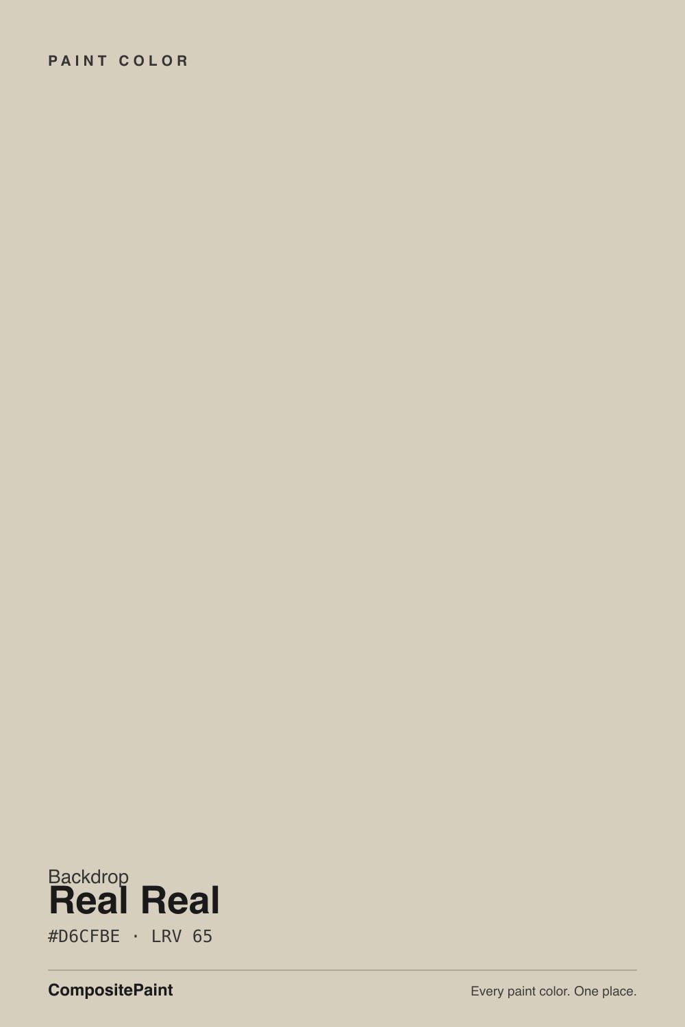
A pale warm cream with the yellow grayed out until it sits closer to greige than to butter. Backdrop treats it as the house white — the default for trim, ceilings, and the quiet edge against their mid-tone walls — because a bright white in a 70-color deck would shout. The trick is the gray: it keeps Real Real from tipping lemon in afternoon sun, and it is also why people who sampled it expecting 'just a soft white' send photos of khaki. That is the paint being honest, not a bad batch.
At LRV 65 it reflects a comfortable amount of light, but it is twenty points darker than White Dove (LRV 85). That gap is the whole review. On a ceiling it takes the glare off; on trim it reads as painted wood, not plastic; on four walls it is a light beige-greige, not a white. If you need the room to bounce light, this is the wrong can. If you want walls, trim, and ceiling to feel like one material, it is one of the better creams in any small deck.
Undertone in one line: warm grayed yellow — stone and putty, never pink, never green. If your sample goes khaki, the light is cool; if it goes buttery, west sun or 2700K bulbs are doing it. Both versions are the same paint reporting the room.
Where It Shines
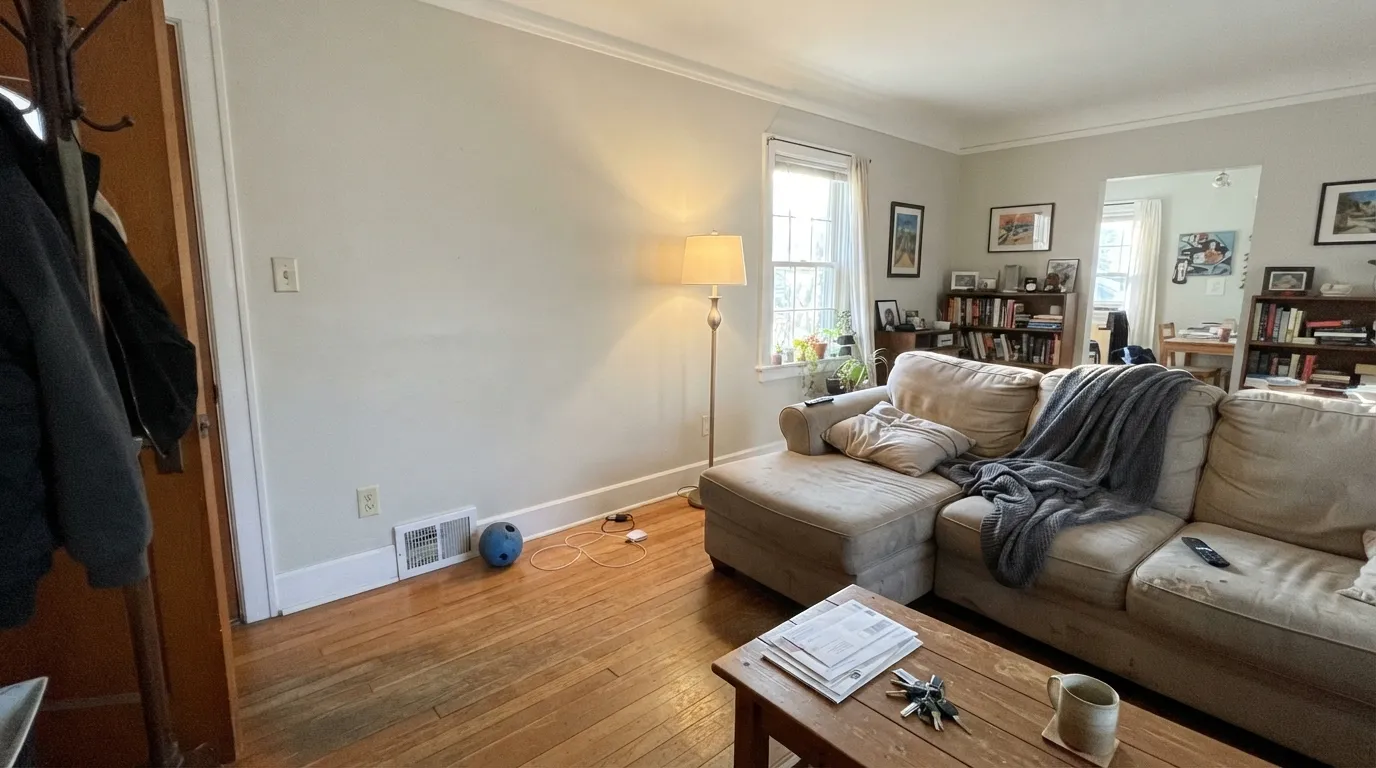
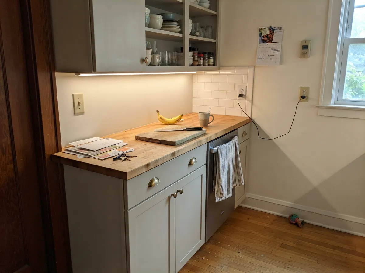
Give it real daylight, warm wood, and a job that is not 'be a white,' and it is quietly excellent. The designer use is trim and ceiling against a slightly deeper greige or beige, so the architecture softens instead of outlining itself. The homeowner use is the one-color room: walls in eggshell, trim in satin, ceiling in flat, all Real Real — small houses and hallways read bigger when the edges do not flash. Cabinets in satin are the sleeper: at LRV 65 they hide knuckle marks a true white would broadcast, and they flatter brass and butcher block.
Where It Fails
Almost every regret story about Real Real is a category error: someone bought a cream and expected a white, or they hung it in cool light and got khaki. None of that is a defective can. If your room matches one of the three situations below, sample something brighter or warmer — more coats will not promote this color into White Dove.
LRV 65 is Pale Oak territory, not White Dove territory. Next to Pure White (LRV 84) or White Dove (LRV 85) trim, Real Real walls go dingy beige and the brighter white wins. The fix is the one-color rule — walls, trim, and ceiling all Real Real — or pick an actual white and stop pretending this is one.
Cool gray daylight strips the cream and leaves the gray-khaki base. Readers will call it dirty, tired, or 'rental beige.' The color did not fail; the light did. If the room stays dim, you need a warmer off-white with more yellow in it, not a grayed cream at LRV 65.
Blue-gray LVP, cool porcelain, and Carrara-type stone sit at the opposite temperature and push Real Real toward yellow khaki. Both sides look worse. Keep it with oak, walnut, cream stone, and brass; against a cool gray floor, pick a true greige or an actual white.
Room by Room
This is why the color exists in Backdrop's deck. Flat on the ceiling it kills glare without going dingy in decent light; satin or semi-gloss on trim it softens the line against mid-tone walls. Pair it with a slightly deeper greige so the contrast is a whisper, not a stripe.
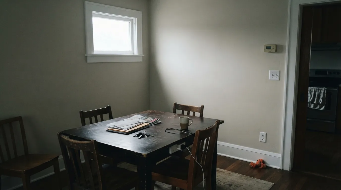
South or west light keeps the cream alive and the gray in check. Eggshell on the walls, same color on trim in a higher sheen. Oak floors, a worn sofa, brass lamp — it looks finished. Skip it in a closed north living room with one window.
Under 2700K bulbs it turns softly creamy at night without going yellow-bedroom. Matte or eggshell hides texture. If the bedroom faces north and you refuse lamps, this will read khaki by 4pm — step to a warmer cream.
Satin Real Real on cabinets is a fingerprint-forgiving cream that likes brass, butcher block, and terracotta. On walls it works if the counters are warm; cool gray quartz will argue. Do not put a brighter white on the uppers and this on the walls — the walls will look unwashed.
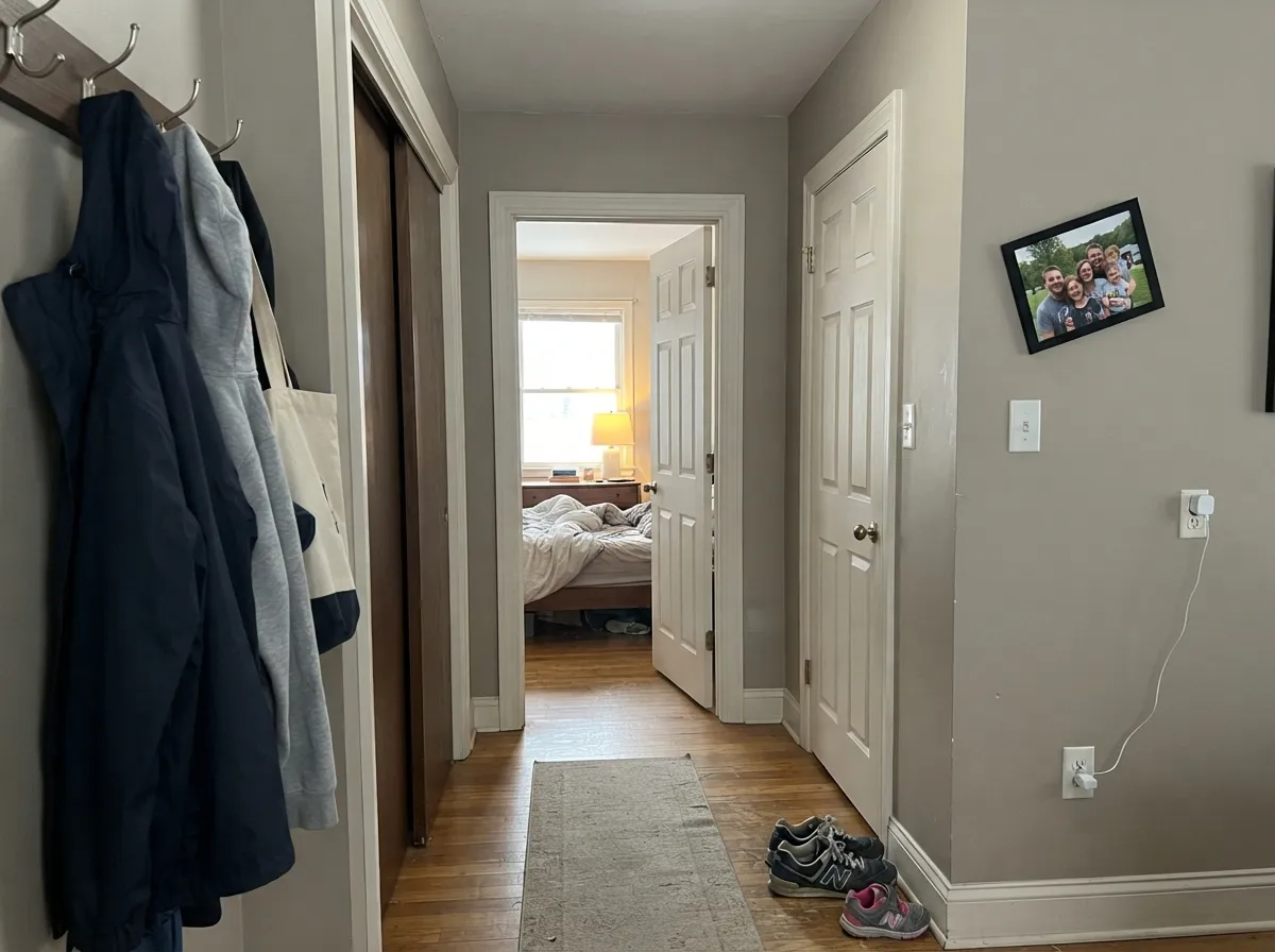
Hallways are where a grayed cream earns its keep: it carries room to room without flashing a different temperature at every doorway. Keep sheen eggshell, and do not switch to a brighter white on the hall trim halfway through the house.
Full sun washes a lot of interior creams brighter; this one has enough gray that it can read dirty-putty from the curb, especially on siding that weathers. A porch ceiling in shade is the exception — that is close to the interior ceiling job it was built for.
Your Light Is the Risk
The cream stays alive and the gray stays in the background. This is the light that makes Real Real look expensive instead of beige.
Cool gray daylight strips the warmth and leaves khaki-putty. Test a big sample here before you commit four walls.
Warmer and creamier at the sun hours, quieter and more greige in shade. The shift is real; most people who wanted cream like it.
2700K lamps: creamier, cozier, slightly yellow. Cool white LEDs: gray-khaki — swap the bulbs before you blame the paint.
Most complaints about Real Real are a light mismatch. Upload a photo of your actual room and see it on your walls — then ask for the same wall in north light or evening lamps before you buy a single sample.
Need It From Another Brand?
Any paint counter can custom-tint Backdrop BD-RR directly. If you would rather stay in one brand's own deck, these are the closest stock matches, measured as ΔE2000. Under 2 is a difference you will not see on the wall.
| Brand | Closest color | ΔE | LRV | |
|---|---|---|---|---|
| Sherwin-Williams | Grecian IvorySW 7541 · Sherwin-Williams | 1.0 | 63 | Color page → |
| Behr | Aged BeigePPU7-09 · Behr | 1.5 | 63 | Color page → |
| Benjamin Moore | Skipping StoneCSP-155 · Benjamin Moore | 0.5 | 63 | Color page → |
| Valspar | Secluded BeachV146-1 · Valspar | 1.9 | 62.4 | Color page → |
| PPG / Glidden | Crushed SilkPPG1024-3 · PPG / Glidden | 1.2 | 62 | Color page → |
| Glidden | Crushed SilkPPG1024-3 · Glidden | 1.0 | 63 | Color page → |
Similar Backdrop Colors
The nearest shades to Real Real within Backdrop's own range, ranked by perceptual color distance — useful when you want the same look a touch lighter, darker, or warmer.
WCAG 2.1: AA is 4.5 : 1 for normal text, 3 : 1 for large text, AAA is 7 : 1.
Real Real vs the Colors You're Also Considering
Every Real Real sample board has the same rivals on it. The numbers show the real lightness gap — then it comes down to which risk you would rather live with.
Pick this when you need slightly more body, and you are already in Backdrop for the rest of the house.
Benjamin Moore OC-20 · LRV 69Pale OakPick this if you want the same grayed cream with a little more air — it is beautiful in good light and still moody when the light dies.
Pick this when Natural Cream would read too sweet and you want the quieter, grayer cream.
Benjamin Moore OC-14 · LRV 65Natural CreamPick this if the room feels cold and you need the warmer off-white — same LRV, more yellow, built to thaw a chilly space.
Within Backdrop's own deck, the closest calls are Cookies & Cream (BD-CC) and Don't Eat the Yellow Snow (BD-DS). Cookies & Cream, at LRV 73, is a step lighter and slightly yellower; on the wall it reads more like a classic cream, while Real Real reads more like a putty-leaning greige. Choose Cookies & Cream when you want a brighter, sunnier room, and Real Real when you want something with a little more body that hides scuffs and shadows better.
Don't Eat the Yellow Snow (BD-DS) is lighter still at LRV 84, close to off-white territory. It works where Real Real would feel too colored, such as small dim rooms that need every point of reflectance.
August (BD-AU), at LRV 60, is the warmer cousin: similar depth, but its pink-peach cast is obvious side by side. August flatters bedrooms and skin tones; Real Real is the safer pick for kitchens, exteriors, and rooms full of cool materials.
Coordinating Colors
Real Real is happiest a step lighter than the wall, or as the wall with no brighter white in sight. Accessible Beige and Edgecomb Gray are the natural wall partners when this is trim: both are warm, both sit a few LRV points deeper, and both fail in the same dark rooms Real Real fails in — so you are not mixing a sunny color with a gloomy one.
If you need an actual white in the house, put it in a different room, not on the same trim line. White Dove next to Real Real will make the cream look unwashed. Hale Navy is the contrast note that does not start a temperature fight: deep enough to count, not blue-bright enough to push the cream yellow.
Why Backdrop Uses It As A White
Backdrop sells a short, curated deck, not three thousand chips. In a deck that size you do not get twelve warm whites; you get one cream that can do trim, ceiling, and the quiet wall. Real Real is that compromise. It is closer in value to Pale Oak and Natural Cream than to any color most people would call white, and that is the point: against Backdrop's mid-tones, a true LRV-85 white would outline every casing like builder trim.
The cost of that compromise is confusion at checkout. If you arrived from a White Dove search, sample Real Real on foam board next to a real white before you buy gallons. If the chip already looks beige to you, believe the chip. There is no Color of the Year story here and no famous TV house to hide behind — it is a useful cream in a small line, and it is only useful if you like cream.
Floors, Wood, And Metal
Oak, walnut, and aged brass are home base. The grayed yellow in Real Real is the same family as most American oak floors, so the floor does not go orange and the wall does not go dirty. Honey-gold builder oak is the edge case: it can pull a little extra yellow out of the cream. A large rug between them is cheaper than a repaint.
Cool gray LVP, blue-gray porcelain, and white-gray marble are the mismatch. They drain the cream and leave khaki, then the khaki makes the floor look blue. Chrome and cool nickel do a smaller version of the same thing. If the metal and the stone are already cool, this is not your cream — you wanted a true greige or a true white, and Real Real is neither.
Three Ready Palettes Built on Real Real
A color is never alone on the wall. These are complete combinations in the 60-30-10 pattern, with the reason each one holds together. Every one opens in the visualizer.
One cream at two sheens is how Real Real avoids looking dingy: nothing brighter sits next to it, so the grayed yellow reads as finished plaster instead of dirty white. The navy door is the single dark note the scheme needs.
Try this palette in your roomAccessible Beige is a step deeper and still warm, so Real Real can do the trim-and-ceiling job it was designed for without looking beige-on-beige. Keep both out of cool north light — that is where each one goes gray.
Try this palette in your roomSatin cream cabinets hide hands better than a true white, the deeper greige walls keep the cabinets looking light instead of dirty, and a navy island supplies the contrast. Brass hardware and a wood counter are not optional here — cool quartz will pick a fight.
Try this palette in your roomReal Real FAQ
is Backdrop Real Real a white or a beige?
It is a pale grayed cream at LRV 65. Backdrop uses it as a trim and ceiling white, but next to White Dove (LRV 85) or Pure White (LRV 84) it is clearly beige-greige. If you need the wall to read as white, this is the wrong color.
can I use Real Real on walls, or only on trim and ceilings?
Both, as long as you do not park a brighter white next to it. On four walls it is a light cream-greige — calm in south light, khaki in a dim north room. The one-color room (walls, trim, ceiling all Real Real, sheen change only) is the safest wall use.
what sheen should I use on Real Real?
Eggshell on walls, satin or semi-gloss on trim and doors, flat on ceilings, satin on cabinets. The color is quiet; sheen is how you see the architecture.
will Real Real work in a north-facing room?
Usually not as four walls. North light is cool and gray, and it strips the cream until you are left with dirty putty. A large sample on the darkest wall is mandatory. If it already looks tired on the sample, pick a warmer off-white instead.
what colors pair with Real Real?
Slightly deeper warm greiges like Accessible Beige (LRV 58) and Edgecomb Gray (LRV 63) for walls when Real Real is trim. Hale Navy for a door or island. Oak, walnut, and brass. Not cool gray floors, not Carrara, not a brighter white on the same elevation.
how close is Real Real to Pale Oak or Edgecomb Gray?
Pale Oak (LRV 69) is the closest Benjamin Moore cream, a little airier. Edgecomb Gray (LRV 63) is the closer greige, a hair deeper and less creamy. Natural Cream (LRV 65) is the same depth with more yellow. Real Real sits in that cluster, not in the white cluster.
Have you painted with Real Real?
Rate it — one tap helps the next reader decide.
Ask a Question