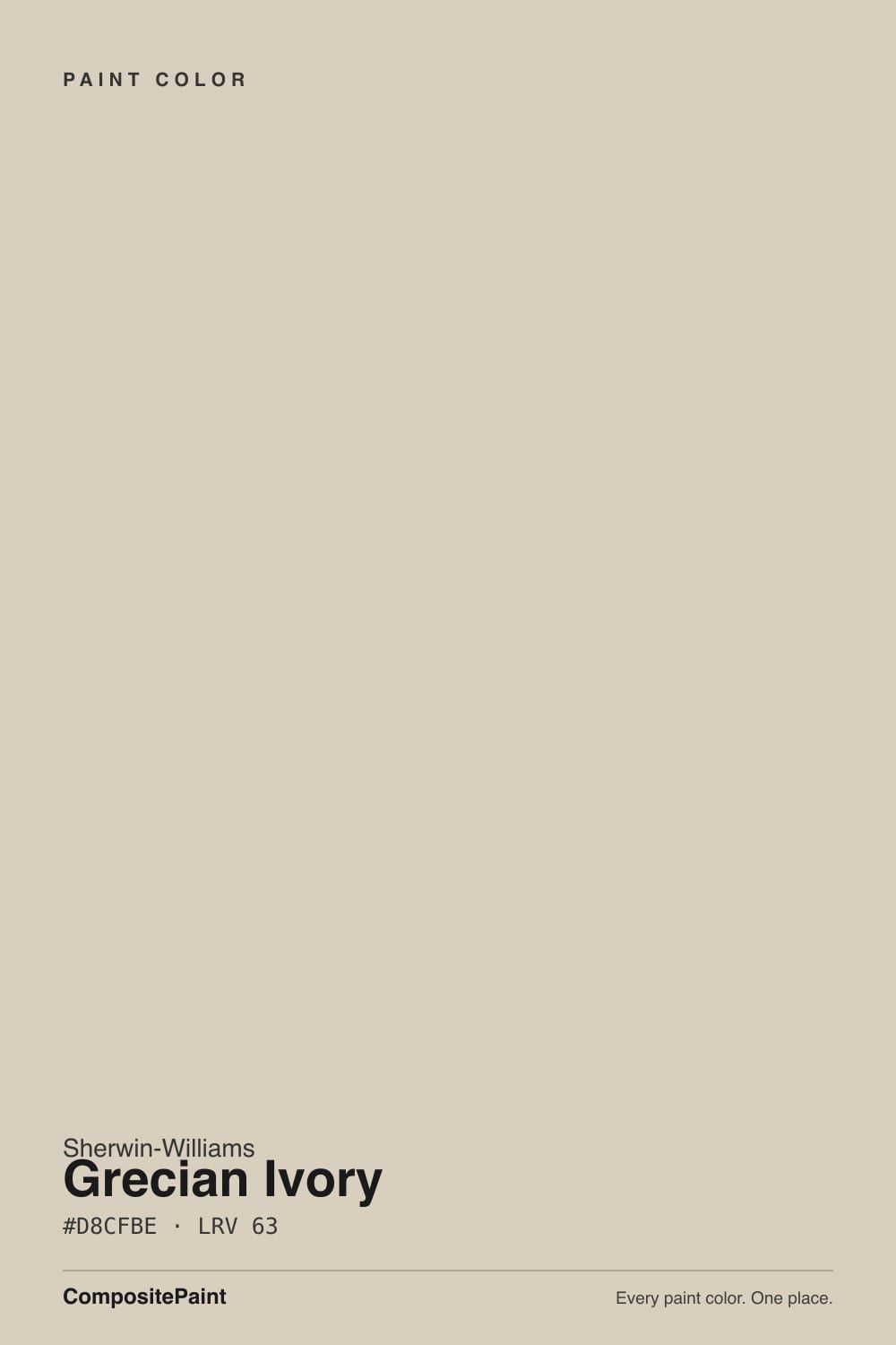
Grecian Ivory
Sherwin-Williams' quiet exterior favorite, reviewed honestly: the green undertone that surprises buyers, the rooms it actually shines in, and what to pick instead.

Jessica has spec'd whites and neutrals for more than 300 rooms and keeps a sample wall of painted drawdowns in her studio. Every color review is checked against real reader rooms in the comments and re-tested when a formula changes. About the testing process →
- 1Light French Gray53
- 2Accessible Beige58
- 3Grecian Ivory63
- 4Pale Oak69
- 5Shoji White74
The Fast Verdict
Grecian Ivory is a warm greige doing double duty as an exterior color, and the name oversells the "ivory": in strong daylight the base leans distinctly green before settling into beige-gray under lamps and a plainer gray in a dim room. That three-way shift is not a flaw so much as the personality — buy it knowing the color you'll see depends on where the sun is, and it rewards you with one of Sherwin-Williams' better stucco-and-stone exterior neutrals.
Stucco and stone exteriors in strong sun · kitchens with brass and warm wood · whole-house warm neutral if you already like Agreeable Gray · anyone comfortable with a color that shifts through the day
You want a true creamy ivory with zero green · your room stays dim and north-facing · your trim is a cool, blue-leaning white · you need one fixed, predictable color at every hour
- A warm greige with real personality — shifts from green to beige-gray through the day instead of sitting flat
- One of Sherwin-Williams' better stucco and stone exterior neutrals, holding its warmth in full sun
- LRV 63 keeps rooms bright without the starkness of a true white
- Near-identical to Benjamin Moore's Edgecomb Gray if your painter or store only stocks one brand
- Flatters brass, walnut, and warm wood without tipping into full beige
- The name says ivory; bright daylight delivers a visible green cast most buyers don't expect
- Needs a warm white trim partner — a cool white makes it look muddy
- Goes flat, cool gray in dim or north-facing rooms, losing the warmth it's known for
- Quieter reputation than Agreeable Gray or Accessible Beige — fewer real-room photos and reviews to check yourself against
What Color Is Grecian Ivory, Really?
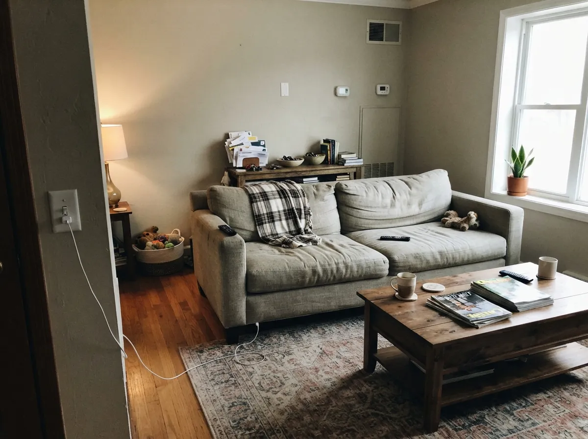
Grecian Ivory is a warm greige built on three undertones instead of one — beige for warmth, a real streak of green, and enough gray to keep it from tipping fully into tan. Most warm neutrals pick a lane and stay there; this one changes lanes with the light, and that is the whole story of living with it. In strong, direct daylight the green comes forward and the wall reads faintly vegetal, almost sage-adjacent. Under warm bulbs or softer indoor light, the green recedes and the beige-gray base takes over, reading as a straightforward creamy greige. It is an unusually literal example of a chameleon neutral, and reader photos bear it out — the same room, morning versus evening, can look like two different colors.
At LRV 63, it sits in the same light-to-medium band as Benjamin Moore's Edgecomb Gray (also LRV 63) — the two are close enough that painters treat them as cross-brand twins, and if your contractor only stocks one brand, either gets you close to the same room. Next to Sherwin-Williams' own more famous cousin, Agreeable Gray (LRV 60), Grecian Ivory reads a shade lighter and noticeably greener; Agreeable Gray plays it safer and warmer. That gap is useful: pick Grecian Ivory when you want a little more personality than the default greige, and are fine with it showing.
Undertone in one line: green first in bright light, beige-gray second under warm indoor light, plain gray third in a dim room — never pink, never blue. It has never been a Color of the Year and it doesn't carry the sales-chart fame of Agreeable Gray or Accessible Beige; it is a quieter, more specialized color that earned its reputation almost entirely outdoors, on stucco and stone exteriors, where full sun keeps the green in check and the ivory name finally makes sense.
Where It Shines
Full sun is where Grecian Ivory does its best-known work: on stucco, stone, and brick-adjacent exteriors it holds a warm, almost-white glow without looking washed out or chalky, which is why it shows up again and again on Tuscan- and earth-toned house repaints. Indoors, give it brass, walnut, and warm-toned stone and it settles into a dependable, slightly more interesting alternative to Agreeable Gray — on cabinets and open-plan walls alike.
Where It Fails
Almost every disappointed review of Grecian Ivory comes from one of three mismatches, and all three are avoidable once you know the color's habits. None of them are the paint's fault — but if your room matches one, sample bigger before you commit.
The name promises cream; strong daylight delivers a visible green cast instead. It is not a defect — it is the undertone doing exactly what the deck says — but buyers who skip the sample and trust the name are the most common disappointed review. Test a large swatch in your actual daylight before painting the whole room.
Pair Grecian Ivory with a cool, blue-leaning white and the contrast reads muddy — the wall looks dingy next to the crisp trim instead of complementary. Stick to a warm white partner like Pure White; a cool builder white is the single most common pairing mistake.
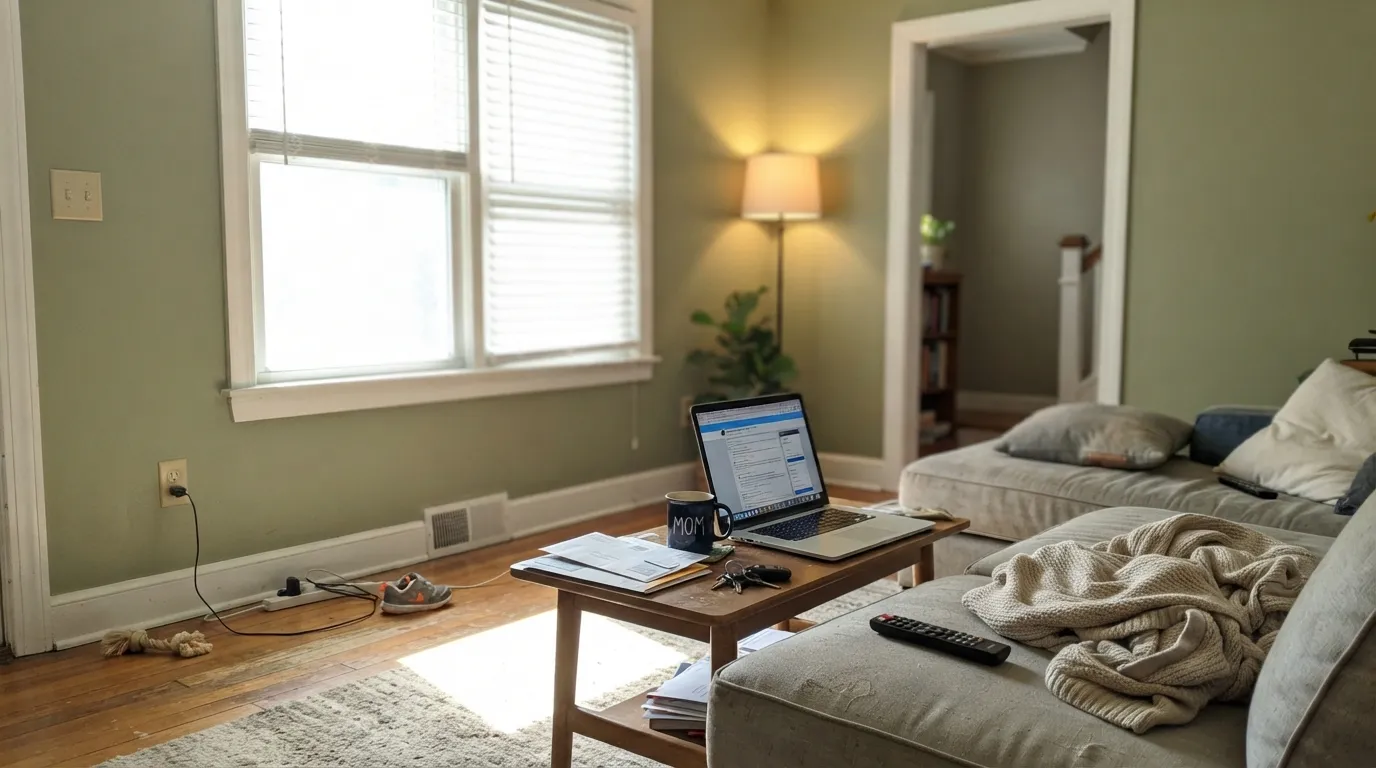
Without real daylight to carry the green and beige undertones, Grecian Ivory settles into a flat, slightly cool gray with none of the warmth the exterior version is known for. If the room stays dim year-round, pick a warmer, more forgiving greige instead.
Room by Room
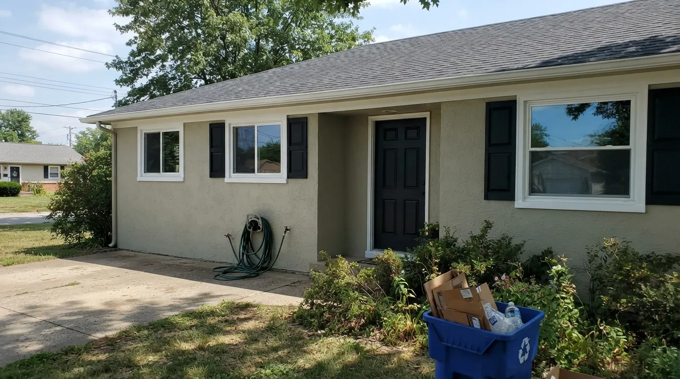
Full sun is genuinely flattering: the color holds a warm, almost-white glow on stucco and stone without chalking out, which has made it a go-to for Tuscan- and earth-toned repaints. Pair with a warm white trim and a near-black door or shutters for the classic look.
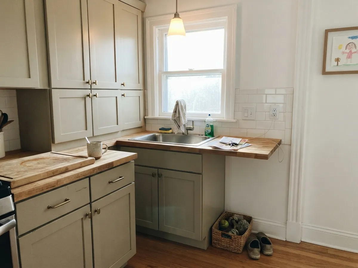
On cabinets under a warm white wall it reads as a more interesting, slightly greener alternative to the usual greige-on-white kitchen. Brass hardware and butcher block bring out the beige side; keep counters warm-toned rather than cool grey marble.
In a bright, sun-filled main floor it carries a whole open plan gracefully, shifting gently through the day rather than sitting flat. In a dimmer room it loses that liveliness — check the light section above before committing to walls-only.
Under 2700K lamps at night the green settles down and the room reads as a quiet, creamy greige — a calm color to fall asleep in. Skip cool LED bulbs here; they pull the green back out after dark.
With warm-veined marble, wood vanities, and brass fixtures it is genuinely luxurious. With cool grey or blue-veined stone, the green undertone fights the tile instead of complementing it — sample against your actual counter before deciding.
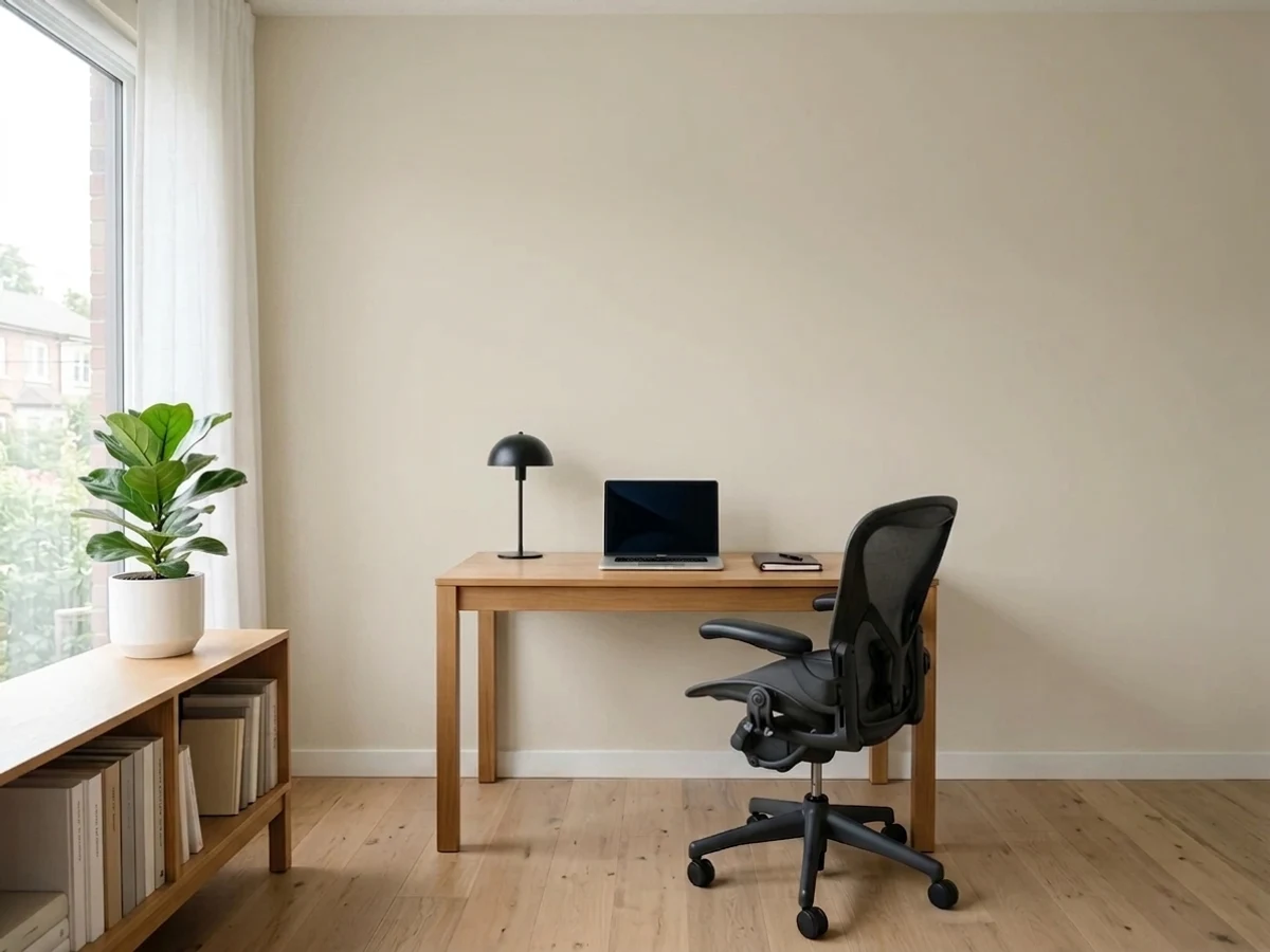
The green streak that surprises some buyers works in its favor here: it gives a workspace a grounded, nature-adjacent feel without committing to a full sage or olive wall. Pair with walnut shelving for the effect.
Your Light Is the Risk
Its best-documented job: strong direct sun keeps it warm and almost-white without washing out — the reason it's an exterior favorite.
Without real daylight the green and beige recede and it settles into a flat, slightly cool gray — the light where it disappoints.
This is where the green undertone shows itself most clearly — a fresh, faintly vegetal cast that some readers love and some are caught off guard by.
Warm 2700K bulbs pull the beige-gray forward and calm the green. Cool LEDs do the opposite — swap bulbs before you blame the paint.
Most complaints about Grecian Ivory are a light mismatch. Upload a photo of your actual room and see it on your walls — then ask for the same wall in north light or evening lamps before you buy a single sample.
Need It From Another Brand?
Any paint counter can custom-tint Sherwin-Williams SW 7541 directly. If you would rather stay in one brand's own deck, these are the closest stock matches, measured as ΔE2000. Under 2 is a difference you will not see on the wall.
| Brand | Closest color | ΔE | LRV | |
|---|---|---|---|---|
| Behr | Aged BeigePPU7-09 · Behr | 1.2 | 63 | Color page → |
| Benjamin Moore | Cedar Key982 · Benjamin Moore | 0.9 | 61 | Color page → |
| Valspar | Gentle Shadows8005-5A · Valspar | 1.6 | 64 | Color page → |
| PPG / Glidden | Crushed SilkPPG1024-3 · PPG / Glidden | 0.5 | 62 | Color page → |
| Glidden | Crushed SilkPPG1024-3 · Glidden | 0.0 | 63 | Color page → |
| Dutch Boy | Existence420-1DB · Dutch Boy | 0.9 | 63 | Color page → |
Similar Sherwin-Williams Colors
The nearest shades to Grecian Ivory within Sherwin-Williams's own range, ranked by perceptual color distance — useful when you want the same look a touch lighter, darker, or warmer.
WCAG 2.1: AA is 4.5 : 1 for normal text, 3 : 1 for large text, AAA is 7 : 1.
Grecian Ivory vs the Colors You're Also Considering
Every Grecian Ivory sample board has the same rivals on it. The numbers show the real lightness gap — then it comes down to which risk you would rather live with.
Pick this if you're already committed to Sherwin-Williams, or want the slightly greener version of the same idea.
Benjamin Moore HC-173 · LRV 63Edgecomb GrayPick this if your painter or store only carries Benjamin Moore — the two sit at the same LRV and read almost identically.
Pick this when the default greige feels too safe and you want a color with a little more character.
Sherwin-Williams SW 7029 · LRV 60Agreeable GrayPick this for the safer, more famous, less green cousin — Agreeable Gray plays it straight where Grecian Ivory shows its undertone.
Within the Sherwin-Williams deck the neighbors are extremely close. Rivers Edge SW 7517 shares LRV 63 with a hex of #DBCEBD, marginally warmer, and Wool Skein SW 6148 at LRV 63 is a well-known alternative at #D9CFBA, which carries a touch more yellow. Accolade SW 9516 at LRV 62 is the grayest of the group.
Across brands, Glidden's Crushed Silk PPG1024-3 matches the hex and LRV exactly, and the PPG version at LRV 62 is effectively the same. Benjamin Moore Cedar Key 982 at LRV 61, C2 Paint Gimlet C2-945 at LRV 64, and Dutch Boy Existence 420-1DB at LRV 63 all fall under one deltaE. Behr Aged Beige PPU7-09 at LRV 63 and Farrow and Ball Shaded White No. 201 at LRV 63 are visually identical in normal room light.
Magnolia Home Stoneware Pieces JG-55 at LRV 63 is the outlier. It is close but visibly different side by side, reading greener and less golden.
Grecian Ivory Coordinating Colors
The rule for coordinating with Grecian Ivory: stay warm on the trim and don't fight the green undertone with a cool white. It pairs comfortably with its own Sherwin-Williams and Benjamin Moore greige cousins, and takes a near-black accent well for exterior contrast. These are the partners that keep showing up in real rooms:
Grecian Ivory on Exteriors
This is where Grecian Ivory earns its reputation. Full, direct sun is the one light condition that keeps the green undertone from taking over — it settles into a warm, almost-white glow on stucco and stone that has made it a repeat pick for Tuscan- and earth-toned house repaints. Indoors, the same undertone needs more careful light management; outdoors, the sun does the work for you.
The pairing decides how it reads. A warm white trim (Pure White) keeps the whole facade cohesive; a near-black door or shutters (Tricorn Black) gives it the classic light-body, dark-accent contrast without fighting the undertone. What to avoid: a cool, blue-white trim, which pushes the green forward by contrast the same way it does indoors — and remember the shaded side of the house will read noticeably greener than the side that sees full sun all day, so sample on both before committing.
Grecian Ivory With Wood Tones and Floors
Warm wood is the easy answer: honey oak, walnut, and cedar all sit comfortably against Grecian Ivory because the beige side of the undertone meets them halfway, and the green rarely reads as a clash against wood the way it can against cool stone or tile. Wide-plank white oak floors are an especially good match — light enough to let the wall carry the room's warmth.
Cool grey or grey-washed flooring is the pairing to test first. Grey pulls warmth out of any neutral, and with Grecian Ivory specifically it can nudge the green undertone into more of a sage-grey cast than most buyers expect. It's not automatically a bad pairing — some readers like the cooler, more muted result — but sample a large piece above the actual floor before painting the whole room.
Three Ready Palettes Built on Grecian Ivory
A color is never alone on the wall. These are complete combinations in the 60-30-10 pattern, with the reason each one holds together. Every one opens in the visualizer.
Full sun keeps Grecian Ivory's green in check and lets the warm ivory glow through; Pure White trim stays warm enough not to fight it, and Tricorn Black shutters give the stucco-and-stone look its contrast.
Try this palette in your roomPure White walls give the green undertone room to breathe without competing; the Agreeable Gray island is close enough in family to feel intentional, not mismatched, and brass pulls tie the whole warm-neutral kitchen together.
Try this palette in your roomEdgecomb Gray shares almost the same LRV and the same warm-greige base, so a den or office in it reads like the same house going a shade deeper — not a color change. Pure White trim keeps every room from looking dingy.
Try this palette in your roomGrecian Ivory FAQ
Is Grecian Ivory warm or cool?
Warm, but with a real green streak. In strong daylight the green comes forward and the color can look faintly vegetal; under warm bulbs or softer light it settles into a creamy beige-gray. It never turns blue or pink — the shift is always between green, beige, and gray.
Why does Grecian Ivory look green in some photos?
Bright, direct daylight is when the green undertone shows most clearly — it's the color's genuine undertone, not a bad photo or a mismatched can. If you want the ivory-cream look the name suggests, expect it mainly indoors under warmer light, not on a sunny exterior wall at noon.
What's the difference between Grecian Ivory and Agreeable Gray?
Agreeable Gray (SW 7029) is darker, warmer, and steadier — it doesn't show the green flash. Grecian Ivory is a shade lighter (LRV 63 versus 60) and more expressive: livelier in changing light, less predictable. Pick Agreeable Gray for safety, Grecian Ivory for a little more personality.
Is Grecian Ivory good for exteriors?
It's arguably the color's best job. Full sun keeps the green undertone in check and lets the warm, almost-white ivory character come through, which is why it shows up so often on stucco and stone repaints. Pair with a warm white trim and a dark door or shutters.
What trim color goes with Grecian Ivory?
A warm white — Pure White is the safe default. A cool, blue-leaning white makes the wall look muddy by contrast, which is the most common pairing mistake with this color.
Does it work on kitchen cabinets?
Yes, especially with brass hardware and warm wood or butcher block. Keep the countertop warm-toned; cool grey marble pulls out the green undertone in a way that can read as a clash rather than a complement.
Have you painted with Grecian Ivory?
Rate it — one tap helps the next reader decide.
Ask a Question