North End
A near-black forest green from a DTC paint startup, reviewed honestly: the light it needs to prove it's green at all, the rooms where it earns its keep, and what to buy instead if you actually wanted color.

Jessica has spec'd whites and neutrals for more than 300 rooms and keeps a sample wall of painted drawdowns in her studio. Every color review is checked against real reader rooms in the comments and re-tested when a formula changes. About the testing process →
- 1English Ivy2
- 2North End7
- 3Sage Green22
- 4Evergreen Fog30
The Fast Verdict
North End sits at the bottom of Backdrop's green wall, LRV 7 — as dark as the brand's near-blacks, just with the dial nudged toward forest instead of charcoal. In good light it reads like a genuine deep green, the kind that makes brass and walnut look expensive. In anything less than good light it reads as black, full stop, and the paint has no say in the matter. Buy it knowing that, and it's one of the more useful dark colors a small kitchen island or a front door can wear.
Kitchen islands and cabinets with real daylight · a front door · a home office or den that wants depth · powder rooms as a small, committed statement · trim and built-ins next to a paler wall color
You want a color a stranger can name off the chip · the room has no window and no lamp plan · you're painting all four walls of a small, dim bedroom · you're hoping for a bright, saturated hunter green
- A genuinely deep, near-black forest green — not a washed-out sage pretending to be dark
- LRV 7 hides scuffs, fingerprints and daily wear better than a lighter cabinet or door color
- Reads custom and expensive against brass, walnut and matte black hardware in real light
- Self-priming acrylic formula from Backdrop — fewer coats and no separate primer step
- Small-commitment surfaces (doors, islands, built-ins) let you use it without repainting a whole room
- Reads flat black, not green, in any room without real daylight or warm lamps
- A full room of it in a small, dim space can feel closed-in rather than cozy
- Cool white LEDs erase the last of the green pigment after dark
- Backdrop is online-only — no in-store sample rack, so you're committing to a can before you see it in person
What Color Is North End, Really?
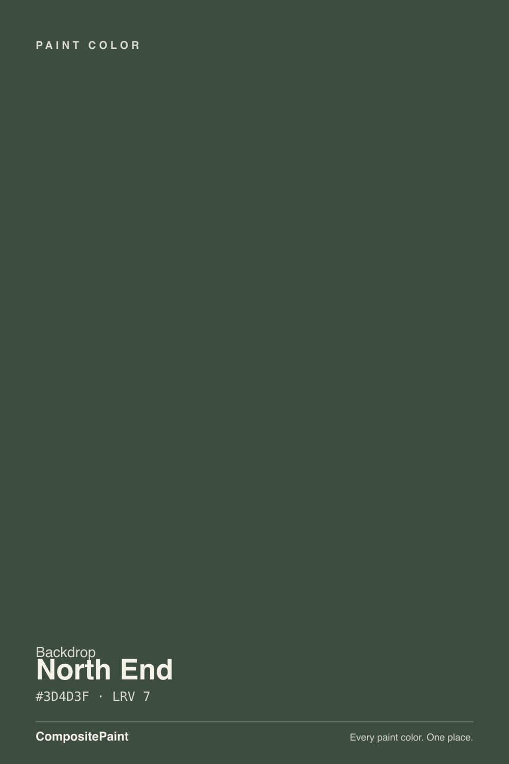
A dark, muted forest green with the saturation turned most of the way down and the depth turned almost all the way up. At LRV 7 it sits in the same near-black bracket as Benjamin Moore Wrought Iron (LRV 6) and Hale Navy (LRV 6) — colors most people describe as "basically black" until direct light catches them. North End's red, green and blue values are close together (a hair more green than blue, and blue edges out red by two points), which is the technical way of saying: no yellow-olive lean, no teal-blue lean, just a balanced dark green with a faint cool whisper under it.
Backdrop is a Los Angeles direct-to-consumer paint brand — no big-box aisle, no dealer network, ordered online and shipped in one of roughly 85 curated interior colors with names built for Instagram, not a swatch fan (siblings in its green lineup are called things like Lawn Party and Dark Arts, not "Forest 420"). The paint itself is a self-priming acrylic interior finish, low-VOC and low-odor by the brand's own account, sold around $59 a gallon — a real premium over big-box paint, positioned on ease of application (one-hour recoat window, easy-pour can) rather than on decades of colorist history the way a Benjamin Moore or Sherwin-Williams color has.
Undertone in one line: green first, with red and blue nearly balanced underneath it — never yellow, never a true blue-teal. If your sample looks flat black, that's the light, not the paint; if it looks faintly blue-green under a cool bulb, that's honest too. What it will not do, in any light, is look bright or saturated — this is a shade for people who want dark, not for people who want green to be the loudest thing in the room.
Where It Shines
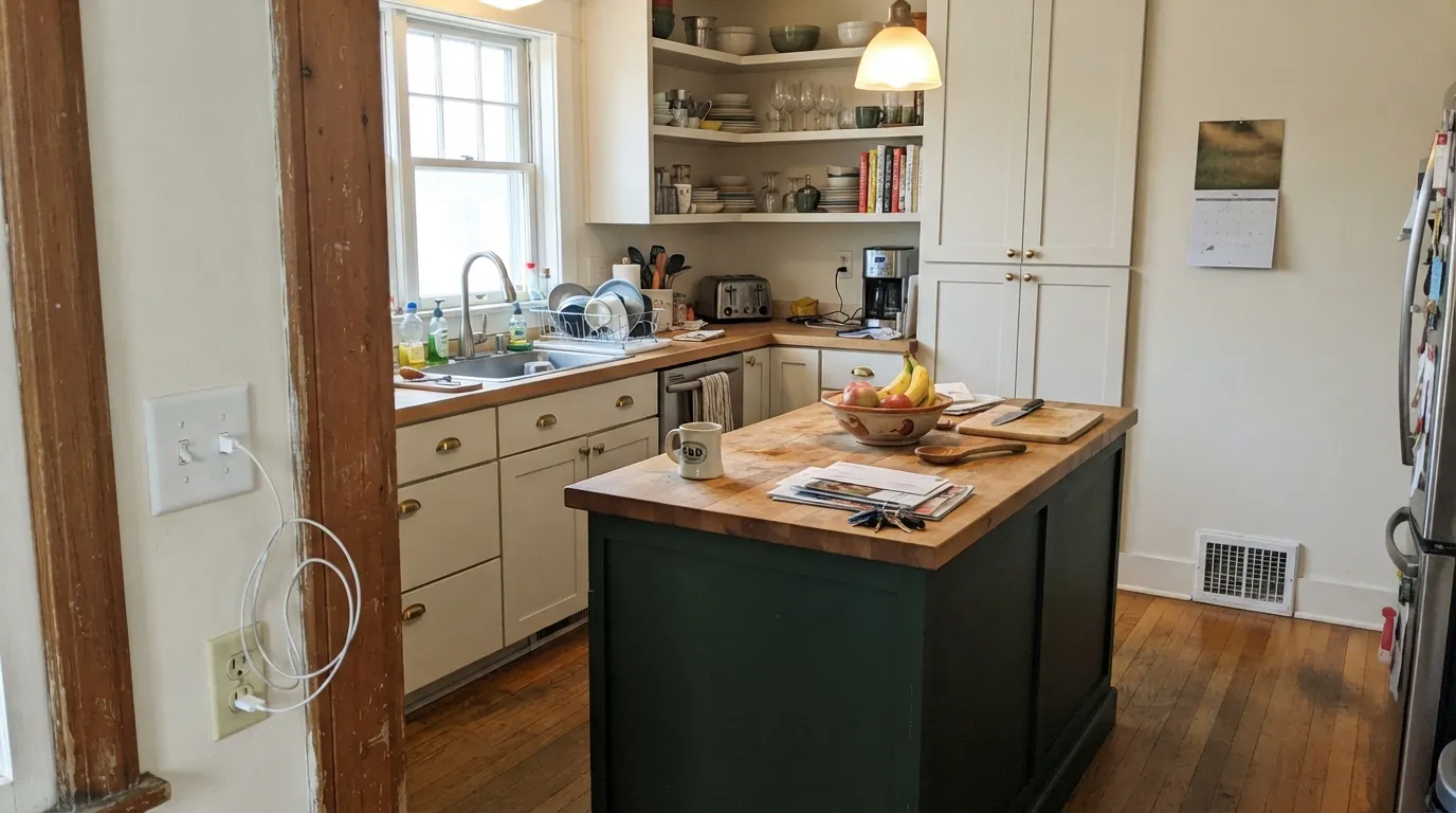
Give it real daylight or a warm lamp and North End stops being a near-black and starts being a genuine, sophisticated forest green — the kind that makes unlacquered brass and walnut look like they cost more than they did. Its best jobs are small and specific: a kitchen island against paler perimeter cabinets, a front door, a built-in bookcase, a powder room with one good sconce. Those are rooms where depth reads as intentional rather than as "we ran out of light."
Where It Fails
Almost every disappointed review of a color this dark follows the same script, and North End is no exception — LRV 7 leaves almost no margin for bad light. None of it is really the paint's fault, but if your room matches one of these, sampling a bigger swatch will only confirm the problem, not fix it.
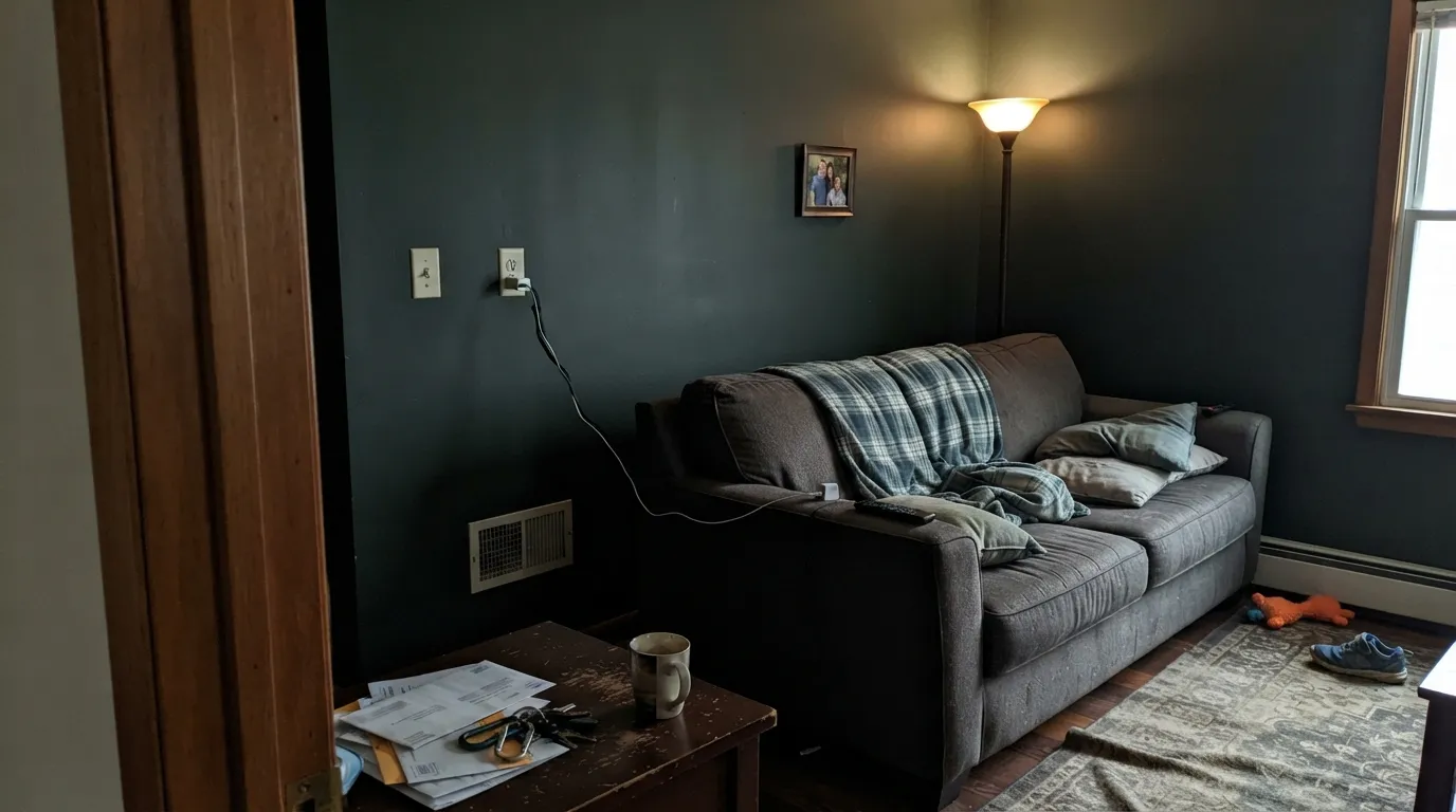
At LRV 7, North End needs light to bounce off it before the green shows up at all. A north-facing room, an interior room, or a room you only light with one overhead fixture will read the color as flat black — not "almost black," just black. If you're not adding a warm lamp or two, pick something with more reflectance.
One dark wall reads intentional; four dark walls in a small room with no window can feel like a closet you accidentally sealed shut. This color works best as an accent, a cabinet color, or a door — a full small-room wrap needs real square footage and real light to avoid feeling like a cave.
Warm 2700K bulbs let a little green glow through in the lamp pools after dark. Cool white or daylight LEDs strip whatever color is left and leave pure charcoal-black — fine if that's what you wanted, a letdown if you paid for a green.
Room by Room
An island or a run of lower cabinets in North End against a paler perimeter (Chantilly Lace, White Dove) is the classic dark-green-kitchen move, and at LRV 7 it hides fingerprints and pot-scuffs better than almost anything lighter. Satin or a real cabinet enamel; brass or matte-black hardware both work.
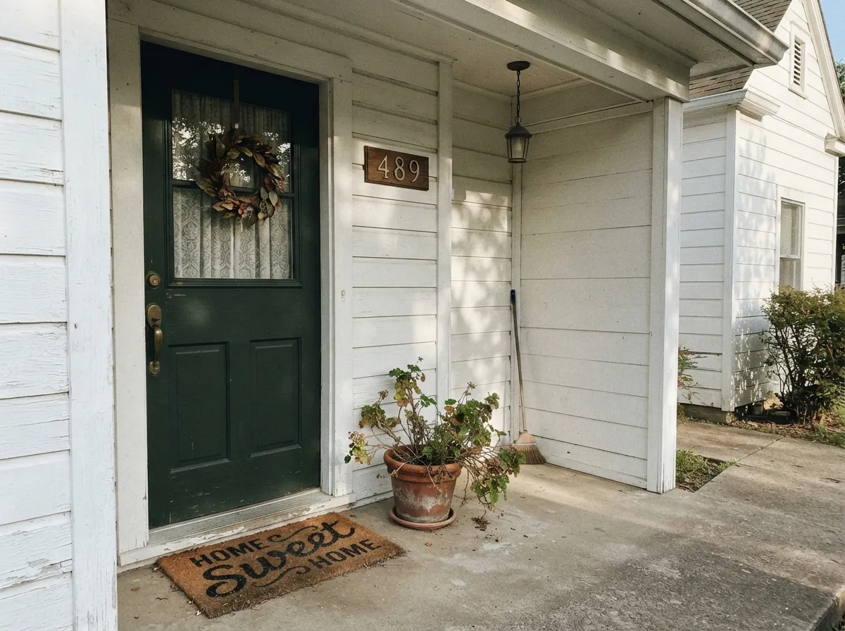
A single door gets full daylight most of the day, which is exactly the condition this color needs. Against a white or pale-greige house it reads as a deliberate, expensive near-black-green rather than just another dark door. Semi-gloss for the weather and the wipe-down.
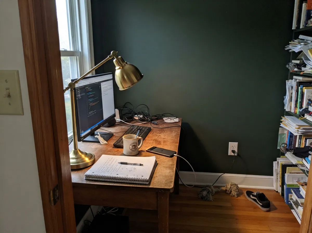
Built-ins, a single accent wall, or a reading nook with a warm floor lamp all flatter it. Pair with walnut shelving and brass task lighting rather than cool overhead fluorescents.
A little room takes a dark color well, and one good sconce is enough light to make it work. Full four-wall coverage here is lower-risk than in a bedroom because powder rooms are rarely someone's only light source in the house.
Behind a headboard with a pair of warm bedside lamps it reads moody and calm. Wrapping a small, dim bedroom in it on all four walls is the fastest way to end up with the "it looked black" complaint — save the full commitment for a room with more daylight.
Works as trim, a fireplace surround, or built-in millwork against a lighter wall color; a full open-plan wall of it has to hold its own against every light source in the space, which is a bigger bet than most people realize until they've lived with it a week.
Your Light Is the Risk
This is the light where North End proves it's a color and not just dark paint — the green comes forward and you can actually see brushwork and depth instead of a flat black plane.
Without real light bouncing off it, LRV 7 collapses to black. This is the single most predictable disappointment with this color, and it's entirely fixable with a lamp plan, not a repaint.
Morning or late-day low sun catches the surface at an angle and pulls a visible green edge out of what looked black an hour before. The shift is real and most owners like it.
Warm bulbs let a faint green glow survive in the lamp pools after dark. Cool or daylight LEDs flatten it to pure charcoal-black — swap the bulbs before you blame the paint.
Most complaints about North End are a light mismatch. Upload a photo of your actual room and see it on your walls — then ask for the same wall in north light or evening lamps before you buy a single sample.
Need It From Another Brand?
Any paint counter can custom-tint Backdrop BD-NE directly. If you would rather stay in one brand's own deck, these are the closest stock matches, measured as ΔE2000. Under 2 is a difference you will not see on the wall.
| Brand | Closest color | ΔE | LRV | |
|---|---|---|---|---|
| Sherwin-Williams | Dard Hunter GreenSW 41 · Sherwin-Williams | 1.6 | 6 | Color page → |
| Behr | Black Bean790D-7 · Behr | 3.3 | 6 | Color page → |
| Valspar | Devon GreenT607 · Valspar | 4.0 | 7.1 | Color page → |
| PPG / Glidden | Pine ForestPPG1134-7 · PPG / Glidden | 2.3 | 7 | Color page → |
| Glidden | Dark Hunter Green30GG 06/113 · Glidden | 4.5 | 6 | Color page → |
| Dutch Boy | Baked Spinach327-7DB · Dutch Boy | 1.6 | 6 | Color page → |
Similar Backdrop Colors
The nearest shades to North End within Backdrop's own range, ranked by perceptual color distance — useful when you want the same look a touch lighter, darker, or warmer.
WCAG 2.1: AA is 4.5 : 1 for normal text, 3 : 1 for large text, AAA is 7 : 1.
North End vs the Colors You're Also Considering
Every North End sample board has the same rivals on it. The numbers show the real lightness gap — then it comes down to which risk you would rather live with.
Pick this for a slightly cooler, more balanced green with none of the yellow lean North Woods carries.
Behr N410-7 · LRV 8North WoodsPick this if you want almost the identical depth from a brand you can sample in-store before you commit.
Pick this when you want the wall to read as a color, not as near-black, even in modest light.
Benjamin Moore PM-22 · LRV 4Essex GreenPick this for a genuine near-black exterior classic with more blue in it — deeper still, and built for shutters and doors.
Pick this for the cooler, more neutral dark green with no olive-yellow undertone to manage.
Behr M380-7 · LRV 7Royal OrchardPick this if you want the same darkness pushed warmer and more olive.
Pick this for maximum drama, when losing detail in low light is an acceptable trade for how good it looks under a lamp.
Benjamin Moore HC-125 · LRV 18Cushing GreenPick this if LRV 7 feels like too much commitment — same grayed-green family, more than twice the reflectance, and it still reads as green in ordinary light.
After Hours (BD-AH), LRV 6, is the closest sibling. Its saturation is lower, so it reads as a green-tinged charcoal rather than a true green. Choose After Hours if you want people to say "black," and North End if you want them to say "green." In side light the difference is obvious; in a dim room they nearly merge.
Last Call (BD-LC), LRV 6, sits on the blue side with a violet cast. It is equally dark but feels dressier and cooler, better suited to a formal dining room, where North End leans more natural and organic.
We Three Kings (BD-WK), LRV 8, is a slate navy-blue at almost the same depth. It pairs more easily with grays and crisp whites, while North End pairs more easily with wood, cream, and warm metals. If your room already has lots of oak or tan leather, North End is the safer dark; in a gray-based scheme, We Three Kings fits better.
North End Coordinating Colors
The rule for coordinating with North End: pale, warm whites to bounce light back at it, and other dark neutrals used sparingly so the room has one clear dark note, not three competing ones. Brass and walnut are its best company; icy whites and polished chrome are its least flattering.
Backdrop as a Brand: What You're Actually Buying
Backdrop is a direct-to-consumer paint company out of Los Angeles, founded by Natalie and Caleb Ebel, selling a curated deck of roughly 85 interior colors online only — no dealer counter, no in-store fan deck to flip through. Its self-priming interior standard finish is pitched on convenience: low odor, quick recoat time, an easy-pour can, and a price around $59 a gallon that sits well above big-box paint and roughly in line with a premium regional brand.
The naming convention is the clearest sign of who the brand is chasing: colors read like playlist titles or vacation memories — Lawn Party, Dark Arts, Weekend Upstate, Kismet — rather than the numbered, historically footnoted names a legacy brand like Benjamin Moore uses. North End fits that pattern: evocative, unattached to any single design tradition, sold on vibe rather than pedigree. That's not a knock — it just means you're buying a well-made, competently formulated color from a young company, not a shade with fifty years of documented real-world performance behind it.
North End With Wood Tones and Metals
Walnut, dark stained oak and any warm, deep wood tone sit comfortably next to North End because both are already dark — the pairing reads intentional rather than heavy. Pale white oak and light ash work too, and give the strongest visual contrast if that's the goal.
Metals decide more than most people expect. Unlacquered brass and aged bronze pick up warmth from the green and look genuinely expensive against it. Matte black hardware is safe but low-contrast — it can nearly disappear into the paint in dim light, which is either the point or a problem depending on what you wanted. Polished chrome and nickel are the pairing to test first: their coolness fights the green's warmth more than any other finish here.
Three Ready Palettes Built on North End
A color is never alone on the wall. These are complete combinations in the 60-30-10 pattern, with the reason each one holds together. Every one opens in the visualizer.
A near-white perimeter throws enough daylight back onto the island for North End to read as forest green instead of black. Wrought Iron on a hood or shelf brackets the room with a second near-black note without adding a third color to manage.
Try this palette in your roomA single door gets the full daylight North End needs to prove it's green. Cushing Green on the shutters repeats the family without doubling the darkness, and a warm white body keeps the whole front elevation from tipping too somber.
Try this palette in your roomSwiss Coffee keeps most of the room bright enough to bounce light onto the dark wall, which is what North End needs to avoid going flat. Royal Orchard inside open bookshelves adds a second dark note without another full wall of commitment.
Try this palette in your roomNorth End FAQ
Is North End actually green, or is it just black?
It's a genuine dark green — but at LRV 7 it needs real light to prove it. In good daylight or under a warm lamp you can clearly see the green. In a dim room with no lamps, it will look black, and no amount of squinting at the can fixes that; the fix is a light plan, not a different can.
What white goes with North End?
A warm white like White Dove or Chantilly Lace works best on trim or a perimeter next to it — the contrast in reflectance is what lets North End read as color instead of a black hole in the room. A stark cool white can make the pairing feel harsh rather than crisp.
Is it good for kitchen cabinets?
Yes, especially on an island against paler perimeter cabinets — that's the pairing that flatters it most, and LRV 7 hides everyday scuffs and fingerprints well. Use a real cabinet-grade satin enamel, not a wall paint, for the wear a kitchen surface takes.
Does it work in a room with little natural light?
Not as a full four-wall treatment. A dim or windowless room is exactly where this color reads as plain black rather than green. It still works there as a door, a piece of millwork, or an accent under a dedicated lamp — just not as the only color on every wall.
What metal finish pairs best with it?
Unlacquered or antique brass is the classic match and looks the most expensive against it. Matte black hardware disappears into the paint in low light, which some people want and some don't. Polished chrome is the one finish that reads coldest next to this particular green.
How does it compare to a Benjamin Moore or Sherwin-Williams dark green?
Close in depth to Behr North Woods and Behr Royal Orchard — both sit at LRV 7–8 with a similar near-black forest character, one slightly warmer, one slightly cooler. The real difference isn't the color, it's the buying experience: Backdrop is online-only with no in-store sample rack, where BM and Behr let you hold a fan deck and a big sample pot before you commit.
Have you painted with North End?
Rate it — one tap helps the next reader decide.
Ask a Question