Dainty Lace
The Behr warm greige almost nobody searches for by name, reviewed honestly: where it quietly earns its keep, the light that flattens it, and what to pick instead.

Jessica has spec'd whites and neutrals for more than 300 rooms and keeps a sample wall of painted drawdowns in her studio. Every color review is checked against real reader rooms in the comments and re-tested when a formula changes. About the testing process →
- 1Mindful Gray48
- 2Revere Pewter55
- 3Dainty Lace62
- 4Pale Oak69
- 5Shoji White74
The Fast Verdict
Dainty Lace is a warm greige-beige that does the same job as Benjamin Moore's famous Edgecomb Gray — almost the identical hex, almost the identical LRV — without a single design blog ever writing it up. At LRV 62 it sits right in the sweet spot between beige and gray: warm enough to flatter oak and brass, muted enough to avoid reading like builder-grade tan. Nothing about it is exciting. That is the whole appeal, and also why nobody talks about it.
Whole-house walls in a room with decent daylight · kitchens and living rooms with warm wood floors · buyers who want a safe warm neutral without paying a "trend name" premium · anyone who already loves Edgecomb Gray and wants the Behr equivalent
Your room is dim and north-facing · you want a true gray with zero beige · your trim and doors are already a stark cool white · you're chasing a specific viral color for resale appeal
- Clean warm-greige undertone with no pink or green surprise
- Flatters warm wood floors, oak cabinets, and brass hardware
- LRV 62 holds its color without going flat or swallowing a small room
- Ages well precisely because it isn't a trend color
- A near-exact, less expensive alternative to Benjamin Moore Edgecomb Gray
- Goes flat and slightly muddy in dim, north-facing rooms
- Looks dingy next to stark cool-white trim
- Unglamorous — almost no design-blog coverage to check the color against before buying
- Not a true gray, despite what the name might suggest
What Color Is Dainty Lace, Really?
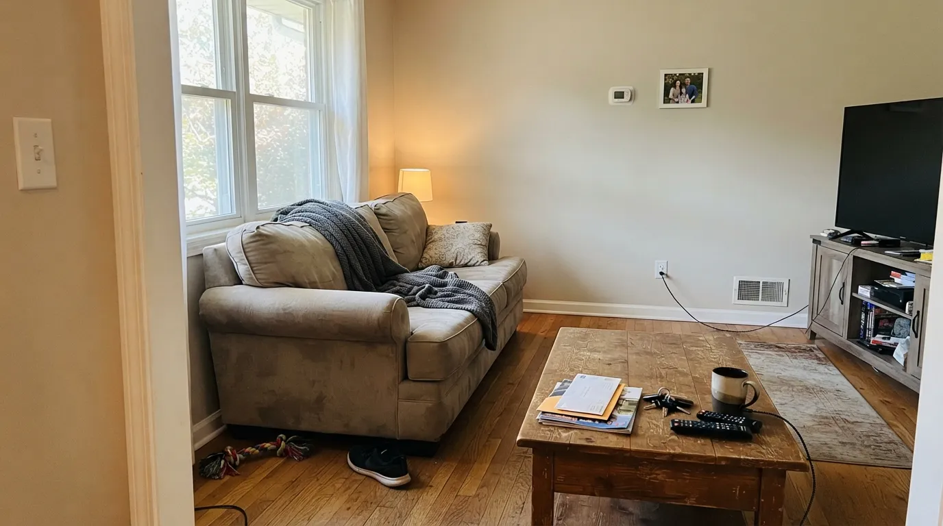
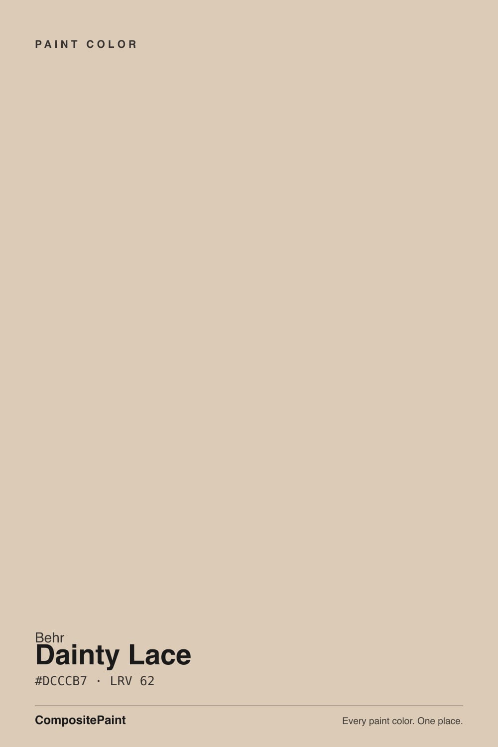
A warm, grayed-down beige — the pigment math is straightforward: red and green sit close together (220 vs 204), blue trails well behind (183), which is the recipe for a color that reads "tan" in isolation but "greige" once it's rolled across a whole wall and diluted by white. There's no pink flag and no green flag in the numbers; this is a clean, mid-warm neutral without a personality quirk to watch for, which is unusual for a color in this LRV range.
At LRV 62 it sits noticeably lighter than a true greige like Revere Pewter (LRV 56) but with more body than the pale off-whites people mistake for "safe." It will not disappear into a wall the way an LRV-75 cream does, and it will not swallow a small room the way anything under LRV 50 can. That middle placement is exactly where Edgecomb Gray (BM HC-173, LRV 63, hex #D2C9B7) lives — the two colors are close enough on paper that a painter switching brands mid-project could get away with it.
Undertone in one line: warm beige first, a soft gray settling it down second — never pink, never green, never cool. If a swatch of it looks flat or slightly muddy on your wall, that's dim or north light doing what it does to every warm neutral in this LRV band, not a defect in the paint.
Where It Shines
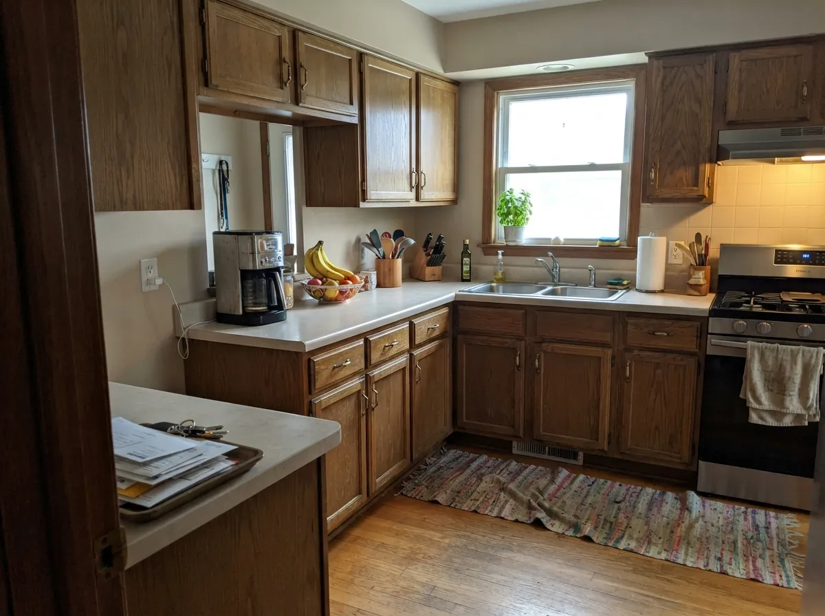
Give it ordinary daylight and it does the job a whole-house neutral is supposed to do: it doesn't fight the floor, doesn't fight the cabinets, and doesn't demand the rest of the room be redecorated around it. It is at its best next to warm wood — oak, walnut, butcher block — and brass or matte-black hardware, the same company Edgecomb Gray keeps. Because it's underexposed rather than trendy, it also ages well: nobody is going to look at these walls in ten years and immediately date the paint job to a specific Pinterest year.
Where It Fails
The complaints that do exist for this color follow three predictable patterns, and none of them are unique to Dainty Lace — they're the standard failure modes for any warm greige in the LRV 55–65 range. If your room already matches one of these, sample it big before you commit a gallon.
"Lace" and "Dainty" sound cool and delicate, but the paint underneath is warm beige-greige, not gray. On the chip the beige is subtle enough to miss; on four walls it's unmistakable. If your goal was a true cool gray, look at Stonington Gray or Light French Gray instead and let this one go.
A bright, blue-white trim (Extra White, Chantilly Lace territory) throws the warm beige into relief and makes the wall look dingy by comparison — the single most common regret story for any color in this family. Match the trim's warmth to the wall's warmth: a soft warm white like Swiss Coffee or Dainty Lace itself in semi-gloss keeps the room coherent.
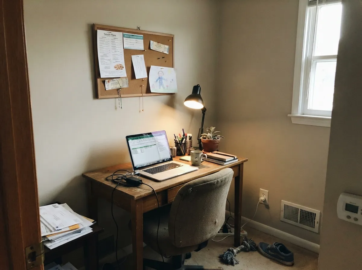
Cool light and low light both strip warmth out of a beige-greige and leave a flat, slightly grayed-down tan that photographs worse than it looks in person. It isn't a paint failure — it's what north light does to every warm neutral. Warm 2700K bulbs and, if you can get it, a second light source fix most of the complaint.
Room by Room
A dependable backdrop for wood furniture, leather, and neutral upholstery. It doesn't compete for attention, which is exactly the job in a room full of other things to look at.
Reads well against oak cabinets, butcher block, and warm quartz. It won't fight granite the way a cool gray sometimes does. Satin or eggshell for wipeability near the stove.
Restful without being cold. Keep the bulbs at 2700K; under cool white LEDs it can drift toward flat and slightly gray, which is not the mood most people want in a bedroom.
Warm quartz, wood vanities, and brass fixtures agree with it. Cool blue-grey marble or chrome-heavy fixtures push against the warmth — sample first if your stone leans cool.
This color wants a warm-white or same-color trim, not a stark cool white. A brighter, colder trim white is the fastest way to make these walls look dirty rather than finished.
In full sun it reads a step brighter and cleaner than indoors, and it pairs comfortably with charcoal or black trim for a soft modern-farmhouse look, or with warm-toned stone and brick. Avoid stark white trim outside for the same reason it fights indoors.
Your Light Is the Risk
Steady warm daylight keeps the beige and the gray in balance all day — the most whole-house-safe condition for this color.
Cool, flat daylight drains the warmth and leaves a muted, slightly gray-tan that reads duller than the chip. Test a large sample here before committing.
Warmer and more beige at the sun-facing hours, quieter and more neutral the rest of the day — a gentle shift most people don't notice, but it's real.
2700K bulbs bring the warmth forward and make it feel cozier at night. Cool white LEDs flatten it toward gray — swap the bulbs before you swap the paint.
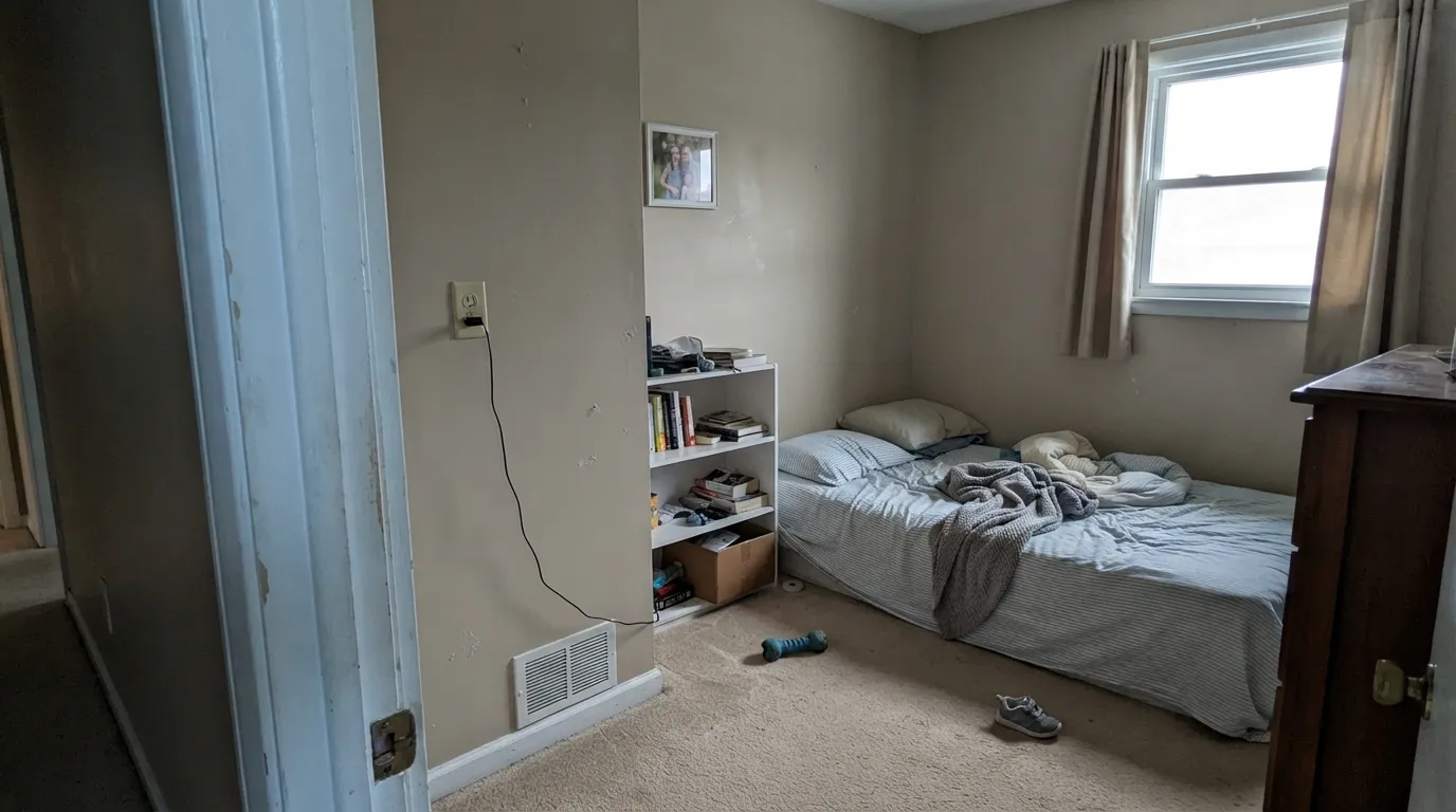
Most complaints about Dainty Lace are a light mismatch. Upload a photo of your actual room and see it on your walls — then ask for the same wall in north light or evening lamps before you buy a single sample.
Need It From Another Brand?
Any paint counter can custom-tint Behr MQ3-11 directly. If you would rather stay in one brand's own deck, these are the closest stock matches, measured as ΔE2000. Under 2 is a difference you will not see on the wall.
| Brand | Closest color | ΔE | LRV | |
|---|---|---|---|---|
| Sherwin-Williams | StuccoSW 7569 · Sherwin-Williams | 1.5 | 63 | Color page → |
| Benjamin Moore | Havana Tan1121 · Benjamin Moore | 1.2 | 62 | Color page → |
| Valspar | Rattan Basket3007-10C · Valspar | 0.9 | 61.4 | Color page → |
| PPG / Glidden | Water Chestnut1097-3 · PPG / Glidden | 1.7 | 63 | Color page → |
| Glidden | Seriously SandPPG1085-3 · Glidden | 1.2 | 62 | Color page → |
| Dutch Boy | Sugar Scrub419-1DB · Dutch Boy | 2.9 | 63 | Color page → |
Similar Behr Colors
The nearest shades to Dainty Lace within Behr's own range, ranked by perceptual color distance — useful when you want the same look a touch lighter, darker, or warmer.
WCAG 2.1: AA is 4.5 : 1 for normal text, 3 : 1 for large text, AAA is 7 : 1.
Dainty Lace vs the Colors You're Also Considering
Every Dainty Lace sample board has the same rivals on it. The numbers show the real lightness gap — then it comes down to which risk you would rather live with.
Pick this if you're already committed to Behr and want the same warm-greige effect at Behr pricing.
Benjamin Moore HC-173 · LRV 63Edgecomb GrayPick this if you want the famous, heavily-reviewed version of nearly the same color — same undertone, same light behavior, more sample-room track record.
Pick this for a bit more depth and a touch more gray in the mix.
Behr PPU7-10 · LRV 65Roman PlasterPick this for a slightly lighter, plainer warm beige from the same Behr deck, with less gray settling it down.
Rodda Oyster CA018 at LRV 63 and a deltaE of 0.93 is a true match, as is Valspar Rattan Basket 3007-10C at LRV 61.4 and deltaE 0.95. Glidden Seriously Sand PPG1085-3 at LRV 62 and deltaE 1.19 and Benjamin Moore Havana Tan 1121 at LRV 62 and deltaE 1.24 would both be visually identical in normal room light.
Sherwin-Williams Stucco SW 7569 at hex #DCCFBA, LRV 63 and deltaE 1.53 is the same story, one point brighter and a hair softer. Farrow and Ball Joa's White No. 226 at LRV 63 and deltaE 1.85 also sits inside that band.
Annie Sloan Old Ochre at LRV 60 and deltaE 3.78 is close but visibly different side by side, reading more clearly yellow. Clare Flatiron PNT100-LT-17 at LRV 61 and deltaE 4.21 is the same lightness but noticeably grayer and cooler, which is a useful alternative if Dainty Lace turns out too warm for your room.
Dainty Lace Coordinating Colors
The rule for coordinating with Dainty Lace is the same as for any warm greige: stay warm on trim and metals, and don't let a stark cool white sit right next to it. It pairs cleanly with soft warm whites, deeper charcoal-toward-black anchors, and navy for a single confident dark note. These are the partners that keep the color looking finished rather than dingy:
Why You've Probably Never Heard Of Dainty Lace
Some colors get famous through a Color of the Year campaign or a designer's Instagram grid. Dainty Lace got neither. The MQ prefix on its code just means it's cataloged under Behr's Marquee one-coat collection — the same numbering every Marquee color gets, not a mark of obscurity by itself — but unlike Behr's headline names (Swiss Coffee, Blank Canvas, Chic Gray) it never got its own campaign, and there's almost no forum discussion to check it against before buying.
That obscurity cuts both ways. It means there's no hype to live up to, and honestly, no large body of real-room reports to lean on beyond the color science and light behavior every warm beige-greige in this LRV range shares. It also means the color hasn't been chased by a wave of copycat trend paint the way Edgecomb Gray or Agreeable Gray have — which, if trend-fatigue is a real concern for you, is arguably a point in its favor rather than against it.
Dainty Lace With Wood Tones and Floors
Warm wood is the safe pairing here: oak, walnut, and butcher block all sit comfortably against this color because their warmth and the paint's warmth agree with each other. Honey oak in particular benefits — a warm greige doesn't fight orange-leaning wood the way a true cool gray can.
Cool gray-washed or LVP flooring is the one combination worth sampling first. Against a cool floor, the warmth in Dainty Lace becomes more noticeable by contrast, which some rooms want and others don't. A large sample taped above the actual floor, viewed in your own daylight, settles the question faster than any online swatch can.
Three Ready Palettes Built on Dainty Lace
A color is never alone on the wall. These are complete combinations in the 60-30-10 pattern, with the reason each one holds together. Every one opens in the visualizer.
Both neutrals share the same warm base, so the wall-to-cabinet handoff is seamless with no cold-white clash. The near-black island supplies the one dark anchor the scheme needs and loves brass hardware.
Try this palette in your roomA soft warm white on trim keeps the beige-greige walls from ever looking dingy, and the navy door supplies one confident dark note without disturbing the calm neutral base running through the rest of the house.
Try this palette in your roomWarm siding against charcoal trim is the classic modern-farmhouse contrast, and it avoids the stark-white-trim mistake that makes warm neutrals look dirty. The near-black door is the one loud note the scheme allows itself.
Try this palette in your roomDainty Lace FAQ
Is Dainty Lace warm or cool?
Warm — a warm beige with a gray settling it down, never pink, never green, never cool. In dim or north light it can look flatter and grayer than the chip, but it never tips blue or icy.
Is Dainty Lace the same as Benjamin Moore Edgecomb Gray?
Not identical, but very close: hex #DCCCB7 versus Edgecomb Gray's #D2C9B7, and LRV 62 versus 63. If you already like Edgecomb Gray and want the same effect from the Behr deck, this is the closest match we've found.
What trim color goes with Dainty Lace walls?
A warm white or the wall color itself in semi-gloss — Swiss Coffee is a safe warm-white pick. A stark, cool-white trim (Chantilly Lace territory) is the single most common mistake; it makes the walls look dingy by comparison.
Does it work in a dim or north-facing room?
Not its best case. Dim, cool-facing rooms flatten it toward a muted gray-tan that photographs duller than the chip. If your room is dark, sample it big or step up to a lighter, creamier warm neutral instead.
Is it good for exteriors?
Yes — full sun reads it a step brighter and cleaner than an interior wall, and it pairs well with charcoal or black trim for a modern-farmhouse look. Avoid stark white trim for the same warm-vs-cool clash it has indoors.
Why haven't I heard of this color before?
It's a straightforward, well-behaved neutral that Behr hasn't built a marketing campaign around — no Color of the Year push, no design-blog features. That's not a quality flag; it just means you're on your own for sample-room stories, which is exactly why we tested it here.
Have you painted with Dainty Lace?
Rate it — one tap helps the next reader decide.
Ask a Question