Loft Light
A Home Depot sandy beige, reviewed honestly: the rooms where it reads sand, the light that turns it peach, and what to pick if the name made you expect gray.

Jessica has spec'd whites and neutrals for more than 300 rooms and keeps a sample wall of painted drawdowns in her studio. Every color review is checked against real reader rooms in the comments and re-tested when a formula changes. About the testing process →
- 1Mindful Gray48
- 2Revere Pewter55
- 3Loft Light61
- 4Pale Oak69
- 5Shoji White74
The Fast Verdict
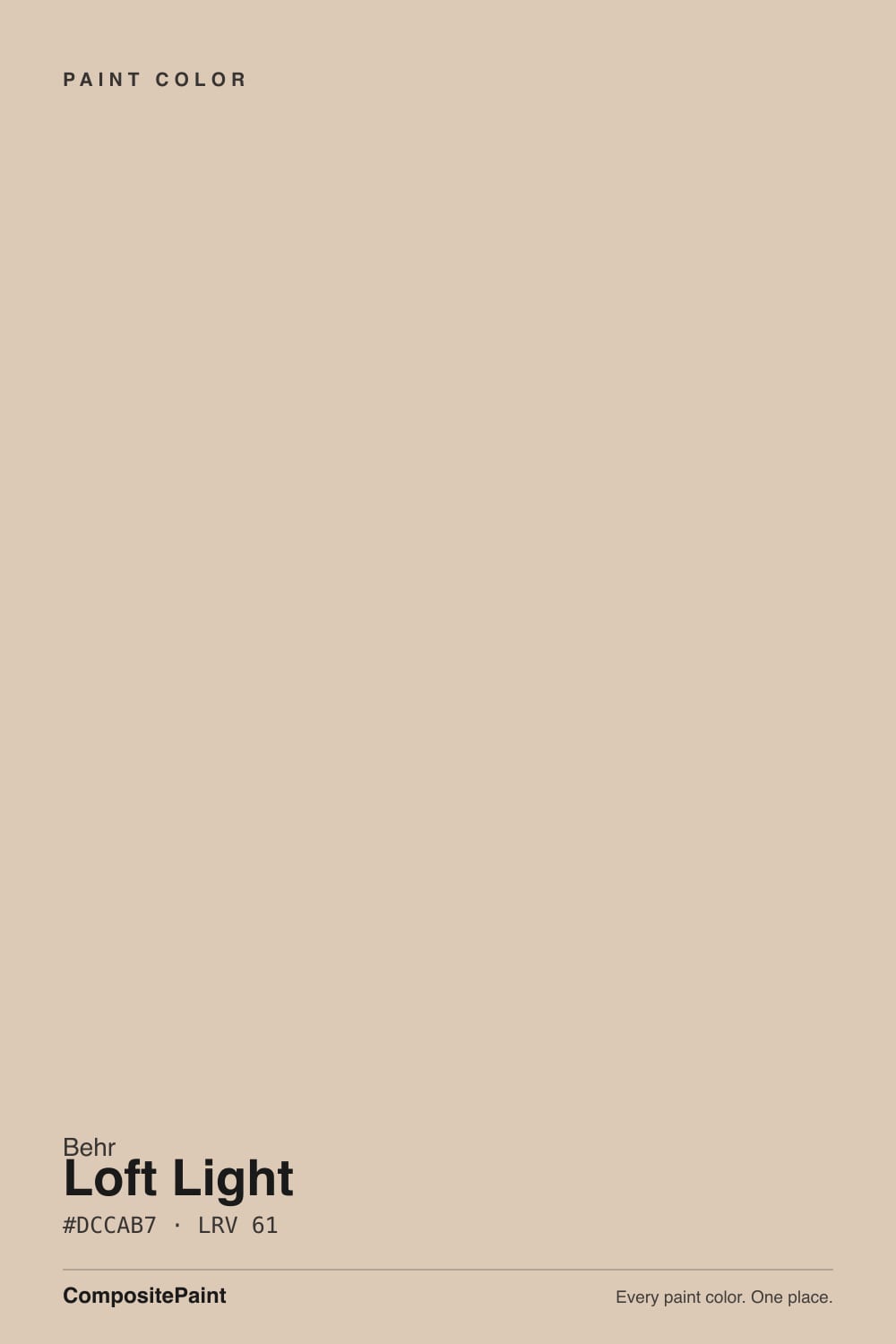
Loft Light is the color you sample when you want a real beige at Home Depot and the name sounds cooler than the can. It is not a loft gray. At LRV 61 it is a warm sandy beige with a peach-tan undertone — enough body to look finished, enough warmth to meet oak halfway, and just enough red-yellow that four walls will never pass for greige. In south light it is the calm sand people meant. In north light, or next to a crisp white, the peach is the story.
South and west living rooms with oak or walnut · bedrooms that should feel sandy, not gray · dining rooms under 2700K lamps · anyone who wants beige without Navajo White yellow
You wanted a loft gray or a modern greige · your floors or counters are cool gray · your trim is Extra White or another crisp white · the room faces north and runs on cool LEDs
- A real sandy beige — peach-tan, not greige pretending to be beige
- LRV 61 keeps rooms open while still reading as a color
- Meets honey oak, walnut, brass, and cream millwork halfway
- Quieter and sandier than Sherwin-Williams Beige at the same depth
- Home Depot color with Marquee one-coat hide, no designer waitlist
- The name says loft; the wall says peach — people expecting gray are surprised
- Cool north light and cool LEDs push it apricot or dingy
- Looks dated against gray floors, gray quartz, and chrome
- Crisp white trim makes the walls look like a suntan
What Color Is Loft Light, Really?
The name is doing the wrong job. Loft suggests concrete, steel, a cool gray loft — and MQ3-09 is a warm sandy beige. Behr files it in the Neutral family and sells it as morning daylight on the wall, which is the honest hour: east light keeps it sand. The pigment is peach-tan, low-chroma, not the grayed taupe of Accessible Beige and not the butter-yellow of Navajo White. It is the beige Reddit threads reach for when they ask for a normal, regular beige and every other Behr chip has already gone green or pink.
At LRV 61 it sits in the useful middle of the beige shelf: one point lighter than Agreeable Gray (LRV 60) and Even Better Beige (LRV 60), three points lighter than Accessible Beige (LRV 58). That bounce keeps a living room open, and the extra sand gives corners a warm shadow instead of a dirty one. It will not wash out the way an off-white does in a bright south room, and it will not close a hallway the way a mid-40s greige can. What it will not do is pretend to be gray. Depth multiplies the peach-tan, so the chip's polite sand becomes a real color on four walls.
Undertone in one line: peach-tan first, sand second — never green, never gray. If your sample looks apricot, that is west sun or a crisp white trim pulling the red-yellow forward. If it looks dingy, your light is cold. Both versions are the same gallon being honest about the room.
Where It Shines
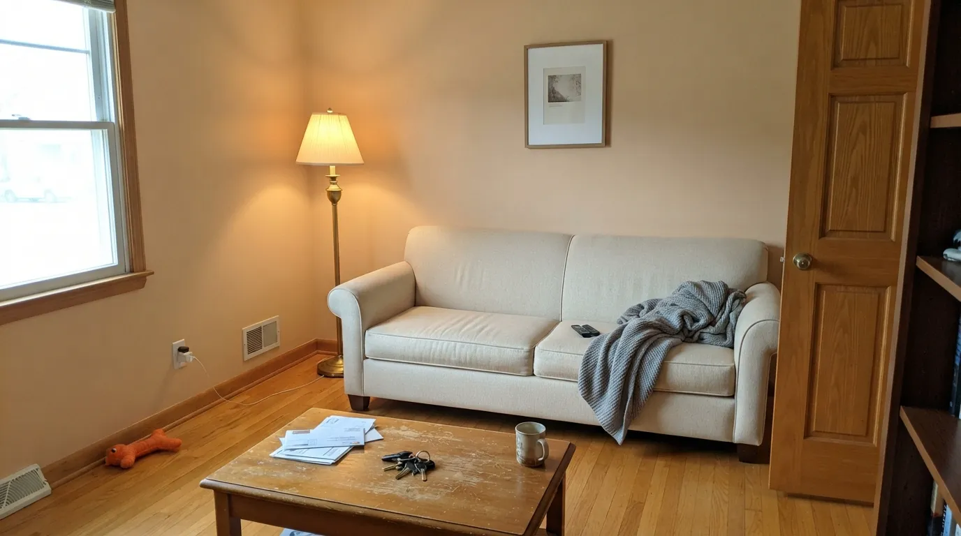
Give it real daylight, oak or walnut, and a warm off-white trim and Loft Light does the job a beige is hired for: the floors stop looking leftover, the woodwork looks chosen, and the room feels sandy instead of grayed-out. South living rooms, morning bedrooms, dining rooms under brass and 2700K lamps. Linen, leather, and unlacquered brass all sit comfortably against it. This is a Home Depot beige that actually reads beige.
Where It Fails
Almost every regret about Loft Light is the same surprise: it is warmer and peachier than the loft in the name. The three situations below are visible on a large sample before the first gallon. If your room matches one, a different beige will make you happier, and sampling bigger will only confirm it.
On the chip it looks like quiet sand. On four walls the peach-tan is unmistakable. If you came here from a cool-gray Pinterest loft, or you wanted Accessible Beige's grayed tan, this is the wrong search result. Those colors stay quiet; Loft Light stays sandy-peach. Switch before you roll the whole floor — Even Better Beige if you still want Behr beige, Agreeable Gray if you actually wanted greige.
Gray LVP, gray-veined stone and polished chrome sit at the opposite temperature. Against them the peach-tan goes muddy apricot and the gray finishes look colder. It is the pairing that makes people call this color dated. With a cool hard-finish package, use Agreeable Gray and let warmth come from wood and textiles, not the wall.
Extra White, Chantilly Lace, and other sharp trim whites pull the peach forward and make the wall look like a suntan next to a sheet of paper. Cool north daylight does the same job without any help from the trim. The fix is the pairing and the bulbs, not a second coat: Behr Off White or Sherwin-Williams Alabaster keep the sand reading deliberate. If the bright trim has to stay and the room stays dim, do not use this beige.
Room by Room
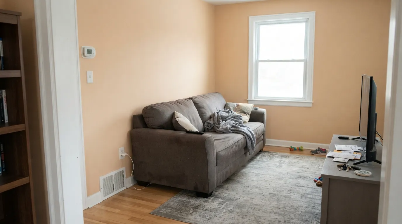
With oak or walnut and south or west daylight this is the calm sandy backdrop that makes older furniture look intentional. Eggshell on the walls; Behr Off White or Sherwin-Williams Alabaster trim in semi-gloss. Check the west wall at golden hour before you commit — that is when the peach-tan is loudest.
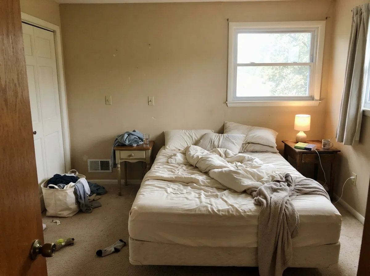
At LRV 61 it stays light enough to wake up to and warm enough to settle at night. 2700K bulbs turn it creamier and sandier; cool LEDs turn it apricot. Cream or white bedding, not gray. If the bedroom faces north and stays dim, Sherwin-Williams Natural Linen is the safer beige.
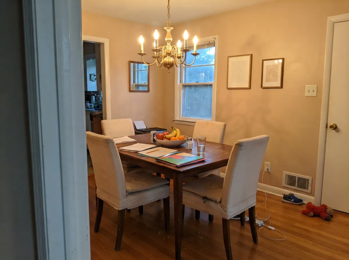
Evening rooms flatter it. A walnut or oak table, cream linen, brass, one warm chandelier — the peach-tan reads as candlelight on the wall. Eggshell, same cream trim as the rest of the floor so the handoff does not flash.
Honey oak cabinets and cream or tan stone love it; gray quartz and blue-white cabinets fight it. If the oak is staying, this is one of the few Behr walls that meets it halfway instead of making it orange. Satin on any painted cabinets. Skip the whole-kitchen bet if the counters are cool.
It carries room to room as long as every room is already on the warm side. Windowless halls will look peachier and a step deeper than the sample — that is low light, not a bad batch. One cream trim white through the floor so the walls read as a decision.
With warm stone, a wood vanity, and brass: easy. With gray porcelain or peachy-pink cultured marble: the peach-tan either argues or doubles down, and you will hate both. Sample against the actual tile, not the chip. Satin on vanity doors.
Your Light Is the Risk
Warm sun all day keeps the peach-tan in check and the wall reads as settled sand. This is the light that makes the beige true.
Cool gray daylight either drains the sand into something dingy or leaves the peach sitting on top. The beige you sampled under store fluorescents will not match. Test here first.
East morning light is its quietest, sandiest hour. West golden hour flushes the peach-tan for a couple of hours. Sample both walls; they will not agree.
2700K lamps: creamier, cozier peach-tan. Cool LEDs at 4000K: dusty apricot. Swap the bulbs before you blame the paint.
Most complaints about Loft Light are a light mismatch. Upload a photo of your actual room and see it on your walls — then ask for the same wall in north light or evening lamps before you buy a single sample.
Need It From Another Brand?
Any paint counter can custom-tint Behr MQ3-09 directly. If you would rather stay in one brand's own deck, these are the closest stock matches, measured as ΔE2000. Under 2 is a difference you will not see on the wall.
| Brand | Closest color | ΔE | LRV | |
|---|---|---|---|---|
| Sherwin-Williams | BeigeSW 2859 · Sherwin-Williams | 2.2 | 60 | Color page → |
| Benjamin Moore | Basking Ridge Beige1158 · Benjamin Moore | 2.8 | 61 | Color page → |
| Valspar | Desert Fortress2008-10B · Valspar | 0.9 | 60.9 | Color page → |
| PPG / Glidden | Cocoa CreamPPG1079-3 · PPG / Glidden | 0.6 | 60 | Color page → |
| Glidden | Antique Alencon Lace20YY 60/104 · Glidden | 1.6 | 60 | Color page → |
| Dutch Boy | Wine Cork412-2DB · Dutch Boy | 1.4 | 59 | Color page → |
Similar Behr Colors
The nearest shades to Loft Light within Behr's own range, ranked by perceptual color distance — useful when you want the same look a touch lighter, darker, or warmer.
WCAG 2.1: AA is 4.5 : 1 for normal text, 3 : 1 for large text, AAA is 7 : 1.
Loft Light vs the Colors You're Also Considering
Every Loft Light sample board has the same rivals on it. The numbers show the real lightness gap — then it comes down to which risk you would rather live with.
Pick this when you want the slightly sandier, more morning-peach version of the same Home Depot beige.
Behr DC-010 · LRV 60Even Better BeigePick this if you want Behr's sand beige with the yellow taken out — same aisle, less peach-tan.
Pick this when you actually want sandy beige, not taupe, and your wood is already warm.
Sherwin-Williams SW 7036 · LRV 58Accessible BeigePick this if you wanted the grayed modern beige — it stays quiet where this one stays peach-tan.
Arabian Sands 280E-2 at LRV 61 is #DDC9B8 against Loft Light's #DCCAB7, which is a difference nobody will see once it is rolled out. Dainty Lace MQ3-11 at LRV 62 is a shade yellower and Studio Clay MQ2-27 at LRV 60 is a shade grayer, so those two mark the useful edges of the family.
Across brands the matches are unusually tight. PPG Cocoa Cream PPG1079-3 at LRV 60 has a deltaE of 0.64, Valspar Desert Fortress 2008-10B at LRV 60.9 is 0.92, and both are true matches with no visible difference. Dutch Boy Wine Cork 412-2DB at LRV 59 is 1.39 and Dunn-Edwards Practical Tan DE6115 at LRV 58 is 1.58, so both are visually identical in normal room light.
Farrow and Ball Scallop No. 311 at LRV 60 is 2.11 and Benjamin Moore Basking Ridge Beige 1158 at LRV 61 is 2.83, very close but worth sampling first. Magnolia Home Plaster JG-156 at LRV 59 is 3.70, close but visibly different side by side.
Loft Light Coordinating Colors
The rule for coordinating with Loft Light is simple: stay warm, or go clearly complementary. Cream off-whites, bronze, navy, and muted sage all sit comfortably against the peach-tan. Icy whites, cool grays, and chrome make the sand look like a mistake. These are the partners that keep showing up in rooms that work:
A Home Depot Beige With a Misleading Name
Loft Light is not a Color of the Year and it does not have a designer waitlist. It lives in Behr's Neutral family as MQ3-09, tintable in the Marquee one-coat-hide line, and most people find it by standing in the beige row at Home Depot after every other chip has already gone green or pink. Reddit threads hunting a normal, regular beige land here for the same reason: it actually is beige.
The loft in the name is the trap. Shoppers hear loft and picture a cool industrial gray; the can is a warm sandy beige with a peach-tan undertone. There is no famous TV-house or viral living room attached to it, which is useful — you are not buying someone else's mood board. You are buying a low-chroma sand that behaves in daylight and misbehaves next to gray. Sample a big board on the actual wall for a couple of days. If it still reads sand at 6pm, you have your beige.
Loft Light With Wood Tones and Floors
This decision gets made at the floor. Honey oak, red oak, walnut, and older builder stain are the color's best friends — the peach-tan meets their orange halfway, so the floor looks calmer instead of louder. Pale unstained white oak is safe and gives the room a softer linen cast. Brass and antique bronze sit naturally against it; polished chrome is the metal that leans cold.
The one honest no is cool gray: gray LVP, gray-washed wood, gray porcelain, blue-gray carpet. Gray sits opposite peach-tan, so each side exaggerates the other — the floor reads colder, the walls read more apricot, and no amount of coats fixes geometry. If the gray floor is staying, put a large warm rug between it and this paint, or choose Agreeable Gray and keep the lightness without the fight.
Three Ready Palettes Built on Loft Light
A color is never alone on the wall. These are complete combinations in the 60-30-10 pattern, with the reason each one holds together. Every one opens in the visualizer.
Off White is warm enough to sit beside the peach-tan without turning it apricot, and dim enough that the walls still read as sand. Hale Navy supplies the one dark note a sandy scheme needs or the whole floor goes flat.
Try this palette in your roomCottage White is a farmhouse cream that never learned to be neutral, so it meets Loft Light's peach-tan instead of accusing it. Mesa Taupe adds one deeper sandy note so the bedroom has a shadow, not a theme.
Try this palette in your roomAlabaster on cabinets is warm enough that the sandy walls do not go peach against a blue-white box. Urbane Bronze on the island grounds the oak and brass; keep the counters on the cream or tan side or the whole argument collapses.
Try this palette in your roomLoft Light FAQ
Is Loft Light warm or cool?
Warm — sandy beige with a peach-tan undertone. It will not read gray except in cool north light or against gray floors, and even then the peach is still there. If you want a beige that can pass for greige, this is the wrong one.
Will it look peach on my walls?
More than the chip, especially at golden hour and under 2700K bulbs. Depth multiplies the peach-tan, and a crisp white trim makes it obvious. In south light with oak and cream trim it reads as settled sand. Sample the sunniest wall and the north wall; they will not agree.
What trim white goes with Loft Light?
A warm, slightly creamy one. Behr Off White is the default in the same aisle; Behr Cottage White if you want the farmhouse cream look; Sherwin-Williams Alabaster if your painter is already in that deck. Extra White and Chantilly Lace make the walls look apricot. Semi-gloss on the trim, eggshell on the walls.
Does it work with oak floors?
That is the reason to buy it. Honey oak, red oak and older builder stain all meet this color halfway — the wall takes the orange so the floor looks calmer. Pale white oak is fine. Cool gray LVP is the one honest no.
Loft Light or Even Better Beige?
Same store, same lightness, different tell. Even Better Beige skipped the yellow and still can flash peach in west sun; Loft Light starts from peach-tan and reads sandier and a touch more morning-warm. If pink is a dealbreaker, sample Even Better Beige first. If you want the sandier beige, this is it.
Can I use it on a whole house?
On a warm house with oak and cream trim, yes — living, halls, bedrooms, one color. Skip the north rooms that stay dim, skip any floor that is already gray, and do not run it onto the kitchen if the counters are cool stone. It is a whole-warm-house beige, not a whole-any-house beige.
Have you painted with Loft Light?
Rate it — one tap helps the next reader decide.
Ask a Question