Off White
Behr's own shelf-ready cabinet and trim white, reviewed honestly: the exact undertone, the light where it goes dingy, and what to buy instead if you want it bright.

Jessica has spec'd whites and neutrals for more than 300 rooms and keeps a sample wall of painted drawdowns in her studio. Every color review is checked against real reader rooms in the comments and re-tested when a formula changes. About the testing process →
- 1Agreeable Gray60
- 2Pale Oak69
- 3Off White76
- 4Dover White83
- 5Moonlit Beach88
The Fast Verdict
Off White is Behr's answer to "just give me a can of trim white": a warm, muted off-white with a whisper of yellow-green that Home Depot stocks as its own pre-mixed Cabinet, Door & Trim enamel — no custom tint counter required. At LRV 76 it is deep enough to shrug off scuffs and handprints on cabinets and doors, but it is not a bright wall white, and it is not trying to be a designer pick. It is the workhorse can, and it does that job well in warm light and poorly in cold, dim rooms.
Cabinets, doors and trim in warm-toned kitchens · exteriors, shutters and siding in full sun · hallways and bathrooms with real daylight · quick rental-turnover repaints where you want one dependable can
Your room is north-facing and dim · you want a crisp, bright modern white on the walls · your counters or floors are cool gray · you are trying to match a specific higher-end white like White Dove or Alabaster
- Sold pre-mixed as Behr's own Cabinet, Door & Trim enamel — no custom tint counter needed
- Deep enough (LRV 76) to hide scuffs, fingerprints and grease better than a bright white
- Warm cream-beige base flatters wood trim, cabinets and brass without tipping into full cream
- Available across nearly every Behr line — Premium, Premium Plus, Ultra, Dynasty, Marquee — so the color stays consistent as you upgrade durability
- Rated for interior and exterior use on the same can, so cabinets, trim and shutters can all match
- The yellow-green undertone reads flat and slightly dingy in cool, dim light
- Not bright enough for anyone wanting a crisp, modern white
- Looks dirty next to a brighter white trim or ceiling
- No real design identity — a workhorse color, not a color you fall in love with
What Color Is Off White, Really?
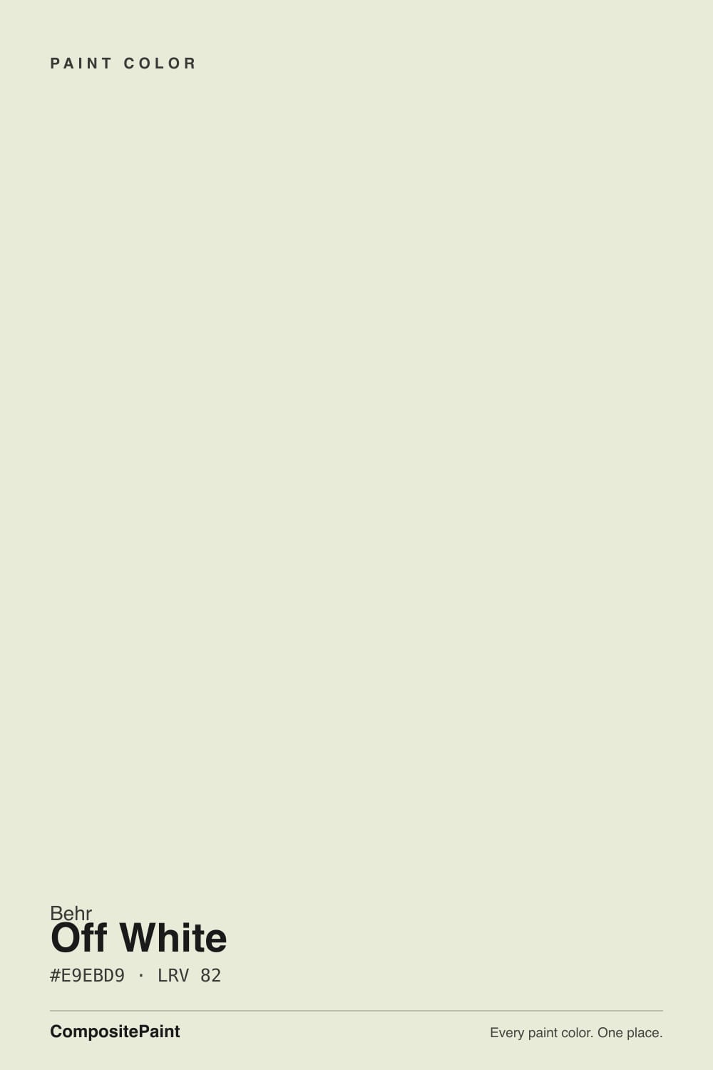
A muted, warm off-white with a gentle yellow-green undertone underneath its cream-beige surface. That undertone is what separates it from a straightforward cream: most warm off-whites lean yellow-pink, but Off White leans yellow-green, so in flat or cool light it can read faintly sage-gray instead of the buttery cast you would expect from a color this warm. It is a subtle effect, not a loud one, but it is the reason this color behaves a little differently than its cousins in the Behr deck.
At LRV 76 it sits in the middle of Behr's white lineup — noticeably deeper than Polar Bear (LRV 86) or Behr's own White (LRV 83), and a shade darker than Swiss Coffee (LRV 80). That depth is the point: Behr sells Off White as its own ready-made Cabinet, Door & Trim enamel, in semi-gloss and satin, interior and exterior, because a color this deep hides fingerprints, scuffs and grease around handles far better than a brighter white would. It shows up across nearly every Behr line — Premium, Premium Plus, Ultra, Dynasty, Marquee — so the color itself never changes, only the durability and sheen you're paying for.
Undertone in one line: warm cream-beige on top, a quiet yellow-green underneath — never pink, never blue. If your sample looks flat and slightly gray-green on the wall, that is cool daylight pulling the green forward; warm light and warm bulbs push it back toward cream.
Where It Shines
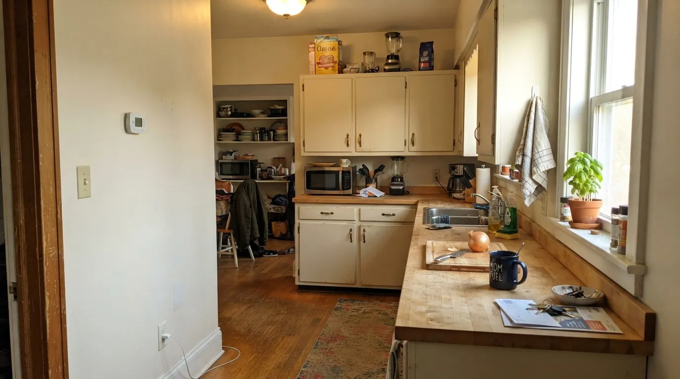
This is a can built for hands-on surfaces, not statement walls, and it earns its keep there. Cabinets, doors, window casings and trim all wear it well: the depth hides the daily wear a bright white would show off, and because Behr sells it pre-mixed as a Cabinet, Door & Trim enamel, it is genuinely one of the easiest whites to buy — no waiting at the tint counter, no batch-to-batch guessing. Outdoors, on shutters, siding trim and porch woodwork, full sun brings the cream forward and it reads clean without the stark, plasticky glare of a brighter white.
Where It Fails
Almost every complaint about Off White traces back to one of three mismatches, and all three are predictable before the first coat goes on. None of them are a defect in the paint — they are the wrong room, the wrong neighbor color, or the wrong expectation.
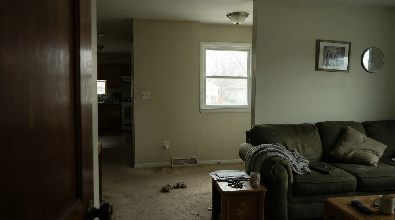
Cool, indirect daylight is exactly the light that exposes Off White's green-yellow undertone. Without warm sun or lamps to push the cream forward, the color goes flat and slightly gray-green — readers describe it as "dingy" or "institutional." The paint is not failing; the light is. Go warmer (Behr Swiss Coffee) or plan on warm bulbs.
Put Off White trim under a brighter white ceiling or against builder-white walls and the contrast makes it look dirty rather than warm. The fix is the one-color rule: use Off White for the walls, trim and cabinets in the same room, or accept the greige-adjacent step down and pair it deliberately, not by accident.
At LRV 76 with a warm-muted base, this will never look stark or gallery-bright, on a wall or on a cabinet. If the brief is white kitchen cabinets that read clean and cool, this is the wrong can — try Behr White or Polar Bear instead.
Room by Room
This is the exact color Behr packages as a Cabinet, Door & Trim enamel, and it is genuinely good at it: the depth hides grease and handprints around pulls better than a brighter white, and the warm base flatters butcher block, oak and brass. Semi-gloss for durability at the sink and stove.
Under mid-tone walls it softens the edge the way a stark white would cut. Because it ships pre-mixed as a trim enamel, it is the easiest can to grab for a quick door or baseboard refresh without a custom tint order.
Warm and clean against wood vanities and brass fixtures. Against cool gray tile or chrome it can look muddy — sample it against your actual fixtures before committing, especially in a windowless bath under cool LEDs.
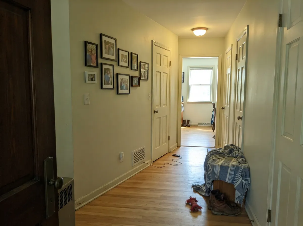
A safe carry-through color for hallways with borrowed light from adjoining rooms, as long as at least one of those rooms gets real daylight. In an all-interior, lamp-only hallway it can read a touch dull.
Workable on walls if the room gets afternoon sun or you commit to warm 2700K bulbs. In a cool, north-facing bedroom, step up to Swiss Coffee or a warmer white instead.
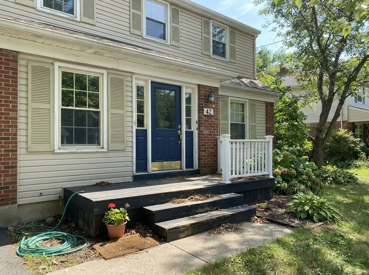
Full sun reads it cleaner and brighter than indoors, and Behr sells it as an exterior-rated enamel for exactly this use. Works well on shutters, porch trim and siding accents; pair with a dark door or shutter color for contrast.
Your Light Is the Risk
Direct or filtered sun pushes the cream forward and hides the green undertone. This is the light it was picked for.
Cool, flat daylight exposes the green-yellow undertone and the color goes dull and slightly gray. Test first in a dim room.
Warm and creamy at the sun hours, quieter and more neutral the rest of the day. A gentle shift, not a dramatic one.
2700K warm bulbs bring the cream forward and settle the color down. Cool white LEDs expose the green tinge — swap the bulbs before you blame the paint.
Most complaints about Off White are a light mismatch. Upload a photo of your actual room and see it on your walls — then ask for the same wall in north light or evening lamps before you buy a single sample.
Need It From Another Brand?
Any paint counter can custom-tint Behr 73 directly. If you would rather stay in one brand's own deck, these are the closest stock matches, measured as ΔE2000. Under 2 is a difference you will not see on the wall.
| Brand | Closest color | ΔE | LRV | |
|---|---|---|---|---|
| Sherwin-Williams | NacreSW 6154 · Sherwin-Williams | 1.1 | 76 | Color page → |
| Benjamin Moore | French Canvas1514 · Benjamin Moore | 1.4 | 76 | Color page → |
| Valspar | Totten's Inlet7006-9 · Valspar | 2.4 | 75.2 | Color page → |
| PPG / Glidden | OatmealPPG1023-1 · PPG / Glidden | 1.3 | 76 | Color page → |
| Glidden | Brandied PearsPPG1086-2 · Glidden | 1.4 | 76 | Color page → |
| Dutch Boy | Washed Cotton014W · Dutch Boy | 0.5 | 76 | Color page → |
Similar Behr Colors
The nearest shades to Off White within Behr's own range, ranked by perceptual color distance — useful when you want the same look a touch lighter, darker, or warmer.
WCAG 2.1: AA is 4.5 : 1 for normal text, 3 : 1 for large text, AAA is 7 : 1.
Off White vs the Colors You're Also Considering
Every Off White sample board has the same rivals on it. The numbers show the real lightness gap — then it comes down to which risk you would rather live with.
Pick this when you want the exact shade Home Depot stocks as a ready-made cabinet and trim enamel, with no custom tint needed.
Behr W-B-700 · LRV 87Swiss CoffeePick this for more cream and less green — Swiss Coffee is warmer and a touch lighter, with none of the green-gray risk in cool light.
Pick this for cabinets and doors that take daily handling — the extra depth hides scuffs and grease far better, and it stays easier on the walls too.
Behr 52 · LRV 83WhitePick this for a lighter, more neutral ceiling and trim white — brighter than Off White, though it takes a confident room to wear it on four walls.
Pick this if you are already buying Behr and want the shelf-ready cabinet and trim can, with zero mixing to schedule.
Benjamin Moore PM-19 · LRV 85White DovePick this if your painter works in Benjamin Moore and you want the industry-standard warm trim white — a smoother grey-warm balance with no green in it.
Diamond Vogel Whitewash 0747 shares the exact hex, #E9EBD9, and LRV 82, at a deltaE of 0, so it is the same color under another name. Kompozit and Hirshfield's Whitewash 0747 at deltaE 0.37 are matches in practice, as are PPG and Glidden Really Rain PPG1115-1 at deltaE 0.89 and 0.9.
Benjamin Moore Meadow Mist 936 at deltaE 0.9 matches on hue but sits at LRV 78, four points lower, so it will read slightly deeper. Dunn-Edwards Whispering Rain DE5533 at deltaE 0.94 drops further to LRV 76. Sherwin-Williams Queen Anne's Lace SW 6420 at #ECEAD5 and LRV 82 is at deltaE 1.92, visually identical in normal room light but a touch more yellow.
The gaps show at the far end. Farrow and Ball White Tie No. 2002 at #EFE9D8 and LRV 82, deltaE 3.83, is close but visibly different side by side, reading warmer and more cream where Off White holds its green edge. Rodda Vanilla Soy R127 at deltaE 4.32 does the same.
Off White Coordinating Colors
The rule for coordinating with Off White: stay warm, and give it something dark to anchor against, because on its own the color is quiet enough to disappear. It pairs easily with warm greiges and beiges, takes a dark cabinet or door color well, and gets along with muted greens better than with anything blue-cool. These are the partners that keep showing up in rooms that work:
Why Behr Sells Off White as Its Own Cabinet & Trim Can
Most paint colors only exist as a formula a store mixes to order. Off White is different: Behr packages it as a standalone Cabinet, Door & Trim enamel, in semi-gloss and satin, rated for interior and exterior use on the same can — and it shows up pre-mixed across nearly every Behr line, from Premium up through Dynasty. That is a deliberate choice, not an accident: it is one of Behr's most-used trim and cabinet colors, common enough to justify its own dedicated product rather than a custom order every time.
The practical upside is real. You can walk into Home Depot and walk out with the exact can for a cabinet refresh or a trim touch-up without waiting on a tint order or worrying about a slightly different mix from your last gallon. The tradeoff is the one this review keeps coming back to: a color built to be dependable and easy to buy is not a color built to be exciting. Off White does its job quietly, which is exactly what a trim and cabinet white is supposed to do.
Off White With Wood Tones and Floors
Warm wood is the easy pairing. Oak, butcher block, cedar and most stained trim sit comfortably with Off White because the color's cream-beige base meets them halfway, and on cabinets it plays especially well with brass and warm hardware finishes.
Cool-toned floors are the one combination to sample first: gray-washed LVP, cool gray tile or gray-stained hardwood can pull Off White's yellow-green undertone into relief, making the trim look slightly muddy against a crisp floor. It is rarely a dealbreaker on trim and cabinets alone, but if the whole room is going Off White on the walls too, test a large sample against the actual floor before committing.
Three Ready Palettes Built on Off White
A color is never alone on the wall. These are complete combinations in the 60-30-10 pattern, with the reason each one holds together. Every one opens in the visualizer.
Agreeable Gray's warm base keeps the wall-to-cabinet handoff calm instead of clashing, and the near-black island gives the room one anchor point so the cream cabinets don't drift toward flat.
Try this palette in your roomOne color at two sheens on the main living areas keeps a turnover repaint fast and forgiving; Even Better Beige gives a single accent room without introducing a fight; the dark door is the one deliberate contrast note.
Try this palette in your roomOff White trim in full sun reads clean and warm without going stark; navy and muted sage are both dark enough to hold their own against it and neither fights its yellow-green undertone the way a cool blue-gray would.
Try this palette in your roomOff White FAQ
Is Behr Off White 73 warm or cool?
Warm on top — a cream-beige base — with a quiet yellow-green undertone underneath. In warm light it reads soft and creamy; in cool, dim light the green comes forward and it can look flat gray-green. It is never a cool, blue-leaning white.
Is it a good cabinet paint?
Yes — it is genuinely built for this. Behr sells Off White as its own pre-mixed Cabinet, Door & Trim enamel in semi-gloss and satin, so you don't need a custom tint order, and the LRV 76 depth hides fingerprints and grease better than a brighter white would.
What's the difference between Off White and Behr Swiss Coffee?
Swiss Coffee (LRV 80) is lighter and creamier, with more warmth and less risk of a green cast in cool light. Off White (LRV 76) is a step deeper and more muted — the workhorse trim and cabinet shade rather than the wall color you'd pick for its looks alone.
Does it work on exterior trim and shutters?
Yes — it is sold as an exterior-rated enamel on the same can as the interior version. Full sun reads it clean and warm rather than stark; pair it with a dark door or shutter color like Hale Navy or Evergreen Fog for contrast.
Will it look yellow or green on my walls?
Not yellow — Off White's undertone leans yellow-green, not yellow-pink like a straight cream. In warm light it looks soft and cream-colored; in cool north light it can look faintly sage-gray. Sample it in your actual room before committing to walls.
How many coats does it need over a darker color?
Two coats over any light existing wall color. Over a dark or saturated color, prime first with a gray-tinted primer — three finish coats of a light off-white over a bold color is the expensive way to find this out.
Have you painted with Off White?
Rate it — one tap helps the next reader decide.
Ask a Question