Charcoal Blue
The blue-gray that reads near-black indoors and finally shows its color in sunlight, reviewed honestly: the doors and exteriors it was built for, and the rooms where it just goes dark.

Jessica has spec'd whites and neutrals for more than 300 rooms and keeps a sample wall of painted drawdowns in her studio. Every color review is checked against real reader rooms in the comments and re-tested when a formula changes. About the testing process →
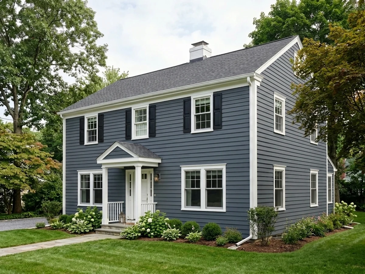
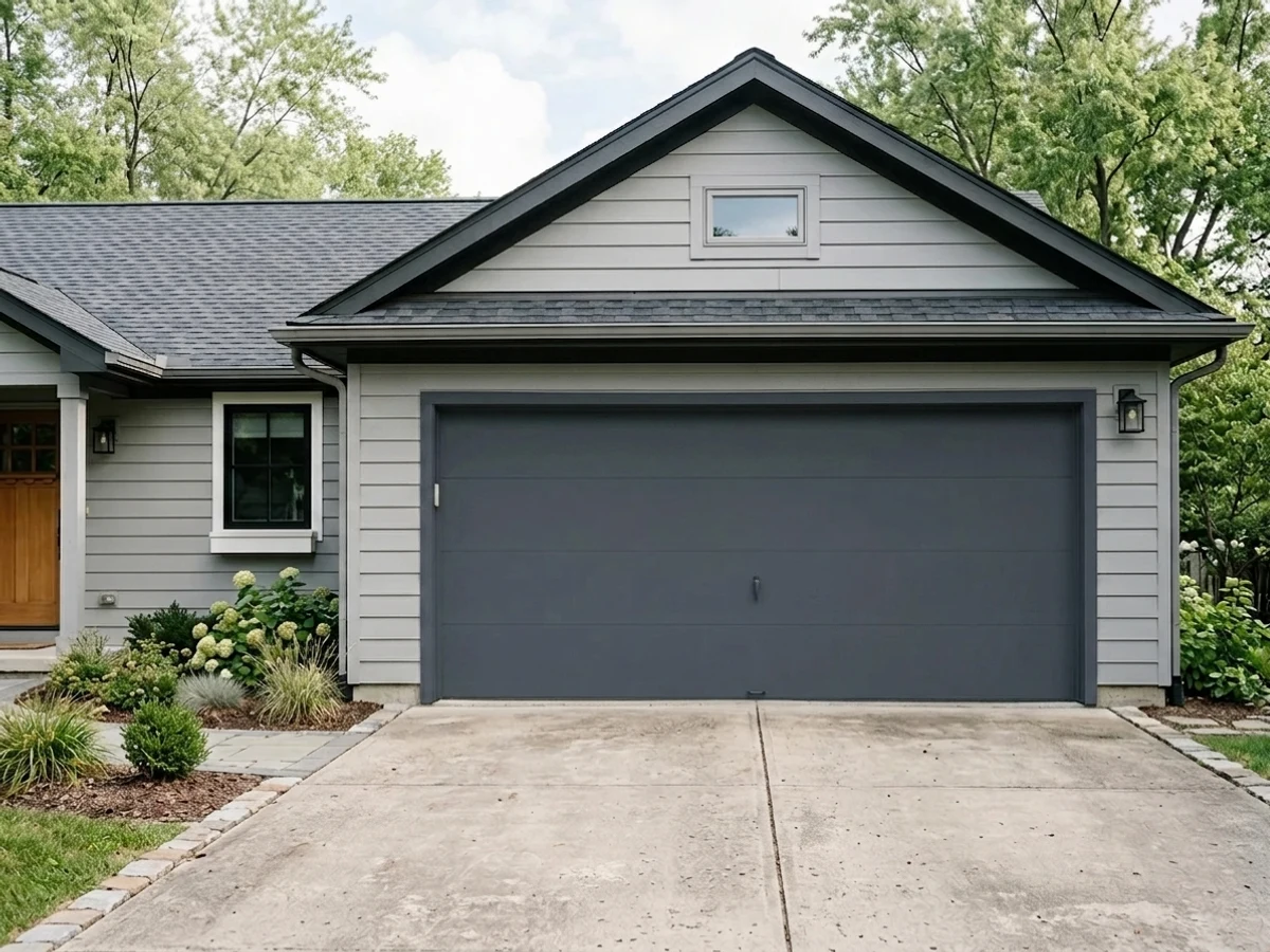
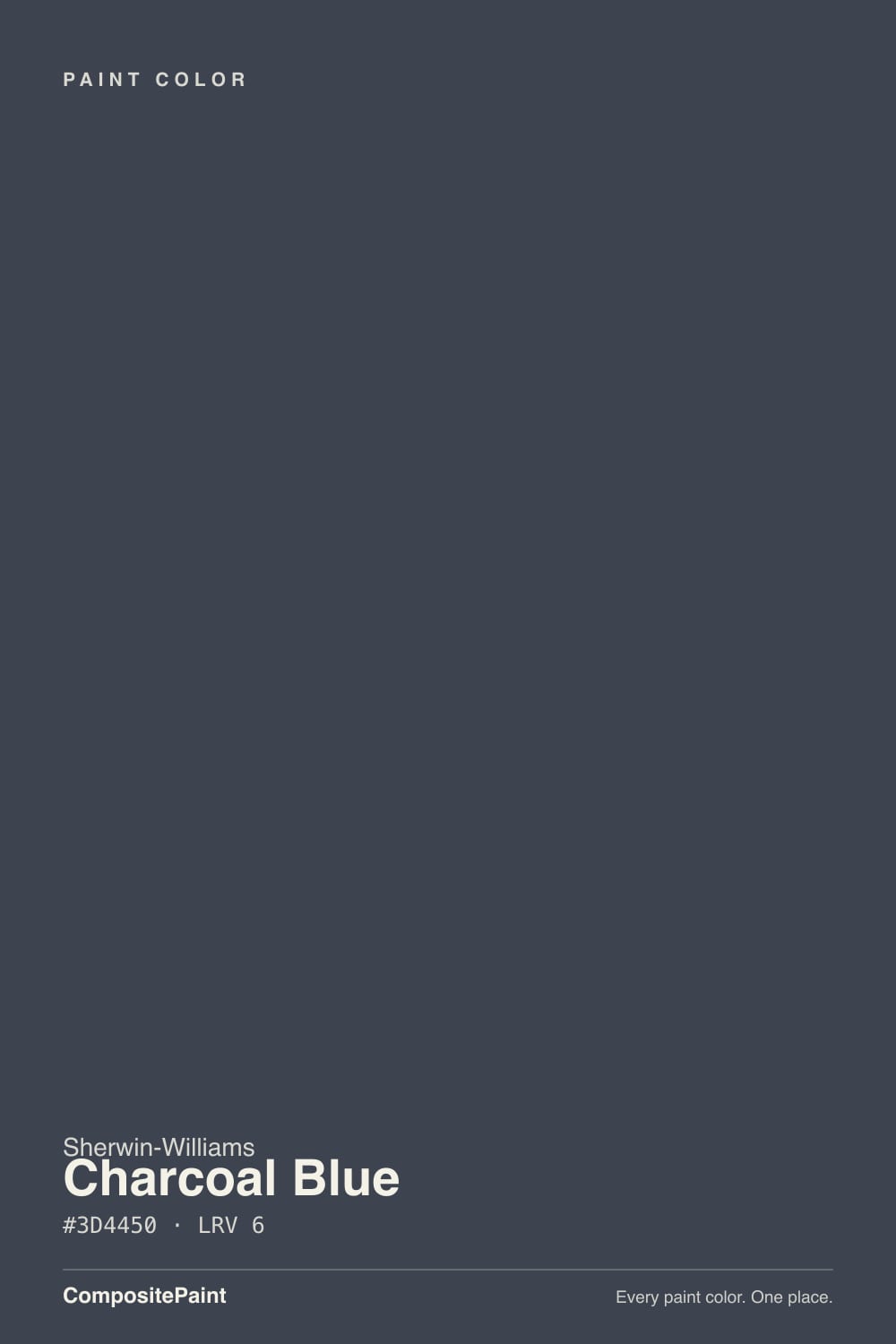
- 1Charcoal Blue6
- 2Waterloo13
- 3Charcoal Blue19
The Fast Verdict
Charcoal Blue is what a navy looks like after the warmth has been drained out of it: a deep blue-gray with a violet tilt that reads sophisticated in daylight and simply dark everywhere else. At LRV 6 it is a near-black, which is exactly why it works so well outside — a garage door, a front door, a whole facade with white trim — where full sun finally lets the blue show. Indoors it needs a bright room or good lighting to be a blue at all.
Garage doors and front doors · exteriors with white or off-white trim · kitchen islands, built-ins and cabinets under light walls · offices and dens with real windows
You want an obvious, cheerful navy · the room is small, dim or north-facing · your siding or shutters are vinyl · you are painting over a light color and hate three-coat jobs
- One of the best garage-door and front-door colors in the SW deck
- Muted enough to stay rich in full exterior sun instead of washing out
- The violet lean sits well with red brick, warm stone and cool stone alike
- Near-black depth hides dents, grime and panel seams on big doors
- Reads as a sophisticated neutral-dark, not a loud navy
- At LRV 6 it reads black in any room without strong light
- Off-limits on vinyl shutters and vinyl-clad doors — heat warping
- Poor coverage over light colors; primer plus two to three coats
- Dark exteriors fade and chalk sooner unless you buy premium paint
What Color Is Charcoal Blue, Really?
A deep blue-gray with the blue heavily muted and a violet tilt underneath. That tilt is the whole personality. Put it beside a true navy and Charcoal Blue looks cooler and dustier — one exterior designer's painter nicknamed it a blurple, and once you have heard that you cannot unsee it. It is not a purple wall by any stretch; it is a navy that leans away from green and toward violet, which is why it sits comfortably next to red brick and warm stone that a green-leaning navy would fight.
At LRV 6 it is a near-black, in the same depth bracket as Iron Ore and Hale Navy. Practically, that means the color you get depends entirely on how much light hits the surface. In direct sun it is unmistakably blue. In an average room, in shade, or after dusk it collapses into a soft charcoal that most people would call black. Outdoors this is a feature — exterior sun is several times stronger than window light, so the muted blue holds up on a facade where it would go flat on a wall.
Undertone in one line: cool blue with a violet lean, and a lot of gray in the mix — never warm, never green. Some write-ups describe a whisper of green in it; on the wall next to an actual green-leaning navy that reading does not hold up. If your sample looks pure black, your light is the problem, not the pigment.
Where It Shines
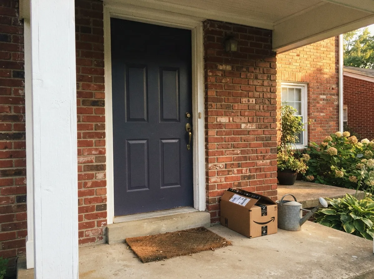
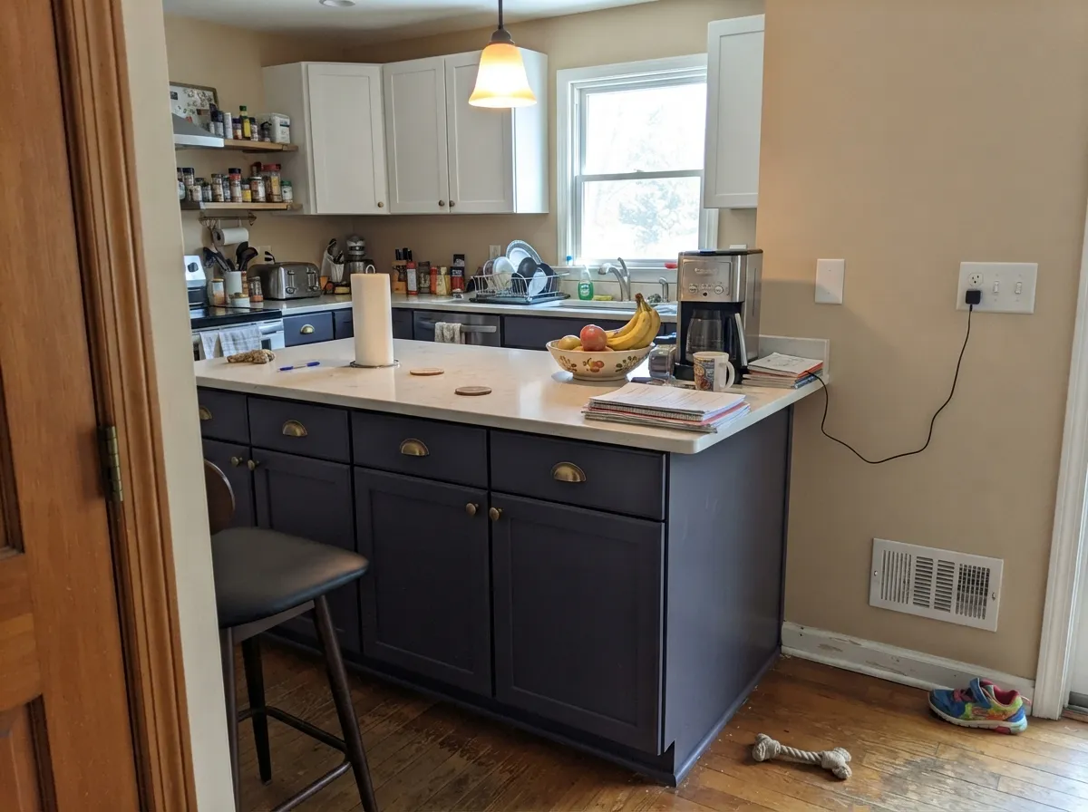
This color was made for surfaces that live in daylight. A garage door is its single best job: two big flat panels in open sun, where the blue reads clearly, the depth hides dents and road grime, and the door finally stops being the biggest blank rectangle on the house. Front doors and shutters are the same argument at smaller scale. Indoors it earns its keep in doses — an island, a run of built-ins, an office wall opposite a real window — where light walls around it keep the blue awake.
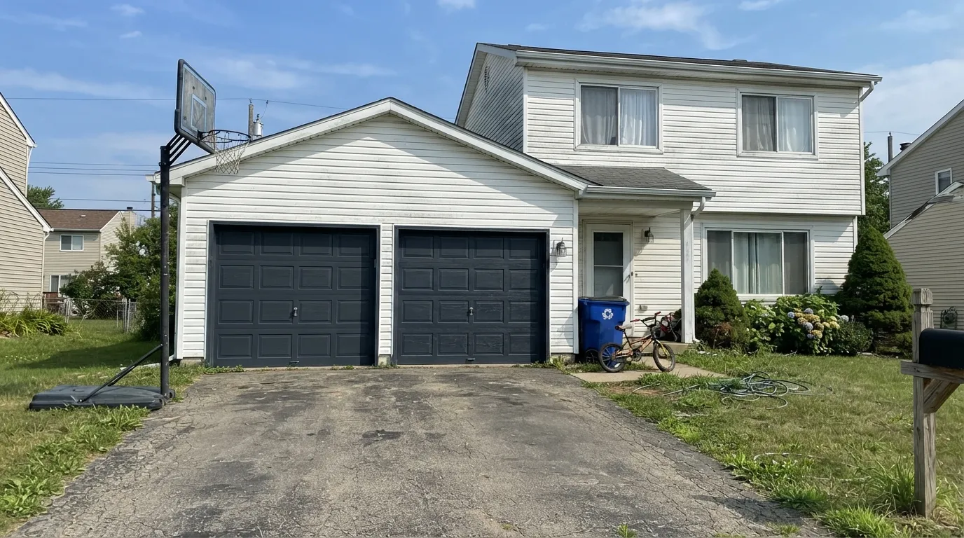
Where It Fails
The complaints about Charcoal Blue are remarkably consistent, and every one of them is predictable before you open the can. Two are about light and one is about the surface you are painting. If your project matches, sampling bigger will only confirm it.
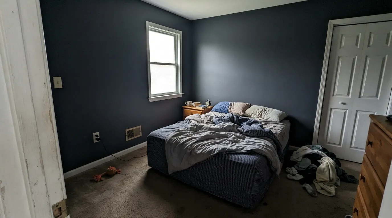
This is the number-one regret, and LRV 6 explains all of it. In a north-facing room, a hallway, a windowless powder room or anywhere after sunset, the blue drains out and the surface reads as a slightly cool black. Owners describe cabinets that looked navy in the showroom and black in their kitchen. If the blue is the point, the surface needs direct sun or a bright, light-walled room around it — otherwise pick something a couple of steps lighter.
Dark paint on vinyl is a real failure mode, not a technicality: an LRV 6 color absorbs almost everything that hits it, the panel heats far past what the vinyl was engineered for, and it warps or buckles. Vinyl-safe formulas exist precisely because of this, and a color this dark falls well outside the safe range. Insulated steel and fiberglass doors handle it fine. On a south or west wall in a hot climate, use a premium exterior line with fade-resistant pigments — budget dark blues chalk and go patchy years early.
Deep-base blues cover badly over anything light. Expect a gray-tinted primer plus two full coats, and plan on three if you are going over white siding or a builder-beige garage door. Touch-ups on a big flat panel flash unless you keep a wet edge and roll the whole section — the honest advice on a garage door is to do the full door in one go rather than dab it later.
Room by Room
The strongest use of this color. Full daylight keeps it reading blue instead of black, the depth hides dents, dirt and the panel seams, and against white or off-white siding it turns a builder-blank door into an intentional part of the facade. Satin exterior enamel on steel or fiberglass — not gloss, which telegraphs every ding. Never on a vinyl or vinyl-clad door.
The same logic in a smaller, cheaper test. On a white house it is quietly formal; on red brick the violet lean is what saves it, since a green-leaning navy would argue with the brick's orange-red. Satin holds up better than gloss under sun and hides brush marks on a paneled door.
It survives full sun better than most darks because it is already muted; designers who use it on siding report it stays deep and rich outdoors rather than washing out. It needs a bright trim white to define the windows and a lighter porch ceiling so the house does not read as a solid block. Budget for a premium exterior product and accept dark-color maintenance.
Excellent on an island, a hood, or lower cabinets with light uppers and light walls; brass, matte black and polished nickel all read well against it. A full kitchen of it is a much bigger bet and only works in a genuinely bright room. Satin urethane-fortified cabinet enamel either way.
This is its best interior room. Deep blue-gray is calm to work against, and a desk wall or a wall of built-ins in it looks expensive. The condition is real light: one decent window, or lamps you actually turn on. In a basement office it is just a dark room.
Not because it is ugly, but because at LRV 6 you are choosing a near-black, and most people who pick it for a bedroom wanted the navy they saw on a chip in the store's bright lights. If you want that moody bedroom anyway, go in knowing it is a dark room, keep the trim and ceiling light, and put lamps in the corners.
Your Light Is the Risk
Open daylight on a door or a facade is the only light that shows the color honestly — clearly blue, clearly violet-cool, still deep. This is the light to judge it in.
Cool, weak light plus LRV 6 leaves a flat charcoal that nobody would call blue. The most common disappointment with this color, and no extra coat fixes it.
East sun gives it a bright, almost slate-blue morning; midday is its truest read; by golden hour and dusk it sinks steadily toward black. A west-facing door changes character twice a day.
Warm 2700K lamps have little blue to give back, so the color drops to a soft near-black and the room feels cozy rather than blue. Cooler 4000K LEDs bring the blue-violet forward but make the whole space feel colder — pick which trade you want before you buy bulbs.
Most complaints about Charcoal Blue are a light mismatch. Upload a photo of your actual room and see it on your walls — then ask for the same wall in north light or evening lamps before you buy a single sample.
Need It From Another Brand?
Any paint counter can custom-tint Sherwin-Williams SW 2739 directly. If you would rather stay in one brand's own deck, these are the closest stock matches, measured as ΔE2000. Under 2 is a difference you will not see on the wall.
| Brand | Closest color | ΔE | LRV | |
|---|---|---|---|---|
| Behr | BlackbirdECC-23-3 · Behr | 2.1 | 6 | Color page → |
| Benjamin Moore | Blackberry PunchCC-962 · Benjamin Moore | 3.7 | 5 | Color page → |
| Valspar | Dutch Licorice4008-4C · Valspar | 3.2 | 5.5 | Color page → |
| PPG / Glidden | Wright MidnightFLLW36 · PPG / Glidden | 3.3 | 5 | Color page → |
| Glidden | NapoleonPPG1013-7 · Glidden | 3.3 | 5 | Color page → |
| HGTV Home by Sherwin-Williams | No LimitsHGSW 1461 · HGTV Home by Sherwin-Williams | 4.0 | 6 | Color page → |
Similar Sherwin-Williams Colors
The nearest shades to Charcoal Blue within Sherwin-Williams's own range, ranked by perceptual color distance — useful when you want the same look a touch lighter, darker, or warmer.
WCAG 2.1: AA is 4.5 : 1 for normal text, 3 : 1 for large text, AAA is 7 : 1.
Charcoal Blue vs the Colors You're Also Considering
Every Charcoal Blue sample board has the same rivals on it. The numbers show the real lightness gap — then it comes down to which risk you would rather live with.
Pick this when that warmth is the problem: Charcoal Blue is the cooler, grayer, violet-leaning version at the same depth.
Benjamin Moore HC-154 · LRV 6Hale NavyPick this for the softer, warmer, more familiar navy — the one clients recognize and rarely regret.
Pick this when Naval is too much color and you want the door to read as a dark neutral first, blue second.
Sherwin-Williams SW 6244 · LRV 4NavalPick this if you want a navy that is obviously navy — cleaner, bluer, a touch greener, and darker at LRV 4.
Side-by-side comparison →Pick this when you still want the blue to be identifiable in sunlight rather than filed under gray.
Sherwin-Williams SW 7964 · LRV 7CyberspacePick this for the grayer, slightly greener cousin — closer to a charcoal that happens to lean blue.
Pick this for the same weight on the facade with one degree of color in it, which is the difference between a black door and a considered one.
Sherwin-Williams SW 7069 · LRV 6Iron OrePick this if you actually want black — same LRV 6, none of the blue, and no risk of the color reading purple to a neighbor.
Naval SW 6244 at LRV 4 is the comparison people usually want. Naval is darker and far more saturated, with a hex of #2A4054 against #3D4450, so it reads as an actual navy while Charcoal Blue reads as a charcoal that happens to be blue. Pick Naval when you want the blue to be obvious.
Within the line, Cyberspace SW 7076 at LRV 6 is the more neutral option and drops most of the blue. Gale Force SW 7605 at LRV 6 and Mount Etna SW 7625 at LRV 6 both lean greener and read closer to slate teal. Sea Mariner SW 9640 at LRV 7 is the nearest in character.
Across brands, Behr Blackbird ECC-23-3 at LRV 6 has a deltaE of 2.06 and Dunn-Edwards MacKintosh Midnight DET579 at LRV 6 is 2.58, so both are very close and worth sampling before you switch. Benjamin Moore Blackberry Punch CC-962 at LRV 5 measures 3.74 and leans a little more purple, so it is close but visibly different side by side.
Charcoal Blue Coordinating Colors
Charcoal Blue is a dark that needs light around it, so almost every good pairing is either a crisp white or a mid-tone that bridges the gap. Cool whites sharpen it, warm neutrals soften it, and one mid-tone step keeps a facade or a kitchen from splitting into black-and-white extremes. These are the partners that keep showing up in schemes that work:
Charcoal Blue on Garage Doors and Front Doors
A garage door is usually the largest single surface on the front of an American house, and painting it the same white as the siding is the most common way to waste it. Charcoal Blue is on nearly every designer shortlist for this job for three practical reasons: it lives in the one light that flatters it, its depth camouflages the dents and dirt a garage door inevitably collects, and it is dark enough to look deliberate without shouting like a true navy would across the street.
Get the surface right first. Insulated steel and fiberglass doors take a dark color without complaint. Vinyl and vinyl-clad doors do not — an LRV 6 finish absorbs so much heat that the panel can warp, which is the same reason vinyl shutters have their own restricted color lists. Clean the door, scuff-sand the factory finish, prime bare or light areas with a bonding primer, and use a satin exterior enamel; gloss on a big flat panel highlights every ding and every roller lap.
Two more field notes. Paint the whole door in one session, top panel to bottom, because touch-ups on a dark flat surface flash badly. And if the door faces south or west in a hot climate, spend the money on a premium exterior line with fade-resistant pigments — dark blues take more UV than mid-tones and a budget product will chalk years before the rest of the house needs attention.
Charcoal Blue With Brick, Stone and Roofs
The violet lean is the reason this color pairs so widely outdoors. Red brick is the hard case for most navies: brick is orange-red, and a navy with green in it exaggerates that orange until the two materials look like they belong to different houses. Charcoal Blue tips the other way, so the brick reads warmer and richer rather than louder. Designers who use it report the same flexibility with both warm limestone and cool gray stone, which is unusual for a color this dark.
Roofs are easier than people fear. Brown and weathered-wood shingles work — the warmth reads as a deliberate contrast against a cool facade. Charcoal and gray roofs are the safest match of all, since the roof simply becomes another value of the same dark. The combination to sample carefully is a strongly red or terracotta roof, where you now have two saturated hues competing and the house needs a neutral trim to referee.
Inside, the same logic applies to counters and floors. Light quartz, white marble and pale oak give the blue something to read against; dark counters and dark floors on top of dark cabinets erase it entirely. Metals are forgiving: brass, matte black, polished nickel and chrome all sit well against it, brass being the warmest and most flattering of the four.
Three Ready Palettes Built on Charcoal Blue
A color is never alone on the wall. These are complete combinations in the 60-30-10 pattern, with the reason each one holds together. Every one opens in the visualizer.
The classic curb-appeal move, with one fix built in: two near-black doors on a bright white house can read as holes punched in the facade. Storm Cloud at LRV 24 gives the eye a middle step in the same cool family, so the doors read as the darkest note in a scheme rather than as gaps.
Try this palette in your roomDark siding needs maximum trim contrast or the windows disappear, and Extra White at LRV 86 is the sharpest white in the SW deck for that job. The pale blue porch ceiling is the traditional detail that keeps a near-black house from feeling heavy, and it echoes the siding instead of introducing a new color.
Try this palette in your roomA cool violet-navy on its own can make a kitchen feel chilly, so the warm side of the room does the balancing: Accessible Beige on the walls and Alabaster uppers keep the light bouncing while the island carries all the depth. Brass or polished nickel pulls; keep the counters light so the blue has something to read against.
Try this palette in your roomCharcoal Blue FAQ
Does Charcoal Blue look black?
Often, yes — and that is the single thing to understand before buying it. At LRV 6 it only reads as blue when real light hits it: direct exterior sun, a bright south room, or a light-walled kitchen. In shade, in a dim room, or under warm lamps at night it settles into a soft near-black. Outside it usually looks blue; inside it usually looks dark.
Is it a good garage door color?
It is one of the best. Garage doors live in open daylight, which is the light this color needs, and the near-black depth hides dents, panel seams and road dirt that a mid-tone would show. Use a satin exterior enamel rather than gloss, prime if the door is currently light, and paint the whole door in one session so touch-ups do not flash. The one hard no is a vinyl or vinyl-clad door.
Can I use it on vinyl shutters or vinyl siding?
No. Dark colors on vinyl absorb enough heat to warp and buckle the panel, which is why vinyl-safe paint lines exist at all — and an LRV 6 color sits far outside that safe range. On steel, fiberglass, wood or fiber cement it is fine. If your shutters are vinyl and you want this look, replace them or choose a vinyl-safe dark from the manufacturer's approved list.
What white goes with Charcoal Blue?
A crisp one. Extra White at LRV 86 or Pure White at LRV 84 give the contrast a near-black needs, indoors and out. Creamy whites work too but soften the effect — pretty on a traditional house, muddy on a modern one. Inside, Alabaster is the natural cabinet and trim partner when you want the contrast a little gentler.
How is it different from Hale Navy?
Temperature, mostly. They sit at the same depth in our deck, but Hale Navy carries a softer, warmer cast and is the safer, more recognizable navy; Charcoal Blue is cooler, grayer and leans violet. On red brick or cool stone that violet lean is an advantage, because it does not fight the material the way a green-leaning navy can.
How many coats does it take?
Two over a similar dark color, three over anything light — and prime first with a gray-tinted primer. Deep-base blues carry little of the white pigment that gives paint its hiding power, so a single coat over white siding or a beige garage door will look streaky and stay that way. Buy the extra gallon up front; running out mid-door is how lap marks happen.
Have you painted with Charcoal Blue?
Rate it — one tap helps the next reader decide.
Ask a Question