Black Panther
The cool blue-black BM buyers hunt for a front door, reviewed honestly: the undertone that makes it different from a true black, the rooms where it disappears, and what to pick instead.

Jessica has spec'd whites and neutrals for more than 300 rooms and keeps a sample wall of painted drawdowns in her studio. Every color review is checked against real reader rooms in the comments and re-tested when a formula changes. About the testing process →
- 1Cordovan Brown0
- 2Black Panther5
The Fast Verdict
Black Panther is Benjamin Moore's answer to "I want a black door, not a stark one." At LRV 5 it's a genuine near-black, but a quiet blue-gray edge — never brown, never warm — keeps it from looking flat or chalky the way some true blacks can on a big surface. That softness is exactly why it's the classic pick for a front door, window frames, or a kitchen island: bold enough to be the statement, gentle enough not to feel harsh. Push it across four walls in a dim room, though, and the same softness reads as murky rather than moody.
Front doors and shutters · exterior trim and window frames · kitchen islands and cabinets · accent walls and built-ins in rooms with real daylight
You want a true, saturated jet black with zero undertone · your room runs dim with small windows · your house is warm brick or unfinished orange-toned cedar with no buffer color · you want a whole-room wall color, not a surface
- A genuine near-black with a cool, blue-gray edge that never looks flat
- Softer and easier to live with than a stark true black
- The classic BM choice for a front door, shutters, and window frames
- Reads richly saturated even close up — not chalky or dusty
- Hides scuffs and fingerprints well on cabinets and doors at satin
- Not a true jet black — buyers expecting zero undertone see the blue-gray
- Four full walls in a dim room reads flat and absorbs all the light
- Fights warm orange-toned brick and unfinished cedar siding
- Shows every dust speck and water spot in bright, direct sun on a door
What Color Is Black Panther, Really?
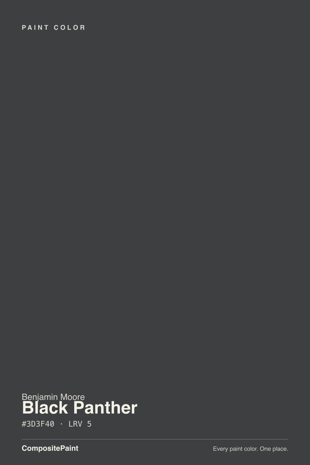
A genuine near-black built on a cool, blue-gray edge rather than a warm brown or a flat true black. The lift of blue and green over red is subtle — you won't see it as "blue paint" the way you would on a navy — but it's what keeps Black Panther from reading harsh or lifeless the way a saturated true black can across a whole door or a long run of trim. Benjamin Moore doesn't market it with the fanfare of Onyx or a Color-of-the-Year shade; it has built its reputation the ordinary way, one front door and one kitchen island at a time.
At LRV 5 it reflects almost no light, putting it right alongside Wrought Iron in BM's near-black lineup — a genuine black in daily use, not a dark gray wearing a black name. That depth is exactly what makes it work on a door or a run of window frames: it holds its color from ten feet away and up close, in shade and in full sun, without going patchy or streaky the way thinner, lighter darks sometimes do. The same depth is why a full room of it needs real daylight to avoid going flat.
Undertone in one line: cool blue-gray — never brown, never warm. If your sample looks distinctly navy on the wall, that's a shadow or a blue-toned bulb exaggerating it; if it looks warm or brownish, check your light source, because that isn't this paint.
Where It Shines
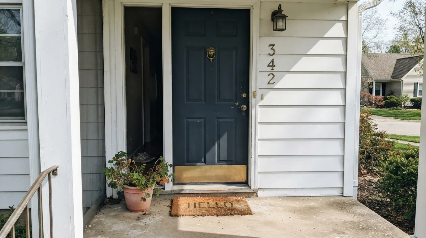
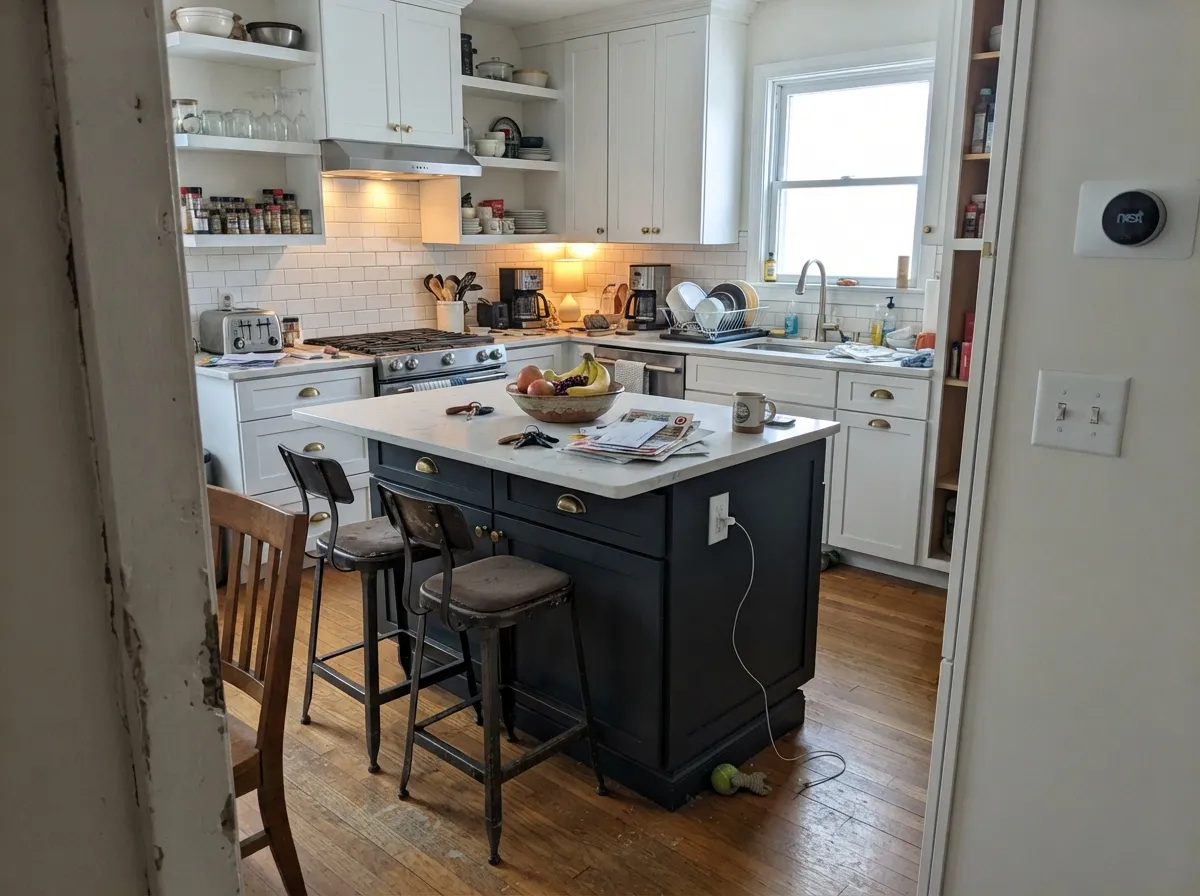
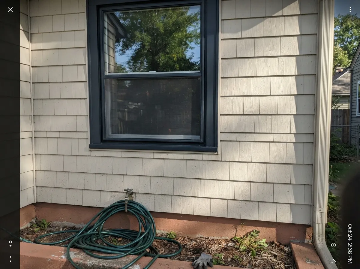
This is a door-and-accent color first, and it's exceptional at that job. On an exterior door, shutters, or window frames it holds a rich, consistent black in direct sun without fading toward gray, and the blue-gray edge reads as sophistication rather than a mistake. Its other classic home is the kitchen island: paired with a lighter perimeter, it delivers the drama of black cabinetry in a single, contained dose.
Where It Fails
Almost every Black Panther regret story comes from asking it to do a job it wasn't built for. None of these are the paint's fault — but if your project matches one, this is the wrong color, or at least the wrong surface for it.
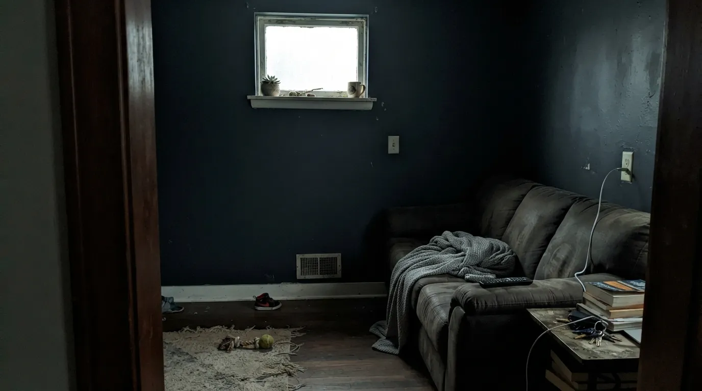
At LRV 5 it absorbs almost all the light in the room. On a door or a single accent wall that depth reads dramatic; wrapped around four walls in a room without generous daylight, it goes flat and cave-like fast. This is a color for a surface, not a whole dim room.
The cool blue-gray in Black Panther and the warm orange in raw wood or red brick pull against each other. Painted directly next to either with no white or cream body color between them, both sides look slightly off. A painted buffer — the classic white-house-black-door move — fixes it completely.
Up close and in bright light, the blue-gray edge is real — this is a near-black, not a flat true black. If you want zero undertone, Benjamin Moore Onyx or Sherwin-Williams Tricorn Black are the truer, more saturated blacks; Black Panther will always read one step softer next to them.
Room by Room
This is what the color was built for. Satin or semi-gloss holds a rich, even black through direct sun and shade alike, and the cool edge reads sophisticated rather than harsh next to a warm wood porch or a white body color.
A full run of black window frames or trim in Black Panther is a modern-farmhouse standard for a reason: it draws a crisp, consistent line around a white or light-colored house without the streakiness some blacks show over a long run.
Paired with a lighter perimeter — White Dove or a warm greige — a Black Panther island delivers real black-cabinet drama without closing the room in. A full kitchen of it is a bigger, riskier bet; keep the walls and upper cabinets light.
In a room with generous windows, one Black Panther wall behind a bookcase or fireplace reads intentional and grounding. In a dim room it competes with the same light the room already lacks — pick a lighter neutral instead.
Both are classic, low-risk homes for this color: contained surfaces that get full daylight and don't need to carry an entire dim interior. It's a dependable choice against nearly any siding color except unbuffered warm brick or orange cedar.
Four walls of a near-black this deep is a genuine commitment that only pays off with big windows and intentional lighting. Most owners who try it as a whole-room wall color end up happier using it as one wall or a run of trim instead.
Your Light Is the Risk
Full daylight on a door, shutters, or trim brings out the richest version of the black — deep and consistent, with the blue-gray edge reading as depth, not a flaw.
Without real daylight, the color absorbs what little light there is and reads flat, murky, almost cave-like — the situation behind most "too dark" regrets.
Cooler morning light keeps the blue-gray edge crisp; warm late-day sun softens it very slightly, though this color moves less through the day than a true navy or charcoal would.
Warm 2700K bulbs take a little of the coolness off; cool white LEDs sharpen the blue-gray edge and can make it look almost charcoal-blue up close.
Most complaints about Black Panther are a light mismatch. Upload a photo of your actual room and see it on your walls — then ask for the same wall in north light or evening lamps before you buy a single sample.
Need It From Another Brand?
Any paint counter can custom-tint Benjamin Moore 2125-10 directly. If you would rather stay in one brand's own deck, these are the closest stock matches, measured as ΔE2000. Under 2 is a difference you will not see on the wall.
| Brand | Closest color | ΔE | LRV | |
|---|---|---|---|---|
| Sherwin-Williams | ArmorySW 9600 · Sherwin-Williams | 3.7 | 5 | Color page → |
| Behr | Obsidian StoneECC-25-3 · Behr | 0.6 | 5 | Color page → |
| Valspar | Caviar8006-4G · Valspar | 2.1 | 5 | Color page → |
| PPG / Glidden | Black MagicPPG1001-7 · PPG / Glidden | 1.3 | 5 | Color page → |
| Glidden | Starless SkyPPG0995-7 · Glidden | 1.0 | 5 | Color page → |
| Dutch Boy | Cauldron437-7DB · Dutch Boy | 2.4 | 5 | Color page → |
Similar Benjamin Moore Colors
The nearest shades to Black Panther within Benjamin Moore's own range, ranked by perceptual color distance — useful when you want the same look a touch lighter, darker, or warmer.
WCAG 2.1: AA is 4.5 : 1 for normal text, 3 : 1 for large text, AAA is 7 : 1.
Black Panther vs the Colors You're Also Considering
Every Black Panther sample board has the same rivals on it. The numbers show the real lightness gap — then it comes down to which risk you would rather live with.
Pick this when you want the undertone to stay reliably cool and blue, wall after wall, door after door.
Benjamin Moore 2124-10 · LRV 6Wrought IronPick this if you want an even softer near-black — Wrought Iron's chameleon undertone can read warmer in some rooms, cooler in others.
Pick this for a black with a touch more life and depth than a flat, true black.
Sherwin-Williams SW 6258 · LRV 3Tricorn BlackPick this if you want the truest, most saturated black in the deck, with essentially no visible undertone.
Black Panther Coordinating Colors
The rule for coordinating with Black Panther is simple: let whites and warm neutrals do the work, and keep the black for the single loudest element — door, island, or built-in. It pairs cleanly with crisp trim whites and warm greiges, and layers well with its own softer cousin Wrought Iron when a project needs two blacks in different rooms.
Black Panther vs. Onyx vs. Wrought Iron: Picking Your Black
Benjamin Moore sells several near-blacks, and buyers routinely land on the wrong one. Onyx and Sherwin-Williams' Tricorn Black are the truest, most saturated blacks in their respective decks — the ones with essentially no visible undertone. Black Panther sits one step softer: a genuine near-black with a quiet blue-gray edge that keeps it from ever looking flat or chalky, which is exactly why it shows up so often on front doors and window frames instead of walls.
It has also become a go-to for kitchen designers looking for a black island without the starkness of a true black — a widely shared kitchen from designer Becki Owens used it for exactly that. The color doesn't chase a Color-of-the-Year moment; it's simply BM's dependable answer to "I want black, but not harsh."
Black Panther With Wood Tones and Metals
Warm wood does the heavy lifting here: a stained wood front door beside Black Panther trim, or a butcher-block counter beside a Black Panther island, both work because the wood's warmth balances the paint's cool edge. Unlacquered brass and aged bronze hardware are the classic match — polished chrome reads a little cold against it, though it's not a hard clash.
On siding and exterior trim, avoid painting it directly against unfinished orange-toned cedar or warm brick with no buffer — the cool blue in Black Panther and the warm orange in raw wood or brick pull in opposite directions. A painted white or cream body between the two solves it instantly, which is the entire logic behind the classic white-house-black-door pairing.
Three Ready Palettes Built on Black Panther
A color is never alone on the wall. These are complete combinations in the 60-30-10 pattern, with the reason each one holds together. Every one opens in the visualizer.
Two warm-neutral whites keep the body and trim airy so the one black door does all the talking. Chantilly Lace's extra brightness on the trim gives the door a crisp, deliberate frame instead of blending it into the siding.
Try this palette in your roomGreige walls and warm white perimeter cabinets keep the kitchen from feeling like a cave; the island carries all the contrast, and brass hardware finishes the look.
Try this palette in your roomPale Oak's soft warmth keeps the room from going cold next to so much black; White Dove trim separates the planes without adding a second bright white to compete with the door-black tone.
Try this palette in your roomBlack Panther FAQ
Is Black Panther a true black?
Not quite — and that's the point. It's a genuine near-black with a soft blue-gray edge instead of a flat, fully saturated black. If you want zero undertone, look at Benjamin Moore Onyx or Sherwin-Williams Tricorn Black instead; Black Panther is the softer, more forgiving option.
What LRV is Black Panther?
It sits at LRV 5 in our deck — deep enough to reflect almost no light, on par with Benjamin Moore's other near-blacks like Wrought Iron. At that depth, a full room of it needs real windows or it goes flat.
Black Panther or Wrought Iron for a front door?
Black Panther if you want the blackest, most reliably cool-toned door on the block. Wrought Iron if you want a softer near-black whose undertone can shift warmer depending on the room's light — some owners find that shift charming, others find it unpredictable for an exterior color they see every day.
Can I paint a whole room in Black Panther?
You can, but it's a bold, light-hungry bet — this is a door-and-trim color first. In a bright room with big windows it can work as a dramatic accent wall or built-in; in a dim room with small windows, four walls of it reads heavy and cave-like fast.
What white goes with a Black Panther front door?
Any of BM's warm whites work as the body color — White Dove is the classic pairing, Chantilly Lace if you want a crisper, cooler contrast. Keep the trim one shade brighter than the siding so the black door has a clean edge to sit against.
Is Black Panther good for kitchen cabinets or an island?
Yes — it's a popular island color specifically because it reads black without the starkness of a true black. Pair it with a lighter perimeter (White Dove or a warm greige) so the kitchen doesn't feel closed in, and use a satin urethane-fortified cabinet enamel for durability.
Have you painted with Black Panther?
Rate it — one tap helps the next reader decide.
Ask a Question