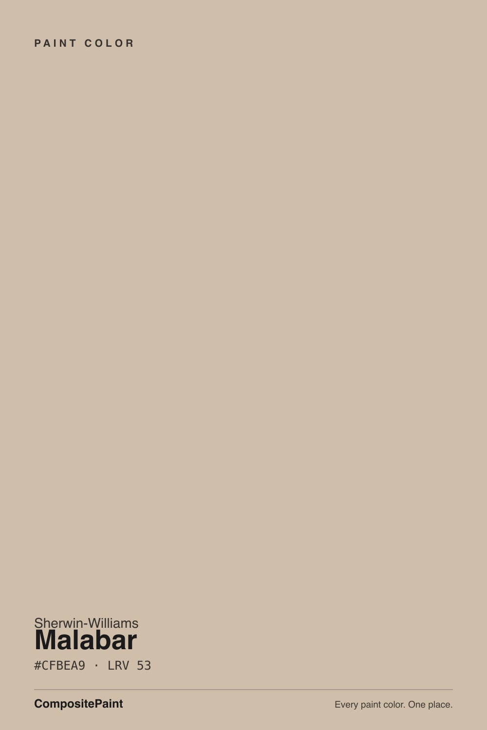
Malabar
SW 9110 · #CFBEA9 · LRV 53 — warm red-orange tone, light — bounces daylight without going clinical.
- 1Dorian Gray39
- 2Mindful Gray48
- 3Malabar53
- 4Agreeable Gray60
- 5Pale Oak69
What Color Is Malabar, Really?
Malabar (SW 9110) is a warm light beige with a hex value of #CFBEA9. The hue sits at 33 degrees with around 28 percent saturation, which puts it in the sand and tan range with a clear red-orange lean. At an LRV of 53 it is a light color that still has visible body, so it reflects daylight without going pale or washed out.
People choose it when white feels too stark and greige feels too gray. The warmth is real enough to read as a color rather than a neutral placeholder, which gives walls a soft, sunlit look and lets wood floors, leather, and stone sit comfortably against it. It is a common choice for whole-house palettes in open plans, where one warm tone has to carry several rooms.
The catch is the same warmth. At 28 percent saturation this is more saturated than most modern neutrals, so in strong south or west light it can look distinctly peachy or tan rather than a quiet beige. If you have cool gray flooring or a lot of blue in the furnishings, Malabar will look yellower next to them than it does on the chip. Sample a large piece on two walls and check it in late-afternoon light.
Malabar leans warm red-orange. A hue of 33 degrees is the sand and clay part of the wheel, and at about 28 percent saturation the color is more colorful than a typical greige, so the warmth is easy to see once it is on a wall.
What it reads as depends on the company it keeps. Against a cool gray floor or a blue-gray sofa the warmth jumps forward and Malabar can look peachy. Against a deeper tan or a terracotta tile it settles down and reads as a soft neutral. Against a bright white trim the color is obvious, which is usually what people want from it.
There is no gray in this color to hold it back, so do not expect it to behave like a greige. Test it beside anything pink or orange in the room, and beside your flooring, since a red-toned wood can push Malabar further toward peach than you intended.
Best Rooms and Uses for Malabar
Malabar is a whole-house wall color. At LRV 53 it works in living rooms, bedrooms, hallways, and dining rooms without going dark, and the warmth makes north-facing spaces feel less cold. It is a common pick for open plans, since a single warm tone reads consistently across rooms that get different light.
On trim and cabinetry it is softer than white and reads as a creamy sand, which suits traditional and Mediterranean interiors more than sharply modern ones. It also makes a good ceiling color in a room where a bright white ceiling would feel disconnected from warm walls.
Outside it is a natural body color for stucco, brick, and stone houses, pairing with white or cream trim and a darker door. Where it disappoints is in rooms full of cool gray flooring, stainless, and blue textiles, since the red-orange undertone will fight all of them and look yellower than expected.
How Lighting Changes Malabar
At LRV 53 Malabar reflects a good amount of light, so it stays light in most rooms rather than going heavy. North-facing rooms are where it works most easily. Cool, indirect daylight tempers the red-orange and Malabar reads as a soft, balanced beige, which is why it is often used to warm up rooms that otherwise feel cold.
South-facing rooms do the opposite. Strong warm daylight amplifies the 28 percent saturation and the color can look tan or faintly peach through the middle of the day. East rooms warm up in the morning and calm down later, while west rooms glow strongly in the late afternoon.
Bulbs push it the same way. Warm 2700K lamps deepen the sandy quality and can make it look almost golden at night, while 3500K to 4000K light neutralizes it and brings it closer to a plain beige. In a bright south room, cooler bulbs are the simplest way to keep it in check.
Most complaints about Malabar are a light mismatch. Upload a photo of your actual room and see it on your walls — then ask for the same wall in north light or evening lamps before you buy a single sample.
Need It From Another Brand?
Any paint counter can custom-tint Sherwin-Williams SW 9110 directly. If you would rather stay in one brand's own deck, these are the closest stock matches, measured as ΔE2000. Under 2 is a difference you will not see on the wall.
| Brand | Closest color | ΔE | LRV | |
|---|---|---|---|---|
| Behr | CaboUL170-7 · Behr | 0.9 | 53 | Color page → |
| Benjamin Moore | Bleeker BeigeHC-80 · Benjamin Moore | 2.7 | 52 | Color page → |
| Valspar | Hopsack3003-10B · Valspar | 1.2 | 53.3 | Color page → |
| PPG / Glidden | HideawayPPG14-26 · PPG / Glidden | 3.9 | 52 | Color page → |
| Glidden | Sahara Desert Sand20YY 53/124 · Glidden | 0.7 | 53 | Color page → |
| Dutch Boy | Crumcake411-2DB · Dutch Boy | 0.8 | 52 | Color page → |
Similar Sherwin-Williams Colors
The nearest shades to Malabar within Sherwin-Williams's own range, ranked by perceptual color distance — useful when you want the same look a touch lighter, darker, or warmer.
WCAG 2.1: AA is 4.5 : 1 for normal text, 3 : 1 for large text, AAA is 7 : 1.
Malabar vs Similar Colors
Inside the Sherwin-Williams deck the differences are small. Nantucket Dune (SW 7527), hex #D0BFAA at LRV 54, is essentially the same beige a hair lighter. Urban Putty (SW 7532), hex #CFC0AB at LRV 54, is fractionally greener. Sandbar (SW 7547), hex #CBBFAD at LRV 53, and Minimalist (SW 9611), hex #CABEAD at LRV 52, both carry a little more gray, which makes them read calmer next to cool flooring.
Across brands, HGTV Home by Sherwin-Williams Cloth and Stone (HGSW 3156) shares the exact hex #CFBEA9 and LRV 53. Glidden Sahara Desert Sand (20YY 53/124) at a color difference of 0.67, Behr Sonoran Desert (N240-3) at 0.78, and Dutch Boy Crumcake (411-2DB) at 0.79 are all effectively the same color. Valspar Hopsack (3003-10B) at 1.18 and Farrow and Ball Oxford Stone (No. 264) at 1.44 look identical in normal room light.
Benjamin Moore Bleeker Beige (HC-80), hex #CDC0A8 at LRV 52, is at 2.66, so it is very close but worth sampling first, and it leans slightly more olive.
Colors That Go With Malabar
A creamy off-white on trim keeps Malabar looking soft and intentional, while a crisp bright white gives more separation and makes the beige look warmer by contrast. Both work, and at LRV 53 there is enough gap for the trim to register either way.
For adjoining rooms and second colors, Nantucket Dune (SW 7527), hex #D0BFAA at LRV 54, is nearly the same tone if you want continuity, and Sandbar (SW 7547), hex #CBBFAD at LRV 53, is a slightly cooler, quieter version for a room with more sun. Naturel (SW 7542), hex #CBC0AD at LRV 54, and Minimalist (SW 9611), hex #CABEAD at LRV 52, both pull back a little of the warmth without changing the lightness.
Materials carry the rest. Oak, walnut, and rattan share its undertone, while brass, bronze, and leather look natural against it. Terracotta, olive, and deep brown accents extend the same family, and black hardware gives it a crisper edge. Cool blue-grays are the pairing most likely to look off.
Coordinated palette
Generated by hue-rotating #CFBEA9 in HSL space. Pair Malabar with one accent and one neutral — the swatches below are starting points, not final picks.
Malabar FAQ
Is Malabar warm or gray?
Malabar is warm, not gray. Its hue sits at 33 degrees with a red-orange lean, and at about 28 percent saturation it is more colorful than a typical greige. There is no cool gray in it to hold the warmth back, so expect a clear sandy beige rather than a neutral that could pass for gray.
What LRV is Malabar?
Malabar has an LRV of 53, on a scale from 0 for black to 100 for pure white. That places it in the light range. It bounces a useful amount of daylight around a room and keeps a space feeling open, while still holding enough depth that it never looks like an off-white.
Is Malabar too yellow or peachy?
It can go that way in strong light. The red-orange undertone and the 28 percent saturation mean south and west rooms, or warm 2700K bulbs, can push it toward peach or gold. In north light the same color reads as a balanced soft beige. Sample it in the room and check it in late-afternoon sun before deciding.
Does Malabar work in a dark room?
Yes, and it is one of its better uses. At LRV 53 it reflects enough light to keep a dim or north-facing room from feeling closed in, and the warm undertone counteracts the coolness of weak indirect daylight. In that setting it usually looks like a calm beige rather than the warmer version you get in full sun.
What white trim goes with Malabar?
A creamy off-white keeps the pairing soft and matches the warm undertone, which suits traditional and Mediterranean rooms. A crisp, bright white gives sharper separation and makes the beige look warmer by contrast. With the wall at LRV 53, either option leaves clear definition between wall and trim.
Is Malabar good for exteriors?
Yes. The warm sandy tone works well on stucco, brick, and stone houses, and it holds its character in full sun better than a cooler neutral, which can go flat outdoors. Pair it with a white or cream trim and a darker door or shutter for contrast, since at LRV 53 the body color alone is fairly light.
Have you painted with Malabar?
Rate it — one tap helps the next reader decide.
Ask a Question