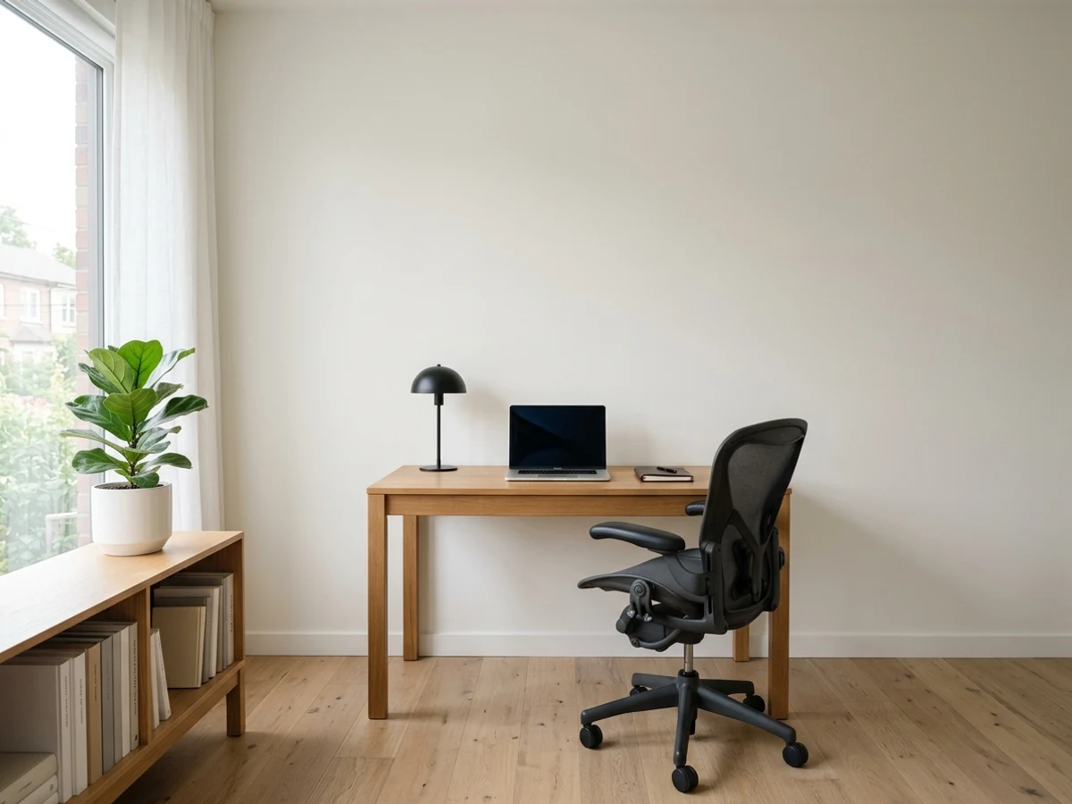
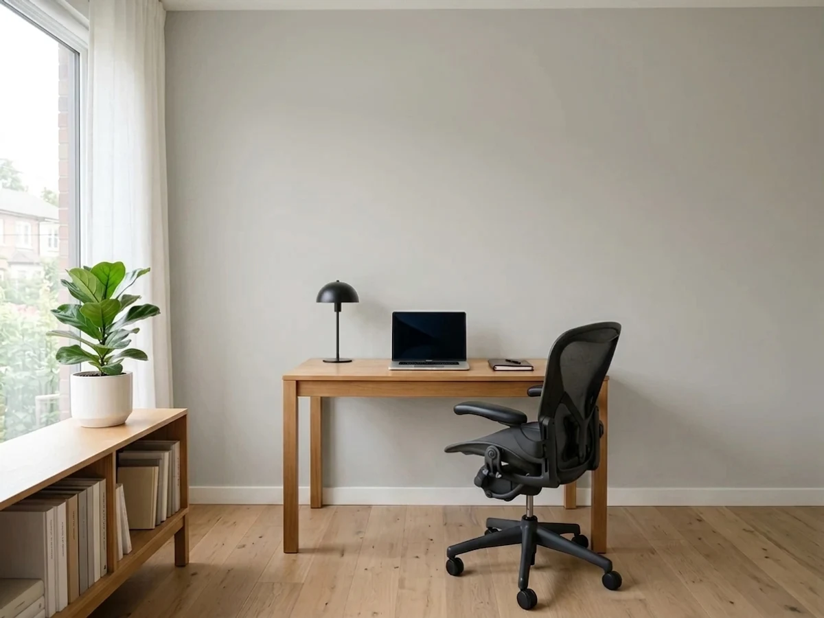
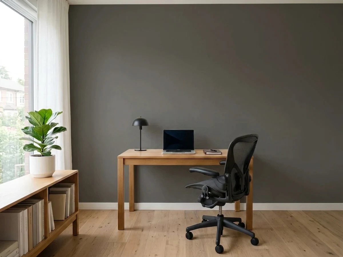
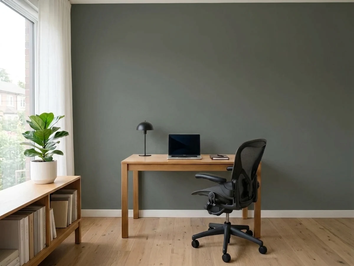
Room Colors · Gray Home Office
8 Best Gray Home Office Paint Colors for 2026
ideas, combinations, and real rooms
8 curated picks from real gray home offices — with the exact colors, honest reasons why, and the combinations that hold the room together.

Former interior stylist who can spot a green undertone from across a room. Jessica writes the color and mood pieces — what to choose, what pairs, and why your "white" looks pink.
The Fast Answer
Don't want to read 8 picks? These four are the safe answers.

Top Picks for the Gray Home Office
Tap a shade to see the gray home office in it, then try it on your own room.
Gray Home Office Color Trends 2026 — What's In, What's Out


- Cool Flat Gray — Blue-undertone, flat cool gray that filled offices for years now reads cold and corporate next to 2026's warmer, deeper gray choices.
- Light Greige On Every Surface — The same pale greige on walls, trim, and ceiling with no depth is losing ground to 2026's bolder, more saturated gray statements.
- Silvery Cubicle Gray — Cool, silvery grays that echo old office cubicles feel dated next to 2026's warmer, moodier charcoal and green-gray tones.
The 8 Best Gray Home Office Paint Colors
Every pick below is a real rendered gray home office, not a chip. The lead color first; the swatches are the full scheme in the photo — walls, furniture, textiles, accent.

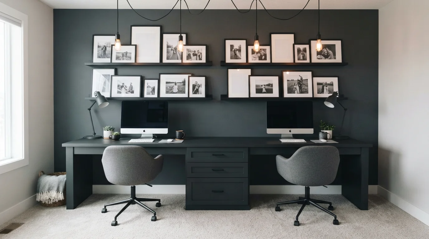
Deep charcoal walls, soft pendant lighting, and clean symmetry create an effortlessly calm and focused shared workspace.
Slate gray is a deep, smoky neutral that brings a grounded and quiet vibe to any room. In this setup, rich slate covers the main wall, complemented by a seamless dark double desk, heather gray swivel chairs, and crisp white baseboards. The room feels incredibly focused, neat, and snug. It works so well because the warm amber glow from the pendant lights balances the deep wall, keeping everything soft instead of harsh. It is the ultimate look for anyone wanting a distraction-free, stylish work zone.
SEE OUTERSPACE ON YOUR WALLS →
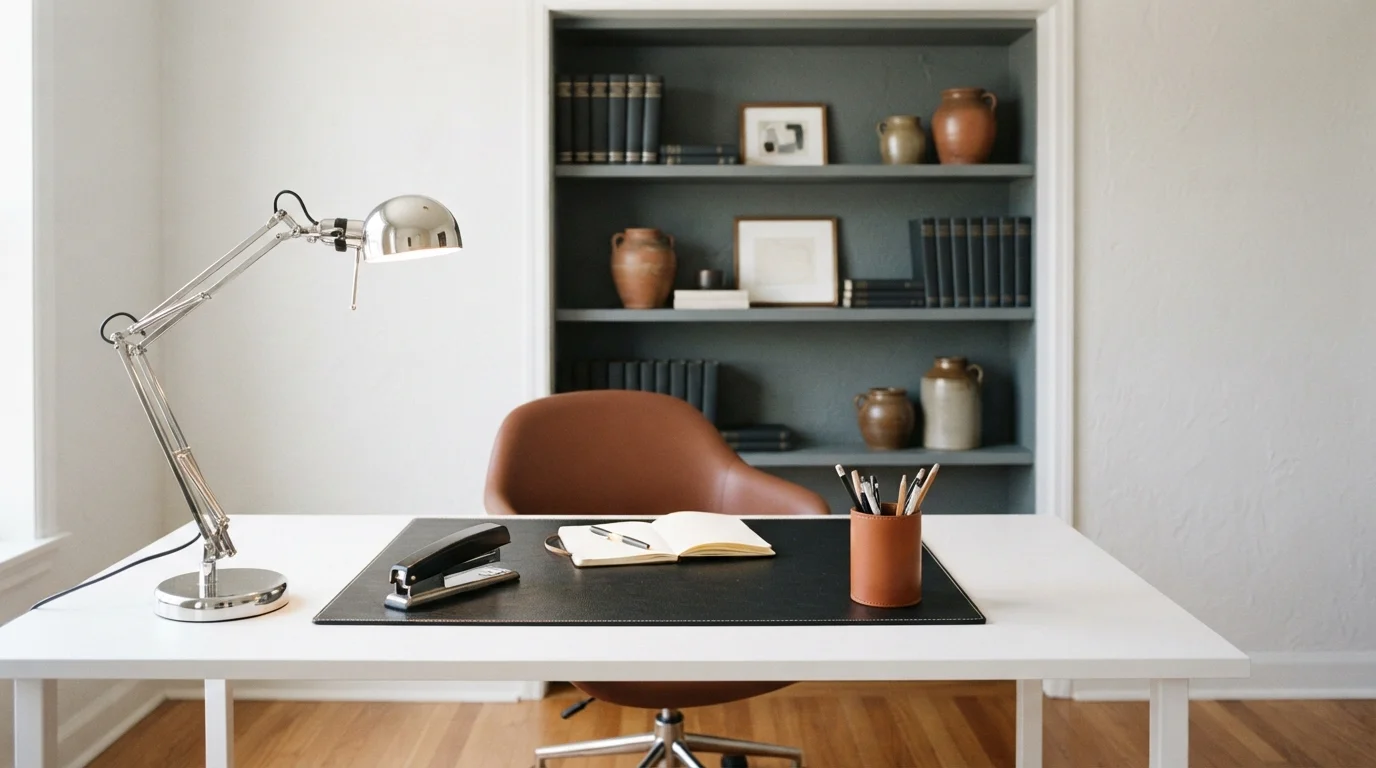
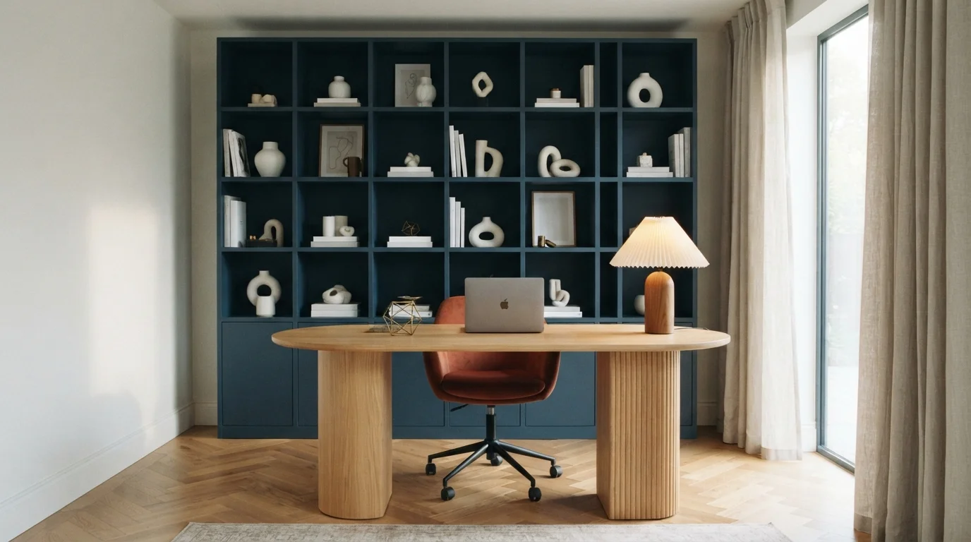
A tailored workspace enveloped in muted slate gray with warm cognac leather details for calm, distraction-free focus.
Slate gray is a deep, quiet stone color. In this room, velvety gray coats the walls and built-in shelving, balanced by a clean white desktop, a warm cognac leather pencil cup, and a rust-toned chair. The room feels grounded, orderly, and calm. The combination works because rich leather and earthy ceramics warm up the cool, matte gray shelves instantly. It is ideal for anyone who wants a distraction-free home office designed for deep thinking.
SEE BANK VAULT ON YOUR WALLS →
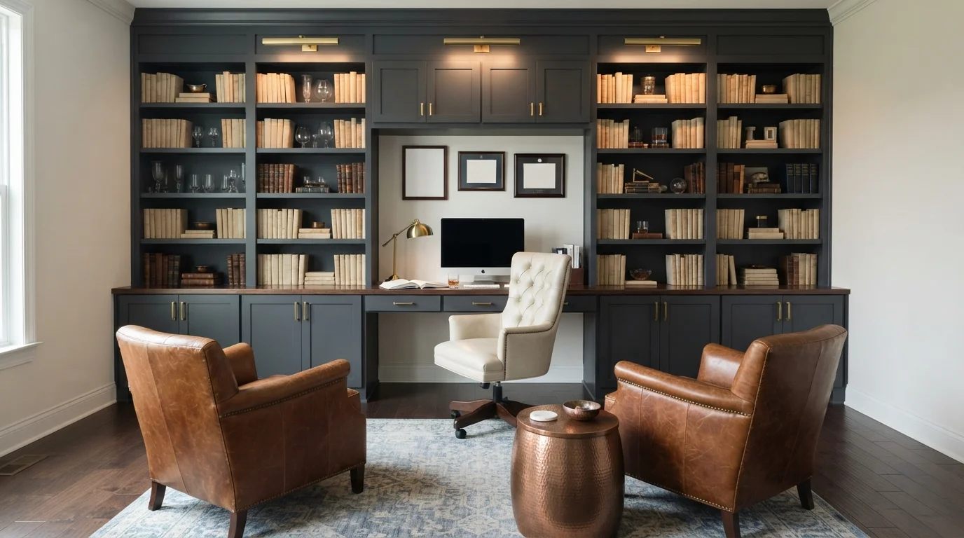
Rich dark gray built-ins and warm leather armchairs create a calm, dignified retreat built for deep focus.
Charcoal gray is a deep, moody neutral with handsome slate depths. In this study, dark gray covers the massive wall of built-in bookshelves and storage, beautifully framing a warm honey-wood desk, cream tufted chair, and caramel leather armchairs resting on a faded blue rug. The room feels grounded, cozy, and perfectly tailored for quiet work. Dark cabinetry lets glowing brass fixtures and natural wood grains stand out with refined contrast. It is a timeless choice for anyone wanting a sophisticated and distraction-free home office.
SEE BLACKBIRD ON YOUR WALLS →
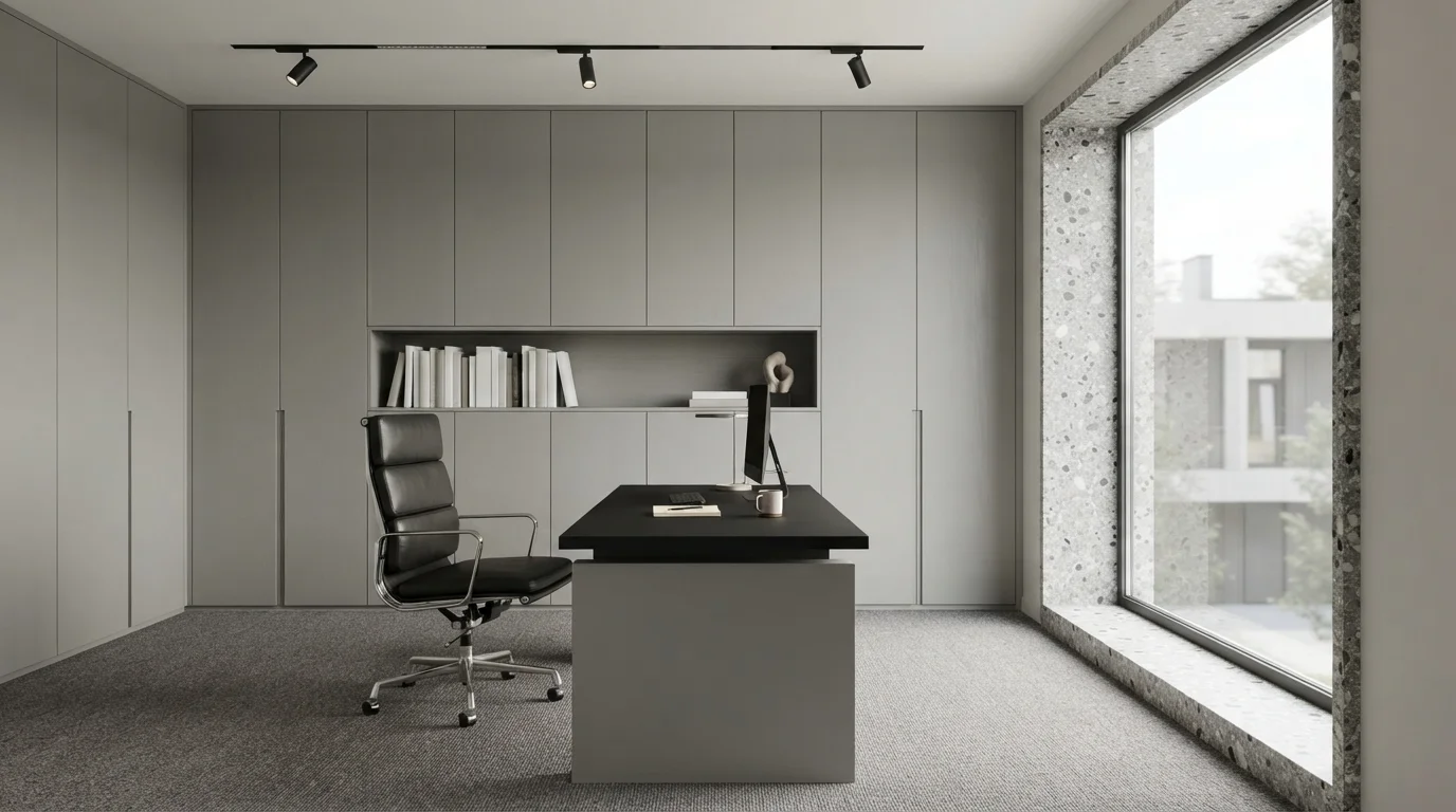
Clean lines and quiet gray surfaces meet bright natural light for an effortless, distraction-free executive workspace.
Fog gray is a cool, balanced neutral with a crisp stone feel. In this sleek office, the seamless built-in storage cabinets take on this soft gray, set against a crisp white ceiling, a two-tone black desk, and textured gray carpeting. The room feels incredibly calm, orderly, and quietly sophisticated. Keeping the entire space within a tight range of neutral tones eliminates visual clutter, making the large window light stand out effortlessly. It is ideal for anyone who thrives in a calm, modern, distraction-free work environment.
SEE GRAYVE-YARD ON YOUR WALLS →
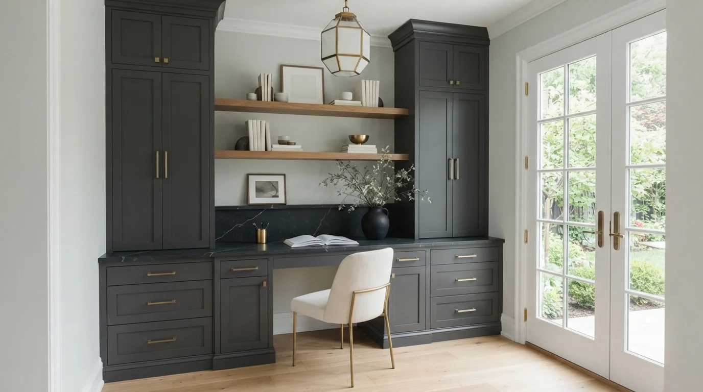
Crisp charcoal cabinetry meets warm brass fixtures and light wood floors for a quiet, sophisticated workspace.
Charcoal is a deep, velvety dark gray that feels grounded and tailored. In this room, the custom built-in desk and side cabinets wear this rich shade, while the surrounding walls stay soft pale gray. The light-colored upholstered chair and warm gold hardware bring brightness right to your fingertips. The dark built-ins frame the workspace beautifully without overwhelming the natural light coming from the French doors. It is an ideal setup for anyone wanting a dedicated home office that feels both modern and calm.
SEE BERYL PEARL ON YOUR WALLS →
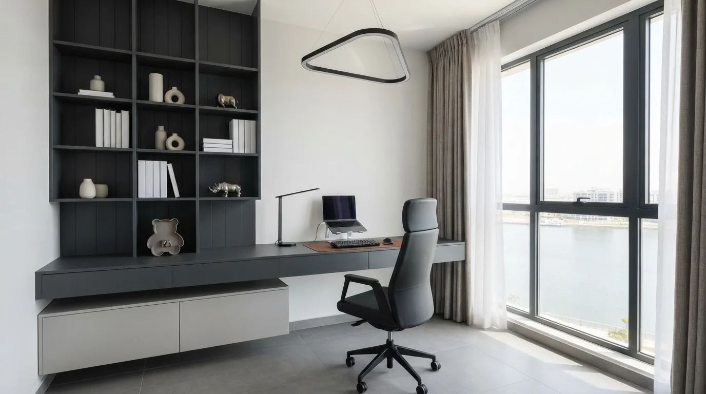
Crisp natural daylight balances deep charcoal cabinetry for a distraction-free, ultra-modern workspace that feels quietly powerful.
Charcoal is a deep, sophisticated slate gray with a cool edge. In this study nook, dark charcoal covers the sleek built-in paneling and floating shelves, paired with pale gray walls, a matching low cabinet, and a smooth leather chair. The room feels incredibly focused, calm, and uncluttered. This combination works because the crisp off-white walls and massive window keep the deep gray from ever feeling heavy or dark. It is the perfect setup for minimalists who need a clean, distraction-free environment to get work done.
SEE IT ON YOUR WALLS →
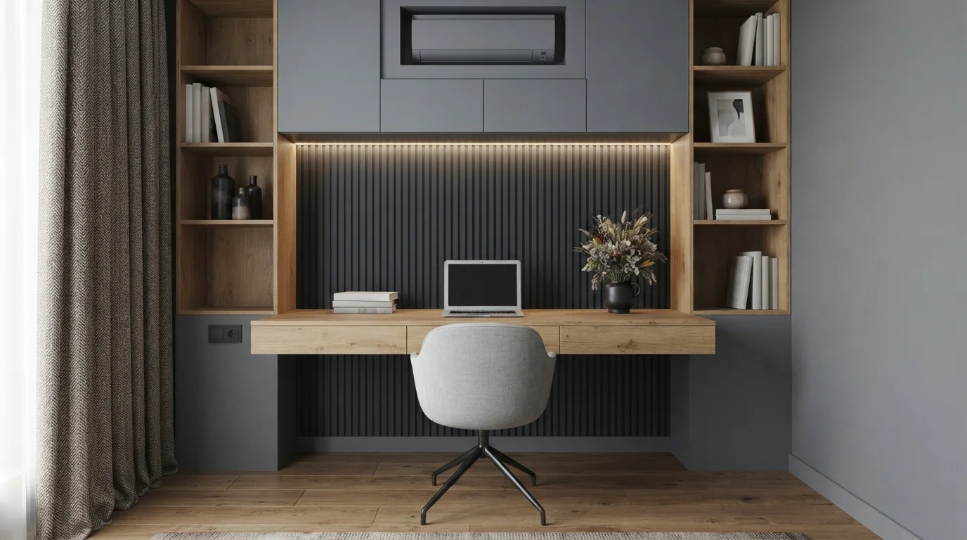
Cool slate cabinetry and textured charcoal fluting create a focused, minimalist workspace grounded by warm oak accents.
Slate grey is a clean, cool mid-tone with quiet elegance. In this study nook, smooth slate covers the overhead cabinets, deep charcoal lines the fluted accent wall, and textured grey fabric dresses the desk chair. The space feels focused, tidy, and remarkably calming throughout the workday. The combination works because the organic oak desk and shelving bring instant warmth to the cool, tailored greys. It is a fantastic look for professionals who want a polished, distraction-free home office setup.
SEE IT ON YOUR WALLS →
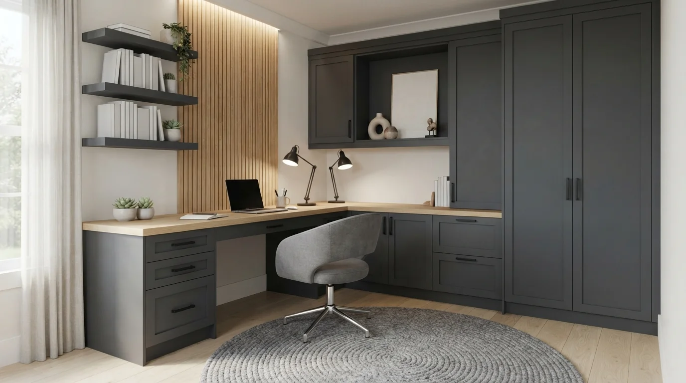
Rich charcoal cabinetry pairs with warm wood slats and soft ambient lighting to create a focused, cozy workspace.
Charcoal is a deep, velvety dark gray that instantly adds quiet elegance. In this room, seamless matte charcoal finishes the custom desk base, overhead shelves, and tall wardrobe cabinets, paired with a matching heather gray swivel chair and circular woven rug. The entire space feels calm, grounded, and refreshingly distraction-free. The combination works because the warm wood slats and glowing under-shelf lights bring natural texture that keeps the dark surfaces soft and inviting. It is ideal for anyone looking to build a tailored, high-focus work sanctuary.
SEE WHITE SAND ON YOUR WALLS →Gray Home Office Wall Color Combinations
A wall color never works alone. These are the full schemes from the rooms above — the lead color first, then the supporting colors that make the photo work.
Deep charcoal walls, soft pendant lighting, and clean symmetry create an effortlessly calm and focused shared workspace.
TRY THIS PALETTE →A tailored workspace enveloped in muted slate gray with warm cognac leather details for calm, distraction-free focus.
TRY THIS PALETTE →Rich dark gray built-ins and warm leather armchairs create a calm, dignified retreat built for deep focus.
TRY THIS PALETTE →Clean lines and quiet gray surfaces meet bright natural light for an effortless, distraction-free executive workspace.
TRY THIS PALETTE →The charcoal end of this page — Kendall Charcoal, Pewter Green, Peppercorn, Iron Mountain — wants a crisp white trim to keep it from swallowing the room whole. Benjamin Moore Chantilly Lace or Simply White on baseboards, door casing, and any built-in shelving gives the dark wall an edge to read against, and it's what keeps a charcoal office looking like a considered choice instead of a cave. Warm wood tones — oak desks, walnut shelving, leather chairs — pair naturally with all four dark picks and do more to warm the room than a paint swap ever will.
On the lighter side, Quiet Moments, Comfort Gray, Boothbay Gray, and Quietude read best against black or deep navy accents rather than more white — a black desk lamp, black task chair, or a single navy bookshelf keeps a pale gray office from drifting into no-color-at-all territory. If you want one wall to carry more weight without going fully dark, pair a light gray on three walls with Peppercorn or Iron Mountain on the wall behind the desk; it frames the workspace on video calls and still leaves the rest of the room bright enough to work in during the day.
More Home Office Color Ideas
Set on a color family already? Each page has its own real rooms and picks.
Light or Dark Gray Home Office Colors?
Go Light (LRV 60+) If…
The room is small, faces north, or has to work at every hour. Light warm colors make it feel bigger and stay calm in evening light — the light you actually live in.
Go Dark (LRV Under 20) If…
You want the cocoon effect and the room has real daylight. Dark works best on one feature wall — or fully color-drenched in a large room with good windows.
The split in this room comes down to daylight and screen glare, not taste. A home office with one small window or north-facing light does better with Comfort Gray or Quiet Moments (LRV 47 and 50) — both stay legible after 4pm and won't force you to run a lamp all day just to see your notes. A dark gray in a dim room reads muddy by afternoon, and it makes the monitor the brightest thing in the room, which is hard on your eyes during long stretches.
A dark gray earns its place when the office gets real daylight, or when the goal is a room that photographs and video-calls well rather than one that needs to feel airy. Kendall Charcoal, Peppercorn, and Iron Mountain (LRV 11–13) work in offices with a big window, a skylight, or strong overhead lighting, and they're the better choice if the room doubles as a library, den, or media room where you want it to feel enclosed and quiet after dark. If you're not sure which way to go, Boothbay Gray or Quietude (LRV 36–41) split the difference — dark enough to feel considered, light enough to survive a cloudy day.
See It. Love It.
Paint It.
Upload one photo of your gray home office and try every color on this page on your own walls — in your own light, before you buy a drop of paint.

Repose GrayBeforeSheen And Finish For A Home Office
Eggshell is the right call for most home office walls — it wipes clean when a chair back or cable scuffs the paint, and it doesn't throw the hard glare that satin or semi-gloss can bounce straight into a monitor or a webcam. Flat looks richer on the darkest picks like Peppercorn and Iron Mountain, but it marks easily near a desk, so it only makes sense on a wall you won't be brushing past daily.
If the office gets direct sun through a west-facing window, stick to eggshell or matte rather than anything glossier — a shiny dark wall next to a bright window creates a hot spot that's distracting on a screen share and uncomfortable to look at directly.
Where To Use The Darkest Shades
Kendall Charcoal, Peppercorn, and Iron Mountain work best as the wall directly behind the desk, in the webcam's frame, rather than on all four walls. That gives you the polished, on-camera look these colors are picked for without darkening the whole room or making it harder to read by lamp light in the evening. The other three walls can stay a lighter gray from this same page, like Quietude or Comfort Gray, so the room still feels workable after the call ends.
If the office is small — under roughly 100 square feet — save the charcoal or Iron Mountain for trim, a closet door, or a single accent wall rather than the whole room. A fully dark small office with poor ventilation and no natural light reads closer to a storage closet than a study.
Mistakes To Avoid In A Gray Home Office
The most common mistake is picking a dark gray for the on-camera look without checking what light the room actually gets during work hours. Peppercorn and Iron Mountain (LRV 11) both need daylight or strong lamp light to read as intentional rather than dim — in a windowless room they just look underlit on a video call, which defeats the purpose.
The second mistake is matching gray walls to a gray desk or gray flooring with no contrast anywhere in the room. Every pick on this page needs at least one warm or dark anchor — a wood desk, a black chair, a brass lamp — or the whole office reads flat instead of considered, especially once it shows up compressed on a webcam feed.
About Gray Home Office Paint Colors
Gray is the default answer for a home office because it does the one thing a workspace needs most: it gets out of the way of your focus without going cold or clinical. It reads calm on a call, doesn't fight with wood desks or black monitors, and unlike white it hides the scuffs a rolling chair leaves on baseboards. That's why it dominates every "best home office color" list, and why the range on this page runs from near-black charcoal to a wash barely darker than a ceiling white.
At the deep end, Kendall Charcoal by Benjamin Moore (HC-166, LRV 13) is the pick that keeps coming up for offices meant to look sharp on camera — it reads as a true charcoal, not blue or green, so it doesn't clash with skin tones on video calls. Pewter Green (Sherwin-Williams SW 6208, LRV 12) pulls the same moody depth but with enough green undertone to feel like a library or study rather than a boardroom. Peppercorn (SW 7674, LRV 11) and Iron Mountain (Benjamin Moore 2134-30, LRV 11) go darker still, closer to black than gray, and work best when the room already has strong natural light or you want the walls to disappear behind bookshelves and art.
At the light end, Quiet Moments (Benjamin Moore 1563, LRV 50) and Comfort Gray (Sherwin-Williams SW 6205, LRV 47) sit close to a warm white and are the safer call for a small or windowless office, since anything under about LRV 25 in a room without much daylight can start to feel like working in a closet. Boothbay Gray (Benjamin Moore HC-165, LRV 36) and Quietude (Sherwin-Williams SW 6212, LRV 41) land in the middle — cool enough to feel crisp and businesslike, bright enough to still bounce light around a desk.

The Questions Everyone Asks
What color should I paint my gray home office?
If you want one answer, start with the safe picks above — White Sand, Outerspace, Bank Vault, Blackbird. They read well in any light and survive furniture changes. Then check the light: strong afternoon sun wants a step cooler, a north-facing room wants a step warmer.
is gray a good color for a home office?
Yes — gray is one of the most recommended home office colors because it reads calm and professional without going cold, and it holds up well on video calls where warmer colors can shift skin tones. Kendall Charcoal by Benjamin Moore is a common pick specifically for its neutral, true-gray tone on camera, while lighter options like Comfort Gray keep a small or dim office from feeling closed in.
should a home office be light or dark gray?
It depends on the room's daylight, not preference alone. A dim or small office does better with a lighter gray like Quiet Moments (LRV 50) or Comfort Gray (LRV 47), which stay bright without a lamp running all day. A room with strong natural light can carry a dark gray like Peppercorn or Iron Mountain (LRV 11) without feeling closed in.
what gray looks best on video calls?
A true, neutral charcoal reads best behind you on camera — it doesn't cast a color tint the way blue-gray or green-gray shades can under artificial light. Kendall Charcoal (Benjamin Moore HC-166) is picked for exactly this reason. If you want something lighter that still looks polished, Boothbay Gray (Benjamin Moore HC-165) is cool and crisp without going dark enough to need extra lighting.
what colors go with gray in a home office?
Crisp white trim and warm wood tones pair with every gray on this page, from the deep charcoal of Iron Mountain to the pale wash of Quiet Moments. Dark grays like Kendall Charcoal and Peppercorn look sharpest against white trim and black hardware; lighter picks like Quietude and Comfort Gray pair well with a single navy or black accent so the room doesn't drift into no-color-at-all.
does a dark gray office feel too small?
It can, if the room is small and dim to begin with — Peppercorn or Iron Mountain (LRV 11) on all four walls of a windowless office will feel closer to a closet than a study. The fix isn't switching to white; it's using the dark color on one wall behind the desk and keeping the rest of the room in a lighter gray like Boothbay Gray or Comfort Gray.
What two-color combination works best in a gray home office?
The reliable pattern is a quiet main color plus one deep accent on a single wall. Keep trim and ceiling in one warm white so the two colors are the only event in the room — the combination cards above show complete schemes from real rooms.
What colors make a gray home office look bigger?
High-LRV, slightly warm colors — LRV 60–75 is the sweet spot. Paint the walls and trim close to the same light color so the corners blur, and keep the ceiling white. Stark cool white actually works against you; it creates hard shadows that show the room's edges.


Ask a Question