Room Colors · Neutral Home Office
8 Best Neutral Home Office Paint Colors for 2026
ideas, combinations, and real rooms
8 curated picks from real neutral home offices — with the exact colors, honest reasons why, and the combinations that hold the room together.

Former interior stylist who can spot a green undertone from across a room. Jessica writes the color and mood pieces — what to choose, what pairs, and why your "white" looks pink.
The Fast Answer
Don't want to read 8 picks? These four are the safe answers.

Top Picks for the Neutral Home Office
Tap a shade to see the neutral home office in it, then try it on your own room.
Neutral Home Office Color Trends 2026 — What's In, What's Out


- Cool Greige Walls — The blue-gray greige that dominated offices for a decade feels cold and dated next to 2026's warmer, creamier neutral choices.
- Sterile All-White Office — A plain white office with no warmth or depth is losing appeal as 2026 pushes toward richer, more grounded neutral tones.
- Flat Single-Tone Walls — One flat neutral with no layering of trim, ceiling, or accent tone reads unfinished next to 2026's more deliberate neutral schemes.
The 8 Best Neutral Home Office Paint Colors
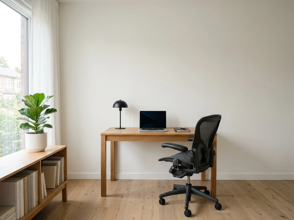
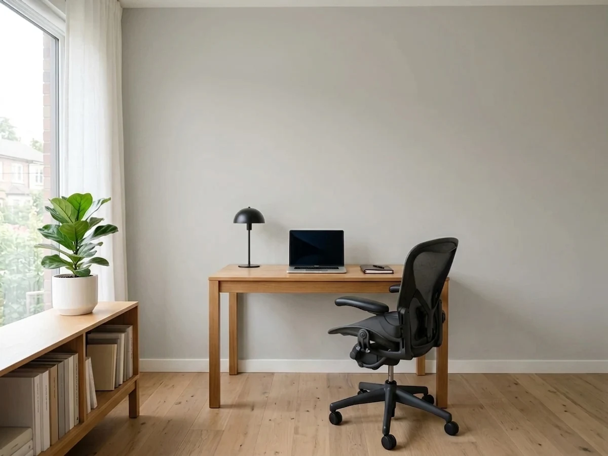
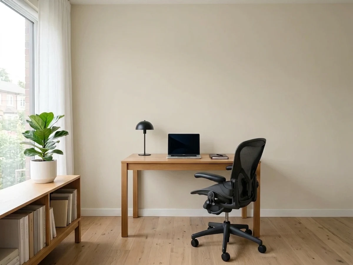
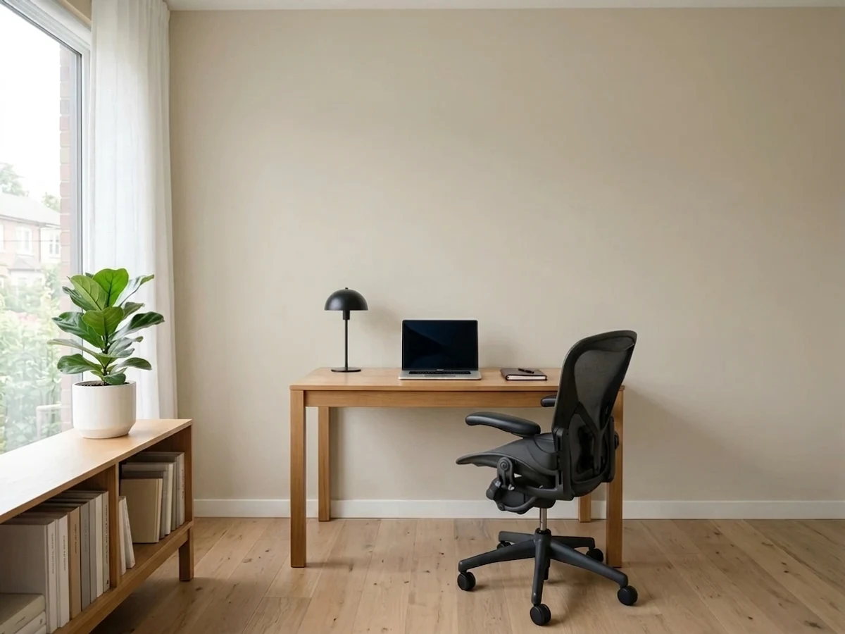
Every pick below is a real rendered neutral home office, not a chip. The lead color first; the swatches are the full scheme in the photo — walls, furniture, textiles, accent.

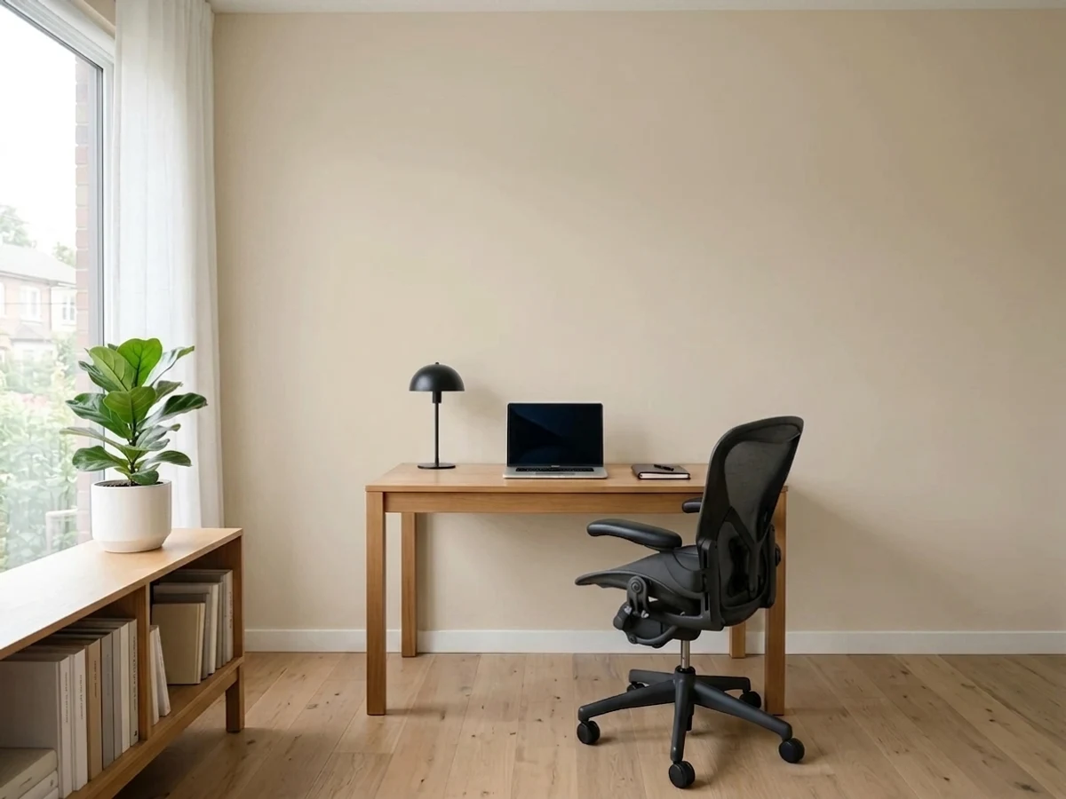
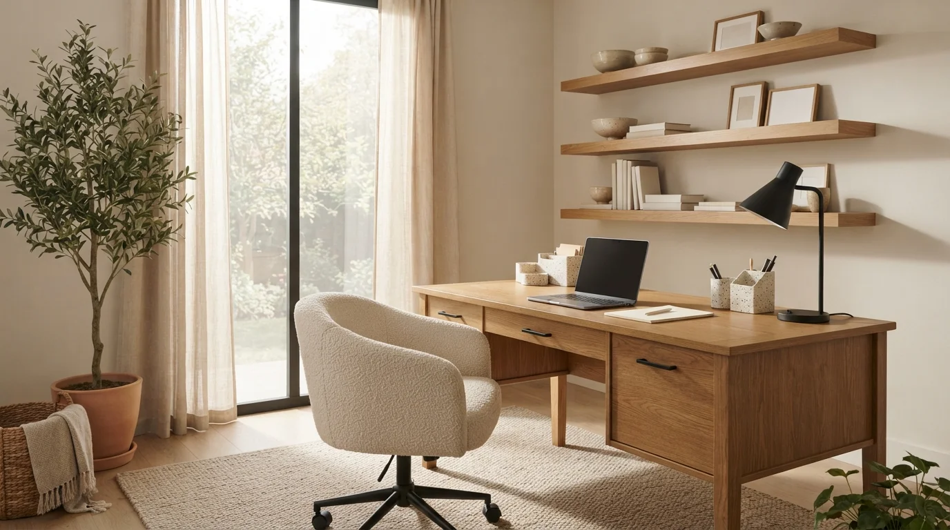
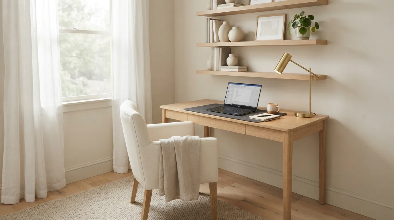
Gentle beige walls paired with blonde wood and soft cream textures create an utterly tranquil workspace.
Creamy beige is a soft, warm neutral with a gentle touch of warmth. In this room, that cozy shade covers the main walls, providing a quiet backdrop for a light wood desk, an upholstered cream chair, and off-white built-in shelves. The space feels wonderfully calm and inviting for a full workday. The look works so well because natural textures like wood and woven fibers naturally balance pale walls without adding clutter. This style is perfect for anyone who wants a distraction-free space to focus.
SEE SAND CASTLE ON YOUR WALLS →
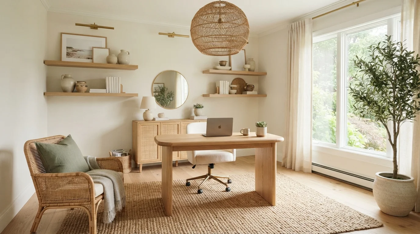
Golden morning light pours across warm cream walls, woven textures, and soft blonde oak for a calm, grounding workspace.
Warm cream is a soft, sun-kissed white with gentle beige warmth. Here, it covers the walls to let the light oak desk, cane credenza, and woven jute rug shine without feeling sterile. The space feels calm, grounded, and blissfully sunlit. Layering natural woods with soft linen and textured rattan keeps a neutral room deeply inviting. It’s perfect for anyone who wants a tranquil work-from-home sanctuary that blends indoor productivity with breezy outdoor views.
SEE EDELWEISS ON YOUR WALLS →
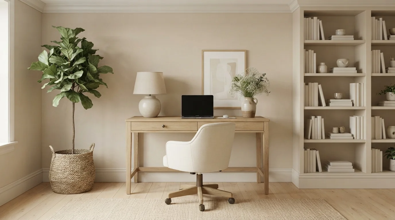
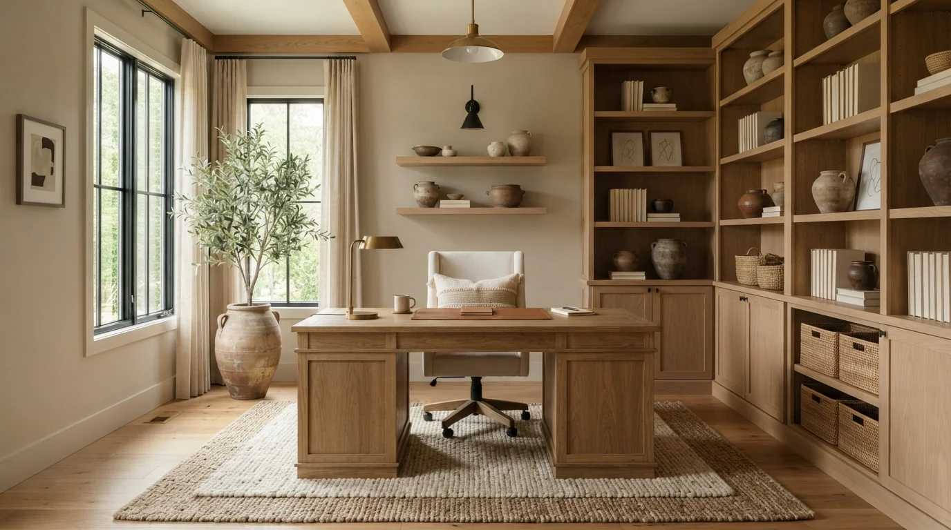
Sunlight filters softly across natural oak woodwork and textured earthenware, creating a peaceful, grounded space to focus and unwind.
Warm taupe is a soft, soothing beige with subtle earthy richness. In this home office, the creamy taupe walls provide a quiet, elegant backdrop for the natural honey-oak desk, towering built-in bookshelves, and textured cream swivel chair over a thick woven rug. The entire space feels grounded, tranquil, and deeply inviting. This look works because organic wood tones and soft neutral walls always harmonize naturally without competing. It is an ideal setting for anyone who wants a distraction-free home office bathed in rustic elegance.
SEE SHIITAKE ON YOUR WALLS →
Soft cream walls and warm oak wood create a quiet, sunlit workspace that feels deeply soothing and focused.
Warm cream is a soft, gentle off-white with cozy golden notes. In this sunny office, the walls wear this gentle shade, framing the rich oak desk, matching wooden shelves, and a textured boucle desk chair. The space feels tranquil, bright, and completely distraction-free. The combination works because natural woods and leafy greens always look grounded against a soft, light backdrop. It is ideal for anyone who wants a peaceful, tidy workspace to stay inspired all day.
SEE CANVASED ON YOUR WALLS →
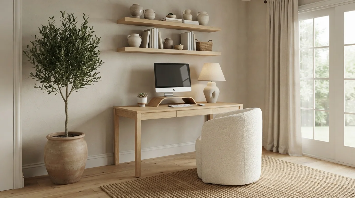
Soft beige walls and warm oak textures create an effortlessly calm workspace bathed in peaceful daylight.
Sandy beige is a warm, earthy neutral. In this space, gentle textured beige covers the walls, blending beautifully with a solid oak desk, matching floating shelves, a cream bouclé chair, and a woven natural rug. The entire setup feels deeply calm, grounded, and refreshing to work in. Natural tones and organic textures go together without ever clashing, keeping the open layout light and airy. It is the perfect design for anyone looking to build a peaceful, distraction-free corner to focus every day.
SEE MONACO ON YOUR WALLS →
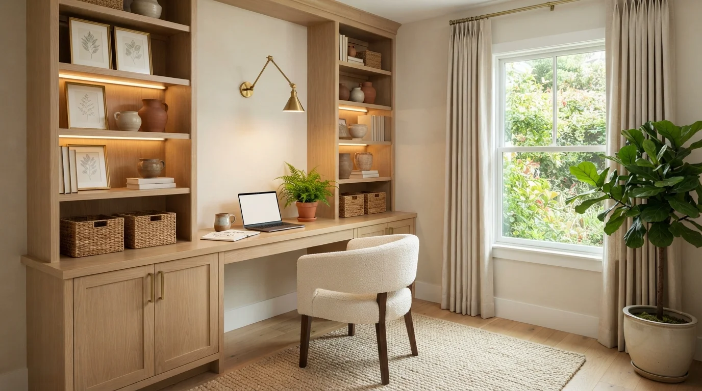
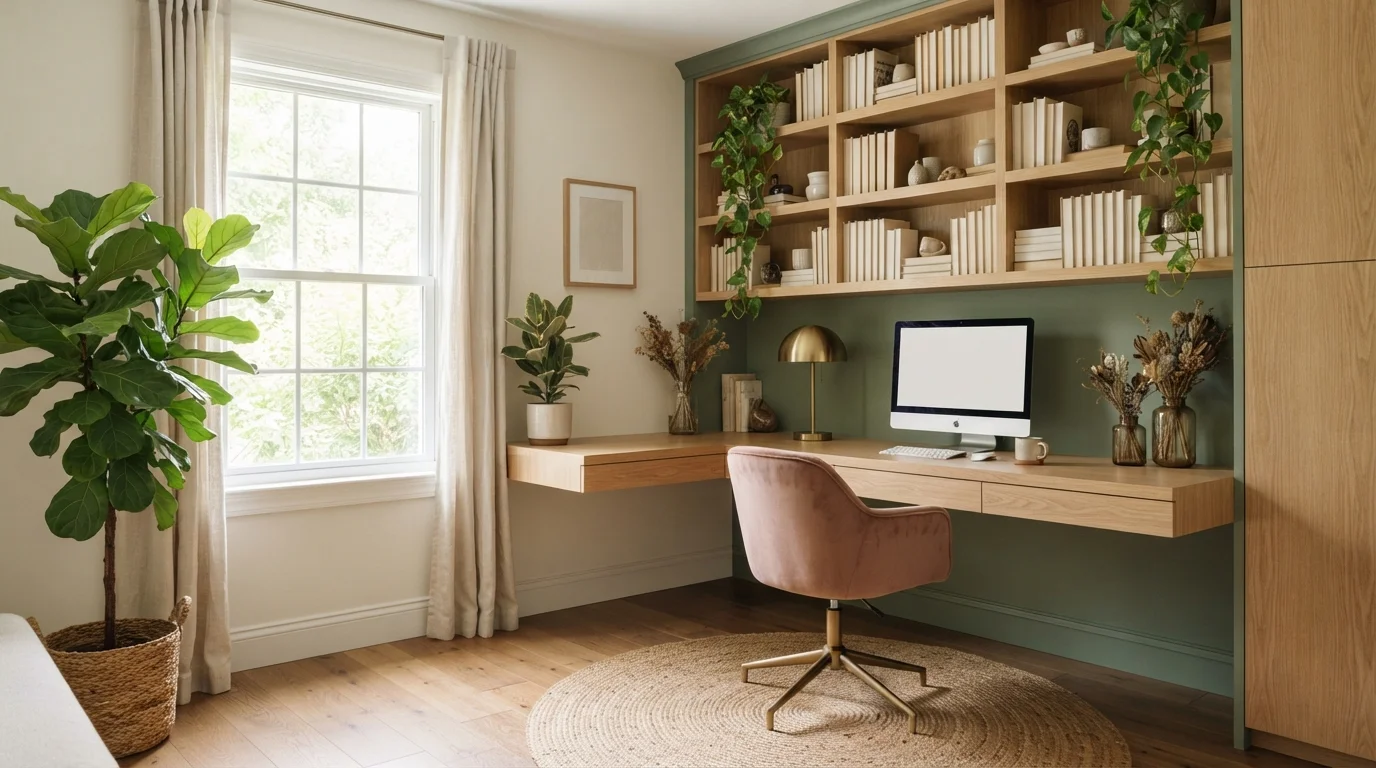
Golden wood tones blend with soft cream walls and lush garden views to create an effortlessly calm, inspiring workspace.
Cream is a soft, warm off-white with gentle beige notes. In this cozy study nook, creamy walls back custom light oak shelves, a matching wood desk, and a plush bouclé chair. The whole space feels quiet, organized, and deeply soothing to work in. Pairing pale walls with warm natural wood and leafy green plants keeps the nook feeling airy and grounded all at once. If you love natural textures and want a calm, clutter-free work-from-home spot, this look is made for you.
SEE NATURAL WICKER ON YOUR WALLS →
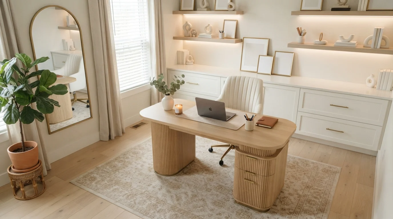
Soft creamy walls and honeyed wood tones create a peaceful, sunlit sanctuary built for effortless daily focus.
Creamy ivory is a soft, warm off-white with a gentle glow. In this space, it wraps the walls around crisp white built-in shelves, a ribbed blonde wood desk, and a ribbed cream chair over a faded beige rug. The whole room feels deeply calm, tidy, and welcoming. This pairing works because soft white walls let the rich honey wood and warm ambient lighting shine without competing. It is an ideal look for remote workers who want an uncluttered, inspiring space that feels peaceful all day.
SEE SUGAR SOAP ON YOUR WALLS →
Soft daylight and creamy walls wrap this quiet study space in gentle, grounding warmth and calm focus.
Creamy beige is a soft, warm off-white that creates an instant sense of peaceful focus. Here, the walls wear this gentle beige tone, paired with clean white trim, light oak shelving, and a matching blonde wood desk. The space feels open, uncluttered, and deeply soothing to work in. Sticking to pale earthy shades and raw wood keeps the whole corner feeling light and cohesive. It is an ideal look for anyone wanting a distraction-free work zone that still feels welcoming.
SEE ETIQUETTE ON YOUR WALLS →Neutral Home Office Wall Color Combinations
A wall color never works alone. These are the full schemes from the rooms above — the lead color first, then the supporting colors that make the photo work.
Gentle beige walls paired with blonde wood and soft cream textures create an utterly tranquil workspace.
TRY THIS PALETTE →Golden morning light pours across warm cream walls, woven textures, and soft blonde oak for a calm, grounding workspace.
TRY THIS PALETTE →Sunlight filters softly across natural oak woodwork and textured earthenware, creating a peaceful, grounded space to focus and unwind.
TRY THIS PALETTE →Soft cream walls and warm oak wood create a quiet, sunlit workspace that feels deeply soothing and focused.
TRY THIS PALETTE →The reliable combination for any of these eight is a soft white trim, not a stark white — a bright white trim next to Popular Gray or Gratifying Gray can make the wall color look dingy by comparison, since both have a hint of gray in the base. Pair warm picks like Spanish Sand and Aged Beige with a warm white or cream trim so the whole room reads as one warm palette instead of two competing temperatures.
For furniture and flooring, match undertone rather than guessing by eye. Cedar Key and Popular Gray, both cooler-leaning neutrals, sit well against gray-washed or whitewashed desks and black or nickel hardware — common in a modern home office setup. Spanish Sand and Grecian Ivory, both warmer, pair naturally with oak or walnut desks and brass hardware. If your office has built-in bookshelves, paint them the same color as the wall in a satin finish so the shelves recede and your books and monitor become the visual focus, rather than adding a second accent color that competes with your screen.
More Home Office Color Ideas
Set on a color family already? Each page has its own real rooms and picks.
Light or Dark Neutral Home Office Colors?
Go Light (LRV 60+) If…
The room is small, faces north, or has to work at every hour. Light warm colors make it feel bigger and stay calm in evening light — the light you actually live in.
Go Dark (LRV Under 20) If…
You want the cocoon effect and the room has real daylight. Dark works best on one feature wall — or fully color-drenched in a large room with good windows.
Home offices lean light more often than any other room in the house, and the reasoning is practical, not just aesthetic. Most desks sit against a wall, away from the window, so the wall color is doing real work bouncing light back toward you rather than just setting a mood. Crushed Ice at LRV 66 is the brightest pick here and the safest choice for a windowless office or one with only a small north-facing window — it keeps the room from feeling like a cave by 3pm in winter.
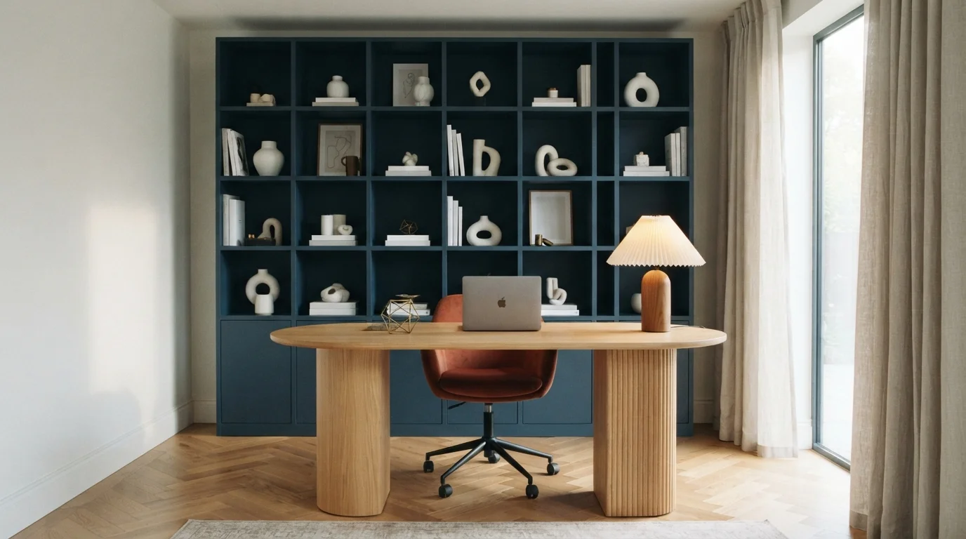
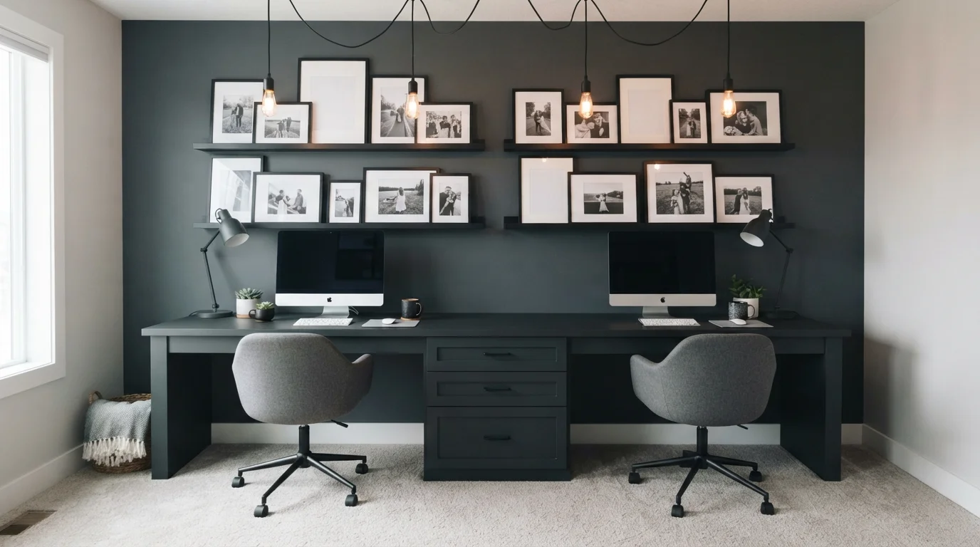
If your office gets strong south or west light, or you have a big window right at your monitor, you can afford to go a step warmer and slightly lower without losing brightness — Spanish Sand or Aged Beige will still feel lit even though they read a touch deeper than Crushed Ice on the chip. Going much darker than these eight picks is a real trade-off in a work room: a moody navy or charcoal office looks sharp in photos, but it also makes small rooms feel more confined and shows scuffs and monitor glare more than a light neutral does. If you want that cocoon feeling, save the dark color for a wall behind a bookshelf or a single accent wall behind your desk, and keep the rest of the room in one of the lighter picks like Crushed Ice or Grecian Ivory so the room doesn't lose all its daylight.
See It. Love It.
Paint It.
Upload one photo of your neutral home office and try every color on this page on your own walls — in your own light, before you buy a drop of paint.

Repose GrayBeforeSheen And Finish For A Work Room
Home offices take more wear than a bedroom but less than a kitchen, so eggshell or satin on the walls is the right call for any of these eight colors — it wipes clean where a desk chair or cable bumps the wall, without the glare of semi-gloss under an overhead light or ring light. Trim and built-ins can go one step glossier, satin or semi-gloss, since they take more contact from hands and furniture.
Gloss matters more here than in most rooms because of video calls. A glossy or shimmer-finish wall behind you on a call will pick up reflections from your monitor and window and read as a distracting bright spot on camera. Flat matte finishes look best on video, but they mark and scuff easily on a work-room wall, so eggshell is the honest middle ground — matte enough to look calm on a Zoom call, durable enough to survive years at a desk.
Choosing A Wall For Video Calls
If the room's main job is video calls, work backward from the camera before you paint. Mid-tone neutrals like Popular Gray or Gratifying Gray photograph better on camera than very bright colors, because a wall much brighter than your face forces the camera to expose for the wall and darkens you by comparison. Crushed Ice and Grecian Ivory are still light enough to open up the room but sit far enough from true white that they won't blow out on camera the way a bright white wall can.
Paint only the wall behind your desk if you're testing this, not the whole room — it's the cheapest way to see how a color reads on your specific webcam and lighting before committing four walls to it. Avoid anything glossy behind you for the same reason covered above: reflections and glare read as distracting on a compressed video feed even when they're barely noticeable in person.
Common Mistakes In A Neutral Office
The biggest mistake is picking a neutral for the paint chip alone and ignoring the room's actual light. A color that reads bright and airy in a sunlit showroom can go flat and gray in a north-facing office with one small window — tape a real sample of Crushed Ice or Whiskers to the wall and check it morning, midday, and under your desk lamp at night before buying a gallon.
The second mistake is treating every neutral as interchangeable. Warm picks like Spanish Sand and Aged Beige next to cool picks like Cedar Key or Gratifying Gray on the same wall, or across an open-plan office and hallway, will visibly clash even though every one of them is technically a 'neutral.' Pick one undertone family and stay in it for the room, then let trim, furniture, and accessories carry the contrast.
About Neutral Home Office Paint Colors
A neutral home office earns its keep because it disappears into the background of your workday instead of fighting for attention. High-LRV colors like Crushed Ice (SW 7647, LRV 66) and Grecian Ivory (SW 7541, LRV 63) bounce daylight around the room, which matters most if your desk sits away from the window or you work into the evening under lamps. Neither color reads as stark or clinical; they hold enough warmth to keep a small office from feeling like a waiting room.
The rest of this group leans slightly warmer and lower in LRV, which is worth understanding before you pick one. Spanish Sand (Behr OR-W07, LRV 64) and Aged Beige (Behr PPU7-09, LRV 63) sit closer to sand and putty, so they suit an office with a lot of wood furniture or a desk in direct afternoon sun where a cooler neutral would look flat. Popular Gray (SW 6071, LRV 61) and Cedar Key (Benjamin Moore 982, LRV 61) split the difference between warm and cool, which is why both show up so often in offices that also do double duty as a guest room or reading nook.
Gratifying Gray (Behr DC-008, LRV 58) and Whiskers (PPG1025-3, LRV 60) are the two here that read the most gray-forward rather than beige-forward. They're a better match if your office has cooler-toned trim, gray flooring, or black-and-white hardware you don't want to clash with. All eight picks sit between LRV 58 and 66, which is the range that keeps a work surface bright without the glare of a true white — important on video calls, where very bright white walls can wash out your face or blow out the camera's exposure.

The Questions Everyone Asks
What color should I paint my neutral home office?
If you want one answer, start with the safe picks above — Shiitake, Sand Castle, Edelweiss, Canvased. They read well in any light and survive furniture changes. Then check the light: strong afternoon sun wants a step cooler, a north-facing room wants a step warmer.
what color should i paint a home office
For most home offices, a light neutral with an LRV in the high 50s to mid-60s works best — bright enough to keep the room from feeling closed in, without the glare of a true white on a video call. Crushed Ice (SW 7647, LRV 66) and Grecian Ivory (SW 7541, LRV 63) are both safe, well-tested choices that stay calm and readable in daylight and lamp light alike.
what two colors go well together in a home office
A light neutral wall with a soft white trim is the most reliable pairing, since it keeps focus on your desk and screen rather than the walls. Try Popular Gray (SW 6071) with a warm white trim, or Spanish Sand (Behr OR-W07) with a cream trim — matching the trim's warmth to the wall's undertone keeps the room from feeling like two mismatched whites stacked together.
how do i make a small home office look bigger
Stick to a color with an LRV above 60, like Crushed Ice or Whiskers, and paint the trim a close, soft white rather than a contrasting bright white — a big jump between wall and trim brightness actually draws the eye to the room's edges and makes it feel smaller. Keeping walls, trim, and ceiling in the same light family reads as one continuous space instead of a boxed-in room.
what is the best paint color for a home office with no windows
Go with the highest-LRV neutral on your shortlist, since a windowless room depends entirely on the wall color and your lighting to feel open. Crushed Ice at LRV 66 is the strongest choice here — it reflects the most light back into the room. Pair it with warm-white overhead lighting or a daylight-balanced desk lamp, since a windowless office relies on artificial light doing the job sunlight would normally do.
does paint color affect video calls
Yes — very bright white walls can force your camera to expose for the wall and darken your face, while glossy finishes pick up reflections from monitors and windows. A mid-tone matte or eggshell neutral like Gratifying Gray (Behr DC-008) or Popular Gray (SW 6071) behind your desk photographs more evenly than a stark white or a high-gloss finish, and it won't compete with your face for the camera's attention.
What two-color combination works best in a neutral home office?
The reliable pattern is a quiet main color plus one deep accent on a single wall. Keep trim and ceiling in one warm white so the two colors are the only event in the room — the combination cards above show complete schemes from real rooms.
What colors make a neutral home office look bigger?
High-LRV, slightly warm colors — LRV 60–75 is the sweet spot. Paint the walls and trim close to the same light color so the corners blur, and keep the ceiling white. Stark cool white actually works against you; it creates hard shadows that show the room's edges.


Ask a Question