Lighthouse
Dunn-Edwards' crispest cool white, reviewed honestly: the bright rooms where it glows blue-gray clean, the dim ones where it turns flat, and what to pick instead.

Jessica has spec'd whites and neutrals for more than 300 rooms and keeps a sample wall of painted drawdowns in her studio. Every color review is checked against real reader rooms in the comments and re-tested when a formula changes. About the testing process →
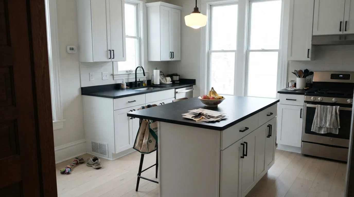
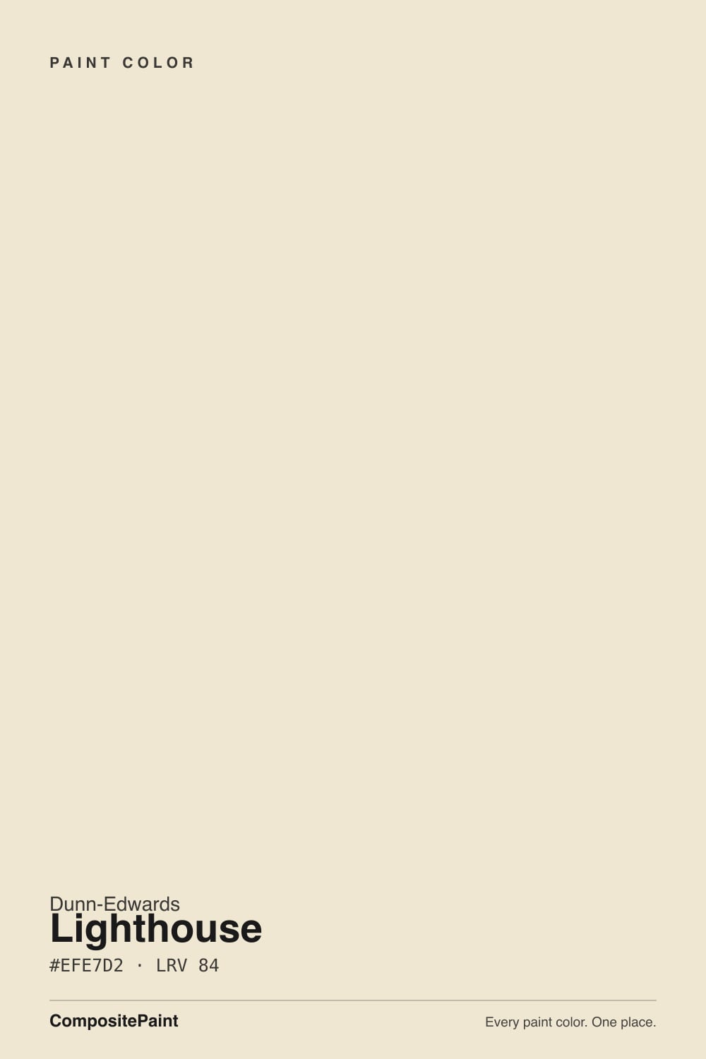
- 1First Star69
- 2Classic Gray74
- 3Lighthouse83
- 4Chantilly Lace91
- 5Ultra Pure White97
The Fast Verdict
Lighthouse is the cool, clean answer in a Dunn-Edwards deck built mostly on warm whites. Where Swiss Coffee and Whisper lean creamy, Lighthouse sits on the blue-gray side of the wheel — crisp, quiet, a little icy. Give it real daylight, black hardware and cool stone and it reads modern and expensive. Put it in a dim north room and it goes flat and clinical fast; this is not a forgiving, one-size white.
Bright kitchens and baths with black hardware and cool quartz or tile · Southwest stucco exteriors in full sun · contemporary rooms that want a genuinely cool white, not another cream · trim and ceilings under mid-tone cool walls
Your room faces north and stays dim most of the day · you want cozy warmth over crisp · your floors are honey oak or golden pine · you're judging the color only under warm 2700K bulbs
- Genuinely cool, crisp white — not another cream dressed up as a whitewash
- Reads bright and clean on Southwest stucco in full sun
- Flatters black hardware, cool quartz, white oak and gray-green accents
- One of the better cool-white cabinet choices in the Dunn-Edwards deck
- High LRV 83 keeps rooms bright without going stark like a ceiling white
- Goes flat and cold in dim, north-facing rooms
- Fights warm 2700K lamp light instead of glowing under it
- Clashes with honey oak and golden-toned wood
- Not the cozy, forgiving whole-house white that a warm off-white is
What Color Is Lighthouse, Really?
A near-white with a genuine blue-gray undertone, filed by Dunn-Edwards in its Whites Collection as the cool counterpart to the brand's warmer standbys, Whisper and Swiss Coffee. Most off-whites sold in the Southwest lean creamy because builders default to warmth; Lighthouse is the deliberate exception, marketed by Dunn-Edwards toward contemporary and coastal-leaning rooms — think black metal, pale quartz, cool grays and blues, not honey wood and brass.
At LRV 83 it reflects most of the light that hits it, which puts it in the same brightness range as Sherwin-Williams Pure White and just under Benjamin Moore Chantilly Lace — bright, but not a stark ceiling white. What separates it from a warm off-white at a similar LRV is temperature, not brightness: next to a cream like Swiss Coffee, Lighthouse reads distinctly cooler and grayer, almost silvery in overcast light.
Undertone in one line: blue-gray, cool — never yellow, rarely pink. If your sample looks dingy or flat rather than crisp, that is dim or north light doing what it does to every cool white, not a defect in the paint.
Where It Shines
Give it strong daylight and it looks genuinely expensive: crisp without going sterile, calm without going creamy. Dunn-Edwards is one of the primary paint brands sold across the Desert Southwest, and Lighthouse is built for that market's light — full sun on stucco reads bright and clean rather than washed-out, which is exactly where a lot of pale cool whites struggle. Indoors, it is at its best paired with the materials that share its temperature: matte black fixtures, white oak, pale quartz, gray-green or blue accents.
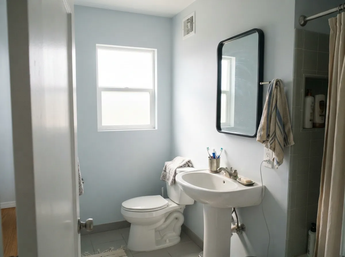
Where It Fails
Almost every disappointed review of Lighthouse comes from one of three predictable mismatches, and none of them are the paint's fault — but if your room matches one, this is not your white.
Cool whites have no warmth reserve to fall back on. Without real daylight, Lighthouse goes flat and slightly blue-gray fast, and readers describe it as "cold" or "clinical." The color did not fail; the light did. Test a large sample on the actual wall before committing, and consider a warmer Dunn-Edwards white like Swiss Coffee if the room stays dim most of the day.
A warm white glows under warm lamp light; a cool white does the opposite — the yellow-leaning bulb fights the blue-gray undertone and the wall can look dull or muddy rather than crisp. If your evenings matter as much as your days, sample under your actual bulbs, not just daylight.
Warm, orange-leaning wood and a cool white argue with each other: the floor looks more orange by contrast, and the wall can pick up a faint yellow cast bouncing off the wood, dulling its crispness. Pale white oak, gray-washed floors, walnut or espresso all sit far more comfortably next to it.
Room by Room
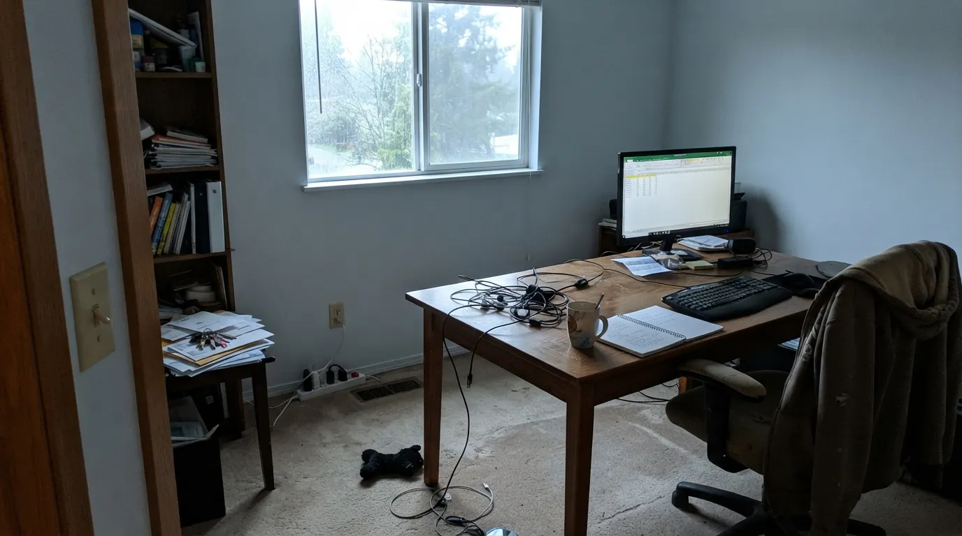
With strong south or west daylight it reads calm and modern. In a dim or north-facing living room it can feel cold and uninviting fast — this is not the safe, goes-anywhere white that a warm off-white would be.
Pale quartz, black hardware and white oak all sit comfortably against it, and satin cabinets wipe clean without showing the yellow flash a warmer white would pick up near stainless appliances. One of the better cool-white cabinet choices in the Dunn-Edwards deck.
It can work in a bright bedroom with plenty of natural light, but a bedroom mostly lived in under warm lamp light is the one place its cool character works against it. If you want dusk-and-lamps coziness, Whisper or Swiss Coffee will serve better.
With cool tile, chrome or matte black fixtures and real daylight from a window or skylight, this is the room Lighthouse was built for — crisp, clean, hotel-bathroom quiet.
Semi-gloss Lighthouse trim reads sharp against blue-grays, sages and charcoals. Against a warm wall color it can look slightly mismatched in temperature; keep trim-and-wall pairings on the same side of the color wheel.
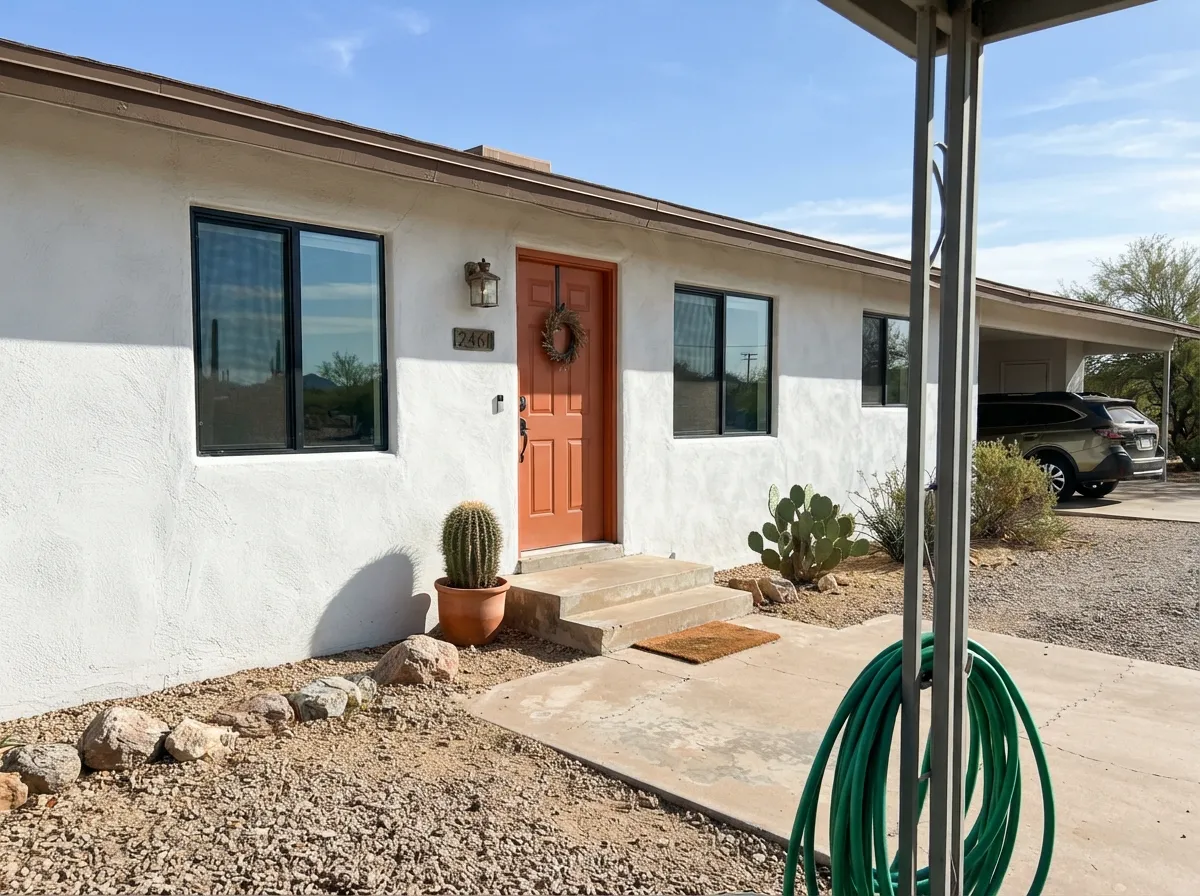
On Southwest stucco under real desert sun it is bright and clean rather than glaring, and it holds up well against black window frames and a saturated door color. Full details and pairings in the exterior section below.
Your Light Is the Risk
Crisp and clean without going sterile — the light this color was made for.
No warmth reserve to fall back on; the blue-gray goes flat and can read cold. Test a large sample first.
Cool and neutral through most of the day, with only a gentle warm cast at golden hour — it never fully glows the way a cream does.
2700K lamps mute it toward dull and gray. Cool white LEDs (4000K+) keep it looking crisp after dark.
Most complaints about Lighthouse are a light mismatch. Upload a photo of your actual room and see it on your walls — then ask for the same wall in north light or evening lamps before you buy a single sample.
Need It From Another Brand?
Any paint counter can custom-tint Dunn-Edwards DEW385 directly. If you would rather stay in one brand's own deck, these are the closest stock matches, measured as ΔE2000. Under 2 is a difference you will not see on the wall.
| Brand | Closest color | ΔE | LRV | |
|---|---|---|---|---|
| Sherwin-Williams | White SnowSW 9541 · Sherwin-Williams | 3.0 | 90 | Color page → |
| Behr | White GloveW-D-610 · Behr | 1.1 | 91 | Color page → |
| Benjamin Moore | Distant Gray2124-70 · Benjamin Moore | 1.8 | 90 | Color page → |
| Valspar | Tell Me a Secret8007-2B · Valspar | 2.1 | 89 | Color page → |
| PPG / Glidden | Delicate WhitePPG1001-1 · PPG / Glidden | 2.2 | 88 | Color page → |
| Glidden | Delicate WhitePPG1001-1 · Glidden | 2.1 | 88 | Color page → |
Similar Dunn-Edwards Colors
The nearest shades to Lighthouse within Dunn-Edwards's own range, ranked by perceptual color distance — useful when you want the same look a touch lighter, darker, or warmer.
WCAG 2.1: AA is 4.5 : 1 for normal text, 3 : 1 for large text, AAA is 7 : 1.
Lighthouse vs the Colors You're Also Considering
Every Lighthouse sample board has the same rivals on it. The numbers show the real lightness gap — then it comes down to which risk you would rather live with.
Pick this for the genuinely cool, clean read that Swiss Coffee's cream base doesn't have.
Dunn-Edwards DEW341 · LRV 83Swiss CoffeePick this if you want warmth instead of a cool crisp — it's the Southwest's default warm white for a reason.
Pick this if you're already matching to a Dunn-Edwards palette or exterior line.
Sherwin-Williams SW 7005 · LRV 84Pure WhitePick this if your painter works in Sherwin-Williams — nearly the same cool-neutral idea at almost the same LRV.
Against Antique White DEW351 at LRV 73, Lighthouse is clearly brighter and lighter. Antique White is deeper and creamier, so it feels cozier and more traditional, while Lighthouse keeps a room feeling open and fresh. Choose Antique White when you want warmth to dominate, Lighthouse when you want brightness first.
Wax Poetic DET651 at LRV 79 leans further into gold. Beside it, Lighthouse looks cleaner and less buttery, so Wax Poetic is the pick for a distinctly warm cream and Lighthouse for a soft white with only a hint of warmth.
Angelic Starlet DET645 at LRV 80 carries a cooler, slightly greener cast. Lighthouse reads warmer and more golden next to it. If your fixed finishes are cool, Angelic Starlet blends in better; if they are warm, Lighthouse is the safer match.
Lighthouse Coordinating Colors
The rule for coordinating with Lighthouse is the opposite of a warm white: stay cool, and treat any warm accent as the single exception, not the theme. It pairs naturally with blue-grays, gray-greens and near-blacks, and needs only one warm note — often a door — to keep the room from feeling sterile. These are the partners that keep showing up in rooms that work:
Lighthouse on Southwest Exteriors
Dunn-Edwards built its reputation as one of the primary paint brands across the Desert Southwest, and Lighthouse is a genuinely popular stucco choice in that market for a reason: full desert sun exposes a lot of pale cool whites as washed-out or glaring, but Lighthouse's blue-gray base keeps it reading bright and clean rather than harsh. It holds its color through the intense midday sun that fades cheaper exterior paint.
The pairing decides how modern or traditional the house reads. Black or charcoal window frames and trim give it a crisp, contemporary edge; a saturated door color — terracotta, deep teal, even a soft sage — supplies the one warm or colorful note the palette needs. What to avoid outside: a warm beige or tan trim, which will look mismatched in temperature against the cool body, and remember the shaded north side of the house will read noticeably grayer and flatter than the sun-baked south side.
Lighthouse With Wood Tones and Floors
This decision gets made at the floor, not the paint can. Pale white oak, gray-washed wood, walnut and espresso are all excellent — the cool or neutral wood tone meets Lighthouse's temperature halfway, and the pairing reads deliberate and contemporary rather than accidental.
The one honest no is golden: honey oak, orange-toned pine, or warm builder-beige carpet. Yellow-orange sits opposite blue on the wheel, so the wood reads more orange next to Lighthouse and the wall can pick up a faint, unflattering yellow cast bouncing off the floor. If the golden wood is staying — a rental, a floor you're not replacing — a warmer Dunn-Edwards white like Swiss Coffee will get along with it far better than Lighthouse will.
Metals follow the same logic: matte black, chrome and brushed nickel all sit comfortably against it; unlacquered brass is the one finish that can look slightly warm and out of step unless the rest of the room leans warm too.
Three Ready Palettes Built on Lighthouse
A color is never alone on the wall. These are complete combinations in the 60-30-10 pattern, with the reason each one holds together. Every one opens in the visualizer.
All three colors sit on the same cool side of the wheel, so nothing fights for temperature. Sea Salt gives one soft blue-green note and Naval supplies the single dark anchor the scheme needs at the front door.
Try this palette in your roomCool white stucco reads bright and clean under desert sun, near-black trim gives it a modern edge, and a terracotta door adds the one warm note the palette needs without fighting the body color.
Try this palette in your roomAgreeable Gray's warmth keeps the room from feeling sterile next to a cool white, and a near-black island gives the crisp cabinets the contrast they want.
Try this palette in your roomLighthouse FAQ
Is Lighthouse warm or cool?
Cool — a genuine blue-gray undertone, not a warm white in disguise. It is Dunn-Edwards' answer to buyers who want a crisp, contemporary white instead of the brand's more common creamy options like Whisper and Swiss Coffee.
Is it good for kitchen cabinets?
Yes, especially with pale quartz, black hardware and white oak. It stays crisp instead of picking up a yellow flash near stainless appliances the way a warmer white can. Use a satin, urethane-fortified cabinet enamel.
What trim white goes with Lighthouse walls?
Lighthouse itself in semi-gloss is the safest match. If you want contrast, stay on the cool side — a blue-gray or charcoal trim works; a warm cream trim will look mismatched in temperature next to it.
Does it work with honey oak floors?
Not comfortably. Yellow-orange wood and a cool white argue with each other — the floor reads more orange and the wall can pick up a faint yellow cast. Pale white oak, gray-washed floors, walnut or espresso are much better partners.
Is it good for exterior stucco?
Yes — this is one of its strongest uses. Dunn-Edwards is one of the primary paint brands sold across the Desert Southwest, and Lighthouse reads bright and clean rather than washed-out under strong desert sun, especially against black window frames or a saturated door color.
How does Lighthouse compare to Dunn-Edwards Swiss Coffee or Whisper?
Swiss Coffee and Whisper are both warm, creamy whites — the brand's defaults for cozy, traditional rooms. Lighthouse is the cool counterpart at nearly the same LRV, built for contemporary rooms and bright Southwest exteriors rather than warm, lamplit ones.
Have you painted with Lighthouse?
Rate it — one tap helps the next reader decide.
Ask a Question