Droplets
A cool gray-white West Coast designers keep putting on walls, reviewed honestly: where the gray stays clean, the pairings that make it look dirty, and what to pick instead.

Jessica has spec'd whites and neutrals for more than 300 rooms and keeps a sample wall of painted drawdowns in her studio. Every color review is checked against real reader rooms in the comments and re-tested when a formula changes. About the testing process →

- 1First Star69
- 2Classic Gray74
- 3Droplets83
- 4Chantilly Lace91
- 5Ultra Pure White97
The Fast Verdict
Droplets is the Dunn-Edwards white you pick when cream would be too much and a true white would feel blank. Cool, quiet, slightly gray — not yellow, not blue — so a room looks finished instead of painted. Amber Lewis uses it as a wall white for exactly that reason: a hint of gray gives you contrast without committing to gray paint. It is a California workhorse, not a national celebrity, and it behaves like one: honest in daylight, airy in small rooms, and unforgiving if you park it next to cream.
Walls in small or modestly lit rooms that need air · kitchens and living rooms with brighter white trim · cabinets · anyone who wants a gray-white without painting the room gray
You wanted cream or White Dove warmth · your floors are honey oak · the room is a dark north box with no lamps · you need an exterior white · leftover cream trim is staying
- Cool gray-white that still reads as white on four walls
- Gives trim contrast without painting the room gray
- Small rooms and modest daylight stay airy instead of yellow
- Cabinets: hides scuffs better than a true bright white
- Designer-tested West Coast default — Amber Lewis's wall white
- Goes dingy and gray in a dark north room with no lamps
- Looks dirty next to cream trim, cream ceilings, or Whisper on the field
- Fights honey oak and other golden floors
- Interior only — not an exterior white
What Color Is Droplets, Really?
A cool white with a drop of gray — and the gray is the whole trick. Most popular whites are built on yellow or blue, so they tip cream or icy the moment the light changes. Droplets does neither. The gray is faint enough that four walls still read as white, strong enough that millwork in a brighter white pops without you having to paint the room gray. That is why Amber Lewis keeps recommending it, and why Southern California studios and staged small rooms keep landing on it: it is a wall white that does contrast work.
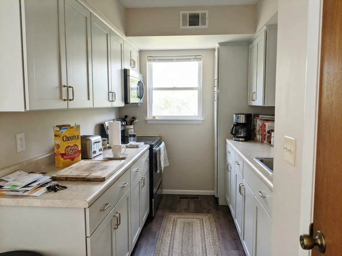
At LRV 83 it sits in the same neighborhood as White Dove (LRV 85) and Snowbound (LRV 83) — clearly not a bright white. Put it next to Dunn-Edwards Warm White (LRV 93), the true paper-white in this deck, and Droplets suddenly shows its body: a pale gray-white rather than a blank. That gap is useful. On walls it holds just enough color to soften shadows; on cabinets it hides scuffs a gallery white would broadcast. Dunn-Edwards files it as interior-only, which is the honest limit — this is not a stucco color.
Undertone in one line: gray first, a vanishing warmth only in strong west sun — never cream, never blue. If your sample looks pink or green, that is bounce from a floor, a roof overhang, or the tree outside, not the paint deciding to be a different color. If it looks dingy, the light went cold and the gray is all that is left.
Where It Shines
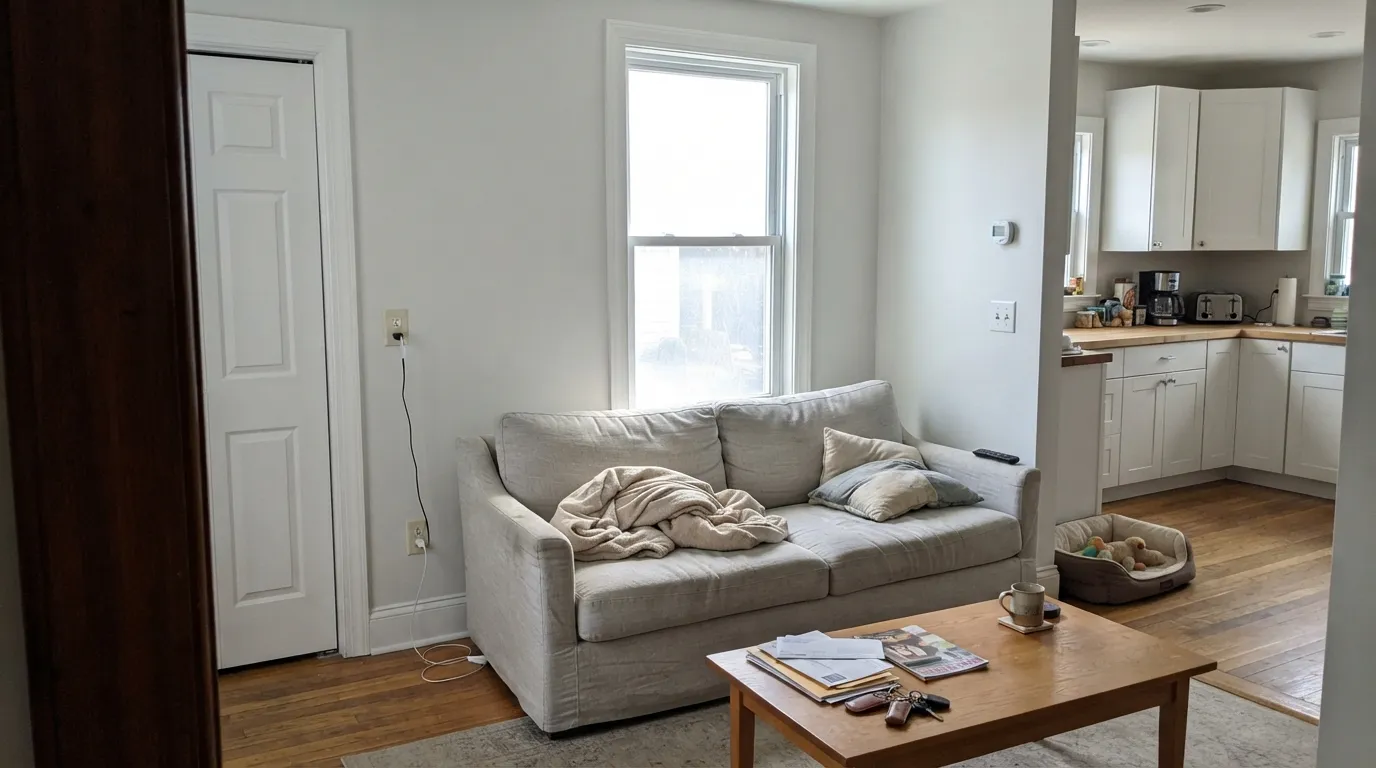
Give it a real window and a brighter trim white and it does the job designers hired it for: the room feels airy, the millwork reads crisp, and nobody calls the walls gray. Small rooms are its home turf — stagers have used it for years in spaces that do not get much daylight, because the gray keeps it from going yellow while LRV 83 still bounces light. Kitchens are the second home: satin on cabinets next to brass and pale stone, with Warm White or Whisper on the boxes around it.
Where It Fails
Almost every bad Droplets story is a pairing or a light mismatch, and all three are visible on the sample wall before you buy a gallon. None of them are the paint going rogue — but if your room matches one, this is not your white.
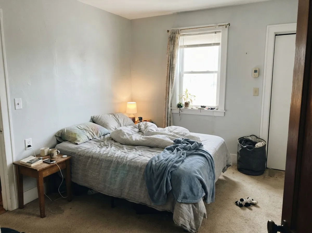
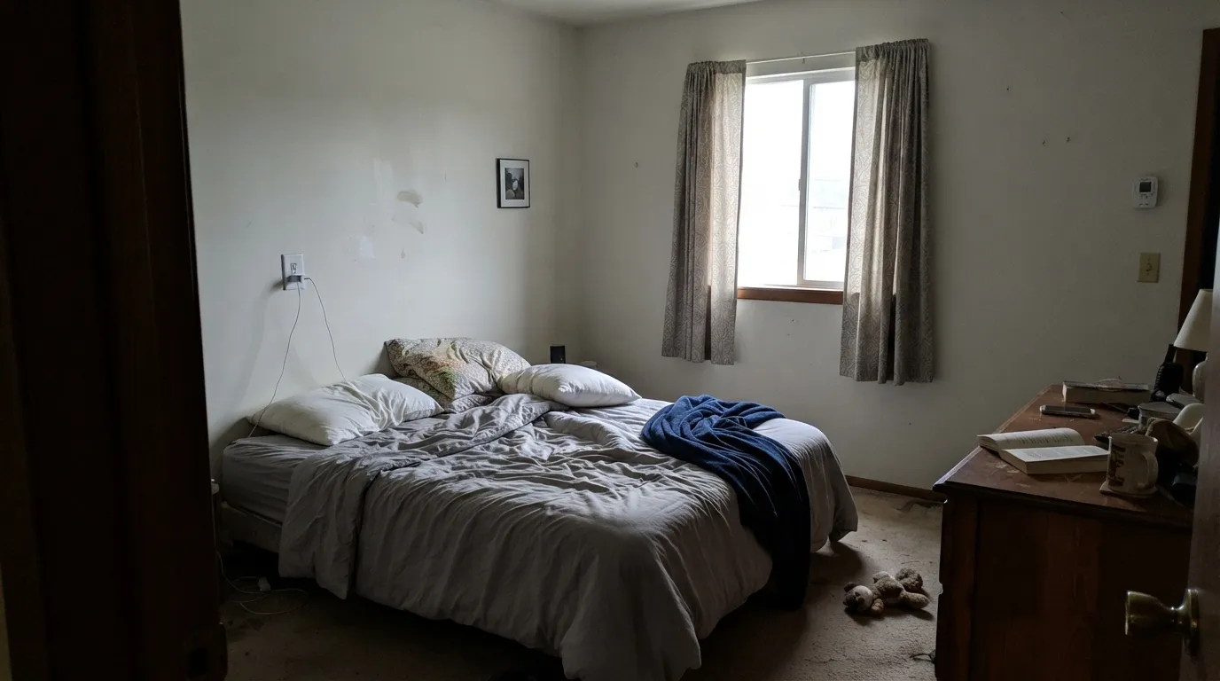
The gray that keeps Droplets clean in ordinary daylight is the same gray that takes over when the room is a cave. Readers call it dingy or unwashed. Dunn-Edwards positions it for dimmer spaces because it will not yellow there — that is true until the light drops so far there is nothing left but gray. Add warm lamps, or pick Whisper.
The most common mistake is leftover builder cream on the ceiling or trim. Cream wins, Droplets looks dirty. The intended pairing is the other way around: Droplets on the walls, a brighter true white on the millwork. If Whisper, Swiss Coffee, or any creamy white is staying on the trim, do not put Droplets on the field.
Yellow-orange floors push a cool gray-white toward cold, and the floor goes more orange in return. Walnut, pale white oak, and gray-washed wood are fine. If the honey oak is staying and you cannot rug over it, you wanted Whisper or White Dove, not this.
Room by Room
In real daylight it is a calm, slightly cool backdrop that makes wood furniture and art look deliberate instead of staged. Eggshell on the walls, a brighter white on trim in semi-gloss. Open to a kitchen, keep both rooms in the same white so the gray does not start a fight at the doorway.
Dunn-Edwards has pointed shoppers here for years, and it earns it: satin Droplets on boxes hides knuckle marks better than Warm White, and brass plus pale stone sit comfortably against the gray. Use Warm White or Whisper on the walls if you want the cabinets to read as the quieter white, not the other way around.
Soft and restful in morning light; under 2700K bulbs the gray relaxes instead of going icy. A north bedroom with one small window and no lamps is the skip — the walls will look tired by 4pm.
This is the job Lauren Matthews and other West Coast stagers hired it for: a small space that needs to feel bigger without going yellow. Eggshell, same color around corners, brighter white on doors. Hallways with a window at the end carry it; windowless halls need a lamp on the whole time.
As a trim white under greige or sage it is quiet and correct. As trim against cream walls it looks gray and unfinished. The designer move with Droplets is walls, not millwork — let Warm White (LRV 93) or Whisper (LRV 87) do the casings.
Dunn-Edwards lists Droplets as interior use only. Full sun would wash the gray toward a chalky off-white that reads like faded house paint from the street. For stucco and siding, use Whisper or Warm White and keep Droplets inside.
Your Light Is the Risk
The gray stays in the background and the walls read as a clean, airy white. This is the light the color was built for — including modest rooms with one real window.
Cool gray daylight strips any remaining warmth and leaves the gray sitting on the wall. Fine if you half-wanted gray; disappointing if you wanted white.
Morning keeps it cool and clean. West afternoon can flash a faint warmth for an hour, then it settles back. Sample on the wall that actually gets the sun.
2700K lamps soften the gray toward cream and the room feels finished. Cool white LEDs push it chalky — swap bulbs before you repaint.
Most complaints about Droplets are a light mismatch. Upload a photo of your actual room and see it on your walls — then ask for the same wall in north light or evening lamps before you buy a single sample.
Need It From Another Brand?
Any paint counter can custom-tint Dunn-Edwards DEW381 directly. If you would rather stay in one brand's own deck, these are the closest stock matches, measured as ΔE2000. Under 2 is a difference you will not see on the wall.
| Brand | Closest color | ΔE | LRV | |
|---|---|---|---|---|
| Sherwin-Williams | White SnowSW 9541 · Sherwin-Williams | 0.8 | 90 | Color page → |
| Behr | Whipped CreamDC-001 · Behr | 0.8 | 91 | Color page → |
| Benjamin Moore | Chantilly Lace2121-70 · Benjamin Moore | 2.0 | 91 | Color page → |
| Valspar | Cuddle Down8007-6F · Valspar | 1.2 | 91 | Color page → |
| PPG / Glidden | Delicate WhitePPG1001-1 · PPG / Glidden | 1.6 | 88 | Color page → |
| Glidden | Delicate WhitePPG1001-1 · Glidden | 1.5 | 88 | Color page → |
Similar Dunn-Edwards Colors
The nearest shades to Droplets within Dunn-Edwards's own range, ranked by perceptual color distance — useful when you want the same look a touch lighter, darker, or warmer.
WCAG 2.1: AA is 4.5 : 1 for normal text, 3 : 1 for large text, AAA is 7 : 1.
Droplets vs the Colors You're Also Considering
Every Droplets sample board has the same rivals on it. The numbers show the real lightness gap — then it comes down to which risk you would rather live with.
Pick this when cream would be too much and you want the cooler gray-white Dunn-Edwards itself positions against Whisper, especially on walls.
Dunn-Edwards DEW340 · LRV 87WhisperPick this if you want the warmer, creamier Dunn-Edwards default — it is this deck's White Dove, and it is the better whole-house white in dim rooms.
Pick this when White Dove's warmth would read as cream in your light and you want the cooler, slightly grayer white at the same depth.
Benjamin Moore PM-19 · LRV 85White DovePick this if your painter is Benjamin Moore and you want the safer warm white — cream grayed just enough that it almost never misbehaves.
Pick this when you are in a Dunn-Edwards store and want that pale gray-white idea with a cleaner gray, not a cream.
Sherwin-Williams SW 7004 · LRV 83SnowboundPick this if you already paint in Sherwin-Williams and want the same LRV gray-white without crossing brands.
Pick this for walls that should feel like a pale gray-white with body, not a gallery blank. The classic pairing is Droplets walls, Warm White millwork.
Dunn-Edwards DEW380 · LRV 93Warm WhitePick this for trim, ceilings, and cabinets that should be a true bright white — the name is a trap; it is paper-white, not cream.
Droplets Coordinating Colors
The rule for coordinating with Droplets is the opposite of a cream white: go brighter and cleaner on the millwork, or stay on the cool-neutral side of the fence. Cream trim makes it look dirty; true white trim makes it look intentional. These are the partners that keep showing up in rooms that work:
Why California Designers Keep Reaching for Droplets
Droplets is not a Color of the Year and it never went viral the way White Dove did. What it has is a West Coast paper trail. Amber Lewis has called out the gray on the record: it is the white you use when you want a little contrast without painting the room gray. Dunn-Edwards itself has sold it to stagers as the cooler alternative to Whisper, and Lauren Matthews of White Orchid Interiors has recommended it specifically for smaller rooms that do not get much natural light. A 2015 Apartment Therapy tour of a 375-square-foot West Hollywood studio put it on every wall in eggshell, with Warm White in semi-gloss on the trim — the exact pairing the color is built for.
That is a regional reputation, not a national one. If you are shopping Dunn-Edwards because that is the store your painter uses, Droplets is one of the honest answers in the Whites collection. If you wanted a white with a decade of Houzz threads behind it, you are still looking at Whisper, White Dove, or Alabaster — and you should sample Droplets anyway, because the gray is doing a different job.
Droplets With Wood Tones and Floors
Cool gray-whites are picky about the floor. Pale white oak, walnut, espresso, and gray-washed wood all sit comfortably against Droplets because they do not pull orange. Marble and pale quartz with gray or beige veining are fine; blue-gray stone is a sample-first situation, because the gray in the paint and the gray in the slab can stack into something colder than you meant.
The honest no is golden: honey oak, orange builder stain, yellow-beige carpet. The floor goes more orange, the walls go more gray, and no extra coat fixes that geometry. A large rug helps in a living room; in a kitchen with wall-to-wall honey oak, pick Whisper and keep the warmth on both sides of the baseboard.
Metals are easy: unlacquered brass, antique bronze, and matte black all work. Polished chrome is the one that can lean showroom-cold against the gray. Dunn-Edwards lists this color interior-only, so the wood question is an indoor one — do not take Droplets outside to settle a siding argument.
Three Ready Palettes Built on Droplets
A color is never alone on the wall. These are complete combinations in the 60-30-10 pattern, with the reason each one holds together. Every one opens in the visualizer.
This is the contrast Amber Lewis was describing: Droplets on the field, a true bright white on the millwork, one dark door so the scheme has a pulse. It is also how a 375-square-foot West Hollywood studio actually got painted — eggshell walls, semi-gloss Warm White trim — and the small room read bigger instead of cream.
Try this palette in your roomDunn-Edwards itself lists Whisper as the trim partner, and the LRV gap is the point: Whisper is brighter and creamier, so Droplets walls get a soft contrast instead of a stark one. Hale Navy is the safest navy as long as the entry has light — one dark note and the whites stay quiet.
Try this palette in your roomCrisp Muslin is the West's default light greige, so the wall-to-cabinet handoff stays in the same family instead of jumping to a cream. Satin Droplets boxes read as a clean white against it; the espresso island grounds the brass and keeps the kitchen from floating.
Try this palette in your roomDroplets FAQ
Is Droplets warm or cool?
Cool — a gray-white, not a cream. In strong west sun it can flash a whisper of warmth for an hour, then it settles back. It never reads as Whisper or White Dove. If you wanted cozy cream, you are in the wrong chip.
What trim white goes with Droplets walls?
A brighter true white. Warm White (DEW380) in semi-gloss is the high-contrast millwork move; Whisper (DEW340) is the softer official pairing. Do not use a cream, and do not use Droplets on the walls and a creamier white on the ceiling — the walls will look unwashed.
Is it good for kitchen cabinets?
Yes. Dunn-Edwards has recommended it for cabinets, and at LRV 83 it hides fingerprints better than Warm White while still reading as white. Satin urethane-fortified enamel, brass or black hardware, and keep honey oak off the floor if you can.
Will Droplets look gray?
On the chip, barely. On four walls in decent daylight, it still reads white with a cool edge — that is the point. In a dim north room with no lamps, yes, the gray comes forward and people call it dingy. Sample on the darkest wall in the house.
Can I use Droplets on the exterior?
No. Dunn-Edwards lists it as interior use only. For siding or stucco, move to Whisper or Warm White. Inside, keep it on walls, cabinets, and sometimes ceilings; let a brighter white do the exterior trim.
Droplets or Whisper for a whole house?
Whisper if the house is dim, north-heavy, or full of warm wood — it is the creamier, safer default. Droplets if you have decent daylight and want walls that sit slightly cool against brighter trim. Do not mix them as wall colors in adjacent rooms; pick one field white and stay there.
Have you painted with Droplets?
Rate it — one tap helps the next reader decide.
Ask a Question