Whisper
Dunn-Edwards' flagship warm white, reviewed honestly: where it earns its keep on West Coast stucco and warm-wood interiors, the exact light that flattens it, and what to pick instead.

Jessica has spec'd whites and neutrals for more than 300 rooms and keeps a sample wall of painted drawdowns in her studio. Every color review is checked against real reader rooms in the comments and re-tested when a formula changes. About the testing process →

- 1Classic Gray74
- 2Alabaster82
- 3Whisper87
- 4Sleek White92
- 5Ultra Pure White97
The Fast Verdict
Whisper is the white Dunn-Edwards built for people who don't want to think about white paint twice. Soft, warm, quiet — a whisper of cream over a near-white base, low enough in chroma that it never tips into visible beige. It's filed in DE's own low-risk color collections for exactly that reason, and on a wall it behaves like it: calm in daylight, cozy under lamps, and forgiving of scuffs in a way brighter whites aren't.
Whole-house walls + trim in real daylight · Southwest stucco exteriors in strong sun · kitchens with warm wood and brass · anyone who wants the Dunn-Edwards version of White Dove or Alabaster
Your climate stays overcast or coastal-foggy most of the year · your room faces north and stays dim · you want a crisp, cool-toned white · your counters are cool gray stone
- Soft, warm, finished white — quiet without reading beige
- Dunn-Edwards' flagship, low-risk white — built to not surprise anyone
- Excels on Southwest stucco exteriors in strong sun
- Flatters warm wood, brass and terracotta indoors
- Hides scuffs and handprints better than a brighter white
- Reads noticeably yellow-cream next to any cool-toned white or fixture
- Goes flat and dull in overcast or coastal-fog light
- Clashes with cool gray stone counters and countertops
- Less widely known and stocked outside Dunn-Edwards' West Coast/Southwest footprint
What Color Is Whisper, Really?
A warm, low-chroma near-white built on a yellow undertone — the kind of white that reads as "soft and finished" rather than "cream" or "beige." Dunn-Edwards files Whisper in its Whites family alongside its own pre-vetted, low-risk color collections, which tells you what job it's meant to do: it's the safe default a painter reaches for when a client just wants a nice white and doesn't want to argue about undertone. That positioning matches how it behaves on the wall — quiet enough to disappear into trim, warm enough not to read sterile.
At LRV 87 it reflects most of the light in a room without reading stark. Put it next to a true bright white — cabinet hardware, appliance white, a fresh coat of ceiling white — and Whisper's warmth shows immediately; that gap is useful, not a flaw, because it's what keeps the color from looking clinical on trim or cabinets. On its own, across four walls with decent daylight, it reads as a clean, understated neutral rather than a color you'd name.
Undertone in one line: warm yellow, low intensity, never pink or green. Dunn-Edwards is a Southwest and West Coast brand first — strongest in California, Arizona, Nevada and Texas — and Whisper was clearly built with strong regional sun in mind. If your sample looks flat or slightly gray on the wall, that's usually a light problem (cloud cover, a north exposure, a shaded stucco elevation), not the paint being inconsistent.
Where It Shines
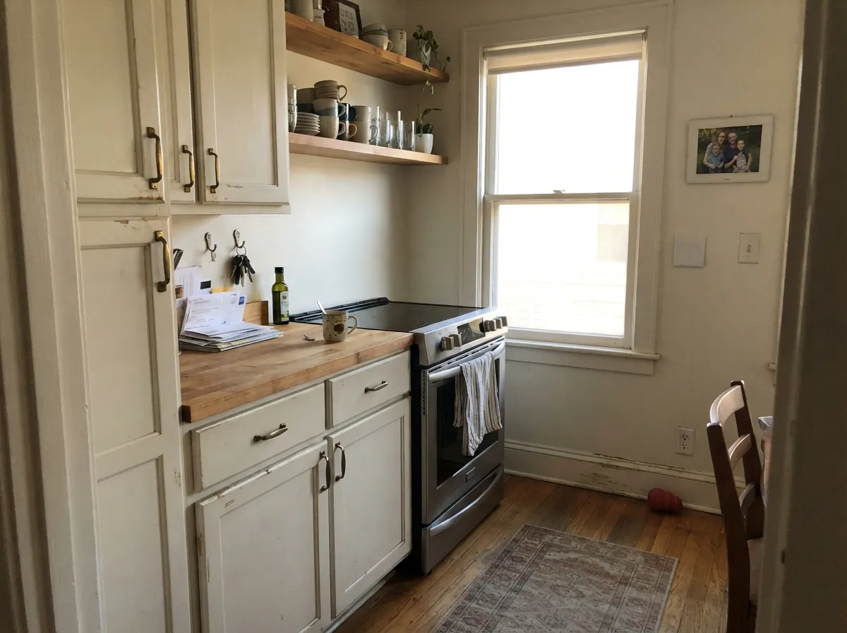
Give it real sun and warm materials and it does exactly what a flagship white should: get out of the way. It's the go-to for Southwest and Southern California exteriors — stucco, tile roofs, warm hardscape — where strong daylight keeps the cream from ever looking dingy. Indoors, it repeats the trick on kitchens: warm wood, brass, butcher block and terracotta accents all sit comfortably against it, and at LRV 87 it hides everyday scuffs and handprints better than a brighter, cooler white would.
Where It Fails
Almost every disappointed review of a warm white like Whisper comes from one of three predictable situations, and none of them are really about the paint. If your room or climate matches one of these, this isn't the white for you — no amount of extra coats fixes it.
Dunn-Edwards markets Whisper as "barely there," and on the chip it can look nearly white. On four walls the warm base is unmistakable, and next to anything genuinely cool-toned — stainless appliances, a bright ceiling white, white subway tile — the cream reads as yellow by comparison. If you want a true neutral white, this isn't it; look at a cooler near-white instead.
Whisper was built for strong regional sun. Flat, gray daylight — a marine-layer morning, a north-facing room with small windows — strips the warmth out and leaves a flat, slightly dull near-white behind. The color didn't change; the light did. Warm lamps help; a genuinely gray sky all winter is harder to fix.
Cool blue-gray stone sits at the opposite temperature from Whisper's yellow base, and the two argue: the counters look colder, the walls look more yellow than they did on the chip. With cool stone, go with a genuinely neutral white instead.
Room by Room
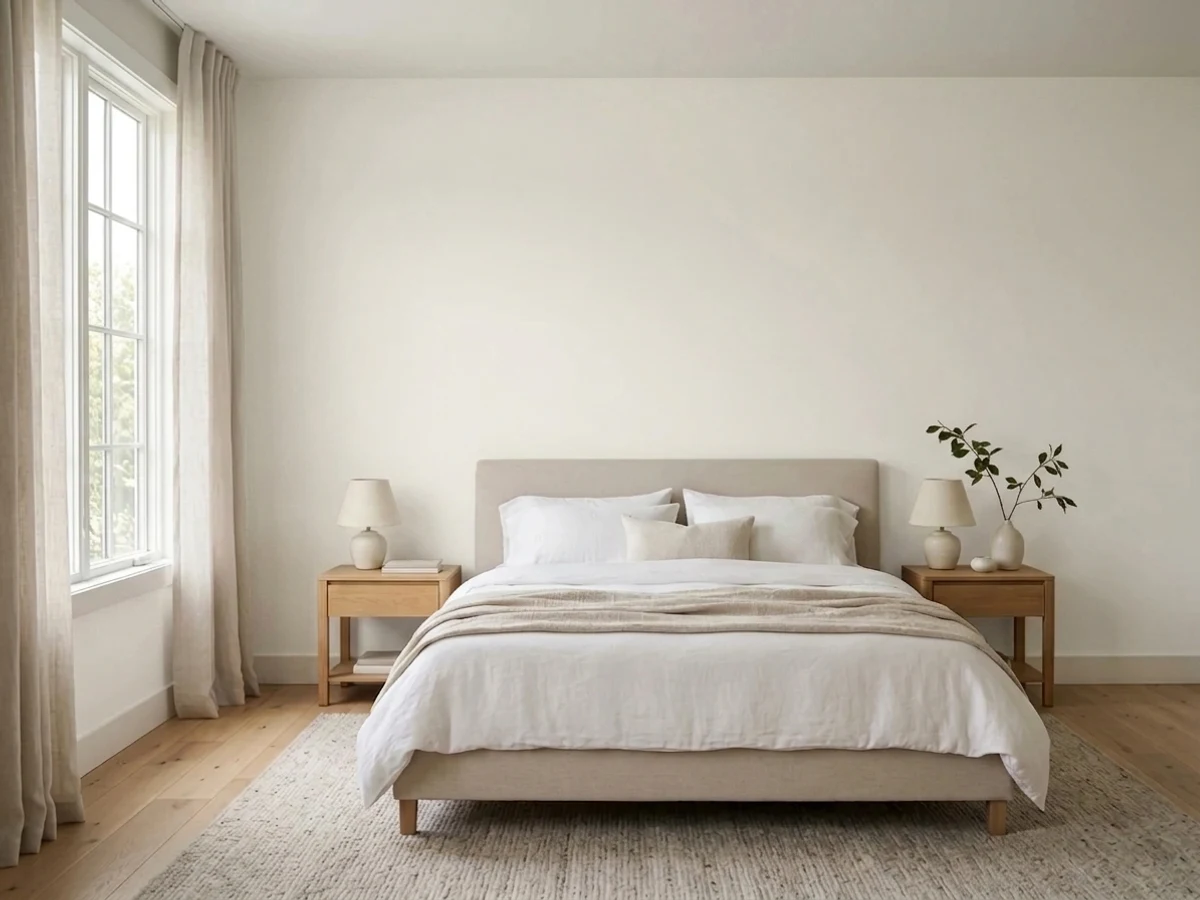
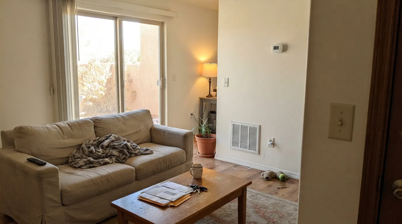
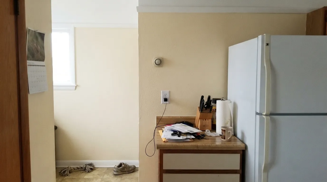
In a room with decent sun it's a calm, warm backdrop for wood furniture and art. Eggshell on the walls, semi-gloss on the trim in the same color for the classic one-color look.
Warm counters, brass hardware, butcher block, terracotta tile — all of it flatters Whisper. On cabinets it reads warm and lived-in rather than factory-bright, and it wipes clean without showing every fingerprint the way a cooler white does.
2700K lamps push it gently cozy at night. A north-facing bedroom that stays dim all day is the one case to sample carefully first.
Semi-gloss Whisper trim under a mid-tone wall color (greige, sage, warm charcoal) softens the contrast the way a stark white would sharpen it. It's the least risky trim decision in the DE deck.
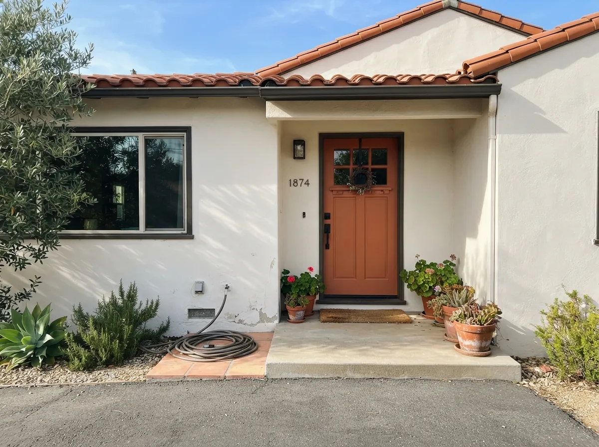
This is where Dunn-Edwards' regional strength shows: on stucco under strong Southwest sun, Whisper reads brighter and cleaner than it does indoors, and it pairs naturally with terracotta roof tile, warm hardscape and dark window trim. Details and pairings are in the exterior section below.
The reason it's filed in DE's low-risk color lists: it carries from room to room without clashing, which matters more in a hallway than almost anywhere else in the house.
Your Light Is the Risk
The warmth glows without tipping yellow-beige. This is the light Whisper was built for — especially on stucco.
Flat, cool daylight drains the warmth and leaves a dull, slightly gray near-white. Test on a genuinely cloudy day before committing.
Warmest at the sun hours, quieter and more neutral the rest of the day — a gentle shift most people find pleasant, not distracting.
2700K bulbs make it creamier and cozier at night. Cool LEDs flatten it toward gray — swap the bulbs before you swap the paint.
Most complaints about Whisper are a light mismatch. Upload a photo of your actual room and see it on your walls — then ask for the same wall in north light or evening lamps before you buy a single sample.
Need It From Another Brand?
Any paint counter can custom-tint Dunn-Edwards DEW340 directly. If you would rather stay in one brand's own deck, these are the closest stock matches, measured as ΔE2000. Under 2 is a difference you will not see on the wall.
| Brand | Closest color | ΔE | LRV | |
|---|---|---|---|---|
| Sherwin-Williams | High Reflective WhiteSW 7757 · Sherwin-Williams | 1.9 | 93 | Color page → |
| Behr | Powdered SnowW-D-700 · Behr | 0.8 | 94 | Color page → |
| Benjamin Moore | Snowfall White2144-70 · Benjamin Moore | 2.1 | 90 | Color page → |
| Valspar | Ultra White7006-24 · Valspar | 2.1 | 93.6 | Color page → |
| PPG / Glidden | Delicate WhitePPG1001-1 · PPG / Glidden | 3.3 | 88 | Color page → |
| Glidden | Crisp Linen White61YY 89/040 · Glidden | 2.1 | 89 | Color page → |
Similar Dunn-Edwards Colors
The nearest shades to Whisper within Dunn-Edwards's own range, ranked by perceptual color distance — useful when you want the same look a touch lighter, darker, or warmer.
WCAG 2.1: AA is 4.5 : 1 for normal text, 3 : 1 for large text, AAA is 7 : 1.
Whisper vs the Colors You're Also Considering
Every Whisper sample board has the same rivals on it. The numbers show the real lightness gap — then it comes down to which risk you would rather live with.
Pick this if you're already working with a Dunn-Edwards dealer or crew on the West Coast — no reason to switch brands for the same warm-white idea.
Sherwin-Williams SW 7008 · LRV 82AlabasterPick this if your painter works in Sherwin-Williams — the two are close enough in hex and character to be interchangeable.
Pick this if Dunn-Edwards is already your brand or your region's default supplier.
Benjamin Moore OC-17 · LRV 85White DovePick this for the nationally famous benchmark this color gets compared to — same warm-but-grayed-out idea, slightly different house.
Whisper (DEW340, LRV 84) has close neighbors in the Dunn-Edwards line, and the differences come down to depth and how warm they feel.
Almond Milk (DEHW01) at LRV 83 is nearly the same brightness and sits right beside Whisper, reading as an equally soft warm white. If you want essentially the same effect, either works. Abstract White (DE6232) at LRV 75 is noticeably deeper and creamier, so it feels cozier and shows a bit more color on the wall, which is useful when a bright 84 LRV white looks too washed out in strong light.
Frostbite (DE6274) at LRV 77 splits the difference, a touch lower and slightly cleaner than Whisper. Choose Whisper or Almond Milk when you want maximum brightness and openness, and step down to Frostbite or Abstract White when you want the room to feel a little warmer and more grounded.
Whisper Coordinating Colors
The rule for coordinating with Whisper is the same as any warm white: stay on the warm side of the fence. It flatters warm greiges, warm woods, deep near-blacks and terracotta-adjacent earth tones, and it argues with icy blues and cool grays. These are the partners that keep showing up in rooms and facades that work:
Whisper on Stucco and West Coast Exteriors
This is where Whisper does its best work, and it's also where Dunn-Edwards itself is strongest — the brand is headquartered in Southern California and sells primarily across the Southwest and West Coast, not nationally. On stucco under real regional sun, Whisper reads brighter and cleaner than it does indoors, and full daylight keeps its warmth from ever tipping into dingy.
The pairing decides the result outdoors. With dark, near-black trim — Wrought Iron, Iron Ore — you get a clean, modern-adobe contrast; with a terracotta or clay-toned door or roof tile, it reads as the classic Southwest palette. What to avoid: cool blue-gray shutters or accents, which make the body color look yellow by comparison, and a heavily shaded, north-facing elevation, which will read noticeably flatter than the sun-facing sides of the same house.
Whisper With Wood Tones and Floors
Warm wood is the easy answer here. Oak, walnut, cedar and butcher block all sit comfortably against Whisper because the color's warmth meets theirs halfway — orange-leaning builder oak in particular looks calmer next to it than it does next to a cooler white.
Cool gray LVP or gray-washed wood floors are the one flooring choice that needs a sample first: they pull Whisper's warmth into relief, and the wall can read a step more yellow than it did on the chip. It isn't always a dealbreaker — a warm rug and brass fixtures fix it in most rooms — but test a large sample above the actual floor before committing to the whole room.
Three Ready Palettes Built on Whisper
A color is never alone on the wall. These are complete combinations in the 60-30-10 pattern, with the reason each one holds together. Every one opens in the visualizer.
One color at two sheens gives depth without contrast lines, so hallways and small rooms flow into each other. The near-black door supplies the one dark note the scheme needs.
Try this palette in your roomWhisper's warmth was built for exactly this: strong sun, terracotta-adjacent accents, and dark trim that keeps the whole facade from reading pastel. This is the pairing Dunn-Edwards is best known for.
Try this palette in your roomRevere Pewter and Whisper share the same warm base, so the wall-to-cabinet handoff is seamless; the navy island grounds the room and loves brass hardware.
Try this palette in your roomWhisper FAQ
Is Whisper warm or cool?
Warm — a soft yellow undertone with very low intensity, so it never tips into visible beige. In flat or overcast light it drifts toward a duller near-white, but it never reads pink, green or genuinely cold.
Is Whisper the same as Behr's Whisper White?
No, and it's a common mix-up. Dunn-Edwards Whisper (DEW340) is deeper, warmer and lower in LRV than Behr's Whisper White (HDC-MD-08), which is brighter and closer to a true white. They only share part of the name.
How does it compare to Sherwin-Williams Alabaster?
Very close — close enough that most people won't see a difference on the wall. If you're already committed to a Dunn-Edwards contractor or store, stick with Whisper; if your painter works in SW, Alabaster gets you the same result.
Is it good for a Southwest or California stucco exterior?
Yes — this is the color's strongest use case. Strong regional sun keeps the warmth from looking dingy, and it pairs naturally with terracotta roof tile and dark window trim. See the exterior section above for pairings.
What trim white goes with Whisper walls?
Whisper itself, in semi-gloss, for the classic one-color look. A stark, cooler white trim will make the walls look dingy by comparison — the same mismatch that trips up every warm white in this price range.
Does it work in a cloudy or coastal climate?
Less reliably. Whisper was built with strong regional sun in mind, and flat, gray daylight — a marine-layer morning, a dim north room — drains its warmth and leaves a dull near-white. If your climate stays overcast most of the year, sample it before committing to a whole house.
Have you painted with Whisper?
Rate it — one tap helps the next reader decide.
Ask a Question