Mole's Breath
The warm mid-charcoal Farrow & Ball put on kitchen islands, reviewed honestly: where it goes velvety taupe, the light that turns it lavender, and why it is not Peppercorn.

Jessica has spec'd whites and neutrals for more than 300 rooms and keeps a sample wall of painted drawdowns in her studio. Every color review is checked against real reader rooms in the comments and re-tested when a formula changes. About the testing process →
- 1Black Fox7
- 2Pewter Green12
- 3Mole's Breath23
- 4Stardew43
- 5Quietude48
The Fast Verdict
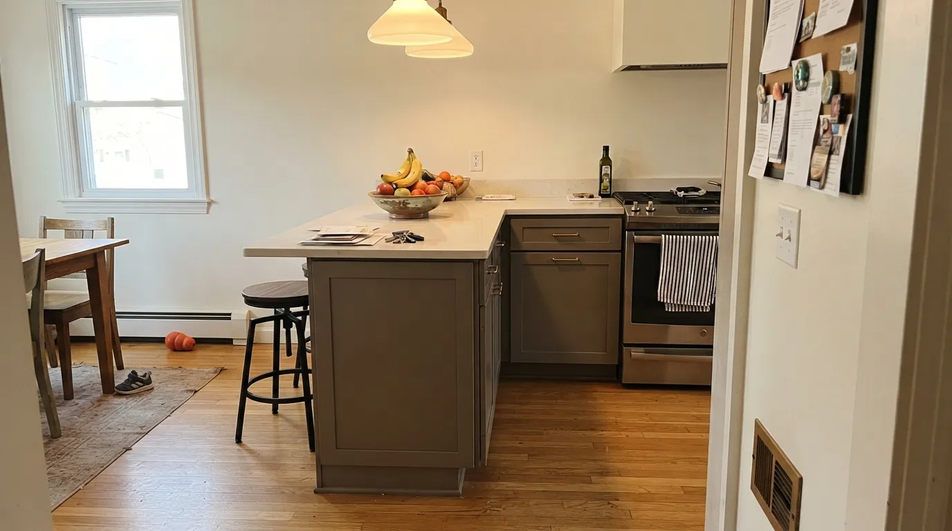
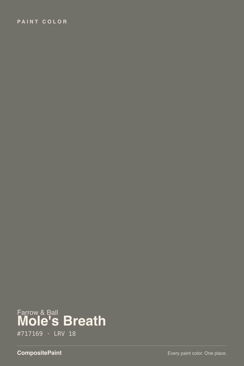
Mole's Breath is a brown-based mid-gray — mole fur, not pencil lead. At LRV 23 it is deep enough to ground a kitchen island and still lighter than a true charcoal. Under warm daylight it reads expensive taupe-gray; in cool north light it can flash lavender. If you came here from Sherwin-Williams Peppercorn, this is the warmer, lighter cousin — same job, different undertone.
Kitchen islands and painted cabinets · small studies and powder rooms · interior doors · lamplit living rooms that should feel grounded
You want a cool true charcoal · the room is large, open, and north-facing · you refuse lamps · you need a whole-house wall color
- Grounds kitchen islands without going black
- Warm taupe-gray that flatters walnut, oak, and brass
- Same depth as Chelsea Gray, with F&B's denser pigment
- Small rooms, doors, and vanities look custom in one color
- Holds its color in daylight instead of washing to cheap gray
- Not charcoal — the brown-taupe is unmistakable on four walls
- Cool north light and cool LEDs can flash lavender
- Too dark for most whole-house wall schemes
- Farrow & Ball price, and Estate Emulsion scuffs in kitchens
What Color Is Mole's Breath, Really?
A warm mid-gray with a brown base — the color of mole fur, which is the whole point of the name. Farrow & Ball launched it in 2013 as the darker, smaller-animal cousin of Elephant's Breath, and it has spent the decade since on kitchen islands. The brown is why wood and brass look considered against it, and why people hunting a cool charcoal bounce off the first sample. It is gray the way a tweed jacket is gray: there is warmth in every thread.
At LRV 23 it sits in genuine mid-depth territory, the same band as Benjamin Moore Chelsea Gray and two full steps lighter than Peppercorn (LRV 11). That number is the useful part: on an island or a run of cabinets it grounds the room without swallowing it; on four walls of a large open plan it can still feel like late afternoon at 2pm. Plan for the wall to read a step darker and browner than the chip — muted taupes always do this, and it is the first surprise in reader photos.
Undertone in one line: taupe-brown first, gray second, with a lavender flash in cold light. If your sample looks purple, the light is cool; if it looks greige-brown, that is the paint being honest about the room. Both versions are the same color. Neither is Peppercorn.
Where It Shines
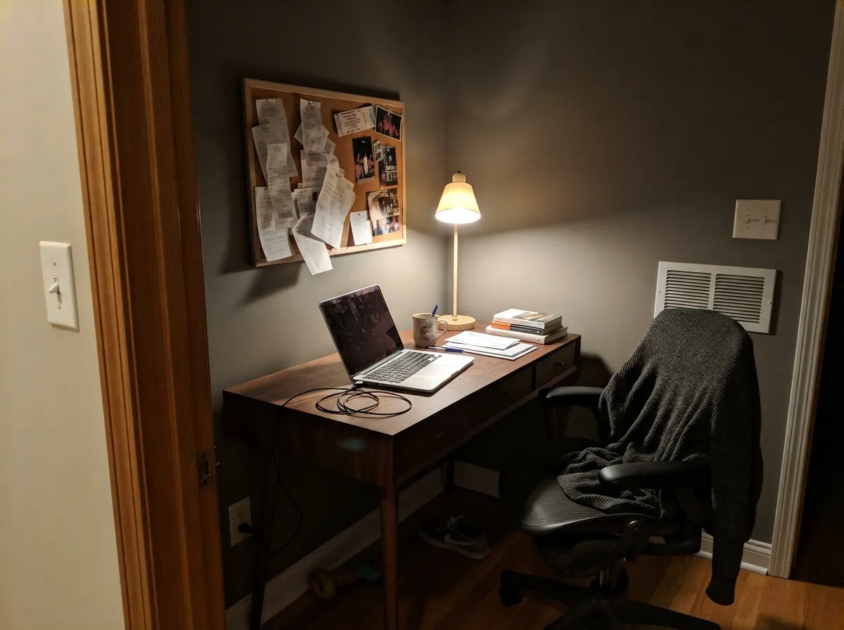
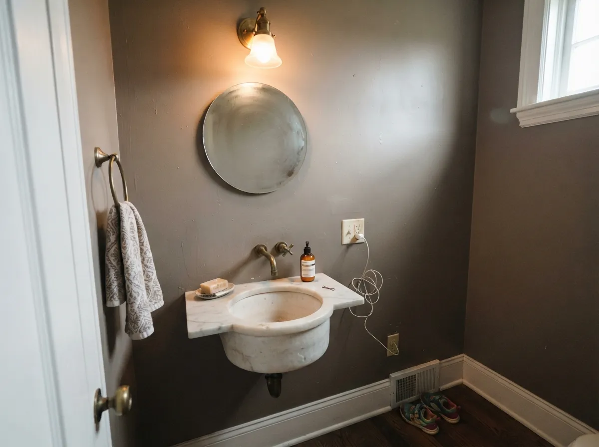
This color was hired to ground kitchens. On an island or a full run of cabinets it does the expensive-custom trick: white uppers stay white, oak floors look chosen, and the brown-gray reads like furniture rather than paint. Its second home is the small commitment — a study, a powder room, interior doors — where LRV 23 feels like atmosphere, not a cave. Give it Pointing or White Dove trim, walnut, unlacquered brass, and warm 2700K lamps, and it looks like it has always been there.
Where It Fails
Almost every regret story about Mole's Breath follows one of three scripts, and all three are visible on a big sample before anyone opens a tin. None of them are the paint's fault — but if your room matches one, this is not your gray, and sampling bigger will only confirm it.
On the chip it passes for a mid charcoal. On four walls the brown comes forward — warmer, lighter, and more fur than stone. If you wanted the cooler, darker American charcoal, Peppercorn (LRV 11) is that color; Mole's Breath is a taupe-gray wearing a charcoal coat. Chelsea Gray is the closer Benjamin Moore twin if you want the same depth without the F&B price.
Cold daylight is the documented trap: designers and owners both report a slight lavender or dusty-violet cast in north rooms and under cool LEDs. The brown-gray loses its warmth and what is left reads bruised. Warm 2700K bulbs are part of this paint job. If the room stays dim and north and you will not add lamps, pick Kendall Charcoal and stay in actual gray.
LRV 23 is island-depth, not whole-house-depth. In a large open living-kitchen with average daylight the walls go sullen and a little cave-like, and every adjacent room has to negotiate with a mid-charcoal. Use it on the island, the doors, or a closed study. For the main walls, step up to Ammonite or Elephant's Breath and let Mole's Breath be the dark note.
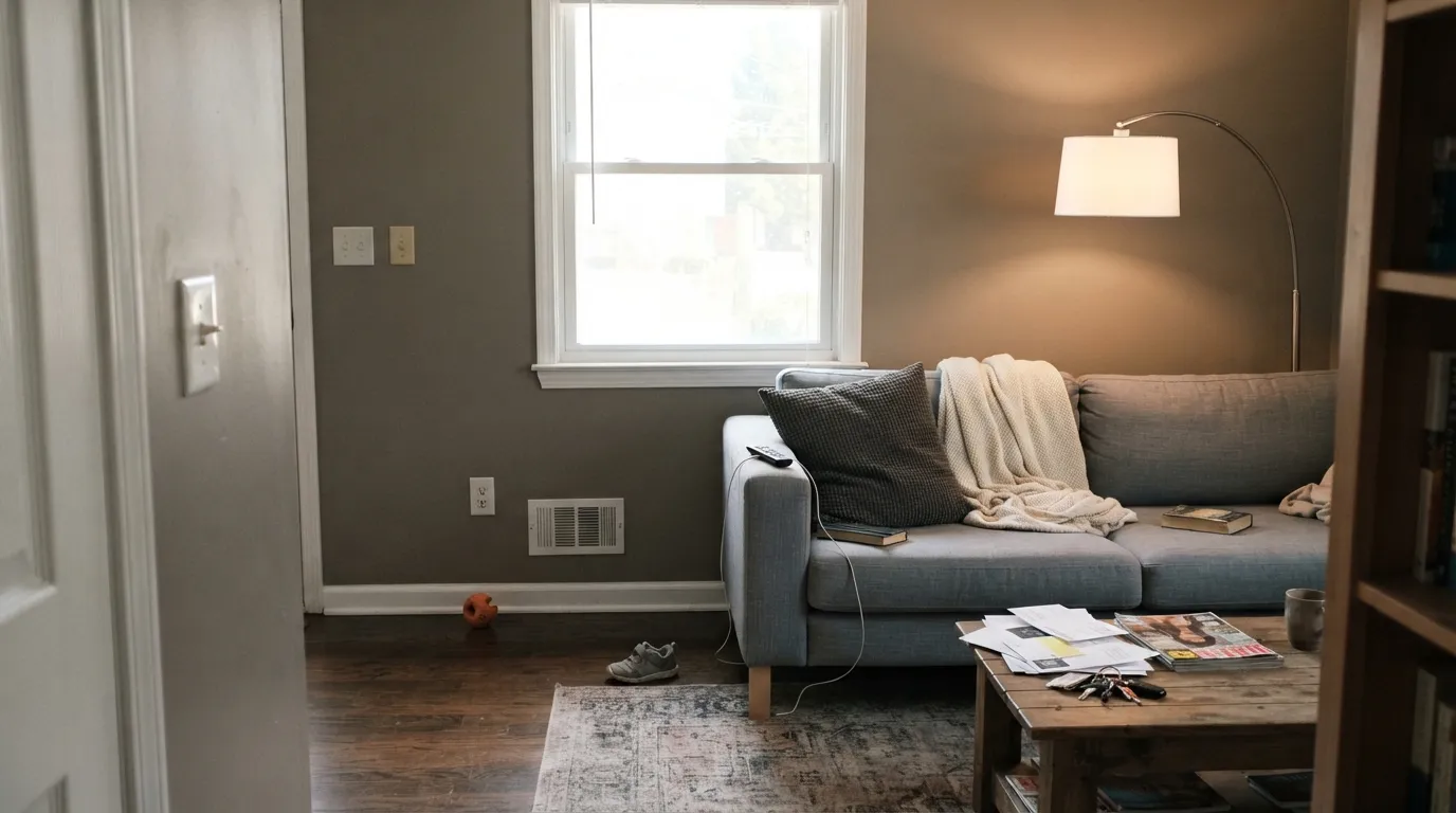
Room by Room
This is the job Farrow & Ball has recommended for a decade, and it earns it. Satin or Estate Eggshell on an island under Pointing or White Dove walls is the designer kitchen in one decision. A full run of Mole's Breath cabinets works too if the room has real daylight and warm wood; under cool white quartz it can go a little muddy. Do not use chalky Estate Emulsion on cabinets — it scuffs.
Small, lamplit, used at night: the exact conditions this depth likes. Matte walls, a Pointing ceiling, walnut shelves, and the room feels finished without going black. Eggshell if chairs scuff the walls.
Drench all four walls. LRV 23 in a room this size reads custom and expensive, not cave. Pair with a marble or warm-stone top, brass taps, and a gloss Mole's Breath door. Cool gray tile is the one fight — it pushes the lavender.
Beautiful in a closed, south- or west-facing living room with cream linen, walnut, and lamps that actually get switched on. Riskier in an open plan, where it has to shake hands with kitchen wood tones and whatever the adjacent rooms wear. Ammonite or Cornforth White next door is the safe handoff — they share the warm-gray family without the depth jump.
Restful at night, heavy by day if the room is large and north. Matte finish, 2700K bedside lamps, cream or white bedding rather than beige (beige goes yellow against the taupe). A Mole's Breath headboard wall under lighter remaining walls is the lower-risk version of the same mood.
Full sun washes the brown toward dusty taupe and the lavender can read as faded paint from the curb. The exception is a shaded front door or a north-facing door on a Pointing or All White house, where the warm charcoal looks intentional. For a whole facade, Kendall Charcoal or Chelsea Gray are the more proven exteriors.
Your Light Is the Risk
Warm sun keeps the taupe-gray rich and expensive — brown in a good way, never dingy. This is the light the island photos are taken in.
Cool gray daylight strips the brown and leaves a dusty lavender-gray. Fine if you half-wanted violet; disappointing if you wanted charcoal.
Cooler and a little greiger in morning east light; distinctly taupe-brown by west afternoon. Sample on two walls and look at both at 8am and 5pm.
2700K bulbs keep the fur-warm taupe and the walls go velvety. Cool white LEDs push the lavender and flatten it toward concrete. Swap the bulbs before you blame the paint.
Most complaints about Mole's Breath are a light mismatch. Upload a photo of your actual room and see it on your walls — then ask for the same wall in north light or evening lamps before you buy a single sample.
Need It From Another Brand?
Any paint counter can custom-tint Farrow & Ball No. 276 directly. If you would rather stay in one brand's own deck, these are the closest stock matches, measured as ΔE2000. Under 2 is a difference you will not see on the wall.
| Brand | Closest color | ΔE | LRV | |
|---|---|---|---|---|
| Sherwin-Williams | Classic French GraySW 77 · Sherwin-Williams | 1.5 | 24 | Color page → |
| Behr | Barnwood GrayPPU24-07 · Behr | 1.4 | 23 | Color page → |
| Benjamin Moore | Street ChicCSP-45 · Benjamin Moore | 1.6 | 23 | Color page → |
| Valspar | Dorian GrayT511 · Valspar | 1.8 | 22.2 | Color page → |
| PPG / Glidden | So SublimePPG1006-5 · PPG / Glidden | 2.6 | 24 | Color page → |
| Glidden | So SublimePPG1006-5 · Glidden | 2.3 | 23 | Color page → |
Similar Farrow & Ball Colors
The nearest shades to Mole's Breath within Farrow & Ball's own range, ranked by perceptual color distance — useful when you want the same look a touch lighter, darker, or warmer.
WCAG 2.1: AA is 4.5 : 1 for normal text, 3 : 1 for large text, AAA is 7 : 1.
Mole's Breath vs the Colors You're Also Considering
Every Mole's Breath sample board has the same rivals on it. The numbers show the real lightness gap — then it comes down to which risk you would rather live with.
Pick this for the lighter, warmer, more taupe version of the same island job, with F&B's denser pigment.
Sherwin-Williams SW 7674 · LRV 11PeppercornPick this if you want the darker, cooler American charcoal — it borrows its undertone from the room and sits nearly black on cabinets.
Pick this when you want that depth with a warmer, browner F&B cast and the chalky finish people are paying for.
Benjamin Moore HC-168 · LRV 23Chelsea GrayPick this for the same depth in a more available deck — the go-to charcoal-greige for islands, exteriors, and accent walls.
Pick this when you want the darker, more committed taupe-charcoal and you have a small room or an island to put it on.
Farrow & Ball No. 229 · LRV 52Elephant's BreathPick this for the lighter parent — it reads beige, grey, or faintly pink depending on the room, and will not cave a main floor.
Pick this when the brown-warmth is the point, not a risk, and you want island-depth rather than near-charcoal.
Benjamin Moore HC-166 · LRV 15Kendall CharcoalPick this if you want a darker gray that stays gray — the best-behaved dark in the BM deck, as long as the room is not a dim cave.
The closest neighbors in the Farrow & Ball range separate mainly by undertone and depth. Green Smoke (No. 47) at LRV 19 is almost the same lightness but carries a clear blue-green cast, so it reads as a soft teal-gray rather than the near-neutral Mole's Breath. Choose Green Smoke when you want obvious color; choose Mole's Breath when you want a quieter gray.
London Clay (No. 244) at LRV 14 is darker and distinctly brown, a warm earthy option for rooms where you want cozy over cool. Mole's Breath stays more neutral and lighter on the wall.
Douter (No. 318) at LRV 15 is another close match but leans green-gray and sits a touch darker. If your room already has warm wood and you want the wall to recede into a soft, undecided gray, Mole's Breath is the safer, more flexible pick of the group.
Mole's Breath Coordinating Colors
The rule for coordinating with Mole's Breath: stay warm, keep one true dark, and do not ice it with a cool white. It wants cream or a grey-based white, walnut and brass, and a cooler near-black so the taupe does not run the whole room. These are the partners that keep showing up in rooms that work:
Not Peppercorn: The 2013 Island Color
Farrow & Ball added Mole's Breath to the card in 2013 as the darker cousin of Elephant's Breath — named for a smaller, furrier animal, which is as close as the company comes to a technical data sheet. It has never been a Color of the Year. What it has been, for a decade, is the island color in English design press and the F&B showroom kitchen: a mid-charcoal with enough brown in it to make painted cabinets look like furniture.
American shoppers meet it as the posh alternative to Peppercorn, and that is a useful comparison only if you know the gap. Peppercorn is darker and more of a chameleon; Mole's Breath is lighter, warmer, and more taupe. Down Pipe is the cooler F&B option if you wanted lead-gray instead of mole fur — bluer and lighter than its reputation, and a different personality entirely. Pick the undertone on purpose; do not assume the names are interchangeable.
Mole's Breath With Wood Tones and Floors
Walnut and espresso are the easy yes — the red-brown depth makes the taupe read smoky and deliberate. Pale white oak and gray-washed floors are safe and go a little more Scandinavian. Honey oak, which fights a lot of cool grays, actually meets this color halfway: the brown in the wall calms the orange in the floor instead of amplifying it. That is one reason it works so often in existing kitchens.
The flooring that needs a sample is cool gray LVP or blue-gray stone. Gray floors pull the brown into relief, and the wall can look dirty-taupe against them; blue-gray stone is what wakes the lavender. A large rug and brass hardware fix mild cases. Metals: unlacquered brass, antique bronze, and matte black all sit naturally; polished chrome is the one that leans cold and can nudge the purple.
If the floor is staying golden and the counters are staying cool, paint the island, not the walls — that is the version of this color that keeps showing up in rooms people do not repaint.
Three Ready Palettes Built on Mole's Breath
A color is never alone on the wall. These are complete combinations in the 60-30-10 pattern, with the reason each one holds together. Every one opens in the visualizer.
Pointing is the warm off-white that still holds most F&B houses together, so the island reads as furniture instead of a paint stunt. Off-Black on metal keeps one true dark note; brass hardware can stand in if you want warmer.
Try this palette in your roomStrong White is the grey-based white for people who find cream boring, so the trim does not go yellow against the taupe walls. Railings is the blue-black that only shows its blue in real light — one cooler dark so the scheme does not collapse into brown.
Try this palette in your roomAmmonite is the greige that made Farrow & Ball a household name, so Mole's Breath doors and an island read like the same house getting quieter, not a color change. Pointing trim ties both back to the warm side of the deck.
Try this palette in your roomMole's Breath FAQ
Is Mole's Breath gray or brown?
Both, and that is the deal. It is a brown-based mid-gray — taupe-charcoal, mole fur, tweed. In warm light the brown is obvious; in cool light it can pass for gray until the lavender flashes. If you need a gray that stays gray, this is the wrong color.
How does it compare to Sherwin-Williams Peppercorn?
Same job, different house. Peppercorn is darker (LRV 11) and more of a chameleon charcoal that borrows its undertone from the room. Mole's Breath is lighter (LRV 23), warmer, and more committed to taupe-brown. If you loved a Peppercorn island photo and the room is already warm, Mole's Breath will feel friendlier. If you wanted near-black cabinets, stay with Peppercorn.
Is it good for kitchen cabinets?
It is the room Farrow & Ball has pointed people toward since 2013, and it is the best use. Eggshell or a cabinet-grade satin, not chalky Estate Emulsion. It loves oak, walnut, brass, and a Pointing or White Dove wall. Cool white quartz and chrome can push it muddy or lavender — sample against the actual counter.
What trim white goes with Mole's Breath?
Pointing is the in-family default, White Dove if your painter is in Benjamin Moore. Strong White if you want a greyer, less creamy edge. Skip Wevet — it is the coolest, most delicate white Farrow & Ball makes, and it will make these walls look muddy-brown by comparison. Semi-gloss or Full Gloss on the trim, matte on the walls.
Does Mole's Breath look purple?
It can. Cool north daylight and cool LEDs strip the brown and leave a dusty lavender cast — that is the complaint designers keep writing down. Warm south or west light and 2700K bulbs keep it taupe-gray. If purple is a dealbreaker, test a big sample on a north wall at noon and again at night under your actual bulbs.
Can I paint a whole house Mole's Breath?
Not the walls. LRV 23 is too deep for most open main floors — it goes cave-like and every adjacent room has to match its mood. Use it on islands, interior doors, a study, a powder room. For the main walls, Ammonite or Elephant's Breath keep the F&B family without the depth.
Have you painted with Mole's Breath?
Rate it — one tap helps the next reader decide.
Ask a Question