Card Room Green
Farrow & Ball's original card-room green, reviewed honestly: the light where it turns properly bottle-green, the rooms where it just goes dark, and what actually pairs with it.

Jessica has spec'd whites and neutrals for more than 300 rooms and keeps a sample wall of painted drawdowns in her studio. Every color review is checked against real reader rooms in the comments and re-tested when a formula changes. About the testing process →
- 1Vintage Vogue12
- 2Dried Thyme21
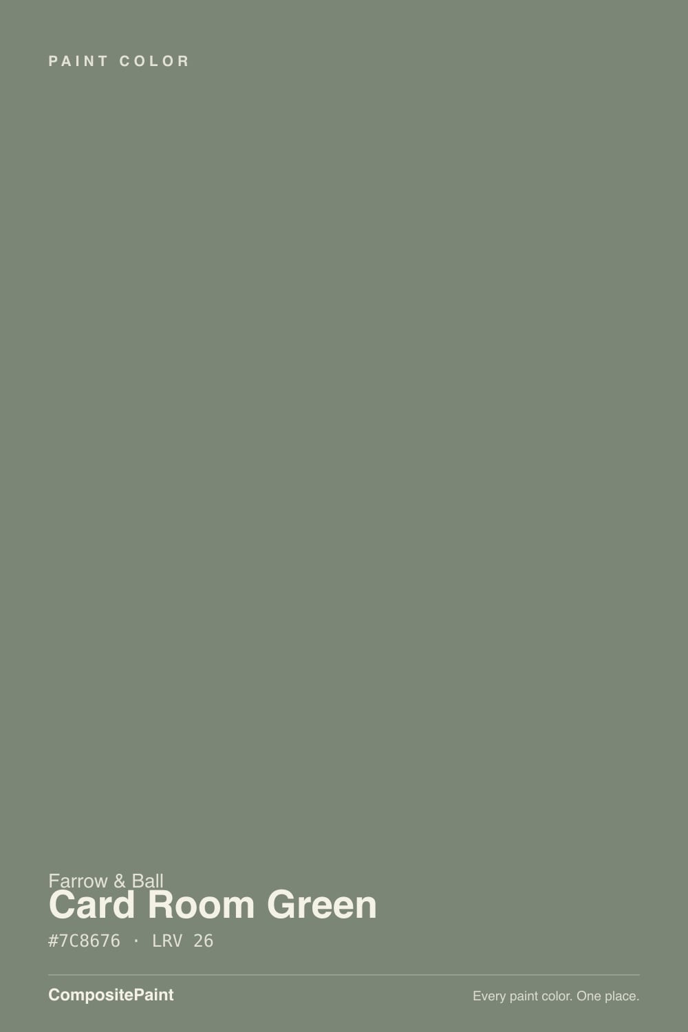
- 3Card Room Green26
- 4Clary Sage41
- 5October Mist47
The Fast Verdict
Card Room Green is Farrow & Ball's No. 79 — one of the brand's original colors, named for the candlelit card rooms of Georgian and Victorian houses where guests gathered to play whist and bridge after dinner. It is a dark, gray-cast green: more smoke than leaf, closer to a hunting-lodge or library green than to a soft modern sage. Give it real daylight or real lamps, walnut, brass and leather, and it turns rich and almost bottle-green; leave it in a dim room with no warm light and it goes flat, near-black. This is a color with a job — studies, cabinets, doors — not a safe wall color for a bright open-plan living room.
Studies, libraries and dens with a fire or lamps · kitchen islands, lower cabinets and butler's pantries · front doors and garden joinery · dining rooms used mostly at night · anyone who wants a serious, historic green instead of a soft modern sage
Your only light source is one small north window · you want a bright, leafy or minty green · your kitchen runs cool stainless steel and white quartz · you're painting an open, sunlit great room · you want one coat to cover
- A real historic color with a documented story, not a trend green
- Turns rich, warm and almost bottle-green under lamplight and firelight
- Excellent on cabinets, islands and joinery against brass and walnut
- Holds its color in full daylight and on exterior doors
- Pairs cleanly with a warm off-white or Farrow & Ball's own Studio Green for a tonal look
- Goes flat, near-charcoal in a dim room with no warm light
- Fights cool steel, chrome and stark white quartz
- Estate Emulsion is thin — plan on a tinted primer and two full coats
- Priced well above Behr, Sherwin-Williams or Benjamin Moore for the same wall
What Color Is Card Room Green, Really?
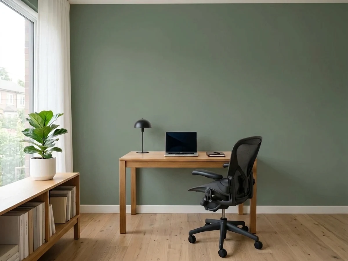
Card Room Green is Farrow & Ball No. 79, one of the oldest colors in the archive. The name comes from the card rooms of Georgian and Victorian country houses — the small, dimly lit rooms set aside for playing cards after dinner, decorated in a green chosen to sit comfortably under candlelight rather than to look bright at noon. Farrow & Ball's own description calls it a dark grey green, "unapologetic in its strength" — an honest label. This is not a whisper-of-green neutral; it reads as a genuine color, closer to English hunting-lodge and library greens than to the pale modern sage trend.
At LRV 26 it sits deeper than most cabinet sages — lighter than Sherwin-Williams Retreat and Dried Thyme (both LRV 21), but noticeably darker than a room-filling sage like Benjamin Moore's October Mist (LRV 39) or Saybrook Sage (LRV 56). That depth is the whole character: on the paint chip it can look almost muted and gray; on four walls or a full run of cabinets it darkens further and reads as a genuine deep green, especially once the light drops. Expect the room to feel noticeably darker than the sample chip suggests — that gap is normal for any color this deep, and Farrow & Ball's own site recommends pairing it with a warm neutral or going tonal with the even darker Studio Green rather than trying to lighten it with white.
Undertone in one line: gray-green with a cool cast — no yellow leaning toward olive, no blue leaning toward teal. In warm lamplight and against dark wood it goes rich and almost bottle-green; under cool daylight or blue-white LEDs it can flatten toward a plain charcoal, which is an honest read of the paint but disappoints anyone who bought it expecting green in every light.
Where It Shines
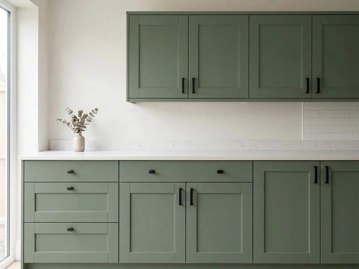
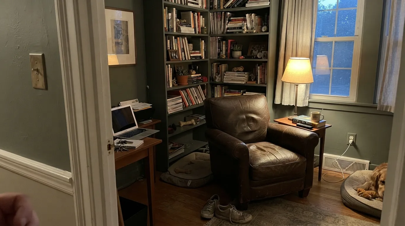
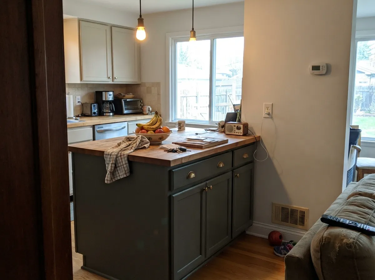
This is a color built for rooms you use after the sun goes down. Under lamplight, firelight and against walnut, leather and brass it does exactly what a Georgian card room needed it to do: it goes warm, rich and enveloping instead of flat. Its second home is cabinetry — on an island or a run of lower units, paired with warm wood counters and unlacquered brass hardware, it reads expensive and deliberate rather than trendy.
Where It Fails
Almost every regret story with Card Room Green comes down to one of three mismatches, and all three are predictable before the first coat. None of them are the paint failing — they are the paint being exactly the deep, gray-cast green it says it is, in a room or a light that does not suit it.
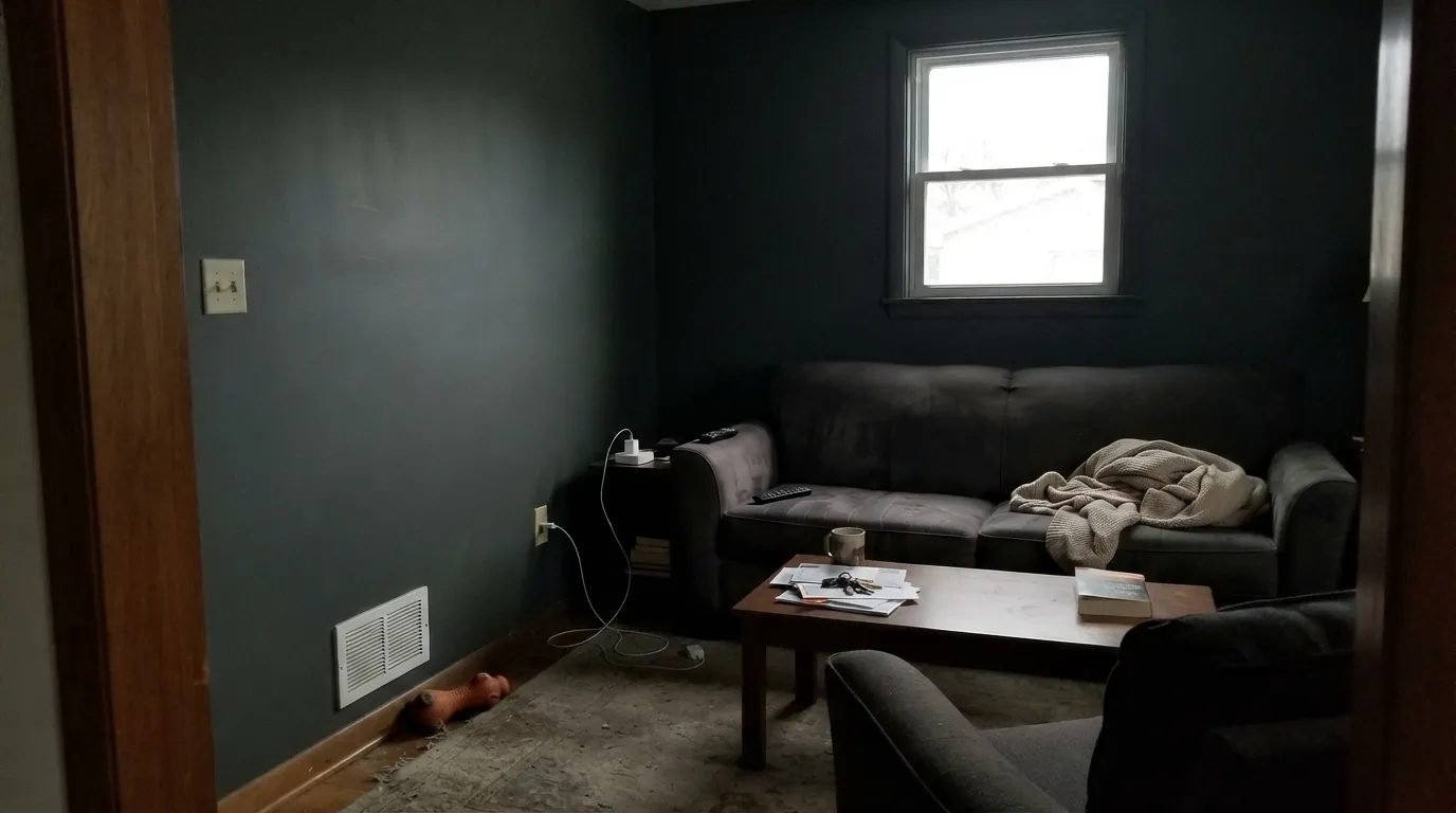
Card Room Green needs real daylight or real warm light to read as green at all. In a dim, north-facing room with the lights off, it slides toward flat charcoal — readers who wanted a rich library green report a room that just looks dark. Add lamps at 2700K or pick a lighter cabinet green like Evergreen Fog instead.
This is a warm-metal, warm-wood green. Set against brushed chrome, stainless appliances and a cool-white or gray-veined quartz counter, the gray-green undertone reads muddy instead of rich. Swap in unlacquered brass or aged bronze hardware and a warmer stone or butcher block and the same paint looks completely different.
Farrow & Ball's water-based Estate Emulsion is famously thin by American standards — it is formulated for depth and a chalky, matte look, not one-coat hide. Going from a light wall color to Card Room Green typically needs a tinted primer and two full topcoats; skipping that step is the single most common complaint about coverage and streaking, and it has nothing to do with the color itself.
Room by Room
This is the room the color was invented for. With a lamp, a fireplace and dark wood shelving, Card Room Green turns a small room into something that feels deliberately cozy rather than cramped. Modern Eggshell on paneling and trim; the walls can stay in a flatter Estate Emulsion finish.
On an island or a full run of lower cabinets it is one of the better deep greens available, as long as the metals and counters are warm. Pair with unlacquered brass, walnut or butcher block; avoid brushed chrome and stark white quartz, which fight the gray-green undertone.
A south- or west-facing living room with real windows carries it beautifully all day. A dim north-facing living room with recessed cool-white downlights is the classic disappointment — the same paint, a completely different color.
Dining rooms are used mostly at night, which plays directly to this color's strength. Under candlelight or warm sconces it goes rich and almost bottle-green; it is one of the most-recommended uses for this exact color.
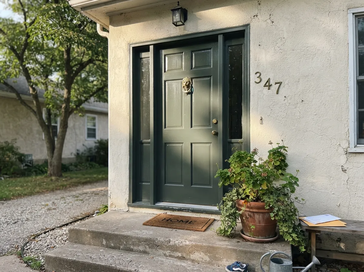
A deep, grayed green front door in Full Gloss or Exterior Eggshell reads classic and English against brick, cream stucco or a pale stone facade. It holds its color in full sun better than it holds up in a dim interior room.
In a bathroom with a window or strong vanity sconces at 2700K, it can be a genuinely luxe, moody choice on a vanity or a drenched powder room. In a windowless bathroom lit only by cool overhead LEDs, skip it — the same flattening happens as in any dim room.
Your Light Is the Risk
Warm 2700K light is this color's natural habitat — the gray lifts and the green goes rich, almost bottle-green. This is the light the color was designed around.
Cool, dim daylight with no lamps flattens it to near-charcoal. If your room only gets this light, this is not the right green.
Warmer and greener at the sun hours, quieter and grayer the rest of the day. The shift is real but the color never reads bright.
2700K warm bulbs deepen it toward true green; cool 4000K-plus LEDs push it toward flat gray-black. Bulb choice matters more with this color than with almost any lighter neutral.
Most complaints about Card Room Green are a light mismatch. Upload a photo of your actual room and see it on your walls — then ask for the same wall in north light or evening lamps before you buy a single sample.
Need It From Another Brand?
Any paint counter can custom-tint Farrow & Ball No. 79 directly. If you would rather stay in one brand's own deck, these are the closest stock matches, measured as ΔE2000. Under 2 is a difference you will not see on the wall.
| Brand | Closest color | ΔE | LRV | |
|---|---|---|---|---|
| Behr | Forest MossECC-49-3 · Behr | 1.2 | 26 | Color page → |
| Benjamin Moore | Carolina Gull2138-40 · Benjamin Moore | 1.1 | 27 | Color page → |
| Valspar | Pond LeavesT696 · Valspar | 2.1 | 26.5 | Color page → |
| Glidden | Walkstone Moss10GY 26/112 · Glidden | 2.3 | 26 | Color page → |
| Dutch Boy | Cattails427-5DB · Dutch Boy | 4.9 | 25 | Color page → |
| HGTV Home by Sherwin-Williams | Valiant BlueHGSW 3293 · HGTV Home by Sherwin-Williams | 4.9 | 25 | Color page → |
Similar Farrow & Ball Colors
The nearest shades to Card Room Green within Farrow & Ball's own range, ranked by perceptual color distance — useful when you want the same look a touch lighter, darker, or warmer.
WCAG 2.1: AA is 4.5 : 1 for normal text, 3 : 1 for large text, AAA is 7 : 1.
Card Room Green vs the Colors You're Also Considering
Every Card Room Green sample board has the same rivals on it. The numbers show the real lightness gap — then it comes down to which risk you would rather live with.
Pick this for the real Georgian card-room history — Retreat is a close modern cousin of this exact family.
Sherwin-Williams SW 6207 · LRV 21RetreatPick this if you want the same low-LRV grayed cabinet green at Sherwin-Williams pricing and easier coverage.
Pick this for the truer, cooler gray-green with no brown creeping in.
Sherwin-Williams SW 6186 · LRV 21Dried ThymePick this for a slightly more olive-brown lean at the same depth, with easier one-coat behavior.
Calke Green (No. 34) at LRV 22 is the closest relative but reads darker and more olive-yellow, so it feels earthier and heavier on a wall. If you want a slightly greener, more historic drab, Calke wins; if you want a cleaner, grayer sage, Card Room Green is the calmer choice.
Treron (No. 292) shares the same LRV of 26 but pulls toward a smoky gray-green with more brown warmth, making it feel dustier and less clearly green. Card Room Green keeps a crisper green identity at the same lightness.
Green Smoke (No. 47) at LRV 19 is darker and noticeably bluer, so it behaves more like a deep teal-green in low light. Choose Green Smoke when you want a richer, moodier envelope, and Card Room Green when you want the same traditional feel but a touch lighter and more clearly sage.
Card Room Green Coordinating Colors
The rule with Card Room Green is warm company: warm whites, warm metals, and either a tonal darker green or one true near-black accent. It fights cool steel, cool grays and stark white the same way most Farrow & Ball darks do. These are the partners that keep showing up in rooms that work:
The History Behind the Name
Card Room Green takes its name from a real room type: the small, dimly lit card rooms found in Georgian and Victorian houses, where guests retired after dinner to play whist, bridge or piquet by candlelight. Farrow & Ball's archive colors are named for what they were actually used for, not invented as a marketing story, and this is one of the oldest colors in the current range — No. 79 in a numbering system that now runs well past 300.
That history explains the color's whole personality. It was never meant to look bright at noon in an open floor plan; it was chosen because a dark, gray-cast green sits comfortably under candlelight and doesn't compete with cards, wood paneling and lamplight the way a truer, brighter green would. Farrow & Ball's own pairing advice — contrast it with a warm neutral, or go tonal with the even darker Studio Green — is really just restating the room it was built for.
Card Room Green With Wood, Brass and Stone
This color was built to sit next to warm materials, and it shows. Walnut, aged oak, leather and unlacquered brass all read richer next to it — the gray in the green keeps everything from looking matchy, while the warmth in those materials keeps the paint from going cold. Butcher block and warm stone counters do the same job in a kitchen.
The materials to watch are the cool ones: brushed chrome, stainless steel, and a cool, blue-white or gray-veined quartz all pull the gray-green toward muddy rather than rich. None of this rules the color out — it just means the hardware and counter decision matters as much as the paint decision. If your kitchen is already committed to stainless and white quartz, a lighter cabinet green like Evergreen Fog will behave more predictably.
Three Ready Palettes Built on Card Room Green
A color is never alone on the wall. These are complete combinations in the 60-30-10 pattern, with the reason each one holds together. Every one opens in the visualizer.
Card Room Green on the walls and built-ins, White Dove on trim and ceiling to keep the room from feeling like a box, and Wrought Iron on the fireplace surround for one true dark note. Warm lamps and leather finish the look.
Try this palette in your roomA pale warm white on the walls and uppers keeps the kitchen bright; Card Room Green carries the island and lower cabinets against brass hardware and a butcher-block or warm stone counter; Kendall Charcoal on the range hood or exposed beams grounds the room with one more warm, dark note.
Try this palette in your roomA warm, pale stone-colored exterior body lets the door do the work; Card Room Green in full gloss reads deep and classic rather than trendy, and Iron Ore shutters or house numbers echo the door's darkness without competing with it.
Try this palette in your roomCard Room Green FAQ
Is Card Room Green actually green, or is it basically gray?
It is green — but a dark, gray-cast one, not a bright leafy green. In good light or under lamps it reads clearly green, almost bottle-green against dark wood. In a dim, north-facing room with no warm light it can flatten toward charcoal, which is where the "is this just gray" confusion comes from.
What white goes with Card Room Green?
Farrow & Ball itself recommends Shaded White as the complementary trim color. If you're buying trim paint elsewhere, a warm off-white like Benjamin Moore White Dove does the same job — a stark, cool white makes the green look dull and dirty by contrast.
Is it good for kitchen cabinets?
Yes, one of the better deep greens for cabinets and islands, as long as the rest of the kitchen is warm — brass or bronze hardware, wood or warm stone counters. Against brushed chrome and cool white quartz, the same paint reads muddier than it should.
How many coats does Card Room Green need?
Plan on a tinted primer (Farrow & Ball's Dark Tones primer, based on Down Pipe) plus two full topcoats if you're covering a lighter color. Estate Emulsion is a thinner, chalkier paint than most American brands, and skipping the primer step is the most common source of streaky, patchy coverage complaints.
Does Card Room Green work on a front door?
Yes — it's a popular front-door choice, and Full Gloss or Exterior Eggshell makes the color read crisp and deep against brick, cream stucco or pale stone. It behaves better outdoors in full sun than it does in a dim interior room.
Will Card Room Green make a small room feel smaller?
Not if the room has a lamp or two. Dark, saturated colors in a small, well-lit space — a study, a powder room, a snug — tend to read cozy and enveloping rather than cramped. It's the combination of small and dim, with no warm light at all, that reads like a hole rather than a room.
Have you painted with Card Room Green?
Rate it — one tap helps the next reader decide.
Ask a Question