Carolina Gull
A green-gray-blue chameleon almost nobody searches for, reviewed honestly: where it turns rich and where it goes flat gray, and why so few real rooms exist online.

Jessica has spec'd whites and neutrals for more than 300 rooms and keeps a sample wall of painted drawdowns in her studio. Every color review is checked against real reader rooms in the comments and re-tested when a formula changes. About the testing process →
- 1Vintage Vogue12
- 2Sage Green22
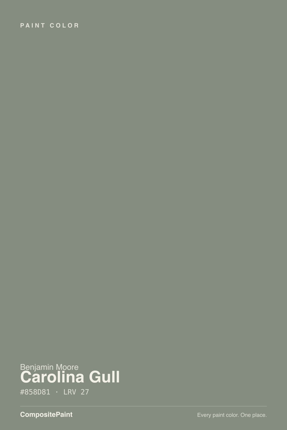
- 3Carolina Gull27
- 4Clary Sage41
- 5October Mist47
The Fast Verdict
Carolina Gull is what happens when a genuinely versatile green-gray never got its moment. It has none of the Pinterest fame of Evergreen Fog or the design-blog buzz of Retreat — search interest for it barely registers — but the color itself does real work: warm and green in south light, quiet blue-gray in north light, deep enough (LRV 27) to hold up on cabinets, built-ins, and even brick exteriors.
The catch is exactly its obscurity: you won't find a hundred real rooms online to check your gut against before you commit.
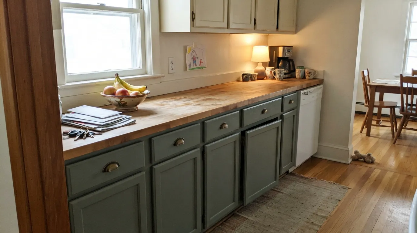
Kitchen cabinets with butcher block and brass · dens, libraries, and built-ins · brick exteriors that want character, not another neutral · anyone who wants a green-gray nobody else on the block picked
You want a punchy, saturated green · your room runs on cool LEDs with no lamps · you need dozens of real-room photos before you commit · your house faces north with small windows
- Genuine green-gray-blue chameleon — warm green in daylight, quiet gray-blue in cool light
- LRV 27 holds real color depth without going dark
- One of the few muted greens with enough depth for a sun-drenched brick exterior
- Excellent on kitchen cabinets and built-ins with butcher block and brass
- Distinctive precisely because almost nobody else has painted it yet
- Cool light and cool LEDs flatten the green into plain gray
- Too muted for anyone wanting a bold, saturated green
- Same paint, wildly different color room to room — surprises buyers expecting consistency
- So few real rooms photographed in it that sampling big, on your own walls, matters more than usual
What Color Is Carolina Gull, Really?
Carolina Gull doesn't have a story — no Color of the Year crown, no viral remodel, no design-blog moment. Search interest for it barely registers next to siblings like Retreat or Evergreen Fog, and that scarcity feeds itself: without enough real rooms photographed in it, fewer people gamble on it, so fewer rooms get photographed. That is an honest, slightly unfair fate for a color that behaves this well. It's a green with a blue-ish undertone underneath the gray, which keeps it firmly in the green section of the color wheel rather than sliding into the yellow-leaning sage most brands sell by the dozen.
At LRV 27 it sits solidly mid-tone — dark enough to feel grounded on cabinets and built-ins, light enough that a whole room of it doesn't read as a cave. That depth is why it holds up outdoors: put it on a brick exterior in full sun and it keeps its color instead of washing out the way pastel sages do. Set next to Sherwin-Williams Retreat (LRV 21), Carolina Gull is the lighter, slightly gentler cousin; set next to Evergreen Fog (LRV 30), it reads a touch deeper and less yellow.
Undertone in one line: green first, with gray and a whisper of blue holding it back from ever turning bright. In warm south light it reads as a genuine rich green; in cool north light the green recedes and what's left is closer to a soft blue-gray. Both are the same paint being honest about the room — if your sample looks flatly gray with no green at all, that's cool light or cool bulbs talking, not a bad can.
Where It Shines
Give it butcher block, brass, and real daylight and it does exactly what a good green should: ground a kitchen without shouting about it. Cabinets and built-ins are its best work — enough depth to read as a real color decision, not a whim, and forgiving of the everyday scuffs a brighter cabinet color would show. Outdoors, it is one of the few muted greens with the depth to hold its own against brick without fading into the mulch.

Where It Fails
The complaints about Carolina Gull are less about the paint failing and more about a color that moves more than people expect — and about how hard it is to find someone else's room to check your gut against. Three situations account for almost everything reported.
In a north-facing room, or under cool white LEDs with no lamps on, the green mostly disappears and what's left reads like a plain, slightly flat gray. That is genuinely disappointing if you bought this color for its green — the fix is warm 2700K bulbs and, ideally, a room that gets some real daylight.
This is a grayed-down, muted green, not a punchy hunter or emerald. On the chip it can look richer than it reads on four walls at LRV 27. If you want a color that reads unmistakably green from across the room, this one is too quiet for the job.
A south-facing room and a north-facing room in the same house can genuinely look like they were painted from different cans — one warm and green, one cool and gray. That's the chameleon trait working as designed, but it surprises people who expect one paint color to read the same everywhere.

Room by Room
Butcher block, brass hardware, open shelving — this is the pairing the color was clearly built for. Satin or semi-gloss on cabinets wipes clean and hides the everyday scuffs a lighter cabinet color would show.
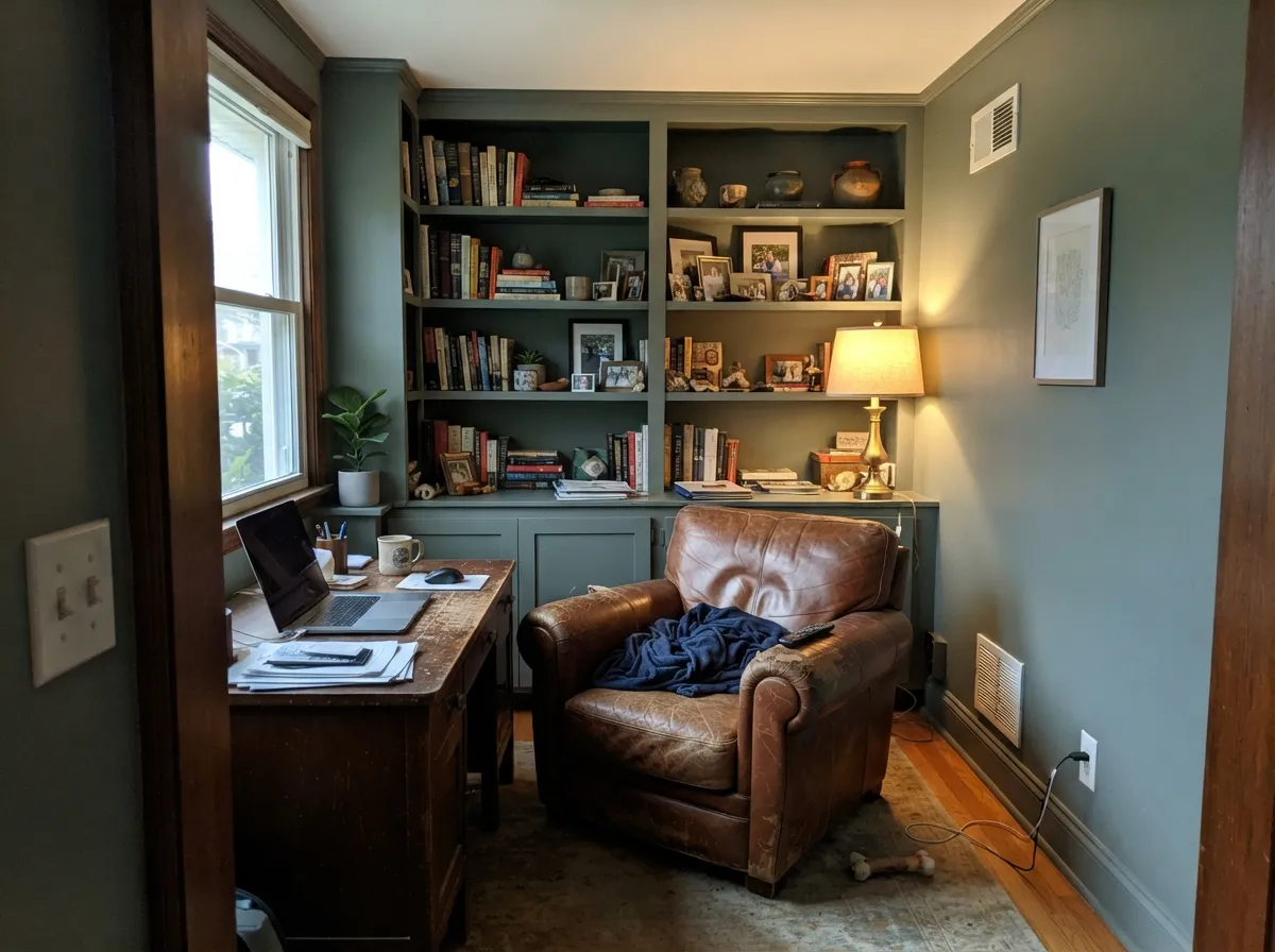
Walnut furniture and a warm lamp bring out the green even on gray days. It reads grounded and a little studious without going dark, the way a proper study color should.
Calm and restful under 2700K lamps at night; in a bright south room it can read a touch more green than a bedroom typically wants. Test both day and evening before committing to all four walls.
One of the few muted greens with the depth to hold up on brick and stone in full sun instead of washing out. Charcoal trim or a crisp white keeps the front door reading intentional, not accidental.
Like most muted greens, it earns its keep in doses. A vanity or a powder room under warm brass fixtures gets the character without betting the whole bathroom on one shifting color.
Best on a built-in or accent wall rather than all four walls of an open-plan room, where it will read differently against every window it passes.
Your Light Is the Risk
The green comes forward and stays rich all day — the color at its truest and most complimented version.
The green recedes and the wall settles toward plain, flat gray. Fine if you half-wanted gray; disappointing if you bought it for the sage.
Warmer and greener at golden-hour sun, cooler and quieter the rest of the day — most owners find the shift pleasant, not a problem.
2700K lamps keep the green alive after dark. Cool white LEDs push it toward gray — swap the bulbs before you swap the paint.
Most complaints about Carolina Gull are a light mismatch. Upload a photo of your actual room and see it on your walls — then ask for the same wall in north light or evening lamps before you buy a single sample.
Need It From Another Brand?
Any paint counter can custom-tint Benjamin Moore 2138-40 directly. If you would rather stay in one brand's own deck, these are the closest stock matches, measured as ΔE2000. Under 2 is a difference you will not see on the wall.
| Brand | Closest color | ΔE | LRV | |
|---|---|---|---|---|
| Sherwin-Williams | UnderseasSW 6214 · Sherwin-Williams | 4.4 | 25 | Color page → |
| Behr | Peaceful GladePPF-34 · Behr | 0.8 | 26 | Color page → |
| Valspar | Pond LeavesT696 · Valspar | 1.6 | 26.5 | Color page → |
| Glidden | Rockspring Green50GY 26/050 · Glidden | 2.7 | 26 | Color page → |
| Dutch Boy | Cattails427-5DB · Dutch Boy | 4.4 | 25 | Color page → |
| HGTV Home by Sherwin-Williams | Valiant BlueHGSW 3293 · HGTV Home by Sherwin-Williams | 4.4 | 25 | Color page → |
Similar Benjamin Moore Colors
The nearest shades to Carolina Gull within Benjamin Moore's own range, ranked by perceptual color distance — useful when you want the same look a touch lighter, darker, or warmer.
WCAG 2.1: AA is 4.5 : 1 for normal text, 3 : 1 for large text, AAA is 7 : 1.
Carolina Gull vs the Colors You're Also Considering
Every Carolina Gull sample board has the same rivals on it. The numbers show the real lightness gap — then it comes down to which risk you would rather live with.
Pick this for the lighter, slightly airier version of the same green-gray mood.
Sherwin-Williams SW 6207 · LRV 21RetreatPick this if you want it a shade darker and more of a true cabinet green — Retreat is Carolina Gull's closest cousin, one step deeper.
Pick this for more depth and less yellow — Evergreen Fog is the safer bet, this is the quieter one.
Sherwin-Williams SW 9130 · LRV 30Evergreen FogPick this for a lighter, warmer sage that leans further from gray — the more famous, more photographed choice.
Cos Cob Stonewall 1483 at LRV 26 and hex #898C83 is the closest same-brand neighbor and the useful comparison: nearly identical depth, but the green is largely gone, so it reads as a straight warm gray. Garden Oasis 699 at #7D8D81 and LRV 25 goes the other way, darker and clearly greener. Antique Pewter 1560 at LRV 25 and hex #8B8A7B trades the green for a drier, more khaki cast.
Cross-brand, Behr Peaceful Glade PPF-34 at a deltaE of 0.81 is a true match. Kompozit Dowager 0442 at 1.03, Farrow and Ball Card Room Green No. 79 at 1.07, C2 Paint Pond Ripple BD82 at 1.42, and Valspar Pond Leaves T696 at 1.63 are all visually identical in normal room light.
After that the gap opens up. Magnolia Home Eden JG-60 at 2.54 and Glidden Rockspring Green 50GY 26/050 at 2.69 are very close but worth sampling. Sherwin-Williams Underseas SW 6214 at 4.44 is close but visibly different, reading cooler and more blue-green.
Carolina Gull Coordinating Colors
The rule for coordinating with Carolina Gull: keep whites crisp rather than yellow-warm, and let it stand next to one confident dark rather than a second busy color. It pairs easily with brass, walnut, and brick, and it holds its own next to a true navy or a near-black without a fight. These are the partners that keep showing up in rooms that work:
Why Almost Nobody Has Heard Of Carolina Gull
There's no scandal here, no discontinued formula, no dated undertone — Carolina Gull is simply a color that never caught a wave. It missed the sage boom that made Evergreen Fog a household name, and it never landed a Color of the Year moment the way some of its darker cousins did. Search interest for it is genuinely low, and that creates its own trap: buyers look for real rooms to compare against before they commit, don't find many, and pick something more documented instead — which keeps the room count low for the next person too.
That obscurity is not a mark against the paint itself. Everything the color does well — the chameleon shift between green and gray-blue, the depth that survives full sun outdoors, the ease with brass and walnut — it does regardless of how many people have discovered it. If you're comfortable being one of the first real photos online, it rewards the gamble.
Carolina Gull With Wood Tones and Floors
Butcher block and honey-toned oak are the pairing the color photographs best in — the warm wood grain plays directly against the green, and the two make each other look intentional rather than accidental. Walnut and darker stains work just as well in lower light, especially in a den or library where the green settles into something quieter and moodier.
The one combination that fights it is very cool, gray-washed flooring: two cool-leaning surfaces next to each other can push the paint further toward plain gray and away from the green that makes it interesting in the first place. If your floors already read cool, warm the room up with brass, brown leather, or a rug before you paint — or expect the gray side of this chameleon to show up more than the green side.
Three Ready Palettes Built on Carolina Gull
A color is never alone on the wall. These are complete combinations in the 60-30-10 pattern, with the reason each one holds together. Every one opens in the visualizer.
Simply White keeps the room bright enough to carry the darker cabinets; Hale Navy on the island gives one confident dark note so the kitchen doesn't read as two competing greens. Butcher block and brass hardware finish the look the color was built for.
Try this palette in your roomWhite Dove keeps the trim warm instead of stark, which is what this green-gray wants next to it; Wrought Iron gives the room one true dark note without adding a second color family. Walnut furniture and a warm lamp do the rest.
Try this palette in your roomChantilly Lace's crisp, cool white keeps the trim sharp against the green without fighting it; Kendall Charcoal on the shutters and door adds the one dark anchor a traditional brick front wants. The combination holds its depth in full sun instead of washing out.
Try this palette in your roomCarolina Gull FAQ
Is Carolina Gull green or gray?
Both, depending on the light — it's genuinely a green with a blue-gray undertone. In warm daylight it reads as a soft, muted green; under cool light or cool bulbs, the green recedes and it settles into a quiet blue-gray. Neither read is wrong; it's the same paint responding honestly to the room.
Why can't I find more photos of rooms painted in it?
Because almost nobody has painted it yet. It has none of the search volume or design-blog attention of colors like Evergreen Fog or Retreat, so there simply aren't hundreds of real rooms online to check your gut against. That's a real practical downside — sample bigger than you normally would, and expect to be one of the first photos online.
What trim white goes with Carolina Gull?
A crisp, cool white like Chantilly Lace works outside against brick; a warmer white like Simply White or White Dove suits interior cabinets and built-ins better, since it won't fight the green. Avoid a stark, blue-white trim on interior walls — it can make the green read muddy by comparison.
Is it good for kitchen cabinets?
Yes — it's arguably the color's best job. With butcher block counters and brass hardware it reads intentional and a little vintage without trying too hard. Use a satin or semi-gloss cabinet-grade enamel; it wipes clean and hides scuffs around handles well at this depth.
Does it work on a brick exterior?
Genuinely well. At LRV 27 it has enough depth to hold its color in full sun instead of washing out, and it reads as character rather than another safe neutral against red or brown brick. Pair it with a crisp trim white and a dark door or shutters for the classic look.
Will it look the same in every room of my house?
No — expect it to look noticeably different from room to room depending on exposure. A south-facing room will read as a warmer, richer green; a north-facing room will read cooler and grayer. That's normal for this color, not a bad batch, but paint a sample in every room you're considering before you commit to all of them.
Have you painted with Carolina Gull?
Rate it — one tap helps the next reader decide.
Ask a Question