Intrigue
The green-gray almost nobody talks about, reviewed honestly: where the green actually shows, the light that flattens it to plain charcoal, and why it never became anyone's favorite.

Jessica has spec'd whites and neutrals for more than 300 rooms and keeps a sample wall of painted drawdowns in her studio. Every color review is checked against real reader rooms in the comments and re-tested when a formula changes. About the testing process →
- 1Black Fox7
- 2Pewter Green12
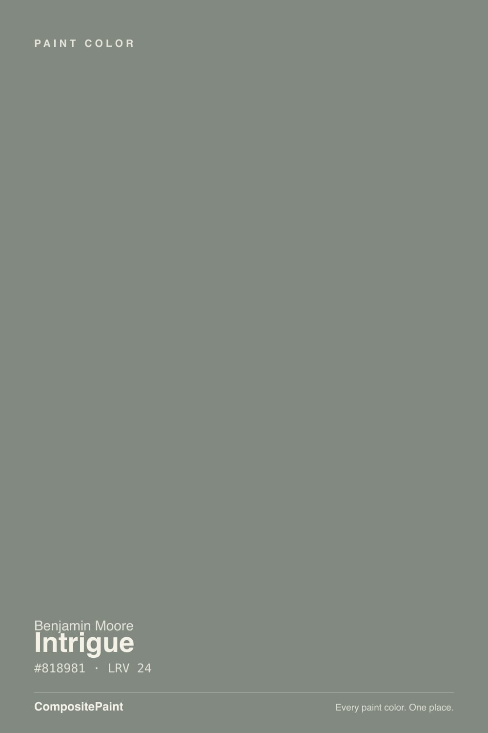
- 3Intrigue24
- 4Stardew43
- 5Quietude48
The Fast Verdict
Intrigue is a real green-gray — Benjamin Moore's own line for it is "a handsome, moody blend of gray and green" — and one of the quietest names in the Classics collection. It has never had a Color-of-the-Year moment, a viral kitchen, or a design-blog obsession; it just sits in the deck doing honest work on cabinets and accent walls for people who want more character than gray without committing to green. At LRV 24 it needs real light to earn its keep, and in the wrong light it just reads dark gray with nothing else going on.
Kitchen or bath cabinetry · a home office or den that wants depth · one accent wall with warm white trim · anyone who wants a hint of green without picking a color that reads as "green paint"
Your room is dim or north-facing with no supplemental light · you want a color a friend or a resale buyer will recognize by name · your cabinets need a bright, opaque finish · you're chasing a color with a documented trend story to fall back on
- A genuine gray-green, not a marketing name on a plain gray
- Excellent on cabinetry and small, doses-sized rooms
- Deep enough (LRV 24) to hold color better than a pale sage
- Pairs cleanly with pale oak, linen, brushed nickel, and brass
- Filed as a gray on most sites, so it slides past "green-averse" buyers who then discover they like it
- Loses its green almost entirely in dim, cool-lit rooms
- No design-world reputation or trend story to lean on later
- Too dark and heavy for a whole open-plan main floor without real light
- The undertone genuinely surprises buyers expecting a plain gray
What Color Is Intrigue, Really?
A grayed-down green with a weathered, stony cast rather than a crisp botanical one — soft and low-saturation is the whole point. Benjamin Moore files it in the Classics® Color Collection and describes it in one line: a moody blend of gray and green. That is an accurate, if modest, summary. It is not a color built to announce itself; it is built to sit quietly behind furniture and materials and let them do the talking, which is exactly why it shows up more often in kitchens and studies than in design-magazine spreads.
At LRV 24 it is a genuine mid-deep tone — meaningfully darker than a sage like October Mist (LRV 39) and close in depth to Benjamin Moore's own Chelsea Gray (LRV 22), a charcoal-greige with a far bigger following. That depth is why the green needs help: in flat or dim light, a color this dark loses its color identity fast and reads as plain charcoal. Give it real daylight or warm accent lighting and the green comes forward; take the light away and Intrigue quietly becomes just another dark gray.
Undertone in one line: gray first, green second, and genuinely responsive to light — brighter, more clearly green in daylight, flatter and grayer under dim or cool artificial light. If your sample looks almost black in a corner, that is the light, not a defect in the paint.
Where It Shines
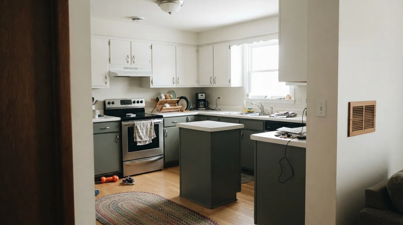
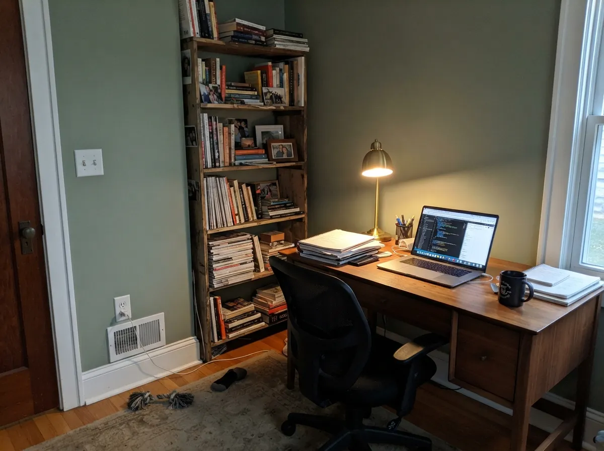
Its best work is done in doses, not whole rooms. On kitchen or bathroom cabinetry — an island, a vanity, a run of lowers under a lighter counter — it reads as a deliberate, slightly unusual choice instead of "another green kitchen." It is equally at home in a home office or a small den, where warm lamp light and dark wood do the flattering for it. Pair it with pale oak, linen, honed stone, and brushed nickel or unlacquered brass, and it looks chosen on purpose rather than defaulted into.
Where It Fails
Almost every regret story with a color this quiet follows the same handful of patterns, and none of them are really the paint's fault. If your room or your expectations match one of these, this is not your color.
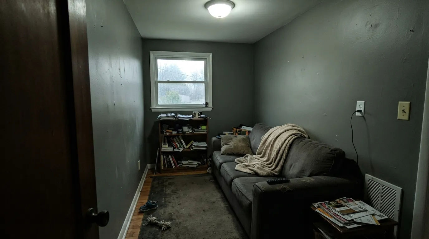
At LRV 24, Intrigue needs real light to hold its green. In a dim, north-facing room lit only by cool white bulbs, the green all but disappears and the wall reads as flat, slightly muddy charcoal — nothing distinctive left. Add warm 2700K lighting or accept it as a true dark neutral, not a green one.
Most retailer sites — including our own family listing — file Intrigue under "gray," and in dim or cool light it genuinely can pass for one. But in daylight the green is unmistakable. If gray with zero color is the actual goal, this is the wrong pick and no amount of testing will change it; go look at a true gray like Stonington Gray instead.
Drenching a large open room in a color this dark, with no lighter wall or ceiling to break it up, reads heavy and cave-like fast — a problem shared by every color at this depth. Unlike a bestseller you can lean on for resale ("it's the classic everyone uses"), Intrigue has no design-world reputation to point to if a future buyer asks about it. Keep it to cabinetry, a den, or one wall, and let a lighter neutral carry the rest of the house.
Room by Room
Lower cabinets, an island, or a vanity under a pale stone or wood counter is where Intrigue earns its keep. Satin cabinet enamel wipes clean, and brushed nickel or unlacquered brass hardware plays well against the gray-green.
Low, warm light flatters it the same way it flatters any moody color. Walnut shelving, leather, and a brass reading lamp are natural company. Eggshell for durability where a chair rolls against the wall.
One wall in a bedroom or living room, with white or pale oak trim to keep it from reading as a full dark room. Matte deepens the color and hides texture.
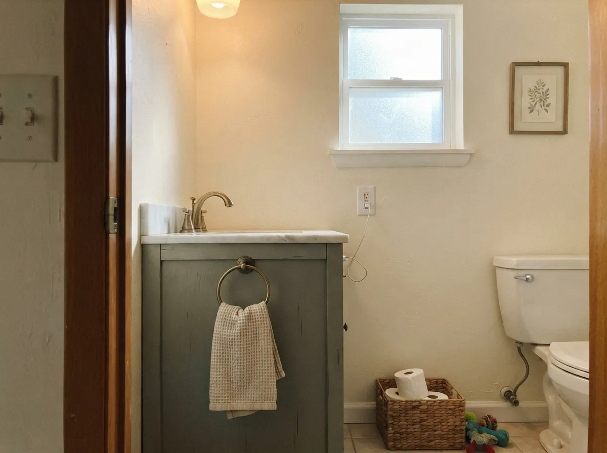
Small rooms carry deep color well, and Intrigue on all four walls of a powder room, or just on a vanity under cream walls, reads custom without the commitment of a whole house.
A living room or primary bedroom in full Intrigue can work, but only with strong daylight or generous warm lighting. In a dim room it collapses toward flat gray and loses the reason you picked it.
Full outdoor sun grays it out and the green rarely survives the trip; it is not one of Benjamin Moore's documented exterior colors. A shaded front door is the one place it could work, tested in person first.
Your Light Is the Risk
Full daylight is where the green actually shows — the gray backs off and the wall reads like a soft, weathered slate-sage. Sample it here first, not under store fluorescents.
Without supplemental light, a dim north-facing room swallows the green and Intrigue collapses toward flat, muddy charcoal. This is the light behind almost every "it just looks gray to me" complaint.
Morning east light keeps it cooler and grayer; west afternoon sun warms it and the green edges forward for a few hours before settling back at dusk.
Warm 2700K light pulls it toward a soft, mossy gray-green at night. Cool 4000K LEDs flatten it back to plain charcoal — the gap is bigger than most buyers expect before they see it.
Most complaints about Intrigue are a light mismatch. Upload a photo of your actual room and see it on your walls — then ask for the same wall in north light or evening lamps before you buy a single sample.
Need It From Another Brand?
Any paint counter can custom-tint Benjamin Moore 1580 directly. If you would rather stay in one brand's own deck, these are the closest stock matches, measured as ΔE2000. Under 2 is a difference you will not see on the wall.
| Brand | Closest color | ΔE | LRV | |
|---|---|---|---|---|
| Sherwin-Williams | WillowleafSW 9649 · Sherwin-Williams | 3.2 | 24 | Color page → |
| Behr | Euro GrayPPU25-17 · Behr | 3.8 | 24 | Color page → |
| Valspar | Beguile5002-2A · Valspar | 1.6 | 24 | Color page → |
| PPG / Glidden | ThunderboltPPG10-06 · PPG / Glidden | 2.7 | 23 | Color page → |
| Glidden | ThunderboltPPG10-06 · Glidden | 2.4 | 23 | Color page → |
| HGTV Home by Sherwin-Williams | Valiant BlueHGSW 3293 · HGTV Home by Sherwin-Williams | 4.2 | 25 | Color page → |
Similar Benjamin Moore Colors
The nearest shades to Intrigue within Benjamin Moore's own range, ranked by perceptual color distance — useful when you want the same look a touch lighter, darker, or warmer.
WCAG 2.1: AA is 4.5 : 1 for normal text, 3 : 1 for large text, AAA is 7 : 1.
Intrigue vs the Colors You're Also Considering
Every Intrigue sample board has the same rivals on it. The numbers show the real lightness gap — then it comes down to which risk you would rather live with.
Pick this if you want the same idea with more daylight tolerance — Intrigue's higher LRV holds up better across four walls, not just a cabinet run.
Sherwin-Williams SW 6208 · LRV 12Pewter GreenPick this for a darker, more overtly green cabinet color — Sherwin-Williams' benchmark cabinet green, two full shades moodier than Intrigue.
Pick this for the grayer, more restrained version — Intrigue reads less like "green paint" at a glance and slides past green-averse buyers.
Sherwin-Williams SW 6207 · LRV 21RetreatPick this for a slightly greener, marginally lighter cousin with the same cabinet-first reputation.
Pick this if plain gray feels flat and you want the quiet color note green gives without committing to a color called green.
Benjamin Moore HC-168 · LRV 22Chelsea GrayPick this if you want the same depth with zero green risk — a proven charcoal-greige with a real following, for islands and accent walls.
Duxbury Gray HC-163 at LRV 23 and #7F867F is the closest sibling, marginally darker with the same faint green. Secret AF-710 at LRV 26 and #888983 is lighter and flatter, closer to a true neutral. Georgetown Gray ES-77 at LRV 24 and #7F8786 shares the depth but tilts blue rather than green, which is the clearest fork in the group. Garden Oasis 699 at LRV 25 and #7D8D81 is the most obviously green of the set, and Carolina Gull 2138-40 at LRV 27 lands between the two.
Across brands, Beguile 5002-2A from Valspar at LRV 24 is the tightest match with a deltaE of 1.63, visually identical in normal room light. Stone Craft DE6292 from Dunn-Edwards at LRV 22 sits at 1.65. Woodcraft N200-5 from Behr at LRV 24 and Thunderbolt PPG10-06 from Glidden at LRV 23 come in at 2.19 and 2.4, very close but worth a sample first.
Intrigue Coordinating Colors
Coordinating with Intrigue is mostly about keeping the room light where the color is dark. Warm off-whites, pale wood-toned neutrals, and one true near-black for contrast is the whole formula — the same combination that flatters most deep, muted colors at this LRV. These are the partners that show up again and again:
Why Intrigue Never Became Famous
Search for Intrigue and you mostly find paint-matching databases and cross-brand color tools repeating Benjamin Moore's own line back at you — not the flood of designer blog posts, Reddit threads, and before-and-after photos that surround a bestseller like White Dove or a trend color like Sleepy Hollow. There is no record of it as a Color of the Year, no viral kitchen, no famous project attached to its name. It has simply sat in the Classics collection, doing quiet cabinet-and-accent work for the people who found it, for years.
That is not a knock on the paint. A grayed-down green at LRV 24 was never going to be a whole-house default the way a pale greige is — it is a specialist color, chosen in doses by people who already know they want more depth and more character than a plain gray. The honest trade-off: you get a genuinely distinctive, well-behaved color, and in exchange you give up the reassurance of a color everyone recognizes. If that trade sounds fine, it is a very good choice; if you want validation from strangers online before you buy the gallon, this will not give you much to find.
Intrigue With Wood Tones and Materials
Pale, honed materials are its best company: white oak, pale ash, honed limestone or soapstone, and natural linen all sit comfortably next to the gray-green because none of them fight for attention. Walnut and other dark woods work too, deepening the mood rather than lightening it — good for a den, less good if the goal is an airy room.
Hardware and metals lean toward the muted side: brushed nickel and unlacquered or antiqued brass both read well; a shiny, polished chrome is the one finish that looks slightly out of place against a color this quiet. Very pink-toned or golden-orange wood — the kind that already fights plain gray — is worth sampling carefully first, since it can pull the green in Intrigue toward a slightly murkier olive rather than a clean gray-green.
Three Ready Palettes Built on Intrigue
A color is never alone on the wall. These are complete combinations in the 60-30-10 pattern, with the reason each one holds together. Every one opens in the visualizer.
White Dove keeps the kitchen bright enough to carry the deep lower cabinets; Kendall Charcoal on the hood gives one darker anchor point so Intrigue doesn't read as an accident. Brass or nickel hardware finishes it either way.
Try this palette in your roomPale Oak's own quiet green-taupe lean keeps the trim from fighting the walls, and Wrought Iron gives the room one true dark note so Intrigue doesn't have to do all the depth alone. Warm lamp light is doing most of the work here — plan for it.
Try this palette in your roomA small room takes deep color easily, so the vanity carries the whole personality while Swiss Coffee keeps the walls airy. Wrought Iron on the mirror frame and door ties the near-black and the green-gray together without adding a fourth color.
Try this palette in your roomIntrigue FAQ
Is Intrigue warm or cool?
Neither strongly — it is a grayed-down green that leans on the light around it. In warm daylight or under 2700K bulbs it settles into a soft, mossy gray-green; under cool LEDs or dim north light it flattens toward plain gray. It never reads distinctly warm or distinctly cold.
Is Intrigue gray or green?
Both, honestly — and that is the most common surprise with this color. Benjamin Moore itself describes it as "a moody blend of gray and green," and most retailer color-family listings, including ours, file it under gray. In good daylight the green is unmistakable; in dim or cool light it can pass for a plain dark gray.
What white or trim color goes with Intrigue?
A warm off-white keeps it from reading too cold — White Dove or Swiss Coffee are the default choices, in semi-gloss on trim. Pale Oak is a good next-room neutral if you're carrying the mood through a hallway without repeating the exact color.
Is Intrigue good for kitchen cabinets?
Yes — cabinetry, particularly lower cabinets or an island under a lighter counter, is where this color performs best. Use a satin urethane-fortified cabinet enamel, and pair it with pale wood, honed stone, and brushed nickel or unlacquered brass hardware.
Does Intrigue work in a room with little natural light?
Not well on its own. At LRV 24 it depends on real daylight or generous warm artificial light to hold its green; in a genuinely dim room it reads as flat, slightly muddy charcoal with no color story left. If the room stays dark most of the day, keep this color to cabinetry or a lit accent wall rather than the whole space.
Why isn't Intrigue more popular?
It has simply never had a moment — no Color of the Year nod, no viral kitchen, no design-blog obsession, despite sitting in Benjamin Moore's Classics collection for years. That is not a mark against the paint; it is a genuinely usable gray-green that most people find through a color-matching search rather than a magazine. Its low profile just means you should sample it in person rather than trust a screen, since there is little photographic precedent to lean on.
Have you painted with Intrigue?
Rate it — one tap helps the next reader decide.
Ask a Question