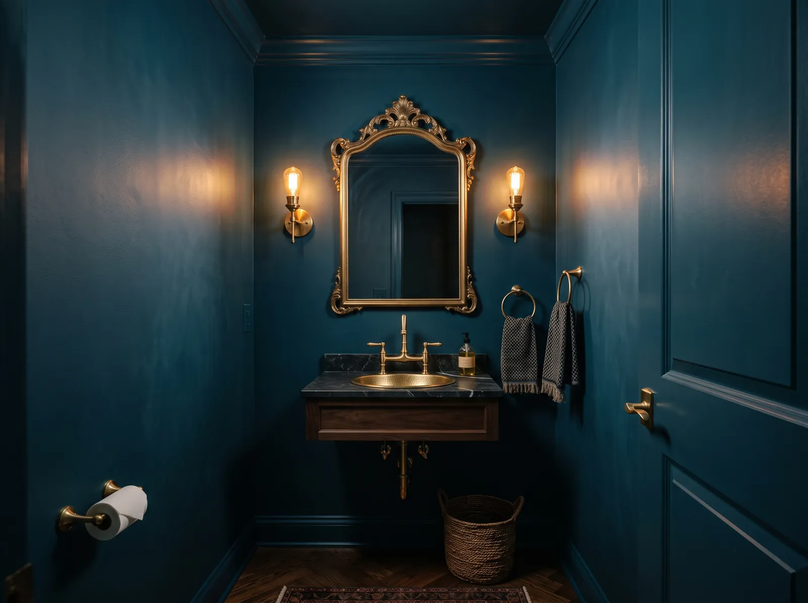
 1
1Hague BlueNo. 30 · LRV 7
F&B's most famous deep blue; the AD/Domino dark-room benchmark.
3 curated blues with undertones, LRV, and the honest reasons why, plus the full 19-color blue deck below.
Don't want to compare 19 blues? These three cover most real projects.
Numbered and curated. Tap any color for its full review, or see it on your own walls in the visualizer.
1F&B's most famous deep blue; the AD/Domino dark-room benchmark.
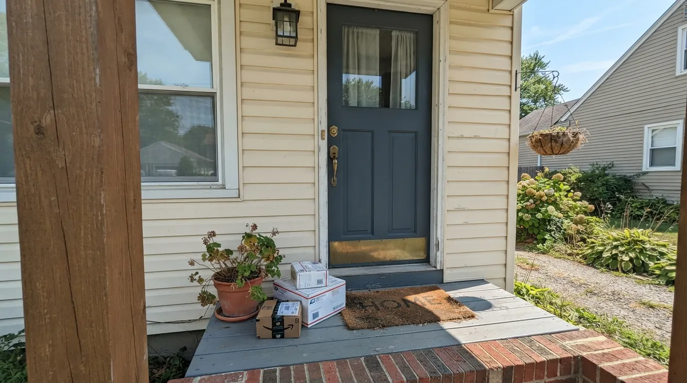 2
2F&B's deep navy second to Hague Blue; library/study favorite.
The whole Farrow & Ball blue range by depth. LRV is the number to trust: the same blue looks two steps darker on a wall than on a chip.
LRV is just how much light a color bounces back, on a scale where higher means lighter and airier. In this blue slice the range runs from 10 at the dark end to 46 at the light end, so you can pick by how bright you want the room to feel. Lulworth Blue (No. 89) at LRV 46 is the soft, open choice; Stiffkey Blue (No. 281) at LRV 10 is the deep, enveloping one.
The two middle colors give you a clear ladder in between. St Giles Blue (No. 280) at LRV 31 is a clean mid-blue with energy, and Cook's Blue (No. 237) at LRV 26 sits a touch deeper and more saturated. A simple rule: lower LRV in a dark or north-facing room will feel cozy and intentional, while higher LRV keeps a small or dim space from closing in.
Stuck between two? These head-to-heads settle the ones people actually can't pick between.
Each room page shows blue picks from every US brand side by side, so you can compare in context.
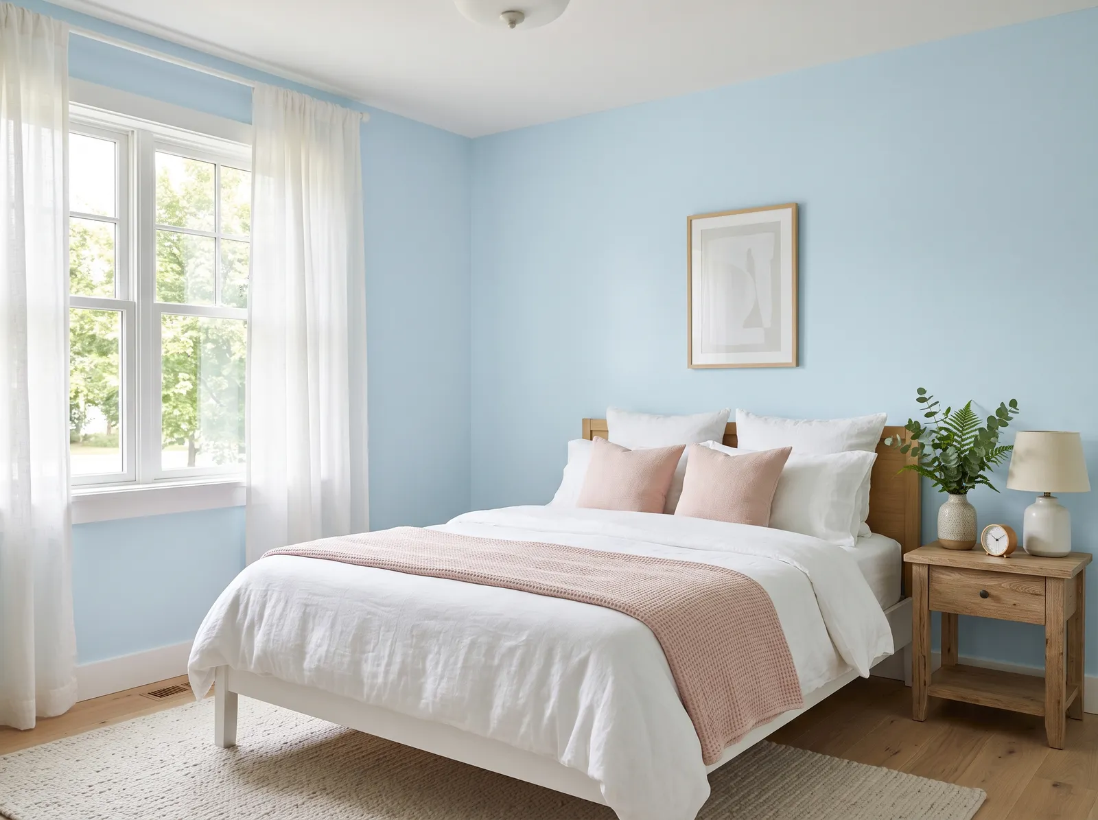
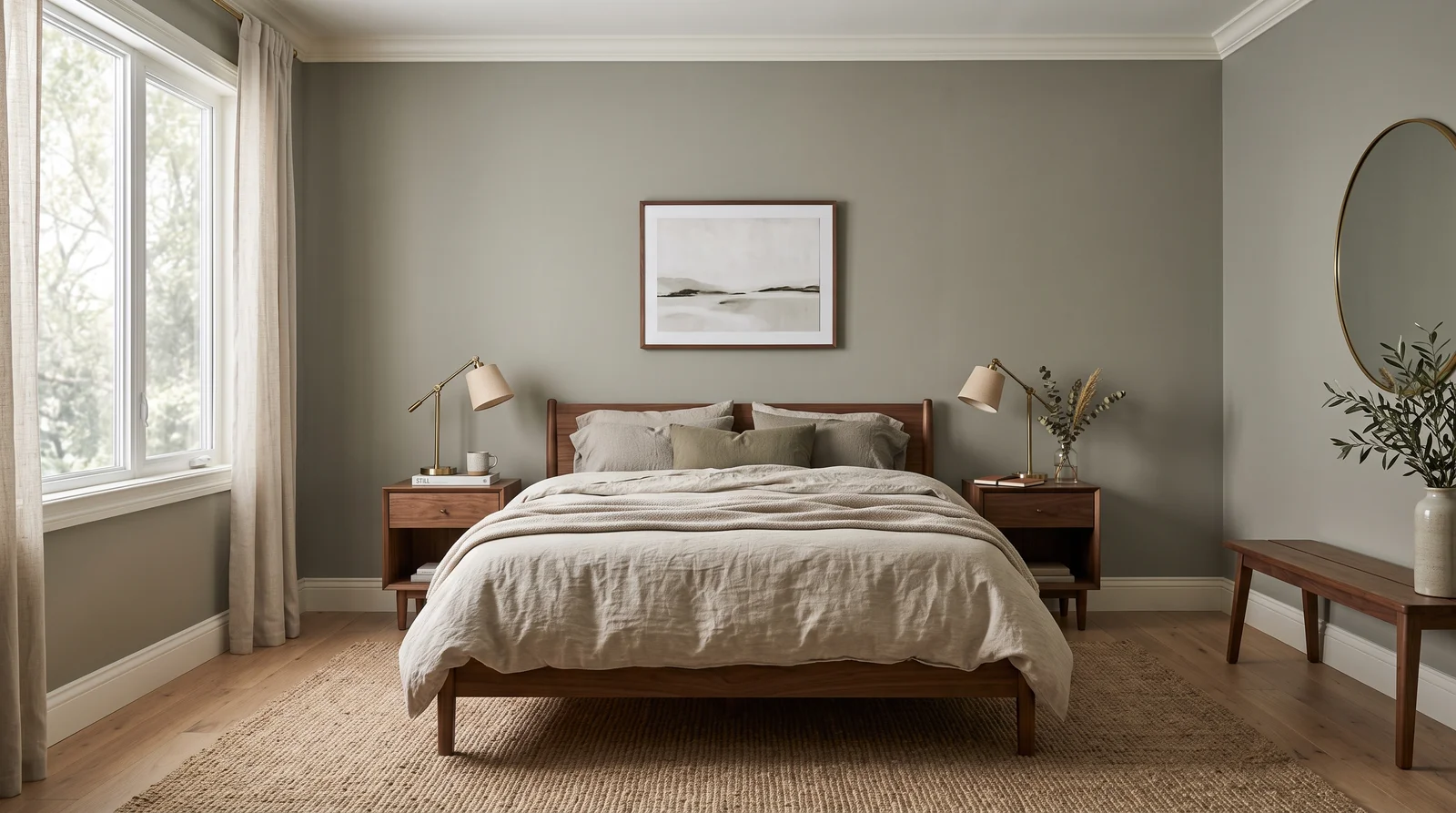
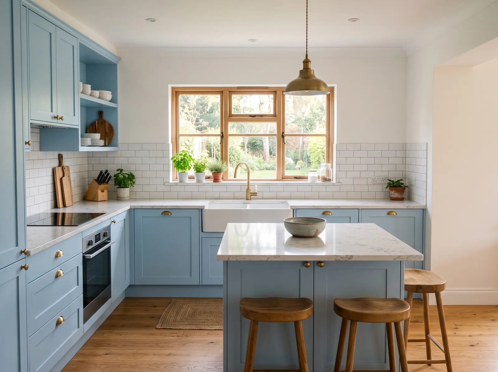
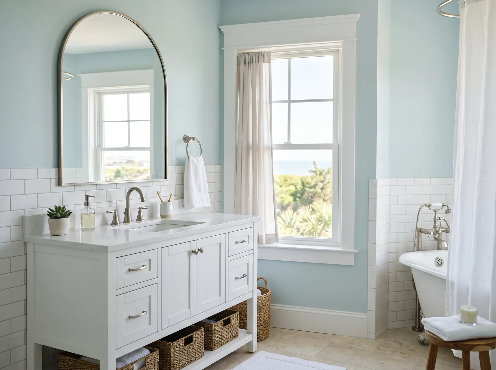
The lighter blues here suit rooms you want to feel calm and open. Lulworth Blue (No. 89) is an easy fit for bedrooms, bathrooms, and nurseries where you want softness without going pale. St Giles Blue (No. 280) brings more life and works well in a kitchen, a hallway, or a kid's room where you want some cheer.
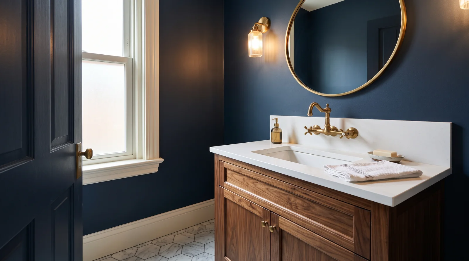
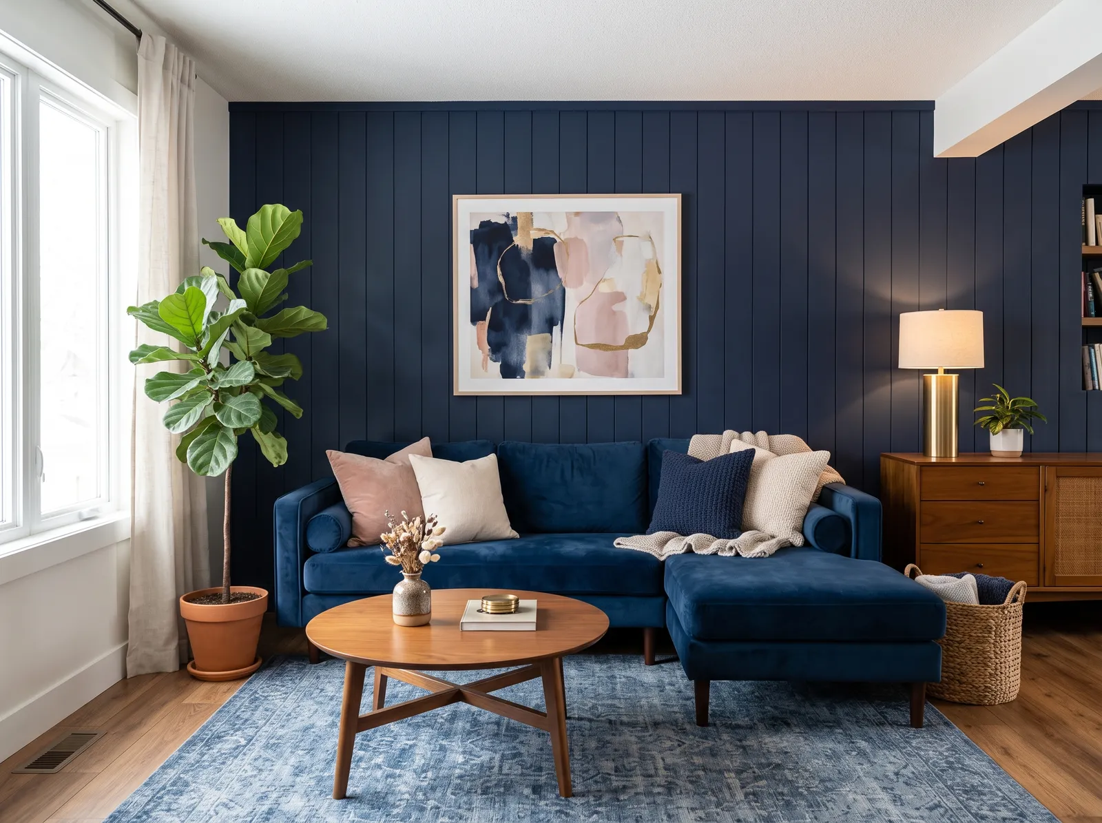
The deeper end earns its keep in rooms you want to feel rich and grounded. Cook's Blue (No. 237) is a strong, traditional choice for cabinetry, a back door, or a built-in. Stiffkey Blue (No. 281) is made for drama, dining rooms, a study, or an accent wall, and it looks especially good by lamplight.
Every Farrow & Ball blue, grouped by undertone, warm to cool. Filter by depth or change the order.
Hex values are display approximations from Farrow & Ball's published swatch tools, not a physical sample under controlled lighting. Order a brand-direct sample before specifying.
Upload a photo of the room. We paint it in the blue you chose with your light and your floor, and you can swap colors until one holds.
Farrow & Ball is a British premium import sold through the brand's own showrooms and authorized stockists, and it runs roughly $100 or more per gallon, which is two to three times mainstream paint. There is no off-the-shelf can sitting on a rack; the color is mixed to order when you buy it, so you choose the color first and the finish second. Common finishes include Estate Emulsion for chalky matt walls, Modern Emulsion for a washable wall surface, Estate and Modern Eggshell for wood and metal, plus Dead Flat and Full Gloss.
Because every color is tint-on-demand, you are not locked into buying from one place to get the exact shade. Any of these blues can be color-matched into a more affordable paint, including the featured Kompozit deck, by bringing the name and number, like St Giles Blue No. 280, to a store that mixes to order. The match will be very close on the wall, though sheen and that signature pigment depth can differ, so always test a sample before committing a whole room.
How many blue colors each brand carries, drawn with that deck's own blues from light to dark. Pick your store first, then the color. Every brand equal, no favorites.
Farrow & Ball's blues are known for depth, not flatness. Each color carries a high load of pigment, so it reads as a real, layered blue rather than a one-note wash. The famous deep tones in this part of the range, like Stiffkey Blue (No. 281), can look almost navy in low light and soften to a dusty slate when the sun hits.
These colors are built to shift with the light, which is the whole point. A cool morning makes them quieter and grayer; a warm lamp at night pulls out the richness. That movement is why a Farrow & Ball blue rarely feels boring on a wall.
A clean off-white trim keeps these blues looking crisp rather than heavy. Farrow & Ball's own Pointing is a common companion for woodwork because it is warm enough to soften a cool blue without fighting it. For ceilings, a soft white or a paler tint of the wall color keeps the room from feeling top-heavy.
For a coordinating accent, the deeper blues pair naturally with warm neutrals and muted greens, and the brand's Studio Green or a stone-like neutral both work. If you want a tonal look, run a lighter blue like Lulworth Blue (No. 89) on the walls and a darker one like Stiffkey Blue (No. 281) on a door or built-in for contrast that still feels like one family.
Hague Blue (No. 30) — F&B's most famous deep blue; the AD/Domino dark-room benchmark. Stiffkey Blue and Lulworth Blue round out the short list most people choose from.
This blue slice of the Farrow & Ball deck has 4 colors: Lulworth Blue (No. 89), St Giles Blue (No. 280), Cook's Blue (No. 237), and Stiffkey Blue (No. 281). The full deck is tightly curated at around 132 colors, and each one has its own number.
For a small or low-light room, lean on LRV. Lulworth Blue (No. 89) at LRV 46 bounces back the most light and keeps the space feeling open. If you want the room to feel cozy and deliberately dark instead, Stiffkey Blue (No. 281) at LRV 10 leans into the shadow rather than fighting it.
It is a British premium import sold through the brand's own showrooms and authorized stockists, and it runs about $100 or more per gallon, roughly two to three times mainstream paint. You are paying for high pigment depth and colors built to shift with the light. If the price is a barrier, you can color-match the same blue into a cheaper paint.
Yes. Every color is mixed to order anyway, so any paint store that tints on demand can match a Farrow & Ball blue into another line, including the featured Kompozit deck. Bring the name and number, like Cook's Blue No. 237, and test a sample, since the match is close but sheen and pigment depth can vary slightly.
No. Farrow & Ball openly rejects the Color of the Year idea. Instead the brand releases new colors each year along with trend predictions, so there is no single annual blue to anchor to.
Choose the finish after the color. For walls, Estate Emulsion gives a chalky matt look and Modern Emulsion is more washable. For doors, trim, and cabinetry, Estate or Modern Eggshell holds up better, with Dead Flat and Full Gloss available for specialty looks.
Ask a Question