CP

Room Colors · Blue Sunroom

8 Best Blue Sunroom Paint Colors for 2026
ideas, combinations, and real rooms

8 curated picks from real blue sunrooms — with the exact colors, honest reasons why, and the combinations that hold the room together.

Jessica Williams
Jessica Williams· Color Stylist & Interior Editor

Former interior stylist who can spot a green undertone from across a room. Jessica writes the color and mood pieces — what to choose, what pairs, and why your "white" looks pink.

The Fast Answer

Don't want to read 8 picks? These four are the safe answers.

BM HC-154 · LRV 6 · LRV 8
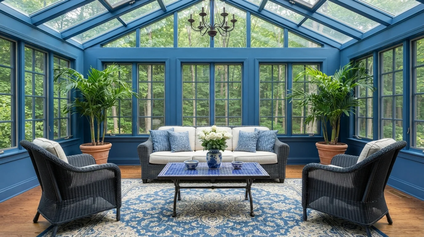
Valspar · Cobalt Conservatory Retreat · LRV 13
Rich ocean blues frame lush outdoor greenery, making this sun-drenched space feel like an elegant garden oasis.
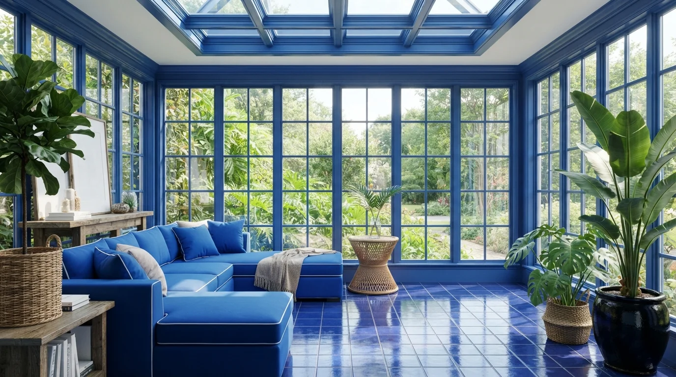
Behr · Cobalt Sunlit Sanctuary · LRV 7
Drenching every window frame and beam in radiant royal blue creates a striking, plant-filled sanctuary flooded with bright sunlight.
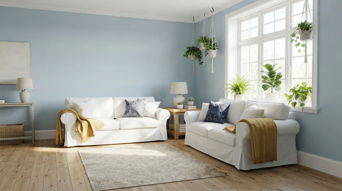
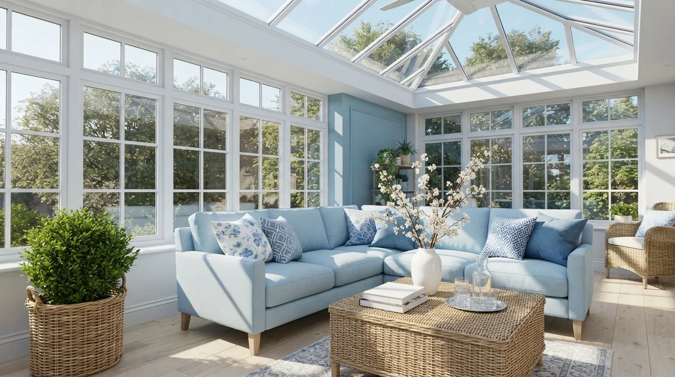
Dunn-Edwards · Sunlit Powder Blue · LRV 45
Gentle powder blue walls pair with soft white slipcovers and sunny yellow accents to create a bright, uplifting retreat.
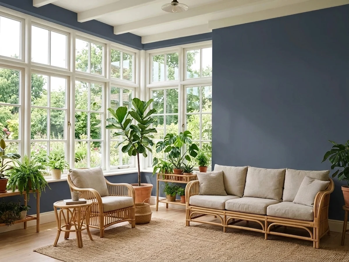
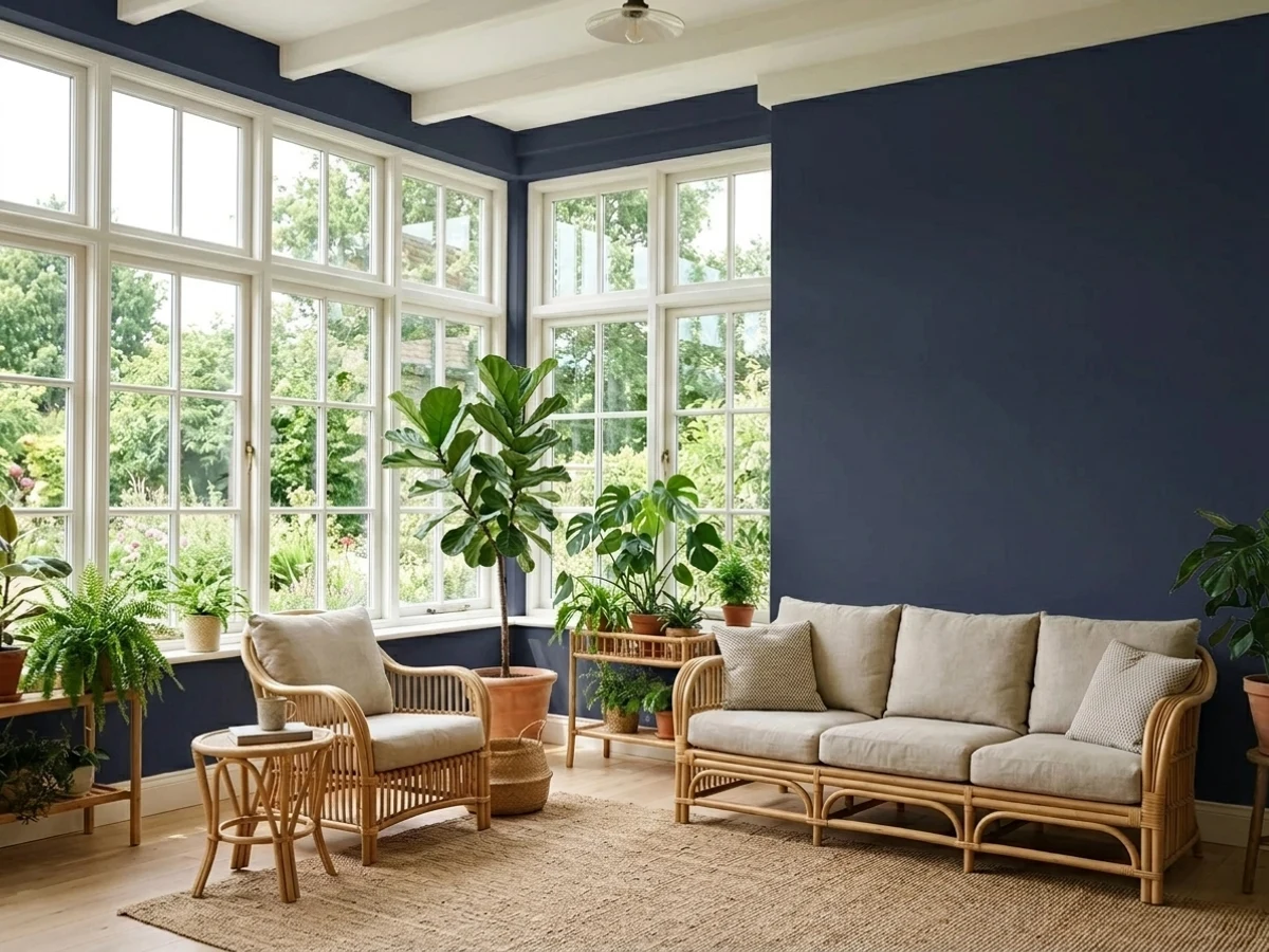
Room painted in Hale Navy
Hale Navy
Try it in your room →
Top picks · see them in a room

Top Picks for the Blue Sunroom

Tap a shade to see the blue sunroom in it, then try it on your own room.

Hale Navy
Benjamin Moore

Cozy navy wraps the sunny room in calm without dimming the light.

SEE IT IN YOUR ROOM →

Blue Sunroom Color Trends 2026 — What's In, What's Out

On the Way Out
  • Cool Powder Blue EverywhereThe flat powder blue that used to blanket sunrooms now reads cold and dated next to 2026's warmer, moodier blue choices.
  • Bare White Sunroom WallsAn all-white sunroom with no wall color is losing appeal as owners lean into color to make the space feel like a real room.
  • Blue Paired With Warm WickerMuted blue sunroom walls set against warm wicker and rattan furniture is a 2026 pairing that keeps the space from reading too coastal-cliche.

The 8 Best Blue Sunroom Paint Colors

Every pick below is a real rendered blue sunroom, not a chip. The lead color first; the swatches are the full scheme in the photo — walls, furniture, textiles, accent.

Cobalt Conservatory Retreat — blue sunroom painted in In the Nick
1In the NickValspar · Cobalt Conservatory Retreat

Rich ocean blues frame lush outdoor greenery, making this sun-drenched space feel like an elegant garden oasis.

Cobalt blue is a rich, energetic medium blue full of classic charm. In this sunroom, deep blue coats the window frames, ceiling beams, and walls, surrounding grey wicker seating, white cushions, and an intricate blue mosaic table. The space feels breezy, crisp, and remarkably inviting. The combo works because the vibrant blue frames the natural green outdoors while crisp white cushions keep the seating light and airy. It is perfect for anyone who loves an all-season garden room with bold personality.

Walls · Valspar
Sofa · C2 Paint
Chair · Sherwin-Williams
Rug · Glidden
Plant · Behr
SEE IN THE NICK ON YOUR WALLS →
Cobalt Sunlit Sanctuary — blue sunroom painted in Star Spangled
2Star SpangledBehr · Cobalt Sunlit Sanctuary

Drenching every window frame and beam in radiant royal blue creates a striking, plant-filled sanctuary flooded with bright sunlight.

Cobalt blue is a deep, energetic royal blue with plenty of punch. In this room, all the window frames, coffered ceiling beams, and plush sectional couch are wrapped in vibrant blue tones, framed by glossy matching floor tiles. The space feels dramatic, cheerful, and full of life. This monochrome look works because the cool blue tones make the lush green houseplants and sunny outdoor garden pop intensely. It is a fantastic choice for bold decorators who want to turn a classic sunroom into an unforgettable conversation space.

Trim · Behr
Sofa · Behr
Plant · Valspar
Table · Benjamin Moore
Cushions · Sherwin-Williams
SEE STAR SPANGLED ON YOUR WALLS →
Sunlit Powder Blue — blue sunroom painted in Country Air
3Country AirDunn-Edwards · Sunlit Powder Blue

Gentle powder blue walls pair with soft white slipcovers and sunny yellow accents to create a bright, uplifting retreat.

Powder blue is a soft, airy light blue with a gentle touch of cool grey. Here, that cool blue washes over the walls, framing bright white slipcovered sofas, crisp moldings, and a soft beige area rug. Warm mustard yellow cushions and lush hanging plants instantly perk up the room. The space feels breezy, lighthearted, and welcoming. Combining cool blue with warm yellow and crisp white keeps the look grounded and cheerful. It is a fantastic match for anyone wanting a relaxed, coastal-inspired home.

Walls · Dunn-Edwards
Trim · Rust-Oleum
Sofa · Dunn-Edwards
Accent · Glidden
Cushions · PPG / Glidden
SEE COUNTRY AIR ON YOUR WALLS →

Blue Sunroom Wall Color Combinations

A wall color never works alone. These are the full schemes from the rooms above — the lead color first, then the supporting colors that make the photo work.

Cobalt Conservatory Retreat
WallsIn the NickSofaScrollChairAnchors Aweigh
Walls
In the Nick · · LRV 13
Sofa
Scroll · · LRV 82
Chair
Anchors Aweigh · · LRV 3

Rich ocean blues frame lush outdoor greenery, making this sun-drenched space feel like an elegant garden oasis.

TRY THIS PALETTE →
Cobalt Sunlit Sanctuary
TrimStar SpangledSofaSapphire LacePlantShepherd's Green
Trim
Star Spangled · · LRV 7
Sofa
Sapphire Lace · · LRV 9
Plant
Shepherd's Green · · LRV 15

Drenching every window frame and beam in radiant royal blue creates a striking, plant-filled sanctuary flooded with bright sunlight.

TRY THIS PALETTE →
Sunlit Powder Blue
WallsCountry AirTrimLinen WhiteSofaSnowflake
Walls
Country Air · · LRV 45
Trim
Linen White · · LRV 93
Sofa
Snowflake · · LRV 87

Gentle powder blue walls pair with soft white slipcovers and sunny yellow accents to create a bright, uplifting retreat.

TRY THIS PALETTE →
Blue & Orange Color Palette — Cobalt Flame
DominantCobalt FlameSecondaryEmber OrangeBaseLinen Cream
Dominant
Cobalt Flame · · LRV 8
Secondary
Ember Orange · · LRV 25
Base
Linen Cream · · LRV 84

A bold five-color scheme pairing vivid cobalt blue with a warm flame orange, balanced by soft cream and a smoky charcoal — every color matched to real paint you can buy.

TRY THIS PALETTE →

Nightlife and Time's Current both want a genuinely cool, crisp white on the trim and window casings — not a warm off-white, which will look dingy next to a navy this saturated. If the sunroom has any exposed wood (rattan furniture, a stained wood ceiling, wicker), let that wood stay the warm counterpoint instead of trying to match it to the wall; the contrast is what keeps a dark-blue sunroom from feeling like one flat block of color.

Encore and Dragonfly are more forgiving because they're lighter, but they still read best against white trim rather than a matching blue-on-blue trim treatment — sunrooms have enough glass and sightlines that a defined trim line matters more here than in a closed room. Either blue also pairs naturally with natural wood tones (a teak or rattan sunroom set, a light oak floor), since the blue stays cool and the wood carries the warmth the room needs so it doesn't feel sterile.

More Sunroom Color Ideas

Set on a color family already? Each page has its own real rooms and picks.

Light or Dark Blue Sunroom Colors?

Go Light (LRV 60+) If…

The room is small, faces north, or has to work at every hour. Light warm colors make it feel bigger and stay calm in evening light — the light you actually live in.

Go Dark (LRV Under 20) If…

You want the cocoon effect and the room has real daylight. Dark works best on one feature wall — or fully color-drenched in a large room with good windows.

Sunrooms flip the usual light-vs-dark math. In most rooms, a dark wall color needs to be earned with good natural light or it just reads dim. A sunroom already has that light in excess, which is why Nightlife and Time's Current work here in a way they wouldn't in a windowless den — the glazing does the brightening, the paint does the grounding. That trade only holds up if the room genuinely gets hours of direct or strong indirect sun; a three-season porch that's shaded by trees or faces north will make either of those dark blues feel flat and heavy instead of rich.

For north-facing sunrooms, rooms with smaller window runs, or anyone converting a screened porch that only gets bright, indirect light, Encore and Dragonfly are the safer lane. Both stay legible and lively without needing hard sun to activate them, and they won't make a smaller glassed-in room feel like it shrank the way a full-wall navy can when the light is inconsistent through the day.

VISUALIZE YOUR SPACE

See It. Love It.
Paint It.

Upload one photo of your blue sunroom and try every color on this page on your own walls — in your own light, before you buy a drop of paint.

Drag the slider to compare
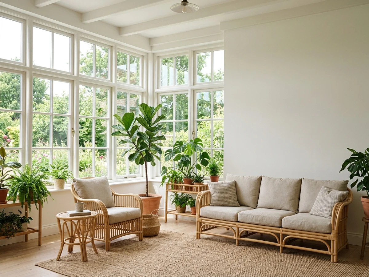
blue sunroom before paintingblue sunroom painted in Hale NavyHale NavyBefore

Sheen and Fade Protection for a Blue Sunroom

Sunrooms get more direct UV than almost any other interior space, and navy and deep blue pigments are known to shift toward gray-green over years of that exposure — it's a slower version of the same fading reds and yellows go through. That's a real factor for a room where Nightlife or Time's Current would sit on a wall facing south or west glass most of the day.

Ask for a UV-resistant or exterior-grade-pigment interior formula if your paint store offers one for the color, and stick to satin or eggshell rather than flat — flat finishes show fade unevenly, while a bit of sheen holds color truer and wipes clean easier, which matters in a room that collects pollen and dust off screens and open windows.

Testing These Blues in Sunroom Light

Sunroom light changes more over a single day than in any other room, so a swatch of Encore or Dragonfly that looks soft and gray at 9am can look fully saturated and almost turquoise by 2pm. Paint a large sample — at least a poster-board-sized patch, not a paint chip — on the wall that gets the most direct sun and check it at morning, midday, and evening before buying gallons.

This matters even more for the dark picks. Nightlife and Time's Current can look nearly black in flat morning light and then open up into a true navy once the sun is directly on the glass, so judging them from a single glance can lead to returning paint you already opened.

Mistakes Specific to a Blue Sunroom

The most common mistake is treating a sunroom like any other room and skipping the same-day, multi-hour test — sunrooms are exactly the space where paint chips lie the most, because the lighting swings so far from morning to golden hour.

The second is ignoring the floor and ceiling material. A stained wood or brick floor next to a navy wall like Time's Current reads warm and intentional; a cool gray tile floor next to the same navy can feel cold. And with a room this glass-heavy, resist the instinct to paint more than one accent color in — one blue, used confidently on the walls, does more for a sunroom than mixing two or three.

About Blue Sunroom Paint Colors

A sunroom is one of the only rooms in the house where a deep blue reads as cozy instead of closed-in, because the glass doing the work never stops. Nightlife from Portola Paints and Time's Current from Valspar both lean into that: they're dark enough to feel grounded and intentional, but the wall of windows a sunroom is built around keeps them from turning cave-like the way the same color would in a bedroom with one small window. Time's Current in particular reads as navy rather than black-blue, so it settles a room that gets strong afternoon sun without fighting the light.

On the other end, Encore and Dragonfly (both from brands with wide dealer networks — Encore is Valspar, Dragonfly is PPG/Glidden) do the opposite job. They're the blues that make a sunroom feel like an extension of the sky outside the glass. Encore has an ocean-water liveliness that gets brighter and more saturated as direct sun hits it, and Dragonfly stays a soft, breezy blue that doesn't compete with a view — it echoes it.

All four are stock mixes, not specialty tints, so any of them can go on the shelf at a counter this weekend regardless of which paint store is closest to you. The real decision isn't availability, it's how much daylight your sunroom actually gets and whether you want the color to calm that light down (Nightlife, Time's Current) or amplify it (Encore, Dragonfly).

The Questions Everyone Asks

What color should I paint my blue sunroom?

If you want one answer, start with the safe picks above — Hale Navy, In the Nick, Star Spangled, Country Air. They read well in any light and survive furniture changes. Then check the light: strong afternoon sun wants a step cooler, a north-facing room wants a step warmer.

is a dark blue too dark for a sunroom?

Usually not, as long as the room gets real daylight. A sunroom's wall of windows offsets a deep color the way it wouldn't in a normal room, which is why navy shades like Time's Current from Valspar or Nightlife from Portola Paints read as cozy rather than dim here. The exception is a shaded or north-facing sunroom with limited direct sun — in that case a lighter blue like Encore holds up better.

will blue paint fade in a sunroom?

Yes, more than in most rooms, because sunrooms get sustained direct UV. Navy and deep blue pigments in particular tend to shift toward a gray-green cast over years of exposure. Ask your paint store about a UV-resistant formula for whichever color you pick, and use a satin or eggshell sheen instead of flat — it holds true color longer and is easier to wipe down.

what color trim goes with blue sunroom walls?

A crisp, cool-leaning white, not a warm off-white. Cool blues like Time's Current, Nightlife, and Encore all read cleaner against a true white trim; a creamy or warm white will look slightly dingy next to them. If the sunroom has wood furniture or a wood ceiling, leave the wood as the warm accent and keep the trim white rather than trying to match the two.

should a sunroom be a light or dark color?

Either can work — it depends on how much direct sun the room gets. Rooms with strong, consistent daylight can carry a dark, grounding blue like Nightlife or Time's Current without feeling closed-in. Rooms with less direct light, more shade, or a north-facing orientation do better with a lighter, livelier blue like Encore or Dragonfly, which stays bright without needing hard sun to activate it.

what is a good blue for a small sunroom?

Encore from Valspar or Dragonfly from PPG/Glidden are the safer picks for a small sunroom — both stay light and airy rather than closing the walls in, and they read as an extension of the sky rather than a boundary. A dark navy can still work in a small sunroom if it gets strong direct light most of the day, but it's a bigger commitment to test first.

What two-color combination works best in a blue sunroom?

The reliable pattern is a quiet main color plus one deep accent on a single wall. Keep trim and ceiling in one warm white so the two colors are the only event in the room — the combination cards above show complete schemes from real rooms.

What colors make a blue sunroom look bigger?

High-LRV, slightly warm colors — LRV 60–75 is the sweet spot. Paint the walls and trim close to the same light color so the corners blur, and keep the ceiling white. Stark cool white actually works against you; it creates hard shadows that show the room's edges.

Ask a Question

Jessica Williams

Not sure what's right for your blue sunroom?

Ask Jessica below — every question gets a real reply, usually within a day.