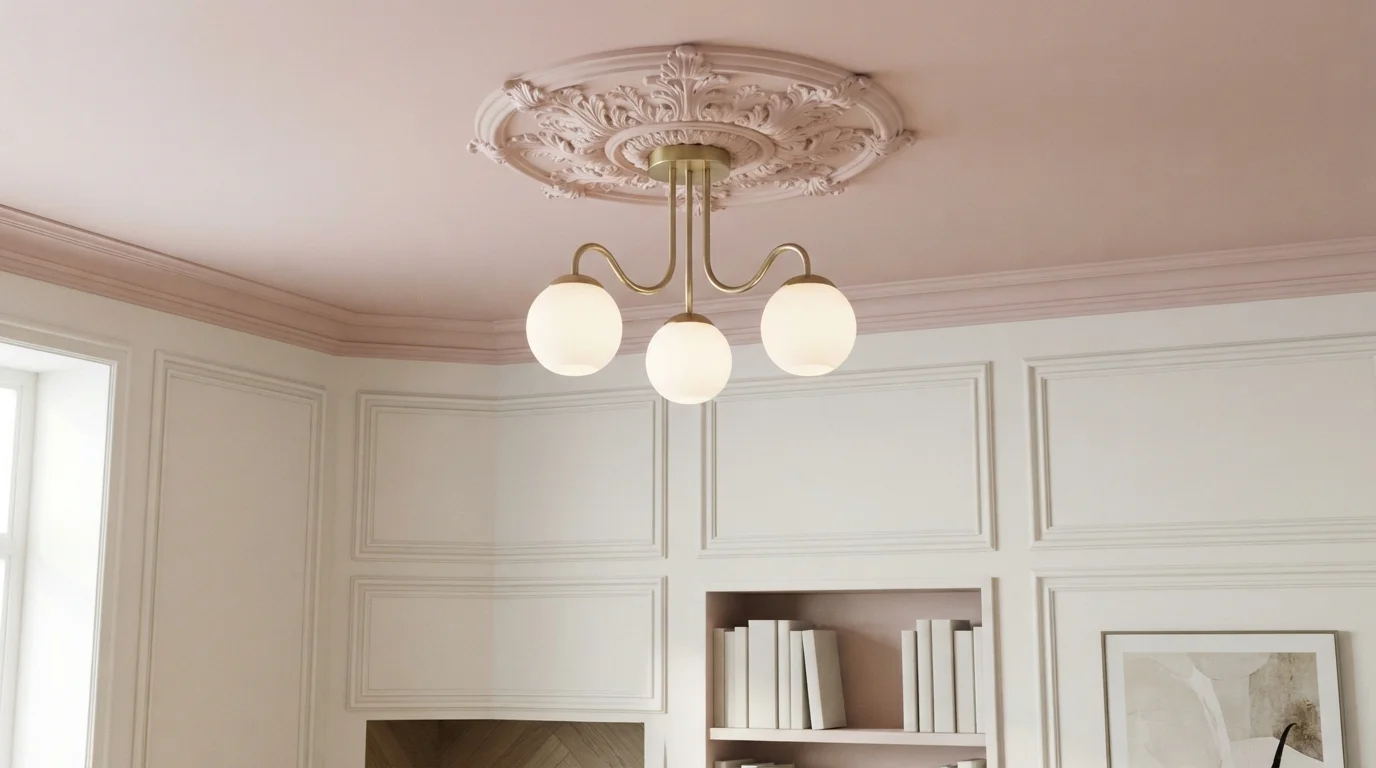
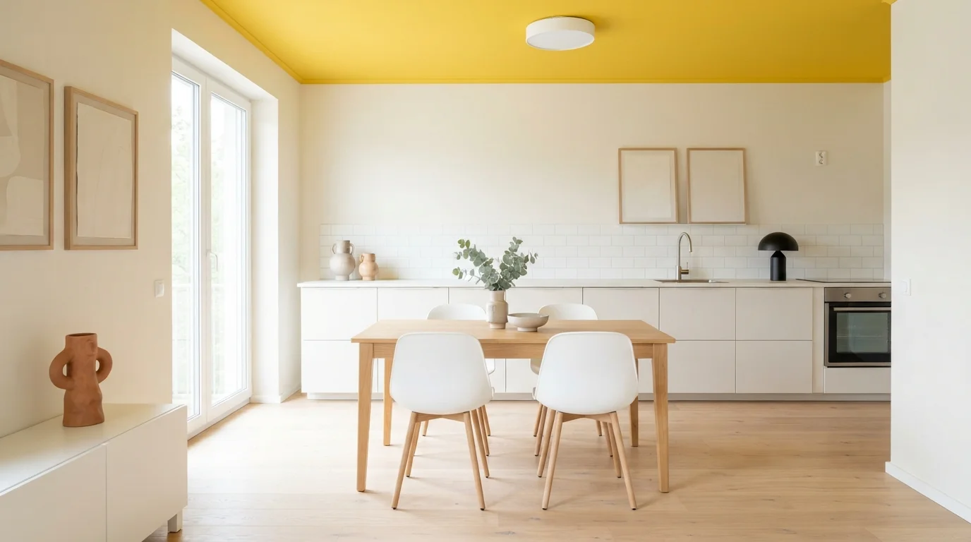
Room Colors · Blue Ceiling
8 Best Blue Ceiling Paint Colors for 2026
ideas, combinations, and real rooms
8 curated picks from real blue ceilings — with the exact colors, honest reasons why, and the combinations that hold the room together.

Former interior stylist who can spot a green undertone from across a room. Jessica writes the color and mood pieces — what to choose, what pairs, and why your "white" looks pink.
The Fast Answer
Don't want to read 8 picks? These four are the safe answers.

Top Picks for the Blue Ceiling
Tap a shade to see the blue ceiling in it, then try it on your own room.
Blue Ceiling Color Trends 2026 — What's In, What's Out
- Cool Gray-Blue Ceiling Tints — The chalky, cool gray-blue ceiling tint that read modern a few years ago is starting to feel cold next to 2026's warmer blue palettes.
- Pastel Baby Blue Ceilings — Very light, powdery baby blue ceilings are fading as homeowners choose deeper, more saturated blues that read intentional rather than nursery-generic.
- High-Gloss Blue Ceiling Finish — Glossy blue ceilings are losing ground to flat and matte finishes that soften the color instead of mirroring the room's light fixtures.
The 8 Best Blue Ceiling Paint Colors
Every pick below is a real rendered blue ceiling, not a chip. The lead color first; the swatches are the full scheme in the photo — walls, furniture, textiles, accent.

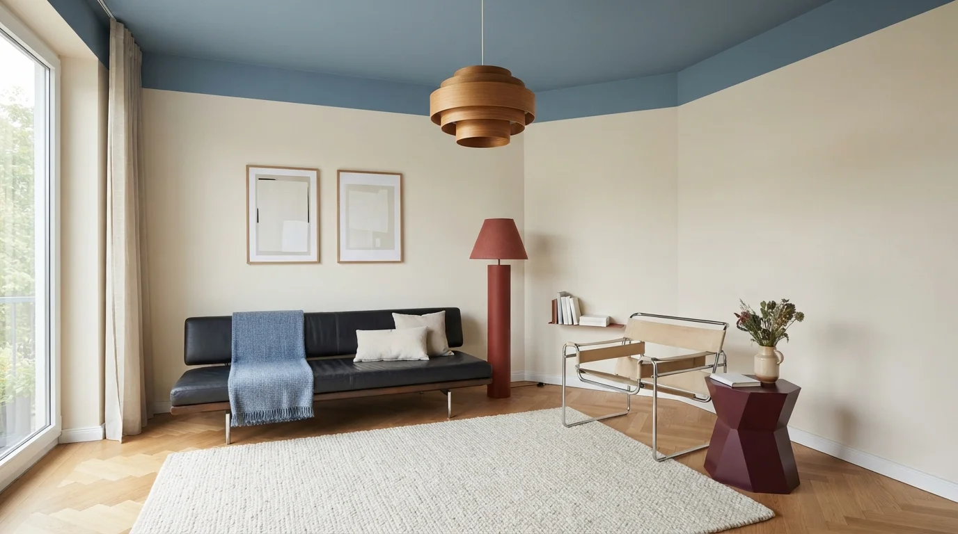
A soft sky blue ceiling brings open-air charm to a curated space filled with mid-century silhouettes.
Dusty blue is a calm, muted sky shade with gentle grey notes. In this room, that soothing tone covers the ceiling and upper trim, while soft cream covers the main walls. A black leather sofa, a bold terracotta-red floor lamp, and a minimalist sling chair ground the floor below. The whole space feels relaxed, artistic, and cozy. This pairing works because the pale walls keep everything bright while the ceiling adds an unexpected splash of personality overhead. It is ideal for anyone wanting creative, designer flair.
SEE OFFICE BLUE ON YOUR WALLS →
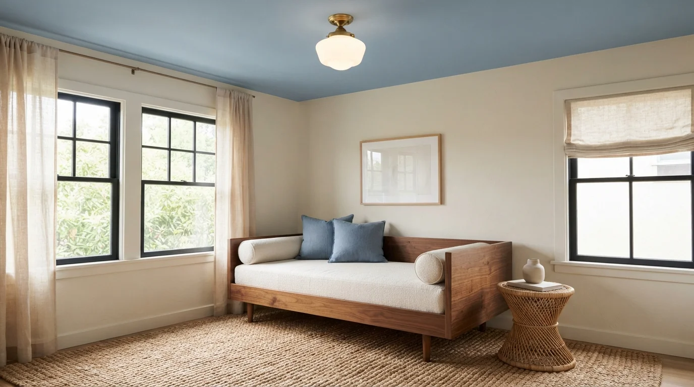
Breezy blue ceilings bring the open sky indoors, paired with warm woven textures and sunlit linen.
Sky blue is a soft, airy shade that feels like a clear morning. In this room, the ceiling is painted in gentle powder blue, while warm creamy beige covers the walls. A low wood daybed with crisp white cushions, soft blue accent pillows, and a chunky jute rug keep the floor grounded. The room feels incredibly breezy, quiet, and peaceful. Painting the ceiling blue works because it draws your eyes upward while natural woods and woven textures soften the space. It is perfect for anyone wanting a relaxed, coastal-inspired reading corner.
SEE NOTABLE HUE ON YOUR WALLS →
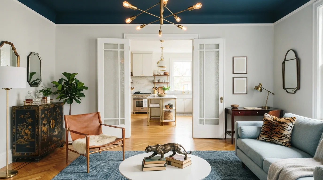
Deep midnight blue sweeps across the ceiling, anchoring airy neutral walls and rich caramel woods with tailored elegance.
Deep petrol blue is an intense, ocean-inspired shade with plenty of depth. In this room, the ceiling carries the rich blue shade, while crisp off-white coats the tall walls and classic molding. The space feels both grand and surprisingly intimate. Painting the ceiling a bold tone works because the light walls and warm wood floors keep the space open and grounded. It is a fantastic choice for anyone who loves European sophistication and wants to make an architectural statement without overwhelming everyday living.
SEE VELVET EVENING ON YOUR WALLS →
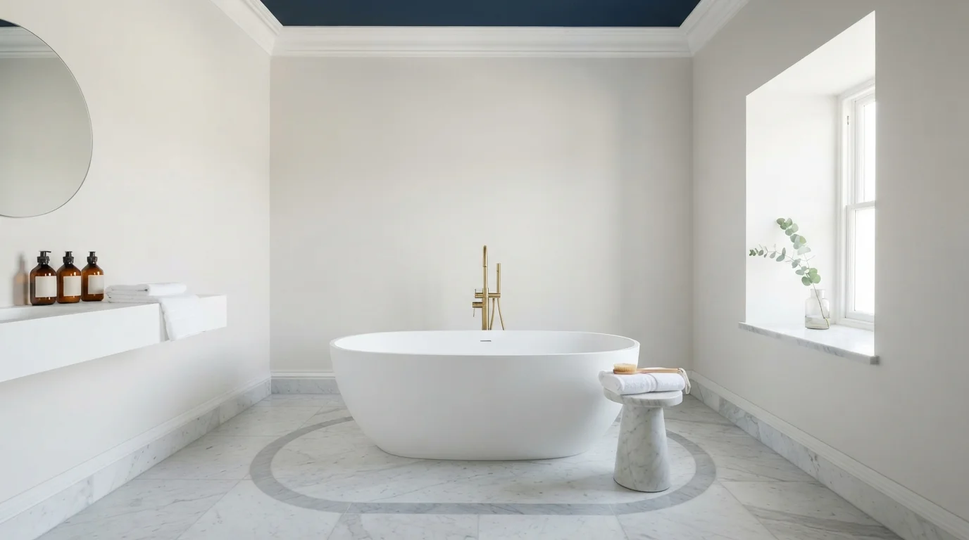
A deep navy ceiling anchors crisp white walls and warm brass accents in this light-drenched, spa-like bathroom.
Navy blue is a deep, stately blue with lots of depth. In this room, that dark blue covers the high ceiling and its classic crown molding, while the surrounding walls stay a clean, quiet off-white. The space feels tall, fresh, and grounded. This combo works because the dark color on top creates high contrast without taking away the light from the white walls and sunny window. It is perfect for anyone who wants a bold splash of color in a peaceful space.
SEE SYMPHONY BLUE ON YOUR WALLS →
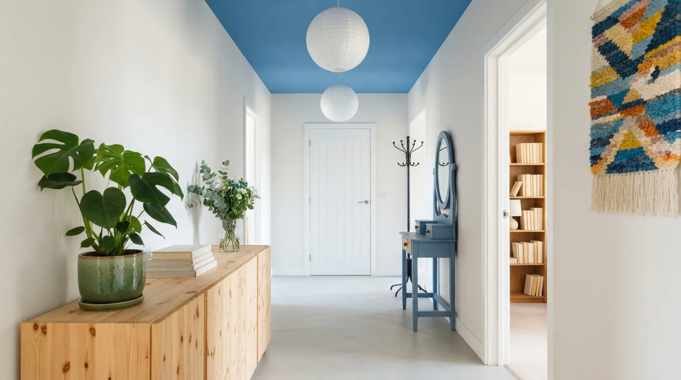
A cheerful blue ceiling and crisp white walls create an airy, uplifting corridor filled with natural light.
Sky blue is a crisp, uplifting color reminiscent of a clear summer day. In this hallway, that vibrant blue covers the ceiling while clean white walls keep the narrow space feeling open and bright. Blonde pine wood on the dresser warms up the entry, complemented by round paper globe lamps, lush greenery, and a quirky teal side table. The space feels instantly breezy, cheerful, and welcoming. Painting overhead draws the eye upward to make compact areas feel taller. It is ideal for anyone who loves playful Scandinavian charm.
SEE MAGIC SPELL ON YOUR WALLS →
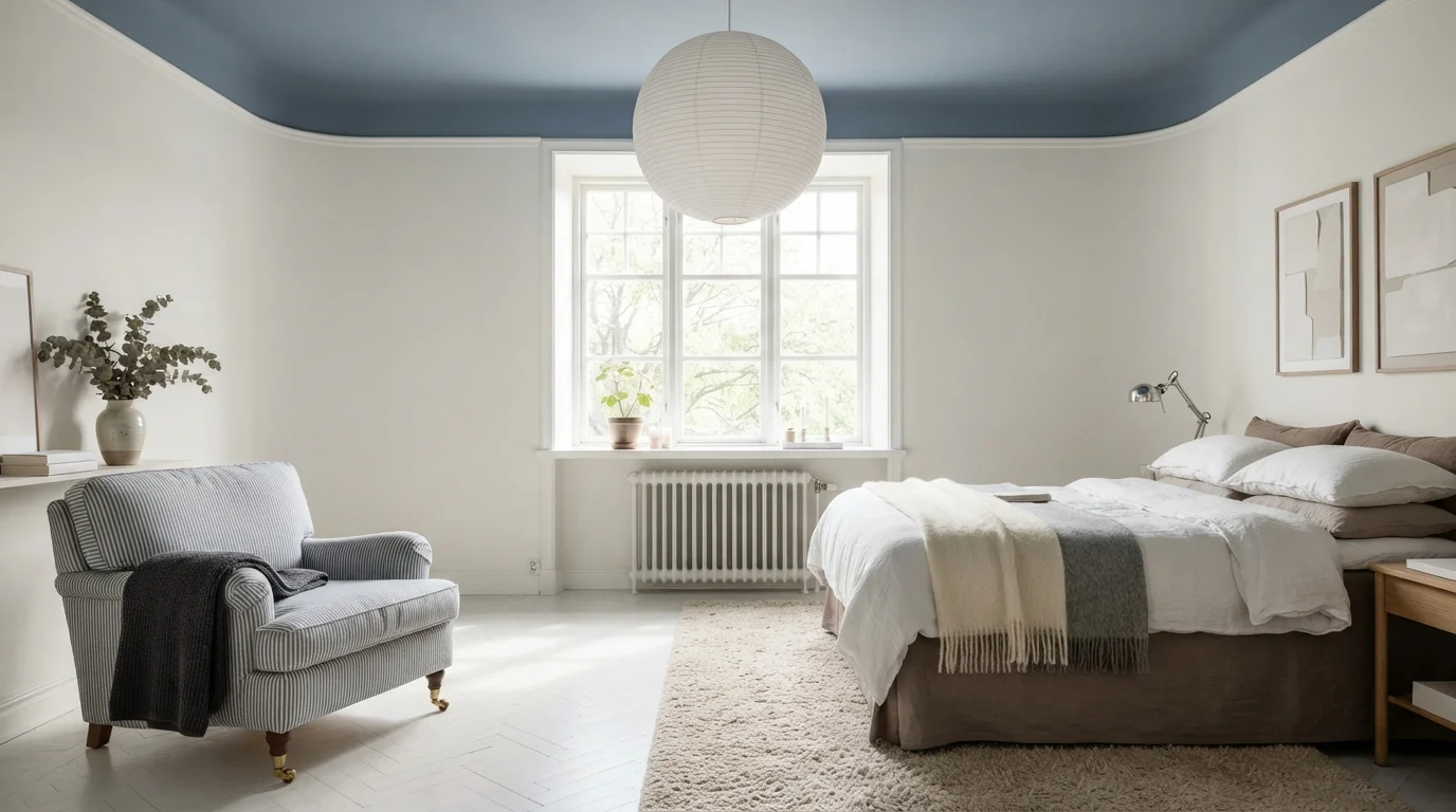
Soft morning daylight fills this serene bedroom, where a muted blue ceiling brings the quiet sky indoors.
Slate blue is a soft, peaceful gray-blue that feels like a quiet morning sky. In this room, the calm blue washes over the ceiling and top trim, while the rest of the walls stay a clean, bright white. Earthy taupe bedding, a striped armchair, and a thick woven rug warm up the floor level. The space feels open, restful, and deeply soothing. Drawing the color overhead works because light walls keep the room bright while framing the high ceiling. It is ideal for anyone craving a minimalist, Scandinavian-style sanctuary.
SEE PROVENCE ON YOUR WALLS →
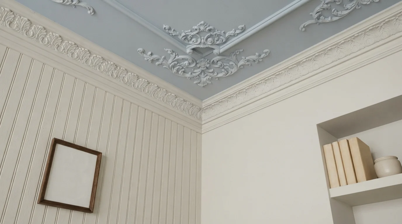
A soft powder blue ceiling brings the quiet calm of an open sky above gentle off-white paneled walls.
Powder blue is a soft, tranquil shade of pastel blue. In this space, the blue covers the entire ceiling and ornate crown molding, while crisp off-white coats the vertical beadboard walls below. The room feels fresh, restful, and wonderfully airy. Adding color to the ceiling works because it draws your eyes upward and gives decorative plaster molding a gorgeous spotlight without making the space feel closed in. It is a lovely choice for anyone wanting vintage charm with a gentle pop of color.
SEE SHEER ROMANCE ON YOUR WALLS →
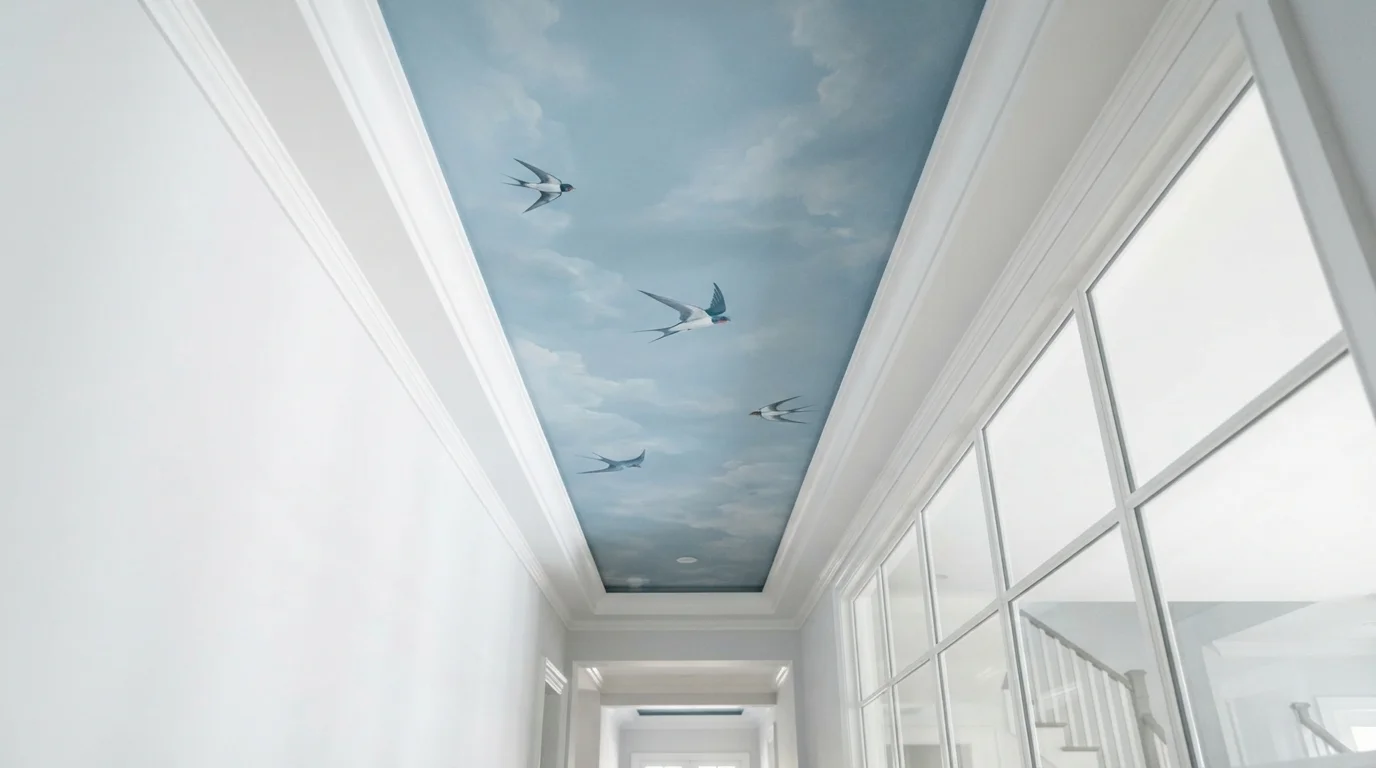
Gazing upward into a painted morning sky creates an instant feeling of endless space and gentle calm.
Sky blue is a soft, dreamy shade that brings the outdoors right inside. In this space, the ceiling is transformed with a realistic cloud mural and flying swallows, framed neatly by bright white walls and trim. The whole area feels open, refreshing, and full of whimsical charm. This pairing works because the crisp white frame acts like a picture border, making the soft blue sky pop without feeling heavy. It is perfect for anyone wanting to turn a plain hallway into a magical focal point.
SEE BEWILDER ON YOUR WALLS →Blue Ceiling Wall Color Combinations
A wall color never works alone. These are the full schemes from the rooms above — the lead color first, then the supporting colors that make the photo work.
A soft sky blue ceiling brings open-air charm to a curated space filled with mid-century silhouettes.
TRY THIS PALETTE →Breezy blue ceilings bring the open sky indoors, paired with warm woven textures and sunlit linen.
TRY THIS PALETTE →Deep midnight blue sweeps across the ceiling, anchoring airy neutral walls and rich caramel woods with tailored elegance.
TRY THIS PALETTE →A deep navy ceiling anchors crisp white walls and warm brass accents in this light-drenched, spa-like bathroom.
TRY THIS PALETTE →For the two dark options, Nightlife and Time's Current, keep the walls and trim lighter so the ceiling has somewhere to contrast against — crisp white or warm cream trim reads clean against both, and a wood tone ceiling beam or door pairs naturally with Time's Current's grounding, twilight character. Painting the walls the same dark blue as the ceiling erases the contrast that makes these colors work in the first place, so save the full monochrome treatment for rooms where you actually want that enclosed, cocoon feeling.
Encore, being the boldest and brightest of the four, works best against a genuinely neutral wall — white, off-white, or a warm greige — so it stays the one loud element in the room instead of competing with a busy wall color. Dragonfly is the most flexible pairing partner: its dusty, muted quality sits comfortably with warm wood tones, white trim, or a soft neutral wall, which is why it's the pick that fits a wider range of rooms without needing the rest of the palette built around it.
More Ceiling Color Ideas
Set on a color family already? Each page has its own real rooms and picks.
Light or Dark Blue Ceiling Colors?
Go Light (LRV 60+) If…
The room is small, faces north, or has to work at every hour. Light warm colors make it feel bigger and stay calm in evening light — the light you actually live in.
Go Dark (LRV Under 20) If…
You want the cocoon effect and the room has real daylight. Dark works best on one feature wall — or fully color-drenched in a large room with good windows.
Time's Current is the one to think hardest about before you commit — it's a deep, nearly-navy blue that behaves close to black once it's up on the ceiling, especially in a room that doesn't get much daylight. It works in rooms with real natural light or supplemental fixtures aimed upward; in a dim room it can flatten the ceiling into a dark void instead of adding depth. Nightlife reads similarly bold and is best treated the same way — a deliberate, moody choice for a bedroom, dining room, or reading nook, not a default.
Dragonfly is the safer bet for a room with limited light or a lower ceiling, since a dusty, muted blue doesn't swallow light the way a near-black navy does — it softens a ceiling rather than darkening it. Encore sits in between: it's saturated and bold enough to be a statement, but because it's a true blue rather than a blue pushed toward black, it keeps more brightness bouncing around the room than Time's Current or Nightlife do.
See It. Love It.
Paint It.
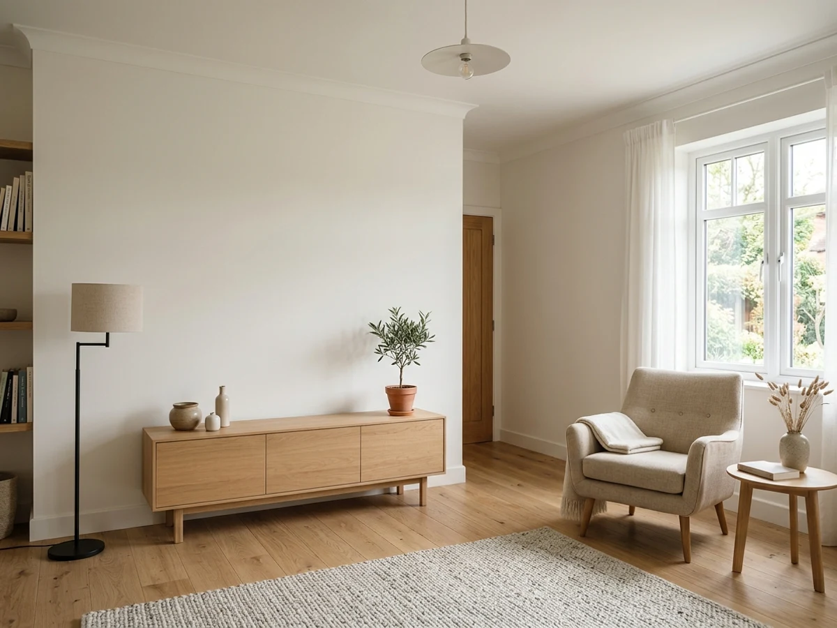
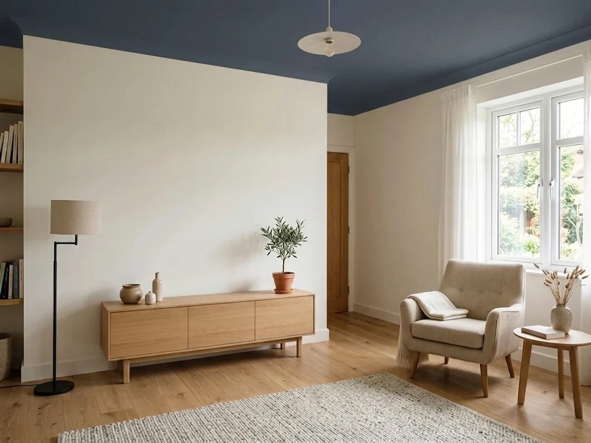
Upload one photo of your blue ceiling and try every color on this page on your own walls — in your own light, before you buy a drop of paint.

Hale NavyBeforeSheen and Finish for a Blue Ceiling
Most ceilings get a flat or matte finish because it hides drywall seams, texture, and touch-up marks better than anything with sheen, and that logic still applies once the ceiling is blue. Flat is the right call for Dragonfly and Encore in a normal living space — it lets the color read evenly instead of catching glare from overhead light fixtures at odd angles.
The deep, dark picks are the exception worth flagging. Time's Current and Nightlife can look muddy or lifeless in dead-flat sheen because there's so little light bouncing off a dark, matte surface to reveal any depth in the color. Bumping to a matte-with-a-little-more-life or eggshell finish gives these darker blues a bit of sheen to catch light and keeps the ceiling from reading as a flat black rectangle instead of a deliberate navy.
Where a Blue Ceiling Actually Works
The haint blue tradition started on porches for a reason — an exterior or semi-exterior ceiling with plenty of ambient light is the easiest place to try any of these four colors, since daylight keeps even the darker picks like Time's Current from going flat and dark. Indoors, blue ceilings do best in bedrooms, dining rooms, powder rooms, and reading nooks — spaces where you want a felt mood rather than maximum daylight brightness.
Be more careful in a home office, kitchen, or any room where you're working under the ceiling for hours at a time. A saturated, dark ceiling like Nightlife overhead can start to feel oppressive during a full workday, while a softer choice like Dragonfly is comfortable to sit under for long stretches.
Mistakes to Avoid with a Blue Ceiling
The most common mistake is picking a deep, dark blue like Time's Current or Nightlife for a room with only one small window and no plan to add light — the ceiling goes from moody to just dark, and the room feels lower and smaller instead of more intimate. Test the color on an actual ceiling patch, not just a wall swatch, before committing to a full gallon.
The second mistake is leaving the trim and crown molding color untouched when a bold pick like Encore goes up — a mismatched white or cream trim that clashes with the undertone of the blue creates a visible seam where the ceiling meets the wall instead of a clean line. Match the trim's undertone to the blue's undertone, or keep the trim a true, neutral white that won't fight with any of these four colors.
About Blue Ceiling Paint Colors
Painting a ceiling blue is one of the oldest color moves in the book, not a new trend. Southern porches have been painted "haint blue" for close to 200 years, a Gullah Geechee tradition meant to mimic water and keep restless spirits out of the house. That history is why blue still feels like the most natural non-white choice for a ceiling: it reads as sky, not as a paint decision.
The four picks on this page cover very different reasons to look up. Nightlife by Portola Paints is a midnight shade for people who want the ceiling to close the room in and feel intimate after dark. Time's Current by Valspar sits in the same deep-twilight territory — a grounding, almost-navy blue that pulls a tall or plain ceiling down into the room instead of letting it disappear. Encore by Valspar is the opposite instinct: a vibrant, saturated blue meant to be noticed, for a ceiling that's the statement instead of the backdrop. Dragonfly from PPG / Glidden is the calmest of the four, a dusty, muted blue built for a restful room rather than a dramatic one.
Ceilings work differently from walls because you see them at a glance, not head-on, and usually with less direct light hitting them. A blue that looks soft on a paint chip can read noticeably darker and cooler once it's overhead, which is why picks like Time's Current and Nightlife are worth testing on the actual ceiling before committing to the whole room.
The Questions Everyone Asks
What color should I paint my blue ceiling?
If you want one answer, start with the safe picks above — Provence, Office Blue, Notable Hue, Velvet Evening. They read well in any light and survive furniture changes. Then check the light: strong afternoon sun wants a step cooler, a north-facing room wants a step warmer.
does a blue ceiling make a room look bigger or smaller?
It depends on the shade. A soft, dusty blue like Dragonfly from PPG / Glidden reads close to sky and tends to make a ceiling feel like it's receding, which can open a room up. A deep, saturated blue like Nightlife or Time's Current does the opposite — it pulls the ceiling down visually and makes the room feel more enclosed and intimate rather than bigger.
what is haint blue and why are porch ceilings painted blue?
Haint blue is a Southern tradition that started with the Gullah Geechee people roughly 200 years ago. The color was meant to mimic water, since folklore held that restless spirits, or "haints," couldn't cross it. Windows, doors, and shutters were often painted the same blue for the same reason. It's still common on Southern porches today, independent of the superstition.
should ceiling paint match the wall color?
It doesn't have to, and for these four picks it usually shouldn't. Painting Time's Current or Nightlife on both the walls and ceiling erases the contrast that makes a dark ceiling feel deliberate instead of accidental. Keep walls and trim lighter than the ceiling color so the blue has something to stand out against, unless you're specifically going for a fully enclosed, monochrome look.
what sheen should i use for a blue ceiling?
Flat or matte for most rooms — it hides drywall imperfections and doesn't catch glare from overhead lights. The exception is a very dark pick like Time's Current or Nightlife, which can look flat and lifeless in dead-matte sheen. A finish with slightly more life than pure flat helps a dark navy ceiling keep some visible depth instead of reading as a black rectangle.
is a dark blue ceiling a bad idea in a small room?
Not automatically, but it needs real light to work. Time's Current has a very low light reflectance value and can make a small, dim room feel like a cave rather than cozy. In a small room with good natural or supplemental light, a dark ceiling like Nightlife can still work well; without that light, Dragonfly's softer, dusty blue is the safer choice.
What two-color combination works best in a blue ceiling?
The reliable pattern is a quiet main color plus one deep accent on a single wall. Keep trim and ceiling in one warm white so the two colors are the only event in the room — the combination cards above show complete schemes from real rooms.
What colors make a blue ceiling look bigger?
High-LRV, slightly warm colors — LRV 60–75 is the sweet spot. Paint the walls and trim close to the same light color so the corners blur, and keep the ceiling white. Stark cool white actually works against you; it creates hard shadows that show the room's edges.

Ask a Question