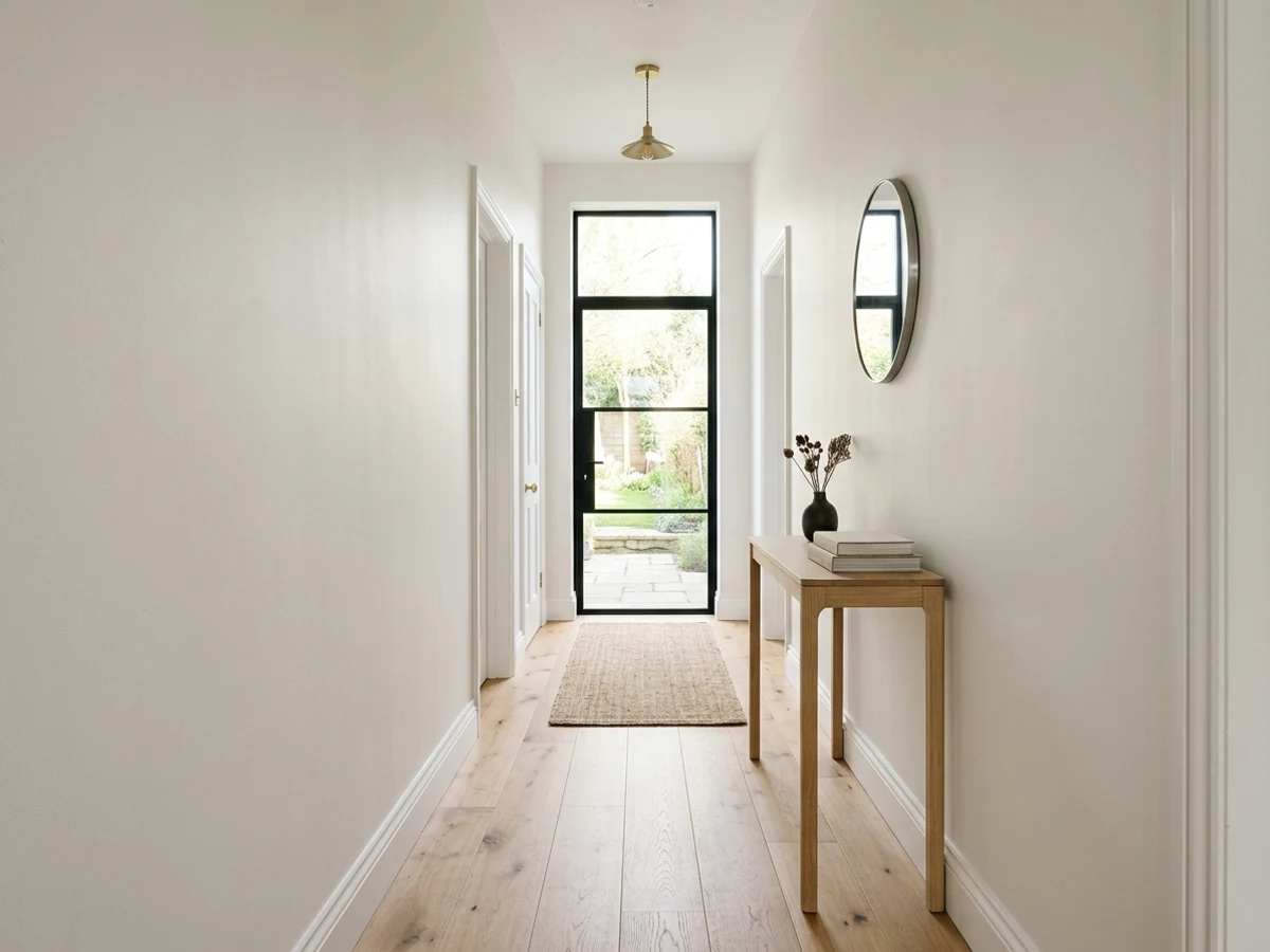
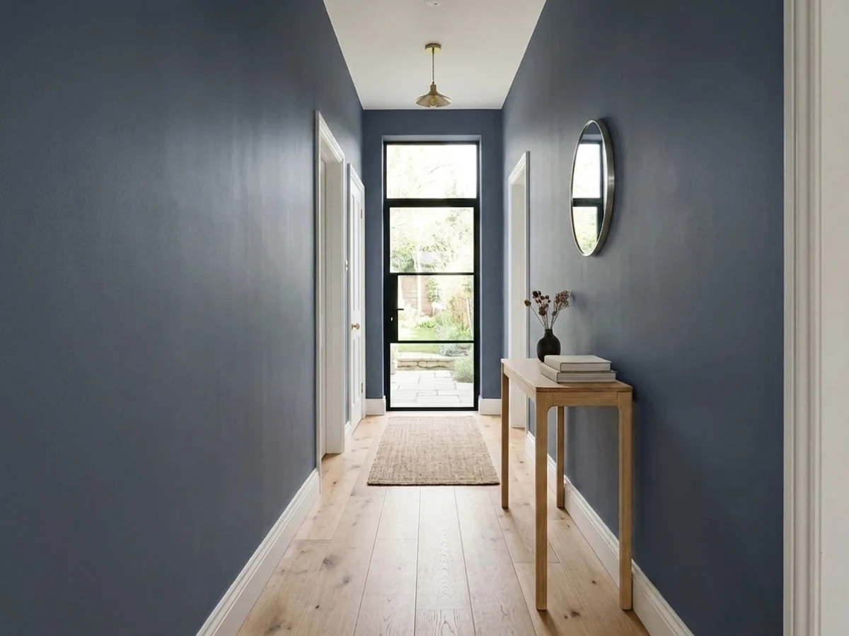
Room Colors · Blue Hallway
8 Best Blue Hallway Paint Colors for 2026
ideas, combinations, and real rooms
8 curated picks from real blue hallways — with the exact colors, honest reasons why, and the combinations that hold the room together.

Former interior stylist who can spot a green undertone from across a room. Jessica writes the color and mood pieces — what to choose, what pairs, and why your "white" looks pink.
The Fast Answer
Don't want to read 8 picks? These four are the safe answers.

Top Picks for the Blue Hallway
Tap a shade to see the blue hallway in it, then try it on your own room.
It creates a classic, welcoming entryway that instantly makes your home feel cozy.
Blue Hallway Color Trends 2026 — What's In, What's Out
- Pale Powder Blue Walls — Soft, baby-blue hallway walls read dated and nursery-like next to 2026's deeper, more saturated blue choices.
- Blue Paired With Cool Gray Trim — Matching blue walls with cool gray trim creates a flat, monochrome look that feels stuck in the last decade.
- Single Blue Accent Wall — One blue wall at the end of a hallway with white everywhere else looks half-finished compared with fully committed, color-drenched schemes.
The 8 Best Blue Hallway Paint Colors
Every pick below is a real rendered blue hallway, not a chip. The lead color first; the swatches are the full scheme in the photo — walls, furniture, textiles, accent.

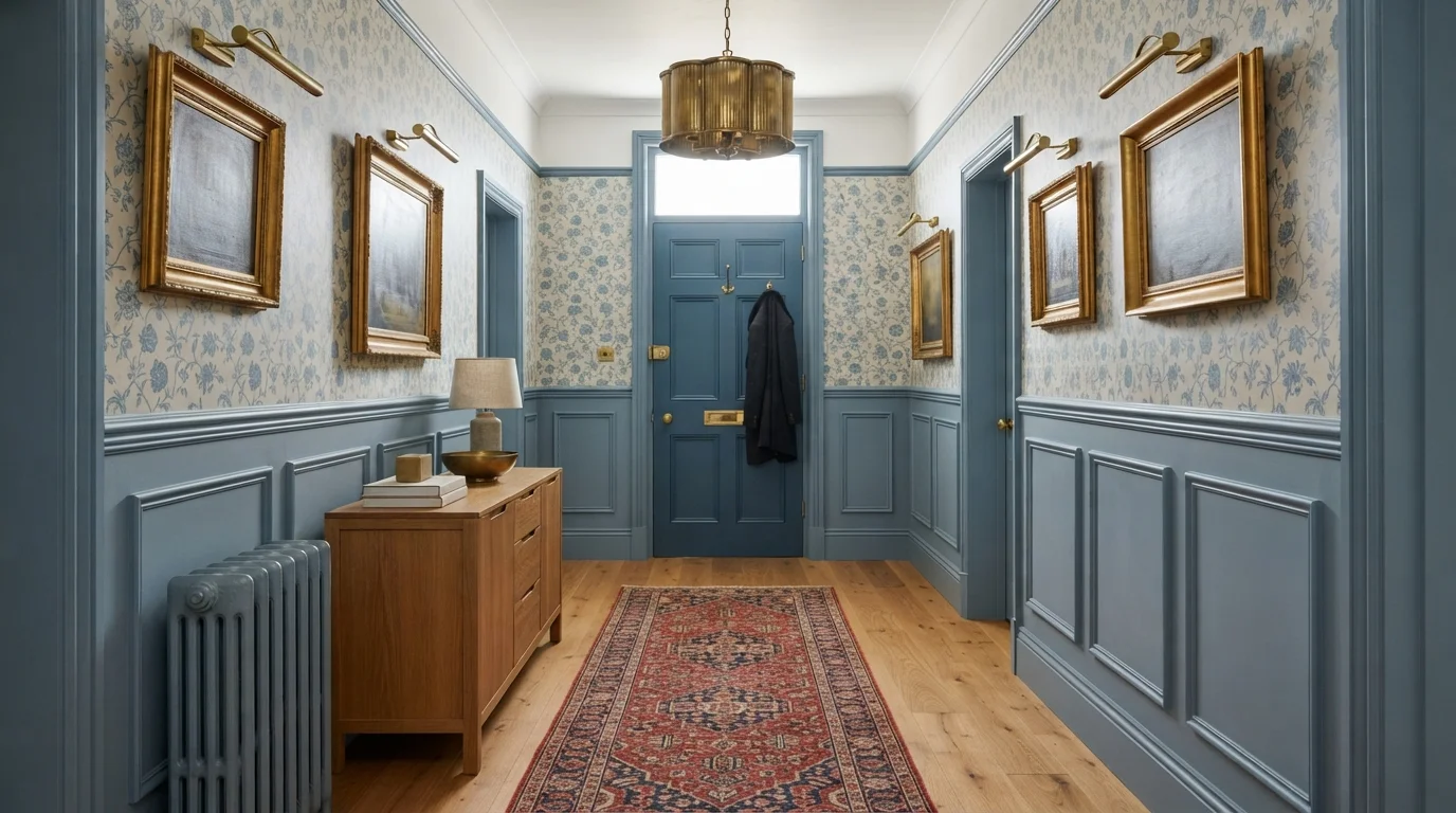
A gentle heritage blue wraps this vintage hallway in historic warmth, soft floral pattern, and timeless cottage elegance.
Soft cornflower is a gentle, vintage-inspired medium blue with peaceful charm. In this entry hall, the color blankets the lower wall paneling, interior door, radiator, and ceiling molding, sitting gracefully alongside dainty floral wallpaper, warm oak flooring, and an antique wooden cabinet. The space feels instantly cozy, welcoming, and rooted in tradition. The cool blue pairs effortlessly with honey wood tones and warm brass frames, keeping the narrow corridor bright rather than stiff. It is made for lovers of classic English country style.
SEE SPORTY BLUE ON YOUR WALLS →
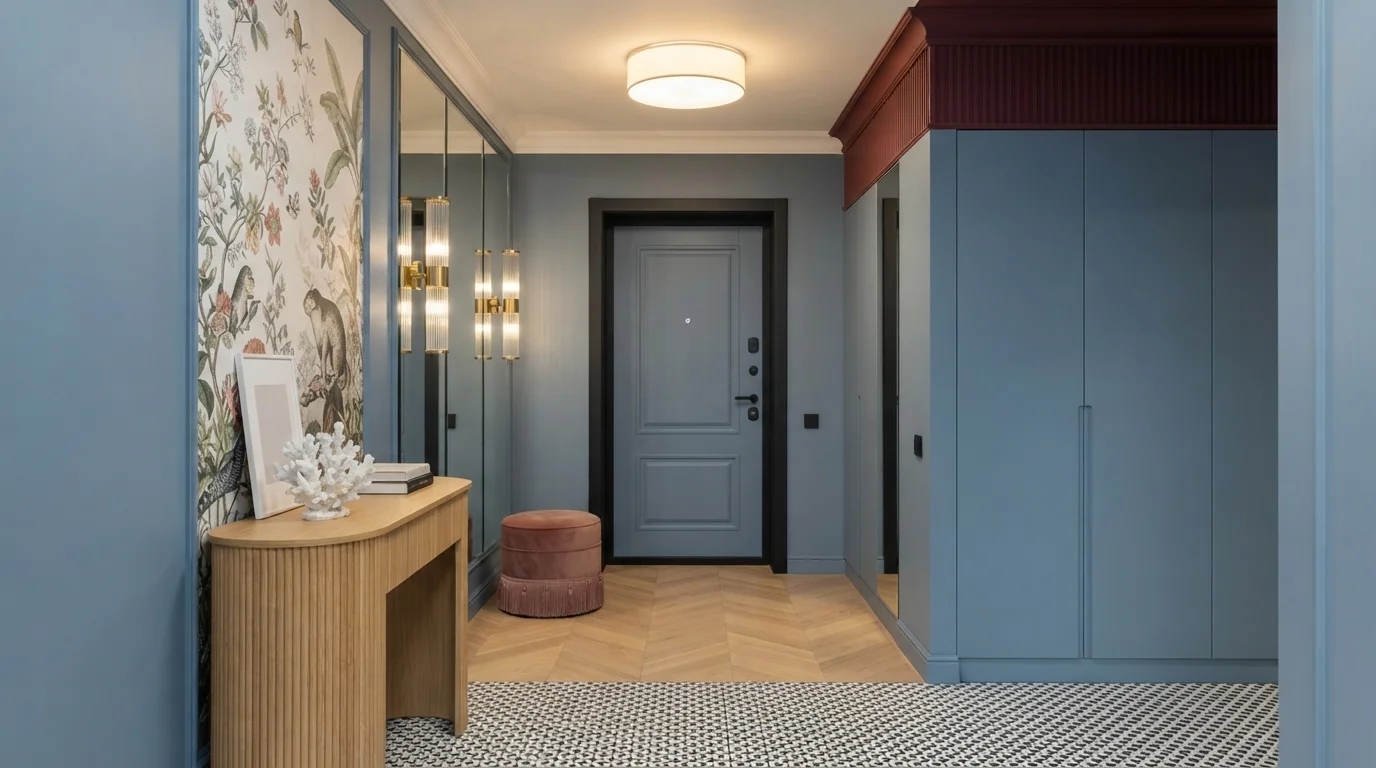
Rich burgundy ceilings and muted slate blue walls create a dramatic, deeply welcoming entrance to your home.
Slate blue is a calm, dusty medium blue with a classic feel. In this foyer, muted slate covers the walls, custom closets, and front door, topped with a bold burgundy ceiling and paired with a warm cream side wall. The space feels richly tailored, inviting, and wonderfully snug. The pairing works because the deep, warm wine ceiling anchors the height while balancing the cool stillness of the blue walls. It is a fantastic choice for anyone wanting an entryway with striking character and polished charm.
SEE GREEK BLUE ON YOUR WALLS →
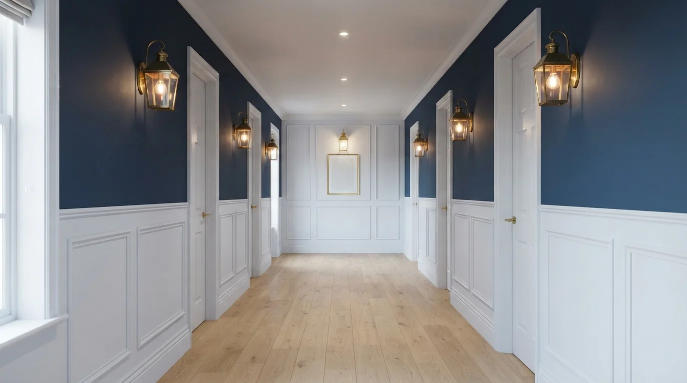
Deep midnight blue walls and crisp white paneling pair with warm brass lanterns for a timeless, stately arrival.
Navy blue is a rich, moody dark blue with classic charm. In this hallway, deep navy covers the upper walls, while bright white wainscoting and door frames anchor the lower half. The space feels dramatic and sophisticated without being too dark. The high-contrast pairing works effortlessly because the crisp white panels and warm lantern light keep the rich blue from feeling heavy. It is a fantastic choice for anyone wanting to turn a plain passageway into a grand design statement.
SEE NOCTURNAL SEA ON YOUR WALLS →
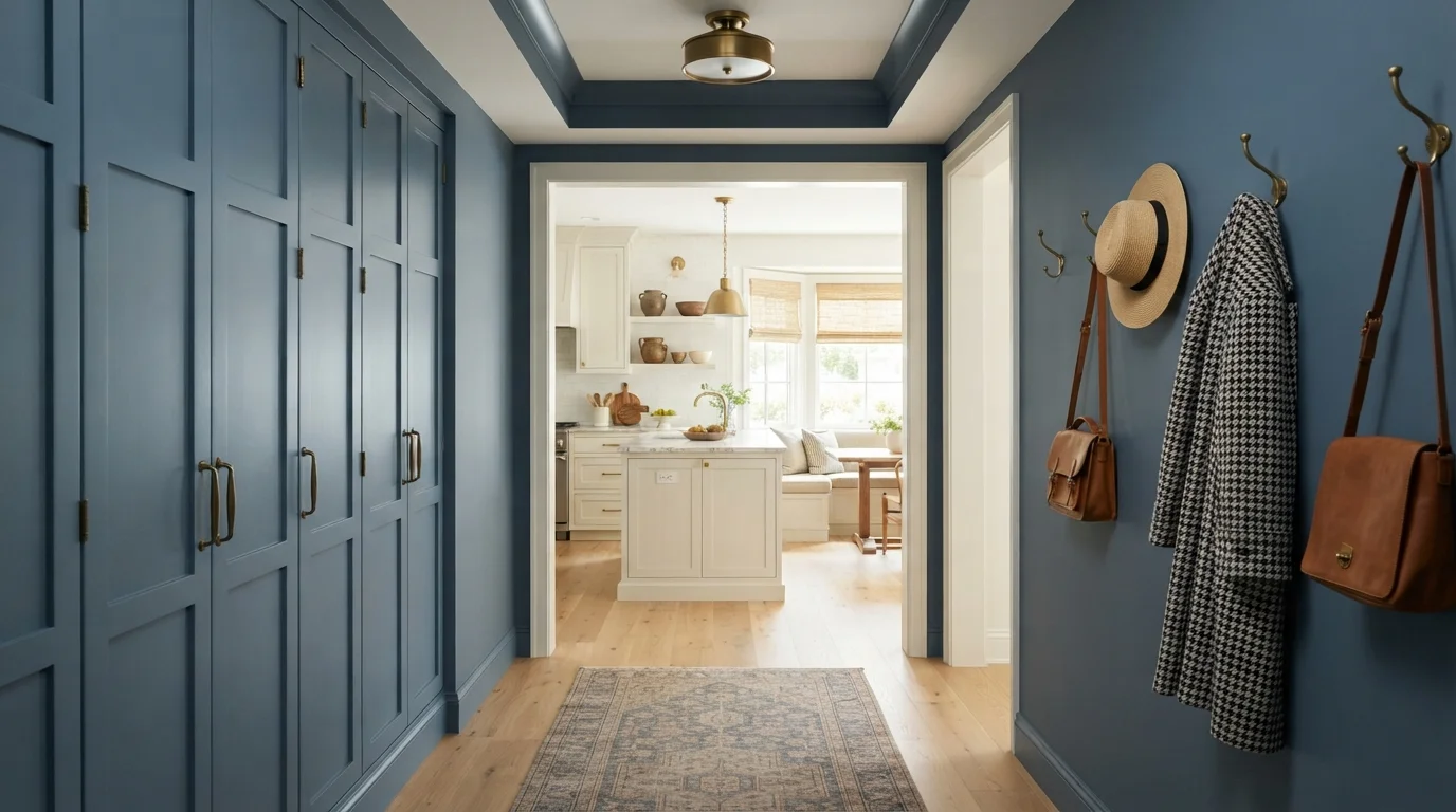
Rich slate blue envelops every surface of this stylish corridor, framing a sunlit glimpse into the warm kitchen beyond.
Slate blue is a classic, medium-toned blue with soft gray undertones. In this space, the deep color completely wraps the walls, trim, ceiling, and built-in shaker cabinets, paired with vintage runner rugs and warm brass accents. The hallway feels cozy, quiet, and wonderfully tailored. Painting every single surface the same shade works because it blurs the boundaries of a small pass-through and makes the bright room ahead feel extra airy. It is ideal for anyone looking to turn an ordinary corridor into a memorable moment.
SEE IT ON YOUR WALLS →
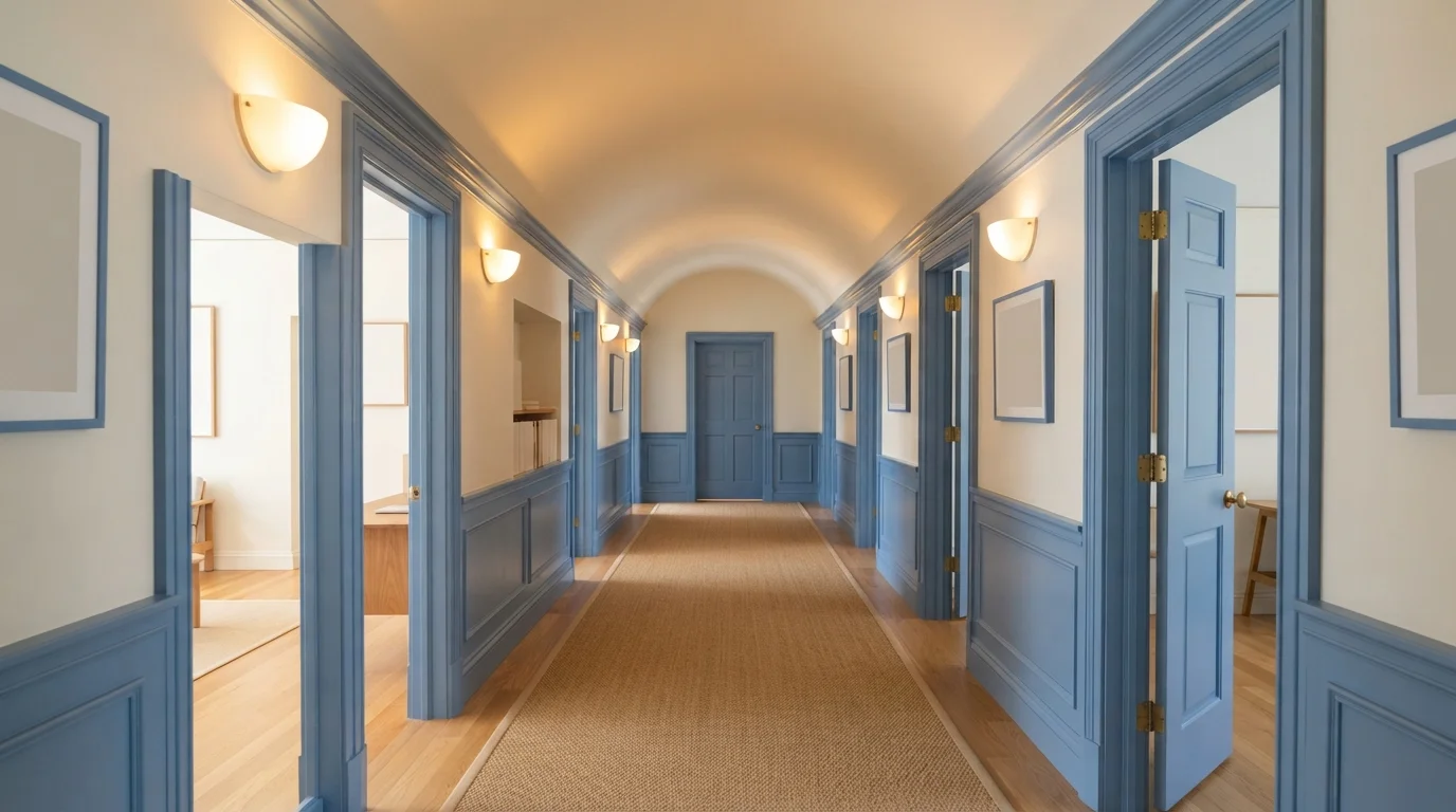
Slate blue wainscoting and creamy arched ceilings create an elegant, grounded passageway bathed in soft, warm light.
Slate blue is a soft, dusty blue with gentle gray notes. In this hallway, that soothing blue coats the paneled wainscoting, chunky door trims, and paneled interior doors, while soft cream warms the upper walls and curved ceiling. The space feels historic, calm, and unexpectedly inviting. Splitting the walls with a darker color on the bottom adds structure while keeping the high ceiling feeling light and open. It is a fantastic choice for anyone looking to give a simple corridor timeless character.
SEE PURITY ON YOUR WALLS →
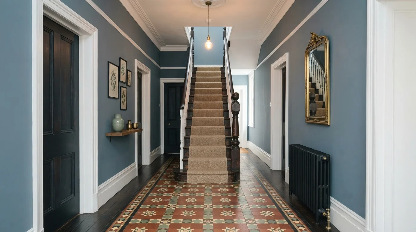
Dusty slate walls create a grounded, elegant welcome alongside ornate geometric floor tiles and warm wood accents.
Slate blue is a calm, muted blue with a gentle touch of gray. In this entryway, slate blue covers the walls, beautifully framing the crisp white trim, rich wooden doors, and ornate geometric floor tiles. The space feels grounded, orderly, and wonderfully inviting the moment you walk through the door. This combination works because the cool wall tone allows the warm terracotta tiles and dark wood grains to pop without overwhelming the narrow space. It is a fantastic look for anyone wanting timeless, heritage-inspired charm.
SEE CANYON BLUE ON YOUR WALLS →
Deep slate blue wraps this entryway in cozy elegance, beautifully balanced by warm honey oak floors.
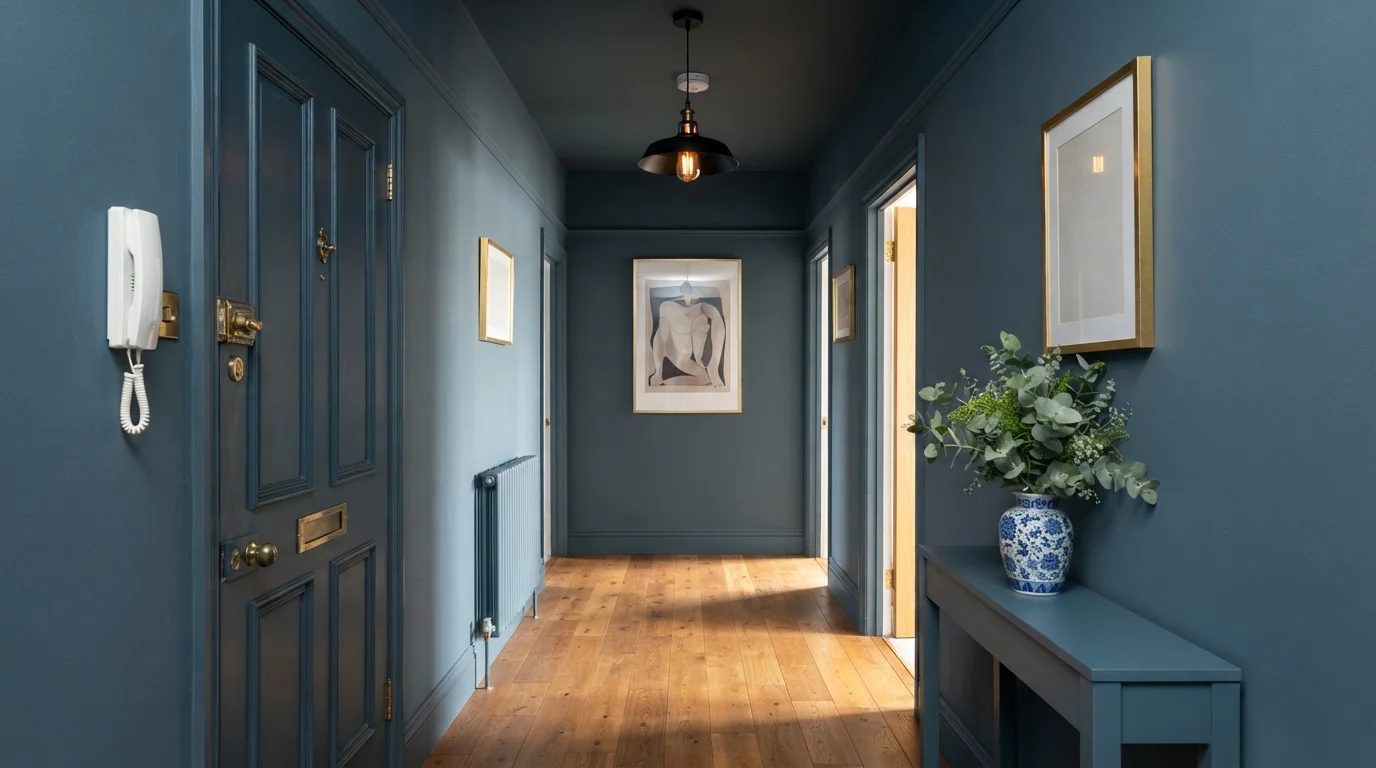
Slate blue is a deep, smoky blue with a calm and grounded feel. Here, the walls, ceiling, baseboards, and paneled front door are drenched in the same rich blue shade, paired with warm natural oak floorboards and framed gallery art. The hallway feels wrapped, snug, and dramatic the moment you step inside. The deep blue makes the honey wood floors and gold picture frames instantly glow. It is perfect for anyone wanting a bold, moody entrance that leaves a lasting impression.
SEE CALLIGRAPHY ON YOUR WALLS →
A serene slate blue corridor glows under warm globe lights, creating a gracious and grounded transition through the home.
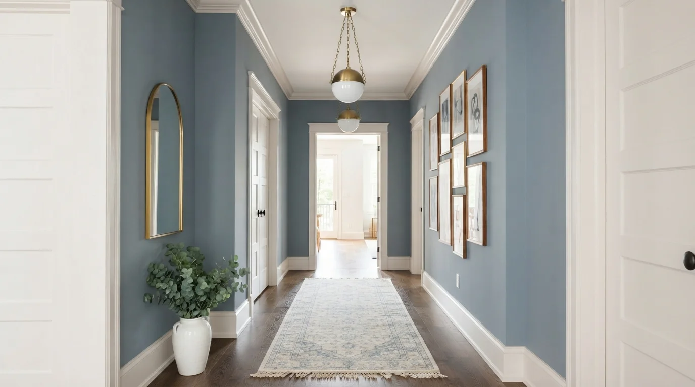
Dusty slate is a calming blue-gray that brings tailored charm to any space. In this hallway, cool blue walls frame a detailed cream runner rug, crisp off-white molding, and glowing brass globe lights overhead. The space feels instantly composed, quiet, and welcoming. The combo works because the cool blue walls make the warm wood floors and creamy trim pop with clean definition. It is a fantastic choice for anyone wanting a connecting space that feels like a polished art gallery.
SEE ROYAL GRAY ON YOUR WALLS →Blue Hallway Wall Color Combinations
A wall color never works alone. These are the full schemes from the rooms above — the lead color first, then the supporting colors that make the photo work.
A gentle heritage blue wraps this vintage hallway in historic warmth, soft floral pattern, and timeless cottage elegance.
TRY THIS PALETTE →Rich burgundy ceilings and muted slate blue walls create a dramatic, deeply welcoming entrance to your home.
TRY THIS PALETTE →Deep midnight blue walls and crisp white paneling pair with warm brass lanterns for a timeless, stately arrival.
TRY THIS PALETTE →Rich slate blue envelops every surface of this stylish corridor, framing a sunlit glimpse into the warm kitchen beyond.
TRY THIS PALETTE →Because a hallway is narrow and often windowless on at least one side, the trim decision matters as much as the wall color. Crisp white trim in semi-gloss gives Encore or Time's Current a hard edge that keeps the run from feeling like one dark tunnel — paint the door the same wall color instead of white, since a white door on a dark wall chops up an already-tight sightline. For Dragonfly, whose undertone is grayer and softer, a warm white or light greige trim reads more cohesive than stark white, since bright white can make the lavender cast look muddy by comparison.
Wood pairs better than any other accent here. Light or honeyed floors and stair treads keep any of the four from feeling like a cave — PPG specifically recommends honeyed wood alongside Dragonfly for this reason, and the same logic holds for Nightlife and Time's Current. Brass or warm-toned hardware and sconces pick up the warmth in the wood and keep the hallway from going cold, which is the real risk with deep blue in a space that gets brief, passing light rather than long daylight exposure.
More Hallway Color Ideas
Set on a color family already? Each page has its own real rooms and picks.
Light or Dark Blue Hallway Colors?
Go Light (LRV 60+) If…
The room is small, faces north, or has to work at every hour. Light warm colors make it feel bigger and stay calm in evening light — the light you actually live in.
Go Dark (LRV Under 20) If…
You want the cocoon effect and the room has real daylight. Dark works best on one feature wall — or fully color-drenched in a large room with good windows.
Here's the honest tradeoff: an LRV of 5 or 6 bounces almost no light back into a room, so these four picks need a hallway that already has some — a front door with sidelights, a run that opens into two lit rooms, a skylight, or at minimum overhead fixtures doing real work. Painted in a genuinely windowless, single-bulb hallway, any of them can read flat and dingy rather than rich, because there's nothing for the color to reflect. If that's your hallway, a lighter, paler blue (powder or slate blue territory, LRV 40+) will do more for the space than these four will.
If your hallway does get decent light, go by mood rather than by LRV — the four picks are close enough in depth that the number won't decide it for you. Nightlife suits a front entry that should feel like an arrival. Encore's clean cobalt works where you want blue to read as blue, not as a near-black. Dragonfly's lavender undertone is the one to reach for if you want deep without full drama, especially next to warm wood tones. Time's Current is the pick for a hallway that connects to other navy- or charcoal-heavy rooms and needs to match that weight.
See It. Love It.
Paint It.
Upload one photo of your blue hallway and try every color on this page on your own walls — in your own light, before you buy a drop of paint.

Hale NavyBeforeSheen And Finish For A Blue Hallway
Hallways take more hand contact and passing traffic than almost any other room, so finish matters more than in a bedroom. Satin or eggshell is the right call for the walls — both hold up to scuffs and wipe clean, and satin in particular reflects a bit more light than flat, which helps offset the low LRV on Time's Current, Encore, and Dragonfly.
Trim and doors should step up to semi-gloss. Against a wall this dark, semi-gloss trim isn't just about durability — it's what makes the trim line read as a deliberate edge instead of disappearing into the wall. Skip flat or matte on the walls in this room; on a color this saturated, matte will look chalky under hallway lighting rather than moody.
Mistakes To Avoid With Deep Blue In A Hallway
The biggest one is committing to a near-black blue in a hallway that has no real light source and only one overhead fixture. All four picks here read dull and gray rather than rich under those conditions — the color needs something to bounce off, and a single bulb isn't enough. Fix the lighting first, or size down to a lighter blue.
The second mistake is stopping the color at a chair rail or painting only one wall in a narrow hall. Split treatments tend to make a tight space look choppier, not bigger — wrapping the full run in one of these four, trim included, reads as one confident decision instead of an unfinished one. Also test the actual sample on the actual wall: LED bulbs above 3500K will pull Dragonfly's lavender cast toward gray-purple, and warmer 2700K bulbs will push Encore and Time's Current closer to black than they look on the chip.
Where Each Pick Works Best
Nightlife suits a front entry hallway — the one guests see first — where a moody, near-black wall is meant to feel like an arrival rather than a passage. Encore's cleaner cobalt works well on a stairwell wrap or a second-floor hallway that gets skylight or landing-window light, since its truer blue needs that light to avoid reading flat.
Dragonfly is the one to reach for in a hallway near a mudroom or laundry area, where a softer, dustier deep blue feels intentional rather than severe. Time's Current fits a hallway that connects rooms already painted in charcoal or navy, since its near-black navy-teal reads as a continuation of that palette rather than a new color introduced mid-house.
About Blue Hallway Paint Colors
Every color on this page runs deep. Time's Current (Valspar, LRV 5), Encore (Valspar, LRV 6), and Dragonfly (PPG / Glidden, LRV 6) all sit in the same near-black band, and Nightlife (Portola Paints) reads just as inky in person. That's not an accident for a hallway. A hall is a space you pass through, not one you sit in for an hour under one lamp — so a saturated blue reads as drama during the walk-through instead of gloom, the way it might in a room where you're staring at the same wall all evening.
The four picks split by undertone more than by depth. Encore (#0f456e) is a crisp, saturated cobalt — Valspar's 2025 Color of the Year, and the cleanest, most true-blue of the group. Time's Current (#20415C) leans toward navy-teal, almost black in low light. Dragonfly (#314A76) is the softest of the four on paper, a twilight blue with a lavender-gray cast that PPG itself calls "dark and subdued" — it's muted rather than gentle, closer to dusk than daytime sky. Nightlife is Portola's moodiest pick, built for an entrance that wants to feel like an event.
All four mix on demand — Valspar at Lowe's, Glidden/PPG at their retail counters, Portola through its dealer network — so this is a paint-this-weekend decision, not a special-order one. The main thing to plan around is light, which the next section covers.
The Questions Everyone Asks
What color should I paint my blue hallway?
If you want one answer, start with the safe picks above — Sporty Blue, Greek Blue, Nocturnal Sea, Flattering Blue. They read well in any light and survive furniture changes. Then check the light: strong afternoon sun wants a step cooler, a north-facing room wants a step warmer.
is dark blue too dark for a hallway with no windows?
Usually, yes. Time's Current, Encore, and Dragonfly all sit at an LRV of 5 or 6, which means they reflect almost no light back — fine in a hallway with a lit room at each end, but flat and dingy in one lit by a single bulb with no windows. If your hallway is genuinely dark, a paler blue (LRV 40 or higher) will do more for the space than any of these four.
should i paint a narrow hallway ceiling the same blue?
It depends on what you're solving for. Wrapping the ceiling in Nightlife or Encore blurs the corners and makes a narrow hall feel like one enclosed, cohesive space rather than a tube with a white lid — good if the hallway already feels tight. If the ceiling is low, keep it white or a very pale tint instead; the contrast reads as height.
what trim color goes with a blue hallway?
Crisp white semi-gloss is the safe, high-contrast choice for Encore or Time's Current, since both have clean, saturated undertones that read well against true white. Dragonfly's lavender-gray cast looks better with a warm white or light greige trim — stark white can make its undertone look muddy by comparison. Paint doors the wall color, not the trim color, so the hallway doesn't feel chopped up.
what wood tone pairs with a blue hallway?
Light to honeyed wood tones — oak, ash, or a mid-brown stair tread — pair best with all four picks. PPG specifically recommends honeyed woods alongside Dragonfly, and the same logic carries to Nightlife and Time's Current: warm wood keeps a near-black blue from feeling cold or cave-like in a space that only gets brief, passing light.
is a blue hallway a bad idea for resale?
Not if it's done as a wrapped, intentional look rather than a leftover accent wall. Deep blue hallways photograph well and read as a designed choice in listing photos, especially entry halls painted in something like Nightlife. The risk isn't the color — it's a poorly lit hallway that makes any dark shade look neglected rather than deliberate.
What two-color combination works best in a blue hallway?
The reliable pattern is a quiet main color plus one deep accent on a single wall. Keep trim and ceiling in one warm white so the two colors are the only event in the room — the combination cards above show complete schemes from real rooms.
What colors make a blue hallway look bigger?
High-LRV, slightly warm colors — LRV 60–75 is the sweet spot. Paint the walls and trim close to the same light color so the corners blur, and keep the ceiling white. Stark cool white actually works against you; it creates hard shadows that show the room's edges.


Ask a Question