Stiffkey Blue
The inky blue-gray every 'better than Down Pipe' front-door list points to, reviewed honestly: the light where it reads true blue, the light where it goes flat black, and the finish mistake that ruins a hallway.

Jessica has spec'd whites and neutrals for more than 300 rooms and keeps a sample wall of painted drawdowns in her studio. Every color review is checked against real reader rooms in the comments and re-tested when a formula changes. About the testing process →
- 1Naval4
- 2Stiffkey Blue10
- 3Smoky Blue15
- 4Wolf Gray21
The Fast Verdict
Stiffkey Blue is a blue-gray so deep it flirts with black — and which one you get depends entirely on your light. In a bright room or full sun it reads as a genuine, confident blue, one of the few near-black colors that doesn't feel like a compromise for people who wanted color, not just dark. In anything dimmer it slides toward near-black and mostly stops reading as blue. Named for the blue-gray mud of a Norfolk salt marsh, it's the color most design blogs reach for when Hague Blue feels too green and Down Pipe feels too plain gray.
Front doors and exteriors with real daylight · kitchen islands and cabinetry, not full walls · powder rooms and small foyers · bedrooms and dens you actually use with lamps on · anyone who wants moody without buying a true black
Your room is dim or north-facing and you want it to read as blue, not black · you're painting a high-traffic hallway or mudroom in a matte, chalky finish · your budget has no room for three or four coats of premium paint · you want a color that looks identical all day
- A genuine deep blue-gray that reads as color, not just 'another navy'
- The go-to alternative to plain black or gray for front doors
- Pairs effortlessly with brass, warm whites, and warm wood
- Holds its color in bright light without going washed out or pastel
- Small, well-lit rooms take its full LRV 10 depth beautifully
- In dim rooms it reads closer to black than blue — wanted blue, got black
- The signature chalky Estate Emulsion finish scuffs and marks easily
- Needs three to four coats over a lighter existing wall color
- Premium Farrow & Ball pricing on top of the extra coats
What Color Is Stiffkey Blue, Really?
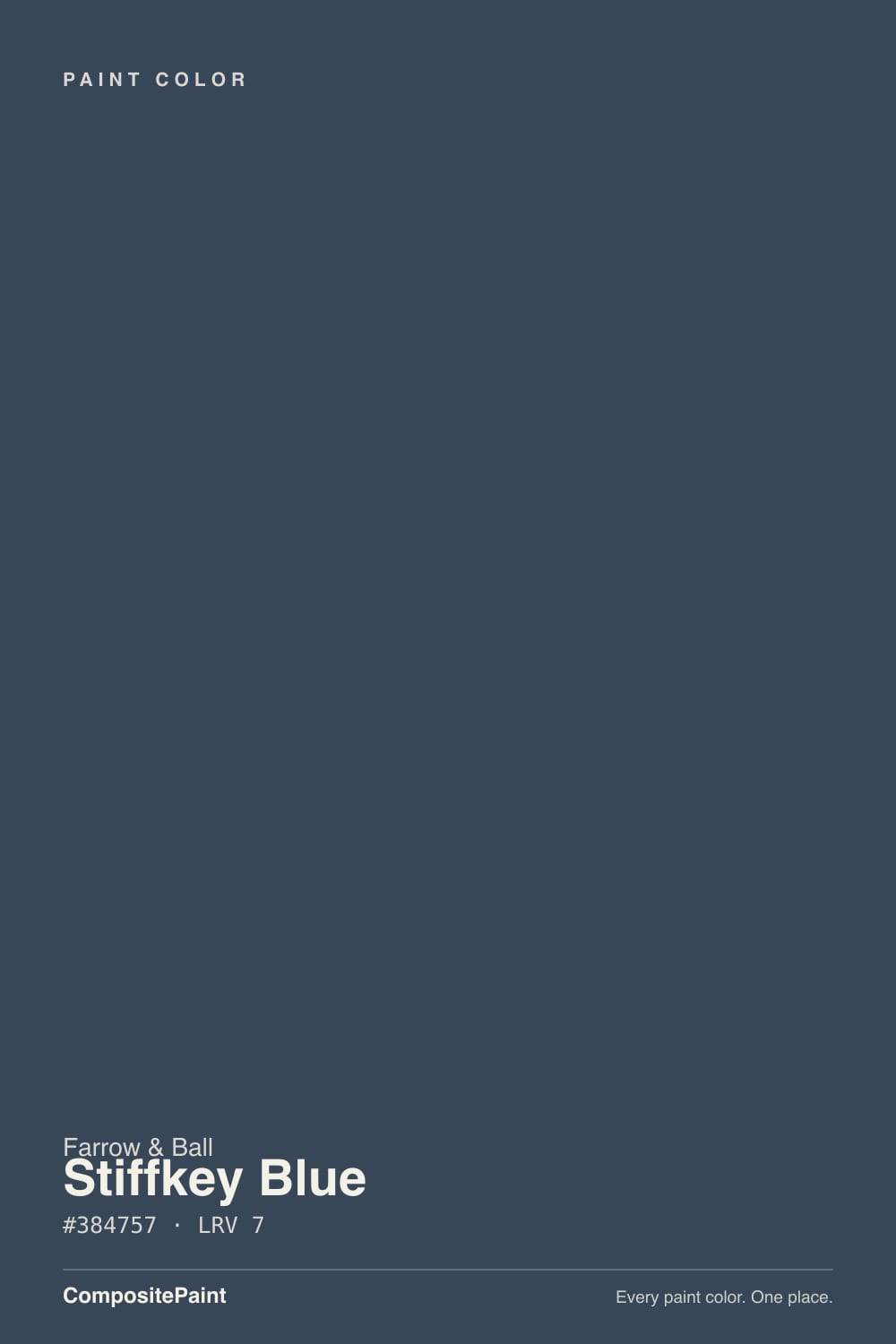
Stiffkey Blue takes its name from Stiffkey (locally pronounced 'Stewkey'), a salt-marsh village on the North Norfolk coast in England, where the tidal mud runs this exact blue-gray at low tide. It's a genuinely blue-leaning dark, cooler and truer to blue than its two more famous Farrow & Ball stablemates: Hague Blue drifts green-teal and can read almost khaki in warm light, while Down Pipe is a lead gray with only a hint of blue in it. Of the three, Stiffkey Blue is the one that actually commits to being blue.
At a deck LRV of 10 it sits in near-black territory on paper, and in a dim room it behaves like it — corners and shadowed walls read as a flat charcoal with no obvious hue at all. Farrow & Ball's own guidance on the color is that it 'will appear much bluer' in well-lit areas, which is really the whole review in one sentence: give it real light and the blue asserts itself; starve it of light and you've bought an expensive near-black.
Undertone in one line: cool blue first, gray second — never green, never purple. If your sample reads as flat charcoal instead of blue, that is your light talking, not a bad batch; move the card to the brightest wall in the room, or check it against south or west sun, before deciding it isn't blue enough.
Where It Shines
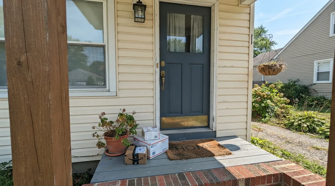
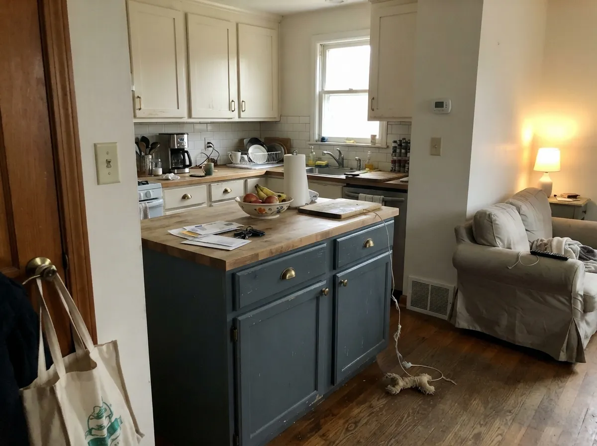
Give it a bright window, a glossy front door catching full sun, or a small room lit by a real overhead fixture, and Stiffkey Blue is genuinely one of the better dark blues on the market — deep enough to feel dramatic, blue enough to avoid reading as a flat near-black. Its signature job is the front door: painted in Exterior Eggshell against a white or cream house, it has become the default answer whenever someone wants a blue door that isn't the obvious navy everyone else picked. Its second home is small, well-lit rooms — powder rooms, foyers, a kitchen island under can lights — where the depth reads as intentional rather than gloomy.
Where It Fails
Almost every regret story about Stiffkey Blue comes from one of three predictable mismatches — a light problem, a finish problem, or a budget surprise. None of them are unique to this color, but its extreme depth (LRV 10) makes all three land harder than they would on a lighter paint.
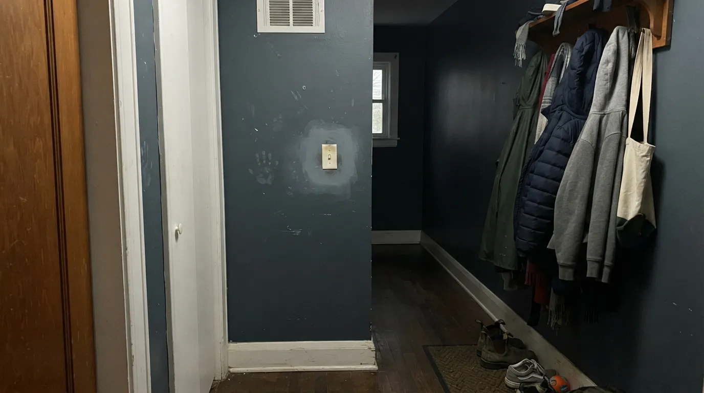
Farrow & Ball's signature Estate Emulsion is a genuinely beautiful, ultra-matte finish — and it marks and scuffs easily, and it isn't washable. On a low-traffic bedroom wall that's fine. On a hallway, mudroom, or anywhere hands and bags brush past, it shows every mark within weeks. For those rooms, ask for Modern Emulsion or Modern Eggshell instead — more sheen, real washability, the same color.
This is the single most common surprise: the same can reads as a rich, obvious blue by a bright window and as a near-black in the far corner of the same room. That's not a bad batch — LRV 10 colors are dramatic about light by nature, and Farrow & Ball says as much on its own site. If you need the color to look the same everywhere in the room, this depth of blue is not the right pick.
Dark, saturated colors going over a lighter existing wall routinely need three to four coats to go on even. Farrow & Ball's paint also carries a real premium over big-box brands. Buy a tester pot first, prime with a tinted primer if you're covering something light, and budget the extra coat and the extra can before you start, not after.
Room by Room
In full or partial sun it reads as a confident, unmistakable blue against white, cream, or brick. Use Exterior Eggshell, not the interior matte finishes — it needs the weather resistance, and the slight sheen actually helps the blue read true instead of flat.
On lower cabinets or an island under a warm white upper cabinet, with brass hardware, it's one of the most-copied kitchen looks going. Use Modern Eggshell or Modern Emulsion for durability; the chalky Estate finish will not survive a kitchen.
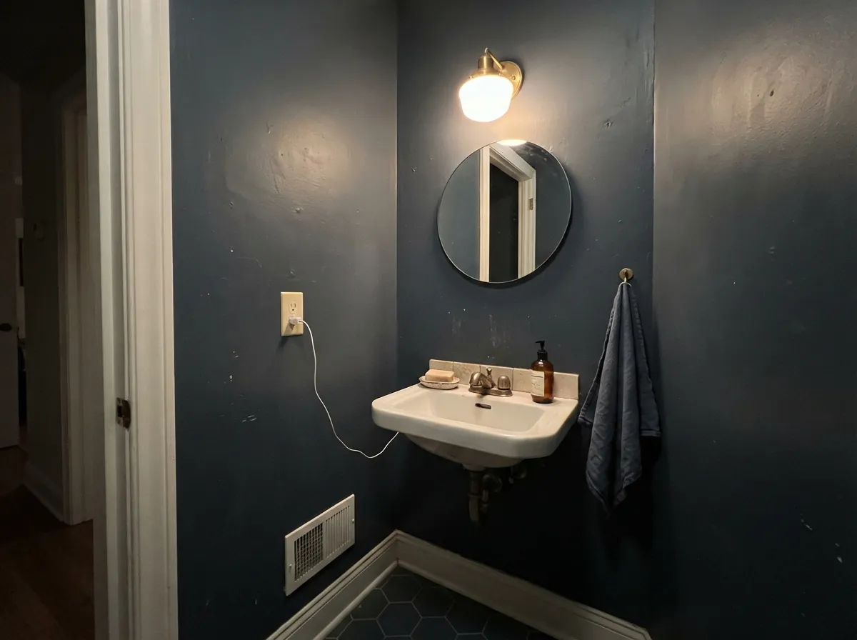
Powder rooms are usually windowless or nearly so, which means Stiffkey Blue will likely read close to black here — and that's usually the point. Drench all four walls for a jewel-box effect; add a sconce with a warm bulb so it doesn't go completely flat.
Under warm 2700K lamplight at night it goes properly velvety and dark; by day it needs a real window to keep the blue instead of sliding to charcoal. Pair with a warm white trim so the room doesn't feel like a cave.
With leather, walnut, and brass it reads considered and expensive rather than gloomy. It rewards a room you actually sit in under a lamp, not one you just walk through.
Against a white, cream, or pale gray house it's a classic, restrained accent. Against a dark body color the contrast disappears and there's no reason left to use it.
Your Light Is the Risk
A sunny window or full sun on a front door pulls out its truest, richest blue. This is the light the color needs to make its case.
With little window light it drops toward near-black and loses the blue almost entirely. Fine if that's the look you want; disappointing if you paid for blue.
Steel-gray at dawn, a clear confident blue at midday in good light, near-ink by evening. The swing is bigger than most colors — sample it at more than one time of day.
2700K lamps deepen it toward a charcoal-navy, cozy but darker. Cool white LEDs keep it truer to blue but flatter and starker.
Most complaints about Stiffkey Blue are a light mismatch. Upload a photo of your actual room and see it on your walls — then ask for the same wall in north light or evening lamps before you buy a single sample.
Need It From Another Brand?
Any paint counter can custom-tint Farrow & Ball No. 281 directly. If you would rather stay in one brand's own deck, these are the closest stock matches, measured as ΔE2000. Under 2 is a difference you will not see on the wall.
| Brand | Closest color | ΔE | LRV | |
|---|---|---|---|---|
| Sherwin-Williams | Mineral GraySW 2740 · Sherwin-Williams | 4.4 | 9 | Color page → |
| Behr | Harbour (marquee)QE-55 · Behr | 1.3 | 9 | Color page → |
| Benjamin Moore | Van Deusen BlueHC-156 · Benjamin Moore | 1.3 | 12 | Color page → |
| Valspar | Dark Night4003-4C · Valspar | 4.1 | 10.2 | Color page → |
| Glidden | Approaching Storm90BG 11/101 · Glidden | 1.3 | 11 | Color page → |
| Dutch Boy | Sailing Suzy336-6DB · Dutch Boy | 4.4 | 10 | Color page → |
Similar Farrow & Ball Colors
The nearest shades to Stiffkey Blue within Farrow & Ball's own range, ranked by perceptual color distance — useful when you want the same look a touch lighter, darker, or warmer.
WCAG 2.1: AA is 4.5 : 1 for normal text, 3 : 1 for large text, AAA is 7 : 1.
Stiffkey Blue vs the Colors You're Also Considering
Every Stiffkey Blue sample board has the same rivals on it. The numbers show the real lightness gap — then it comes down to which risk you would rather live with.
Pick this for the more straightforward blue — Hague Blue's teal can read almost khaki in some light, and Stiffkey doesn't carry that ambiguity.
Farrow & Ball No. 30 · LRV 6Hague BluePick this if you want more green-teal movement through the day — Hague Blue never sits still, though it also never goes as flatly near-black as Stiffkey can in a dim room.
Side-by-side comparison →Pick this when you want the color to commit to blue — Down Pipe stays a neutral gray in most light and never gets this dramatic.
Farrow & Ball No. 26 · LRV 11Down PipePick this if gray is actually the goal — Down Pipe is lighter (LRV 11) and reads as a lead gray with only a blue whisper, so it won't vanish into black the way Stiffkey can.
Pick this for the true blue-gray rather than blue-black — Naval reads noticeably more purple than Stiffkey does under lamplight.
Sherwin-Williams SW 6244 · LRV 4NavalPick this if you're not working with a Farrow & Ball painter — Naval is the closest big-box navy, a touch darker and more purple-leaning in warm light.
Pick this when you want real depth and drama — Van Deusen Blue is a soft slate next to Stiffkey's near-black punch.
Benjamin Moore HC-156 · LRV 11Van Deusen BluePick this for a lighter, easier-to-live-with version of the same idea — LRV 11 keeps it reading as blue even in dimmer rooms.
The closest rival is Hague Blue (No. 30), Farrow & Ball's flagship deep navy at a similar LRV of about 6. Hague Blue carries a touch more teal and green, so it feels a hair warmer and more aquatic, while Stiffkey Blue stays purer blue and slightly cooler. If you want the darkest, most classic navy, choose Hague Blue; if you want a cleaner blue that still reads dark, choose Stiffkey.
Railings (No. 31, LRV 6) and Off-Black (No. 57, LRV 6) are the alternatives when you want to lose almost all of the color. Railings is a blue-black that looks like soft charcoal, and Off-Black is a warmer near-black. Both read black far more readily than Stiffkey Blue, which keeps a visible blue note. Pick Stiffkey when you still want people to see blue, and pick Railings or Off-Black when you want the depth of black with only a whisper of undertone.
Stiffkey Blue Coordinating Colors
The pairing rule is simple: warm whites and warm neutrals do most of the work, because Stiffkey Blue is a genuinely cool color and needs something to keep the room from feeling cold. Brass hardware, walnut furniture, and cream fabrics do the same job in materials. These are the partners that show up again and again:
Where the Name Comes From, and Why It Beats Hague Blue and Down Pipe to the Front Door
Stiffkey is a real village on the North Norfolk coast, home to a tidal salt marsh whose exposed mud runs this exact blue-gray at low tide — the kind of specific, unglamorous source that Farrow & Ball's naming is known for. It isn't a recent trend color; it's sat in the deck for years as the more overtly blue option next to two darker, more famous stablemates.
That positioning is exactly why it keeps showing up in 'alternatives to Down Pipe' and 'better than Hague Blue' articles: Down Pipe is really a gray, and Hague Blue drifts teal-green in a lot of light, so anyone who wants a dark front door that reads unambiguously as blue tends to land on Stiffkey Blue instead. It has become something of a default answer for that specific brief, without ever needing a Color of the Year moment to get there.
Farrow & Ball Finishes: Picking the Right One for Stiffkey Blue
Farrow & Ball sells Stiffkey Blue in several finishes with names that mean nothing if you've only bought paint from a US big-box store, and picking the wrong one is a real, common mistake. Estate Emulsion is the brand's signature ultra-matte, chalky interior wall finish — beautiful depth of color, but it marks easily and isn't washable, so it belongs on low-traffic walls and ceilings, not hallways or kitchens. Modern Emulsion and Modern Eggshell add real washability and a touch of sheen for the rooms people actually touch: kitchens, hallways, kids' rooms, cabinetry.
For anything outside — the front door, exterior trim, shutters — use Exterior Eggshell, which is formulated for weather rather than wipeability. There is also a Dead Flat finish, an even more delicate, almost powdery matte used mostly by decorators on feature surfaces that see zero contact. Match the finish to how the surface actually gets used, not just to how it looks on the sample card, and most of Stiffkey Blue's durability complaints disappear.
Three Ready Palettes Built on Stiffkey Blue
A color is never alone on the wall. These are complete combinations in the 60-30-10 pattern, with the reason each one holds together. Every one opens in the visualizer.
Wevet is the warmest, softest white in the F&B lineup for a body color; All White trim keeps the edges crisp. With two whites doing the quiet work, the door gets to carry all the color and reads richly blue in daylight against both.
Try this palette in your roomAmmonite's warm greige walls give the kitchen a neutral backdrop so the blue island reads as the deliberate accent, not a clash; Wevet uppers keep the room from feeling closed in.
Try this palette in your roomElephant's Breath's warm greige trim softens the drama without going stark white; Card Room Green on a single built-in or door adds one more deep, considered color without competing for attention.
Try this palette in your roomStiffkey Blue FAQ
Is Stiffkey Blue blue or black?
Blue — but only when it gets real light. At LRV 10 it's genuinely dark, and in a dim or north-facing room it can read as a near-black with barely any hue. Farrow & Ball itself says it reads bluer in well-lit rooms; test your sample on the brightest wall you have before deciding it isn't blue enough.
Is it good for a front door?
One of the most popular blue front-door colors going, and for good reason — daylight brings out a genuine, confident blue against most house colors. Use Exterior Eggshell, not an interior finish; it needs the weather protection.
What sheen should I use on kitchen cabinets?
Modern Eggshell, not Estate Emulsion. The chalky matte Estate finish Farrow & Ball is known for scuffs and marks easily and isn't washable — fine for a bedroom wall, wrong for anything you touch daily. Modern Eggshell gives real washability in the same color.
How many coats does it take?
Plan on three to four coats over a lighter existing wall, even with a tinted primer first. Dark, saturated colors like this rarely cover in two — budget the extra can before you start, not after.
Stiffkey Blue, Hague Blue, or Down Pipe — which one?
Down Pipe if you want a gray that only hints at blue. Hague Blue if you want a teal-leaning dark that shifts color through the day. Stiffkey Blue if you want the one that actually commits to being blue, full stop.
Is Farrow & Ball worth the extra cost over a big-box match?
For the exact hue alone, not really — a color-matched formula from a mainstream brand gets close for a fraction of the price. What you're paying for is the pigment depth and the finish range, including the chalky Estate Emulsion look that has no exact big-box match. If the finish itself isn't the point, a matched navy will save real money.
Have you painted with Stiffkey Blue?
Rate it — one tap helps the next reader decide.
Ask a Question