Clare Blue All 4, sorted honestly.
Every blue in the Clare DTC deck: 4 colors, LRV 50 down to 11, grouped by undertone and depth.
All 4 Clare Blue Paint Colors
Every blue in the Clare DTC deck, LRV 50 down to 11. Grouped by undertone, warm to cool. Filter by depth or change the order.
Hex values are display approximations from Clare's published swatch tools, not a physical sample under controlled lighting. Order a brand-direct sample before specifying.
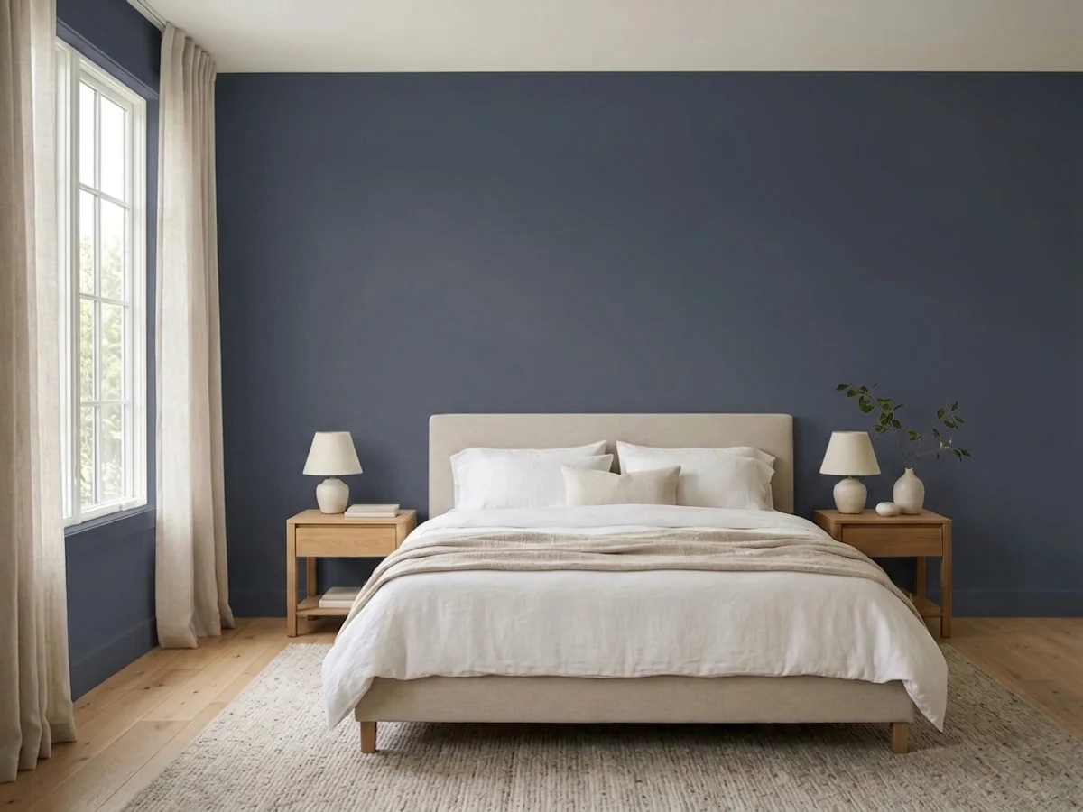
Upload a photo of the room. We paint it in the blue you chose with your light and your floor, and you can swap colors until one holds.
Clare is direct-to-consumer, so you buy everything at clare.com. You can order peel-and-stick swatches to try on your wall before you commit, then the paint ships in about one to two days. It runs $54 a gallon for walls or trim and $42 for ceiling or primer, and every color is zero-VOC and GREENGUARD Gold certified.
Because paint is mixed to order from a tint formula, you are not locked into one brand to get this look. If you find a blue you love on another US deck, any paint counter can mix a close match to that formula, and the reverse is true for matching Hyperlink elsewhere. The featured Kompozit deck can be cross-matched the same way by LRV and undertone, so use Hyperlink's depth (LRV 16, a deep saturated blue) as your reference point and ask for the nearest equivalent.
Light to Dark
The whole Clare blue range by depth. LRV is the number to trust: the same blue looks two steps darker on a wall than on a chip.
LRV stands for Light Reflectance Value. It runs from 0 (black) to 100 (pure white), and it tells you how light or dark a color will feel once it is on the wall. Hyperlink sits at 16, which is firmly in the dark end of the scale.
Dark blues like this drink up daylight, so the same wall can look richer in a bright room and almost inky in a dim one. If you want the deep look but worry about a room feeling closed in, test it on the wall that gets the most sun. The light will pull the color forward instead of letting it disappear.
Clare Blue, Room by Room
Each room page shows blue picks from every US brand side by side, so you can compare in context.
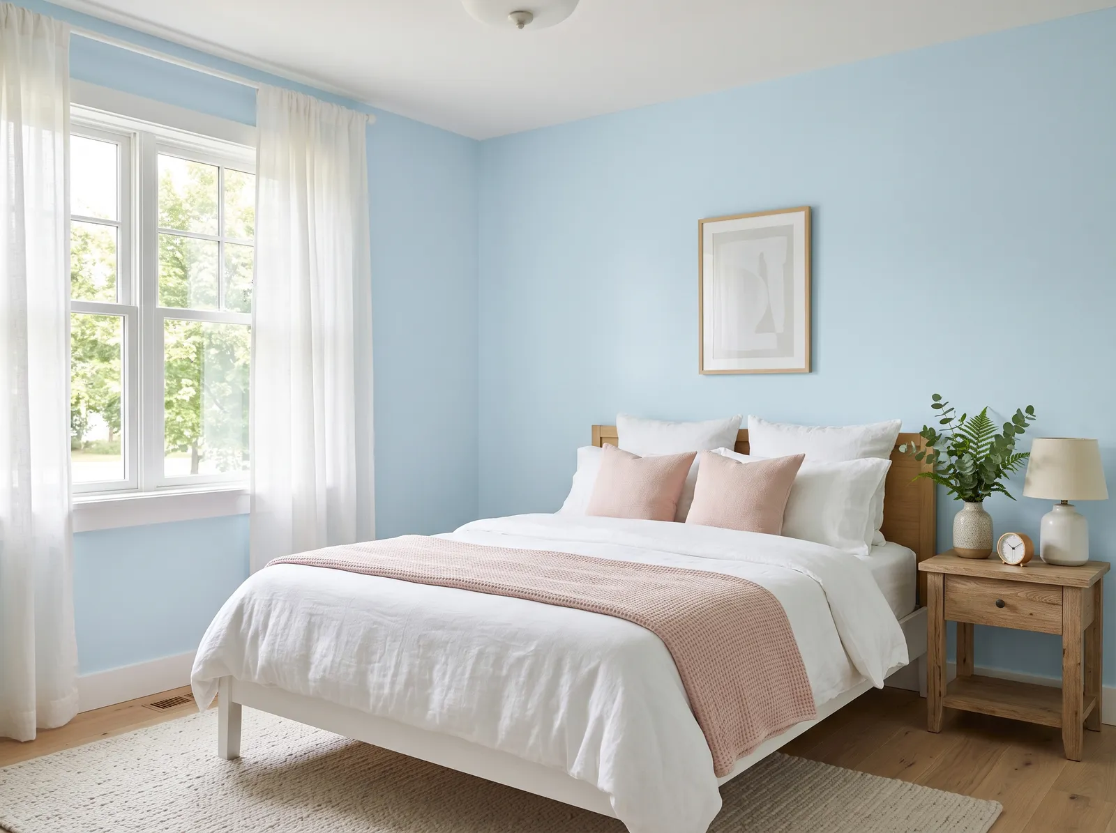
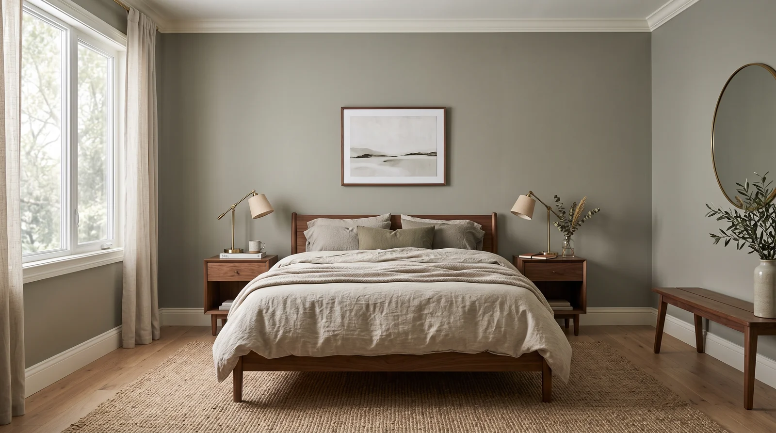
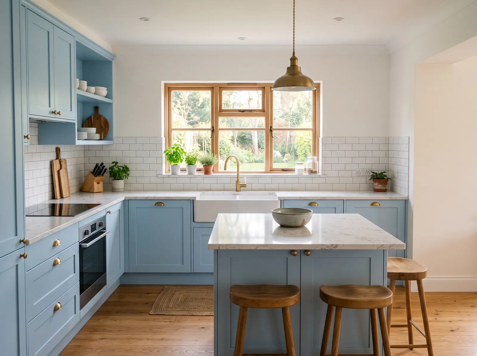
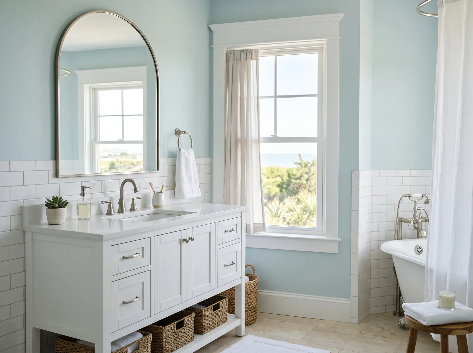
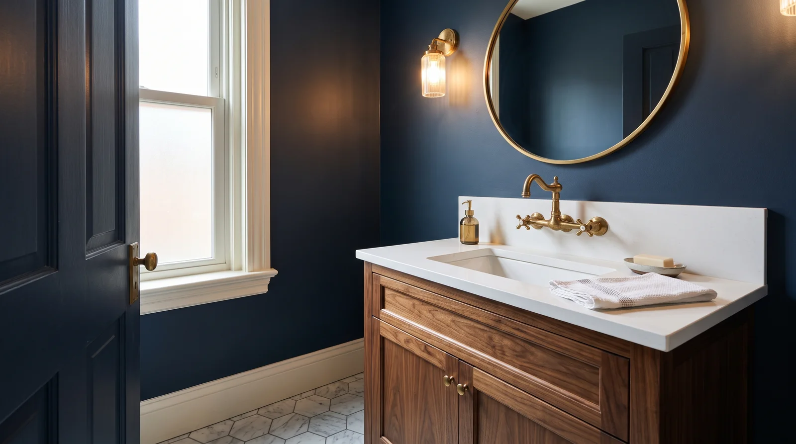
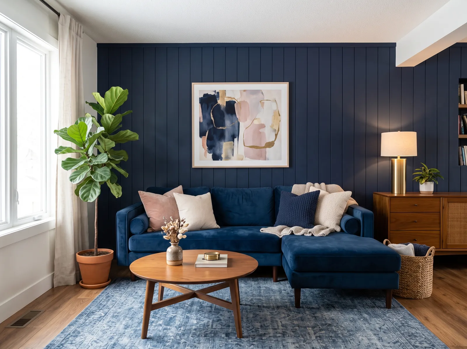
A blue at LRV 16 is made for rooms where you want mood and focus. Think a study, a powder room, a dining room, or a single accent wall behind a bed. In those spaces the depth feels cozy and deliberate rather than dark by accident.
It also works well on cabinets, a built-in bookcase, or an island, where a saturated blue adds weight without taking over a whole room. In a smaller space like a powder room, leaning all the way into the dark color often reads as confident, not cramped. Just give it good light or warm fixtures so the blue stays alive after sunset.
How Deep Each Blue Deck Goes
How many blue colors each brand carries, drawn with that deck's own blues from light to dark. Pick your store first, then the color. Every brand equal, no favorites.
More on Clare blue paint colors
Clare's Blue, in One Color
Clare keeps a tight deck, so its blue family is small on purpose. Right now there is one blue in the lineup: Hyperlink (PNT100-MD-41), with an LRV of 16. That low number means it reads as a deep, saturated blue rather than a soft pastel.
A color at LRV 16 absorbs most of the light that hits it. So Hyperlink behaves like a moody, grounded blue that has real presence on a wall. It is the kind of blue that feels intentional, not breezy.
Pairing Trim, Ceiling, and Coordinating Colors
A deep blue wants a clean contrast around it, so a crisp white trim and ceiling let the color do its job. Clare paints trim and doors in Subtle Semi-Gloss and ceilings in its flat Ceiling finish, while the walls themselves go on in Perfect Eggshell. That mix of sheens keeps a dark blue room from looking flat.
For coordinating colors, Clare's own warm whites and soft neutrals make easy partners. Whipped, the brand's all-time bestseller, is a safe warm white to carry onto the trim or an adjacent wall, and a green like Money Moves or a grounded green like Current Mood can sit nearby for a layered, lived-in palette. Warm wood, brass, and natural textures all flatter a blue this deep.
Clare Blue Paint FAQ
What is the most popular Clare blue paint color?
Goodnight Moon (PNT100-DP-42) — Clare's signature dark blue; a Domino and Apartment Therapy favorite. round out the short list most people choose from.
How many blue colors does Clare have?
Just one in the current deck: Hyperlink (PNT100-MD-41). Clare keeps its whole lineup tight at around 55 curated colors, so the blue family is small by design.
Is Hyperlink a light or dark blue?
It is a dark, saturated blue. Its LRV is 16, which is near the dark end of the 0-to-100 scale, so it reads deep and moody rather than soft or pastel.
What rooms work best for a deep blue like this?
Studies, powder rooms, dining rooms, and accent walls all suit a blue at LRV 16. It also looks great on cabinets, built-ins, or an island where you want depth without painting an entire room.
What trim and ceiling colors go with Hyperlink?
A clean white trim and ceiling give the deep blue the contrast it needs. Clare's warm white bestseller Whipped is an easy partner, and the brand uses Subtle Semi-Gloss on trim and doors with a flat Ceiling finish overhead.
How do I buy Clare paint?
You order online at clare.com. Peel-and-stick swatches ship to your door so you can test the color first, and the paint itself ships in about one to two days. Walls and trim run $54 a gallon and ceiling or primer is $42.
Can I match Hyperlink to another brand?
Yes. Paint is mixed to order, so any paint counter can match a close version from a formula, including across decks like Kompozit. Use the depth as your guide, an LRV near 16 with a deep, saturated blue undertone, and ask for the nearest equivalent.
Ask a Question