Goodnight Moon
Clare's signature midnight blue, reviewed honestly: the bedrooms where it cocoons, the light that turns it charcoal, and what to pick instead.

Jessica has spec'd whites and neutrals for more than 300 rooms and keeps a sample wall of painted drawdowns in her studio. Every color review is checked against real reader rooms in the comments and re-tested when a formula changes. About the testing process →
- 1Naval4
- 2Goodnight Moon11
- 3Charcoal Blue19
- 4Resolute Blue40
The Fast Verdict
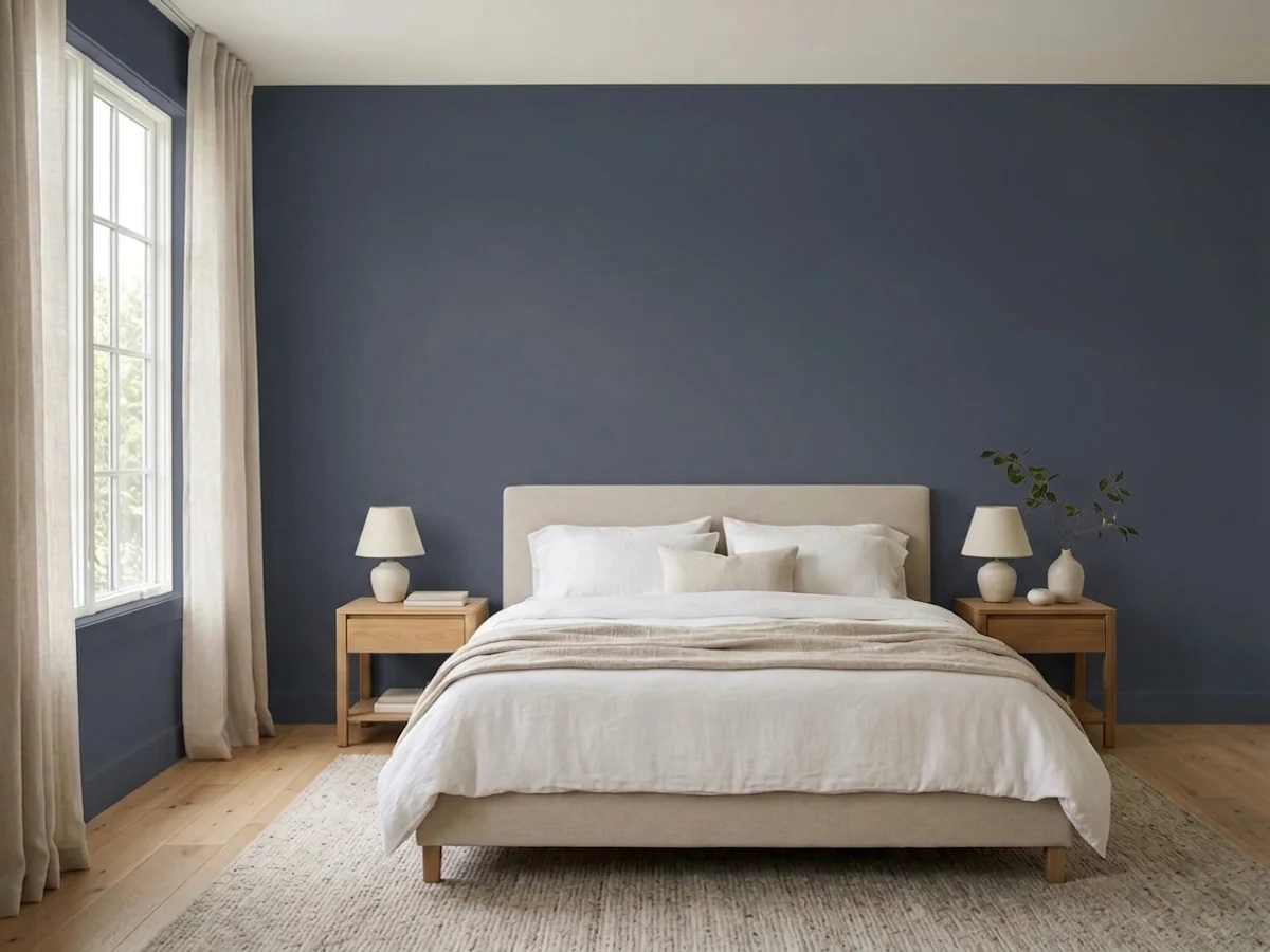
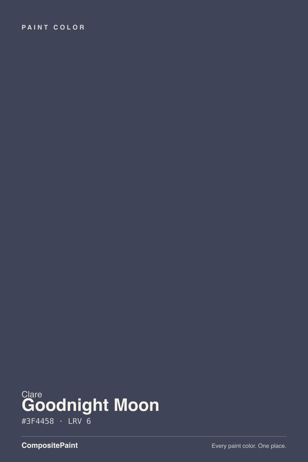
Goodnight Moon is the dark blue Clare built its mood around: a steel midnight that reads as a moonlit sky in lamplight and as charcoal when the lamps stay off. On the chip it looks like a medium slate; on four walls at LRV 11 it drops a full step and the blue has to be earned with light. If you want a bedroom that feels like evening at 4pm, this is the color — just never buy it hoping it will stay obviously navy in a dim north room.
Bedrooms you want to cocoon · powder rooms and color-drenched dining rooms · lamplit home offices · anyone who wants midnight blue without a big-box navy
The room is dim and you refuse lamps · you actually wanted a saturated navy that stays blue in every light · you need a whole-house color · north-facing rooms running on cool white LEDs
- Midnight that still shows blue in real daylight and warm lamps
- Bedrooms and powder rooms feel finished with one color decision
- Cool, clean undertone — no green, no candy purple by day
- Slightly more bounce than Hale Navy (LRV 11 vs 8) without going mid-tone
- The Clare dark blue people actually sample, not a random navy from a strip
- Reads charcoal-black in dim north rooms with no lamps
- Slatier than a saturated navy — buyers expecting cobalt feel underwhelmed
- Cool LEDs turn it into a steely gray-black
- Too dark for whole-house walls; this is a room color, not a main-floor color
What Color Is Goodnight Moon, Really?
A steel midnight — gray-blue first, navy second — not the inky cobalt the name suggests on a phone screen. Clare sells it as a rich midnight blue, and in a lit room that is fair: the cool undertone stays clean, with no green and no candy purple. What the marketing underplays is the slate. Put a sample next to Hale Navy and Goodnight Moon is the lighter, steelier cousin; put it next to Naval and the Sherwin-Williams color is the one still punching as navy. This is the DTC version of a classic dark blue: more atmosphere, less uniform.
At LRV 11 it is a genuine dark. That number is the whole job. Anything under about 15 swallows light, so the wall will always read a step deeper than the chip, and in corners it can go near-black. Designer Orlando Soria, who color-drenched a house in it, called it a chameleon that goes rich violet-black after dark — which is the honest night read, not a purple pigment. Plan for the blue to show in daylight and lamplight, and for the room to feel like a cocoon once the sun is down. If that swap sounds like a problem, this is the wrong depth.
Undertone in one line: cool steel-blue — never teal, never green, never a purple navy in daylight. If your sample reads flat charcoal, the room is too dim; if it flashes violet after dark, that is low-LRV paint doing what dark blues do under warm bulbs. Both versions are the same paint being honest about the light.
Where It Shines
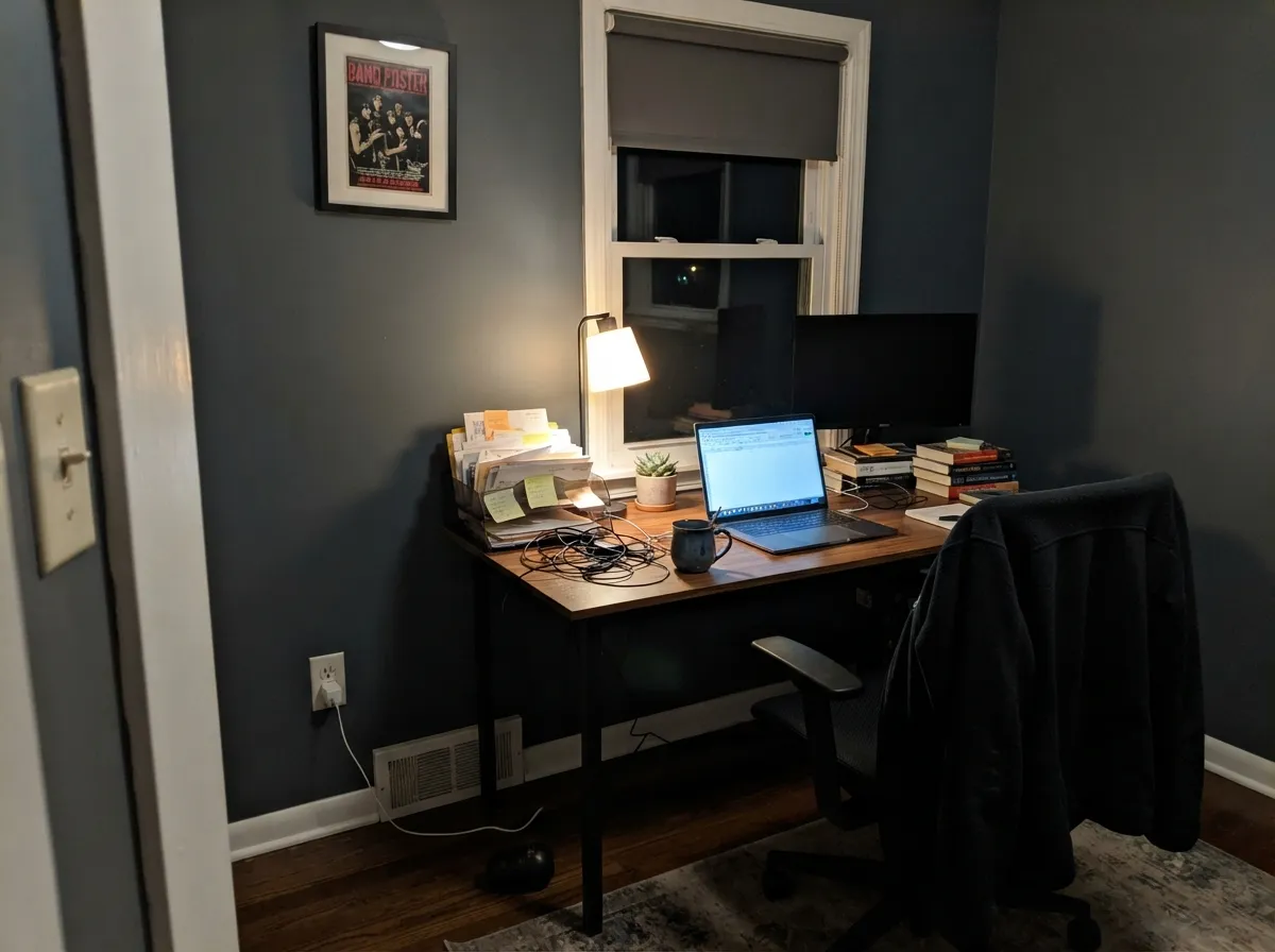
This color is built for rooms you use at night. Under 2700K lamps the steel lifts into a real midnight blue and the walls go velvety — the exact moonlit calm the name is after — which makes it one of the better bedroom colors in the Clare deck. Its second home is the small, committed room: a powder, a dining room color-drenched wall-to-ceiling, a home office with a desk lamp, where the dark reads custom instead of cave. Give it cream linen, walnut, unlacquered brass and a white that is actually white, and it looks like a designer did the house.
Where It Fails
Almost every regret story about a color this dark follows one of three scripts, and all three are predictable before the first coat. None of them are the paint's fault — but if your room matches one, this is not your blue, and a bigger sample will only confirm it.
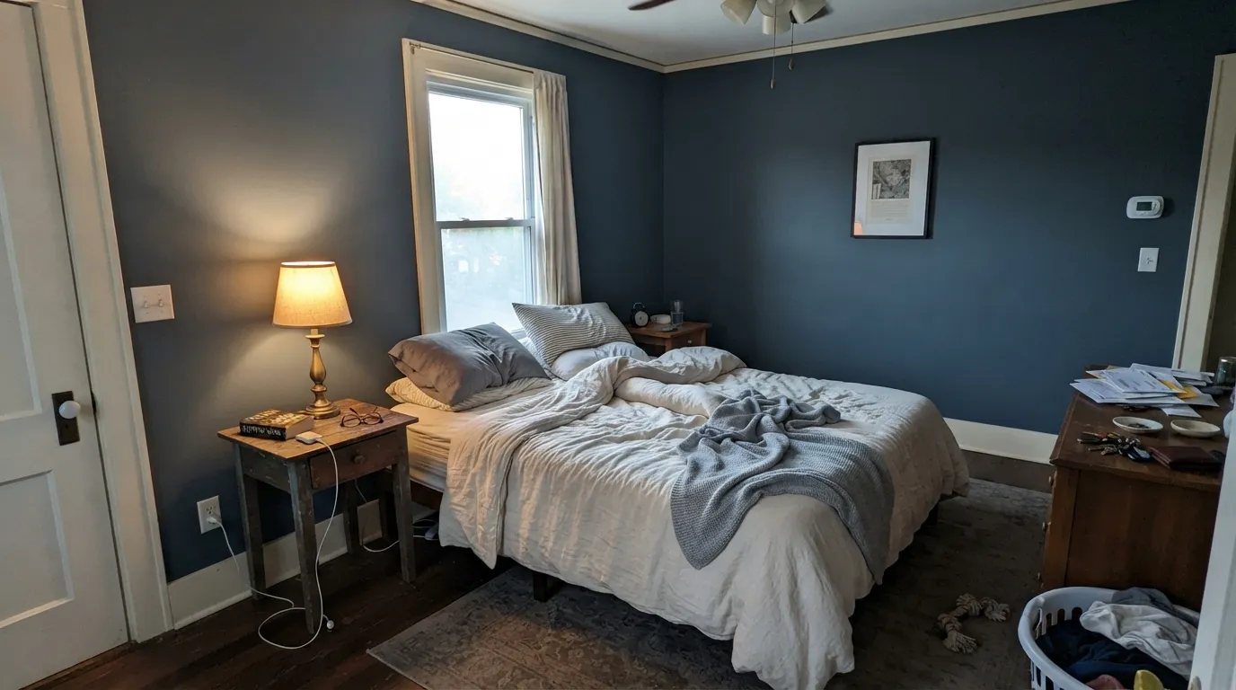
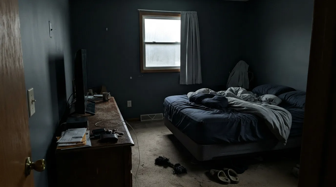
LRV 11 absorbs most of the light that hits it. In a dim north room with no lamps, the blue leaves and you are left with a soft charcoal — the same complaint Hale Navy owners file, and Stiffkey Blue's whole character line is this trap. The fix is lighting, not another coat. If you will not add lamps, pick a blue with more bounce.
On four walls this is a steel midnight, not a flag navy. Naval is the one that still reads navy when the light gets stingy; Hague Blue is the teal-navy that never goes flat black. If your Pinterest save is inky cobalt, sample Naval or Hale Navy first — Goodnight Moon is slatier than both, and that is the surprise in real rooms.
Cool white LEDs strip the blue and leave a steely gray-black that readers describe as office-cave. Warm 2700K bulbs are part of this paint job. A north room can still work — Clare's own Whipped exists specifically for north light on the trim — but the walls need lamps. If the room stays dim on purpose, pick a mid-tone.
Room by Room
Dusk on the walls all day, velvet at night. Matte finish hides texture and deepens the color; Whipped or White Dove trim keeps the edges from going graphic. With cream bedding and 2700K lamps it is the rare dark blue that still reads restful instead of teenage.
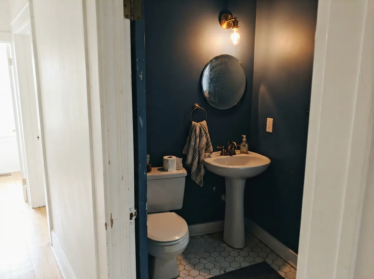
Small rooms take dark color well, and this is the designer move: walls, trim, and ceiling in Goodnight Moon, or walls drenched and a crisp white on the ceiling. Satin on the door. Brass and a pale stone top keep it from feeling like a closet.
Low, warm light is its natural habitat, so a desk lamp and a window are enough. Books, walnut, and a leather chair look deliberate against it. Eggshell if chairs scuff; matte if you want the color to recede.
Color-drenched dining rooms are why people buy this. It needs a fixture that actually throws light and candles or sconces after dark; under a dim chandelier it goes cave. White Dove or Fresh Kicks on adjacent hall trim keeps the handoff clean.
Beautiful in a closed, lamplit living room with cream and walnut. Risky in an open plan that has to share daylight with a kitchen, and a losing bet in a north-facing family room with one window. If the living room is the darkest room in the house, this is not the whole-house navy.
A Goodnight Moon front door on a white or cream house is a quiet classic — steel-blue in sun, near-navy in shade. Full exterior walls in this depth will read as dark gray-blue from the curb and show every scuff. Satin or a door enamel; skip it for shutters unless you want them to go charcoal by afternoon.
Your Light Is the Risk
2700K bulbs wake the blue and the walls go velvet-midnight. This is the light the color was named for — the reason to buy it.
Cool gray daylight plus a low LRV strips the blue and leaves charcoal. Fine if you half-wanted a soft black; disappointing if you wanted navy.
South and west rooms give the most honest chip match at midday — clearly a steel blue — then the color sinks toward near-black through late afternoon. Sample at 2pm and again at 7pm.
Warm 2700K keeps the midnight blue alive after dark. Cool white LEDs push it into steely gray-black; if those are the only bulbs in the room, pick a different color or change the bulbs with the paint.
Most complaints about Goodnight Moon are a light mismatch. Upload a photo of your actual room and see it on your walls — then ask for the same wall in north light or evening lamps before you buy a single sample.
Need It From Another Brand?
Any paint counter can custom-tint Clare PNT100-DP-42 directly. If you would rather stay in one brand's own deck, these are the closest stock matches, measured as ΔE2000. Under 2 is a difference you will not see on the wall.
| Brand | Closest color | ΔE | LRV | |
|---|---|---|---|---|
| Sherwin-Williams | Rain CloudSW 9639 · Sherwin-Williams | 2.2 | 11 | Color page → |
| Behr | Thunder BayECC-35-3 · Behr | 1.3 | 11 | Color page → |
| Benjamin Moore | FlintAF-560 · Benjamin Moore | 3.4 | 12 | Color page → |
| Valspar | Carriage WheelM330 · Valspar | 2.8 | 11.5 | Color page → |
| PPG / Glidden | MysteriousPPG1037-6 · PPG / Glidden | 1.1 | 11 | Color page → |
| Glidden | GoblinPPG1040-7 · Glidden | 1.1 | 11 | Color page → |
Similar Clare Colors
The nearest shades to Goodnight Moon within Clare's own range, ranked by perceptual color distance — useful when you want the same look a touch lighter, darker, or warmer.
WCAG 2.1: AA is 4.5 : 1 for normal text, 3 : 1 for large text, AAA is 7 : 1.
Goodnight Moon vs the Colors You're Also Considering
Every Goodnight Moon sample board has the same rivals on it. The numbers show the real lightness gap — then it comes down to which risk you would rather live with.
Pick this for a slightly lighter steel midnight with the same cocoon, without leaving Clare.
Benjamin Moore HC-154 · LRV 8Hale NavyPick this if you want the safest, most-tested navy in the big-box world — it is darker (LRV 8) and a hair less slate, and it still needs light.
Pick this if you want a touch more gray-slate and a bit more bounce (LRV 11 vs 4) instead of an inky flag navy.
Sherwin-Williams SW 6244 · LRV 4NavalPick this when the navy has to stay navy — it is the one that still reads blue when the light gets stingy, even at LRV 4.
Pick this when the point is midnight and cocoon, not a brighter, airier navy.
Benjamin Moore HC-156 · LRV 12Van Deusen BluePick this when Hale Navy feels like too much and you still want a Historic-collection navy with a little more visible blue.
Pick this for a cleaner steel midnight that is a little less moody-gray, in a paint you can order without the estate-emulsion premium.
Farrow & Ball No. 281 · LRV 10Stiffkey BluePick this for the Farrow & Ball cousin at nearly the same depth (LRV 10) — it is the deep blue that needs real light to stay blue.
Blackish (PNT100-DP-54, LRV 6) matches Goodnight Moon for depth but drops the blue. It is a true dark near-neutral, so if you want the drama of a black wall without any color cast, Blackish is the safer pick. Goodnight Moon keeps a visible blue lean that shows in daylight.
Blackest (PNT100-DP-55, LRV 8) is a hair lighter and also more neutral, closer to a deep charcoal. Choose it when you want almost-black that stays quiet under any light rather than shifting blue.
Deep Dive (PNT100-MD-40, LRV 12) is the meaningful step up in both lightness and color. At LRV 12 it reads clearly as a teal-leaning blue-green, not a near-black. Pick Deep Dive when you actually want to see the color on the wall, and Goodnight Moon when you want a moody, black-adjacent blue.
Goodnight Moon Coordinating Colors
The rule for coordinating with Goodnight Moon: a real white (warm or crisp, pick a lane), a lighter slate if you want layers, and a near-black only if you need one dark punctuation mark. It loves walnut, unlacquered brass, cream linen, and pale stone. Keep chrome and cool gray marble at arm's length — they push the steel toward office. These are the partners that keep showing up in rooms that work:
Clare's Signature Dark Blue — Famous in a Small Room
Goodnight Moon is not a Color of the Year and it is not Hale Navy. It is Clare's house midnight: founder Nicole Gibbons has pushed it since the brand launched, Real Simple flagged it in a best-paint-colors roundup around 2019, and Havenly has put it on best-of-blue lists. That is real design-media fame, not a TV-set credit. It is also why the name carries more expectation than a random navy on a strip — people arrive wanting the Instagram cocoon.
What that fame does not change: LRV 11 still needs light. The rooms that look witchy and expensive in Clare's own photos are lamplit, often color-drenched, and styled with cream and brass. Copy the lighting and the furniture temperature and you get that room. Copy only the paint into a dim builder bedroom and you get charcoal. The color is not oversold. The light is.
Goodnight Moon With Wood Tones and Floors
Walnut and espresso are the easy yes — the red-brown depth makes the steel read as midnight instead of gray. Pale white oak and gray-washed floors are safe and push it slightly more modern. Honey oak is not the enemy here the way it is with mauve: navy and golden oak is an old, intentional pairing. It just needs cream (not beige) elsewhere so the floor does not become the only warm thing in the room.
Builder-beige carpet and yellow-oak kitchen cabinets in an open plan are the harder test. The cool steel will make that yellow look cheaper, and the yellow will make the walls look dingy. A large rug, or keeping Goodnight Moon behind a door in the dining room, is the honest workaround.
Metals are straightforward: unlacquered brass, antique bronze, and matte black all belong. Polished chrome is the one that leans office-cold against it. If the faucets are already chrome, a powder-room drench can still work — just warm up the bulbs and add a brass mirror or sconce so the room has one warm metal.
Three Ready Palettes Built on Goodnight Moon
A color is never alone on the wall. These are complete combinations in the 60-30-10 pattern, with the reason each one holds together. Every one opens in the visualizer.
Tonal slate layering is what keeps a dark bedroom from feeling themed: Goodnight Moon for the cocoon, Stargazer as the dusty mid-slate that belongs in evening rooms, Whipped on trim because it is Clare's warmest white and was built for rooms that do not get a lot of sun. A stark cool trim white would make the walls look sooty by comparison.
Try this palette in your roomA tiny room can take the dark. Drench the powder in Goodnight Moon and let Wrought Iron — the softest near-black in the BM deck — handle the door so the scheme has a true dark note. Snow Day is the out if you want a bright ceiling: it is a cool white, so it stays crisp against the steel walls instead of creaming them.
Try this palette in your roomIf you are not ready to drench the house, put Goodnight Moon on the dining room and the interior doors and let Pale Oak run the main floor. Pale Oak is beautiful in good light and a little moody in bad light, which is the same personality as this navy, just at LRV 69. White Dove trim is the safest warm white in the BM deck and keeps both rooms in one house.
Try this palette in your roomGoodnight Moon FAQ
Is Goodnight Moon navy or gray?
Navy in good light, charcoal when the light leaves. On the chip it is a steel blue-gray; on four walls at LRV 11 the blue shows in daylight and under 2700K lamps, then the color sinks toward near-black after dark. If you need a navy that stays obviously blue in a dim room, look at Naval instead.
What trim white goes with Goodnight Moon?
Whipped if you want to stay in Clare and the room is short on sun — it is their warmest white, built for north light. White Dove if you want the classic cream-and-navy look. Fresh Kicks or Snow Day if you want a graphic, zero-cream edge. Chantilly Lace also works if you want the cleanest BM white, but it is a hard roll and a cool, crisp contrast, not a soft one. Semi-gloss on the trim, matte on the walls.
Is it good for a bedroom?
It is the best room for it. The color is calmest in low, warm light — exactly a bedroom's operating conditions. Use matte, keep the bulbs at 2700K, and pair with cream or white bedding. Skip it in a north-facing bedroom that you keep dark on purpose unless you are committed to the cave.
Will Goodnight Moon look black?
In a dim north room with no lamps, yes — or close enough that you will call it charcoal. That is LRV 11 doing its job, not a bad batch. South and west rooms, and any room with warm lamps, keep the steel-blue. Sample on the darkest wall and look at it at 8pm before you buy gallons.
How does it compare to Hale Navy?
Hale Navy is the safer, more-tested navy (LRV 8) and still needs light. Goodnight Moon is a step lighter (LRV 11) and slatier — more steel, less uniform flag-navy. If you want the color everyone already knows how to live with, Hale Navy. If you want Clare's midnight and a slightly airier dark, this is the one.
Does it work with oak floors?
Walnut, espresso, and pale white oak are excellent. Honey oak is high-contrast traditional, not a clash — navy and golden oak is an old pairing, and it reads colonial-intentional if the rest of the room is cream and brass. Builder-beige carpet is the one to watch: yellow-beige next to cool steel can make the walls look dingy. A rug helps.
Have you painted with Goodnight Moon?
Rate it — one tap helps the next reader decide.
Ask a Question