Rain Cloud
A quiet slate blue-gray Sherwin-Williams never turned into a headline color, reviewed honestly: the light where it turns rich, the light where it goes flat, and what to pick instead.

Jessica has spec'd whites and neutrals for more than 300 rooms and keeps a sample wall of painted drawdowns in her studio. Every color review is checked against real reader rooms in the comments and re-tested when a formula changes. About the testing process →
- 1Naval4
- 2Rain Cloud11
- 3Charcoal Blue19
- 4Resolute Blue40
The Fast Verdict
Rain Cloud is what a deep blue-gray looks like without a marketing campaign behind it. At LRV 11 it holds real color instead of collapsing into the flat near-black some depth colors turn into — it reads as a considered slate blue, not a trend chaser. Give it real daylight or warm lamps, cream trim and a little wood, and it earns the quiet-luxury look other colors have to shout for. Skip both the daylight and the lamps, and it just goes dark.
Kitchen islands and cabinets · home offices and dens that should feel moody, not dim · powder rooms and vanities · exteriors that want slate-blue instead of full navy
The room runs on cool LEDs with no window and no lamps · you actually want a warm greige · you need one predictable color, not one that shifts with the hour · you're painting a small windowless room on all four walls
- Real depth (LRV 11) that reads as a deliberate slate blue, not just "dark"
- Believable gray-blue undertone in daylight — no orange, pink, or yellow surprises
- Excellent on kitchen islands and cabinets against cream trim and wood
- Works outdoors as a modern slate-blue alternative to full navy
- Quiet, un-hyped reputation means it won't look dated the way a viral trend color can
- Cool LEDs with no daylight or lamps flatten it into a near-black blob
- Not a warm gray — the wrong pick if a cozy warm greige was the actual goal
- A full small windowless room in Rain Cloud can feel like a cave, not a cocoon
- Little public track record — you are largely testing this one yourself, not leaning on a thousand reviews
What Color Is Rain Cloud, Really?
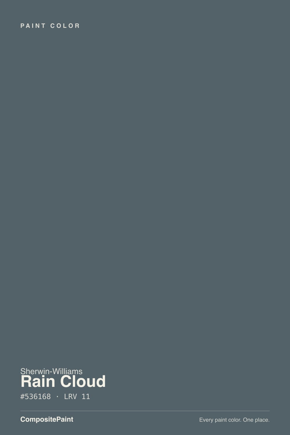
Rain Cloud is a deep slate blue-gray that Sherwin-Williams files quietly under its Neutral family — no Color of the Year run, no viral before-and-after, just a workhorse depth color designers reach for on cabinets, exteriors and accent walls without ever putting it on a billboard. That obscurity is honest, not a flaw: it means fewer people are chasing it because it's trending, and more people who use it are doing so because it actually solved a problem in their room.
At LRV 11 it sits in genuine depth-color territory — close to the same reflectance range as a charcoal or a dark greige, just built on blue instead of brown. That is the number that decides everything else about how it behaves: it needs light bouncing back into it to read as color rather than as a dark blob. Direction matters more than usual here. North light keeps it muted and cool; south light softens it; east-facing rooms catch a blue morning read; west-facing rooms deepen dramatically as the sun drops. None of that is unusual for a color this dark — it is simply the tax every LRV-11 color pays.
Undertone in one line: gray-blue with a navy lean — a true slate, not a warm gray and not a saturated blue. In daylight it reads consistently as that gray-blue. A few owners report a faint green or violet whisper under certain cool artificial bulbs; if your sample does that, it's the bulb temperature talking, not a different paint underneath.
Where It Shines
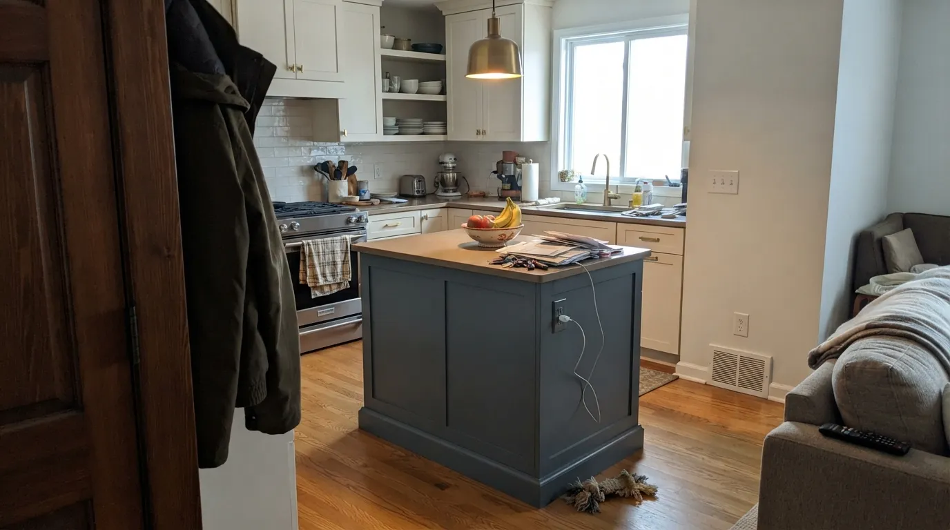
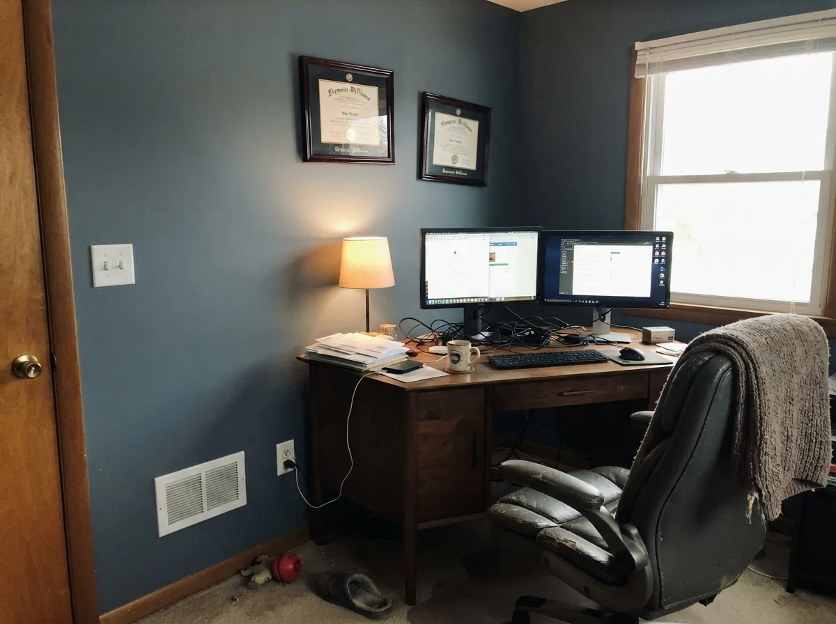
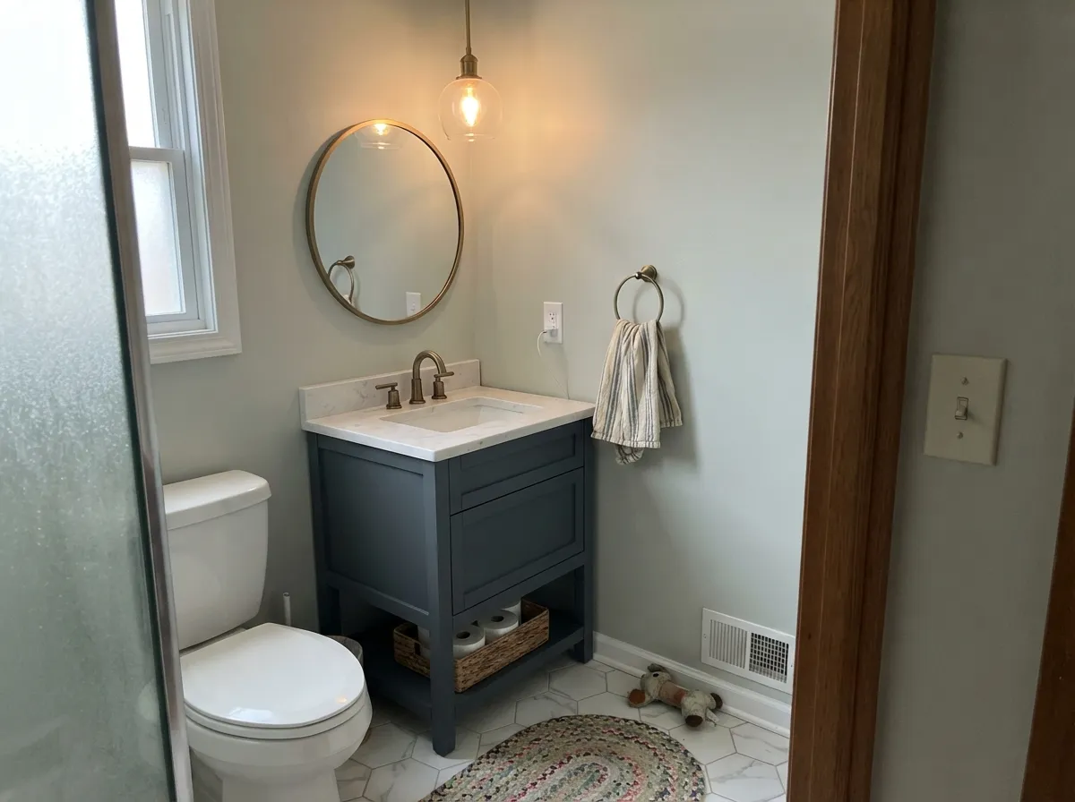
This is a color for surfaces and rooms that get real light or real lamps, not for a whole dim house. On a kitchen island against cream walls and warm wood it looks custom-mixed. In a den or home office with afternoon sun it turns genuinely moody instead of just dark. Powder rooms and bath vanities are its other natural home — small enough that the depth reads as a deliberate jewel-box choice rather than a commitment you have to live with in every room.
Where It Fails
The complaints about Rain Cloud are not really about the paint — they are about what LRV 11 does when a room doesn't hold up its end of the bargain. All three are predictable before the first coat.
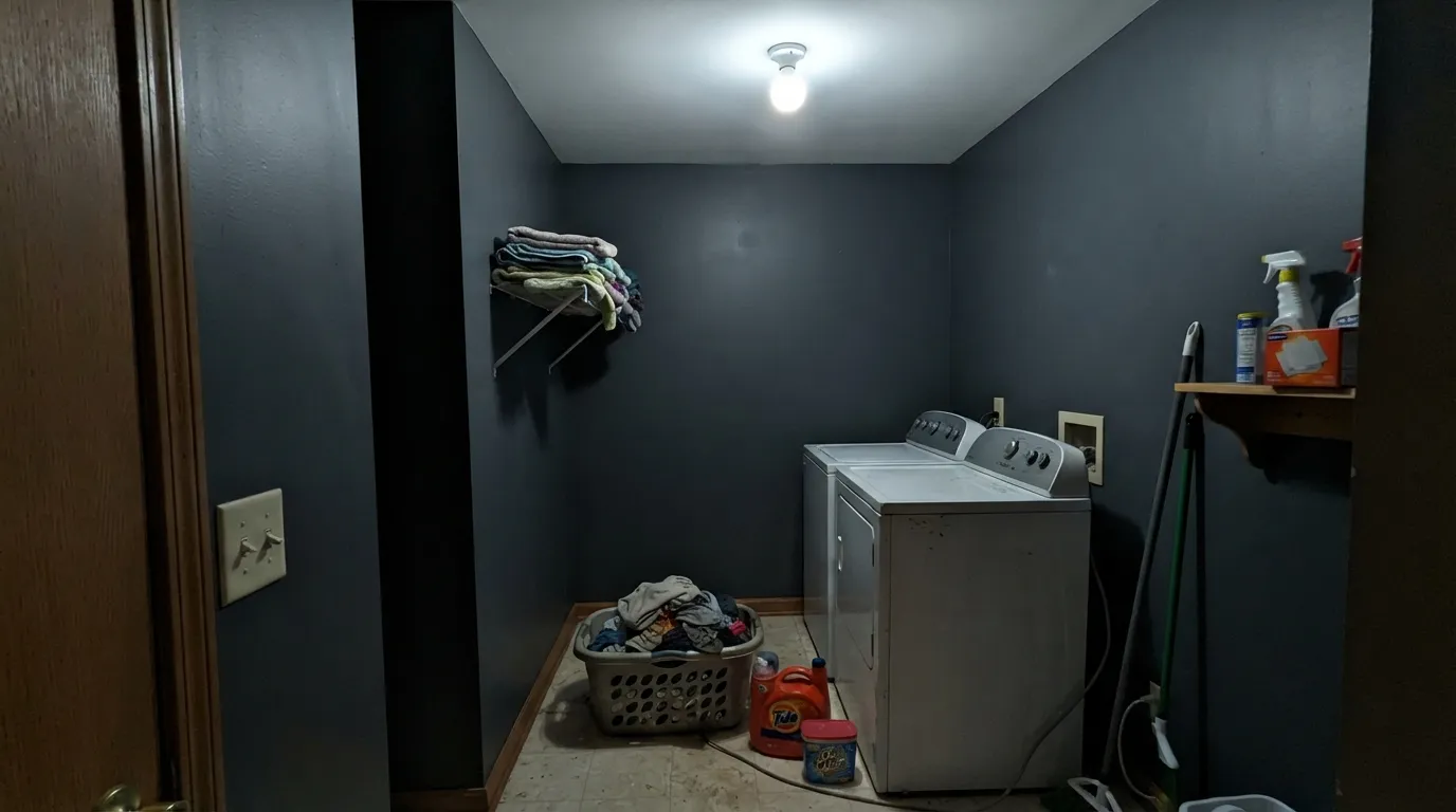
This is the color's real failure mode: a windowless bath, hallway or laundry room lit only by a cool overhead LED. With nothing bouncing warmth back into it, the blue-gray flattens into a near-black blob and the character disappears entirely. Add a warm lamp or skip a color this dark in that room.
Rain Cloud is blue-gray, not greige — there is no yellow or brown in it to warm a room up. Paired with warm oak flooring expecting a cozy warm gray, it can read cold and slightly off. If warmth is the goal, a true greige like Dorian Gray or Anew Gray does that job; Rain Cloud does a different one.
A depth color this saturated needs somewhere for the eye to land — a white ceiling, bright trim, a mirror. Painted floor-to-ceiling in a small room with no daylight source, it can feel like a cave rather than a cocoon. Break it up with a pale ceiling or crisp trim if the room has no natural light of its own.
Room by Room
Against cream walls, warm wood floors and brass or matte-black hardware, Rain Cloud on an island looks deliberate and expensive. Satin cabinet enamel wipes clean and doesn't flash under kitchen lighting the way a gloss would.
Afternoon sun or a west-facing window makes this one of the better moody-office colors in the deck. Walnut desks and leather chairs are natural company. Pair with a pale ceiling so the room doesn't read like a bunker.
A satin Rain Cloud vanity under a marble or quartz top, with brass or nickel fixtures, is a weekend project that reads like a design fee. Full four-wall powder rooms take the depth well because the room is small enough to still feel bright with good lighting.
Under 2700K bedside lamps it settles into a calm, grounded charcoal-blue at night. A north-facing bedroom with no lamp plan is the one situation to skip; the color needs the warmth to come from somewhere.
In a bright, south- or west-facing living room, all four walls in Rain Cloud can be genuinely striking against a cream sofa and wood furniture. In a dim, north-facing living room, it is a harder sell — sample it at the darkest hour of the day before committing to the whole room.
Outdoors it reads as a modern slate-blue that stops just short of navy — a workable alternative for anyone who wants depth on siding without going full Naval. White or cream trim keeps it from reading flat; full sun brings out more of the blue than shade does.
Your Light Is the Risk
Direct light gives it a rich, believable slate-blue read instead of a flat dark patch. This is the light that sells the color.
Cool, indirect daylight with nothing to warm it flattens Rain Cloud toward plain dark gray-black, losing the blue character entirely.
Morning east light emphasizes the blue; west light deepens it dramatically as the sun drops. Sample at both ends of the day before committing.
2700K lamps pull it toward a soft charcoal-navy at night. Cool LEDs flatten it and can pull out a faint green or violet cast — swap the bulb before swapping the paint.
Most complaints about Rain Cloud are a light mismatch. Upload a photo of your actual room and see it on your walls — then ask for the same wall in north light or evening lamps before you buy a single sample.
Need It From Another Brand?
Any paint counter can custom-tint Sherwin-Williams SW 9639 directly. If you would rather stay in one brand's own deck, these are the closest stock matches, measured as ΔE2000. Under 2 is a difference you will not see on the wall.
| Brand | Closest color | ΔE | LRV | |
|---|---|---|---|---|
| Behr | Thunder BayECC-35-3 · Behr | 1.4 | 11 | Color page → |
| Benjamin Moore | Vermont Slate1673 · Benjamin Moore | 3.1 | 13 | Color page → |
| Valspar | Carriage WheelM330 · Valspar | 3.9 | 11.5 | Color page → |
| PPG / Glidden | MysteriousPPG1037-6 · PPG / Glidden | 1.8 | 11 | Color page → |
| Glidden | GoblinPPG1040-7 · Glidden | 2.4 | 11 | Color page → |
| Dutch Boy | Poseidon Depths432-6DB · Dutch Boy | 1.9 | 12 | Color page → |
Similar Sherwin-Williams Colors
The nearest shades to Rain Cloud within Sherwin-Williams's own range, ranked by perceptual color distance — useful when you want the same look a touch lighter, darker, or warmer.
WCAG 2.1: AA is 4.5 : 1 for normal text, 3 : 1 for large text, AAA is 7 : 1.
Rain Cloud vs the Colors You're Also Considering
Every Rain Cloud sample board has the same rivals on it. The numbers show the real lightness gap — then it comes down to which risk you would rather live with.
Pick this for the deeper, more grounded version that leans a touch more toward navy.
Sherwin-Williams SW 9141 · LRV 13WaterlooPick this if you want the closest sibling in the SW deck — a hair lighter, needing a room just as willing to give it light.
Pick this for a truer blue-gray with none of the green mixed in.
Sherwin-Williams SW 6223 · LRV 10Still WaterPick this if you want the same depth pulled toward green instead of navy.
Rain Cloud Coordinating Colors
The rule for coordinating with Rain Cloud is simple: keep the partners warm and let the wall carry the cool. Cream trims soften it, warm woods and brass keep it from reading cold, and one true near-black gives it a partner that doesn't fight its blue. These are the pairings the research and the deck agree on:
A Quiet Color in a Loud Category
Deep blue-grays have had a moment — Naval, Cyberspace, Iron Ore have all had their design-blog cycle. Rain Cloud has never had that cycle. Sherwin-Williams files it plainly in its Neutral color family rather than pushing it as a statement blue, and there is no Color of the Year run or viral before-and-after attached to it. That is not a knock; it means the color has stayed exactly as useful as its LRV and undertone actually are, without a marketing push inflating expectations a real room can't meet.
The honest trade-off: pick Rain Cloud and you are largely on your own for reference photos and reviews, the way you would be with any workhorse color that never got famous. What you get in return is a slate-blue that reads as a deliberate, grown-up choice rather than a trend anyone will date the room by in five years.
Rain Cloud With Wood Tones and Floors
Warm wood is Rain Cloud's best partner. Oak, walnut and butcher block all sit comfortably against it because the wood's warmth balances the wall's cool without a fight — this is the pairing both the deck and outside research keep coming back to for cabinets and islands specifically.
The one floor that needs a sample first is a very cool gray or gray-washed wood. Two cool surfaces in the same room can stack up and read colder than either one alone, especially in a north-facing space. A warm rug or warm-toned furniture breaks that up if the floor is already gray.
Three Ready Palettes Built on Rain Cloud
A color is never alone on the wall. These are complete combinations in the 60-30-10 pattern, with the reason each one holds together. Every one opens in the visualizer.
A pale ceiling keeps a Rain Cloud room from feeling like a cave, and Iron Ore is the one place the palette goes darker still — since both are true grays, the near-black door reads as one deliberate accent instead of competing with the wall's blue.
Try this palette in your roomWarm cream walls give the island something soft to sit against instead of fighting it, and a crisp white trim keeps the cream from reading flat — the combination this color is most often recommended for.
Try this palette in your roomSea Salt's green-gray softens Rain Cloud's blue so the small room doesn't read as two competing blues, and the vanity carries all the depth while the walls stay light enough to keep a windowless powder room from feeling closed in.
Try this palette in your roomRain Cloud FAQ
Is Rain Cloud blue or gray?
Gray-blue with a navy lean — a true slate. It never turns warm and it never fully commits to a saturated blue either; in daylight it reads consistently as a deep gray-blue. If you want an unmistakable blue, look at a true navy like Van Deusen Blue instead.
How dark is Rain Cloud really?
LRV 11 — genuine depth-color territory, similar in reflectance to a charcoal or a near-black. That number is why it needs a room with real light or lamps behind it: without that, it reads as plain dark rather than as blue-gray.
Is it good for kitchen cabinets?
Yes, especially on an island rather than a full kitchen of upper and lower cabinets. Against cream walls, wood floors, and brass or matte-black hardware it looks custom. Use a satin urethane-fortified cabinet enamel.
What trim color goes with Rain Cloud walls?
A soft cream like Greek Villa or Natural Linen for a warmer look, or a crisp white like Extra White or Pure White for more contrast. Both directions work — pick based on whether the room already runs warm or cool.
Does Rain Cloud work on exteriors?
Yes — it reads as a modern slate-blue that stops short of full navy, a workable option for siding or a front door. Pair it with white or cream trim; full sun brings out more of the blue than a shaded elevation does.
Will it look black in a dark room?
It can. In a windowless space lit only by a cool overhead LED, the blue-gray flattens and the color reads as plain near-black. Add a warm lamp, or pick a lighter color for a room with no daylight source of its own.
Have you painted with Rain Cloud?
Rate it — one tap helps the next reader decide.
Ask a Question