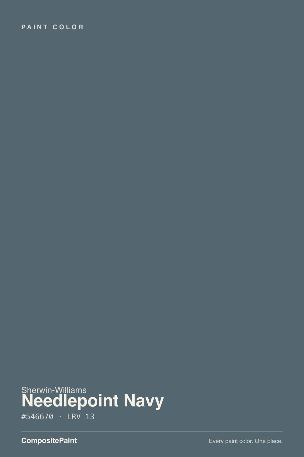
Needlepoint Navy
SW 32 · #546670 · LRV 13 — cool blue tone, dark — high drama, needs strong daylight or warm bulbs.
- 1Anchors Aweigh3
- 2Hale Navy8
- 3Needlepoint Navy13
- 4Charcoal Blue19
- 5Resolute Blue40
What Color Is Needlepoint Navy, Really?
Needlepoint Navy SW 32 is a dark, grayed blue. Sherwin-Williams files it with the grays, and the numbers show why: the hue sits at 201 degrees, which is blue with a slight cyan lean, but saturation is only 14 percent. At hex #546670 and an LRV of 13, it absorbs most of the light that reaches it, so it lands closer to weathered slate than to a bright flag navy.
People pick it when they want the weight of a dark blue without the punch. A saturated navy can dominate a room and fight everything warm in it. Needlepoint Navy has enough gray in it to sit quietly next to oak, brass, and stone, which is why it shows up so often on islands, built-ins, and front doors rather than on all four walls.
The catch is the light. At LRV 13 there is very little reflectance to work with, and in weak or cool light the blue drains out and the color reads as plain charcoal. Before committing, look at a large sample after dark under your own bulbs, not just on a bright afternoon.
The undertone here is blue, but it is a blue that has been pulled a long way toward gray. Hue 201 puts it just past true blue, with a faint cool green edge, and 14 percent saturation keeps that color quiet. On a small chip it can look like charcoal with a chill in it. On a full wall the blue becomes clear and steady.
What it reads next to changes everything. Beside a clean, saturated navy, Needlepoint Navy looks dusty and gray. Beside a warm charcoal or a brown-black, the same paint suddenly looks distinctly blue. Warm wood and brass make it feel cooler; gray stone can drain the blue out almost entirely.
Hold your sample against anything blue already in the room, including tile, counters, and upholstery. A cleaner blue nearby is the fastest way to make this color look like gray by comparison.
Best Rooms and Uses for Needlepoint Navy
This is a dark color, so it works best where depth is the point. Studies, libraries, dining rooms, and powder rooms take it well, and a single wall behind a bed gives a bedroom weight without swallowing it. In a room with big windows on two sides it can carry all four walls comfortably.
Cabinetry is its easiest use. At LRV 13 it gives an island or a run of lower cabinets real contrast against light counters and warm wood floors, and the gray in it stays calmer over a whole kitchen than a saturated navy would. Built-ins, wainscoting, and interior doors behave the same way.
Outside it holds up as a front door, shutter, or full body color for a house that wants a dark, quiet exterior. Keep the trim in a clear white so the edges stay readable from the street, since a dark body with dark trim loses its shape at a distance.
How Lighting Changes Needlepoint Navy
At LRV 13 this color absorbs most of the light that hits it, so the room does the work. In north-facing rooms, where daylight is cool and flat, it sinks deeper and the blue turns slate gray. That can feel enveloping in a study or a powder room and closed in almost anywhere else.
South-facing light keeps more of the blue visible and gives the wall some movement through the day. East rooms look heavier and cooler in the morning and lift slightly by afternoon. West rooms stay flat early and pick up warmth late.
Bulbs matter as much as windows here. Warm 2700K light softens the color into a gentle blue-gray and keeps a dark room comfortable. Cooler 4000K bulbs sharpen the blue and can push it toward cold. Because a 13 LRV shows every shadow and every roller mark, plan for more fixtures and a careful finish.
Most complaints about Needlepoint Navy are a light mismatch. Upload a photo of your actual room and see it on your walls — then ask for the same wall in north light or evening lamps before you buy a single sample.
Need It From Another Brand?
Any paint counter can custom-tint Sherwin-Williams SW 32 directly. If you would rather stay in one brand's own deck, these are the closest stock matches, measured as ΔE2000. Under 2 is a difference you will not see on the wall.
| Brand | Closest color | ΔE | LRV | |
|---|---|---|---|---|
| Behr | Rush HourMQ5-25 · Behr | 1.4 | 13 | Color page → |
| Benjamin Moore | Nocturnal Gray2135-30 · Benjamin Moore | 2.0 | 14 | Color page → |
| Valspar | Smoky Pitch4007-4B · Valspar | 1.4 | 12.1 | Color page → |
| PPG / Glidden | Silent NightPPG1153-6 · PPG / Glidden | 1.8 | 13 | Color page → |
| Glidden | Silent NightPPG1153-6 · Glidden | 1.1 | 13 | Color page → |
| Dutch Boy | Grayed Navy431-5DB · Dutch Boy | 1.8 | 13 | Color page → |
Similar Sherwin-Williams Colors
The nearest shades to Needlepoint Navy within Sherwin-Williams's own range, ranked by perceptual color distance — useful when you want the same look a touch lighter, darker, or warmer.
WCAG 2.1: AA is 4.5 : 1 for normal text, 3 : 1 for large text, AAA is 7 : 1.
Needlepoint Navy vs Similar Colors
Waterloo SW 9141 is the closest neighbor in the line, at hex #536872 and the same LRV 13. It carries slightly more blue and slightly less gray, so it leans a touch more navy and a touch less slate. Alone in a room, few people would tell them apart.
Outerspace SW 6251 at LRV 12 and Rain Cloud SW 9639 at LRV 11 are both darker and less blue, reading closer to charcoal. Mountain Pass SW 9655 at LRV 14 is a shade lighter and shifts green instead of blue.
Across brands, Glidden Silent Night PPG1153-6 at LRV 13 and Behr Rush Hour MQ5-25 at LRV 13 are visually identical in normal room light. Benjamin Moore Nocturnal Gray 2135-30 at LRV 14 is very close, so sample it first. Farrow and Ball Inchyra Blue No. 289 at LRV 13 is close but visibly different side by side, with noticeably more green in it.
Colors That Go With Needlepoint Navy
Trim is the first decision. A clean white keeps the edges sharp against something this dark, and UltraWhite SW 9500 at LRV 94 gives about as much separation as paint can. A softer, warmer white works too if you want the contrast gentler and less graphic.
For a lighter wall partner in an open plan, Hinting Blue SW 6519 at LRV 68 stays in the same cool blue-green family and gives the eye somewhere to rest. Illusive Green SW 9164 at LRV 29 is a quieter mid-tone neutral that lets the navy stay the darkest thing in the room without competing for attention.
If you like the depth but want less blue in it, Grays Harbor SW 6236 at LRV 12 and Web Gray SW 7075 at LRV 13 sit at nearly the same darkness with less color. Warm oak, walnut, and rattan all flatter it. Brass and aged bronze read warmer against the blue than polished chrome does.
Coordinated palette
Generated by hue-rotating #546670 in HSL space. Pair Needlepoint Navy with one accent and one neutral — the swatches below are starting points, not final picks.
Needlepoint Navy FAQ
Is Needlepoint Navy a navy or a gray?
It is both, and Sherwin-Williams files it with the grays. The hue sits at 201 degrees, which is blue, but saturation is only 14 percent, so the blue is heavily grayed. On a full wall it reads as a dark slate blue, while a small chip can look like charcoal.
What LRV is Needlepoint Navy?
Needlepoint Navy has an LRV of 13. Light reflectance value runs from 0 for black to 100 for pure white, so 13 is firmly in the dark range. It absorbs most of the light in a room, which is what gives it depth and also what makes lighting the main thing to plan for.
Does Needlepoint Navy work in a dark room?
It can, but go in with your eyes open. At LRV 13 there is almost no reflectance to help a dim room, and in cool north light the blue drains out and the color reads as charcoal. If you want that enveloping effect in a study or powder room it works well, especially with warm 2700K bulbs.
What white trim goes with Needlepoint Navy?
A clean, bright white gives the crispest edge against a color this dark. UltraWhite SW 9500 at LRV 94 sits near the top of the white range and creates maximum separation. If that feels too graphic, a softer warm white lowers the contrast and makes the pairing feel more traditional.
Is Needlepoint Navy good for cabinets and exteriors?
Yes on both counts. At LRV 13 it gives an island or lower cabinets strong contrast against light counters, and the gray in it keeps a whole kitchen from feeling loud. Outside it works as a front door, shutters, or a full dark body color, as long as the trim stays a clear white so the house keeps its shape.
How is Needlepoint Navy different from Waterloo?
Waterloo SW 9141 shares the same LRV of 13 and sits at hex #536872 against Needlepoint Navy's #546670. Waterloo has a bit more blue and a bit less gray, so it leans slightly more navy. The difference shows side by side and largely disappears once one of them is on the wall alone.
Have you painted with Needlepoint Navy?
Rate it — one tap helps the next reader decide.
Ask a Question