Whipped
Clare calls Whipped its warmest white, reviewed honestly: what that actually means at LRV 95, the rooms where the whisper of warmth earns its keep, and where it just disappears.

Jessica has spec'd whites and neutrals for more than 300 rooms and keeps a sample wall of painted drawdowns in her studio. Every color review is checked against real reader rooms in the comments and re-tested when a formula changes. About the testing process →
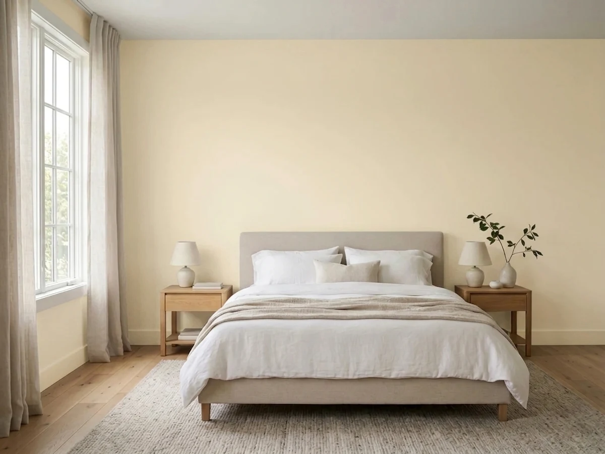
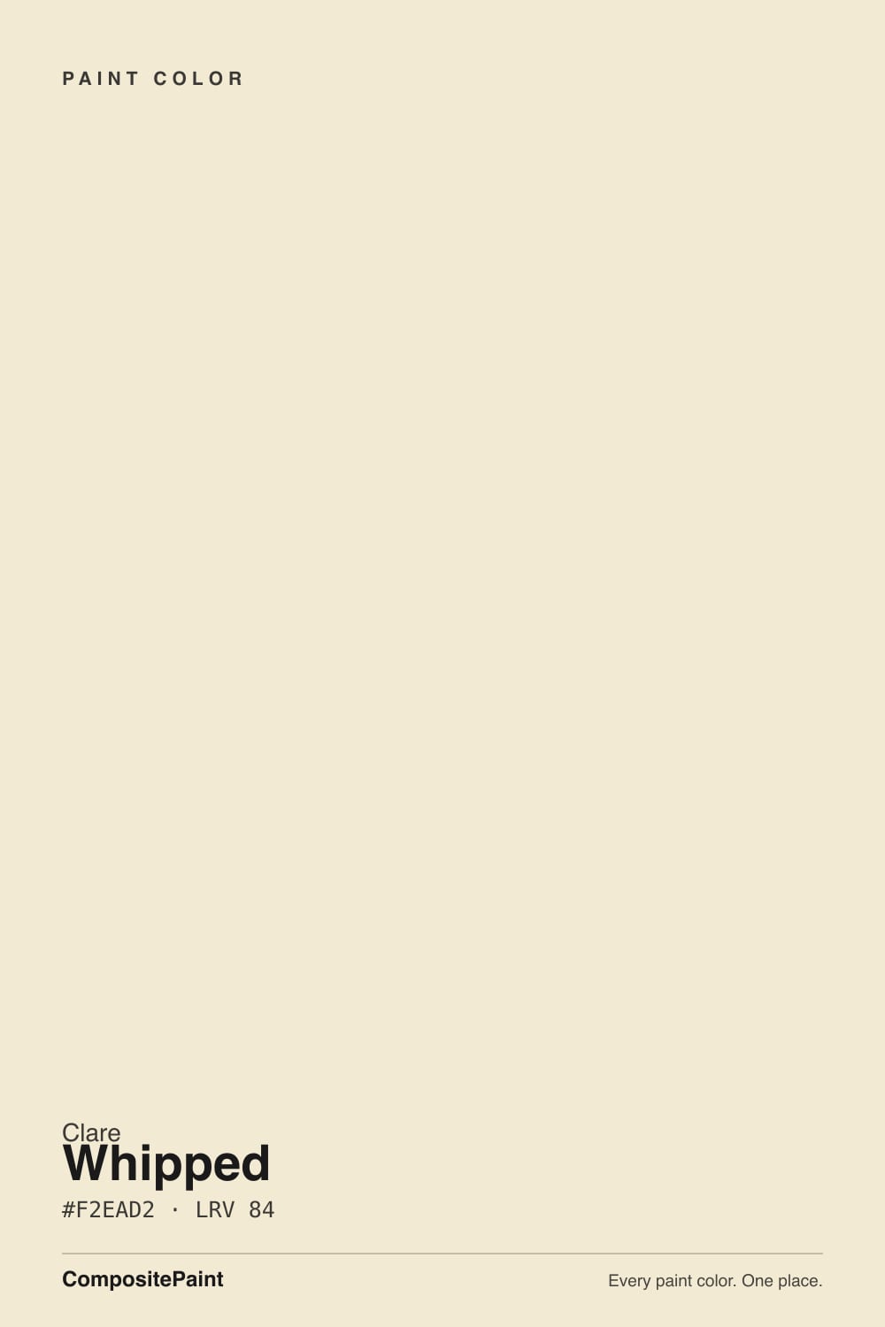
- 1Alabaster82
- 2Simply White90
- 3Whipped95
- 4White100
The Fast Verdict
Whipped is Clare's answer to one specific problem: a north-facing room that reads cold and gray no matter what white goes on the wall. It is not a cream — at LRV 95 and hex #F9F9F7 it sits almost at the top of the reflectance scale, a hair off pure white with just enough warmth to counter blue daylight without ever tipping yellow. "Warmest" here is relative to Clare's own lineup, not to the market's creamy whites. Judge it as a quiet fix for cold light, not as a statement color, and it does its job well.
North-facing rooms that read cold and blue no matter what white you try · dim hallways, entryways, and small windowless baths · nurseries and kids' rooms that want soft, not stark · anyone who wants one Clare paint system (same white on walls and trim) for a whole room
Your room already gets strong, direct afternoon sun · you want a white with visible, obvious cream in it · you're chasing crisp contrast against a bright trim white · you need more sheen options than Clare's two-finish wall-and-trim system
- Genuinely the warmest of Clare's near-white paints — built specifically to counter cold north light
- LRV 95 bounces nearly all available light, which helps brighten a dim room
- Whisper-warm undertone reads as soft, never yellow and never cold-gray
- One paint brand, two finishes (eggshell wall, semi-gloss trim) makes whole-room matching simple
- Reads close enough to neutral that it coordinates with almost anything chosen later
- So close to neutral that in bright light it can be mistaken for plain, uncolored white
- The "warmest white" marketing oversells how much visible cream is actually on the wall
- Clare's own customer reviews report batch-to-batch color inconsistency on repeat orders
- Only two finishes to choose from, versus the five-plus sheens bigger brands offer
What Color Is Whipped, Really?
Whipped is marketed as Clare's warmest white, and that is true — but only next to its own siblings. On the wall it is a near-pure soft white: hex #F9F9F7 is barely a shade off neutral gray-white, and at LRV 95 it reflects almost every bit of light that hits it. Compare that to an actual cream like Benjamin Moore Navajo White or Sherwin-Williams Dover White, both built on visible yellow-oxide bases that show up as color even in flat light — Whipped has none of that. What it has instead is a whisper: just enough warmth in the base to keep a cold room from reading blue, without ever registering as a colored wall.
That distinction matters because Clare's own deck makes the comparison for you. Snow Day, Clare's other near-white at the identical LRV 95, sits one digit cooler in hex (#F9F9F8 versus Whipped's #F9F9F7) and is described in Clare's own materials as a bright cool white. The two paints are close enough in reflectance that the entire difference between them is that whisper of warmth — which is the whole point of Whipped. It exists to be the warm half of that pair, purpose-built for the exact rooms where Snow Day goes flat.
Undertone in one line: a faint warm neutral, never yellow, never gray-cold, never pink. If a wall painted Whipped reads flat and colorless, that is almost always strong daylight washing out a color that was never carrying much pigment to begin with — not the paint doing anything wrong.
Where It Shines
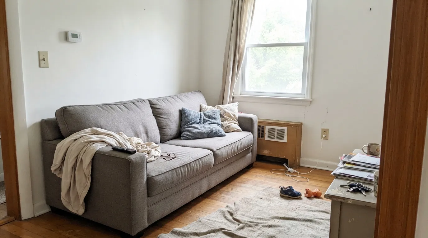
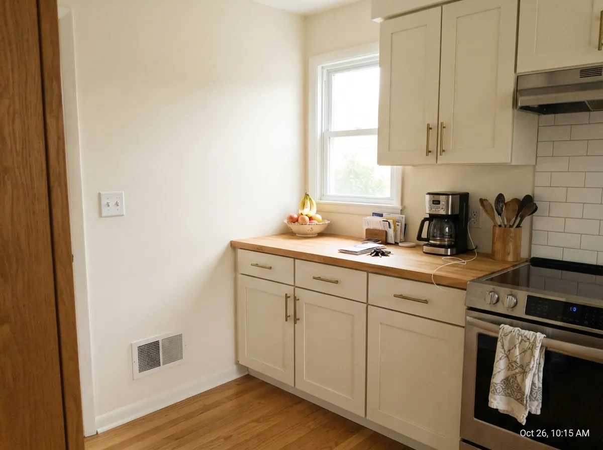
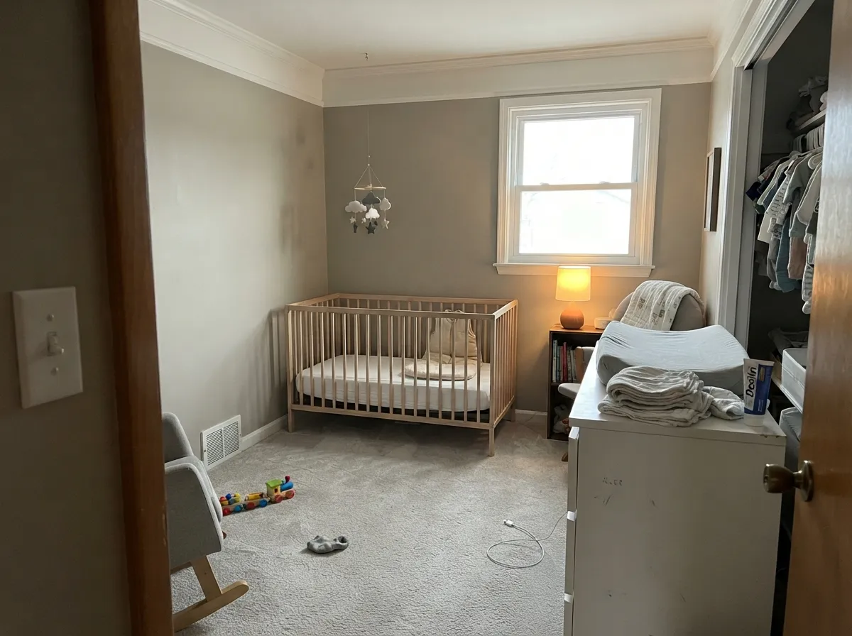
Put it in the room it was designed for — north-facing, low direct sun, the kind of space that turns every white slightly blue by 2pm — and Whipped does exactly what it promises: the cold edge softens and the room feels finished instead of dim. It is also a strong pick anywhere a wall needs to disappear rather than perform: hallways, entryways, small baths without a window, nurseries where parents want calm over statement. Because Clare sells only two finishes, matching walls to trim in the same white is simple — no guessing between five sheens of the same name.
Where It Fails
The regret stories about Whipped follow a pattern, and it traces back to one thing: the color carries less visible pigment than its "warmest white" name implies. Readers who expect a cream get a near-neutral instead, and readers who put it somewhere already bright find there is almost nothing left to see.
"Warmest of Clare's whites" sounds like a creamy tone, but the deck number tells the real story: LRV 95 and a hex just one digit off neutral gray-white. If you want a white that visibly reads warm on the wall, look at Benjamin Moore White Dove (LRV 85) or Sherwin-Williams Dover White — both carry real color where Whipped carries almost none.
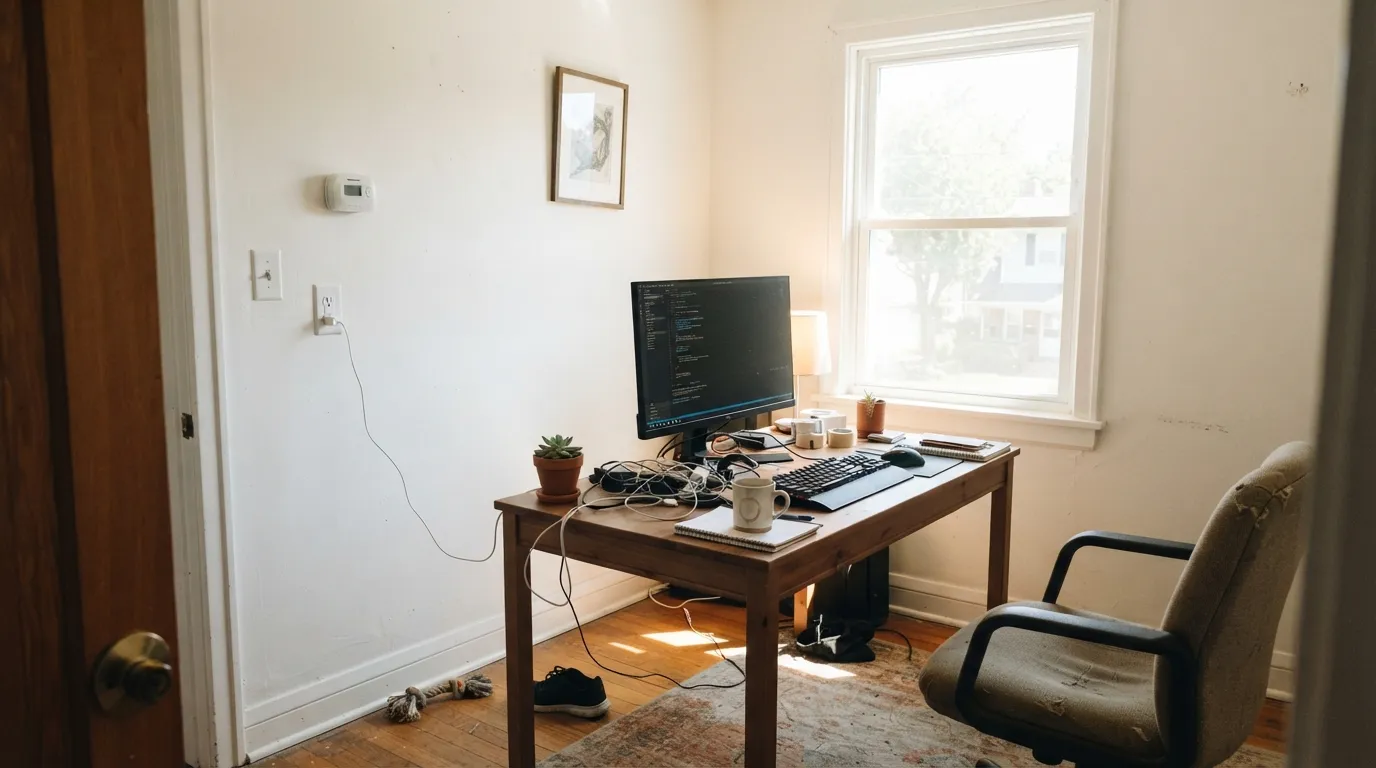
Put this in the strong south or west light it was never designed for and the little warmth it has washes out almost completely — readers describe it as looking like bare primer or builder-grade white. Save Whipped for the dim, cool rooms it was built to fix.
Clare's own customer reviews flag real batch-to-batch inconsistency on repeat orders — some buyers report a second can reading noticeably different from the first. Order every gallon a project needs in one purchase rather than reordering mid-job.
Room by Room
This is the color's home turf: a north-facing living room that always felt a little cold gets its warmth back without turning cream. In a south-facing room, it is not wrong, just unnecessary — a cooler white would do the same job for less money.
On cabinets it stays quiet and lets wood tones and brass do the talking. Pair with a slightly deeper warm neutral on the walls so the cabinets don't vanish into them — two near-identical whites side by side is the one combination to avoid here.
Under warm 2700K bulbs at night the faint warmth reads gently cozy rather than stark. If the room already gets strong daylight, this will feel closer to plain white than the name suggests — that's fine if plain is what you want.
Small, windowless or north-facing baths are where Whipped earns its keep, countering the flat fluorescent-and-cold-tile feel those rooms get. A sunny bathroom with a big window doesn't need it as much.
Clare markets heavily to this exact buyer, and the color fits: soft, calm, doesn't read as "decorated," and pairs easily with almost any accent color chosen later. North exposure is where it does the most good.
Clare's own semi-gloss Trim Paint in the same Whipped formula keeps walls and trim in one family with just a sheen change for definition — the same one-color logic that works for any quiet white.
Your Light Is the Risk
The exact problem this paint was built to solve: the whisper of warmth counters north light's cool blue cast without tipping the wall yellow.
At LRV 95 there is very little pigment to hold onto — direct sun can wash it out to a flat, almost colorless glare. Test before committing in a bright room.
A touch warmer at the sun hours, quietly neutral the rest of the day. The shift is subtle — this is not a color that dramatically changes mood.
2700K lamps bring out the faint warmth and make it feel cozier at night. Cool white LEDs flatten it back toward plain white — swap the bulbs before repainting.
Most complaints about Whipped are a light mismatch. Upload a photo of your actual room and see it on your walls — then ask for the same wall in north light or evening lamps before you buy a single sample.
Need It From Another Brand?
Any paint counter can custom-tint Clare PNT100-LT-02 directly. If you would rather stay in one brand's own deck, these are the closest stock matches, measured as ΔE2000. Under 2 is a difference you will not see on the wall.
| Brand | Closest color | ΔE | LRV | |
|---|---|---|---|---|
| Sherwin-Williams | UltraWhiteSW 9500 · Sherwin-Williams | 1.8 | 94 | Color page → |
| Behr | Smart White730A-1 · Behr | 0.8 | 94 | Color page → |
| Benjamin Moore | Chantilly Lace2121-70 · Benjamin Moore | 2.1 | 91 | Color page → |
| Valspar | Ultra White7006-24 · Valspar | 1.5 | 93.6 | Color page → |
| PPG / Glidden | Delicate WhitePPG1001-1 · PPG / Glidden | 2.1 | 88 | Color page → |
| Glidden | Delicate WhitePPG1001-1 · Glidden | 1.9 | 88 | Color page → |
Similar Clare Colors
The nearest shades to Whipped within Clare's own range, ranked by perceptual color distance — useful when you want the same look a touch lighter, darker, or warmer.
WCAG 2.1: AA is 4.5 : 1 for normal text, 3 : 1 for large text, AAA is 7 : 1.
Whipped vs the Colors You're Also Considering
Every Whipped sample board has the same rivals on it. The numbers show the real lightness gap — then it comes down to which risk you would rather live with.
Pick this for a north-facing or dim room, where the whisper of warmth keeps the cool twin from going flat and blue.
Clare PNT100-LT-01 · LRV 95Snow DayPick this for a bright, sun-filled room — Snow Day is Whipped's cool twin at the exact same LRV, built for the opposite light situation.
Pick this when you want the quietest, most reflective version of white and don't need the color to announce itself.
Benjamin Moore PM-19 · LRV 85White DovePick this if you want a white that visibly reads warm on the wall — White Dove carries real cream where Whipped carries almost none.
Whipped's closest neighbor is Like Buttah (PNT100-LT-62, LRV 80). Like Buttah is a touch deeper and more openly yellow, so it reads as a richer butter cream, while Whipped stays a shade lighter and slightly cleaner. Choose Like Buttah when you want the warmth to be unmistakable, and Whipped when you want cream that still passes for a soft white.
Wing It (PNT100-LT-24, LRV 88) is lighter and brighter than Whipped, with a warm, almost pinkish softness rather than a clear yellow. It suits a room where you want maximum lightness with just a hint of warmth.
Classic (PNT100-LT-12, LRV 82) is the opposite direction: a near-neutral off-white with far less color, reading cooler and grayer beside Whipped. Pick Classic if Whipped looks too yellow for your light, and pick Whipped if Classic feels flat or cold.
Whipped Coordinating Colors
Because Whipped carries almost no visible color of its own, it coordinates with nearly anything — the real decision is how much warmth or contrast you want next to it. These are the partners that keep it from reading flat:
Whipped vs. Snow Day: Clare's Two Near-Whites
Clare sells two whites at the identical LRV 95, one digit apart in hex: Whipped at #F9F9F7 and Snow Day at #F9F9F8. That is about as close as two named paint colors get, and the gap between them is entirely that faint warmth — Whipped leans a hair warm, Snow Day a hair cool.
The practical rule Clare itself gives is exposure-based: north-facing and low-light rooms get cooler daylight, so they need Whipped's whisper of warmth to avoid reading blue. South- and west-facing rooms already run warm, so Snow Day's cooler lean keeps them from tipping yellow. Neither color is going to read as strongly "warm" or "cool" the way a true cream or a true gray-white would — this is a choice between two very quiet options, not two dramatic ones.
Whipped With Wood Tones and Floors
Because it carries so little color, Whipped is unusually easy to place next to wood. Honey oak, walnut, white oak, cedar — all read comfortably against it, since there is no competing undertone for the wood's own color to argue with. It is one of the safer whites to use over builder-grade orange oak specifically because it doesn't add its own yellow to the mix.
The one place to sample first is a room with cool gray-washed LVP or concrete-look flooring. With almost no warmth of its own, Whipped can end up reading colder than expected against a genuinely cool floor — the two together lean the room gray rather than soft. A warm rug or wood furniture usually settles the argument.
Three Ready Palettes Built on Whipped
A color is never alone on the wall. These are complete combinations in the 60-30-10 pattern, with the reason each one holds together. Every one opens in the visualizer.
One near-white color at two sheens fixes the cold-room problem without adding visible color anywhere; the navy door supplies the single dark note the scheme needs so the room doesn't read flat.
Try this palette in your roomAlabaster's visible warmth on the walls keeps Whipped's near-invisible cabinets from vanishing into them; the navy island grounds the room and gives brass hardware something to shine against.
Try this palette in your roomRevere Pewter carries the room's warmth so Whipped can do its quiet job overhead and on the trim; the muted green accent adds a single playful note without disturbing the calm.
Try this palette in your roomWhipped FAQ
Is Whipped a warm white or a cool white?
Warm, but only just. At hex #F9F9F7 and LRV 95 it is nearly neutral — the warmth is real but faint, built to counter cold light rather than to look creamy on its own.
Is Whipped actually good for a north-facing room?
Yes — this is the one job it is specifically built for. North light is cool and blue; Whipped's whisper of warmth pushes back just enough to keep the wall from reading gray without ever tipping yellow.
Whipped or Snow Day — which one should I pick?
They sit at the identical LRV 95 with almost the same hex, so the choice comes down to your room's light. Snow Day is the cool twin for bright, sunny rooms; Whipped is the warm twin for north-facing or dim ones.
Will Whipped look plain or washed out in a bright room?
It can. There is very little pigment in this white to begin with, and strong direct sun can wash out what little warmth it has, leaving a flat, almost colorless wall. Save it for the rooms with less direct light.
What sheen should I use on trim with Whipped walls?
Clare's own Trim Paint in the same Whipped formula, in its semi-gloss finish, keeps the whole room in one color family with just enough sheen change to define the trim.
Is Whipped a good choice for a nursery?
Yes, especially in a north-facing room. It reads soft and calm rather than stark, and its near-neutral base leaves plenty of room for whatever accent color gets added later.
Have you painted with Whipped?
Rate it — one tap helps the next reader decide.
Ask a Question