Dirty Chai
Clare's fast-rising cinnamon-brown neutral, reviewed against its corrected color data: a deeper, grayer mushroom taupe than the product photos suggest, and exactly which rooms can carry that depth.

Jessica has spec'd whites and neutrals for more than 300 rooms and keeps a sample wall of painted drawdowns in her studio. Every color review is checked against real reader rooms in the comments and re-tested when a formula changes. About the testing process →
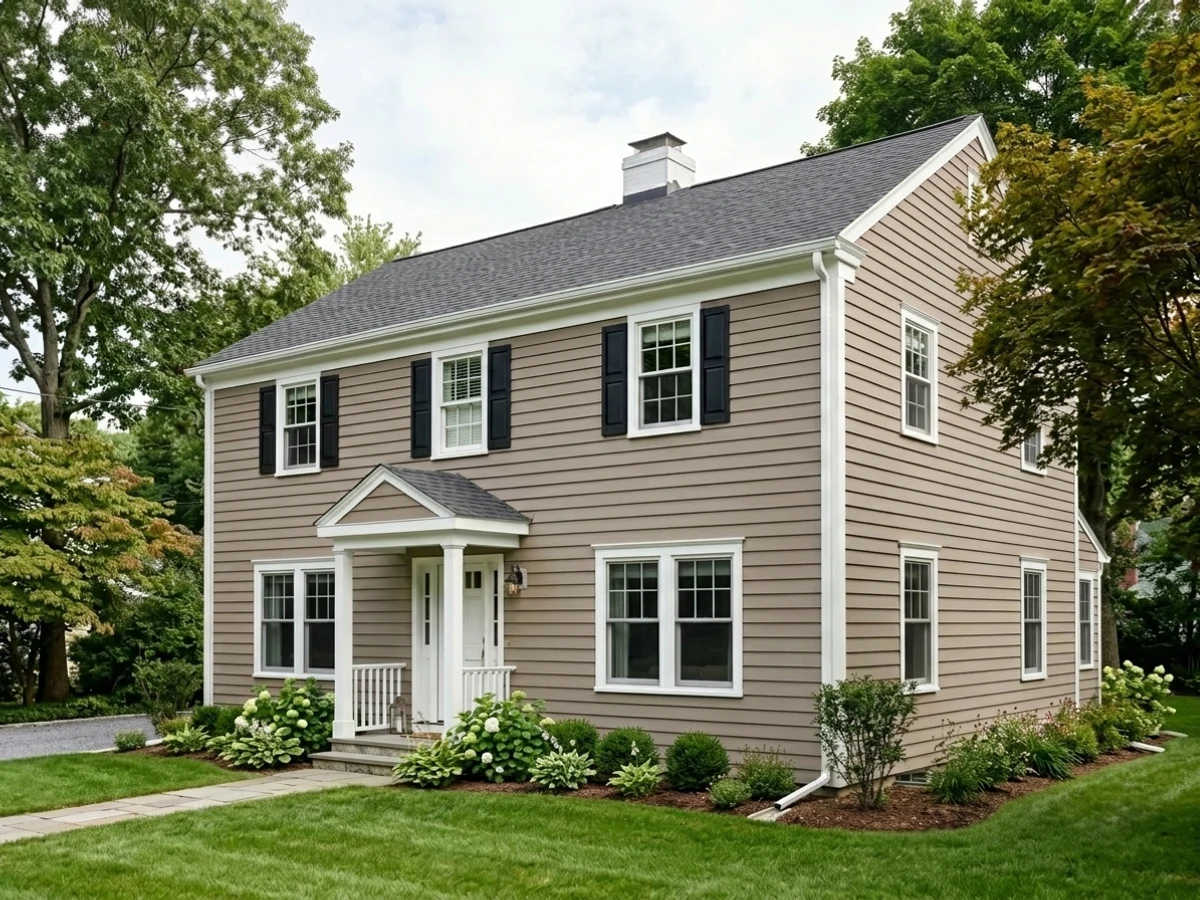
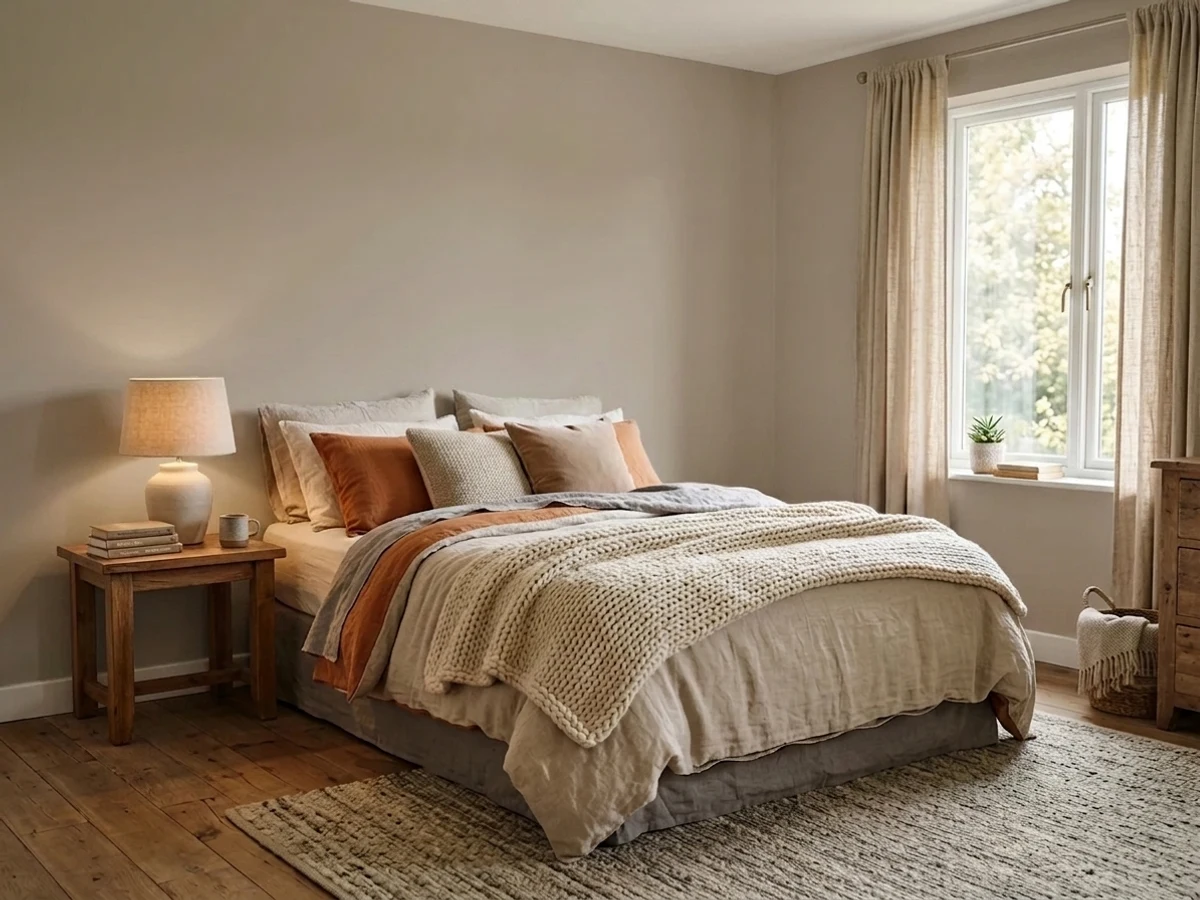
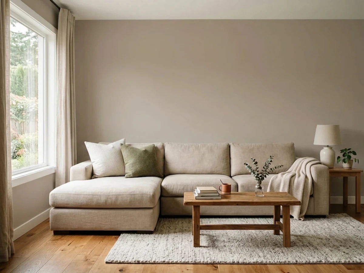
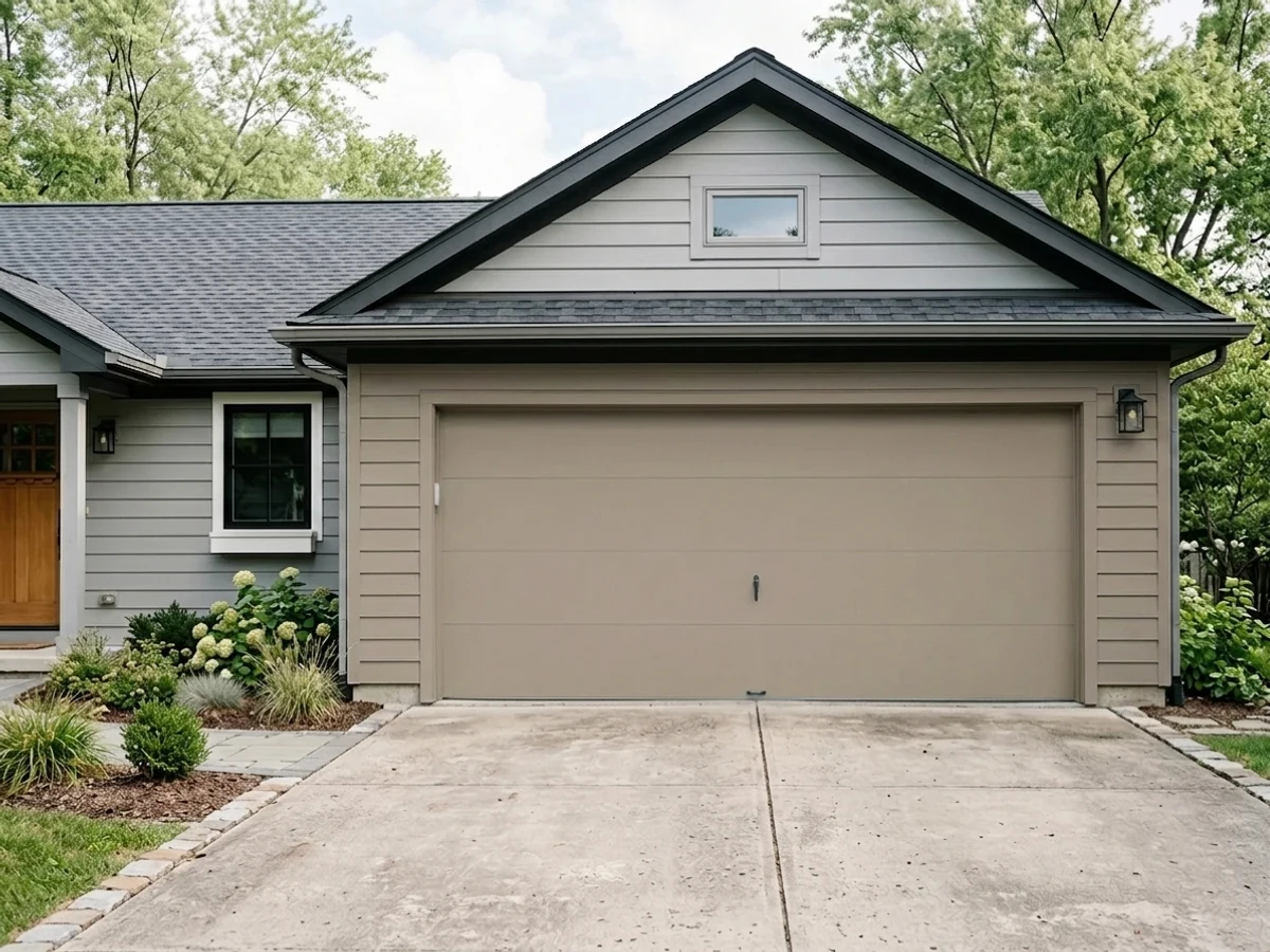
- 1Nocturne8
- 2Mocha Latte17
- 3Dirty Chai23
- 4Mindful Gray48
- 5Light French Gray53
The Fast Verdict
Dirty Chai is a warm, grayed-down brown that reads more mushroom taupe than the light cinnamon shade its name and product photos promise. At LRV 23 it sits closer to a mid-dark neutral than a pick-me-up latte tone — deep enough to anchor a kitchen island or a den, but deep enough that a dim room will swallow it. Clare's own undertone call is Warm, and that holds up: no pink, no true gray, just brown grayed down until it reads sophisticated instead of muddy — as long as the room gives it light.
Kitchen islands and cabinets · dens, offices and dining rooms with real daylight · mudrooms and entryways that need a scuff-hiding color · front doors, with Clare's matching exterior line
Your room is small with one weak window · you're picturing the lighter cinnamon-brown from Clare's product photos · your counters or floors are cool blue-gray stone or LVP · you want a true gray, not a brown wearing gray
- A real trend color with real demand behind it, not a manufactured hype pick
- Genuinely warm, genuinely brown-gray — no pink or green surprises
- Hides scuffs and marks well in high-traffic entries and mudrooms
- Flatters brass hardware, walnut and butcher block
- Deep enough to flatten shadow lines when used as a monochrome wall-ceiling-cabinet trick
- Noticeably darker and grayer in real rooms than Clare's own product photography suggests
- Goes flat and cave-like in small rooms with weak daylight
- Fights cool blue-gray stone and gray-washed floors
- A bigger commitment than a standard beige — more repaint risk if the mushroom-brown trend cools off
What Color Is Dirty Chai, Really?
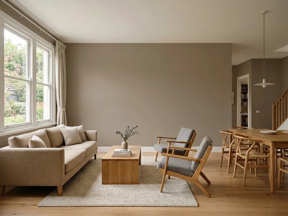
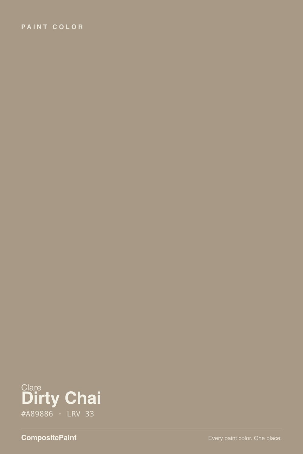
Dirty Chai is a warm brown pulled down toward gray until it lands in mushroom-taupe territory — not the clean, sugar-and-spice cinnamon its name implies. Clare lists the undertone as Warm, and on the wall that reads true: no pink flash, no green cast, just a grayed brown that leans cozy rather than rustic. The corrected swatch data (hex #8C8479) is noticeably deeper and less orange than the lighter, brighter brown shown in Clare's own product photography, which is worth knowing before you order off the thumbnail.
At LRV 23 this is a genuine mid-to-dark neutral, closer in depth to Benjamin Moore's Chelsea Gray (LRV 23) than to any of the pale greiges people usually reach for. That depth is the whole story: on a small sample it can look like a soft, forgiving taupe, but across four walls the color holds its weight and reads considerably darker and more brown-gray than a quick glance at the paint chip suggests. Plan the room's light around that, not around the marketing shot.
Undertone in one line: warm brown-gray, never pink, never true blue-gray. If your test patch looks orange, that's a warm bulb or afternoon sun pulling the brown forward; if it looks flat and lifeless, that's cool north light stripping the warmth out and leaving the gray base exposed.
Where It Shines
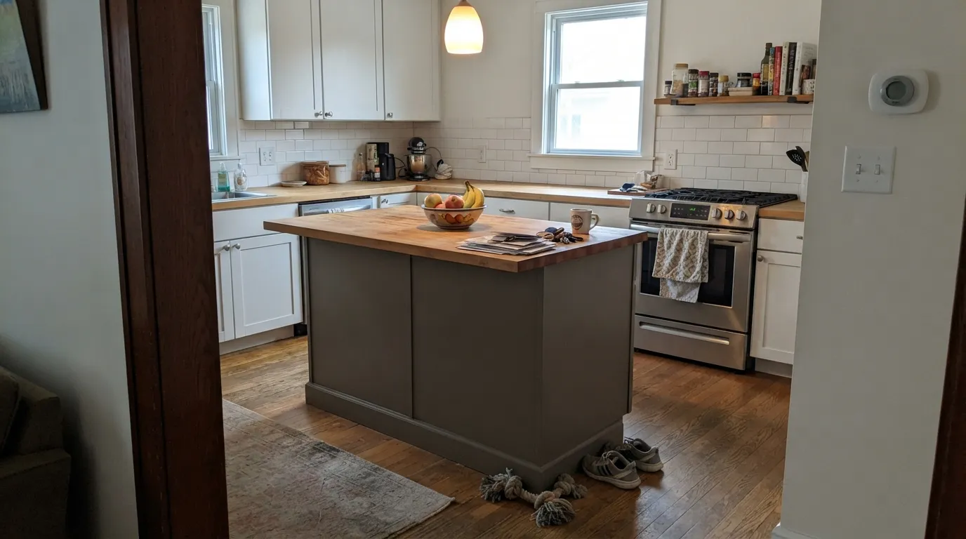
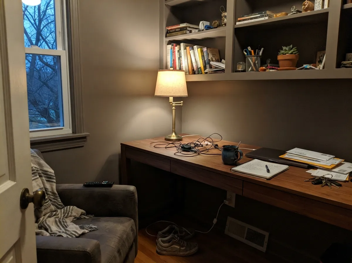
This is a trend color for a real reason — Clare's own numbers show sales climbing well over 100% year over year — and it earns that popularity in warm, well-lit rooms. Clare features it specifically in cozy kitchen styling, and it is genuinely strong on an island or a full run of cabinets against a lighter wall. One documented real-world use: a homeowner painted walls, ceiling and cabinets all in Dirty Chai to disguise bulkheads and other structural imperfections — the monochrome trick works because the color is dark enough to flatten shadow lines instead of highlighting them. Give it brass hardware, warm wood, and a window that actually sees sun, and it looks expensive rather than dim.
Where It Fails
The complaints this color earns are predictable once you know its real depth, and none of them are about the paint being bad — they're about buyers expecting the lighter, brighter brown from the product photo instead of the mushroom taupe that actually goes on the wall.
LRV 23 is already a mid-dark neutral before the room's light works against it. In a cramped space with little daylight, Dirty Chai stops reading cozy and starts reading like a cave. This color wants either real window light or a deliberate, fully-committed dark room — not a compromise.
The undertone is warm brown-gray, and it argues with cool blue-gray quartz, marble or LVP the same way every warm neutral does — the wall looks muddy, the floor looks colder by comparison. Pair it with warm wood, butcher block or a warm-toned stone instead.
Clare's own listing shows a lighter, more orange-leaning cinnamon brown than the color's actual corrected swatch data produces on a wall. Buyers expecting a pale latte-brown pick-me-up are getting a noticeably deeper, grayer taupe. Order a real sample and look at it on your own wall — in your own light — before committing to four of them.
Room by Room
On an island or a full cabinet run it is exactly the cozy, trend-right neutral Clare markets it as, especially against a lighter wall color. Semi-gloss for cabinets; it wipes clean and hides fingerprints better than a pale color would.
With brass fixtures and warm wood it turns a plain dining room into something that photographs like a design blog. Needs a real light source at the table, not just ambient daylight.
A moody, focused workspace color, especially on built-ins or a single wall behind a desk. Pairs well with leather and walnut; skip it if the room only gets indirect north light.
Deep enough to hide scuffs, boot marks and bag straps that a pale hallway color would show immediately. Semi-gloss trim on the same wall for durability where coats and bags brush past.
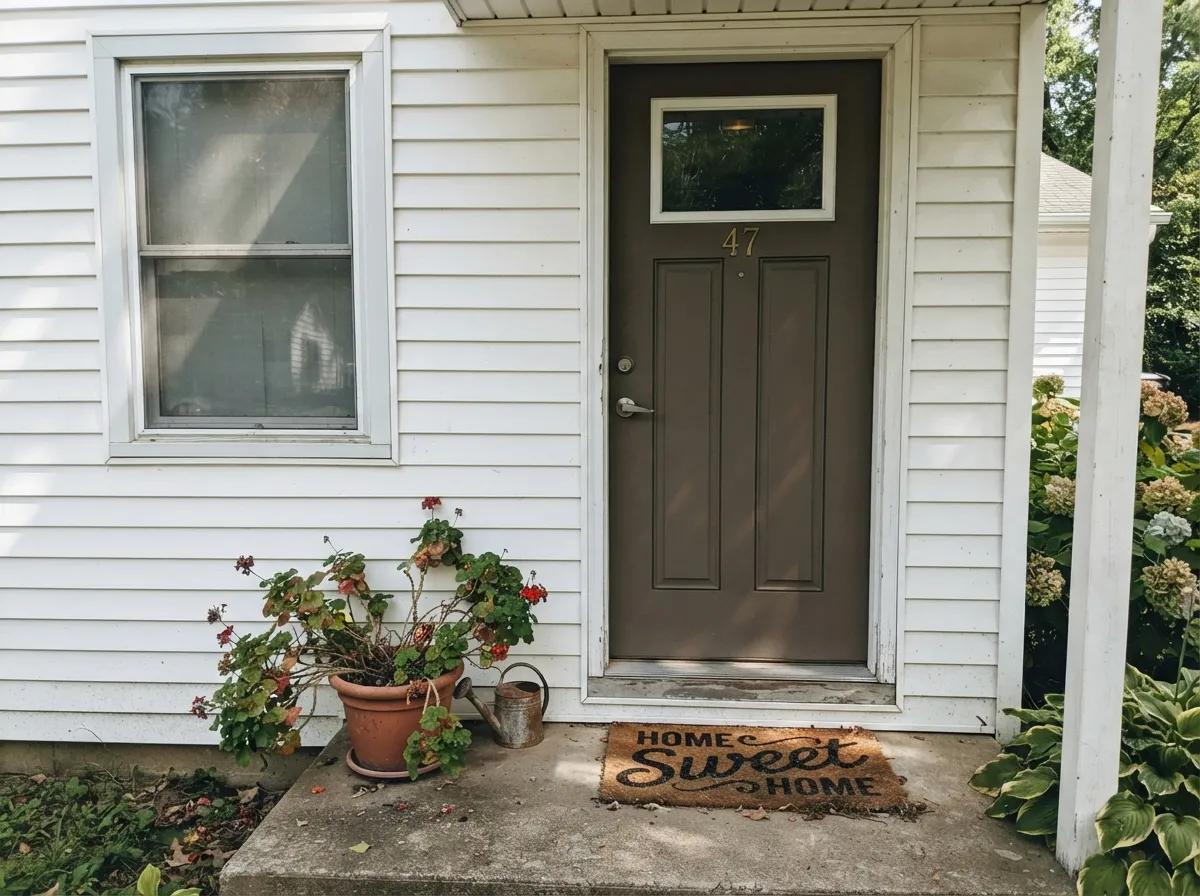
Clare sells Dirty Chai as a dedicated exterior paint, and the warm mushroom-brown reads as a confident, current front-door color against white or light-gray siding. Full sun opens it up closer to its lighter marketing photo than indoor light ever will.
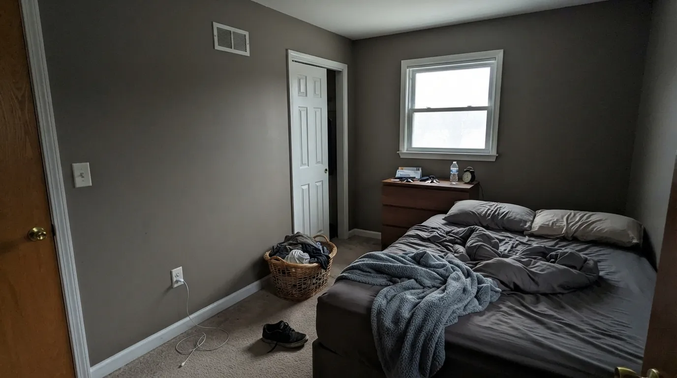
Can work as a cocoon-like accent wall behind a bed with warm lamps at night, but it is a heavier commitment than most bedroom neutrals — sample it against your actual bedding and floor before painting all four walls.
Your Light Is the Risk
The brown comes forward and the gray recedes — this is the closest the wall gets to Clare's own product photo.
Cool, dim daylight strips the warmth and leaves a flat, muddy gray-brown that reads darker than most buyers expect.
Warmer and more open at the sun hours, quieter and grayer the rest of the day — a real shift, not a subtle one at this depth.
2700K lamps pull it toward a cozy espresso-brown at night. Cool white LEDs flatten it back toward plain gray — keep the bulbs warm.
Most complaints about Dirty Chai are a light mismatch. Upload a photo of your actual room and see it on your walls — then ask for the same wall in north light or evening lamps before you buy a single sample.
Need It From Another Brand?
Any paint counter can custom-tint Clare PNT100-DP-52 directly. If you would rather stay in one brand's own deck, these are the closest stock matches, measured as ΔE2000. Under 2 is a difference you will not see on the wall.
| Brand | Closest color | ΔE | LRV | |
|---|---|---|---|---|
| Sherwin-Williams | TerrainSW 9613 · Sherwin-Williams | 1.9 | 23 | Color page → |
| Behr | WoodcraftN200-5 · Behr | 1.9 | 24 | Color page → |
| Benjamin Moore | Taos Taupe2111-40 · Benjamin Moore | 0.5 | 23 | Color page → |
| Valspar | Artichoke6003-2A · Valspar | 1.4 | 24.1 | Color page → |
| PPG / Glidden | Sweater WeatherPPG0999-5 · PPG / Glidden | 1.4 | 23 | Color page → |
| Glidden | Sweater WeatherPPG0999-5 · Glidden | 1.4 | 23 | Color page → |
Similar Clare Colors
The nearest shades to Dirty Chai within Clare's own range, ranked by perceptual color distance — useful when you want the same look a touch lighter, darker, or warmer.
WCAG 2.1: AA is 4.5 : 1 for normal text, 3 : 1 for large text, AAA is 7 : 1.
Dirty Chai vs the Colors You're Also Considering
Every Dirty Chai sample board has the same rivals on it. The numbers show the real lightness gap — then it comes down to which risk you would rather live with.
Pick this when you specifically want the brown to lead, not the gray.
Benjamin Moore HC-168 · LRV 23Chelsea GrayPick this if you want the exact same depth with the brown dialed back toward true charcoal-greige.
Pick this for the slightly more chai-warm, less olive version of the same muted-earth idea.
Sherwin-Williams SW 7046 · LRV 20AnonymousPick this if your painter works in Sherwin-Williams — a similarly quiet earthy neutral, one of SW's best exterior colors too.
At a glance several Clare neutrals share Dirty Chai's LRV, but they lean different directions. Shade (PNT100-MD-14, LRV 28) is a touch deeper and reads as a cool gray-green rather than a warm taupe; choose Shade when you want something moodier and less brown, and Dirty Chai when you want cozy warmth.
Cosmic Vibes (PNT100-LT-32, LRV 34) sits at nearly the same lightness but has a cool gray-violet cast, so side by side Dirty Chai looks clearly warmer and earthier. Cosmic Vibes suits a more modern, cool palette.
Extra Virgin (PNT100-MD-64, LRV 35) is close in value too but is a soft sage green. If you love the depth of Dirty Chai but want a hint of color instead of brown, Extra Virgin is the greener alternative. For a straightforward warm neutral, Dirty Chai stays the safest of the group.
Dirty Chai Coordinating Colors
Stay warm and stay muted — that's the whole rule for pairing with Dirty Chai. It wants soft warm whites for trim, other grayed earth tones for layering, and a genuine near-black for contrast. Cool grays and bright blue-based whites are the two things that consistently fight it.
A Trend Color With Real Demand Behind It
Dirty Chai isn't a color Clare invented buzz for — it's one where the sales followed the buzz. Clare's own reporting put it among its hottest colors with sales climbing well over 100% year over year, riding the same wave of warm, grounded browns that pushed colors like Benjamin Moore's Cinnamon Slate into the spotlight. It's a mushroom-brown answer to a decade of gray fatigue.
The corrected color data behind this review puts Dirty Chai meaningfully deeper and grayer than Clare's own listing suggests, which matters for how it ages: a muted, grayed brown like this one reads closer to a neutral than a saturated trend color, and neutrals survive trend cycles better than anything bright does.
Dirty Chai With Wood Tones and Floors
Warm wood is this color's best friend. Walnut, butcher block and honey oak all sit comfortably against Dirty Chai because their warmth meets the paint's warmth instead of fighting it — one documented real-world example used Dirty Chai on walls, ceiling and cabinets together specifically to smooth over structural bulkheads, which only works because the color and the wood tones it was paired with agreed with each other.
The floors and stone that need a sample first are anything cool: blue-gray LVP, cool marble, gray-washed engineered wood. Those surfaces pull against the brown undertone and can leave both the floor and the wall looking slightly off. If a cool floor is staying, test a large sample directly above it before committing to the wall.
Three Ready Palettes Built on Dirty Chai
A color is never alone on the wall. These are complete combinations in the 60-30-10 pattern, with the reason each one holds together. Every one opens in the visualizer.
A soft warm white keeps the perimeter bright while Dirty Chai carries the island's real weight; Kendall Charcoal adds one deeper accent so the room doesn't read as two flat blocks of color.
Try this palette in your roomWhite Dove siding and trim let Dirty Chai do exactly one job — the front door — instead of competing with itself; Wrought Iron shutters add the near-black note that makes the warm brown look intentional, not accidental.
Try this palette in your roomSwiss Coffee keeps the room's trim soft instead of stark, and Anonymous on the built-ins layers a second muted earth tone close enough in family to feel deliberate rather than mismatched.
Try this palette in your roomDirty Chai FAQ
Is Dirty Chai a brown or a gray?
Brown, grayed down — Clare lists the undertone as Warm, and it holds true on the wall. It never reads as a true gray, but it's muted enough that people who wanted a soft mushroom taupe are usually happy, while people picturing a bright cinnamon brown are surprised by how gray it feels.
Why does my wall look darker than the paint chip?
At LRV 23 this is already a mid-to-dark neutral, and depth always intensifies across four walls compared to a small sample. Clare's own product photos also lean lighter and more orange than the corrected color data actually produces — order a real sample and check it in your room's own light before you commit.
Is it good for kitchen cabinets?
Yes — it's one of the stronger uses for this color, especially on an island or lower cabinets against a lighter wall. Use the semi-gloss trim paint for durability and easy cleanup around handles.
What trim white goes with Dirty Chai?
A soft warm white — Swiss Coffee or White Dove — keeps the pairing cohesive. A stark, cool white trim will make the brown-gray walls look muddy by comparison.
Can I use it outside, like on a front door?
Yes — Clare sells Dirty Chai as a dedicated exterior paint. Full sun opens the color up closer to the lighter tone shown in marketing photos than indoor light ever will, and it reads well against white or light-gray siding.
Does it work with gray floors?
Only with warm-toned gray. True cool blue-gray flooring or countertops fight the warm brown undertone and can make both the floor and the wall look off. Warm wood, walnut or a warm greige floor is the safer match.
Have you painted with Dirty Chai?
Rate it — one tap helps the next reader decide.
Ask a Question