Penthouse
Clare's airy warm-cool greige, reviewed honestly: the light where it holds its balance, the real complaint about it drifting blue, and what to pick instead.

Jessica has spec'd whites and neutrals for more than 300 rooms and keeps a sample wall of painted drawdowns in her studio. Every color review is checked against real reader rooms in the comments and re-tested when a formula changes. About the testing process →
- 1First Star69
- 2Classic Gray74
- 3Penthouse79
- 4Greek Villa84
- 5Chantilly Lace91
The Fast Verdict
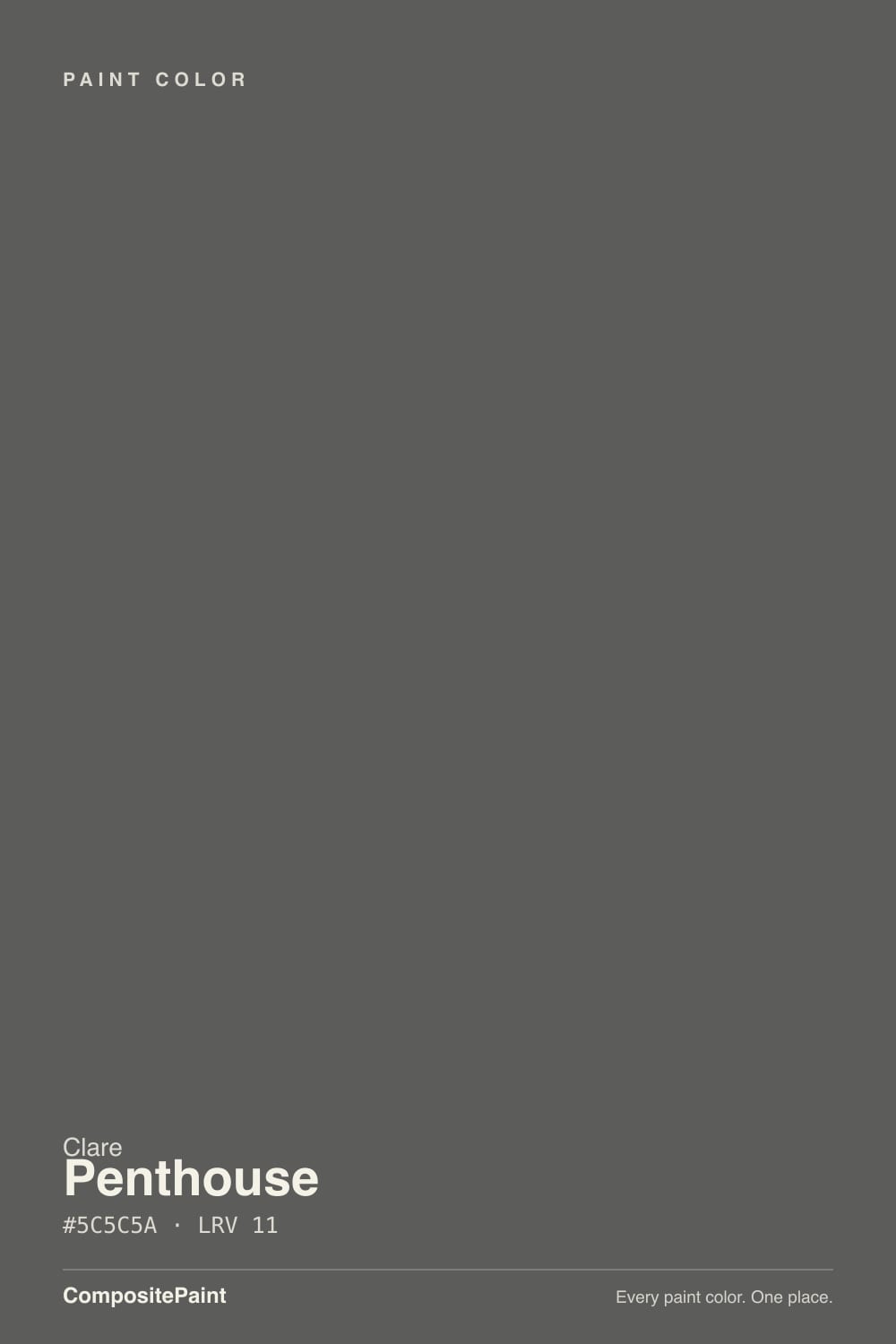
Penthouse is Clare's answer to "just a nice greige, nothing too beige, nothing too gray." At LRV 79 it is bright enough for a whole daylight-filled floor, and the undertone is genuinely split down the middle between warm and cool — which is exactly why it photographs differently in almost every review picture online. Give it real light and warm materials and it reads polished and quiet. Leave it in a dim room with nothing warm nearby and owners report it sliding toward blue-gray.
Open-plan living rooms and hallways with real daylight · kitchens and baths with warm wood, brass or butcher block · bedrooms lit by warm lamps at night · shoppers comfortable buying paint sight-unseen online
Your room is a dim, north-facing box with no warm materials · you need a color that reads identical next to every neighbor · you want to grab a backup gallon from a local store the same day · you're only testing it under cool LED light
- A genuine warm-cool balance, not just a beige with gray stirred in
- Bright enough (LRV 79) to work across a daylight-filled whole floor
- Real owners report success carrying it through kitchen, hallway and living room
- Peel-and-stick swatches make it easy to live-test before buying a gallon
- Self-priming, zero-VOC formula covers evenly with minimal touch-up
- Undertone is thin enough to be pushed around by whatever color sits next to it
- Some owners see it lean blue rather than the advertised warm-cool balance
- Clare is online-only — no local store for a same-day backup gallon
- Paint purchases are final sale, so a bad match means reordering, not returning
What Color Is Penthouse, Really?
Penthouse belongs to Clare's original Whites & Neutrals collection, the paint line Nicole Gibbons built her DTC brand around in 2018. Clare's own copy calls it "the perfect mix of warm and cool" — and unlike most brand copy, that description is doing real work here. Most greiges lean one direction and call it neutral. Penthouse is built to sit on the fence, which is a harder trick to pull off than picking a side.
At LRV 79 it is close enough to white that its undertone has very little pigment weight to assert itself with. That thinness is the whole story: on a bright wall in warm light it reads like a soft, expensive off-white; in a dim room or next to something cooler, the same wall can read flat gray. It is not inconsistent paint — it is a color with almost no anchor of its own, so it takes its cues from whatever room it lands in.
Undertone in one line: warm-leaning gray-beige on paper, but genuinely unstable at the edges — cool light or a cool neighbor color can pull it toward blue-gray, and that shift shows up in real owner reviews, not just theory.
Where It Shines
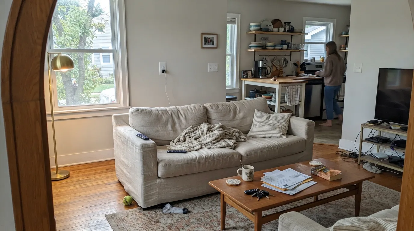
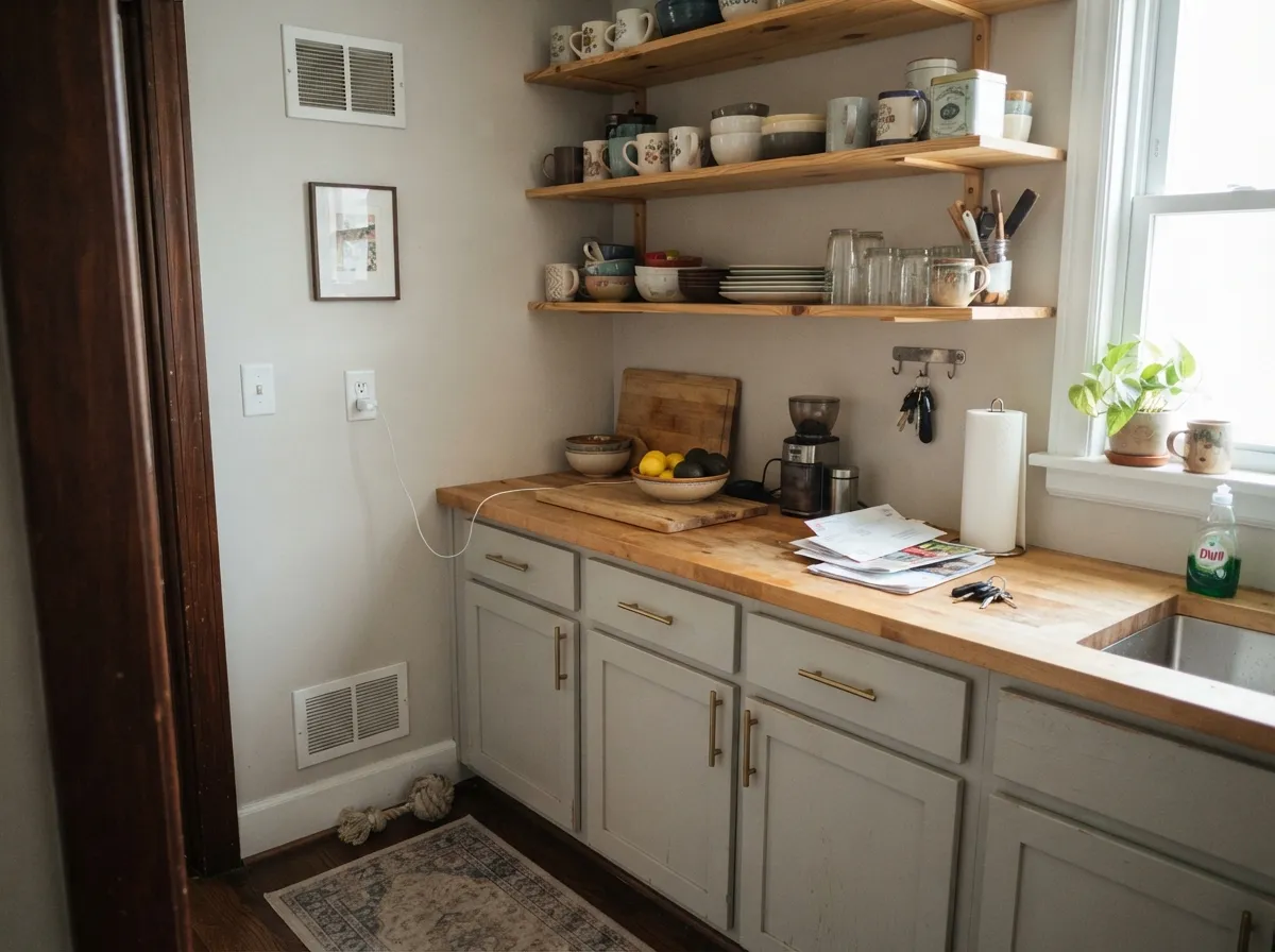
Give it daylight and something warm to bounce off — oak floors, brass hardware, a linen sofa — and Penthouse looks like a paid design consultation, not a paint chip. Clare's own customers report using it successfully across connected rooms: kitchen into hallway into living room, the same wall color quietly carrying the whole downstairs. It is also a genuinely easy bedroom color once warm lamps take over from daylight at night.
Where It Fails
Almost every complaint about Penthouse traces back to one of three situations, and all three are predictable before you order the gallon — but because Clare ships paint rather than selling it off a store shelf, a bad match costs more time to fix than it would with a local can of Benjamin Moore.
Real Clare customers describe Penthouse as a color that "seems to change with whatever you put with it," and others report it reading more blue than the swatch suggested. This is the direct cost of the warm-cool balance Clare sells it on — at LRV 79 there isn't enough pigment weight to hold one identity against every room and every neighbor color. If you need total predictability, pick a color with a clearer, stronger undertone instead.
Clare sells online only, with no retail counter to walk into if a gallon reads wrong. Paint purchases are final sale — Clare will make it right if something is genuinely defective, but a color that simply doesn't suit your room isn't a return, it's a reorder and a wait. Order the peel-and-stick swatch first and live with it for a few days before committing to a full order.
A dim north-facing room with no warm wood, brass or lamp nearby is the one setting where Penthouse's thin undertone has nothing to hold onto — it goes flat and slightly cool. Add a warm floor or warm bulbs, or choose a color with more pigment weight for that room.
Room by Room
Real daylight and a few warm materials — a wood coffee table, a linen sofa — let it settle into the polished, quiet greige Clare markets. Eggshell finish; keep trim in the same family rather than a stark bright white.
Owners specifically call out using Penthouse in the kitchen, and it makes sense: butcher block, brass pulls and warm cabinetry all give the undertone something to lean on. Satin or semi-gloss on cabinets for wipeability.
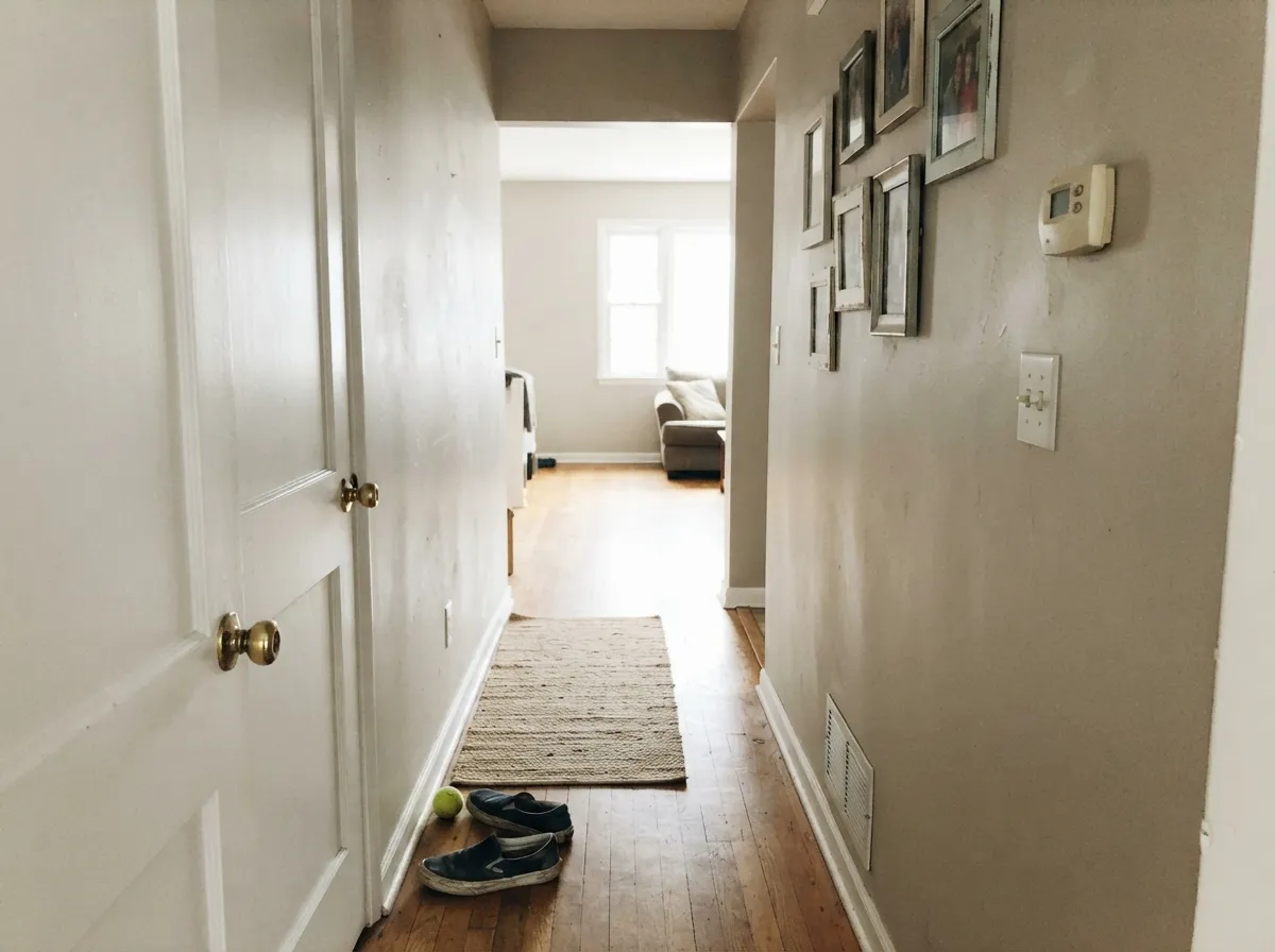
This is the pairing Clare's own customers reach for most: kitchen into hallway into living room, one wall color the whole way through. Hallways rarely get direct sun, so lean on warm-toned doors and trim to anchor it.
Under 2700K bulbs at night it settles warm and calm. If the room faces north and stays dim during the day, plan on lamps doing real work, not just decoration.
With warm-veined marble, wood vanities or brass fixtures it is easy to live with. Cool blue-gray tile or stark white quartz will pull it toward the cooler side of its personality — sample against your actual counter before committing.
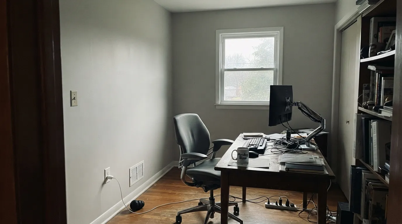
Clare markets it for home offices, and on video calls a warm desk lamp keeps it looking intentional. Cool overhead LEDs alone are the one setup that exposes the color at its flattest.
Your Light Is the Risk
This is where the warm-cool balance actually balances — soft, polished greige with no blue creeping in.
With nothing warm nearby the thin undertone loses its warm half and the wall reads flat, slightly blue-gray.
Warmer at the sun hours, quieter and grayer once the direct light passes — a bigger swing than most whites its LRV.
2700K lamps hold the warm half of the balance. Cool LEDs alone let the color drift toward the gray-blue owners complain about.
Most complaints about Penthouse are a light mismatch. Upload a photo of your actual room and see it on your walls — then ask for the same wall in north light or evening lamps before you buy a single sample.
Need It From Another Brand?
Any paint counter can custom-tint Clare PNT100-LT-05 directly. If you would rather stay in one brand's own deck, these are the closest stock matches, measured as ΔE2000. Under 2 is a difference you will not see on the wall.
| Brand | Closest color | ΔE | LRV | |
|---|---|---|---|---|
| Sherwin-Williams | Minuet WhiteSW 6819 · Sherwin-Williams | 2.2 | 80 | Color page → |
| Behr | Silent WhitePPU26-13 · Behr | 1.2 | 79 | Color page → |
| Benjamin Moore | Mountainscape870 · Benjamin Moore | 1.2 | 79 | Color page → |
| Valspar | Teapot8007-1A · Valspar | 0.6 | 80 | Color page → |
| PPG / Glidden | RadissonPPG1013-1 · PPG / Glidden | 1.5 | 79 | Color page → |
| Glidden | RadissonPPG1013-1 · Glidden | 1.0 | 80 | Color page → |
Similar Clare Colors
The nearest shades to Penthouse within Clare's own range, ranked by perceptual color distance — useful when you want the same look a touch lighter, darker, or warmer.
WCAG 2.1: AA is 4.5 : 1 for normal text, 3 : 1 for large text, AAA is 7 : 1.
Penthouse vs the Colors You're Also Considering
Every Penthouse sample board has the same rivals on it. The numbers show the real lightness gap — then it comes down to which risk you would rather live with.
Pick this when you want visible color on the wall, not just brightness — next to Whipped, Penthouse is the one with a personality.
Clare PNT100-LT-02 · LRV 95WhippedPick this for a near-white that stays warm even in a dim room — Whipped runs LRV 95 and doesn't share Penthouse's undertone drift.
Pick this for the slightly deeper, more clearly greige option — Alabaster reads brighter and less gray by comparison.
Sherwin-Williams SW 7008 · LRV 82AlabasterPick this if your painter works in Sherwin-Williams and you want a warm near-white with less chameleon behavior and a local can to fall back on.
Pick this if you specifically want Clare's online ordering, swatches and delivery, not a paint-store dealer.
Benjamin Moore OC-23 · LRV 74Classic GrayPick this for the same pale-greige chameleon quality from a brand you can buy locally — it also goes quiet in very bright rooms.
Clare's own deep neutrals show where Penthouse sits. Blackest (PNT100-DP-55), hex #515052 at LRV 8, is a few steps darker and reads closer to a soft black; choose it when you want the wall to feel nearly black and Penthouse when you want to still see it as a gray.
Coffee Date (PNT100-DP-53), #726460 at LRV 14, is a clear warm greige-brown by comparison. Side by side, Penthouse looks cleaner and more neutral, so pick Coffee Date if you want visible warmth and Penthouse if you want the depth without the brown.
Goodnight Moon (PNT100-DP-42), #545E66 at LRV 11, shares almost the same darkness but leans blue-gray. In a north room that cool cast is obvious, so go with Goodnight Moon for a slate feel and Penthouse when you want a dark that stays truly neutral and does not commit to blue.
Penthouse Coordinating Colors
The rule for coordinating with Penthouse is to give it a clear side to lean toward — pair it with something decisively warm or decisively cool, rather than another ambiguous neutral, and it stops drifting and starts reading as a deliberate choice. These are the partners that keep it looking intentional:
Buying Clare Penthouse: What Online-Only Means for You
Clare is a direct-to-consumer brand — there is no paint counter to walk into, no in-store color match, and no same-day backup gallon if a room needs a second try. Everything ships from Clare's site, and paint purchases are final sale; genuine problems get made right, but a color that simply doesn't work in your room is a reorder, not a return.
The practical fix is to treat the sample step as mandatory, not optional. Clare's peel-and-stick swatches are reusable and repositionable, which makes them better for this exact undertone-drift problem than a painted swatch card: move the same swatch through the room at different times of day and next to different materials before you commit to a full gallon.
Penthouse With Wood Tones and Metals
This color performs best when the room already leans warm. Oak, walnut and butcher block all give Penthouse's thin undertone something to reflect, and brass or warm bronze hardware reinforces the warm half of its split personality — this is the pairing behind most of the positive owner reviews.
Cool materials are the honest risk: gray-washed floors, chrome fixtures and cool white stone all give the undertone nothing warm to hold onto, and that is when the color settles toward the flat, slightly blue read some owners describe. It is not a dealbreaker in a bright room, but in anything dim, plan on adding warmth somewhere else in the space.
Three Ready Palettes Built on Penthouse
A color is never alone on the wall. These are complete combinations in the 60-30-10 pattern, with the reason each one holds together. Every one opens in the visualizer.
One color at two sheens carries a small open plan without a hard sightline where kitchen meets hallway meets living room — the exact combination Clare's own customers report using. The navy door supplies the one dark note the scheme needs.
Try this palette in your roomWhite Dove cabinets keep the warmth Penthouse can lose in cool light, while the charcoal island supplies real contrast without pulling the whole room cold. Brass hardware and butcher block finish the case for the warm side of Penthouse's undertone.
Try this palette in your roomStaying inside the Clare deck keeps undertones consistent across the room: Whipped's warmer, brighter white on trim gives Penthouse a warm reference point instead of letting it drift on its own, and Dirty Chai grounds the scheme with real depth for lamp-lit evenings.
Try this palette in your roomPenthouse FAQ
Is Penthouse warm or cool?
Clare markets it as a genuine mix of both, and that is honestly the fairest description — but at LRV 79 the undertone is thin enough that real light and real neighbor colors decide the answer more than the paint itself. Some owners see warm greige; some report it leaning blue. Sample it in your actual room before ordering a full gallon.
Can I use it in more than one room?
Yes — this is one of its strongest real-world track records. Clare customers specifically describe running it through kitchen, hallway and living room as one connected color, which suits open floor plans well as long as those rooms share similar light.
What if it doesn't look right once it's on the wall?
Order the peel-and-stick swatch first and live with it for a few days in different light. Clare paint purchases are final sale — genuine defects get made right, but a shade that simply doesn't suit your room means reordering, not returning, since there's no local store to exchange it at.
Does it work in a bathroom?
It depends on your stone and tile. Warm-veined marble, wood vanities and brass fixtures let it settle into its warm half. Cool blue-gray tile or stark white quartz will pull it cooler — test a sample against your actual counter before committing.
What trim white goes with Penthouse?
Semi-gloss in the same undertone family works best — Clare's own Whipped is the brand-matched option, and it also gives Penthouse a warm neighbor to hold onto instead of drifting on its own. A starkly cool white trim will only amplify the blue some owners report.
How is Penthouse different from Whipped or Snow Day?
Both Whipped and Snow Day sit at LRV 95, functionally near-white. Penthouse is a full step darker at LRV 79, with enough body to read as an actual greige rather than an off-white — the trade-off is that extra depth is also what makes its undertone easier to push around.
Have you painted with Penthouse?
Rate it — one tap helps the next reader decide.
Ask a Question