Room Colors · Blue Accent Wall
8 Best Blue Accent Wall Paint Colors for 2026
ideas, combinations, and real rooms
8 curated picks from real blue accent walls — with the exact colors, honest reasons why, and the combinations that hold the room together.

Former interior stylist who can spot a green undertone from across a room. Jessica writes the color and mood pieces — what to choose, what pairs, and why your "white" looks pink.
The Fast Answer
Don't want to read 8 picks? These four are the safe answers.

Top Picks for the Blue Accent Wall
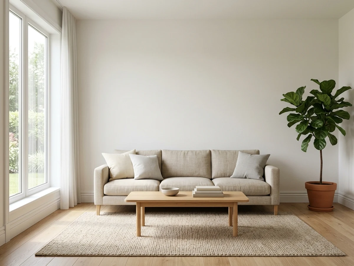
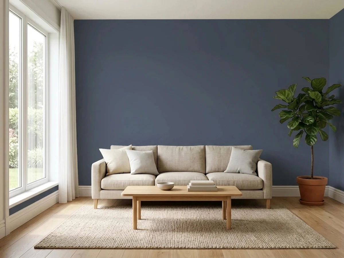
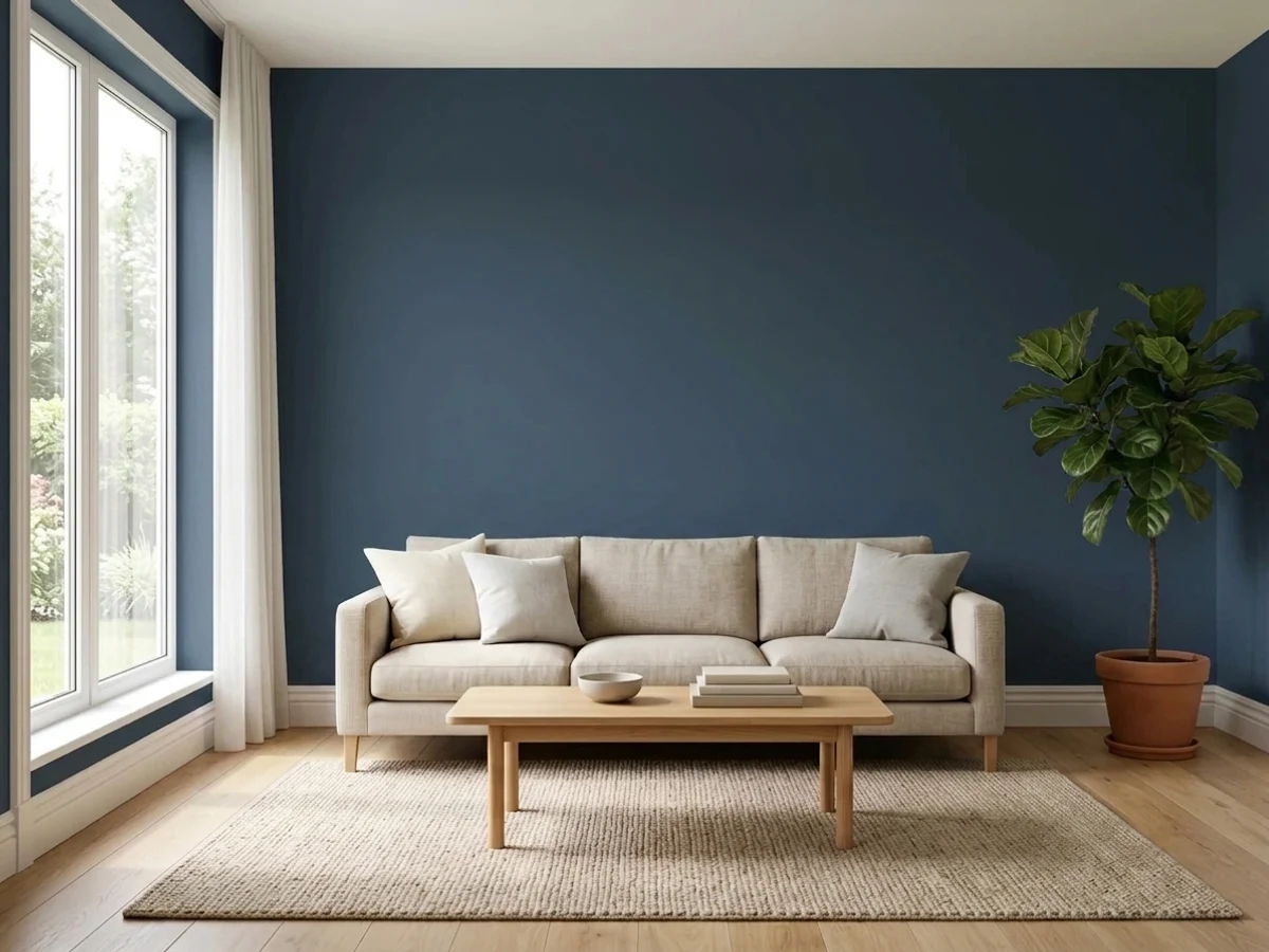
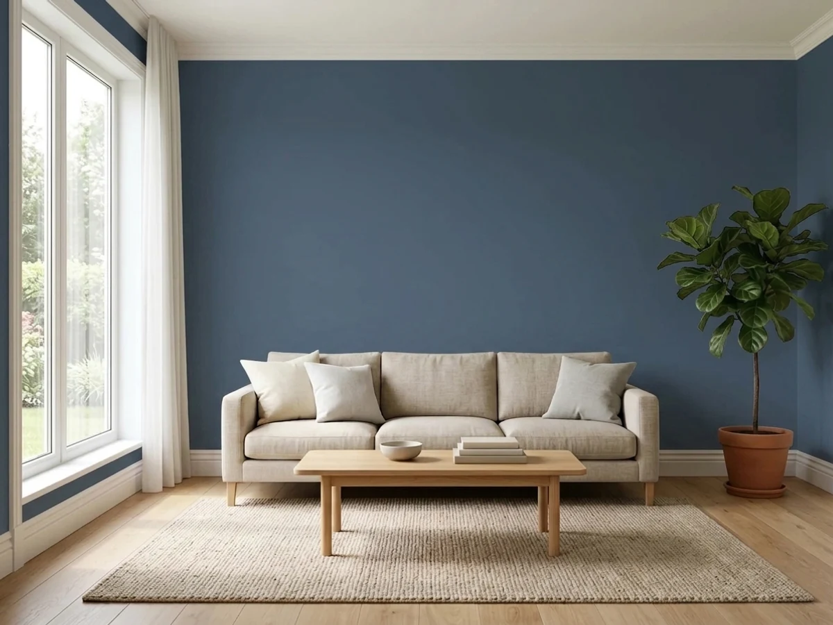
Tap a shade to see the blue accent wall in it, then try it on your own room.
Blue Accent Wall Color Trends 2026 — What's In, What's Out


- Pale Cool Baby Blue — The soft, chalky baby blue popular for accent walls a decade ago now reads flat and dated next to 2026's deeper, more saturated blue tones.
- Blue Accent Wall With Bright White Everything Else — Pairing one blue wall against stark white trim and ceiling is losing ground to rooms that use warmer whites and more tonal color throughout.
- Bright Cobalt Blue — Loud, saturated cobalt blue accent walls from earlier trend cycles now feel busy next to 2026's calmer, deeper navy and ink-blue tones.
The 8 Best Blue Accent Wall Paint Colors
Every pick below is a real rendered blue accent wall, not a chip. The lead color first; the swatches are the full scheme in the photo — walls, furniture, textiles, accent.

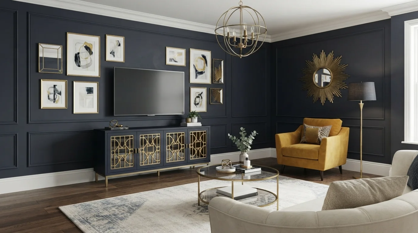
Deep midnight blue walls set an opulent, dramatic tone against radiant brass accents and a plush mustard yellow chair.
Midnight navy is a deep, velvety dark blue that instantly commands attention. Here, rich navy blue covers the grid-paneled walls, setting a striking backdrop for the gold-trimmed media console, warm mustard armchair, and cream patterned rug. The room feels moody, luxurious, and wonderfully intimate. The look works because warm metallic golds and vibrant ochre balance the dark backdrop, keeping the space bright and inviting. It is perfect for anyone who wants a tailored, upscale living room packed with personality.
SEE BLUE COAL ON YOUR WALLS →
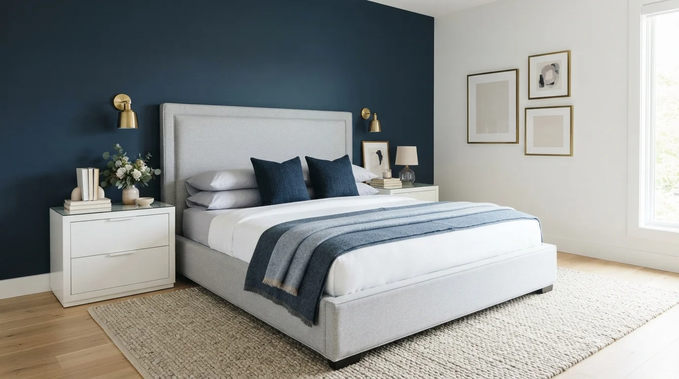
Crisp navy blue anchors this modern bedroom, creating a peaceful, hotel-inspired retreat wrapped in airy whites and soft brass.
Midnight navy is a rich, velvety dark blue that brings depth to any room. In this bedroom, a bold blue accent wall grounds the space behind a pale gray upholstered bed, while crisp white walls, sleek white nightstands, and a light woven rug keep the atmosphere airy. The room feels calm, polished, and quietly sophisticated. The look works so well because high-contrast dark and light tones naturally balance each other without feeling busy. It is ideal for anyone looking to create an elegant, hotel-style master suite.
SEE BLUE DUSK ON YOUR WALLS →
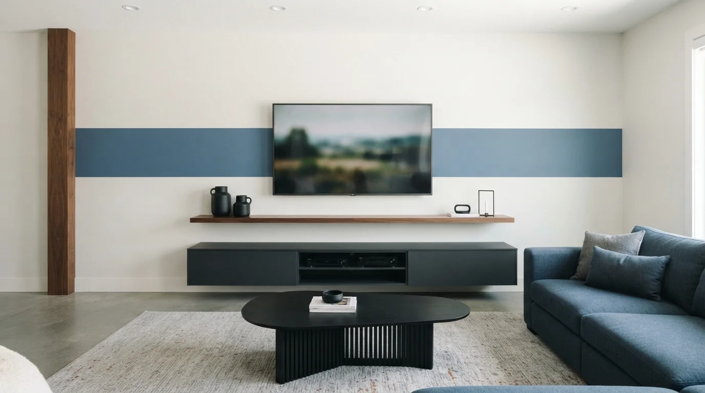
Cool slate blue combines with crisp white, warm walnut, and charcoal accents for a deeply calming modern sanctuary.
Slate blue is a cool, smoky blue with relaxing gray undertones. In this space, a clean horizontal band of blue wraps behind the screen against soft white walls, mirrored by a low charcoal console and a matching blue sofa. The whole room feels grounded, serene, and tailored. This look works because the warm walnut wood details keep the cool blues and crisp neutrals from feeling too stark. It is the perfect setup for minimalist design lovers who want a touch of color.
SEE GLASS SAPPHIRE ON YOUR WALLS →
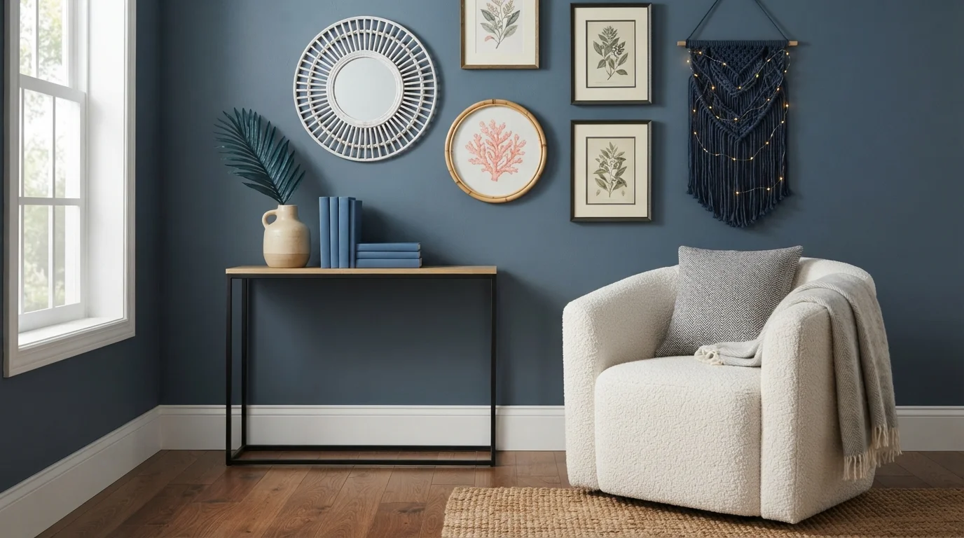
Deep oceanic blue walls paired with tactile rattan, glowing fairy lights, and cozy bouclé bring breezy seaside relaxation indoors.
Slate blue is a soothing, dusty denim shade that feels grounded yet refreshing. In this photo, rich blue coats the walls, creating a stunning backdrop for a creamy bouclé armchair, bright white trim, and a pale wood console table. The corner feels peaceful, snug, and gently inspired by the sea. Woven rattan, macrame, and warm ceramic textures soften the cool wall color beautifully. It is a fantastic choice for anyone craving a relaxing reading nook with beachy charm.
SEE VERANDA BLUE ON YOUR WALLS →
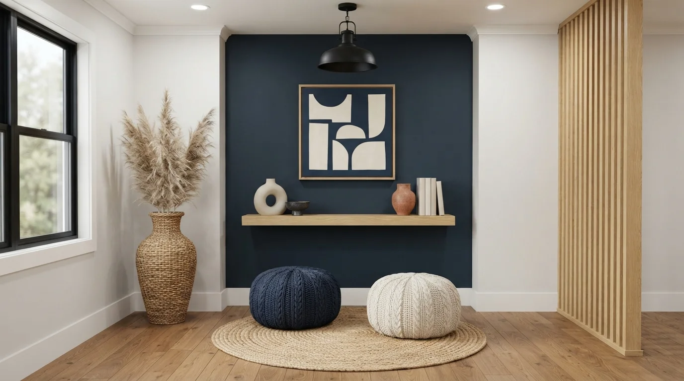
Rich midnight blue pairs with warm blonde wood and woven textures to create a grounded, serene modern lounge.
Midnight blue is a deep, velvety shade of dark navy. In this room, it covers the main focal wall, contrasting cleanly against the soft off-white walls and light oak floating bench. The space feels grounded, peaceful, and snug. This combo works because the dark blue acts as a deep backdrop that makes natural woods and woven textures immediately pop with warmth. It is ideal for anyone wanting a modern, meditative space that stays calm and collected.
SEE IT ON YOUR WALLS →
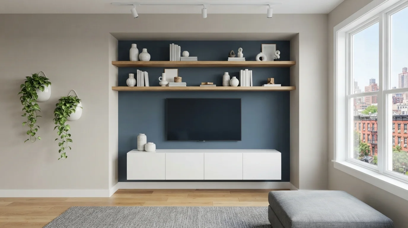
Cool slate blue grounds the media wall, pairing effortlessly with floating oak shelves and soft, sunlit neutrals.
Slate blue is a deep, calming blue with a gentle touch of gray. In this room, it creates an eye-catching focal wall behind the TV, surrounded by soft greige side walls, clean white trim, and a plush gray area rug. The space feels grounded, tidy, and peaceful. This combo works because the cool blue background makes the warm natural oak shelves stand out instantly. It is great for apartment dwellers who want a smart, modern entertainment space.
SEE CHINA PATTERN ON YOUR WALLS →
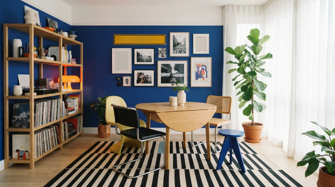
Vibrant cobalt walls meet cheerful vintage furniture and soft diffused daylight, creating an energized and creative space.
Royal blue is an intense, saturated jewel-toned blue. In this room, the deep cobalt wall provides a dramatic backdrop for a light wood table, a graphic striped rug, and playful yellow, black, and blue chairs. The room feels energetic, expressive, and full of creative personality. Pairing rich blue with warm natural wood and pops of sunny yellow keeps the space balanced rather than dark. It is a fantastic choice for anyone who loves modern retro style and collected art.
SEE DARING INDIGO ON YOUR WALLS →
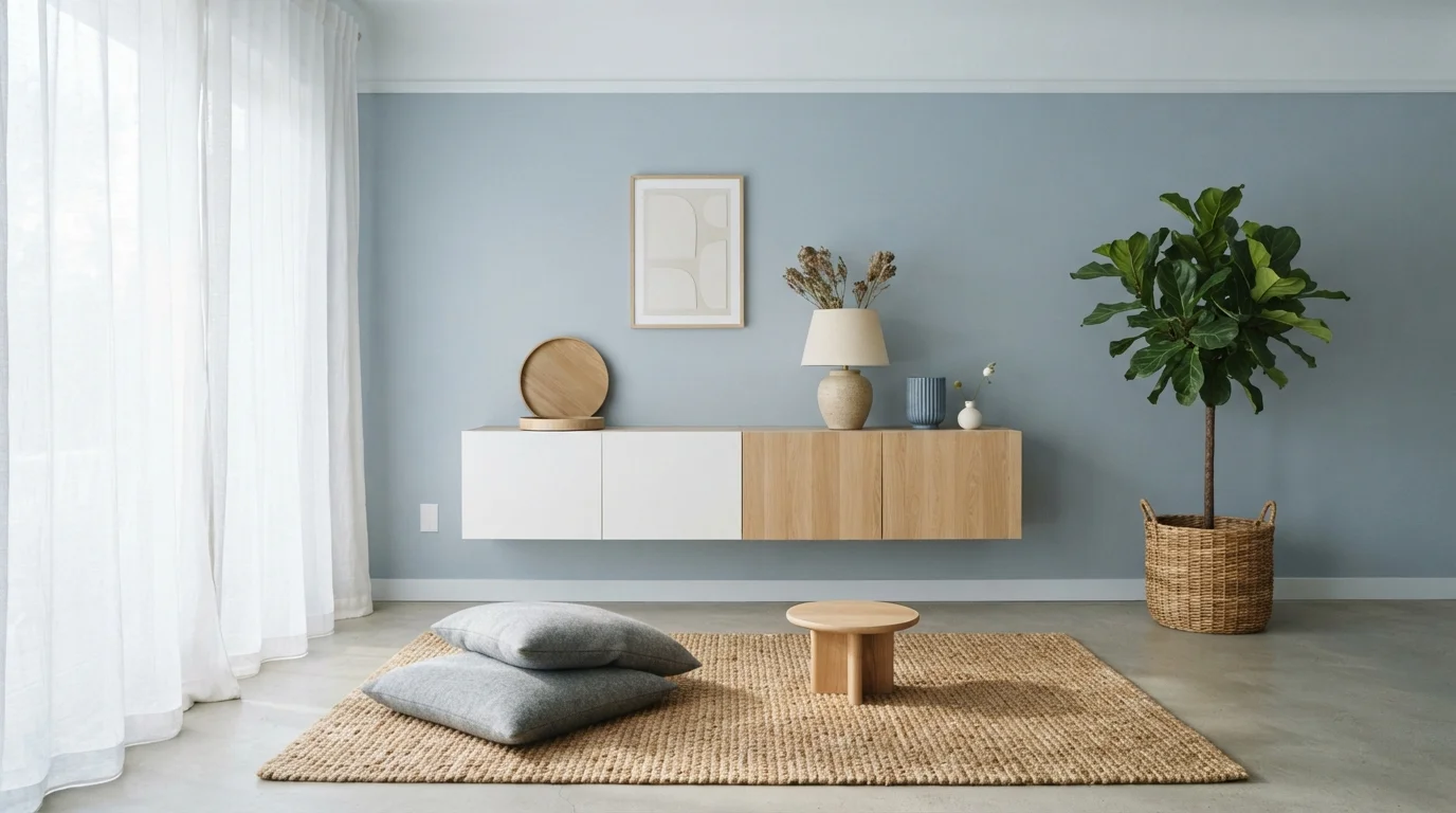
Soft dusty blue walls and light blonde wood create a calm, sunlit sanctuary grounded in natural simplicity.
Dusty slate blue is a gentle, soothing blue with quiet gray notes. In this space, it covers the main wall behind a floating white and oak credenza, paired with an earthy woven rug and soft floor pillows. The room feels completely calm, uncluttered, and breezy. This look works so well because cool blue tones naturally balance warm blonde woods and creamy accents. It is perfect for anyone seeking a mindful, minimalist retreat to unwind at home.
SEE IT ON YOUR WALLS →Blue Accent Wall Wall Color Combinations
A wall color never works alone. These are the full schemes from the rooms above — the lead color first, then the supporting colors that make the photo work.
Deep midnight blue walls set an opulent, dramatic tone against radiant brass accents and a plush mustard yellow chair.
TRY THIS PALETTE →Crisp navy blue anchors this modern bedroom, creating a peaceful, hotel-inspired retreat wrapped in airy whites and soft brass.
TRY THIS PALETTE →Cool slate blue combines with crisp white, warm walnut, and charcoal accents for a deeply calming modern sanctuary.
TRY THIS PALETTE →Deep oceanic blue walls paired with tactile rattan, glowing fairy lights, and cozy bouclé bring breezy seaside relaxation indoors.
TRY THIS PALETTE →Naval or Hale Navy with crisp white trim (Chantilly Lace or Extra White) is the classic accent-wall combination — the white keeps the dark blue from swallowing the room's edges, and black or brass hardware both read well against it. Swap the trim to black semi-gloss instead of white if the rest of the room already leans moody; it removes the contrast and lets the navy wall blend into a darker overall palette rather than standing alone.
Blueprint and Resolute Blue both pair well with warm wood tones — oak, walnut, rattan — because their higher LRV keeps them from fighting with wood's warmth the way a near-black navy can. Smoky Blue and Indigo Batik sit in between: pair them with mid-tone wood and warm white trim (not stark white) so the denim undertone doesn't turn cold. Gothic Purple and Wolf Gray are the two to keep away from strong warm woods — they both read best with cooler-toned or painted furniture, since their undertones fight orange-leaning wood grain.
More Accent Wall Color Ideas
Set on a color family already? Each page has its own real rooms and picks.
Light or Dark Blue Accent Wall Colors?
Go Light (LRV 60+) If…
The room is small, faces north, or has to work at every hour. Light warm colors make it feel bigger and stay calm in evening light — the light you actually live in.
Go Dark (LRV Under 20) If…
You want the cocoon effect and the room has real daylight. Dark works best on one feature wall — or fully color-drenched in a large room with good windows.
For an accent wall specifically, go darker than you think you should. Naval (LRV 4) and Hale Navy (LRV 6) are dark enough to disappear at night without daylight, but that's the point on one wall — it becomes a backdrop, not a room-filling color, and the other three walls carry the light. If the room gets strong natural light for most of the day, Indigo Batik (LRV 8) is the safer stopping point: still clearly navy-adjacent but with enough LRV to avoid looking flat black in a north-facing room.
Go lighter when the accent wall is the only color the room gets and you can't compensate with white trim or a bright ceiling — a small bedroom with one window, a windowless powder room, or a rental where you need the room to still feel open. Resolute Blue (LRV 40) and Blueprint (LRV 19) both hold their blue without eating the light the way anything under LRV 10 will. Wolf Gray (LRV 21) is the compromise pick for anyone nervous about a full-strength blue — it reads as a soft blue-gray rather than a statement color, so it works as an accent wall even in a room that gets afternoon sun only.
See It. Love It.
Paint It.
Upload one photo of your blue accent wall and try every color on this page on your own walls — in your own light, before you buy a drop of paint.

Hale NavyBeforeWhich Wall To Paint
Pick the wall your eye lands on first when you walk into the room — the one behind the bed, behind the sofa, or facing the door — not just whichever wall has the fewest windows. In a rectangular room, that's usually the shorter wall; painting the long wall blue tends to make a narrow room feel more cramped rather than giving it a focal point.
Avoid painting the wall with the most windows or the wall adjoining a doorway you walk through constantly — both break up the color enough that it stops reading as one confident statement. If the room has no obvious focal wall, the wall directly opposite the entry works, since that's the one guests and family see first.
Sheen And Finish
Eggshell is the right default for a blue accent wall in a bedroom or living room — it has enough sheen to make Naval or Hale Navy look rich rather than chalky, and it wipes clean without drawing attention to roller marks the way satin can on a dark color. Flat/matte works too if you want the darkest picks (Naval, Hale Navy, Indigo Batik) to read as truly flat and moody, but skip it in a room where the wall gets touched or bumped often.
For a powder room or entryway accent wall, step up to satin — those rooms see more contact and moisture, and satin holds up to wiping without changing how the color reads much. Whatever sheen you pick, use the same one on the accent wall as you'd use anywhere else in that room; mixing a flat accent wall with satin walls elsewhere makes the color difference look like a paint job that wasn't finished rather than an intentional choice.
Common Mistakes
The biggest mistake with a dark pick like Naval or Hale Navy is testing it on a small chip or a phone screen and being surprised by how dark it reads on the actual wall — paint a full sample board and look at it morning and night before committing, since LRV 4-6 colors shift more between lighting conditions than anything lighter.
The second mistake is matching the accent wall's undertone to the wrong metal or trim. A true navy like Naval can look muddy next to warm gold hardware; it wants silver, black, or brass with more brown in it. And Gothic Purple in particular gets mistaken for a mistake when it drifts purple under warm incandescent bulbs at night — that's the undertone doing what it does, not a bad paint match, so check it under your actual bulbs before you decide it's wrong.
About Blue Accent Wall Paint Colors
A blue accent wall works because blue is the one color family that reads as calm and confident at the same time — you don't get the same effect from a red or a yellow feature wall. The range runs wide: Sherwin-Williams Naval (SW 6244, LRV 4) and Benjamin Moore Hale Navy (HC-154, LRV 6) go almost-black moody, while Sherwin-Williams Resolute Blue (SW 6507, LRV 40) stays airy enough to use in a room with only one window. Because it's one wall carrying the color instead of four, you can push further into a dark, saturated blue than you'd ever try on a whole room — the other three walls stay light and do the work of keeping the room from feeling closed in.
The picks here cover the three ways people actually use a blue accent wall. Naval and Hale Navy are the dramatic-focal-point choice — both sit in single-digit LRV territory, so they read as nearly black in low light and true navy in daylight, and they photograph well behind a bed or a media console. Sherwin-Williams Indigo Batik (SW 7602, LRV 8) and Smoky Blue (SW 7604, LRV 15) are the quieter middle ground: denim and dusty slate tones that add depth without the room-anchor weight of true navy. Behr Blueprint (S470-5, LRV 19) is the outlier in the group — a clear, balanced mid-tone blue with none of the gray or navy undertone, so it reads as color first rather than mood first.
Two picks are worth calling out because they're not obviously blue on the chip: Benjamin Moore Wolf Gray (2127-40, LRV 21) is a gray with enough blue in it to shift a room cooler without committing to a blue wall, and Behr Gothic Purple (N110-4, LRV 25) is a blue-violet that reads as blue in daylight and drifts purple under warm bulbs. Both are the safer pick when you want the accent-wall effect but you're not sure your furniture and rugs can handle a committed blue.

The Questions Everyone Asks
What color should I paint my blue accent wall?
If you want one answer, start with the safe picks above — Blue Coal, Blue Dusk, Glass Sapphire, Veranda Blue. They read well in any light and survive furniture changes. Then check the light: strong afternoon sun wants a step cooler, a north-facing room wants a step warmer.
how many walls should be painted for a blue accent wall?
Just one, unless the room is unusually large or open-plan. One wall is what makes a color like Naval or Hale Navy read as a deliberate focal point instead of a room that's simply blue. If you love the color and want more of it, paint two walls only when they meet at a corner that naturally frames a bed or sofa — never two opposite walls, which just turns it into a full room color with extra steps.
does a blue accent wall make a room look smaller?
A dark blue like Naval (LRV 4) or Hale Navy (LRV 6) can make a wall feel closer if the room is small and dim, but it's the other three walls and the ceiling that decide the outcome — keep those white or light and the dark wall reads as depth, not a cramped box. If the room genuinely lacks natural light, Resolute Blue (LRV 40) or Blueprint (LRV 19) give you the blue-accent effect without the light loss.
what color trim goes with a blue accent wall?
White trim is the safest and most common pairing — it draws a clean line around a dark pick like Naval or Hale Navy so the blue doesn't bleed into the ceiling or floor visually. If the rest of the room already leans dark or moody, black trim works instead and removes the contrast so the wall blends rather than pops. Avoid warm cream trim with true navy; it tends to make the blue look dull rather than rich.
should the accent wall be darker or lighter than the rest of the room?
Darker, almost always — that's what makes it read as an accent rather than just one wall that happens to be a different color. Naval, Hale Navy, and Indigo Batik all work because they sit well below the LRV of typical off-white walls (usually LRV 70-80+). If your other walls are already mid-tone or dark, go lighter instead with something like Blueprint or Resolute Blue so the accent wall still stands out by contrast.
what's the best blue for a small room's accent wall?
Resolute Blue (SW 6507, LRV 40) or Blueprint (S470-5, LRV 19) — both hold a clear blue identity without pulling as much light out of the room as a navy would. Wolf Gray (2127-40, LRV 21) is the next-safest option if you want the effect but aren't sure a full blue will suit the space; it reads as a soft blue-gray rather than a bold color statement, which works better in rooms under about 100 square feet.
What two-color combination works best in a blue accent wall?
The reliable pattern is a quiet main color plus one deep accent on a single wall. Keep trim and ceiling in one warm white so the two colors are the only event in the room — the combination cards above show complete schemes from real rooms.
What colors make a blue accent wall look bigger?
High-LRV, slightly warm colors — LRV 60–75 is the sweet spot. Paint the walls and trim close to the same light color so the corners blur, and keep the ceiling white. Stark cool white actually works against you; it creates hard shadows that show the room's edges.


Ask a Question