Room Colors · Red Accent Wall
8 Best Red Accent Wall Paint Colors for 2026
ideas, combinations, and real rooms
8 curated picks from real red accent walls — with the exact colors, honest reasons why, and the combinations that hold the room together.

Former interior stylist who can spot a green undertone from across a room. Jessica writes the color and mood pieces — what to choose, what pairs, and why your "white" looks pink.
The Fast Answer
Don't want to read 8 picks? These four are the safe answers.

Top Picks for the Red Accent Wall
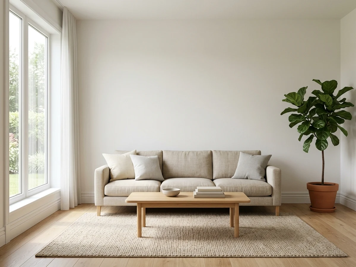
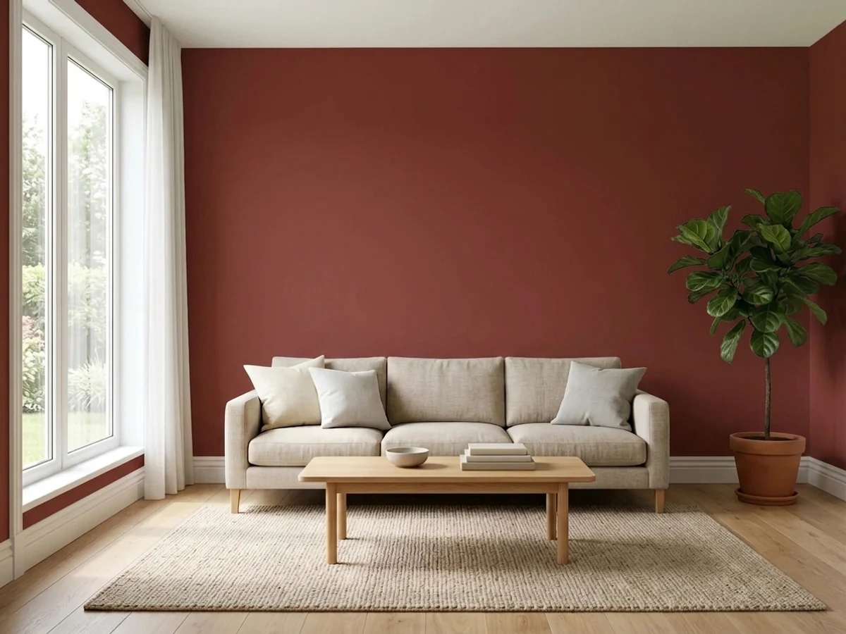
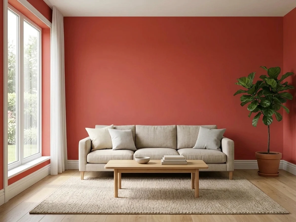
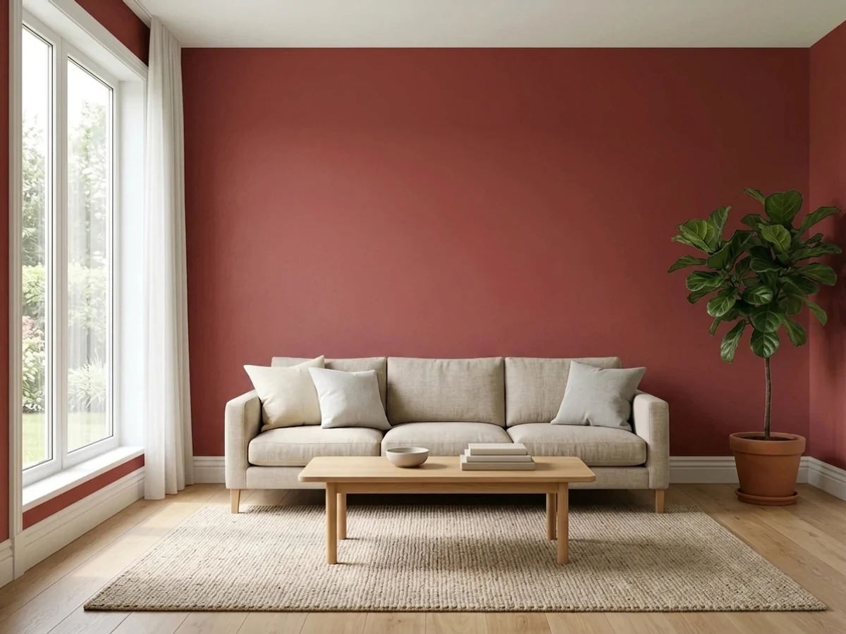
Tap a shade to see the red accent wall in it, then try it on your own room.
Red Accent Wall Color Trends 2026 — What's In, What's Out


- Bright Fire-Engine Red — The loud, saturated fire-engine red common on accent walls in past decades now reads harsh next to 2026's deeper, more muted red tones.
- Red Accent Wall As The Only Color In The Room — A single red wall dropped into an otherwise all-neutral room is losing favor as designers echo the red in smaller accents throughout the space.
- Orange-Leaning Tomato Red — A bright, orange-leaning tomato red that dominated accent walls in past trend cycles now feels dated next to 2026's deeper, wine-toned reds.
The 8 Best Red Accent Wall Paint Colors
Every pick below is a real rendered red accent wall, not a chip. The lead color first; the swatches are the full scheme in the photo — walls, furniture, textiles, accent.

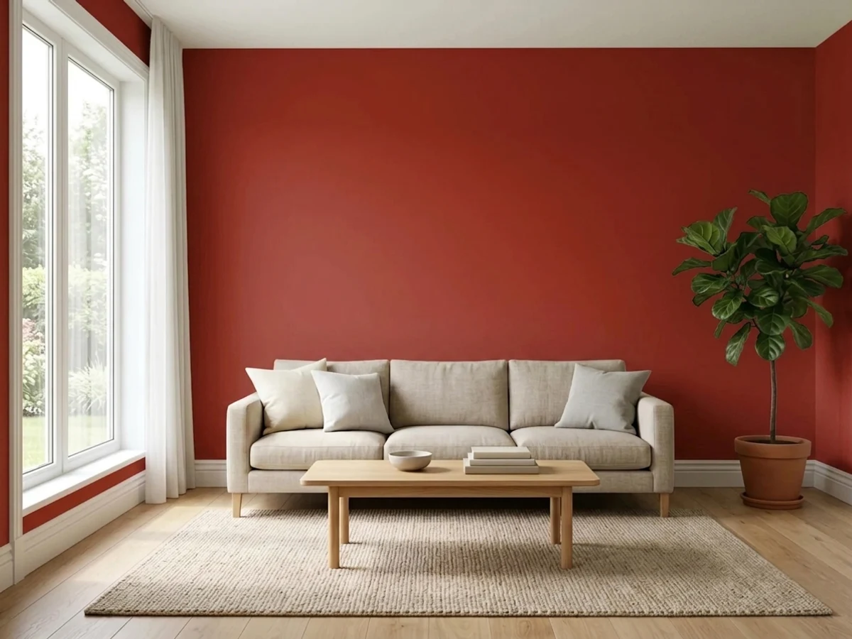
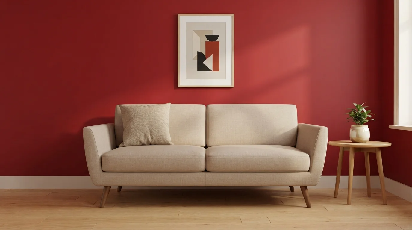
A deep velvety red wall wraps the living space in warmth, balanced by a clean cream sofa and blonde wood accents.
Crimson is a deep, rich ruby red with dramatic depth. In this room, that saturated red coats the entire backdrop, contrasting beautifully against the soft oatmeal sofa, off-white baseboard trim, and light wood accent table. The space feels both deeply cozy and effortlessly upscale. Pairing such an intense wall color with neutral cream fabric and warm wood keeps the look fresh and grounded. It is a fantastic choice for anyone who loves bold, artistic interiors that make a confident first impression.
SEE QUITE RED ON YOUR WALLS →
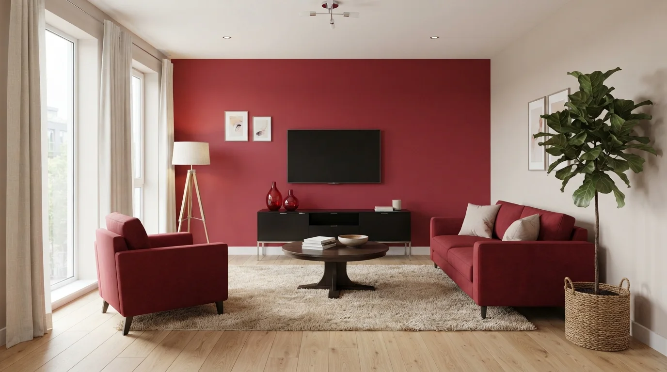
Rich crimson walls and plush ruby seating wrap this contemporary living room in vibrant, confident warmth.
Crimson is a deep, velvety red packed with rich berry warmth. In this room, a striking crimson feature wall pairs directly with matching red upholstered sofas and an armchair. A matte black media console and dark wood round coffee table ground the layout, while a thick beige shag rug softens the light wood flooring. The space feels daring, energetic, and cozy all at once. Repeating one powerful color on the wall and seating against neutral floors creates balanced impact. It is a fantastic look for bold entertainers.
SEE GERANIUM ON YOUR WALLS →
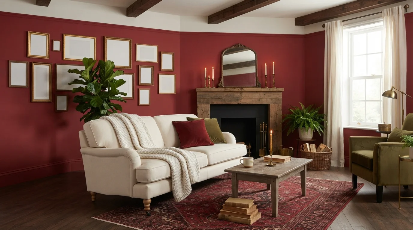
Rich red walls wrap this inviting living room in warmth, perfectly balanced by soft knits and rustic timber.
Brick red is a rich, heritage warm red. In this space, bold red walls create a striking backdrop for an oatmeal linen sofa, dark wood coffee table, and an intricate traditional rug. The room feels snug, romantic, and deeply inviting. This combo works because earthy greens, warm wood tones, and creamy textiles soften the intensity of the wall color. It is ideal for anyone looking to turn a gathering space into a classic, storybook retreat.
SEE ROMANTIC NIGHT ON YOUR WALLS →
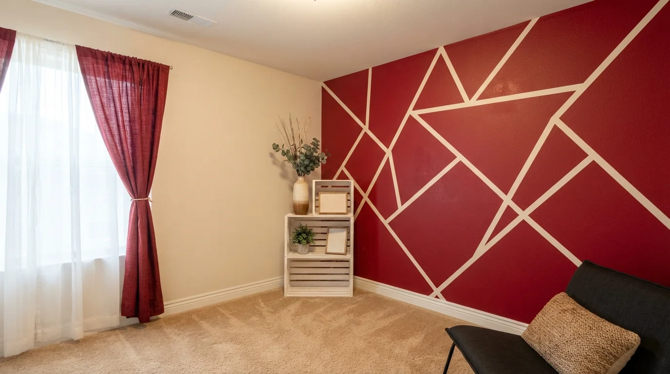
A dynamic ruby red geometric wall pairs with crisp creamy lines to bring bold, playful energy into the space.
Crimson is a rich, energetic cherry red. In this room, the bold red covers a feature wall with sharp, intersecting off-white lines, set against soft cream adjoining walls and matching red drapery. The space feels dramatic, spunky, and full of youthful personality. This combo works because the sharp white lines break up the heavy red, keeping the wall crisp rather than overwhelming. It is perfect for anyone wanting a creative DIY statement wall in a bedroom or gaming room.
SEE IT ON YOUR WALLS →
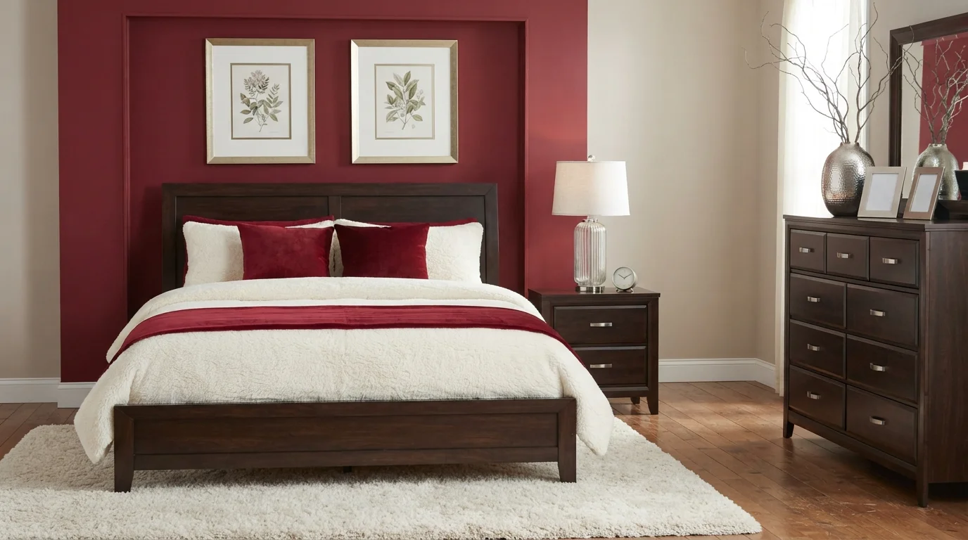
Rich wine-red walls and dark espresso furniture meet ultra-plush cream textures for a luxurious, deeply cozy retreat.
Deep burgundy is a dramatic, wine-red shade with plenty of warmth and depth. In this bedroom, deep red covers the accent wall behind the bed, while soft beige lightens the side wall, dark espresso wood anchors the space, and plush cream bedding softens everything up. The room feels snug, luxurious, and completely restful. The combo works because the light cream fabrics keep the rich, dark colors from feeling too heavy. It is perfect for anyone who loves bold, hotel-style sophistication.
SEE JAZZY RED ON YOUR WALLS →
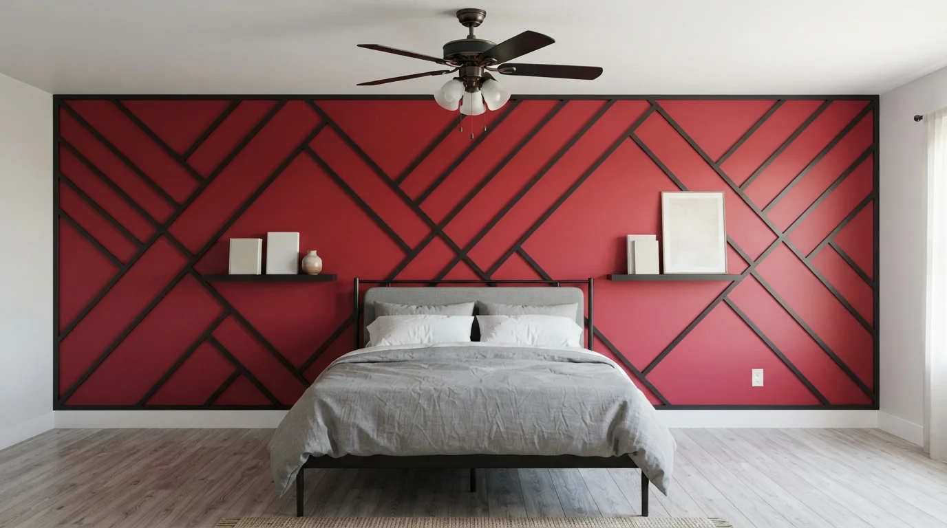
Make a daring statement with a geometric accent wall painted in vibrant crimson and framed with sharp black battens.
Crimson red is a rich, lively shade full of warmth. In this room, the vivid red covers the entire accent wall, segmented by dark charcoal wood trim into crisp geometric shapes, balanced by a clean white baseboard and soft grey side walls. The room feels dramatic, modern, and confident. The high-contrast black grid gives the flat wall sculptural dimension and instant architectural flair. It is a fantastic choice for anyone looking to build a punchy focal point that energizes the entire space.
SEE STILETTO LOVE ON YOUR WALLS →
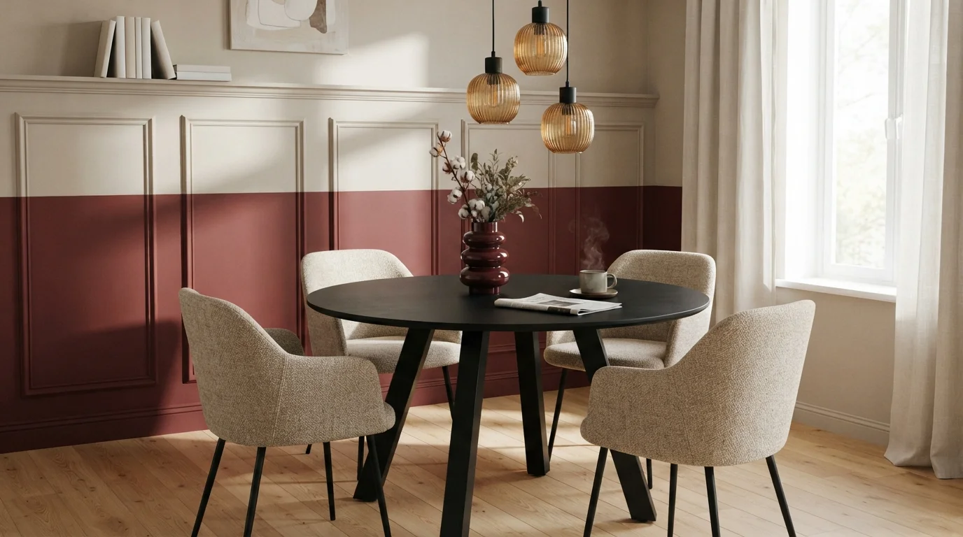
Rich wine red wainscoting paired with warm linen neutrals creates an intimate, sophisticated dining nook filled with cozy charm.
Burgundy is a deep, velvety red packed with rich warmth. In this dining nook, bold crimson coats the lower wall paneling while a gentle linen cream softens the upper molding. A sleek black dining table and oatmeal chairs sit below amber glass pendants that give off a golden glow. The space feels snug, grounded, and undeniably chic. Splitting the wall lets you enjoy rich statement color while keeping the overall room light and airy. It is ideal for dinner party hosts who love vintage bistro charm.
SEE CREATE ON YOUR WALLS →
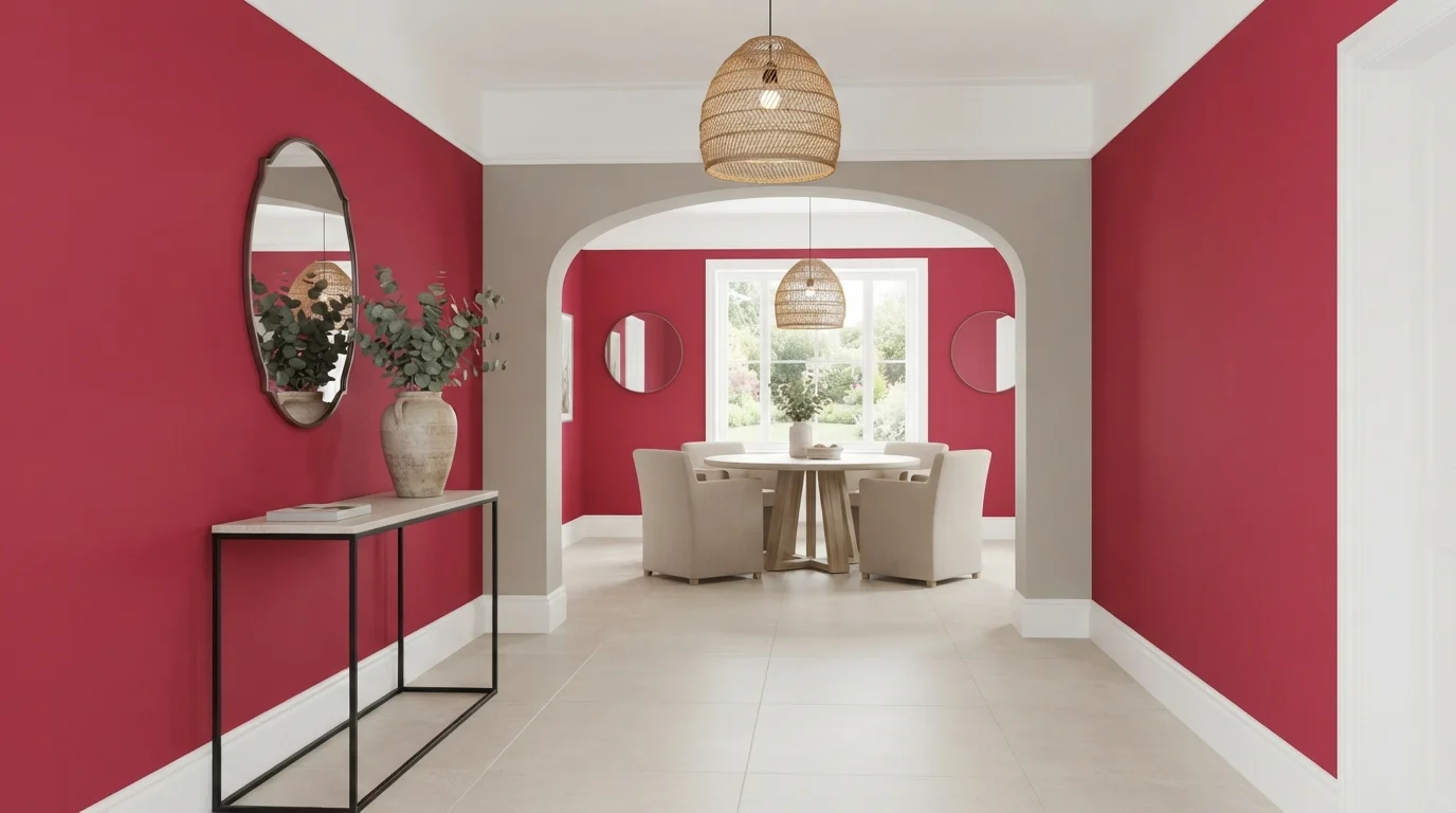
Punchy berry walls pair with warm woven light fixtures and soft stone tiles for an energetic, modern welcome.
Raspberry red is a rich, energetic pinkish-crimson with plenty of punch. In this space, the vivid berry paint covers the main hallway and back dining wall, set against crisp white woodwork and soft beige chairs around a round wooden table. The room feels cheerful, creative, and boldly confident without feeling chaotic. Grounding the bold color with neutral stone floor tiles and natural woven pendant lamps keeps the space balanced. It is a fantastic choice if you want to make an unforgettable first impression.
SEE INTRIGUE ON YOUR WALLS →Red Accent Wall Wall Color Combinations
A wall color never works alone. These are the full schemes from the rooms above — the lead color first, then the supporting colors that make the photo work.
A deep velvety red wall wraps the living space in warmth, balanced by a clean cream sofa and blonde wood accents.
TRY THIS PALETTE →Rich crimson walls and plush ruby seating wrap this contemporary living room in vibrant, confident warmth.
TRY THIS PALETTE →Rich red walls wrap this inviting living room in warmth, perfectly balanced by soft knits and rustic timber.
TRY THIS PALETTE →A dynamic ruby red geometric wall pairs with crisp creamy lines to bring bold, playful energy into the space.
TRY THIS PALETTE →Warm woods are the natural partner for this whole family. Cottage Red or Sunset Orange next to oak, walnut, or any reddish-brown wood tone pulls the same undertone out of the wood rather than fighting it — pair with white or warm cream trim to keep the room from getting heavy. Rosy Apple leans the same direction but softer, and reads well against lighter wood tones like ash or maple where a truer red would look too harsh.
For the darker picks, treat the trim as the contrast instead of the bridge. Million Dollar Red, Caliente, and Heartthrob all read well against crisp white or off-white trim — it keeps the wall from swallowing the room. For a more traditional, less contrasty look, pair any of the three with deep bronze or espresso-stained trim and brass hardware. Rumors, being closer to wine than red, pairs best with warm cream or soft gold rather than white, which can make it look flat instead of rich.
More Accent Wall Color Ideas
Set on a color family already? Each page has its own real rooms and picks.
Light or Dark Red Accent Wall Colors?
Go Light (LRV 60+) If…
The room is small, faces north, or has to work at every hour. Light warm colors make it feel bigger and stay calm in evening light — the light you actually live in.
Go Dark (LRV Under 20) If…
You want the cocoon effect and the room has real daylight. Dark works best on one feature wall — or fully color-drenched in a large room with good windows.
Lighter reds in this group — Sunset Orange (LRV 17) and Rosy Apple (LRV 15) — hold up in rooms with less natural light because they don't drop the room's overall brightness much when they're confined to one wall. They're also the safer pick if the accent wall faces the room's main light source, since strong light can wash out a pale red into something closer to pink. Red Tomato and Cottage Red, both mid-range at LRV 11-14, are the most forgiving in average light and are what most people mean by a classic red accent wall.
Go darker — Million Dollar Red, Caliente, Heartthrob, or Rumors, all LRV 7-8 — when the wall gets decent daylight and the room is large enough to absorb a dark, saturated color without feeling closed in. In a small or dim room, a wall this dark can read as a hole in the room rather than a feature; save it for a wall with a window nearby, good overhead lighting, or a room you're happy to make feel more intimate and enclosed on purpose.
See It. Love It.
Paint It.
Upload one photo of your red accent wall and try every color on this page on your own walls — in your own light, before you buy a drop of paint.

Stage BeautyBeforeWhich Wall Should Carry The Color
Pick the wall you see first when you walk in, or the one behind the room's main furniture piece — a bed headboard, a sofa, a dining table. That's the wall an accent color is built to serve; painting a wall you mostly see from behind, like the one your sofa backs onto, wastes the effect.
Avoid making a wall with a lot of doors, windows, or built-ins the accent wall. Red picks like Million Dollar Red or Heartthrob need an unbroken surface to read as a statement — chop it up with openings and it just looks patchy instead of bold.
Sheen And Coverage
Reds have weak hiding power because of the pigments used to make them, so expect two to three coats no matter which of these picks you choose — even the lighter ones like Sunset Orange or Rosy Apple. A gray-tinted primer, not white, cuts the number of coats you need and keeps the final color from looking chalky.
Stick to eggshell or matte on the wall itself. Reds in satin or semi-gloss show every roller mark and flash under side light, which is especially obvious on darker colors like Caliente or Rumors where the sheen competes with the depth of the color.
Mistakes That Show Up Most With Red
The most common one is judging the color from a small paint chip and ending up with something pinker or more orange than expected once it's on a full wall — always test a large swatch on the actual wall, in the room's real light, before committing. Sunset Orange and Rosy Apple are the two picks here most likely to surprise you this way, since they sit closest to pink and coral.
The second mistake is painting all four walls instead of one. These colors, especially the LRV 7-8 group, are built to work as a single accent — a full room in Million Dollar Red or Heartthrob reads very differently, much more enclosed and intense, than the same color on one wall.
About Red Accent Wall Paint Colors
A red accent wall works because it's contained. One wall carries the color, the other three stay quiet, and that ratio is what keeps red from tipping into too much. Sunset Orange from Behr (BXC-39, LRV 17) is the easiest entry point — it reads as a warm, earthy glow rather than a true red, so it's forgiving in rooms that already have a lot going on. Rosy Apple from Benjamin Moore (2006-30, LRV 15) sits close behind it, softer and more cheerful, good for a room where you want warmth without any edge.
Once you move past LRV 14, the picks stop being polite. Red Tomato from Sherwin-Williams (SW 6607, LRV 14) and Cottage Red from Benjamin Moore (HC-184, LRV 11) are the classic brick-red accent choices — the ones people picture when they say "red accent wall," cozy and lived-in rather than loud. Below that, Million Dollar Red (BM 2003-10), Caliente (BM AF-290), and Heartthrob from Sherwin-Williams (SW 6866) all sit at LRV 7-8, which is genuinely dark for a red. These are statement colors — pick one when the wall is meant to be the first thing you notice in the room, not a backdrop.
Rumors from Behr (MQ1-15, LRV 8) is the outlier in the group: a deep wine rather than a true red, closer to burgundy. It behaves more like a moody neutral than a bright accent, so it pairs differently than the others — treat it as a dark, sophisticated wall rather than an energetic one.

The Questions Everyone Asks
What color should I paint my red accent wall?
If you want one answer, start with the safe picks above — Quite Red, Geranium, Romantic Night, California Poppy. They read well in any light and survive furniture changes. Then check the light: strong afternoon sun wants a step cooler, a north-facing room wants a step warmer.
does a red accent wall make a room look smaller?
A dark red like Heartthrob (SW 6866) or Million Dollar Red (BM 2003-10) will make a wall feel closer, which reads as a smaller room if the space is already tight. In a larger room it just adds depth and focus. If the room is small, a lighter pick like Sunset Orange (LRV 17) or Rosy Apple (LRV 15) gives you the red without the shrinking effect.
what color should the other three walls be with a red accent wall?
Keep them neutral — white, warm cream, or a soft greige. The point of an accent wall is contrast, so a busy or saturated color on the other walls competes with the red instead of framing it. For warmer reds like Cottage Red (BM HC-184), a cream with a hint of the same warmth ties the room together without matching exactly.
how many coats of paint does a red accent wall need?
Plan on two to three coats. Red pigments have weak hiding power compared to most colors, so even a lighter pick like Rosy Apple (BM 2006-30) will look streaky after one coat. A gray-tinted primer first cuts that down and gives you truer color with fewer coats than starting from bare white drywall.
what color trim goes best with a red accent wall?
White or off-white trim is the classic, safe pairing for any of these — it keeps colors like Caliente (BM AF-290) or Red Tomato (SW 6607) from feeling heavy. For a warmer, more traditional look, pair brick reds like Cottage Red with deep bronze or espresso trim instead, especially if the room already has dark wood floors or furniture.
which wall should you paint as the red accent wall?
The wall you face when you first walk into the room, or the one behind the main piece of furniture — a bed, a sofa, a dining table. That's where a bold color like Million Dollar Red or Rumors (Behr MQ1-15) does its job. Avoid a wall broken up by doors or windows; red reads best as one unbroken surface.
What two-color combination works best in a red accent wall?
The reliable pattern is a quiet main color plus one deep accent on a single wall. Keep trim and ceiling in one warm white so the two colors are the only event in the room — the combination cards above show complete schemes from real rooms.
What colors make a red accent wall look bigger?
High-LRV, slightly warm colors — LRV 60–75 is the sweet spot. Paint the walls and trim close to the same light color so the corners blur, and keep the ceiling white. Stark cool white actually works against you; it creates hard shadows that show the room's edges.


Ask a Question