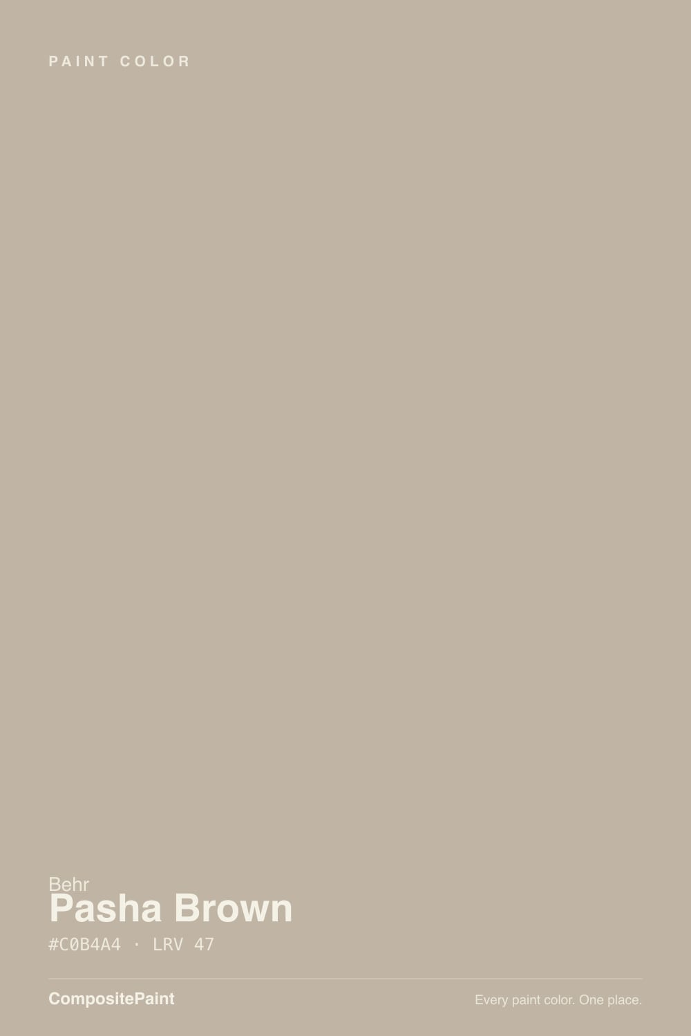
Pasha Brown
MQ2-51 · #C0B4A4 · LRV 47 — warm red-orange tone, mid-tone — versatile but shifts visibly with light.
- 1Anonymous20
- 2Dorian Gray39
- 3Pasha Brown47
- 4Agreeable Gray60
- 5Pale Oak69
What Color Is Pasha Brown, Really?
Pasha Brown (MQ2-51) is a warm greige despite the name. Its hex value #C0B4A4 sits at hue 34, in the orange-toned part of the warm range, with a saturation of about 18 percent. That combination puts it in the beige and taupe zone rather than anywhere near a real brown. The LRV of 47 lands just below the middle of the scale, so it holds enough depth to read as a color on the wall while still keeping a room open.
This is the kind of color people pick when they want walls that do not argue with anything. The warm red-orange base makes it friendly with oak floors, leather, and brass, while the gray in it keeps the beige from turning yellow. It is a safe whole-house neutral, a common choice for open-plan main floors, hallways, and rental turnovers, and it also works as a soft exterior body color.
The catch is the same one every mid-tone greige carries. Against a strong cool white it can look more beige than you expected; against an existing warm tan it can look gray and flat. And at 47 LRV it will read noticeably darker in a north-facing room than it does on the chip in your hand at the store.
The undertone is warm red-orange. Hue 34 sits in the tan and terracotta range, but at only 18 percent saturation the color never gets close to either. What you actually see is a beige with a gray backbone, which is why it behaves like a neutral rather than a color.
The balance between warm and gray flips depending on what is next to it. Against a cool white trim or a gray tile, the warmth comes forward and the walls look clearly beige. Against a strongly yellow oak floor or a golden tan, the gray takes over and the color looks cooler and flatter. Next to a true greige with a violet base, Pasha Brown will look noticeably orange.
The surfaces you cannot repaint decide this. Test the sample against your floor, your counters, and your existing trim before you judge it, because those materials will pull it in one direction or the other.
Best Rooms and Uses for Pasha Brown
This is a workhorse whole-home neutral. At LRV 47 it holds up on walls in living rooms, hallways, open-plan kitchens and dining areas, bedrooms, and stairwells, tying rooms together without pushing a color scheme in any direction. It is a frequent choice for houses being prepared to sell, because it flatters most flooring and furniture.
On trim it is less useful, since a mid-tone greige next to greige walls gives too little contrast. Keep trim in a white. On cabinets it works for a full perimeter run in a kitchen where wood tones already carry the warmth, and on built-ins it reads calm and quiet.
Outside, it makes a soft, low-contrast body color that suits stone, brick, and wood accents, with a darker door or shutter for contrast. Where it disappoints is in a room that already has a lot of warm yellow oak, since the two warms can flatten each other into a single dull tone.
How Lighting Changes Pasha Brown
At LRV 47 this color reflects a bit under half the light that hits it, so it is a genuine mid-tone. In north-facing rooms the cool, flat daylight cancels part of the warmth, and the color reads grayer, cooler, and a shade darker than the chip suggested. That is often a good outcome if you wanted greige rather than beige.
South-facing rooms bring warm light onto an already warm hue, and the result can look distinctly tan or even slightly golden at midday. West rooms hold steady through the morning and then warm up strongly in late-afternoon sun. East rooms are warmest early and settle into a quieter greige by afternoon.
Bulbs push it just as far. Warm 2700K lamps bring out the orange base and can tip it toward tan at night. Cooler 3500K to 4000K light strips the warmth back and leaves a clean, quiet greige.
Most complaints about Pasha Brown are a light mismatch. Upload a photo of your actual room and see it on your walls — then ask for the same wall in north light or evening lamps before you buy a single sample.
Need It From Another Brand?
Any paint counter can custom-tint Behr MQ2-51 directly. If you would rather stay in one brand's own deck, these are the closest stock matches, measured as ΔE2000. Under 2 is a difference you will not see on the wall.
| Brand | Closest color | ΔE | LRV | |
|---|---|---|---|---|
| Sherwin-Williams | Balanced BeigeSW 7037 · Sherwin-Williams | 1.1 | 46 | Color page → |
| Benjamin Moore | Gallery BuffCSP-225 · Benjamin Moore | 1.6 | 47 | Color page → |
| Valspar | Gallery Grey2006-10B · Valspar | 1.3 | 47.1 | Color page → |
| PPG / Glidden | Best BeigePPG1085-4 · PPG / Glidden | 3.1 | 47 | Color page → |
| Glidden | Dry Goods Neutral40YY 44/095 · Glidden | 1.7 | 44 | Color page → |
| Dutch Boy | Bare Titanium404-2DB · Dutch Boy | 2.0 | 47 | Color page → |
Similar Behr Colors
The nearest shades to Pasha Brown within Behr's own range, ranked by perceptual color distance — useful when you want the same look a touch lighter, darker, or warmer.
WCAG 2.1: AA is 4.5 : 1 for normal text, 3 : 1 for large text, AAA is 7 : 1.
Pasha Brown vs Similar Colors
Inside Behr, the differences are small but real. Graceful Gray (PPU18-12) at #BEB6AE and Grey Mist (HDC-CT-21) at #BEB7AE are grayer and less orange. Basic Khaki (HDC-NT-09) at #C4B7A1 and Ranch Tan (QE-28) at #C6B5A2 both carry more yellow and read as clearer tans. Smokestack (N220-3) at #BFB3A7 is the closest neighbor at LRV 46.
This color has unusually many close cross-brand matches. Sherwin-Williams Balanced Beige (SW 7037) at deltaE 1.08, Rodda Hearth (CA045) at 1.26, Valspar Gallery Grey (2006-10B) at 1.27, Farrow and Ball Jitney (No. 293) at 1.52, and Benjamin Moore Gallery Buff (CSP-225) at 1.58 are all visually identical in normal room light, though Jitney at LRV 46 and Gallery Buff at LRV 47 differ slightly in how they behave in dim rooms. Dutch Boy Bare Titanium (404-2DB) at 2.02 and C2 Ostrich (C2-909) at 2.3 are very close but worth sampling. PPG Best Beige (PPG1085-4) at 3.06 is close but visibly warmer side by side.
Colors That Go With Pasha Brown
Trim is the first move. A clean white gives contrast and keeps the walls looking crisp. A soft warm white blends into the beige and gives a quieter, more traditional result. Both are common, and the choice mostly depends on how much you want the walls to stand apart from the millwork.
Within Behr, the near neighbors are useful for layering rooms rather than contrasting them. Graceful Gray (PPU18-12) at LRV 47 and Grey Mist (HDC-CT-21) at LRV 48 are the grayer, cooler versions, good for a room where you want less warmth. Smokestack (N220-3) at LRV 46 is a hair deeper. Canyon View (ECC-20-1) at LRV 46, Ranch Tan (QE-28) at LRV 48, and Basic Khaki (HDC-NT-09) at LRV 48 all push more clearly toward tan and khaki.
For materials, white oak, walnut, leather, brass, and matte black all sit well with this base. Cool chrome and pure gray stone will make it look warmer by contrast.
Coordinated palette
Generated by hue-rotating #C0B4A4 in HSL space. Pair Pasha Brown with one accent and one neutral — the swatches below are starting points, not final picks.
Pasha Brown FAQ
Is Pasha Brown warm or cool?
It is warm. The undertone sits at hue 34, in the orange-toned part of the warm range, which gives it a beige rather than a violet or blue lean. The saturation is low at about 18 percent, so the gray in the mix keeps the warmth from ever reading as yellow or gold in most rooms.
What LRV is Pasha Brown?
Pasha Brown has an LRV of 47, just below the midpoint of the 0 to 100 scale. It reflects a bit under half the light that hits it, so rooms stay reasonably open while the color still has visible body. Expect it to look a shade deeper in a north-facing room than it does on the chip.
Is Pasha Brown actually brown?
No, despite the name it is a greige. The hex value #C0B4A4 sits in the beige and taupe zone, well short of any real brown, and at LRV 47 it is a light-to-mid neutral. Think warm gray-beige rather than a brown wall color.
Does Pasha Brown work in a dark or north-facing room?
Yes, and north light often improves it. Cool, flat daylight cancels part of the orange base, so the color reads as a cleaner greige rather than a tan. The trade-off is that at LRV 47 it will look noticeably deeper in a dim room, so add warm lamps if the space feels heavy.
What white trim goes with Pasha Brown?
A clean white keeps the walls looking crisp and clearly separates the millwork. A soft warm white blends with the beige base and gives a quieter, more traditional look. Both are common; the choice comes down to how much contrast you want between wall and trim.
Is Pasha Brown good for exteriors?
It works well as a soft, low-contrast exterior body color. The warm greige base sits comfortably with stone, brick, and natural wood accents, and at LRV 47 it stays light enough not to absorb excessive heat. Pair it with a darker front door or shutters, since the color itself provides no contrast.
Have you painted with Pasha Brown?
Rate it — one tap helps the next reader decide.
Ask a Question