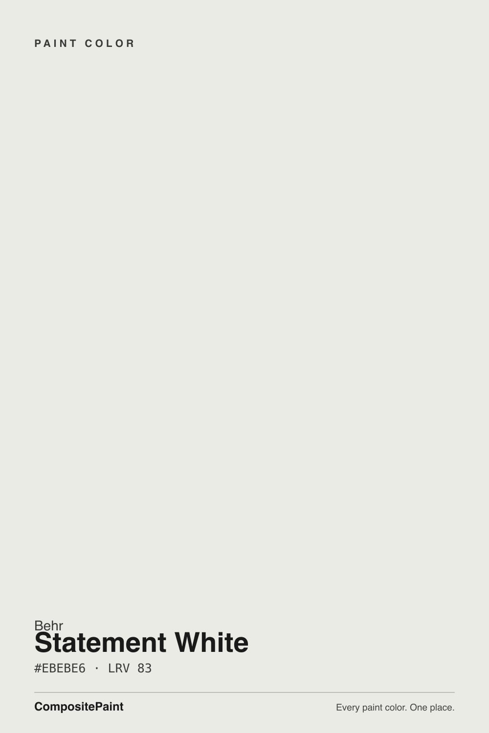
Statement White
Behr's Designer Collection match for Decorator's White, reviewed honestly: the gray that stops the glare, the north light that turns it dingy, and what to pick instead.

Jessica has spec'd whites and neutrals for more than 300 rooms and keeps a sample wall of painted drawdowns in her studio. Every color review is checked against real reader rooms in the comments and re-tested when a formula changes. About the testing process →
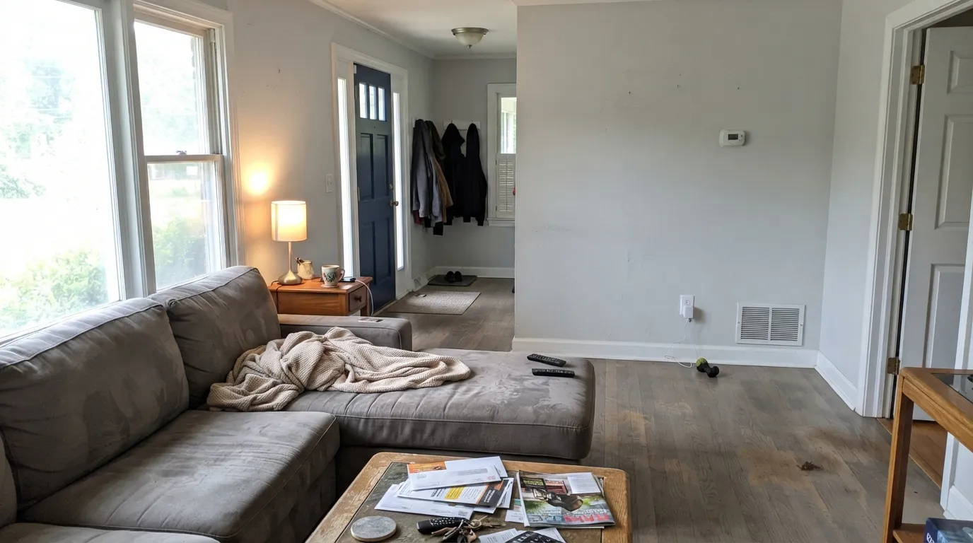
- 1First Star69
- 2Classic Gray74
- 3Statement White83
- 4Chantilly Lace91
- 5Ultra Pure White97
The Fast Verdict
Statement White is the grayed clean white you mix when Ultra Pure White would glare and Blank Canvas would cream. At LRV 83 it has just enough body for walls and trim, and just enough gray that a true gallery white looks plastic next to it. Behr put it in the Designer Collection as the match for Benjamin Moore Decorator's White — same job, Home Depot aisle. It is not a cream, and it is not ice. In a dim north room it goes dingy. In decent daylight it is the white that finally looks finished.
Walls + trim in decent daylight · kitchens and baths with cool stone or subway tile · cabinets when a true white would glare · anyone who wanted Decorator's White and walked into Home Depot
Your room faces north and stays dim · trim stays Polar Bear or Ultra Pure White · floors are honey oak or cabinets are creamy · you wanted a true gallery white or a warm White Dove
- Clean, finished white — grayed enough to skip the glare
- One-color rooms (walls + trim + ceiling) work cleanly
- Agrees with Carrara, subway tile, chrome — the cool-stone white
- Home Depot path to the Decorator's White job, at LRV 83
- Hides scuffs better than Polar Bear or Ultra Pure White
- Goes dingy and faintly blue in dim north-facing rooms
- Reads dirty next to Polar Bear, Ultra Pure White, or Chantilly Lace
- Fights honey oak, cream cabinets, and warm whites next door
- Too gray for anyone who wanted a true gallery white
What Color Is Statement White, Really?
A clean, barely-there white with a hint of gray — and the gray is the whole trick. Most Home Depot whites either dump the pigment (Ultra Pure White, Polar Bear) or lean into cream (Blank Canvas, Swiss Coffee). Statement White sits in the thin, useful band between them: white enough to pass as white on a wall, grayed enough that it does not glare and does not go butter. Behr filed it as DC-002 in the Designer Collection, the short list of about thirty shades published as matches for the designer-deck bestsellers. Independent side-by-sides put it next to Benjamin Moore Decorator's White. A Behr staffer on a century-home trim thread even called out a slight blue undertone. That is the honest fame: a house color on a short list, not a Color of the Year.
At LRV 83 it reflects most of the light that hits it, but it is clearly not a bright white. Put it next to Polar Bear (LRV 94), Ultra Pure White (LRV 97), or Chantilly Lace (LRV 90) and Statement White suddenly shows its body. That gap is the useful part. On a wall it holds just enough color to soften shadows without looking painted; on trim it reads as painted woodwork rather than plastic-bright. It sits in the same depth band as White Dove (LRV 85) and Alabaster (LRV 82) — those two are the warm neighbors. This one is the cool-gray neighbor.
Undertone in one line: gray first, a whisper of cool blue second — never cream, never pink. In south light the gray recedes and the wall reads as a quiet, finished white. In north light and under cool LEDs the gray comes forward, and in a dim room it can go chalky or faintly blue. If the sample looks yellow, look at the floor or the trim next to it before you blame the gallon.
Where It Shines
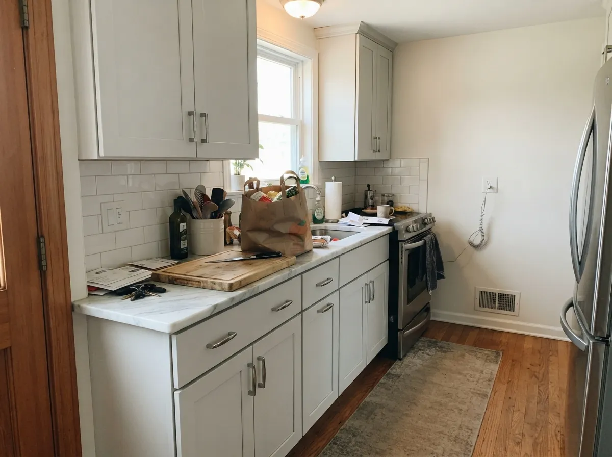
Give it real daylight, no brighter white in the same sightline, and cool or mid-tone neighbors, and it does the rare thing a grayed white is supposed to do: look white, not gray, while still keeping the room from going clinical. The one-color room — walls, trim, and ceiling all Statement White with only sheen changes — is the version that works. Kitchens and baths with Carrara-look stone, white subway, and chrome or polished nickel are its second home: this is the Behr white that actually agrees with cool stone, the exact pairing that makes White Dove and Blank Canvas look yellow. At LRV 83 it hides scuffs a Polar Bear door would broadcast.
Where It Fails
Almost every unhappy Statement White story is a Decorator's White story with a Home Depot receipt. The gray is real, it is small on the chip, and three situations make it loud. None of them are a bad mix — but if your room matches one, this is not your white, and another coat will not hide it.
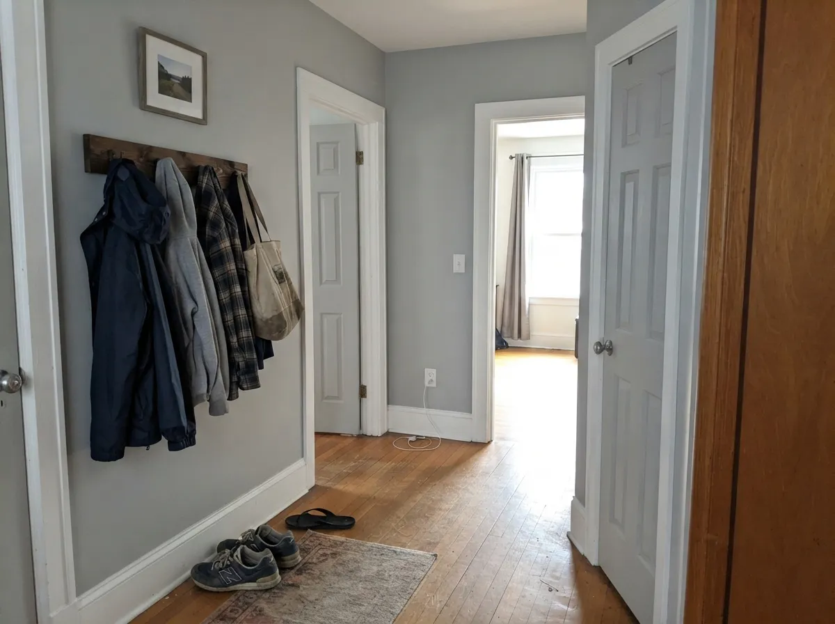
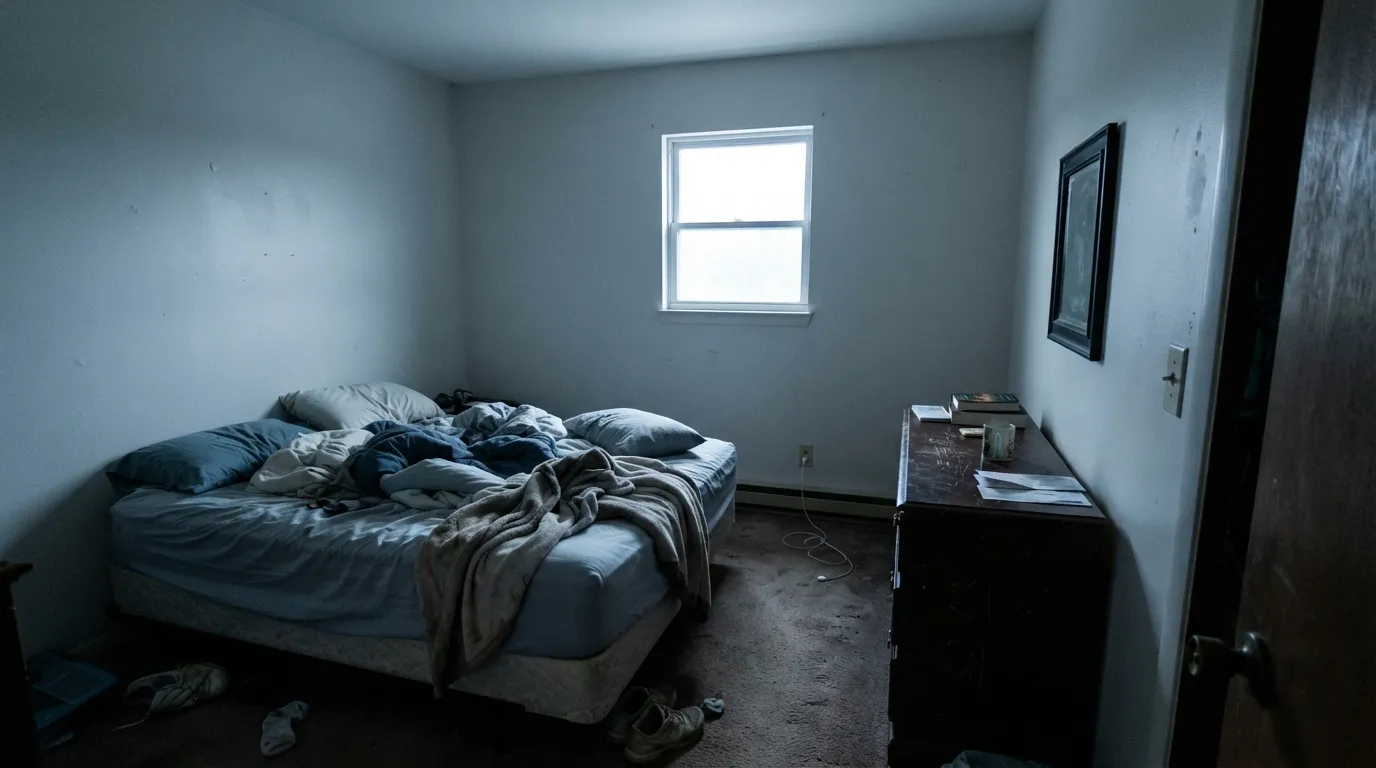
North light is cool and grey — it strips whatever warmth is left and leaves the gray-blue base exposed. Readers of this family call the result dingy, chalky, or just blue. In a dim room the corners go dirty-gray and the wall stops reading as white. The color did not fail; the light did. Step up to Blank Canvas or Behr Swiss Coffee if you still want a white, or commit to warm lamps and sample a full board first.
The most common Home Depot pairing mistake: Statement White walls, Polar Bear (LRV 94) or Ultra Pure White (LRV 97) on the trim and ceiling. The brighter white wins, and Statement White looks unwashed — too gray to be white, too pale to be a color. Chantilly Lace (LRV 90) and Whipped Cream (LRV 91) do the same trick. The fix is the one-color rule — walls, trim, and ceiling all Statement White. If you insist on contrast, go darker, never brighter.
Yellow-warm wood and creamy neighbors sit at the opposite temperature and shove the gray into the open. Honey oak floors make the walls look chilly; Blank Canvas, White Dove, or Swiss Coffee in the next room make Statement White look dirty by comparison. With golden oak or a cream kitchen, pick the warm Designer Collection sibling — Blank Canvas — and keep this gallon for a cooler house.
Room by Room
With any real daylight it is the calm, slightly grayed backdrop that makes art and mid-tone furniture look deliberate instead of staged against ice. Eggshell walls; same color on trim in semi-gloss. This is the whole-house test, and Statement White passes it as long as the adjoining rooms stay on the cool-to-neutral side.
Carrara-look quartz, white subway, stainless, chrome: this is the Behr white that does not go yellow against them. Satin on cabinets wipes clean and hides knuckle marks around handles. Warm butcher block and brass still work if the stone stays cool. Creamy tile or honey-oak cabinets next to these walls will make the gray show.
Cool marble, gray-veined porcelain, chrome, and nickel are the company this color was mixed for. Eggshell or satin on the walls; same gallon on the vanity in satin if you want a one-color bath. With creamy beige tile or an oak vanity it argues — use Blank Canvas there instead.
Semi-gloss Statement White trim under Statement White walls is the pairing that actually works. Flat on the ceiling keeps the plane soft instead of clinical. At LRV 83 the millwork still reads as white woodwork, not gray paint. What does not work is Polar Bear or Ultra Pure White trim against these walls — that is how the color earns its dirty reviews.
East and south bedrooms stay clean and restful. Under 2700K lamps it warms a half-step at night without going cream. A dim north bedroom is the skip — you will wake up to chalky gray walls. If that is the room you have, Blank Canvas or Swiss Coffee will still look like a white in the morning.
Full sun reads it brighter and cooler than indoors, which can look crisp on a modern facade with charcoal or navy trim. It is a poor match for red brick, honey cedar, or warm stone — the gray goes chalky and a little blue from the street. Sample the north elevation before you commit; shade will pull more gray than the south side shows.
Your Light Is the Risk
The gray recedes and the wall reads as a quiet, finished white all day. This is the light the color was mixed for — whole-house safe.
Cool grey daylight exposes the gray-blue base. In a dim room it goes chalky and dingy. Sample here first, or pick a warmer white.
Cooler and more gray in morning shade; a half-step cleaner when the sun is on the wall. The shift is small — it does not turn cream at 5pm.
2700K lamps pull it toward a softer neutral. Cool white LEDs push the gray-blue. 3000K–3500K keeps it closest to the daylight read.
Most complaints about Statement White are a light mismatch. Upload a photo of your actual room and see it on your walls — then ask for the same wall in north light or evening lamps before you buy a single sample.
Need It From Another Brand?
Any paint counter can custom-tint Behr DC-002 directly. If you would rather stay in one brand's own deck, these are the closest stock matches, measured as ΔE2000. Under 2 is a difference you will not see on the wall.
| Brand | Closest color | ΔE | LRV | |
|---|---|---|---|---|
| Sherwin-Williams | White SailSW 9622 · Sherwin-Williams | 0.5 | 83 | Color page → |
| Benjamin Moore | White Violet1408 · Benjamin Moore | 1.0 | 82 | Color page → |
| Valspar | Cool Gray7006-10 · Valspar | 0.8 | 83.2 | Color page → |
| PPG / Glidden | Commercial WhitePPG1025-1 · PPG / Glidden | 1.0 | 83 | Color page → |
| Glidden | Silver FeatherPPG1002-1 · Glidden | 1.3 | 83 | Color page → |
| Dutch Boy | Crisped White022W · Dutch Boy | 1.2 | 82 | Color page → |
Similar Behr Colors
The nearest shades to Statement White within Behr's own range, ranked by perceptual color distance — useful when you want the same look a touch lighter, darker, or warmer.
WCAG 2.1: AA is 4.5 : 1 for normal text, 3 : 1 for large text, AAA is 7 : 1.
Statement White vs the Colors You're Also Considering
Every Statement White sample board has the same rivals on it. The numbers show the real lightness gap — then it comes down to which risk you would rather live with.
Pick this when Dove would read too creamy and you want the grayed, cooler version of the same depth.
Benjamin Moore PM-19 · LRV 85White DovePick this if you want the warm, grayed-cream default — the safest warm white in the BM deck, and the opposite temperature of this gallon.
Pick this when a true gallery white is too stark and you want walls that still look like paint, not plaster glare.
Benjamin Moore OC-65 · LRV 90Chantilly LacePick this for the cleanest BM gallery white — crisp, bright, and hard to roll, with no gray body to hide behind.
Pick this when the white has to live on walls and trim, not just casings. Extra White is the trim cousin; this is the wall-capable one.
Sherwin-Williams SW 7006 · LRV 86Extra WhitePick this if you want the sharper SW trim white — brightest in its family, and the riskiest of the two on four walls.
The closest match on record is Dunn-Edwards At First Light DEHW05 at LRV 83, which shares the hex #EBEBE6 exactly and has a deltaE of 0. Those two are the same color. Sherwin-Williams White Sail SW 9622 at LRV 83, deltaE 0.5, and Rodda Summit CA019 at LRV 82, deltaE 0.63, are effectively the same as well.
A step out, Benjamin Moore White Violet 1408 at LRV 82, deltaE 0.98, PPG Commercial White PPG1025-1 at LRV 83, deltaE 0.99, and Dutch Boy Crisped White 022W at LRV 82, deltaE 1.2, are all visually identical in normal room light. Farrow and Ball Wevet No. 273 at LRV 83, deltaE 1.73, sits in the same group with a slightly cooler cast.
The useful differences are at the edges. Backdrop Jane BD-JA at LRV 86, deltaE 2.32, is lighter and warmer, and Rust-Oleum Linen White 285140 at LRV 93, deltaE 4.42, is far brighter and cooler. That last one is close but visibly different side by side, which is what to reach for if Statement White reads too soft.
Statement White Coordinating Colors
The rule for coordinating with Statement White is the opposite of the White Dove rule: stay on the cool-to-neutral side. It flatters true grays, navy, near-black, chrome, and cool stone — and it argues with creamy whites, honey oak, and yellow-beige. These are the partners that keep showing up in rooms that work:
The Designer Collection Match, Not a Viral White
Statement White is not famous. You will not find it on a Color of the Year list or a TV renovation. What it is: DC-002 in Behr's Designer Collection, the curated short list of roughly thirty whites and neutrals Behr published as matches for the Benjamin Moore and Sherwin-Williams colors designers already specify. The published pairing for this gallon is Decorator's White — the BM off-white that earned its name by showing up on trim, cabinets, and gallery walls for decades, and that also earned a pile of dingy-in-the-north reviews.
That is useful context, not a reason to skip the sample. Spectrophotometer charts put the two in the same LRV band, with Statement White a little less chromatic, which is why it can read slightly quieter and less blue than the BM original. It is still the same assignment: a grayed clean white for people who find a true white too stark. Sample it next to Blank Canvas (the warm sibling, DC-003) and Whipped Cream (the bright cool sibling, DC-001) on the same wall. The three gallons explain the whole Designer Collection white story in one afternoon.
Statement White With Stone, Wood, and Floors
This decision gets made at the slab and the floor, not the paint chip. Cool stone loves it. Carrara-look quartz, gray-veined porcelain, white subway, polished nickel, and chrome all sit in the same temperature band, so the wall stays white instead of flashing yellow. That is the pairing White Dove and Blank Canvas lose, and the reason to pick this gallon in a gray-and-white kitchen.
Warm wood is the honest no. Honey oak, orange builder stain, and golden beige carpet shove the gray forward and make the walls look chilly — sometimes faintly blue. Pale unstained white oak, gray-washed plank, and walnut are safer. Mid-tone gray LVP is fine; a pinky-beige vinyl is not.
Metals are easy if you stay cool or mixed: chrome, polished nickel, matte black, and brushed stainless. Unlacquered brass can work in a south room; in a north room it will make the walls look colder. Test the hardware against a painted board, not the chip.
Three Ready Palettes Built on Statement White
A color is never alone on the wall. These are complete combinations in the 60-30-10 pattern, with the reason each one holds together. Every one opens in the visualizer.
One color at two sheens gives depth without a contrast line, so hallways flow and small rooms read bigger. Hale Navy is the single dark note — the safest navy as long as the entry has light, and it keeps the grayed white looking crisp instead of dusty.
Try this palette in your roomRepose Gray is the modern greige that can flash the same cool family Statement White lives in, so the wall-to-cabinet handoff stays quiet. Iron Ore on the island is the near-black the scheme needs — respect LRV 6 and give it light.
Try this palette in your roomLight French Gray is the truest gray in the SW deck; Statement White is the trim white that does not shove it toward beige. A brighter trim white would make the gray look dirty. Hale Navy on a door is the one saturated note.
Try this palette in your roomStatement White FAQ
Is Statement White warm or cool?
Cool-neutral — gray first, a whisper of blue second. In south light the gray recedes and it can pass as a quiet white. In north light and under cool LEDs the gray-blue is the whole story. It is not cream, and it is not a true gallery white.
Is Statement White a match for Benjamin Moore Decorator's White?
It is the Designer Collection color Behr published for that job — same depth band, same grayed clean-white assignment. Independent spectrophotometer reads put them next to each other, with Statement White a hair less chromatic. It is not a factory clone. Sample both if you are matching existing Decorator's White millwork; use this gallon if you want that look from the Home Depot aisle.
What trim color goes with Statement White walls?
Statement White itself, in semi-gloss. A brighter trim white — Polar Bear, Ultra Pure White, Chantilly Lace, Whipped Cream — makes the walls look dirty. That is the most common mistake with this color. If you want contrast, go darker (a true gray or navy), never brighter.
Is it good for kitchen cabinets?
Yes, when the stone is cool. Satin Statement White on cabinets next to Carrara-look quartz and subway tile is one of the better Home Depot cabinet whites — it will not go yellow the way Blank Canvas or Swiss Coffee can. Honey oak floors and creamy tile are the skip. Use a urethane-fortified cabinet enamel.
Will it look gray in a north-facing room?
In a dim north room, yes — dingy, chalky, sometimes faintly blue. That is the Decorator's White family complaint, and this gallon inherits it. A bright north room with warm 2700K–3000K lamps can still work; a basement-dark north bedroom will not. Sample a big board on that wall before you buy five gallons.
Statement White or Blank Canvas?
Same aisle, opposite temperature. Blank Canvas is Behr's warm Designer Collection white, with a peach tell, and the published match for White Dove. Statement White is the cool-gray one, the published match for Decorator's White. If your house is honey oak and brass, take Blank Canvas. If it is Carrara, subway, and chrome, take this.
Have you painted with Statement White?
Rate it — one tap helps the next reader decide.
Ask a Question