Soot
Benjamin Moore's blue-charcoal black, reviewed honestly: the light where it turns velvety, the rooms where it goes cave-dark, and what to pick instead.

Jessica has spec'd whites and neutrals for more than 300 rooms and keeps a sample wall of painted drawdowns in her studio. Every color review is checked against real reader rooms in the comments and re-tested when a formula changes. About the testing process →
- 1Cordovan Brown0
- 2Soot6
The Fast Verdict
Soot is Benjamin Moore's blue-charcoal black — a near-black built on a cool blue base rather than a true neutral or a warm brown-black. Give it real daylight or a warm lamp and it turns velvety, dimensional, and genuinely sophisticated; put it on all four walls of a windowless room and it just goes dark. It's the color to reach for when Wrought Iron feels too safe.
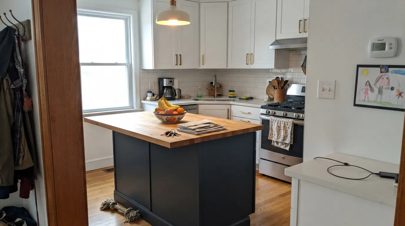
Kitchen islands + cabinets against white counters and brass · front doors and shutters that want quiet drama · powder-room vanities · one accent wall in a room with real daylight
You want a true neutral black with zero undertone · your room has one window or none · you're painting all four walls with no plan for warm lamps · you need it to match black hardware elsewhere exactly
- Genuinely deep blue-charcoal black, more dimensional than flat black
- Cabinets, vanities and islands look custom against white counters and brass
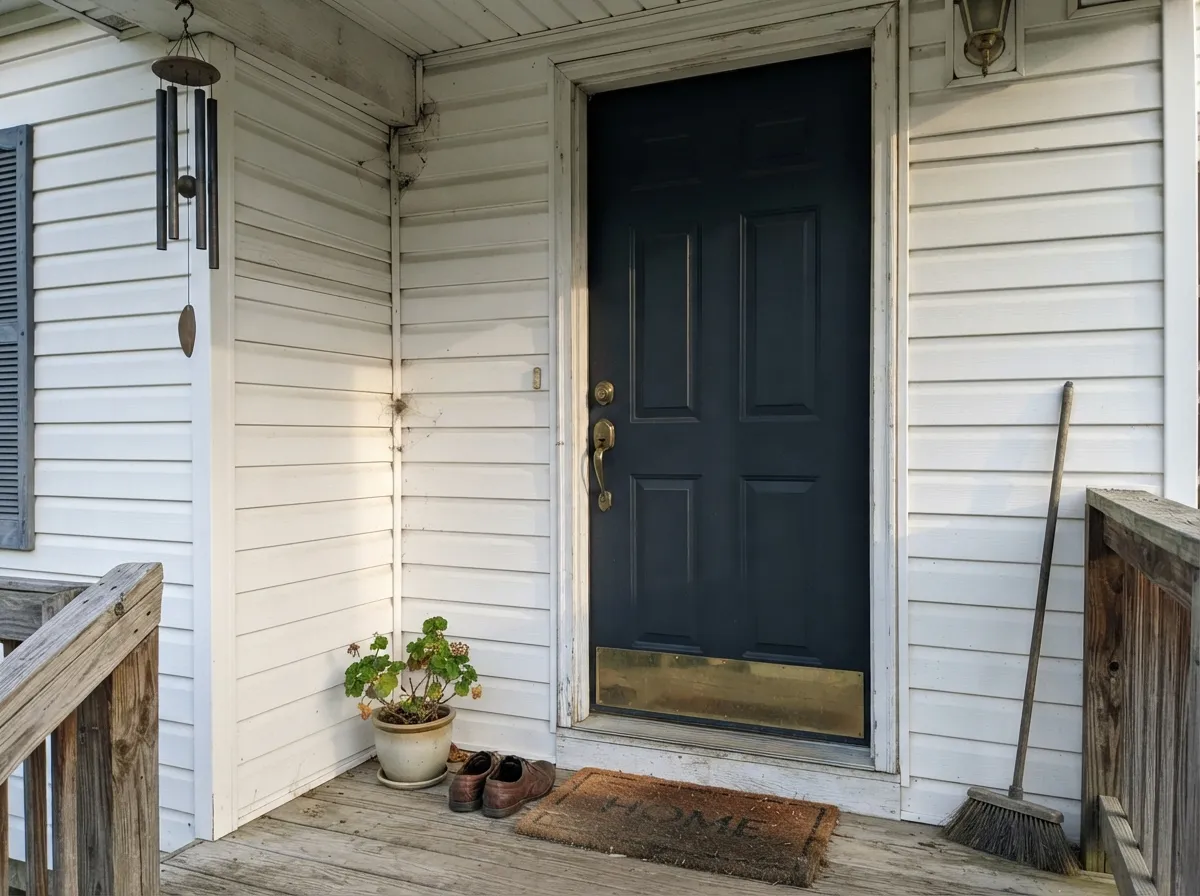
- Front doors and shutters read refined, not gothic
- Turns velvety and rich under warm evening lamps
- Deep enough (LRV 4) to hold its color even in fairly bright rooms
- Too dark for a room with limited windows — reads like a cave
- The blue is unmistakable at scale, even though it's subtle on the chip
- Cool LEDs and north light flatten it to cold slate-navy
- Not a true neutral black — clashes if you wanted flat black to match
What Color Is Soot, Really?
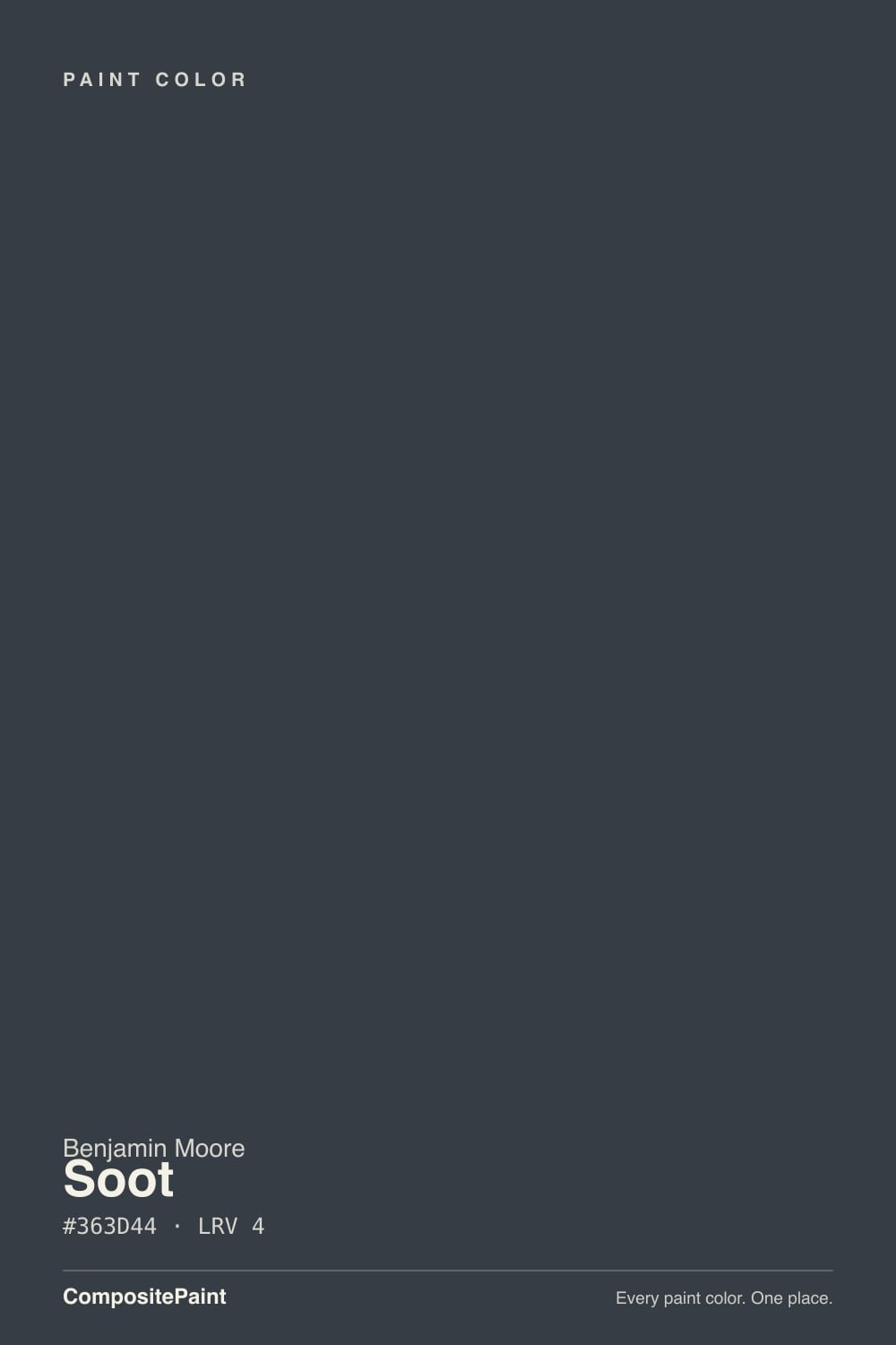
Soot is Benjamin Moore's blue-charcoal black — a near-black built on a cool blue-gray base rather than a true neutral black or a warm brown-black. In daylight it settles into deep charcoal-navy instead of flat black; in direct sun it can look almost gunmetal. The blue is quiet on the chip, easy to miss in a store, but on four walls or a full run of cabinetry it becomes the whole personality of the color — the same way any undertone amplifies at scale.
At LRV 4, this is one of the very darkest colors in the BM deck — a full step darker than Wrought Iron, Benjamin Moore's best-known soft black. That depth is why it swallows light: in a room with real windows it reads as a rich, dimensional charcoal-navy; without them, corners disappear and the color goes flat and cave-like. Reviewers describe the same trade over and over — spectacular with light, punishing without it.
Undertone in one line: cool blue first, black second — never brown, never green. South and west light warms the blue and lets the charcoal come forward; north light and cool LEDs strip the warmth and leave a cold, almost slate-navy cast. If your sample looks warm-brown or reddish, that's reflection from wood floors or trim, not the paint.
Where It Shines
Give it a well-lit room and metal accents and Soot becomes one of BM's most sophisticated darks. Cabinets and vanities under white counters and unlacquered brass sing; front doors gain quiet drama without going gothic; in warm evening lamplight it turns velvety and rich, closer to blue-black denim than shoe polish.
Where It Fails
Almost every regret story about Soot comes from one of three situations, and all three are predictable before the first coat. None of them are the paint's fault — but if your room matches one, this is not your black, and a bigger sample will only confirm it.
Soot is dark enough (LRV 4) that a room with limited natural light doesn't read moody — it reads like a cave, with corners disappearing and the blue going flat and lifeless. Reserve it for a wall, an island, or a door in a room that gets real daylight elsewhere, not the only source of light.
Soot's blue is subtle on the chip and unmistakable at scale. Buyers hoping for a flat, no-undertone black — to match black hardware or trim elsewhere in the house — often find Soot reads visibly blue-charcoal next to it. For true neutral black, look at Tricorn Black; Soot is a different, cooler kind of dark.
Cold light and no direct sun kill the warmth in the blue and leave Soot looking like flat slate-navy — readers describe it as "more gray than black." The fix is cheap: swap to 2700K bulbs before you consider repainting.
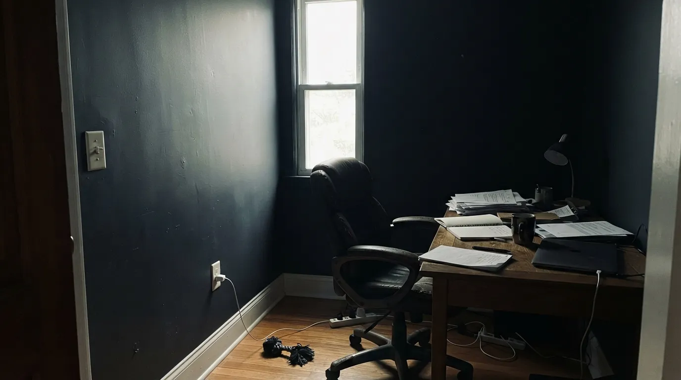
Room by Room
Beautiful as a single accent wall or a fireplace surround in a room with real daylight elsewhere — it reads deep charcoal-navy, not flat black. On all four walls it needs generous windows and warm lamps at night, or it starts to feel like a cave.
Against white counters, a pale backsplash, and brass or matte black hardware, Soot cabinets or an island look custom-built. It hides fingerprints and scuffs well for such a dark color. Satin or high-gloss Advance interior paint is the durable choice.
Gorgeous as a headboard wall under warm 2700K lamps, where the blue softens into something cozy rather than cold. Wrapping the whole room is a bigger bet — make sure there's a real window and a lighting plan before committing to all four walls.
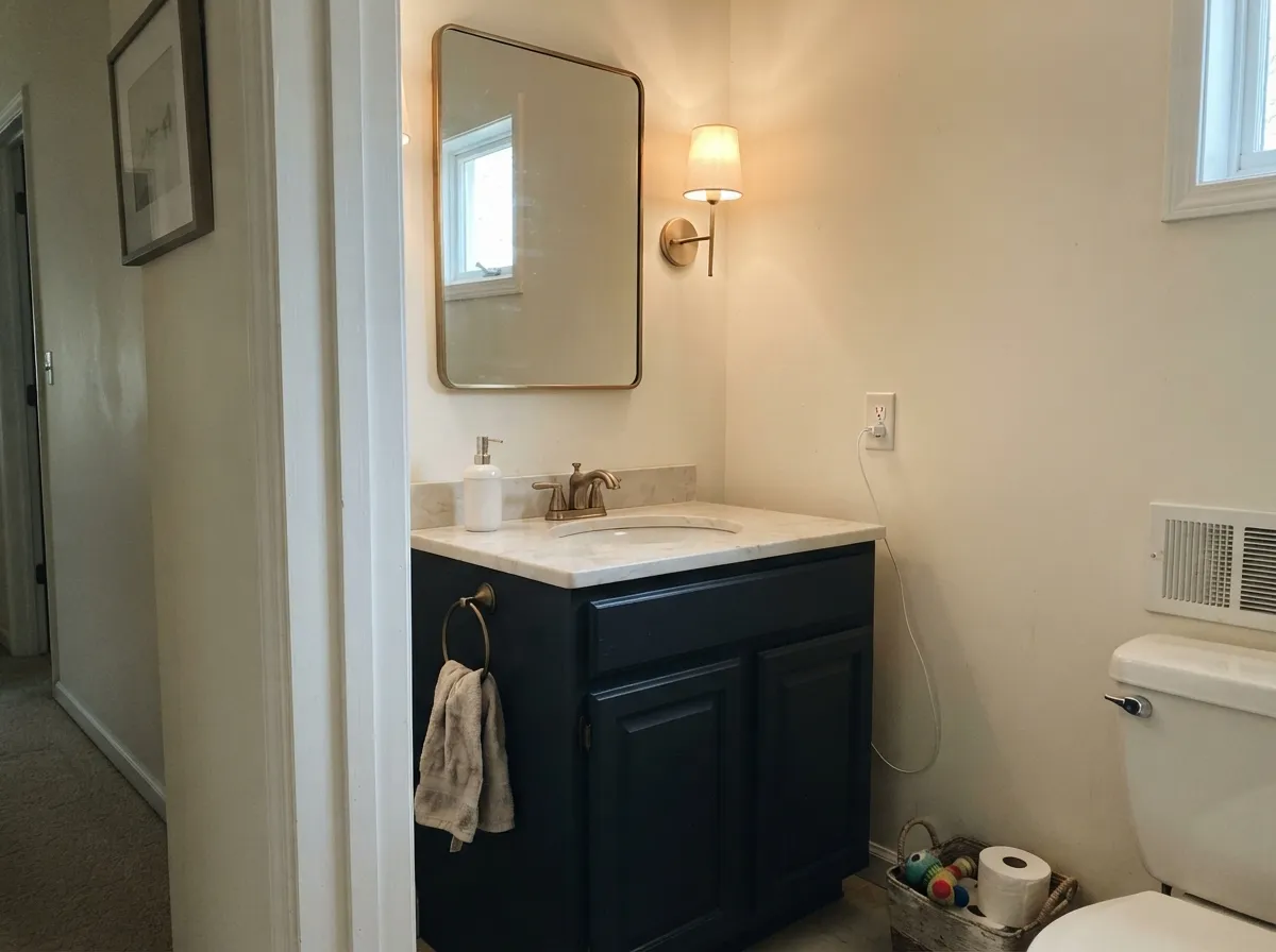
Small rooms carry deep color well, and a Soot vanity or a fully painted powder room under a warm sconce reads expensive fast. Pair with white or marble-look countertops and warm metal fixtures; satin or semi-gloss for durability near water.
Soot on an interior door or a front door gives quiet contrast without the starkness of a true black. On exterior doors it reads a touch more charcoal-gray in full sun than it does on the chip — expect that shift, don't fight it.
Works well on shutters, a front door, or trim against light or mid-tone siding. Full sun pushes it toward gray rather than true black, and the blue undertone shows more outdoors than in — sample it on the actual elevation before committing to a whole garage door or a large surface.
Your Light Is the Risk
South and west sun let the charcoal come forward and the blue turn rich rather than cold. This is where Soot looks most expensive.
Cool, flat daylight strips the warmth out and leaves a slate-navy cast readers call "more gray than black." Test first.
Cooler and bluer in the morning, warmer and more charcoal by late afternoon. The swing is real but gentle at this depth.
2700K lamps push it velvety and warm. Cool white LEDs flatten it toward cold slate-blue — swap bulbs, not paint.
Most complaints about Soot are a light mismatch. Upload a photo of your actual room and see it on your walls — then ask for the same wall in north light or evening lamps before you buy a single sample.
Need It From Another Brand?
Any paint counter can custom-tint Benjamin Moore 2129-20 directly. If you would rather stay in one brand's own deck, these are the closest stock matches, measured as ΔE2000. Under 2 is a difference you will not see on the wall.
| Brand | Closest color | ΔE | LRV | |
|---|---|---|---|---|
| Sherwin-Williams | GreenblackSW 6994 · Sherwin-Williams | 3.2 | 4 | Color page → |
| Behr | Madison AvenueQE-64 · Behr | 3.4 | 5 | Color page → |
| Valspar | Black HeronV120-3 · Valspar | 2.6 | 4.5 | Color page → |
| PPG / Glidden | Starless SkyPPG0995-7 · PPG / Glidden | 3.4 | 5 | Color page → |
| Glidden | Onyx Black00NN 05/000 · Glidden | 3.8 | 5 | Color page → |
| Dutch Boy | Grandeur Blue431-7DB · Dutch Boy | 3.4 | 4 | Color page → |
Similar Benjamin Moore Colors
The nearest shades to Soot within Benjamin Moore's own range, ranked by perceptual color distance — useful when you want the same look a touch lighter, darker, or warmer.
WCAG 2.1: AA is 4.5 : 1 for normal text, 3 : 1 for large text, AAA is 7 : 1.
Soot vs the Colors You're Also Considering
Every Soot sample board has the same rivals on it. The numbers show the real lightness gap — then it comes down to which risk you would rather live with.
Pick this for more depth and more visible blue — Wrought Iron is the safer, softer sibling.
Benjamin Moore 2124-10 · LRV 6Wrought IronPick this if you want a softer, slightly lighter black that's easier to live with on four walls.
Pick this for the cooler, more clearly blue-black character Iron Ore doesn't have.
Sherwin-Williams SW 7069 · LRV 6Iron OrePick this if your painter works in Sherwin-Williams and you want a black built for a whole house, not just an accent.
Soot Coordinating Colors
The rule for coordinating with Soot: warm whites and creams keep it from feeling heavy, cool grays keep it sophisticated, and metal finishes do a lot of the work. It leans blue, so treat golden-warm partners carefully and lean on brass or matte black hardware rather than chrome. These are the partners that keep showing up in rooms that work:
Soot vs. the Rest of BM's Blacks
Benjamin Moore's deck has no shortage of near-blacks, and most buyers default to Wrought Iron — it's the brand's best-known soft black, and for good reason: at LRV 6 it's a hair more forgiving. Soot exists for the buyer who tries Wrought Iron and wants more — more blue, more depth, more contrast against a white kitchen. It's a full step darker (LRV 4) and its blue undertone is more assertive at scale, which is exactly why it keeps showing up on kitchen islands and front doors instead of whole rooms.
What sets it apart from a true black is that Soot never goes flat. Under any real light it keeps a charcoal-navy dimension that a plain, undertone-free black doesn't have — which is the whole appeal for anyone who wants drama without the room reading like a black hole.
Soot With Wood Tones and Floors
Warm wood is Soot's best friend, the same way it is for most deep colors: white oak, walnut and butcher block all ground the blue and keep the pairing feeling intentional rather than cold. Builder-grade honey oak works too, though the contrast reads stronger — expect the floor to look a shade warmer next to Soot's cool base, which most people like.
The one flooring to sample first is cool gray-washed or gray LVP. Two cool, blue-leaning surfaces in the same room can read as one flat mood without any warmth to break them up — fine in a deliberately monochrome scheme, flat in an ordinary room. A warm rug or warm-toned trim usually fixes it.
Three Ready Palettes Built on Soot
A color is never alone on the wall. These are complete combinations in the 60-30-10 pattern, with the reason each one holds together. Every one opens in the visualizer.
White Dove cabinets keep the room bright and warm while the Soot island carries all the drama; Agreeable Gray walls sit quietly between the two so neither fights for attention. Unlacquered brass hardware finishes the look.
Try this palette in your roomA true, no-opinion white siding lets the door do all the talking; Collingwood's cool true gray on the trim keeps the whole facade in the same cool family so the door doesn't look like an afterthought.
Try this palette in your roomWarm cream walls keep the small room from feeling like a cave while the Soot vanity carries the real color; Edgecomb Gray overhead is a soft transition that reads intentional, not accidental.
Try this palette in your roomSoot FAQ
Is Soot black or blue?
Both, technically — it's built on a blue-gray base dark enough (LRV 4) to read as a soft black in most light. On the chip the blue barely registers; on four walls or a full run of cabinetry, it's unmistakable. If you want zero undertone, this isn't the color.
Is Soot warmer or cooler than Wrought Iron?
Cooler and darker. Wrought Iron (LRV 6) is Benjamin Moore's softest, most forgiving near-black; Soot (LRV 4) is a full step deeper with a more assertive blue undertone. They can be mistaken for each other in photos, but side by side Soot reads noticeably bluer and darker.
Is it good for kitchen cabinets?
One of the best dark cabinet colors in the deck. Against white counters, a light backsplash, and unlacquered brass or matte black hardware, it reads custom and expensive. Use a satin or high-gloss urethane-fortified cabinet paint — Benjamin Moore's Advance line comes tinted in Soot.
Does it work on a front door?
Yes — it's a popular choice for a door that wants to look refined rather than trendy. On a white or pale-gray house it reads as quiet contrast; expect it to look more charcoal-gray than black in full sun.
Will Soot make a room feel like a cave?
It can, if you paint all four walls in a room with limited windows. At LRV 4 it swallows light rather than bouncing it, so save the full-room treatment for spaces with real daylight, and use it as an island, a door, or one accent wall everywhere else.
What trim white goes with Soot?
A warm white like White Dove or Swiss Coffee keeps the whole scheme from feeling cold, since Soot's own undertone already leans cool. A stark, blue-white trim can make the pairing read chilly rather than dramatic.
Have you painted with Soot?
Rate it — one tap helps the next reader decide.
Ask a Question