Room Colors · Blue Powder Room
8 Best Blue Powder Room Paint Colors for 2026
ideas, combinations, and real rooms
8 curated picks from real blue powder rooms — with the exact colors, honest reasons why, and the combinations that hold the room together.

Former interior stylist who can spot a green undertone from across a room. Jessica writes the color and mood pieces — what to choose, what pairs, and why your "white" looks pink.
The Fast Answer
Don't want to read 8 picks? These four are the safe answers.

Top Picks for the Blue Powder Room
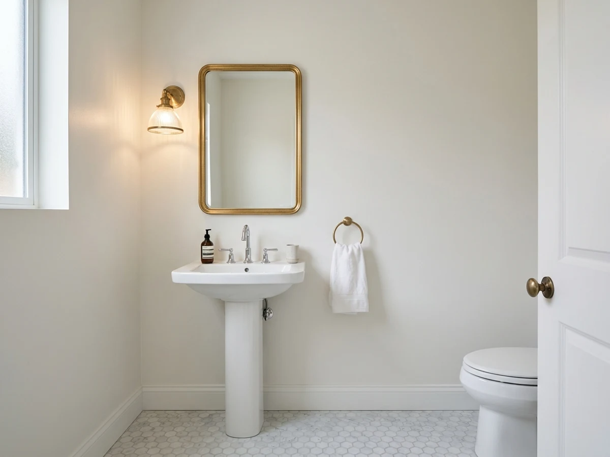
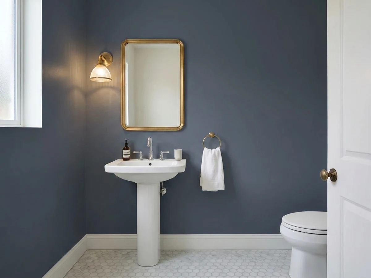
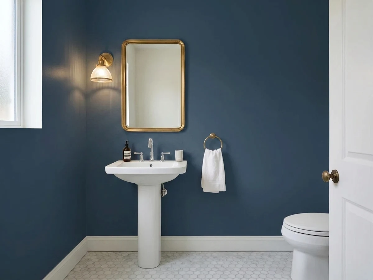
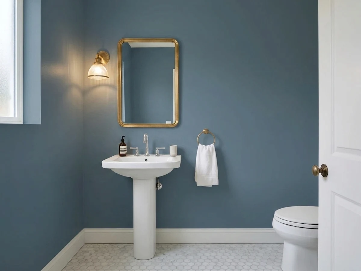
Tap a shade to see the blue powder room in it, then try it on your own room.
Blue Powder Room Color Trends 2026 — What's In, What's Out


- Pale Spa Blue Powder Room — The soft, safe spa-blue that used to fill small powder rooms now feels underwhelming next to 2026's fuller commitment to deep, saturated color.
- Navy Reserved For The Vanity Only — Using navy just on a vanity or accent wall is giving way to painting the whole small room in one bold blue.
- Two-Tone Blue Split Walls — A deeper blue below a chair rail paired with a lighter blue above is a layered look gaining ground over single flat navy powder rooms.
The 8 Best Blue Powder Room Paint Colors
Every pick below is a real rendered blue powder room, not a chip. The lead color first; the swatches are the full scheme in the photo — walls, furniture, textiles, accent.

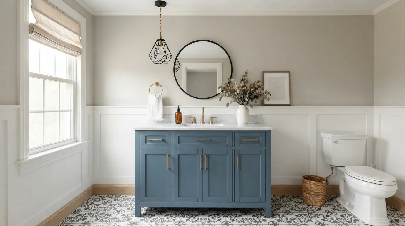
Cool slate blue brings fresh character to warm greige walls, brass hardware, and lively patterned floor tiles.
Slate blue is a dusty, medium-toned blue with a hint of gray. In this bathroom, it anchors the space on the vanity, paired with soft greige upper walls and crisp white paneling. The room feels fresh, relaxed, and polished all at once. This combination works because the cool blue pops against the warm neutral walls while the brass hardware ties everything together. It is perfect for anyone wanting a classic powder room with a splash of personality.
SEE IT ON YOUR WALLS →
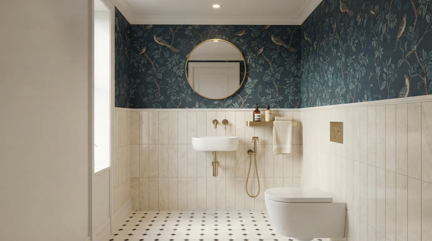
Deep midnight blue walls pair with creamy vertical tiles and brushed gold fixtures for an intimate, boutique jewel-box feel.
Indigo blue is a rich, deep navy with timeless character. In this powder room, the deep blue botanical design covers the upper walls, paired with crisp white door molding and bright stone-look wainscot tiling below. The space feels cozy, artistic, and sophisticated. The combo works because the light vertical tiles and bright white porcelain keep the compact room feeling open while letting the dark blue shine. It is perfect for anyone wanting a chic, hotel-inspired powder bath that leaves an impression.
SEE BLUE DUSK ON YOUR WALLS →
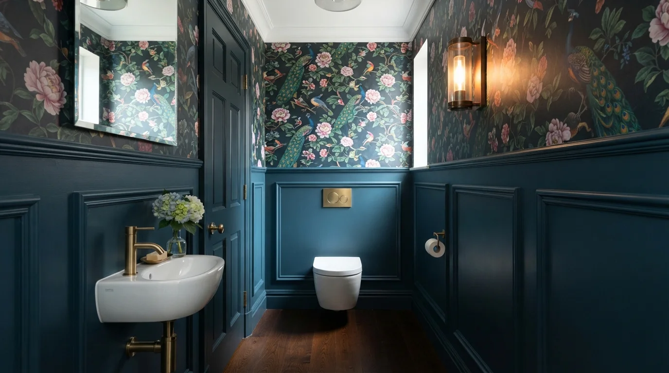
Rich peacock blue paneling pairs with enchanting botanical wallpaper and glowing brass accents for a lavish, jewel-box powder room.
Deep teal is a rich, moody blend of ocean blue and dark forest green. In this powder room, the lower walls and door trim are drenched in bold teal paneling beneath whimsical bird-and-flower wallpaper, balanced by crisp white porcelain fixtures. The space feels snug, dramatic, and intensely luxurious. The combination works because the warm metallic brass fixtures pop brightly against the saturated dark blue backdrop. It is ideal for anyone who wants to turn a small guest bathroom into a memorable design statement.
SEE IT ON YOUR WALLS →
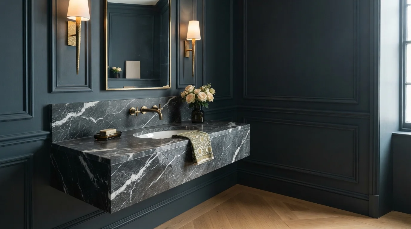
Rich slate blue wainscoting envelops a dramatic dark marble vanity with glowing brass sconces for an intimate feel.
Slate blue is a deep, smoky blue with quiet charcoal depth. In this room, that velvety color covers every inch of the traditional wall paneling, trim, and door casing. The space feels moody, intimate, and wonderfully upscale. Wrapping the whole room in one deep shade lets the heavily veined black marble vanity and warm brass sconces shine like jewelry. If you want a small bathroom that makes a bold, luxurious impression on guests, this rich monochrome look is for you.
SEE ESPIONAGE ON YOUR WALLS →
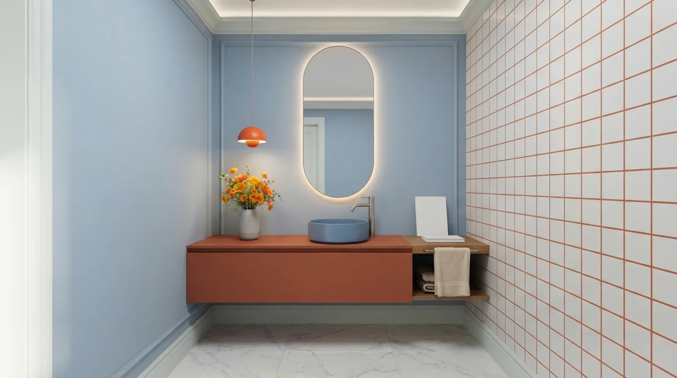
Cool sky-blue walls meet a punchy terracotta vanity, creating a fresh, graphic bathroom full of energy and warmth.
Sky blue is a gentle, refreshing wash of pale pastel. In this compact bathroom, smooth light blue covers the walls, balanced by a sharp terracotta floating vanity and a matching orange pendant lamp. The space feels bright, cheerful, and crisp without being overwhelming. This combo works because complementary blue and orange create an instant high-contrast punch while keeping the overall room feeling clean and open. It's a great look for anyone who loves playful retro design and bold modern accents.
SEE BRUSSELS BLUE ON YOUR WALLS →
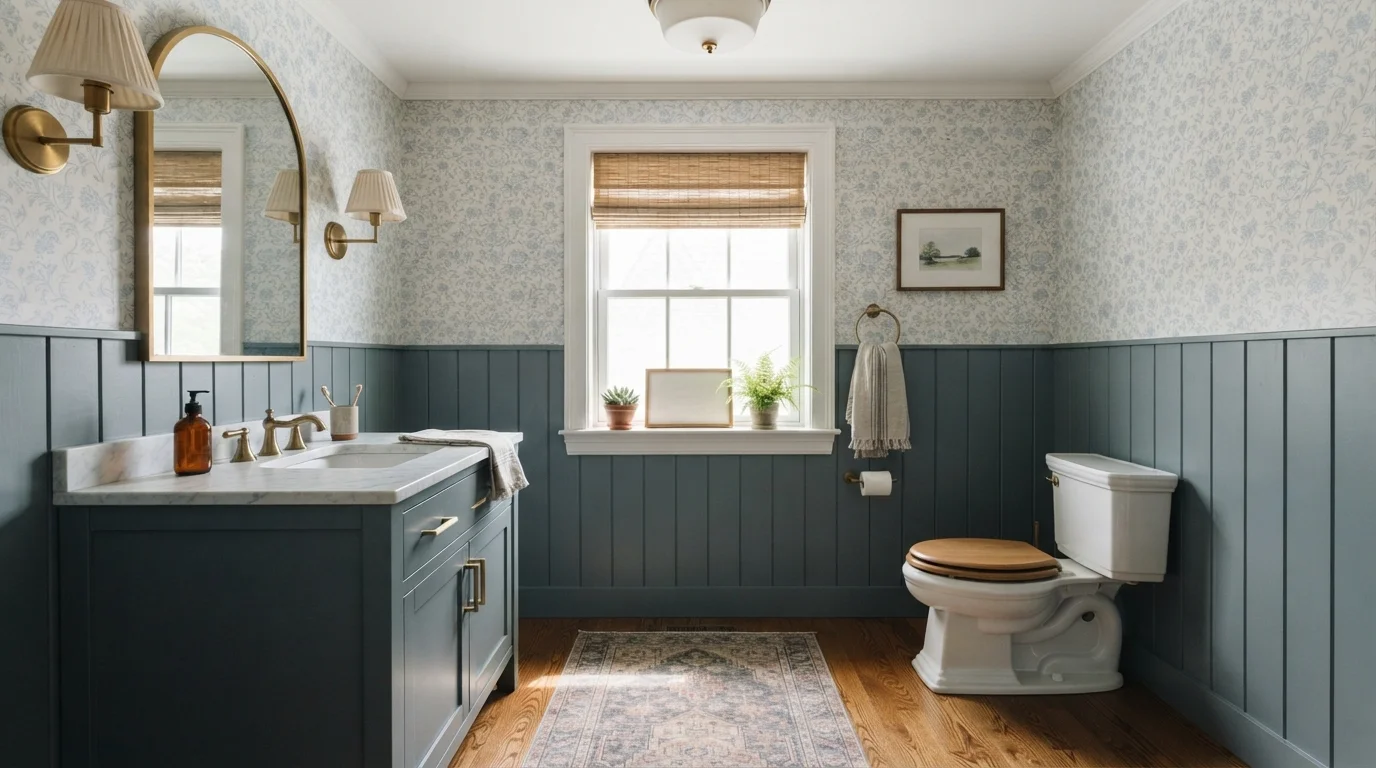
Soft slate blue wainscoting meets delicate botanical wallpaper and warm brass fixtures for a serene, storybook cottage feel.
Slate blue is a soothing, dusty gray-blue that brings immediate character. In this powder room, that gentle slate shade grounds the lower wainscoting and vanity cabinets, while airy floral patterns cover the upper walls. The room feels utterly calm, snug, and well-tailored. The look works beautifully because the cool blue tones find perfect balance against warm brass hardware, rich wood flooring, and a natural woven shade. It is a fantastic choice for anyone wanting a welcoming, timeless half-bath full of vintage personality.
SEE IT ON YOUR WALLS →
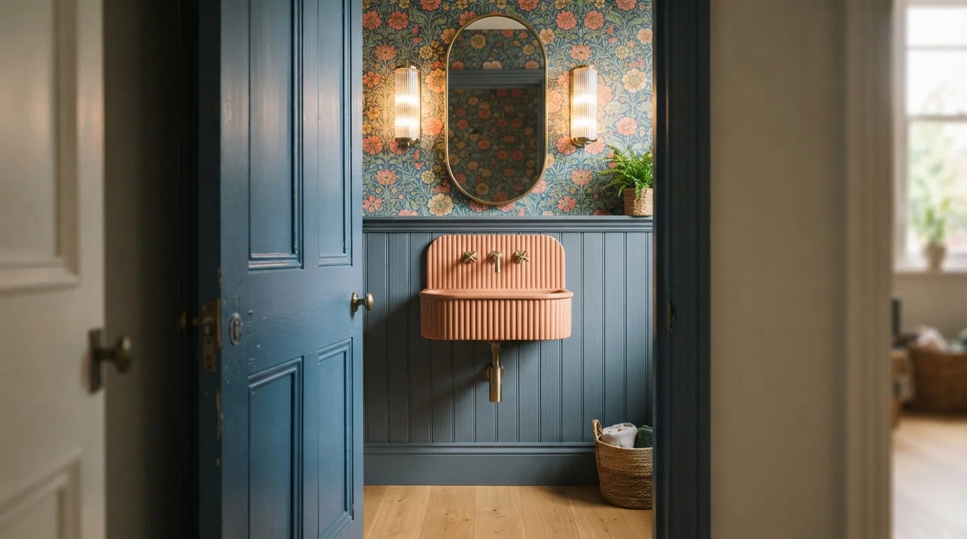
Moody blue fluted paneling and a soft terracotta basin create an artistic, intimate jewel-box powder room.
Slate blue is a dusty, deep blue with soft grey qualities. In this charming powder room, smooth slate blue coats the tall fluted wainscoting and paneled doorway, setting a moody base for lively botanical wallpaper above. The floating peach-terracotta sink provides a gorgeous warm contrast against the ribbed wall, accented by polished brass fixtures. The space feels intimate, bold, and delightfully vintage. The combination works effortlessly because cool blues and warm clay tones naturally balance each other. It is ideal for turning a tiny half-bath into an unforgettable showstopper.
SEE WINTER EVENING ON YOUR WALLS →
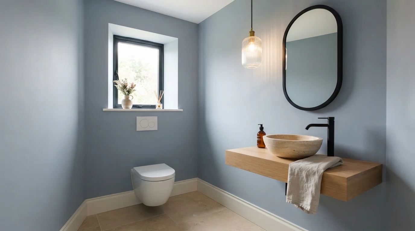
Soft dusty blue walls pair with warm oak and smooth stone for a wonderfully calm, spa-like breath of fresh air.
Dusty periwinkle is a gentle, soothing blue with a touch of gray. In this powder room, that quiet color covers the walls, beautifully framing the natural oak floating counter and creamy stone vessel sink. The space feels instantly clean, tranquil, and airy. The pairing works effortlessly because the warmth of the wood and matte black accents keep the cool walls grounded and modern. It is the perfect choice for anyone wanting a guest bath that feels like a boutique retreat.
SEE NORTH SEA ON YOUR WALLS →Blue Powder Room Wall Color Combinations
A wall color never works alone. These are the full schemes from the rooms above — the lead color first, then the supporting colors that make the photo work.
Cool slate blue brings fresh character to warm greige walls, brass hardware, and lively patterned floor tiles.
TRY THIS PALETTE →Deep midnight blue walls pair with creamy vertical tiles and brushed gold fixtures for an intimate, boutique jewel-box feel.
TRY THIS PALETTE →Rich peacock blue paneling pairs with enchanting botanical wallpaper and glowing brass accents for a lavish, jewel-box powder room.
TRY THIS PALETTE →Rich slate blue wainscoting envelops a dramatic dark marble vanity with glowing brass sconces for an intimate feel.
TRY THIS PALETTE →The classic pairing for the darkest picks here is walls in Hale Navy or Naval with crisp white trim and a white marble or white oak vanity — the white keeps the door frame and baseboards from disappearing into the dark, while brass or gold fixtures (a mirror frame, a sconce, the faucet) catch the light and read as the room's jewelry. For a more cocooned, no-trim look, some homeowners paint the door and trim the same navy as the walls and let a single brass fixture do all the contrast work — it reads more sophisticated but needs good task lighting to keep the room from going flat.
Blueprint and Rain Cloud both pair well with warmer materials — a white oak vanity, unlacquered brass hardware, and white trim — because their mid-range LRV keeps them from fighting with wood tones the way a true navy can. Windmill Wings and Honolulu Blue read coastal against white trim and black or brushed-nickel fixtures, or warmer against a wood vanity and brass. Gothic Purple is the one pick here that wants warm wood and brass over cool white and chrome — its dustiness needs a warm partner to keep it from reading muddy.
More Powder Room Color Ideas
Set on a color family already? Each page has its own real rooms and picks.
Light or Dark Blue Powder Room Colors?
Go Light (LRV 60+) If…
The room is small, faces north, or has to work at every hour. Light warm colors make it feel bigger and stay calm in evening light — the light you actually live in.
Go Dark (LRV Under 20) If…
You want the cocoon effect and the room has real daylight. Dark works best on one feature wall — or fully color-drenched in a large room with good windows.
Powder rooms almost never have the natural light a bedroom or kitchen gets — most run on a single vanity light or overhead fixture, and plenty have no window at all. That makes the light-versus-dark call less about the light the room gets and more about the light you're willing to add. Hale Navy, Naval, and Rain Cloud all read beautifully dark and cozy, but only if there's a mirror to bounce the vanity light back into the room and metal fixtures — brass, gold, or even matte black — to keep reflective surfaces working for you. Skip the extra light source and an LRV 4-6 wall in a windowless four-by-six room can start to feel like a closet instead of a jewel box.
If your powder room is genuinely dark — no window, one weak overhead bulb, a builder-grade fixture nobody's upgraded — Windmill Wings or Honolulu Blue are the safer call. Both sit near LRV 62-63, so they keep bouncing back most of the light the room already has instead of asking you to add more. Save the true navy for the powder room that already has a mirror and a real light fixture to work with.
See It. Love It.
Paint It.
Upload one photo of your blue powder room and try every color on this page on your own walls — in your own light, before you buy a drop of paint.

Hale NavyBeforeChoosing A Sheen For Powder Room Walls
Powder rooms don't run a shower, so the moisture load that pushes most bathrooms toward semi-gloss isn't really a factor here. Eggshell or satin is the standard call, and it matters more with a dark color than a light one: at LRV 4-6, a color like Naval or Hale Navy in flat paint can look chalky and uneven under a single vanity light, while eggshell or satin gives the wall enough sheen to look intentional and lets you wipe off the handprints that collect near the light switch and door frame.
Satin has a bit more shine than eggshell and will make brass or gold fixtures pop a little more against a dark wall, since the wall itself is throwing some light back. Eggshell is the quieter, more matte option and tends to be the better match for lighter picks like Windmill Wings or Honolulu Blue, where you want the color to feel soft rather than glossy. Either works — the wrong call is going flat on a dark wall, not the eggshell-versus-satin split.
Lighting Makes Or Breaks A Dark Powder Room
The single biggest variable in whether Hale Navy or Naval reads as elegant or cave-like isn't the color itself — it's what the room reflects that color off of. A mirror above the vanity does most of the work, bouncing whatever light exists back across the room, and it's the reason nearly every dark powder room photo you'll find online has a mirror as large as the vanity will allow. Add a sconce or two flanking that mirror instead of relying on a single overhead can, and an LRV 4 color like Naval stops swallowing the room.
Metal finishes matter almost as much. Brass, gold, and even polished chrome catch and scatter light in a way that matte black fixtures don't, which is why the classic dark-powder-room formula pairs navy walls with gold hardware rather than black. If your fixtures are already fixed and matte black, lean toward the mid-tone picks — Blueprint, Rain Cloud, Brilliant Blue — rather than the darkest options, since you won't have as much reflected light working in your favor.
Mistakes To Avoid In A Small Blue Powder Room
The most common misstep is picking a true navy for a powder room with no mirror, no upgraded lighting, and a single dim overhead bulb — the same color that looks like a jewel box in a well-lit listing photo can look like an unfinished basement without those elements in place. If you're not ready to add a mirror or a sconce, start with Blueprint, Rain Cloud, or one of the light picks instead of Hale Navy or Naval.
The second mistake is fighting the color with cool-toned everything — white subway tile, chrome fixtures, a cool white trim — when the room also has warm wood floors or a wood vanity elsewhere in the house. Blue reads coldest when it's surrounded only by cool materials; a warm-white trim, brass hardware, or a wood-framed mirror keeps any of these eight picks from feeling sterile. And with the lightest options, Windmill Wings and Honolulu Blue, the mistake is going too matched — pair them with white trim rather than painting the trim the same blue, or the small room loses the contrast that makes it feel bigger.
About Blue Powder Room Paint Colors
A powder room is the one room in the house built for boldness. There's no bed to match, no resale buyer to second-guess, just a few minutes of a guest's attention. That's why deep, saturated blues like Hale Navy (Benjamin Moore HC-154, LRV 6) and Naval (Sherwin-Williams SW 6244, LRV 4) work here in a way they rarely do anywhere else in the house. At an LRV in the single digits, both colors are darker than almost any wall color you'd choose for a bedroom or living room, but in a tight, windowless room lit by one overhead fixture, that darkness reads as a jewel box instead of a cave. Naval in particular has a following for exactly this reason: paired with brass or gold hardware, it turns a plain half-bath into the most photographed room in the house.
Not every powder room wants to go that dark. Blueprint (Behr S470-5, LRV 19), Rain Cloud (Sherwin-Williams SW 9639, LRV 11), and Brilliant Blue (Benjamin Moore 2065-30, LRV 15) sit in the middle of the range — dark enough to feel like a real color choice, light enough that a single sconce and a mirror keep the room from feeling closed in. Gothic Purple (Behr N110-4, LRV 25) leans the same direction from the purple side of the wheel, a dusty, soothing shade that reads as blue-adjacent under warm bulb light and gives the room a little unexpected personality without the commitment of true navy.
If your powder room has no window at all, or you just don't want a dark room, Windmill Wings (Benjamin Moore 2067-60, LRV 63) and Honolulu Blue (Benjamin Moore 2066-60, LRV 62) are the picks that keep the space feeling open. Both sit above LRV 60, close to a soft white in how much light they bounce back, so the room stays bright even with nothing but a builder-grade overhead fixture doing the work.

The Questions Everyone Asks
What color should I paint my blue powder room?
If you want one answer, start with the safe picks above — Yes It's Greige, Blue Dusk, Midnight Sonata, Espionage. They read well in any light and survive furniture changes. Then check the light: strong afternoon sun wants a step cooler, a north-facing room wants a step warmer.
is navy too dark for a small powder room?
Not if the room has a mirror and a real light source. Hale Navy (Benjamin Moore HC-154, LRV 6) and Naval (Sherwin-Williams SW 6244, LRV 4) are two of the most popular powder room colors precisely because a small, briefly-used room can handle darkness that would feel heavy in a bedroom. Add a mirror above the vanity and a sconce or two, and the darkness reads as cozy rather than cramped.
what color should I paint a windowless powder room?
If the room has no window and relies on a single overhead fixture, go lighter rather than darker. Windmill Wings (Benjamin Moore 2067-60, LRV 63) and Honolulu Blue (Benjamin Moore 2066-60, LRV 62) both sit near soft-white territory for how much light they reflect, so they keep a windowless room feeling open instead of asking a weak fixture to fight a dark wall.
do blue walls go with gold fixtures?
Yes, and it's one of the most reliable powder room pairings out there. Dark blues like Naval and Hale Navy in particular pair with brass or gold hardware because the metal catches and reflects light that a dark wall otherwise absorbs. The lighter picks, Windmill Wings and Honolulu Blue, also work with gold but read more coastal with black or brushed nickel instead.
what sheen should I use for a powder room?
Eggshell or satin, not flat and not full gloss. Powder rooms don't have shower moisture to manage, so the semi-gloss rule for full bathrooms doesn't apply here. Satin adds a bit more shine, useful for making a dark color like Naval or Rain Cloud (Sherwin-Williams SW 9639) look intentional rather than chalky under a single vanity light; eggshell is the quieter, more matte choice for lighter picks.
what color trim goes with a blue powder room?
Crisp white trim is the classic pairing for every pick here, from the darkest, Naval and Hale Navy, to the lightest, Windmill Wings and Honolulu Blue — the contrast keeps the door frame and baseboards from disappearing. For a more cocooned look with the dark picks, some homeowners paint the trim the same navy as the walls and let a single brass fixture provide all the contrast instead.
What two-color combination works best in a blue powder room?
The reliable pattern is a quiet main color plus one deep accent on a single wall. Keep trim and ceiling in one warm white so the two colors are the only event in the room — the combination cards above show complete schemes from real rooms.
What colors make a blue powder room look bigger?
High-LRV, slightly warm colors — LRV 60–75 is the sweet spot. Paint the walls and trim close to the same light color so the corners blur, and keep the ceiling white. Stark cool white actually works against you; it creates hard shadows that show the room's edges.


Ask a Question