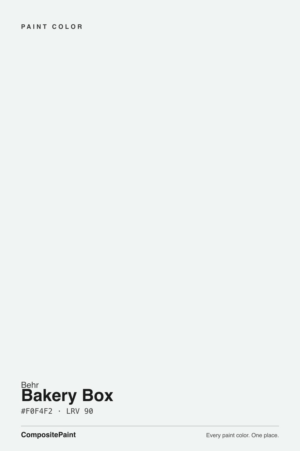
Bakery Box
A crisp 90-LRV white with a faint cool green-gray, reviewed honestly: the kitchens and trim where it stays clean, the light that turns it mint, and what to pick instead.

Jessica has spec'd whites and neutrals for more than 300 rooms and keeps a sample wall of painted drawdowns in her studio. Every color review is checked against real reader rooms in the comments and re-tested when a formula changes. About the testing process →
- 1Classic Gray74
- 2Alabaster82
- 3Bakery Box90
- 4Ultra Pure White97
The Fast Verdict
Bakery Box is the white you pick when cream would look dirty and Ultra Pure White would look like a clinic. At LRV 90 it is almost a true white — crisp, airy, slightly cool — with a green-gray so faint most people never name it until a honey-oak floor or a leftover cream casing sits next to it. Home Depot sells it as cabinet, door and trim enamel for a reason. On four dim walls it is a different paint.
Kitchen cabinets and walls that should stay clean, not creamy · trim and doors in a cool or mixed house · bathrooms with white or gray stone · anyone who wanted Chantilly Lace and walked into Home Depot
The room faces north and stays dim · honey oak or cream trim is staying · you want a cozy, creamy white · Ultra Pure White is already on the millwork and you cannot repaint it
- Crisp kitchen and cabinet white — clean, not creamy
- LRV 90 multiplies light on millwork, in halls and on laundry walls
- Faint green-gray plays well with sage, quartz and stainless
- Home Depot stocks it as cabinet, door and trim enamel
- The Chantilly Lace idea at a Behr price, if your light is right
- North light and dim rooms turn it mint-gray
- Fights honey oak, cream trim and every warm beige
- Looks dirty or green next to Ultra Pure White
- Too sharp and cool for anyone who asked for a cozy white
What Color Is Bakery Box, Really?
A crisp, high-reflectance white with the faintest cool green-gray in it — not cream, not gallery-stark, not a pastel. Behr files it among the cool whites and describes it as blue-white; the chip and the hex tell a greener story. On a wall in decent daylight most people just call it white. The cast only announces itself when a warmer neighbor shows up, or when the light goes gray. That is why it keeps showing up on kitchen cabinets and millwork: it reads clean rather than creamy, and it does not dump the blue glare that Ultra Pure White throws in a lot of houses.
At LRV 90 it sits with the bright architectural whites. It is a twin of Chantilly Lace (LRV 90) and Natural White (LRV 90), a step behind Polar Bear (LRV 94) and Ultra Pure White (LRV 97), and clearly brighter than White Dove (LRV 85) or Extra White (LRV 86). Reflectance that high is the point on cabinets and trim: it multiplies kitchen light and cuts a sharp painted edge. It is also why four walls of it in a dim room look unfinished — there is almost no body to hide in. Sample it on the actual door or the actual wall, not against a cream chip in the store.
Undertone in one line: cool green-gray, never yellow, never pink. If the sample looks mint, that is north light, a lawn reflection, or a cream sitting next to it. If it looks icy blue, that is overcast daylight or a 4000K LED. If it looks like plain white, the room is doing its job.
Where It Shines
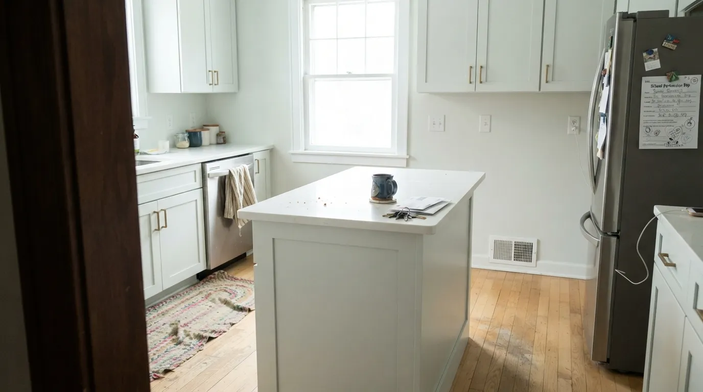
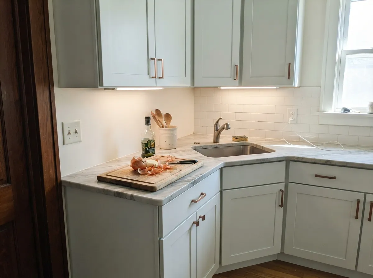
Give it real daylight, cool or mixed materials, and a job on cabinets or millwork, and it is one of the better crisp whites you can walk out of Home Depot with. Satin on shaker boxes next to white quartz or gray stone is the version owners keep: one kitchen with copper pulls made Ultra Pure White look gray in the same lighting and this color look finished. Semi-gloss on doors and casings does the same thing against a sage or soft green-gray wall. South and west afternoon light is the official home, and it earns that listing — the white stays airy instead of creamy.
Where It Fails
Almost every unhappy Bakery Box story is a temperature story, and all three versions are visible on a sample board. None of them are a bad mix. If your room matches one, another white will save you a weekend.
A cool green-gray white next to golden oak floors, honey-stained cabinets, or Swiss Coffee-type trim makes both sides worse: the wood goes more orange, the white goes faintly mint, and the old cream looks yellowed. This is not a warm white with the warmth turned down. If the oak or the cream is staying, pick Blank Canvas or Behr Swiss Coffee instead.
North light is cool and gray — it strips the crispness and leaves the green-gray base sitting on the wall. The result is faintly mint, a little dingy, and nothing like the clean white on the chip. Behr itself points this color at south and afternoon west light for a reason. In a north room, go warmer (Natural White, Swiss Coffee) or commit to lamps.
Ultra Pure White (LRV 97) on the ceiling or leftover builder cream on the casings will both wreck it. The brighter white makes Bakery Box look gray-green and unwashed; the cream makes it look minty. One white for walls, trim, and cabinets, sheen changes only — or drop it and paint the whole room the neighbor.
Room by Room
Satin on shaker or flat-panel boxes, eggshell on the walls if you run it there too. White quartz, gray stone, stainless, brass, even copper — this is the company it was mixed for. Skip it over honey-oak cabinets you are not painting, and do not leave cream uppers next to these lowers.
Home Depot stocks this SKU as cabinet, door and trim enamel, and that is the honest use. Semi-gloss on baseboards, casings and six-panel doors cuts a clean edge against sage, green-gray or mid greige. If Ultra Pure White is already on the millwork, do not introduce this as a second white.
White subway, gray porcelain, chrome or brushed nickel: it stays crisp and the green-gray never becomes a color. Warm beige tile and honey-oak vanities argue. Eggshell on walls; satin on a vanity if you paint one.
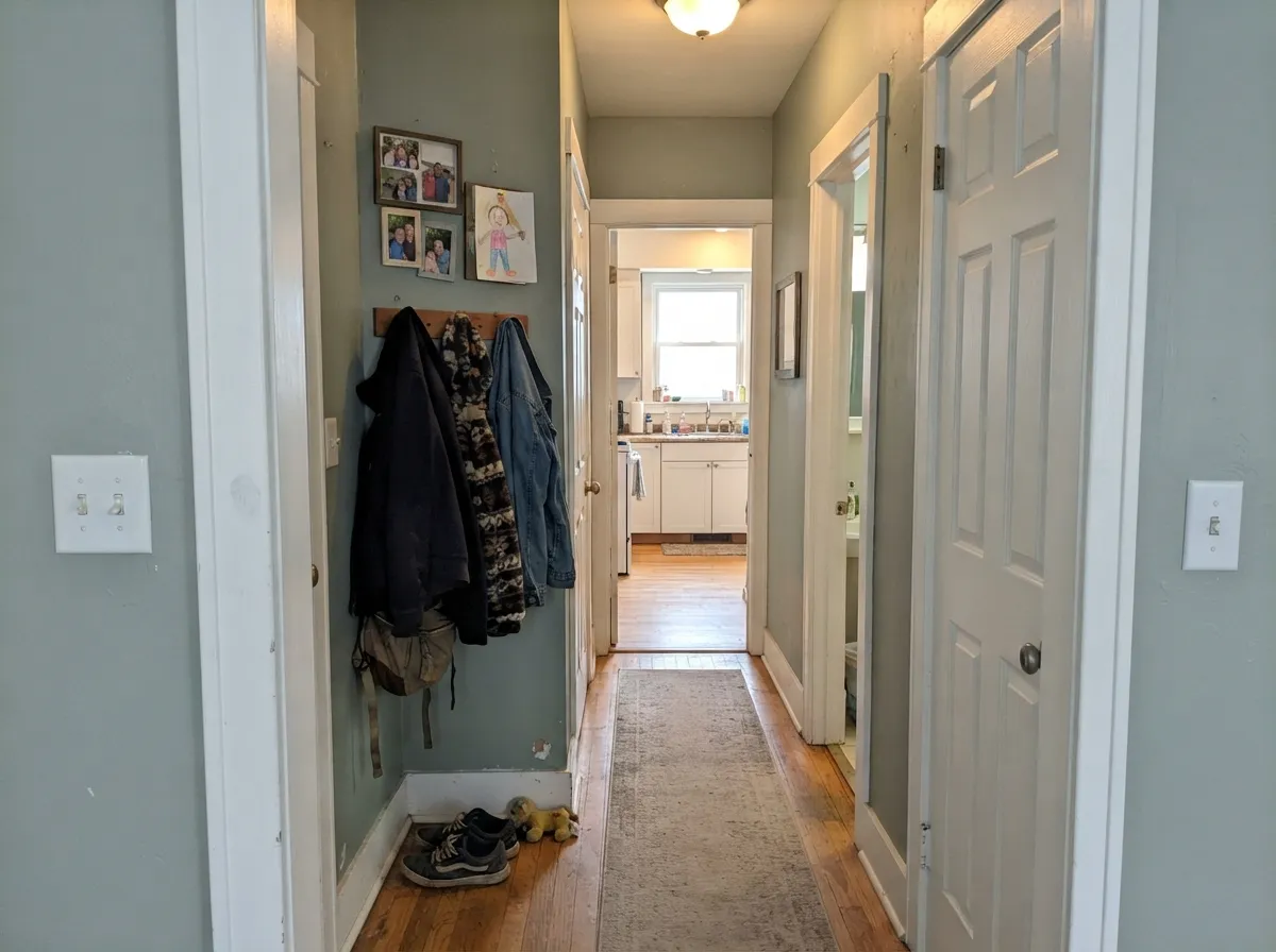
LRV 90 with no cream in it is a kindness in a windowless laundry or a long hall. It bounces the one bulb you have and reads as painted woodwork, not a statement. Semi-gloss on doors and trim; eggshell on the walls if they need a washable coat.
On trim it is automatic. On four walls it needs real windows and enough furniture, wood and art to keep LRV 90 from reading unfinished. South and west rooms are the ones that work. A dim north living room wants Natural White or Smoky White, not this.
A bright, clean bedroom in decent daylight can wear it. A cozy, lamplit one cannot. Under 2700K bulbs it softens a little, but it will never turn into cream, and in a north bedroom the green-gray comes forward. If the brief is restful, keep this color on the trim.
Your Light Is the Risk
Even daylight keeps it a true, airy white — crisp without tipping cream. Behr points it here, and the chip agrees.
Cool gray daylight exposes the green-gray base; the wall goes faintly mint and a little dingy. Test first or pick a warmer white.
Cooler and slightly greener in morning east light; airiest and most 'just white' in afternoon west sun. The shift is small, but it is real.
2700K lamps push it toward a quieter, almost-neutral white. Cool 4000K LEDs ice it and pull the green-gray. Swap bulbs before you swap paint.
Most complaints about Bakery Box are a light mismatch. Upload a photo of your actual room and see it on your walls — then ask for the same wall in north light or evening lamps before you buy a single sample.
Need It From Another Brand?
Any paint counter can custom-tint Behr BL-W09 directly. If you would rather stay in one brand's own deck, these are the closest stock matches, measured as ΔE2000. Under 2 is a difference you will not see on the wall.
| Brand | Closest color | ΔE | LRV | |
|---|---|---|---|---|
| Sherwin-Williams | White SnowSW 9541 · Sherwin-Williams | 2.7 | 90 | Color page → |
| Benjamin Moore | Ice Mist2123-70 · Benjamin Moore | 0.6 | 89 | Color page → |
| Valspar | Tell Me a Secret8007-2B · Valspar | 0.6 | 89 | Color page → |
| PPG / Glidden | Delicate WhitePPG1001-1 · PPG / Glidden | 1.6 | 88 | Color page → |
| Glidden | Delicate WhitePPG1001-1 · Glidden | 1.6 | 88 | Color page → |
| Dutch Boy | Ultra White002W · Dutch Boy | 2.4 | 91 | Color page → |
Similar Behr Colors
The nearest shades to Bakery Box within Behr's own range, ranked by perceptual color distance — useful when you want the same look a touch lighter, darker, or warmer.
WCAG 2.1: AA is 4.5 : 1 for normal text, 3 : 1 for large text, AAA is 7 : 1.
Bakery Box vs the Colors You're Also Considering
Every Bakery Box sample board has the same rivals on it. The numbers show the real lightness gap — then it comes down to which risk you would rather live with.
Pick this if you are at Home Depot and want the same crisp, high-LRV job with a cooler green-gray whisper.
Benjamin Moore OC-65 · LRV 90Chantilly LacePick this if you want the cleanest Benjamin Moore white and a painter who works in that deck — same brightness, less green-gray.
Pick this when Ultra Pure White goes gray or clinic-bright on cabinets and you want a white with a hair of color.
Behr W-B-500 · LRV 97Ultra Pure WhitePick this for ceilings and the whitest possible trim — unbeatable bounce, almost no pigment.
Within Behr, Heavy Sugar T13-14 at #EFF5F1 and LRV 90 is the closest sibling and is effectively the same white. Vibrant White BWC-12 at #EDF5F4 and LRV 90 pushes further toward blue-green. New House White RD-W10 at #F4F3F0 and LRV 90 is the warmer alternative, with red strongest instead of green, so pick it if the cool cast bothers you.
Across brands the matches are tight. Dunn-Edwards Wind Chill DEW369 at #EFF3F0 has a deltaE of 0.55, Benjamin Moore Ice Mist 2123-70 at LRV 89 comes in at 0.61, and Valspar Tell Me a Secret 8007-2B at LRV 89 at 0.64. All three are genuine matches.
Step out a little and differences appear. Glidden Delicate White PPG1001-1 at LRV 88 and deltaE 1.58 is visually identical in normal room light but a fraction warmer. Farrow and Ball All White No. 2005 at LRV 92 and deltaE 2.02 is very close but worth sampling first, being brighter and less green. Sherwin-Williams White Snow SW 9541 at LRV 90 and deltaE 2.73 is the same brightness with a warmer lean.
Bakery Box Coordinating Colors
The rule for coordinating with Bakery Box is stay on the cool-to-neutral side of the fence. It flatters sage, green-gray, navy, chrome and white stone — and it argues with cream, honey oak, and any white that is brighter or warmer than it is. These are the partners that keep the green-gray looking intentional:
Bakery Box on Cabinets, Doors, and Trim
This is the surface the can was mixed for. Home Depot stocks BL-W09 as cabinet, door and trim enamel — semi-gloss and satin — and that is the tell. At LRV 90 it is bright enough to modernize builder oak boxes and still hold a hair of color, so it does not go the gray-clinic route some houses report with Ultra Pure White. Satin on cabinets wipes clean; semi-gloss on doors and casings takes the scuffs.
The pairing decides whether it looks custom or accidental. Against Sea Salt, Quiet Moments, Whitened Sage or a mid greige, the white edge reads deliberate. Against leftover cream millwork or Ultra Pure White ceilings, it reads like the wrong gallon. One white for every painted plane, sheen changes only, is the version that works. If you want one dark note, put it on the island or the door — Hale Navy, Very Navy, Cracked Pepper — not on a second white.
Bakery Box With Wood Tones and Floors
Cool and pale woods are the easy yes: white oak, ash, gray-washed LVP, and mid walnut all sit comfortably against a crisp green-gray white. The white keeps the floor looking finished instead of yellow. Brass and copper hardware work — one kitchen owner ran this color on the boxes with copper pulls and kept it — because the white is close enough to true white that warm metal just reads as metal.
The honest no is golden: honey oak floors, orange-stained trim, yellow-beige carpet. A cool white in that room does not soften the orange; it advertises it, and the wall picks up a mint cast in return. Gray porcelain and white quartz are home turf. Creamy beige tile and builder-beige vinyl are not. Test a big sample above the actual floor before you commit the kitchen.
Three Ready Palettes Built on Bakery Box
A color is never alone on the wall. These are complete combinations in the 60-30-10 pattern, with the reason each one holds together. Every one opens in the visualizer.
Sea Salt and Bakery Box share a cool green-gray family, so the wall-to-cabinet handoff stays quiet; the navy island grounds the room and loves brass or copper pulls. Sample Sea Salt in your actual light — it is beautiful when the light agrees and sulky when it does not.
Try this palette in your roomA cool green-gray wall, a crisp white edge, and one real sage on the boxes. Quiet Moments can flash turquoise in the wrong light, so test it; Bakery Box trim is the clean line that keeps the scheme from going spa.
Try this palette in your roomOne white at two sheens is the pairing that cannot go mint against itself. Cracked Pepper supplies the single dark note so the kitchen does not read unfinished — and it is already on the Behr chip rack.
Try this palette in your roomBakery Box FAQ
Is Bakery Box warm or cool?
Cool — quietly. The green-gray is faint enough that a lot of rooms just call it white, but it is not a cream and it is not a true no-undertone white. In south and west afternoon light it reads crisp and airy. In north light it drifts mint-gray.
Is it good for kitchen cabinets?
That is its best job. Satin enamel on shaker or flat-panel boxes stays clean next to white or gray stone, stainless, brass and copper. Do not park it next to honey-oak boxes you are not painting, and do not leave a cream upper cabinet beside it. Use a urethane-fortified cabinet enamel.
What trim color goes with Bakery Box walls?
Bakery Box itself, in semi-gloss. A brighter trim white — Ultra Pure White, Polar Bear — makes the walls look gray-green. A cream trim makes them look mint. If you want contrast, go darker (navy, charcoal), never creamier and never brighter.
Does Bakery Box work with oak floors?
Depends on the oak. Pale white oak and gray-washed floors are fine. Golden honey oak is the clash: the cool white pushes the floor toward orange and the floor pulls a mint cast out of the wall. A large rug helps. If the honey floor is staying wall to wall, pick Swiss Coffee or Blank Canvas.
How is it different from Ultra Pure White?
Ultra Pure White (W-B-500, LRV 97) is almost pigment-free — unbeatable on ceilings and trim, risky on four walls, and in some houses it reads gray or clinic-bright. Bakery Box is seven LRV points darker and carries a green-gray whisper, so cabinets and walls look finished instead of empty. Do not use both in the same room.
How many coats does it take?
Two over any light existing color. Going over a dark or saturated wall, prime first with a gray-tinted primer — three finish coats of a white this bright over navy or red is the expensive way to learn that. On cabinets, follow the enamel's recoat window and do not rush the last coat.
Have you painted with Bakery Box?
Rate it — one tap helps the next reader decide.
Ask a Question