Room Colors · Green Powder Room
8 Best Green Powder Room Paint Colors for 2026
ideas, combinations, and real rooms
8 curated picks from real green powder rooms — with the exact colors, honest reasons why, and the combinations that hold the room together.

Former interior stylist who can spot a green undertone from across a room. Jessica writes the color and mood pieces — what to choose, what pairs, and why your "white" looks pink.
The Fast Answer
Don't want to read 8 picks? These four are the safe answers.

Top Picks for the Green Powder Room
Tap a shade to see the green powder room in it, then try it on your own room.
Green Powder Room Color Trends 2026 — What's In, What's Out


- Minty Pale Spa Green — The soft, minty pale green that dominated small bathrooms years ago now feels timid next to 2026's deeper, jewel-toned greens.
- Green Confined To The Vanity — Limiting green to a vanity or single accent is giving way to full color-drenched powder rooms.
- High-Gloss Green Ceilings — Painting the ceiling in a high-gloss version of the wall's emerald or forest green is a 2026 move that adds shine and depth overhead.
The 8 Best Green Powder Room Paint Colors
Every pick below is a real rendered green powder room, not a chip. The lead color first; the swatches are the full scheme in the photo — walls, furniture, textiles, accent.

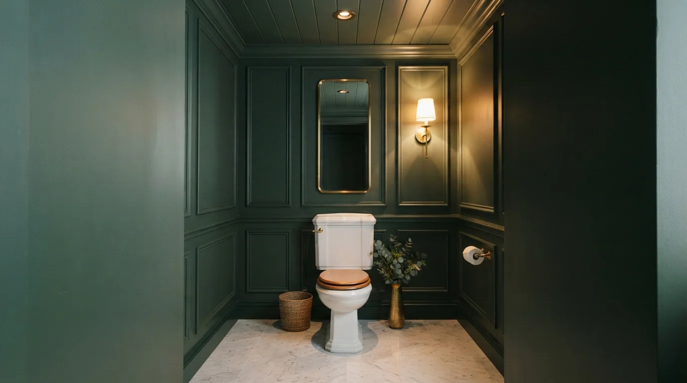
Rich forest green walls and warm golden lighting turn a tiny powder room into a lavish, cozy retreat.
Forest green is a deep, velvety shade of dark emerald. In this space, rich green envelops the entire room across the paneled walls, trim, and ceiling. It feels dramatic, intimate, and wonderfully secluded. The look works because the brilliant white porcelain toilet and gleaming brass accents pop crisply against the dark green backdrop. It's a stunning choice for anyone who wants to turn a small powder room into an unforgettable, high-impact showstopper.
SEE ESSEX GREEN ON YOUR WALLS →
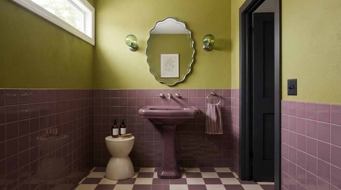
Rich plum tile and luminous chartreuse walls create a bold, playful jewel-box powder room full of personality.
Chartreuse is an energetic yellow-green with a warm, lively feel. In this powder room, velvety green walls pair with glossy plum square tiles, a matching purple pedestal sink, and a playful checkerboard floor. The space feels dramatic, artsy, and delightfully unexpected. This pairing works because deep purple and zesty chartreuse are natural opposites, bouncing light off each other to make a tiny room feel intentional. It is ideal for anyone who wants a bold, memorable look for guests.
SEE FOREST MOSS ON YOUR WALLS →
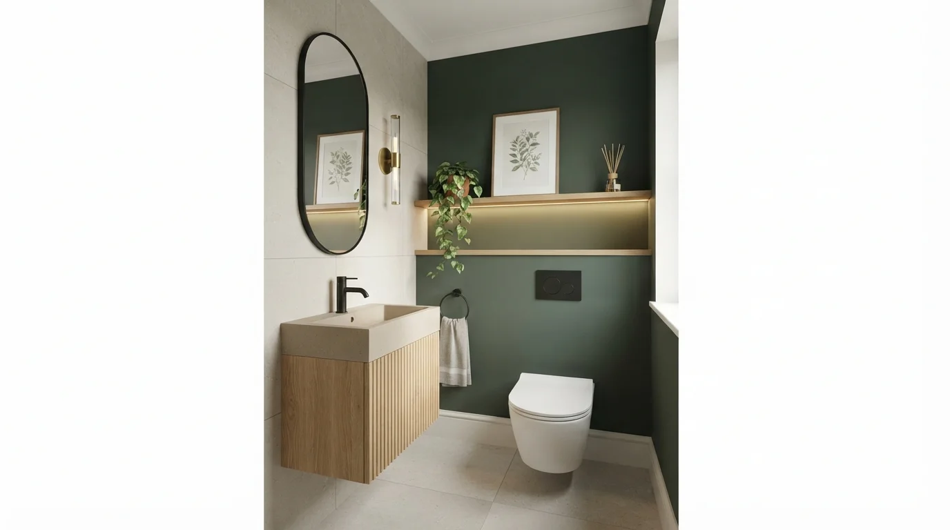
Deep forest green walls blend effortlessly with warm oak and soft stone for a tranquil, spa-like retreat.
Forest green is a deep, grounding shade inspired by lush woodland foliage. In this powder room, it blankets the accent wall behind the toilet, creating a striking contrast with the fluted oak vanity and light greige tiles. The space feels instantly calming, cozy, and high-end. Pairing deep green with natural wood and neutral stone works because earthy textures naturally soften rich, dark paint. It is a fantastic choice if you want to give a small powder room an upscale, boutique hotel vibe.
SEE LUSH GRASS ON YOUR WALLS →
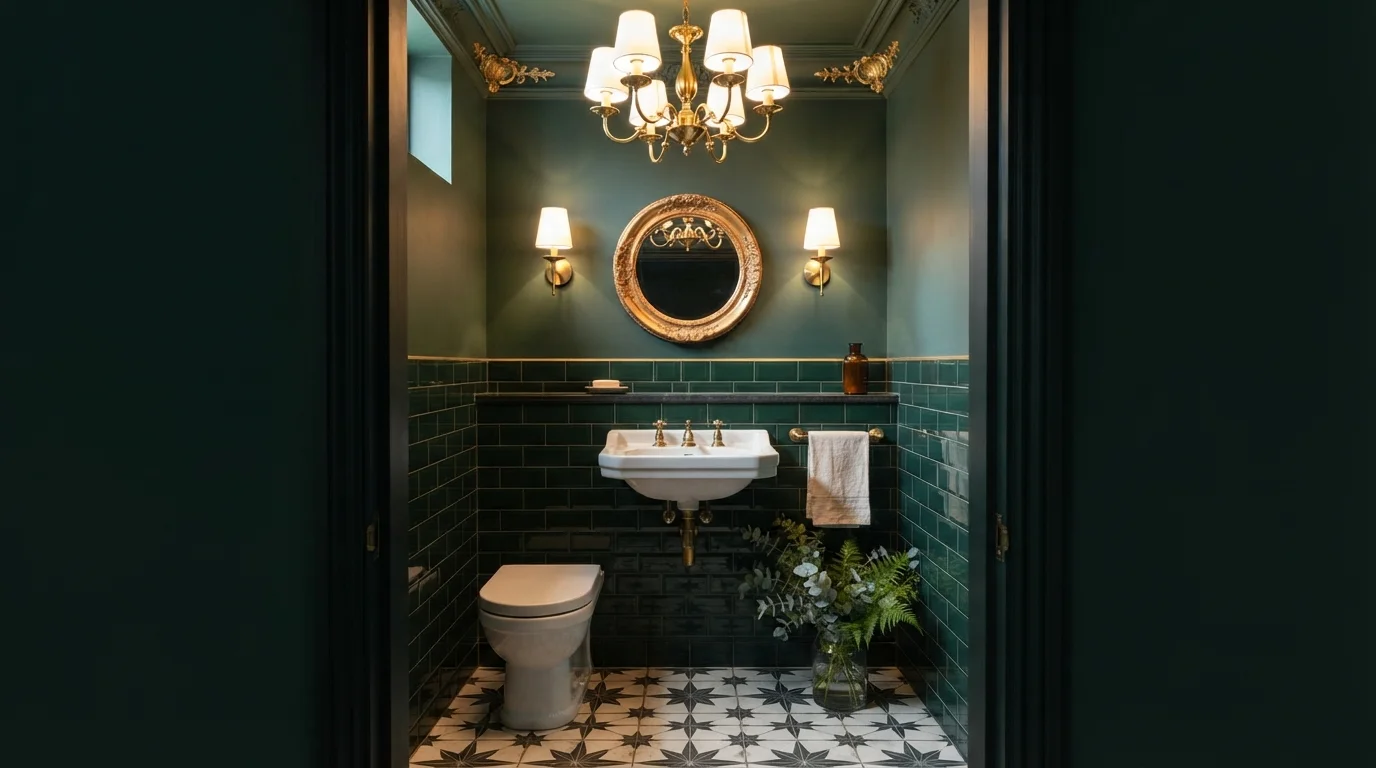
Rich forest green walls and warm golden fixtures wrap this cozy powder room in sophisticated, dramatic luxury.
Forest green is a deep, velvety jewel-toned green. In this room, the dark green coats the upper walls and glossy subway tiles, contrasted by a crisp white porcelain sink, toilet, and bold black-and-white graphic floor. The space feels intimate, snug, and undeniably dramatic. Warm metallic finishes pop effortlessly against the deep, dark backdrop, giving the compact room a glowing antique elegance. It is perfect for anyone who wants to turn a tiny half-bath into an unforgettable, high-drama showstopper.
SEE ENGLISH IVY ON YOUR WALLS →
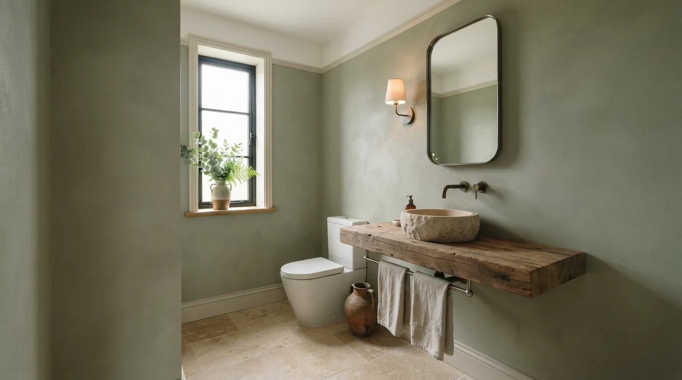
Soft sage plaster walls paired with raw timber and natural stone create a quiet, grounding sanctuary.
Sage is a soft, muted leafy green with gentle gray qualities. In this bathroom, textured sage coats the walls, creating a backdrop for a thick timber countertop and a carved stone sink. The whole space feels peaceful, relaxed, and deeply grounded in nature. This combination works effortlessly because earthy greens and raw natural wood always complement each other. It is ideal for anyone looking to turn a small powder room into a serene, spa-like retreat.
SEE BUSHEL ON YOUR WALLS →
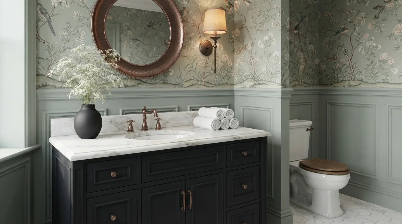
Step into an enchanting powder room wrapped in leafy wallpaper, soft sage paneling, and warm, glowing copper accents.
Sage green is a muted, earthy green with a peaceful, nature-inspired tone. In this powder room, the soft sage coats the traditional wall paneling, framing the botanical bird wallpaper above and setting off the dark black vanity below. The space feels intimate, snug, and richly historic. Pairing gentle earthy greens with deep charcoal cabinetry and bright copper fixtures creates instant depth without feeling crowded. It is a fantastic design choice for anyone looking to turn a small guest bathroom into a memorable jewel box.
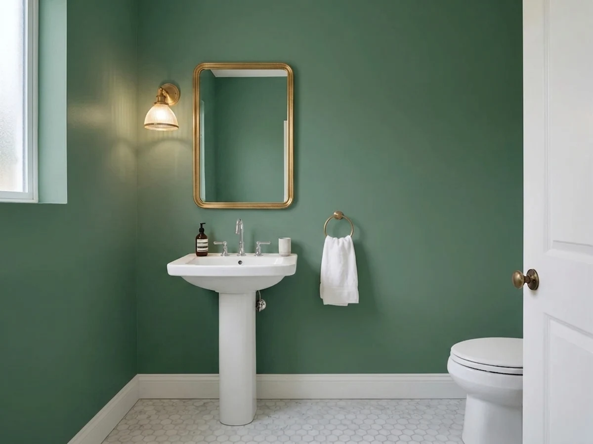
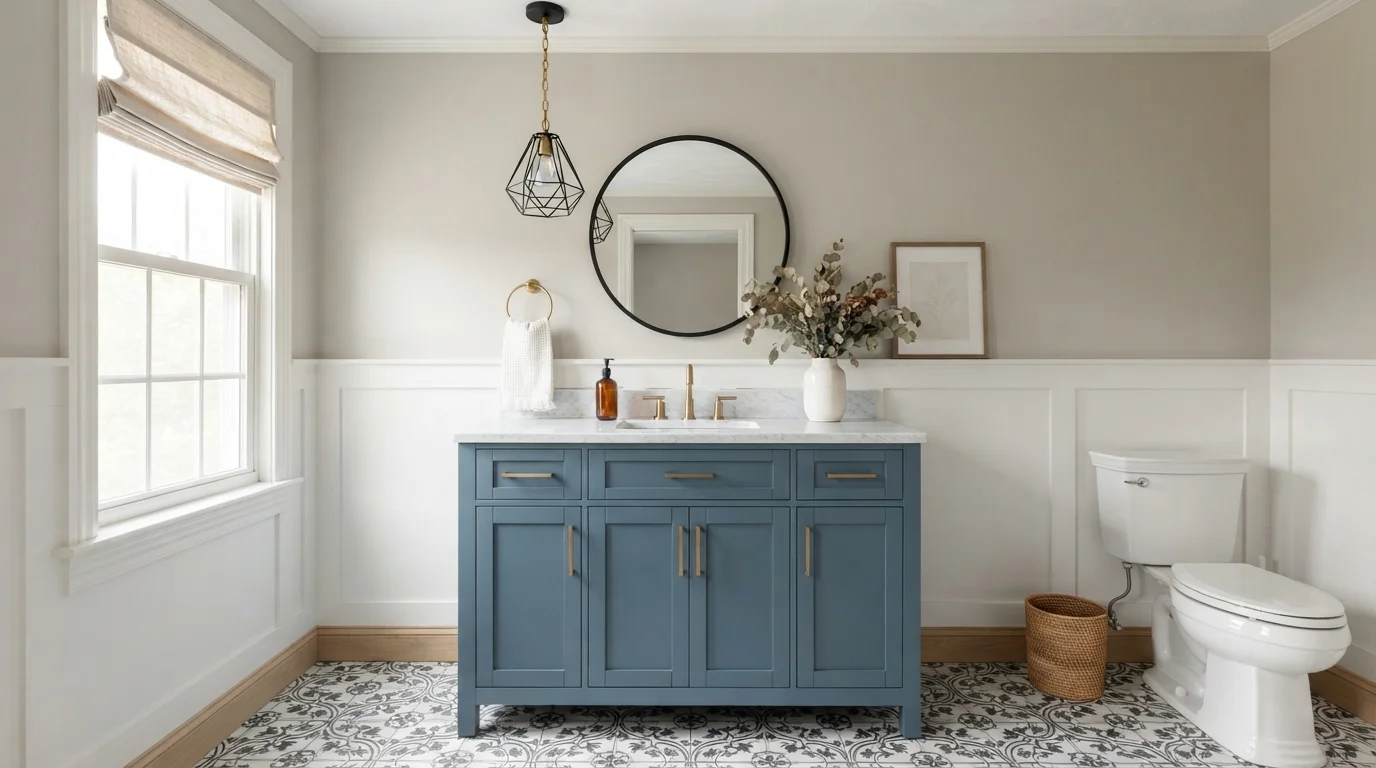
SEE HOCUS POCUS ON YOUR WALLS →Keep things soft and airy with a gentle, spa-like wash of color.
SEE OCTOBER MIST ON YOUR WALLS →Green Powder Room Wall Color Combinations
A wall color never works alone. These are the full schemes from the rooms above — the lead color first, then the supporting colors that make the photo work.
Rich forest green walls and warm golden lighting turn a tiny powder room into a lavish, cozy retreat.
TRY THIS PALETTE →Rich plum tile and luminous chartreuse walls create a bold, playful jewel-box powder room full of personality.
TRY THIS PALETTE →Deep forest green walls blend effortlessly with warm oak and soft stone for a tranquil, spa-like retreat.
TRY THIS PALETTE →Rich forest green walls and warm golden fixtures wrap this cozy powder room in sophisticated, dramatic luxury.
TRY THIS PALETTE →White trim is still the easiest pairing for any of these greens, but which white and how much contrast changes the mood. Pair Salamander with crisp white or off-white trim in a semi-gloss for real contrast — the near-black walls read as a jewel box instead of a hole in the wall when the door casing and baseboards stay bright. Jadite and Cushing Green want the same treatment: white millwork, unlacquered brass or matte black hardware, and if there's a vanity, a white oak or walnut top to warm up the moody wall color instead of a painted white vanity that can look sterile next to a dark, earthy green.
On the lighter end, Hancock Green and Vale Mist pair well with warm wood tones — a wood-framed mirror, a rattan light fixture, or a wood vanity — because the pale green on its own can feel a little flat without something warm to bounce off of. October Mist and Coastal Plain sit in between and pair naturally with either brass or nickel fixtures and a marble or white quartz counter; they're calm enough not to compete with veined stone. Julep is the one pick here bold enough to work as an accent against a white-walled powder room too — paint just the vanity or a single accent wall in Julep and keep the rest white if a full green room feels like too much commitment.
More Powder Room Color Ideas
Set on a color family already? Each page has its own real rooms and picks.
Light or Dark Green Powder Room Colors?
Go Light (LRV 60+) If…
The room is small, faces north, or has to work at every hour. Light warm colors make it feel bigger and stay calm in evening light — the light you actually live in.
Go Dark (LRV Under 20) If…
You want the cocoon effect and the room has real daylight. Dark works best on one feature wall — or fully color-drenched in a large room with good windows.
Powder rooms are usually the one bathroom in the house with no window and no bathtub, so the light in the room is almost always artificial — a vanity sconce or two, on a dimmer or not. That changes the light-vs-dark math compared to a bedroom or living room. Under warm bulb light, a very dark color like Salamander (LRV 5) doesn't go cave-like the way it would in a room people spend hours in; it goes rich and enveloping, because the eye never adjusts to it as a backdrop the way it would in a room used all day. The same logic applies to Jadite (LRV 20) and Cushing Green (LRV 18) — both work best with a decent light fixture and a mirror to bounce it back, not as the room's only light source.
If the powder room is tucked under a staircase, off a dim hallway, or just genuinely tiny, go lighter instead of fighting the room. Hancock Green (LRV 66) and Vale Mist (LRV 56) are close enough to white that they don't swallow the little light there is, and they still register as green rather than a washed-out gray. October Mist (LRV 39) and Coastal Plain (LRV 37) are the middle ground — noticeably colored on the wall but still reflective enough to keep a four-by-five-foot room from feeling sealed shut.
See It. Love It.
Paint It.
Upload one photo of your green powder room and try every color on this page on your own walls — in your own light, before you buy a drop of paint.

Royal OrchardBeforeChoosing The Right Sheen For A Green Powder Room
Powder rooms don't get the shower steam a full bathroom does, so you have more flexibility on sheen than the guest bath down the hall. Eggshell or satin are the standard picks for a powder room — both wipe clean of fingerprints and hairspray without the flat-out shine of semi-gloss, and both let a color like Jadite or Cushing Green read as a soft, matte wall rather than a glossy panel.
Go satin instead of eggshell if the powder room is right off a kitchen or mudroom and gets touched more than a typical guest bath, or if you're painting Salamander and want the extra sheen to help bounce the little light in the room around. Save semi-gloss for the trim and door, not the walls — full-room semi-gloss on a color this saturated tends to show every roller mark and brush stroke under a vanity light.
Where Green Powder Rooms Go Wrong
The most common mistake is picking a green from a fan deck under store lighting and then watching it turn minty, mossy, or oddly blue-green once it's on the wall under a warm bathroom sconce. Because a powder room usually runs on artificial light only, the undertone of the green matters more here than in almost any other room — buy the sample, paint a piece of poster board, and look at it at night under the actual fixture before committing a whole small room to it.
The second mistake is treating a dark pick like Salamander (LRV 5) the same as a light one like Hancock Green (LRV 66) and expecting the same amount of paint and the same lighting plan to work for both. A near-black green needs a real light source — not just daylight from the door being open — or the room reads as dim instead of dramatic. And because a powder room is small enough to paint in an afternoon, don't be afraid to repaint if the first color reads wrong; it's a far cheaper redo than any other room in the house.
Painting The Fifth Wall
In a room this small, the ceiling is close enough to eye level that it's worth a decision instead of an automatic coat of ceiling white. Carrying a lighter pick like October Mist or Vale Mist up onto the ceiling in the same sheen keeps a low powder-room ceiling from feeling like a lid, since there's no harsh color break to make the room feel boxed in.
With the darker picks — Salamander, Jadite, or Cushing Green — a crisp white ceiling does more work than matching it, because it gives the eye a stopping point and keeps a fully saturated small room from feeling like a closet. Either way, skip a flat white ceiling paint in a room that gets bumped by hairspray and steam from the sink; a washable eggshell holds up better over time.
About Green Powder Room Paint Colors
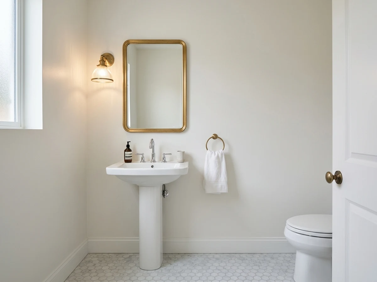
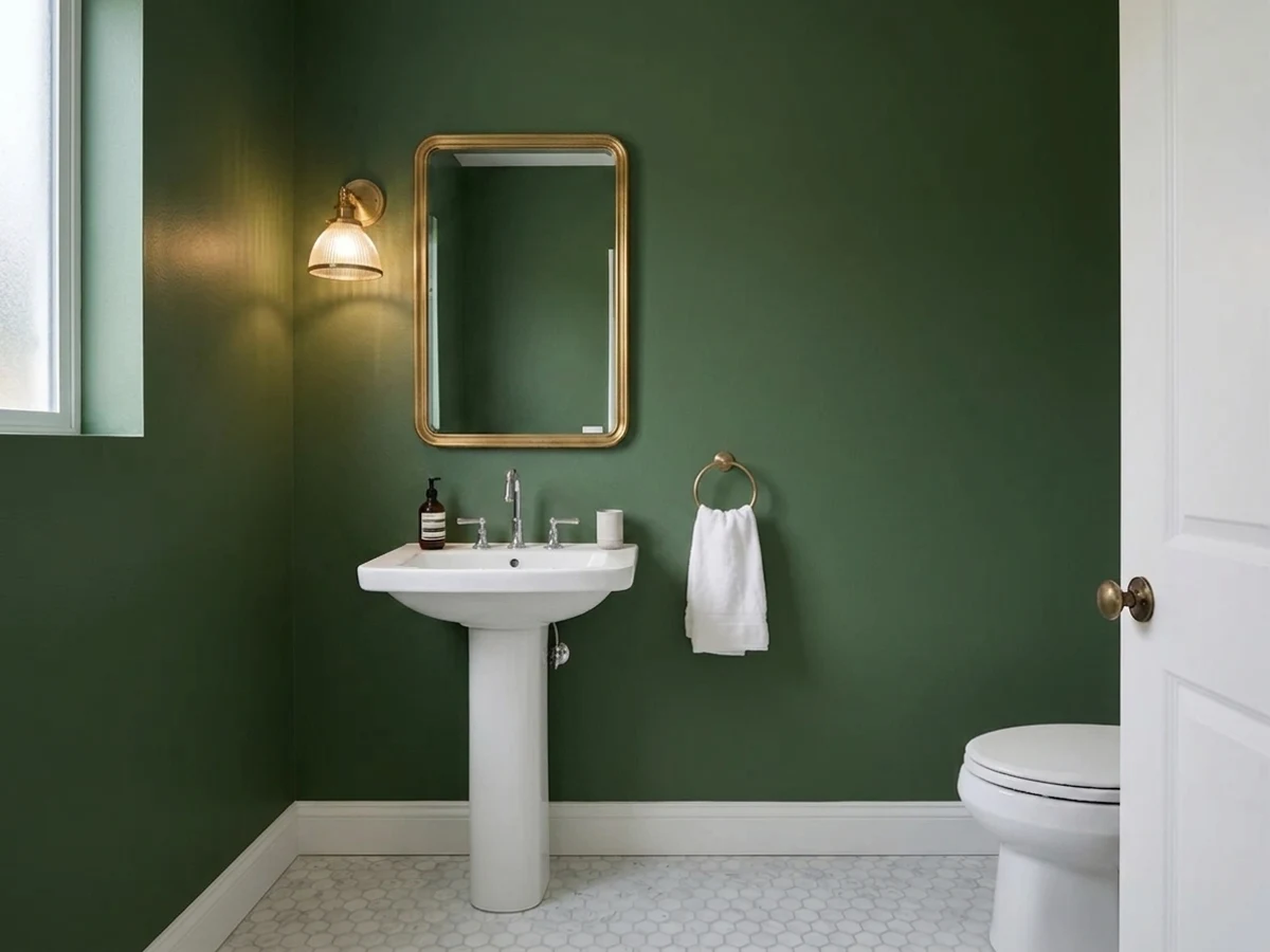
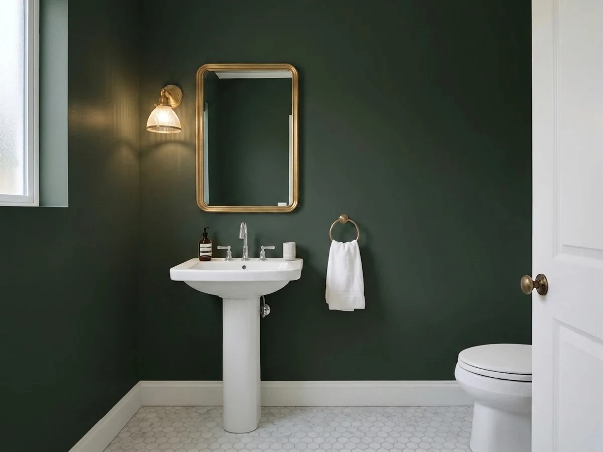
A powder room is the one room in the house you can paint without living in the consequences all day. Nobody does homework or gets dressed in there — guests are in and out in under a minute — so it's the natural place to try the green you'd never risk on a family room wall. That's why this list runs from Vale Mist (Benjamin Moore 1494, LRV 56), a pale, barely-there green that still reads as color, all the way down to Salamander (Benjamin Moore 2050-10, LRV 5), a near-black green so saturated it looks more like a finish than a paint color.
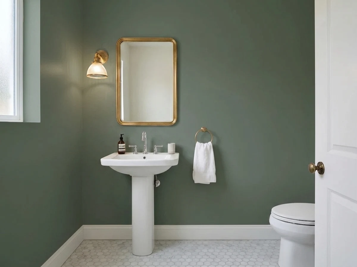
Green also happens to be one of the safer bold choices for resale, because it reads as calm and natural rather than trendy. Hancock Green (Benjamin Moore HC-117, LRV 66) and October Mist (Benjamin Moore 1495, LRV 39) sit closer to sage and celadon, which is why designers keep reaching for them in small, light-starved bathrooms — they add color without adding visual weight. Coastal Plain (Sherwin-Williams SW 6192, LRV 37) and Julep (Sherwin-Williams SW 6746, LRV 32) lean brighter and more herbal, good for a powder room that gets a little daylight from an adjacent hallway or a frosted window.
The darker end of the list — Jadite (Sherwin-Williams SW 6459, LRV 20) and Cushing Green (Benjamin Moore HC-125, LRV 18) — is where a powder room stops being a utility closet and starts being a moment. Both are historic, earthy greens rather than bright or minty ones, which matters in a small enclosed room: a mossy, gray-green like Jadite or Cushing Green wraps the space instead of fighting the mirror, brass, and marble most powder rooms already have.

The Questions Everyone Asks
What color should I paint my green powder room?
If you want one answer, start with the safe picks above — Sage Green, October Mist, Essex Green, Hocus Pocus. They read well in any light and survive furniture changes. Then check the light: strong afternoon sun wants a step cooler, a north-facing room wants a step warmer.
What color should I paint a small powder room with no windows?
Go lighter if the room only has one small vanity light — Hancock Green (Benjamin Moore HC-117, LRV 66) or Vale Mist (Benjamin Moore 1494, LRV 56) stay bright enough to keep a windowless powder room from feeling sealed shut. If the fixture is strong enough to light the room well, a dark pick like Salamander (Benjamin Moore 2050-10, LRV 5) works too — windowless rooms actually hide dark color's usual downside, which is daylight making it look flat.
Is dark green a good color for a powder room?
Yes — a powder room is one of the few rooms in the house designers deliberately go dark and bold in, since guests only spend a minute or two in it. Salamander (LRV 5) and Jadite (Sherwin-Williams SW 6459, LRV 20) both read as a jewel box rather than a cave when paired with white trim and a real light fixture, which is exactly the point of a powder room that gets noticed.
What is the best green paint color for a bathroom?
There isn't one best green — it depends on how much light the room gets. For a bright, airy feel, Coastal Plain (Sherwin-Williams SW 6192, LRV 37) or October Mist (Benjamin Moore 1495, LRV 39) read as calm and spa-like. For drama in a low-light powder room, Cushing Green (Benjamin Moore HC-125, LRV 18) gives a classic, earthy green without going as dark as Salamander.
Should a powder room be painted a different color than the rest of the house?
Most designers say yes, and it's the reasoning behind this whole page — a powder room is seen for seconds at a time by people who don't live with it daily, so it can carry a bolder color than the rest of an open-concept house. A jewel-tone pick like Jadite or Salamander in just the powder room reads as intentional, not mismatched, precisely because the rest of the house stays neutral.
What trim color goes with green bathroom walls?
Crisp white trim in eggshell or satin is the safest, highest-contrast pairing for any of these greens, from pale Vale Mist to near-black Salamander. If the powder room already has warm brass or unlacquered brass fixtures, keep the trim white rather than matching it to the wall — the contrast is what makes a small green room feel finished instead of monochrome.
What two-color combination works best in a green powder room?
The reliable pattern is a quiet main color plus one deep accent on a single wall. Keep trim and ceiling in one warm white so the two colors are the only event in the room — the combination cards above show complete schemes from real rooms.
What colors make a green powder room look bigger?
High-LRV, slightly warm colors — LRV 60–75 is the sweet spot. Paint the walls and trim close to the same light color so the corners blur, and keep the ceiling white. Stark cool white actually works against you; it creates hard shadows that show the room's edges.


Ask a Question